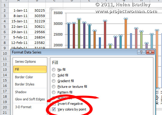
When you have a great big Excel column chart with heaps of delicious data but all in one series, it makes sense for the chart to be plotted in wonderful technicolor. However that’s an option Excel 2010 doesn’t make it very easy to find. If you try the Chart Tools > Design tab you can choose a multi-color chart but that only colors each series a different color so it won’t work when all your data is in one series.
The solution is to click on one column to select it then right click and choose Format Data Series > Fill group. Locate and check the Vary Colors by Point option and you’ll have a wonderful multi-colored series – much more enlightening than a plain old single color chart don’t you think?
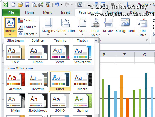
If the colors aren’t to your liking (you are getting just a little bit fussy but I do know exactly what you mean) select the Page Layout tab and check out the Themes – there’s sure to be one which will make your chart perfect.


Helen,
Thank you very much for this article! I am always baffled by the fact that it is harder to do the simple things than the fancy things with most software. We languished through menu after menu until finding your clearly illustrated instructions.
I will bookmark your site and I’m sure you will help me again in the future.
Sincerely,
John David Sharp
Thanks a bunch for this very well written article, I had been changing data point one at a time (was driving me crazy!). This helped me so much.
Sincerely,
Ramon
Thanks a lot for the article. It helped a lot 🙂
I tried this but the last option I have is Invert if negative. Is there something that needs to be turned on to display the vary colors by point option?
You have to be plotting just a single series – this doesn’t work when you are plotting multiple series.
i’m sorry but is there a way to choose the colors on the individual colums?
Click the column so you have it and only it selected. Right click and choose Format Data Point (if it says Format Data Series then you have too many columns selected). Click Fill and then select Solid Fill and choose the color.
cheers
Helen
Helen, you TOTALLY rock! I and some of my team members have been fighting with this for a while! Thank you. …and yes, we are extra picky and wanted to choose our own colors (actually trying to match with canned report). So, thank you much!
Che
Thanks for your comments Che.. glad to be able to be of help and yes, sometimes we do like to choose our own colors – nothing wrong with that!
cheers
Helen
I feel this is one of the such a lot significant information
for me. And i’m glad studying your article. However should statement on few normal issues, The website style is wonderful, the articles is in point of fact excellent : D. Just right task, cheers
Well for single series it works. How about on multiple series? i am having plenty of series. I just need to have each series with two different colors i.e Upto May one color and after may (forecast) another color..
RE your May 11, 2012 comment, let’s back up a step. How do you select only one column?
Hi Andrew
To select a series of columns, click one column. If you click again you will select that particular column and not all in the series.
Hope this helps.
Helen
Yes, Helen is right. To select one bar in a bar chart, left click a bar. That will select all the bars. But when you left click again, it will select only one. Then right click to format it.
Hi there, I enjoy reading through your post. I like to write a little comment to support
you.
Worked like a charm. Since my data was integers 1-5, my formulas were simplified. Now, when data changes, i can just update the data set, and both the bar and the color will update. Brilliant!
Just wanted to add my thanks too! Just the help I needed to complete my presentation perfectly!
Many thanks…it saved me time and headache
Thank you very much.. I was breaking my head to figure this out..