Monday, October 22nd, 2012

Photoshop Heart Shape Crop

Crop an image to a heart shape or any other shape in Photoshop. Uses a filled shape and a clipping mask.

Check out all our tutorials on our YouTube channel.

Complete transcript of this video:

Hello, I’m Helen Bradley. Welcome to this video tutorial. In this tutorial I’m going to show you how to crop to a heart or any other shape in Photoshop. Before we get started on this technique let’s just have a look and see what the end product is going to be. You can see here that I have an image of my cat. And what I’m going to do is to cut her face out in a heart shape. Now in Photoshop Elements this is relatively easy to do because there’s a cookie cutter tool that you can use. In Photoshop it’s not that easy. So we’re going to go through this step by step so that you know exactly how to do it. So let’s get started. I’m going to open up a duplicate of this image. And the shape that we’re using is a heart but this could be any shape at all. So it doesn’t have to be a heart and this process is going to be the same for any shape. The first thing we’re going to do is convert the background into a regular layer. And do that your favorite way. I’m just going to double click the layer and click Ok. And now I’m going to go and get my heart shape. So I’m going to click on the custom shape tool here, and I’m going to select a shape. Now I’ve already selected the heart I want to use but let’s have a look and see. There’s a couple of hearts here. There’s one in the sort of card collection, but I don’t actually like that very much. It’s a really sort of weird shape that one. I prefer this one here so I’m just going to select it, and then let’s go and add a new layer. So I’ve just added a new layer. And let’s go and select a color. Now it can be any color at all, and I’m going to make it this sort of black. It doesn’t matter what color it is. And we’re going to use pixels so this is really important this bit, the pixels bit. In earlier versions of Photoshop there’s actually three icons here and you want to select the one that is pixels. And I’m just going to draw my heart shape. And if it’s not in the exact right position I’m just got a hold the Spacebar as I draw the shape so that I can move it around. And this is actually a nicer shape so once I’ve finished drawing and I’m just going to let go. And now I have a black heart shape right over the top of my cat. It doesn’t matter what this color is because it’s about to disappear. It does matter that the order of these two layers is the wrong way around. So I’m just going to drag the bottom layer up over the top layer. So the photos are on top and the heart is underneath it. And what we’re going to do is we’re going to cut the photo to the heart shape and we do that using a clipping group or clipping mask. So with this layer selected I’m going to choose Layer, Create Clipping Mask. You see here that there is a keystroke that’s Alt Ctrl G. That’s something we could use as well. But what this does is it cuts the photo into the shape of the shape below. So if this were a star than we’d have a star shape. So essentially that’s all you need to do. If you’re already to go, go now because you know how to create a heart shape from an image. If you want to finish it off nicely than hang around and we’re going to finish it off. The way we’re going to finish it off is by adding yet another new layer, and we’re to drag it to the very bottom. And what we’re going to do here is to fill this with a nice color. So I’m going to choose a color of pink because this is a sort of Valentine theme. My foreground color is pink. I have the bottom layer selected. I’m going to Alt Backspace on the PC, Option Delete on the Mac, to fill it with pink. Now we have our heart shape image over pink we can crop it. So I’m just going to crop it to size. And we’ll come in a bit on the edge here too. And now we want that nice finishing touch that we had on the original image. Let’s go and see the original image. You can see that this one’s got dimension and ours is very flat. If you want that dimensional look what we’re going to do is we’re going to add a drop shadow. And we’re going to do it to this heart layer because we want to the drop shadow to follow the heart shape. Here is the layer effects tool, the layer style tool. I’m going to click here and choose Drop Shadow Now my drop shadow at the moment is black. I would prefer a color that is similar to this pink but perhaps a bit darker than it. So let’s just go and get a darker version of our pink. We’re on multiply blend mode which is a good blend mode. I don’t like the angle of light. I prefer my light to be cast in this direction. And you can see that I can now drag my drop shadow around to place it where I want it to be. It’s a bit harsh so I’m going to soften it. Now this is where Photoshop is a little confusing. I think they’ve labeled these really wrongly because size actually adjusts the feathering and spread really adjusts the size. So we don’t want it to have a very big size or spread, but we do want it to have a nice feathering so I’m going to adjust the size to suit there. And on the other one I added an inner glow so I want to grab inner glow here. I again changed the color, this time sampling the pink from the image and going for a lighter pink for my inner glow. And then we’ve got it screen blend mode so that’s going to work nicely. But we do need to increase the size here and probably increase the choke a bit. And we just wanted to blend that around the edge and click Ok. So this is an effect that you can create with any shape in Photoshop. You can put any shape in here. You can put your photo on top. You’re going to add a clipping mask or create a clipping mask with Layer. And this will say Create Clipping Mask. At the moment it says Release because that’s what we would be doing at this point because we already have clipping mask created and we’re just dropping a filled layer below it. I’m Helen Bradley. Thank you for joining me for this Photoshop video. If you liked this video please would you give it a thumbs up so that others know that it’s a good video. Look out for more videos on my YouTube channel and look at projectwoman.com for more tutorials about Photoshop.

Helen Bradley

Helen Bradley

Saturday, October 20th, 2012

How to shoot from a (fast) train


Ok, I’ve struggled with taking good shots on trains for a while now. The biggest problem is that by the time I know I have bad results it’s just impossible to go back and try to fix the problem.

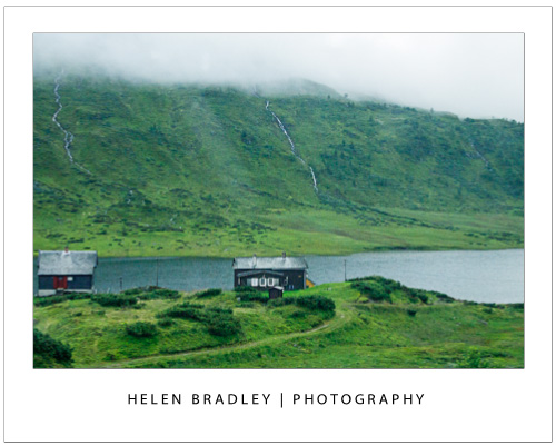
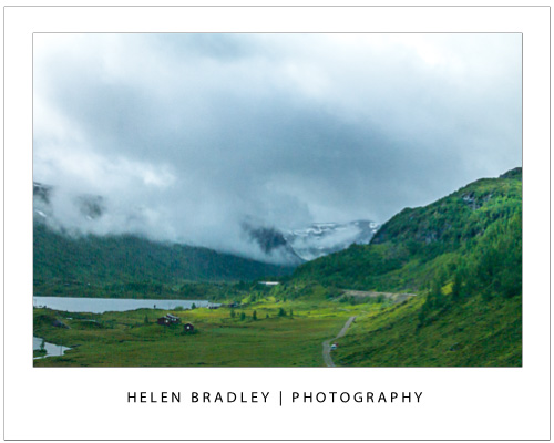
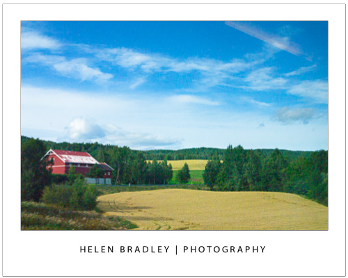
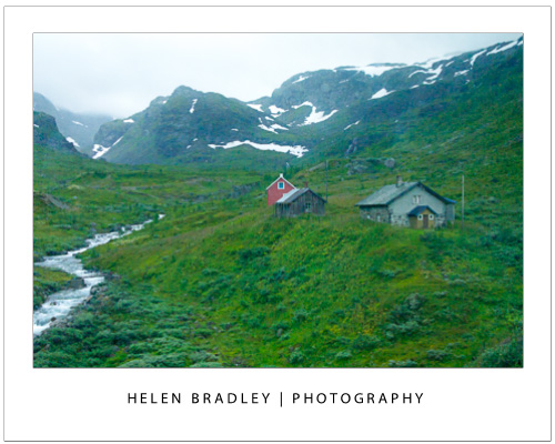
Recently,  on a trip between Bergen and Oslo in Norway I nailed the shoot and ended up deleting only one third of my shots. There’s no way you won’t mess up a lot of your shots when shooting from a train or fast moving car, but with these tips you can make the percentage that are keepers so much higher.

First of all you have a choice between noise and blur. You need to bite the bullet on this – you can get sharp images but you might have a bit of noise. Personally, I actually like some noise and I think it’s fine. But, if you can’t live with some noise it might be as well to pack your camera away and just enjoy the trip.

Second you need a small aperture so you get a lot of the image in focus. I shoot at 7.1 or 8 which is pretty small so it  requires a corresponding high ISO to compensate. So, I dial up the ISO to 1600 and sometimes 3200. That is very sensitive but it means I can capture at speeds like 1/2000 of a second or even much faster than that – and that freezes the motion.

Third, you need to use manual focus. Unless you have a stupid fast focus on your camera it will get caught trying to focus and refocus and you won’t ever get a shot as the train moves. The autofocus will  be confused by things going fast close like trees, tall grass and power poles. If you manually focus you can work faster and ignore distractions. I have to say, I practically NEVER shoot manual so in shooting manual in this situation I’m doing this because there really isn’t any alternative to doing so.

Fourthly, the grass is always greener on the other side of the train. You will always think your side of the train has nothing interesting and it is all on the other side. This probably isn’t the case so don’t keep running back and forth  across the train. Instead, focus on what is on your side of the vehicle, learn to anticipate what you might see so you can react to it instantly when you see it.

Fifthly, I like to sit facing backwards so things move away from me and in a window seat of course. YMMV on this.

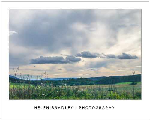
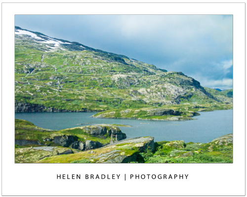
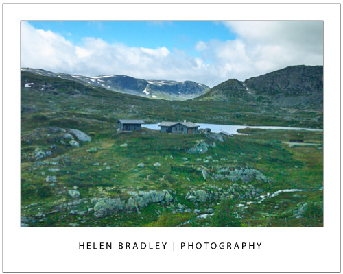
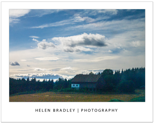
Once you are set up, find a direction to shoot that minimizes the reflections from the train window and inside lighting and start shooting. Accept the fact that trees and poles will mess up a lot of shots but if you take more than the usual number of pictures you will get a good number of good shots. Also accept that you will miss more than you capture depending on the situation. On my trip across Norway trees, power poles, tall grass and numerous tunnels played havoc with my shooting but the skies were wonderful and I did nail some really great shots and i felt way more in control of the shooting than ever before.

So, next time you are. on a fast train traversing a continent, set your camera up and enjoy the shooting experience.

Helen Bradley

Friday, October 19th, 2012

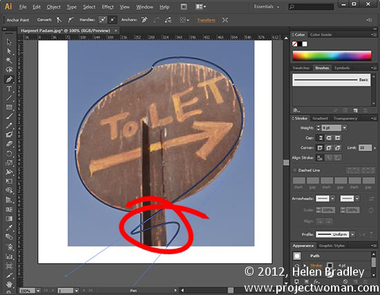
Trevor’s Illustrator Tip – Controlling the Pen Tool

Photo by: Harpreet Padam

Having trouble working with the Pen tool?  When it takes off and draws yet another curved line after a curve when you want a straight segment, the fix is surprisingly easy. Hold the Alt key and click on the last anchor point. The line will be set to a point rather than a curve so you can make a straight line after your curve.The bonus? This works in Photoshop too. The double bonus? In Illustrator CS6 you don’t even have to use the Alt key – it’s smart enough to know that you want to change the line type when you click on the last point.

Helen Bradley

Thursday, October 18th, 2012

Photoshop Masks 101 – Spot Color effect

Create a spot color or isolated color effect in Photoshop. The image is black and white and only a portion of the image is in color. Learn how to do this and how to get started with masks as you do this.

Check out all our tutorials on our YouTube channel.

Complete transcript of this video:

Hello, I’m Helen Bradley. Welcome to this video tutorial. In this tutorial I’m going to show you how to begin to use masks in Photoshop and I’m assuming that you’ve never used a mask before. And so that we actually create something in this tutorial we’re going to use it for a spot color effect. Before we get started on actually introducing what a mask is let’s have a look at the effect that we’re looking at here. This is my original image and it was shot in color on a very wet night in Wales. And what I’ve done is converted the image to black and white but I’ve left this person in the middle of the image in color. And I’ve done it in such a way that we can edit it. So if I didn’t make the selection correctly to begin with I can adjust it at any time. I can also remove the effect. So you can see here I’ve removed the mask here and the image has been reverted to fully black and white. I can reinstate the mask and this converts the image into black and white but leaving this person in color. This is a black and white adjustment layer here, a very simple adjustment layer. But because I’ve got a mask here I’m able to control where the color is on the image. And with masks you can paint with black and white. Black will reveal the layer underneath or the color underneath and white hides it. So if I get a really big brush right now, let’s go and get a really big brush on this image, and just see what happens when I paint on that mask. Can you see that I’m bringing color back into the image because I’m painting was black. If I paint with white I’ll removes the color from the image. I’m painting on the mask so I have the mask targeted but my paint is being painted onto the image itself. So I’m painting here. You can see that the color is going on the mask and we’re poking a hole in this black and white layer to see the color below. If we change to paint in white we’re removing it so we’re seeing what is on this particular layer. So now that we’ve seen what we’re aiming for let’s go and see how we could achieve that result with another image. Here I have another image. This one was shot in Cambridge. And I’m just going to size it down. And to make a start on this image we’re going to convert it to black and white using an adjustment layer. I’ll choose Layer, New Adjustment Layer, black and White and click Ok. And now I can make my black and white adjustment. But because my phone boxes are going to be colored red later on I’m not worried about the color in the phone boxes but I am worried about how the black and white is converted in the image around the edges. So I’m just going to focus on these edges. I do want it to look a little bit dark. So I’m probably going to go to the black end of the scale on most of these. And there’s my black and white image. And now we’re ready to add the color back into it. There any number of ways that we can bring the color back into the image. I’m going to show you a couple of them. Because we created a new adjustment layer you can see that there’s already a mask in place. So we can use this mask just by painting on it. Because it’s white that’s automatically telling us that we’re seeing just the black and white elements in the image. So if we start painting with black, and I’m just going to choose a paintbrush to use, I’m going to choose a slightly softer one to start off with. Now if we paint with black on the mask we’re going to start seeing the color appear underneath. And if we go too far then we can paint over it by painting in white. And you can see that we would really need a harder edge brush to really get a good effect here. But we could get a soft effect if we wanted to with this sort of almost not really quite transparent but it almost is in the edges brush. So I could just brush that effect on. It’s not fully opaque at these edges but it’s still giving me a spot color effect. Now I’m just going to trash that mask, drag it off and I’m going to delete the mask. At any time I want to add a mask I can just click this Add Layer Mask icon and that will add it to an adjustment layer or to a regular layer. Now let’s turn off this entire adjustment layer. Let’s go to the background layer and let’s use the quick selection Tool to select over these telephone boxes because this is another way that we could mask things. And now because I have my selection in place we can go back to our adjustment layer, turn it on, make sure I have the mask selected. I have black as my foreground color, I can Alt Backspace, Option Delete on the Mac to fill the mask with the black color that then shows the red through it. If I press Ctrl or Command D I’ll deselect the selection. And now I can zoom into areas that I think may need to be fixed a little bit, move them into position and go and get my black paintbrush. I’m going to make it a fairly hard edge paintbrush because the edges of these phone boxes are pretty hard. And I’m just going to paint over these edges and just make sure that in every place that I created my mask or my selection that everything is working correctly. I’ve actually got some color here so I’m going to switch colors by pressing X to make white my foreground color. I’m just going to tidy up a little area here where I had too much of the background color. And now I’ve gone the other way, again press X and this time bring it back in by painting with black. I’m painting on the mask. Although I’m using the image, I’m actually physically painting on the image but it’s appearing on the mask layer. And again I can just check around here to make sure that I have everything looking the way I want it to look. Let’s just zoom out again. Now there’s another way that I could have created this entire effect and that would have been to have made a duplicate of this background layer, Layer, Duplicate Layer. And I could have converted this to black and white just using Image, Adjustments, Black and White. Now for this one I’m just going to select the default adjustment. And now I’ve got a black and white layer on top of a color layer. Again I can add my mask here and I could paint on that with the paintbrush and black paint to bring my color back in or I could go to this layer and make my selection on this layer just as we did earlier. I’ll just go and quick mask this, really quick mask it. This is a very quick and dirty mask this one. Ok and then let’s go back into this layer and because I have this selection made, in fact it needs to be a little bit better made, I can just Alt Backspace, Option Delete on the Mac to again mask this layer. And then we can go back and tidy it up with the paintbrush and just paint over any areas where we want to bring back the color from the layer underneath. So this is done with two layers, one of which is black and white and one of which is color. But you could do it with an adjustment layer. There are lots of different ways to do it. It’s this Add Mask icon that allows us to add a mask. We’ll always put the mask on a top most layer because we want to poke a hole through this layer to see the one below. We’ll paint with black or white on the mask, and we can also paint with shades of gray. So let’s go and get a shade of grey here. It’s under my paintbrush so let’s see what happens when I paint with it. What we get is part of the current layer here but not all of it. So you can see I’m getting a mix here of the layer below and this layer because I’m painting with gray. Anywhere I paint with black I’m going to get only the layer below. Anywhere I paint with white I’m only going to get this particular layer. So there’s an introduction to masks by creating a spot color effect which is fully editable. Provided we save this as a PSD file, the image is going to be editable at any time by just painting on that mask. I’m Helen Bradley. Thank you for joining me for this video tutorial. If you liked this video please give it a thumbs up on YouTube. Subscribe to my channel if you’d like to know when new videos are being released. And visit Projectwoman.com for more tutorials for Photoshop, Illustrator and Lightroom.

Thursday, October 18th, 2012

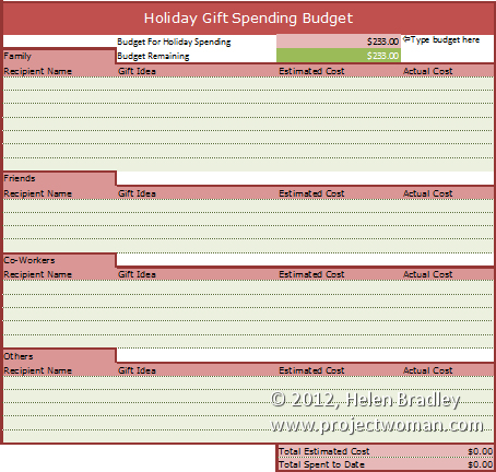
Holiday Gift Budget Worksheet

Don’t blow the budget this holiday season!

Our holiday gift buying budget worksheet will help you avoid a Yule tide spending blow out.

In the interests of helping you better control your spending this Holiday Season we have a free spreadsheet download in the form of a Holiday Gift Spending Budget.

Grab this version for Excel 2007/2010/2013 – gotta love the formatting available in those versions.

If you’re stuck in the land of Excel 2003 and earlier (or want to use it in Zoho, Google Docs, OpenOffice.org or anything else that can read Excel files), then grab this plainer but still fully functional version.

The worksheets are protected against wiping out key formulas and entering data in the wrong cells but there’s no password there so you can easily unprotect if you desire.

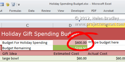
To use this worksheet, download the one for your Excel version, open it in Excel (or another compatible program), and then, in cell D2 type the amount you can afford  to spend.

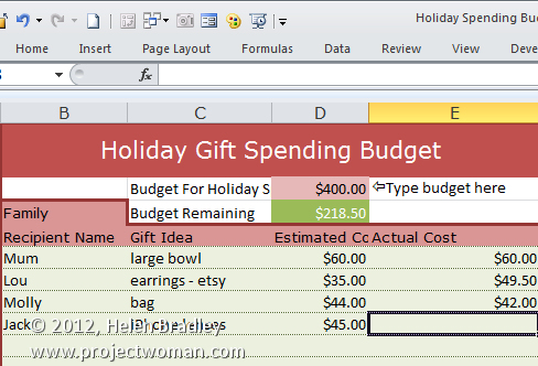
Then add entries for family, friends, co-workers and others – determine what you will get them and  how much you are budgeting to spend. At this stage you can see if you are on track or already over budget.

As you buy presents, fill in the actual amount spent and in cell D3 you will see what you still have to spend of your budget amount or if have spent all you have allowed for.


Helen Bradley

Wednesday, October 17th, 2012

Trevor’s Photoshop tip of the Week – Working with Multiple Layers

(Image by: Helen Bradley)
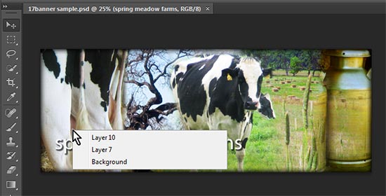
Working with lots of layers and a cluttered Layers palette?  Find the layer that has the content you want to work with by targeting the Move Tool. Right click on a PC or Ctrl + Click on a Mac over the area that contains the content to work with.  A list of all the layers under the cursor will appear – to select one, click on it in the list..

Helen Bradley

Tuesday, October 16th, 2012

Trevor’s Quick Word Tip – Remove unwanted formatting

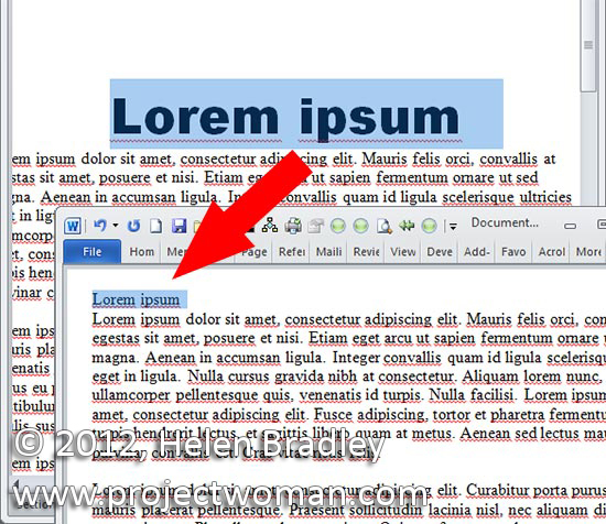
If you are having second thoughts about the look of your document you can remove the formatting. Select the text that you want to strip of its formatting and and press Ctrl + Space Bar to remove its formatting. If you press Ctrl + Shift + N you’ll apply the default Normal style to the selected text.

Helen Bradley

Tuesday, October 16th, 2012

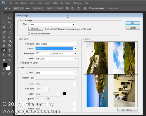
Install Picture Package in Photoshop CS6 – step by step

How to install Picture package into Photoshop CS6

Yes! It can be done! Don’t let anyone tell you it can’t.

Ok, so if you read some of the information that’s available on the web you’ll be lead to believe that, in Photoshop CS6 the Picture Package feature has at last been permanently removed from Photoshop and only the Contact Sheet feature is available.

You’ll also read that the Picture Package is not a supported plug-in. Well, it might not be supported but that doesn’t mean it doesn’t work. If you are a Windows user then it does work – in fact it works just fine. And thanks to J. J. Mack’s research here, step by step is how to put the Picture Package back in Photoshop CS6 for Windows.

Step 1

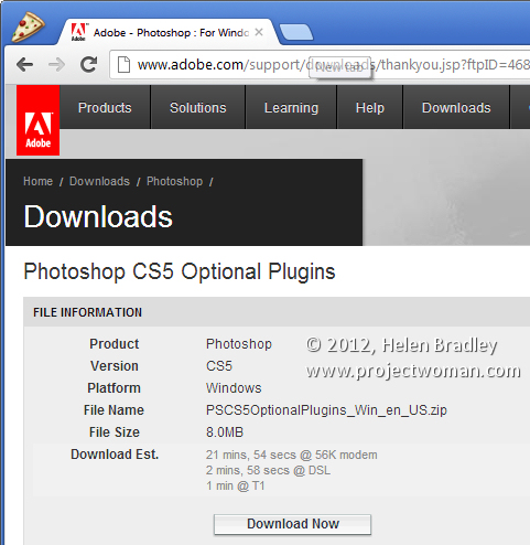
Download the Picture Package and Contact Sheet add-in for Photoshop CS5 from this location: http://www.adobe.com/support/downloads/detail.jsp?ftpID=4688. It is part of the Optional Plugins collection.

Step 2

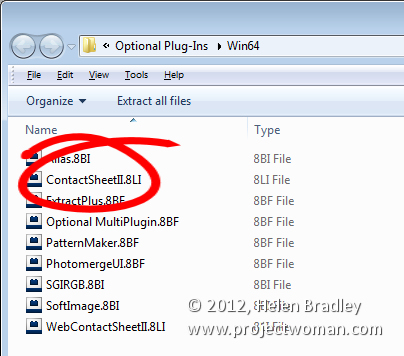
Once you’ve downloaded the plug-in zip file, open it up because what you want is two parts of it. You want the appropriate ContactSheetII.8LI file and the layouts.

install picture package add in into Photoshop CS6

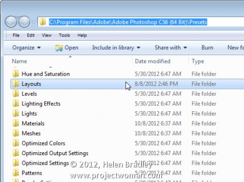
So, once you’ve unzipped the file use Windows Explorer to locate your Adobe folder – you will need the C:\Program Files\Adobe\Adobe Photoshop CS6 <64 bit or 32 bit>\Presets folder. Depending on whether you are using the 32 or 64 bit version of Photoshop, you will need to locate the correct folder. On my machine, I am using the 64 bit version of Photoshop so the folder is: C:\Program Files\Adobe\Adobe Photoshop CS6 (64 Bit)\Presets.

Put the folder of Layouts that were in the zip file into this folder – so you will now have a Presets\Layouts folder with a set of layouts in it.

Step 3

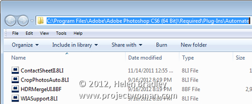
Locate your Adobe Photoshop \Required\Plug-Ins\Automate folder – the Required folder is at the same level as your Presets folder so, on my computer it is here:

C:\Program Files\Adobe\Adobe Photoshop CS6 (64 Bit)\Required\Plug-Ins\Automate

Into this folder copy the ContactSheetII.8LI file from the zip download.

Step 4

Once you’ve done this simply close and restart Photoshop.

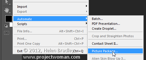
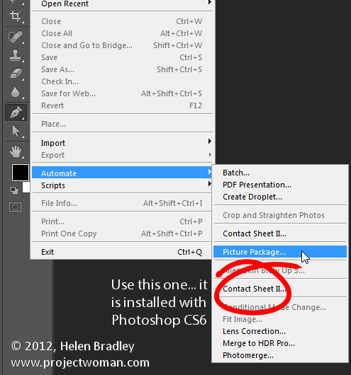
Choose File > Automate and you’ll see the Picture Package option.

You’ll also find that you have two Contact SheetII entries – you want to use the second one of these as this is the one that is installed with Photoshop CS6.


If desired you can use the Edit Menus feature to remove the unwanted entry from the Automate menu to make things neat and tidy.

Step 5

To run the Picture Package plug-in in Photoshop CS6, choose File > Automate > Picture Package. You can now proceed as you did with earlier versions. You can edit layouts, open layouts, you can click on an image to add it, you can go and add a file to the layout and basically do anything that you used to do with the Picture Package in any earlier version of Photoshop.

So when someone tries to tell you that Picture Package is not available in Photoshop CS6 feel free to send them here to prove that it can be done.

Helen Bradley

Monday, October 15th, 2012

Photoshop Make Custom Buttons

Make your own custom glossy buttons in Photoshop – shows how to layer pieces on top of each other, and how to use Styles, a gradient and Warp to quickly and simply create a button in just a few steps.

Check out all our tutorials on our YouTube channel.

Complete transcript of this video:

Hello, I’m Helen Bradley. Welcome to this video tutorial. In this tutorial I’m going to show you how to make custom buttons in Photoshop. This video was really born of necessity. What I needed was for a project that I was working on I needed a stop and a go sign. And all I could find on the stock websites that I liked and that really worked for me was a stop sign. I couldn’t find a matching go sign. So instead of buying just the stop button and then going ahead and reworking it to make my go button I decided I’d make it from scratch.

So here’s my stop button, and we’re going to make it. And I’ll show you have to turn it into a go button so that you can do that as well. I’m going to start with a new document. And I’m going to start with a relatively small one but you can make yours as large as you want and if you were using this at a lot size you’d want a large size document. So I’m just going to click Ok. And it has a white background and that’s Ok for now.

So I’m going to choose Window and then Layers so we can see our layers palette. I’m going to start with the shape that I’m going to use. So I’m going to show my toolbar which has disappeared here, and I’m going to go and get a custom shape. Now there is already a shape that I can use here and what it is is the polygon shape. And all I need to do is to set the number of sides.

Now this is a sided figure so it’s already preset. Let’s just click on a new layer and we’re going to choose pixels. And I’m going to go and get a red color to use. So now that I have Pixel selected and my red color and a brand new layer I’m just going to draw my polygon. Now I’m going to hold the Shift key so it’s constrained to a regular shape. And because it’s being drawn in exactly the wrong place I’m going to hold the Spacebar down and move it into the middle of my image. And only when I’m ready am I actually going to let go the left mouse button which I’m doing now. As you can see it’s not actually rotated correctly but we can fix that with the move tool.

I’m going to go to Edit Free Transform and I’m just going to rotate it 15 degrees because that’s all it needs to be straightened up. So we’ve got our starting shape now. Now we need this white bit. So what I’m going to do is to actually just put this on a new layer. So I’m going to create New Layer via Copy which means I’m going to copy the exact shape into a brand new layer. I’m going to make white my foreground color. I’m going to fill this layer with white using Alt Backspace on the PC, Option Delete on the Mac.

Now if I click on this icon here you can see that now I have a white shape. I want it to smaller than this bottom shape. So I’m going to click and drag on the corner but I’m going to do it with the Alt key selected because that is going to size that relative to the middle portion of the shape. So now I’m just going to size it in and let go the left mouse button and then let go the Alt key. So now I have a second shape on that layer.

So again once I’ve created this layer I’m going to choose Layer New Layer via Copy. And this time we’re going back to our red color. So I have that selected. I’m going to click here to lock these pixels, Alt Backspace Option Delete to fill it with that color. And again I’m going to size it in by dragging with the move tool and do that with the Alt key selected so that I can actually set this border here so it’s sort of even all the way around and then let go and click the checkmark here. And now we have our shapes.

Now we’ve got basically all the bits that we need except for the text. So let’s go ahead and put the text on. So I’m going to go and grab the text tool. I’m going to reset these so that I have white as my foreground color. I’m just going to go and find a font to use. I’m really not that fussed about what font we use because you can go ahead and find a really good font yourself. I think I might just use Calibri. Nowhere near big enough in actual fact, so let’s just go in here and let’s make it 200.

Not nearly big enough even still. 350 pixels is pretty good. And let’s just move that down into position. Ok, so there’s my stop sign. What it’s missing right now is this sort of look that gives it a sort of dimension. Now the dimension that we’re going to give our shape is going to be created using styles so I’m going to click here and add a style. And I’m going to choose bevel and emboss. Now we’re on the back layer so we’re on this outside edge. And what I want to do is to add quite a deep bevel. And we’re just going to size that to suit.

Now you can see that the highlight mode here is Screen but it doesn’t have to be screen. We could actually multiply it and we could use a slight color here if we wanted to darken up the edges of the highlight. And here around the shadow areas we’ve got again multiply and a darker color. In this case I may want my dark red, but I may want it a bit redder. So instead of using a sort of black color to multiply I’m multiplying with a darker version of the color I’m using. But you can play around with that.

You can also play around with the shape of the bevel. So you can make it all sorts of different shapes. And you can even click here and change it manually by dragging on the curve. But I’m just looking for a beveled edge here. And it needs to be an inner bevel, but we could make it chisel hard or we could make it chisel soft as well. They’re alternatives that we could use. Once we’ve done that I’ll just click Ok. So that’s taken care of the outside edge, and we’ve got the white mark. All we need to do is to deal with the middle.

So again I’m going to select the middle and I’m going to again add a slight bevel to it. So let’s go to bevel and emboss. This time again in a bevel I want quite a large one, but I want it to be really, really soft in shadow. I just want it there, only just barely. So I’m going to call that good for that inner bevel right now. If you have a look at this particular stop sign you can see that it’s got a line through it. And now we’re going to create that affect again here in Photoshop.

There are any number of ways that you can create that sort of custom shape. But I’m going to show you just one way that you can do it. I’m going to start with a new layer and I’m going to drag a rectangle on it. And this rectangle is going to be over the top of my stop sign. And I’m going to go and grab the same colors as I’ve used in my stop sign, this red, and I’m going to choose a slightly darker version of the red. And let’s make this a slightly lighter version of it, but again all in the same color palette.

Now that I have these colors I’m going to fill this shape with a gradient made from those colors. And the gradient I want is this foreground to background gradient. So I’m going to select it, and I’m going to drag it into here. And I want a linear gradient. And I want it the other way around because I want the lightness at the top. So I’m going to reverse it. So once I’ve got my linear gradient in place I’m going to call that good. And I’m going to then clip it because what I’ve got right now is a gradient that’s going to give me the beginnings of the effect that I want.

The problem is is that it’s much bigger than the shape underneath. But if I create a clipping mask it’s all going to work perfectly. So with this layer selected I’m going to choose Layer, Create Clipping Mask. And you can see that that shape is now clipped to the shape of the layer below. Now I just need to drag down the opacity a bit. Ok, now we want to make that nice shape. So with this layer selected I’m going to choose Edit and then Transform and then Warp. And now I can warp this shape to the shape that I want. So I’m just going to drag down on this edge. And I’m going to look to make a smooth warp over my image.

If I want some more darkness into my image I can just pull up the darker edge of this rectangle. I don’t want to twist these if I can help it. I did in my shape and it didn’t end up quite the way I wanted it to look. But here we’ll be a bit more careful. So now that I’ve got my sort of warp look I’m just going to click the checkmark here. And that’s now in place. And if I want it a little bit differently I can just drag on this shape and just bring it down or I could re-warp it. But there’s the basics of a stop sign. And that’s all been created now inside Photoshop. So I could save this off as stop. Now to recolor this and make this the go sign all I need to do is to put in an adjustment layer.

So I’ll choose Layer, New Adjustment Layer, Hue/Saturation and click Ok. And this hue/saturation adjustment layer is going to affect everything below it. And so all I need to do is to drag around until I find a green for go. And somewhere in here is a pretty good green, decrease the saturation a bit and just work out exactly where my correct green is. Ok. So now we’ve actually turned stop into go. And we’ve done that just using this layer. And all I’d need to do now is to just go ahead and type a layer that has go written on it. Let’s click the text tool. Let’s make sure we’re typing in white, click here and just type go. So my stop sign is now a go sign.

Here is the stop version. And then with the adjustment layer that changes the color and then a text layer here’s my go sign. And these two signs match exactly. And it was really fairly quick to create them inside Photoshop. I’m Helen Bradley. Thank you for joining me for this video tutorial. If you liked this tutorial place give it a thumbs up and like it on YouTube so that you tell others that it’s a good tutorial. You’ll find more of my tutorials on this YouTube channel. If you subscribe you’ll be advised when new videos are launched. And look out for my website at projectwoman.com where you’ll find more tutorials, Tips and tricks for these applications.

Helen Bradley

Friday, October 12th, 2012

Create an HTML web gallery in Lightroom

With the increasing popularity of the iPad and iPhone it’s no longer appropriate for most of us to create Flash based web galleries – they just can’t be easily viewed on these devices. If you want almost everyone to be able to see your galleries then you need to create them as HTML galleries and not Flash.

Lightroom has a range of HTML Templates you can use to create a reasonable looking gallery in a very short time.

To make your web gallery in Lightroom start by placing your images in a Collection. This makes it easier for you to work with the images and you can save the gallery so you can edit it in future if needed.

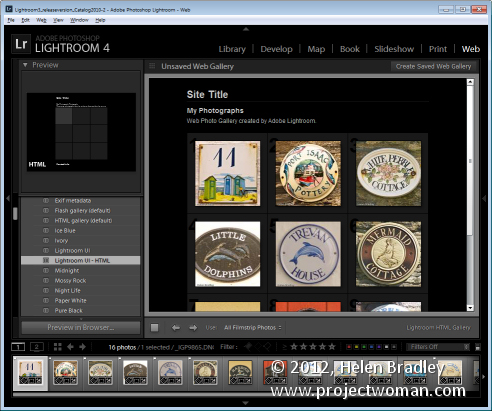
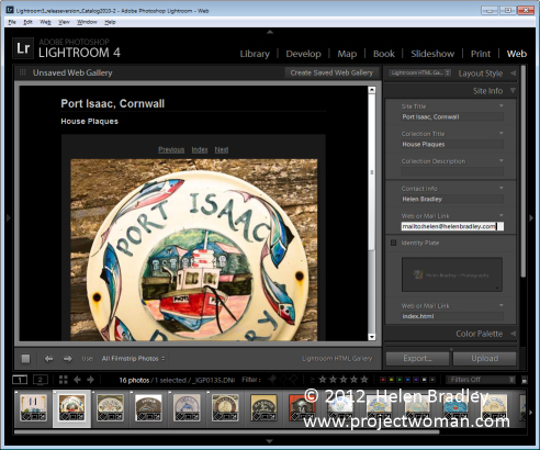
Select your Collection and switch to the Web module. From the Layout Style options, you can select Lightroom HTML gallery or, easier still, from the Template Browser panel on the left of the screen, select a gallery that is HTML based. If you look in the preview area the HTML gallery templates all have the letters HTML in their bottom left corner. Select a template to use.

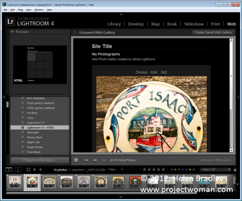
From the toolbar (press T if it isn’t visible), choose All Filmstrip Photos if you have a Collection selected and this will add all the images to your gallery. What you see on the screen in the editing area is a live version of your web gallery. You can click on any image to view it as it will look on the web.

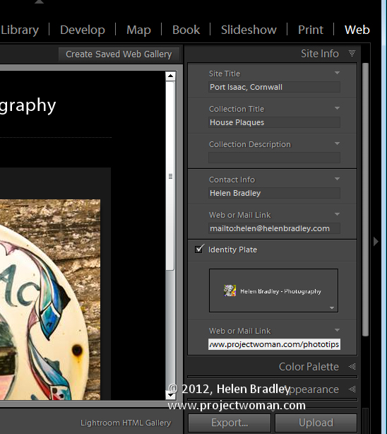
Open the Site Info panel and type a Site Title, a Collection Title and a Collection Description. If you don’t want to use all of these simply delete the placeholder text for those items you don’t want to use and the space they take up in the template will be freed for use for your images.

For the Contact Info, type your contact name if desired and then complete the Web Or Mail Link and this will be linked automatically to the contact name in the web gallery.

You can add an identity plate to the gallery, if desired, it will sit above the Site Title. You can link it back to your site if desired by completing the Web or Mail Link box.

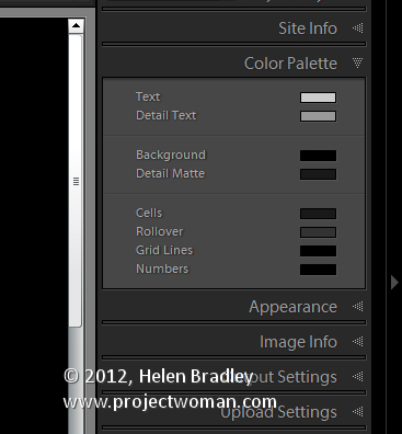
The Color Palette options let you change the colors for the various elements in the website template.

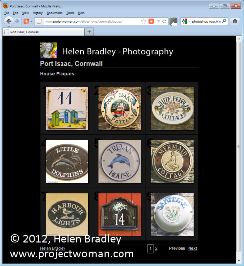
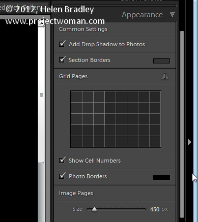
In the Appearance panel you can set the thumbnail image grid size – it defaults to 3 x 3 and cannot be any smaller but it can be considerably larger. If you want to show cell numbers over the images you can do so – this is useful when you need to give viewers an easy way to identify images they like. Images are numbered sequentially and if you have multiple pages the images on the second page continue sequentially from the numbering from the first page.

You can control the size of the full size image on the Image Page by adjusting the Size slider. You can also add Photo Borders to the images in the Image Pages. Note that the Appearance panel is divided into Common Settings, Grid Pages and Image Pages allowing you to make change that effect the entire gallery, only the grid pages or only the image pages.

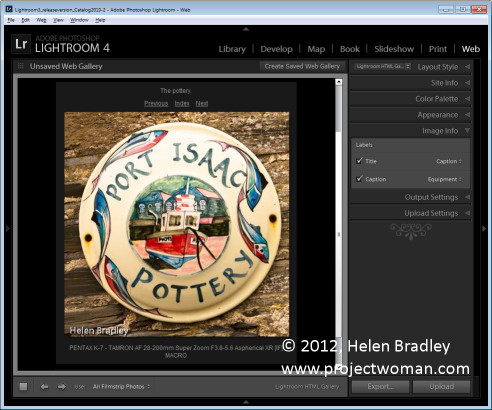
In the Image Info panel you can select to add labels to your images. These appear on the Image Page only. You can select a Title which appears above the image and a Caption which appears below the image. For each you can source the text from the image metadata and there is no reason why you can’t set the Title to be the Caption metadata and the Caption to be your Equipment metadata, for example.

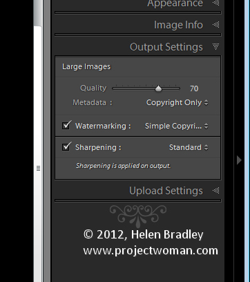
In Output Settings select the quality of the larger size JPG images – 0 is low quality and 100 is high quality. If you want to include Metadata with the image select what to include – your choices are Copyright Only or All.

Also add a Watermark if desired. If you select to add a watermark, you’ll see it on the image page and the index pages so you can check to see that it’s what you want.

Select whether or not to sharpen the images – this sharpening is only applied as the images are output so you won’t see it on the screen. If you’re unsure what to use, enable Sharpening and set it to Standard.

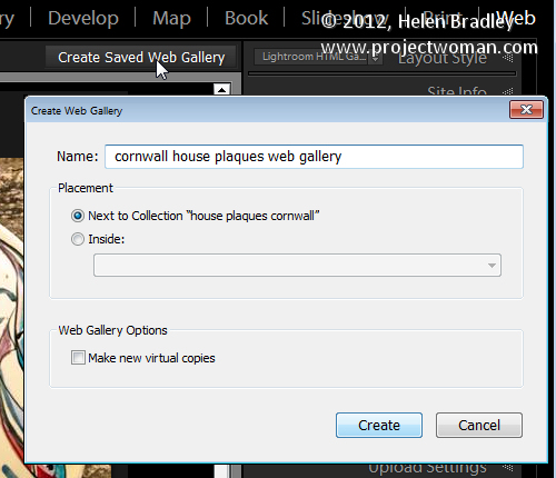
When you’re done, click Create Saved Web Gallery – this is a new option in Lightroom 4 and it appears to the top right of the main editing area. Type a name for your web gallery and click Create. Doing this ensures that the gallery is saved and once you have done this, Lightroom will track your changes from now on.

In future you can come back to the web gallery by clicking the special collection that Lightroom creates for you.

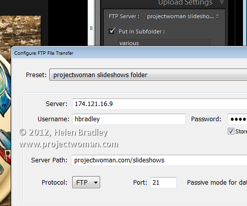
If you want to upload your gallery to the web later on, click Export to export it to disk. Otherwise you can upload it direct to your website by selecting the Upload Settings panel and configure your FTP server. For this, you’ll need your server details, user name and password. You’ll also need the server path although you can click Browse to browse your server to find it if desired. Type a subfolder in which to place the gallery – you’ll need to do this if you plan to have multiple galleries in the server folder you are using. Each gallery needs to be placed in a different subfolder or it will overwrite the previously uploaded gallery.

When you have everything configured click Upload to render the gallery images, create the necessary html code and upload it all automatically to your server.

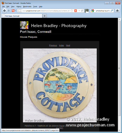
The HTML galleries in Lightroom aren’t the best looking galleries in town but having a gallery accessible to almost any device is definitely and incentive to use them in place of Flash galleries.

Helen Bradley

Page 2 of 3123