Once you have captured a great image of mum it’s time to fix it before sharing.
In a recent blog post I talked about how to take great photos of mum for Mother’s Day or any other occasion. Today I am going to explain how to process them.
Once you’ve downloaded and chosen the best shots – it’s time to fix the photos.
Start out with adjusting the white balance if the images need this. You might also want to warm the image if it is too cold so add a slight yellow/orange color cast to it to warm it a bit. This image is a little bit too blue for my taste and it will look better a bit warmer.
You can do this in Photoshop Elements – a good fix there is to adjust the skintones as explained in this blog post http://projectwoman.com/2010/03/step-8-photo-editing-workflow-fix-skin-tones.html. Photoshop doesn’t have this fix but whenever I use Photoshop Elements I find it really useful. You can fix skintones and warm the image all in the one step.
I will then fix any skin blemishes – if you’re using Photoshop Elements do that with the Spot Healing Brush Tool. The process is as simple as painting out the problem areas and the uneven skin tones will be smoothed.
To lessen the effect of wrinkles a good fix is to make a duplicate of the image background layer (Layer > Duplicate Layer) and to blur this duplicate layer with a small radius Gaussian blur filter (Filter > Blur > Gaussian blur).
Then selectively erase the top layer to reveal the sharper features underneath leaving the blur over the wrinkles. You will want to erase pretty much all but the area under the eyes. Finally, reduce the Opacity of the top layer to blend the two layers together if desired. If you’re handy with using masks do it with a mask instead of the eraser.
If the fix is not enough, use the Spot Healing Brush Tool on the top layer to blend out the wrinkles and dark areas under the eyes even more.
I like to use the Photoshop Elements Lightening Brush to lighten a person’s teeth slightly and I’ll often use the Saturation Enhancing Brush to brighten their eyes. Err on the side of caution though, the edits you make should be subtle and gently enhance the photo – you’re not applying Halloween makeup!
If your mum gets just one photo that she loves of herself from those you’ve taken – you’ve given her a wonderful gift. Best of all, you can bet she’ll be happy to pose for you again next year.
In my last blog post I talked about how to take great photos of mum for Mother’s Day or any other occasion. Today I am going to explain how to process them.
Once you’ve downloaded and chosen the best shots – I use Lightroom because it is so simple to use, it’s time to fix the photos.
I will adjust the white balance – in the series of images I shot the white balance was a little too warm so I cooled the images down and adjusted the Exposure in the Develop module.
I will then fix any skin blemishes either in Lightroom or, if you’re using Photoshop Elements, for example, I’ll do that with the Spot Healing Brush – it is as simple as painting out the problem areas and uneven skin tones.
To lessen the effect of wrinkles a good fix is to make a duplicate of the image background layer and to blur this duplicate layer with a small radius Gaussian blur filter (Filter>Blur>Gaussian blur). Then selectively erase the top layer to reveal the sharper features underneath leaving the blur over the wrinkles. You will want to erase the blurry eyes and mouth and perhaps some of the blurred hair. Finally, reduce the Opacity of the top layer to blend the two layers together for a great result.
If your images are a colder blue color then use a warming filter to give the portrait a warm pink glow which is very flattering to skin tones. In Photoshop Elements, to do this, choose Filter > Adjustments > Photo Filter and choose a Warming Filter (85). You can set the density of the filter to control how strongly it is applied. In the Lightroom Develop module, you can drag the Temperature slider a little to the right.
I like to use the Photoshop Elements Lightening Brush to lighten a person’s teeth slightly and I’ll often use the Saturation Enhancing Brush to brighten their eyes. Err on the side of caution though, the edits you make should be subtle and gently enhance the photo – you’re not applying Halloween makeup!
If your mum gets just one photo that she loves of herself from those you’ve taken – you’ve given her a wonderful gift. Best of all, you can bet she’ll be happy to pose for you again next year.
Create a cancelled postal stamp watermark to use in Photoshop and Lightroom. See how to use the path tools to create the watermark and then save it as a png image with a transparent background so it can be used over your images.
This is the video explanation of the blog post on the same topic which you can find here:
Transcript:
Hello, I’m Helen Bradley. Welcome to this video tutorial. In this tutorial I’ll show you how to create a postage style copyright stamp that you can use on your images. In this tutorial I’m going to show you how you can create a copyright symbol like this which is a couple of concentric circles and some wavy lines and text. And it’s got an overall texture to it.
This is a tutorial that I created for digital-photography-school.com when one of my readers there was having a bit of difficulty following along. So that’s why I’ve created this as a video tutorial. And because of this I’m going to be doing it step-by-step as I did it for that particular tutorial on the Digital Photography School site. And you’ll see in the comments here just below the tutorial I’ve given you a link to that site if you want to follow along.
So the first thing that I did in that tutorial was to create a brand new image. So I’m going to do that now. I’m going to choose File and then New. And I’m going to do a letter size image, landscape. So it’s 11 inches wide by 8.5 inches tall, and it’s 300 pixels resolution, RGB color and the background contents are white. So I’m just going to click Ok. And here’s our starting image.
Now we’re going to add a new layer so I’m going to have my layers palette visible. So if you don’t have it visible choose Window and then Layers so that you can see it. And we’re going to add a new layer and we do that by clicking this little icon here. It’s the Add New Layer icon. It looks like I clicked it twice. So I only want one new layer here. And we’re going to draw our circles using the Ellipsis tool. And it’s here in the toolbar so let’s just have a look and see what we’re looking for.
We’re looking for this tool here. It’s the Ellipsis tool. And when you choose it you want to choose Paths from the tools option palette. Now the options are a little bit different in earlier versions of Photoshop. There are three icons here and you want to make sure that you click the icon that says Path when you mouse over it. They’re the exact same options. They just deliver differently. And this is Photoshop CS6’s version so I have Path selected.
I’m going to drag to draw an ellipsis, but you can see that this is going to be a sort of oval. I want it to be a circle so I’m going to hold Shift as I draw it. And if it’s not in the correct position before I let everything go I’m going to hold the Spacebar and move it into position, let go the Spacebar and just make sure that I have the outermost of my circles created. And when it’s dead right, I’ve still got the Shift key held, I’m going to let go of my Left Mouse button.
So now I have a circle the shape of this outer circle that we’re going to use. Now this is now going to be colored in and we want to stroke this circle. And we do this by going here to the Paths palette. Now the Paths palette you get to by choosing Window and then Paths. And the topmost path is going to be called your work path and that’s the one that you’re working with. This is this circle here. We want to stroke the circle with a brush so we’re going to go and select a brush to use.
So I’m going to click on my Brush tool and then I’m going to select the kind of brush that I want to use. And I’m going to use a hard sort of brush here. So I’m going to select that brush. It’s a hard brush. And let’s just check and see from the original tutorial just how big it needs to be. And apparently it needs to be 40 pixels. So let’s just take it up to around 40 pixels. That’s 39, but that’ll be fine.
I’m going to set black as my foreground color. So I’ve set my brush and my foreground color and what I want to do now is with this path selected I’m going to choose the option that says Stroke Path with Brush. So that’s this icon here. So I’ll click it to stroke the path with a brush. Now I’ve got a funny sort of stroke here and the reason is that my stroke is set to something I don’t want it to be set to. So let’s just wind that back with Edit, Undo.
Then I’m going to right click on this Path option here and choose Stroke Path. And I want to disable this option here, Simulate Pressure. I just want to stroke it with the brush so I’m going to click Ok. Now it’s working the way I want it to. So now I have my path stroked, well at least the outside stroked. Now I need to use the outside to make the inside because it’s going to be really easy to make a concentric circle. To do that I’m going to click on this tool here. It’s the Path Selection tool.
This is the one I want and it shares a position with the Direct Selection tool. But it’s the black one, the Path Selection tool that I want, and I’m going to click on my path so it is selected. Now I want to transform this. And the transformation handles have not appeared so I’m going to press Ctrl T to make them appear. I want to drag in on this handle. But I want to make sure that I don’t lose the circle and I want to make sure that I don’t lose the fact that it needs to be concentric. So I’m going to just hold down both Shift and Alt as I drag in on this handle. So let’s Shift Alt and drag inwards. And you can see that what I’m doing is making a concentric circle. It has the exact same middle as the original circle. I’m going to let go of my Left Mouse button and then let go of the shift and the Alt keys. Now my work path here is a much smaller path so I’m just going to click the checkmark here.
Now I’m going to do exactly the same thing. I’m going to select my brush and I’m going to stroke it, make sure black is my foreground color, and I’m going to stroke this path with the brush. And I get the exact same effect. Now what I need to do is to make a path for my type. And it needs to be a little bit bigger than this inside circle. So again, I’m going to click this Path Selection tool. I’m going to press Ctrl and T to show my handles, I’m going to hold down Alt and Shift, that’s Option and Shift on the Mac, and this time drag out just a little bit so that I get a path for my type, let go of the Left Mouse button, let go the rest of the keys and click the checkmark. Now I’m going to add my text. And to do that I’m going to select my Text tool and then select my type. And I want to use Myriad Pro.
So I’m going to go down here until I find Myriad Pro. And I think the type that I suggested in the article that we used was about 24 points so I’m going to click that. I have black as my type color. So everything looks pretty good. I’m going to hold my mouse over the line, over this path that is still selected, and when I do you’ll notice that the I-beam pointer changes from this I-beam to an I-beam with a short of squiggly line. That means I’m typing on the path. So I’m going to click to do that.
Now the first thing I need to do is to add my copyright symbol. So I’m going to hold down the Alt or Option key and type out 0169 on the keyboard because that gives me copyright, and now 2013, and I’m going to type my copyright details. And I think I’ll do this all in capitals. And I’m using Helen Bradley, projectwomam.com. And I think actually I just want to put a www in there so I’ll just arrow back and make that change.
Now so far my type hasn’t quite stretched all the way around my words. So the next thing we need to do is to stretch it just a little bit more. And I’m going to do that using the Character Spacing tool. So first of all, I’m going to make sure that all my text is selected and then I’m going to choose this dialogue here which will get me to the Character Spacing dialogue. Now this is two dialogues.
There’s a paragraph and a character, and we want the character. And what we want is this tool here, this VA tool. And it’s a scrubby slider so all I need to do is to adjust it a little bit. And can you see that the text is getting bigger every time I drag on it? And I think I’m going to wind that back just a little bit because I could probably add a trailing dash to this. And that’s now all the way around that shape. And let’s just up that to bold because I don’t think it’s really quite dark enough for me. And if I’m using bold I’ll going to have to wind back up on my character spacing a little bit. And so now I’ve created my text on a circle.
Now the only thing that I’m a little bit concerned about is I think that this circle could be a little bit smaller. So I’m going to reselect my text layer here, and again with Alt and Shift selected, I’m going to drag inwards just a little bit to resize that circle path that the text is on because I just think it was a little bit on the big side. So I’m a little bit happier with my text now.
So we’re ready now to go ahead and to create the wavy lines. And we’re going to do that by clicking on the Custom Shape tool here that shares that toolbar position with the Ellipse tool that we used earlier. But this time we want Custom Shape. And from the Shape dropdown list here what we’re looking for is this wiggly line wave shape. Now this is shipped with Photoshop so you will have the wave shape. If you don’t have it in your collection you can click this little fly out arrow and choose All to add all the shapes or append all the shapes to your shapes collection. But this is the one we’re using.
I’m going to drag the shape onto my image and then use the Path Selection tool to just move it into position. Now at the moment it’s a series of closed paths and I want to open these paths. And I’m going to do that by clicking here on the Add Anchor Point tool. Unfortunately you can’t just delete points in Photoshop to open up these curves.
We first of all have to add a point in here that we can then go and delete to open it up. It doesn’t work otherwise. It’s a bit of a nuisance. But this is how we’re going to do it. So I’m going to click once with this Add Anchor Point tool on the ends up all of the shapes. And now I’m going back to the Direct selection tool. And I’m going to make sure that I’m selected on this point that I just added, so it’s black and everything else around it is not, and I’m going to press the Delete key. And that will just break that path in two. And I’m going to repeat that for each of these points.
So select it and press Delete, select it, press Delete, select it, and press Delete. Now if Photoshop is running out of memory if you’ve been using it quite a bit, you might find as I just did earlier that that was not working. Every time I pressed Delete the entire path was going. So I just closed down Photoshop and reopened it and went back to where I was working and it’s working perfectly. So now I have my lines. And you’re probably beginning to see a pattern here because this is just another path. And we can stroke it because we have our tool that we can stroke it with.
So I’m just going to go back and make sure my brush is selected. The same brush is selected, black paint, click on the work path so that I have it selected and now I’m going to stroke it. And that is giving us our lines. And so if you wanted to leave it at this point you could because everything is in place. But I’m going to go ahead and add a Grunge effect to it.
Now we’re ready to create our Grunge effect. And to create that, first of all what we need to do is to flatten the image. But in flattening it I need to remove the white layer from the flattened version. That is because later on when I will put this copyright image over my photograph I want the background to be transparent. So I want to keep this white layer out of the action right now. So I have two visible layers. I’m going to click on the topmost layer and press Ctrl Alt Shift and E to create a new flattened version of this layer. So this is the version that I’m going to use. And now I’m going to bring in a texture layer.
So I have a texture image open here, and I think it’s a really nice texture to use. So I’ve got the texture open. And to add the texture to this particular layer I’m going to select the layer and click the Add Layer Mask icon because that adds a layer mask to the image. And now this texture has to be made the exact same size as this image so I’m going to choose Image and then Image Size. And I want to resize it to the exact same size as this one.
So I can do that by just clicking Window and just pointing to the image whose size I want to borrow. And that’s apparently the size of this image here so I’m just going to click Ok. And because it’s a texture image it doesn’t matter that I’m skewing it a bit out of proportion because nobody really knows what a scratch is supposed to look like. Having done this, and it’s critical that you resize the texture to the exact same size as this image or you can’t use this next technique, which is to apply the texture as a mask.
So I’m going to click on the mask, and I’m going to choose Image, Apply Image. And if you don’t have the texture file the exact same size it will not appear here. So it does obviously appear here so that’s exactly what I want. I want to apply the texture to the image. And at the moment it’s set to Multiply blend mode. But I can test other blend modes and I can even test inverting the layer. So I’m just going to look for the best effect that I can get here.
In fact in the tutorial I suggested that we use Hard Light. So that looks like the one that we’re going to use, Hard Light. So I’m just going to click it and click Ok. And that gives us the sort of texturize look to our shape. And again, I was going to create this as a new layer so I’ll click on this layer and again press Ctrl Alt Shift and E to gives me a newly stamped layer. Well it’s not appearing to work right now. So let’s just add a new layer and press Ctrl Alt Shift E because that will work. And then we’re going to save this as a PNG image. But before I do it I think it’s going to be cropped because I think it’s a bit too big at this stage.
So I’m just going to crop down to get rid of the bits of the image that I don’t want and click the checkmark. And now I’m going to save this but making sure that I have this background turned off because I want it to be a transparent image. So I’m going to save it as a PNG image. So I’ll choose File, Save as, and I’m going to call this HB copyright, black, and PNG. And I’m going to make sure that I select PNG from this list here. And here’s PNG. So I’m going to select it and just click Save and click Ok. And that’s now saved as a PNG image.
Having done that I then want to make it white. So I’m going to choose Image and then Adjustments and then I’m going to invert it so what was black becomes white. And now if I just test this with a black filled layer behind it, you’ll see that it’s now a white image. So we could use that to go over the top of for example a very dark image.
So having created that I’m going to turn off my background because I want this to be a transparent image, and I’m going to resave it this time as a PNG. But this time I’m going to call it white. So again, this is going to be HB copyright, and it’s going to be white, PNG. I’m going to save it as a PNG image, and Ok. And so this is now the copyright image that I can use on my images in future.
I’m Helen Bradley. Thank you for joining me for this video tutorial. And look out for more of my tutorials both on digitalphotographyschool.com and also on my own website at projectwoman.com.
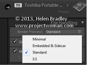
How to choose the correct Preview option for your Lightroom images
In the Import dialog’s File Handling panel, you have options for rending previews for your images as you import them. These previews are used later on when you move to the Develop module to edit your images.
Minimal preview size makes for quick importing of your images but later on, when you’re actually working on your files you will have to wait as larger size previews are created. So the time you save on rendering previews on import has to be spent later on in rendering previews when you want to work on the images.
Selecting Standard previews is a good choice – these previews can be used when editing your images so they don’t have to be created later on – so you can get to editing the image more quickly although the import process will take a little longer.
1:1 preview size is typically not a good choice as the previews are unnecessarily large and it takes time to render them. It might sound like they are the best but it’s a poor trade off in time and size – if you have time to spare when importing, then Standard previews are an ideal choice.
Get to Your Previous Insertion Point with This Shortcut
When you move around a Word document it can be time consuming to find the place you were previously. Word records the last places you worked and you can return to them at any time by pressing Shift + F5. Press this combination four times and you’ll be back to your current position and along the way you’ll have visited three previous editing positions.
You can instantly add a something extra to just about anything you photograph if you get up close
For portraits and pet photos you can get more detail in your shot by getting closer to your subject.
Take a few steps forward to get in close to your subject or use the camera’s zoom if you can’t get physically closer. Fill the viewfinder with your subject and then shoot. Not only will your subject look great but you will remove excess background from the image which generally removes unnecessary and unwanted detail.
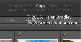
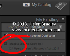
You have four import options for your photos – Copy as DNG, Copy, Move and Add. In some circumstances, not all these options are available – for example, you may choose Copy or Copy as DNG when importing from a camera card but you cannot select Move or Add when you are importing images from a card.
When you select one of these options that choice may affect the other options you have. For example, if you choose Add to add images to the catalog from a folder, you cannot choose to back up your files at the same time. You can also not convert RAW images to DNG if you are adding them to Lightroom.
So, if you want to convert images, or back up, or rename images as you import them, it is best to import them direct from your camera card. Copying them into a folder on your disk before adding them to your Lightroom catalog diminishes your options when working with your images.
Whenever I travel one of the tasks I have is to find good places for street art. It’s not like it makes the top 10 things to see in many, if any, cities in the world!
While I do a lot of research on the internet before I leave I also rely a lot on local information – trick is who to ask. Usually the well dressed, well heeled local or anyone who looks conservative it not my pick! Instead, on a recent trip to Baltimore it was the guys at the Utrecht art store. They were not only so nice in helping me find the supplies I wanted – a new batch of Prismacolor pencils – but also they helped me find graffiti and street art. They took the time to give me a mini hand drawn map of where to find Graffiti Alley – tucked between Howard and North and just the sort of place you need some insider knowledge or lots of dumb luck to find.
Nearby Graffiti Alley on Charles Street I found this piece of art, painted across the back of a parking lot. It was a really big project and basically untouched. There is a bit of art around it in the parking lot and most of it too is untouched. Not so Graffiti Alley where there are layers and layers of art, compelling in a very different way. Luckily a woman waiting in a parked car for her partner joined me for my walk up Graffiti Alley – if I wasn’t concerned about my safety (I was) she was! She insisted in walking with me to keep a lookout – I appreciated it, the alley does a dog leg and much of it is invisible from the road. I was glad of the company!
Helen Bradley explains how to get the best shots of that very important person in your life – mum!
My mum hates being photographed! I’m not that fussed about photographs of myself either. As I age, my face doesn’t always refect the age I feel inside and many photos catch me looking less attractive than I’d like to look. I have every sympathy for my mum who is obviously years older again than I am.
However, chronicling the women in our lives, our mums, mums in law, grandmothers and aunts is an important part of recording our family history. This mother’s day or some time soon, grab the special woman in your life, sit them down and take a portrait that they’re happy to look at. It’s not difficult when you know these few tricks for capturing them at their best.
When something really strikes your subject as funny – be ready to capture a one off shot that will make you smile.
Most people look better looking up at the camera rather than looking down at it. Even someone with no double chin will get one when looking down! Looking down at the camera also accentuates a person’s nostrils which isn’t always flattering.
When taking a photo, position your mum so you can stand higher than she is – this usually means that she needs to be sitting down. Find a place indoors with good natural light and shoot inside or find a shady spot outside.
For our pictures of Anne here we hung some dark curtains from a front porch to shield the worst of the bright and uneven sunlight and shot outdoors.
Here the subject leans on a favourite book and the pose is nice and relaxed.
Using a tripod will ensure that the camera is still when you take the shot – if not, focus on keeping it steady – especially if you start clowning around and you need to laugh. Jokes are good – in fact anything that works to make mum relaxed will help lots. I usually take a friend who is a bit of a wag with me and she makes comments and asks questions of the person I’m shooting. By the time a few minutes have passed the person being photographed forgets I’m even there.
Having something for your mum to hold or to rest on works well as it gives her something to do with her hands. We used an empty picture frame, a chair turned backwards, a book and a sledge hammer (there was some discussion about eyelet setting that prompted Anne to pick it up) when shooting.
Holding a frame gives the subject something to do with her hands and the natural reaction is to ham it up a bit for the camera.
You can use anything from a flower to a stuffed toy – whatever helps to take mum’s attention off the fact that you’re photographing her. Ask mum to wear some light makeup – while you can remove obvious blemishes later on, the even skin tones you get from wearing makeup can save hours of fixing on the computer and really will improve the portrait a lot.
Having the subject lean on something – here a chair turned around gives them something to do with their hands.
When you’re shooting, take lots of photos. I take as many as I can with the promise that I’ll keep only the best and anything that the person absolutely hates will be deleted – no questions asked. After all, I want to do this again and building trust in me as a photographer is really important.
Keep shooting even when the subject is scratching their nose!
You will find that the best shots generally have the person looking direct at the camera – this isn’t to say you won’t get great shots when they’re looking elsewhere but you can improve your chances by having them look at the camera as much as possible. When shooting, fill the frame with the person’s face. The closer you get, the more detail you will capture and the more intimate the resulting portrait will be. Check the results from time to time to make sure they are well lit and check again every time you move position, because the light will change – particularly when you are out of doors.
Here we asked our subject to strike some funny poses and the result was captivating.
If time permits, have mum change clothes half way through the shoot to a different colour so you get a different feel to your photos. You might be surprised how some colours work better with certain skin tones. We liked Anne in the pink jumper best of all. If you have the space to work, move around to get a different perspective of your mum, but always take care that the background isn’t cluttered and that it remains unobtrusive.
Learn how to crop and resize in bulk in Lightroom. If you have a lot of images you need to, for example, crop to 5 x 7 and then save at a particular pixel size and resolution, you can learn how to do this quickly and effectively in Lightroom. This makes use of the tools in the Quick Develop panel in the Library module.
Transcript:
Hello, I’m Helen Bradley. Welcome to this video tutorial. In this tutorial I’m going to show you how you can bulk crop and resize images and export them from Lightroom.
A reader recently posed a question to me and that was what do I do if I need to crop all my images to 5 by 7 in size and get them out as 500 by 700 pixel images. In Lightroom that’s not that difficult to do. What I suggest you do is you do it from the Library in Quick Develop mode. So I’m going to select the images here and then I’m going to select Crop Ratio and I’m going to choose 5 by 7. And that will crop all of these images to 5 by 7 images. But look what it’s done with the verticals. It’s cropped them to 5 by 7 but it’s kept that same vertical alignment.
So now let’s go to the Develop module and just see what we’re seeing here. This is the crop marquee. And you can see that this image, each one of these images in fact has been cropped to 5 by 7. And let’s go and find a vertical crop and see how it’s been cropped. Again, it’s been cropped to 5 by 7 but in a vertical direction. So this means that all of these images have automatically been cropped.
All we would do is have a quick look and make sure that important parts of the image have not been cropped off. If these were people we’d have a quick check to make sure that somebody’s head hasn’t been chopped off for example. And having done that now knowing that everything is cropped to 5 by 7, to export these images at 500 by 700 pixels in size or 700 by 500 we would select all of them by clicking on the first and Shift click on the last. I’m going to right click and choose Export and then Export again and we would just set up the Export option. So here I’m going to put this in a folder called 5 by 7.
I don’t want to rename these files. All we want to do is to resize them. But what I do want to do is I want to select Resize to Fit. And the longest edge since I know that these are all 5 by 7s is going to be 700 pixels and the resolution I can set to 100 pixels per inch. So these are then going to be 5 by 7 images at 100 pixels per inch resolution. And all I need to do is to click Export and Lightroom is going ahead and it is cropping and resizing all of those images so that they are all going to be the exact right size that we chose. And here they are including the ones that were verticals. You can see that these are 500 by 700 pixels in size. This one is 700 by 500 because it’s a landscape image.
So in Lightroom you could batch resize and export these images in just a matter of a few seconds by just choosing the right option. And that is here in the Quick Develop module setting a crop ratio for those images. This is not something you can do easily in the Develop module, but it’s something that you can do very, very simply here in the Quick Develop area of the Library in Lightroom.
My name is Helen Bradley. Thank you for joining me for this Lightroom video tutorial. If you liked the tutorial please comment, press the Like button, consider subscribing to my YouTube channel. You’ll also find more of my tutorials, tips and tricks on my website at projectwoman.com.