Tuesday, January 11th, 2011

Typing in the second column in Word

Ok, so you’ve formatted your text to be two columns in Word and you’ve typed something in the first column. You haven’t filled the first column because you don’t want to. Fair enough – it’s your document – your choice.

But you do want to type something in the next or second column but however hard you try – Word won’t play nice. It wants you to fill column one before you get to fill column two – you don’t want to – so you’re at a stalemate.

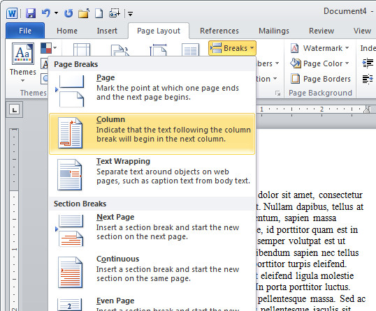
The solution is to force Word to the top of the second column and you do this by inserting a break. In Word 2002/2003 choose Insert> Break > Column Break.

In Word 2007 & 2010 choose Page Layout tab> Breaks > Column.

Now you can type at the top of the second column. Yeah!

Helen Bradley

Sunday, January 9th, 2011

Picture between columns in Word

I get a lot of folks at projectwoman.com who come looking for help with columns and Word – anything from Word 2002 through 2003 to 2007 and now 2010. I have to think the reason is that Microsoft doesn’t make it as easy as it thinks to work with columns.

In the next few posts I’ll show you some things to do with columns that I think most folk have trouble with.

First up, how to put a picture in between columns in Word. Start by formatting your text in columns and then add your picture.

Chances are it won’t move and sit between columns. The issue is that Word inserts images as In Line With Text by default which is the setting MOST OF US WOULDN’T USE IN 1,000 YEARS – but Microsoft doesn’t really understand most users and so that’s what we get – images that are stuck – they won’t move where we want them to go and they won’t rotate.

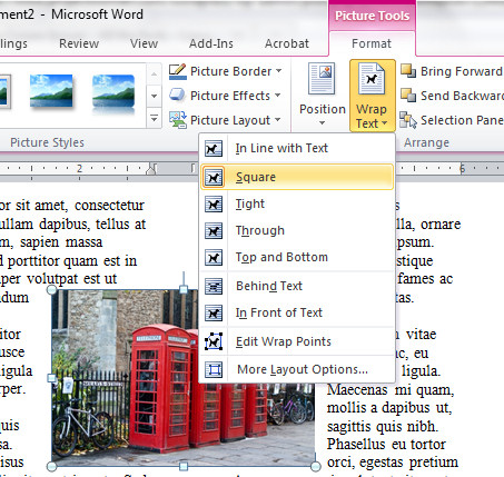
To fix this, in Word 2002/2003 from the Picture toolbar find the Text Wrapping button, click it and choose practically anything except In Line With Text – I choose Square because it is the best all round setting.

In Word 2007/2010 click the Picture and from the Picture Tools > Format tab on the ribbon click the Text Wrapping button and choose Square.

Now your picture does what you expected it to do in the first place – it moves, it can be rotated and when you drag it over the space between two columns it sits where it is put and it pushes the text out of the way around it. Neat huh?

One day… maybe Microsoft will hear our cries of frustration and insert images so they behave like they should without us having to jump through hoops to make them.

Helen Bradley

Saturday, January 8th, 2011

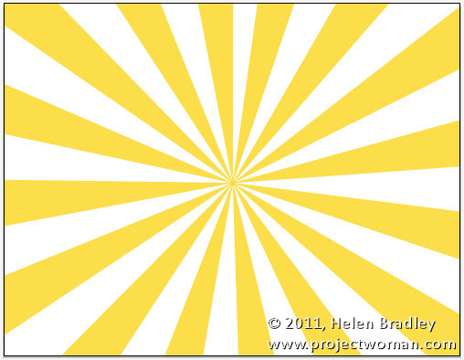
Create a Vector Sunburst in Illustrator

I’ve been looking around for some time for a good way to make sunbursts in Illustrator. Those methods I’ve seen suffer from one of two problems, one is that some use a triangle shape which is repeatedly copied and rotated to create the sunburst – I’m lazy so that’s too much repetition for me to be bothered doing. In addition, getting a good balance between width of the ray and the number of rays is also a problem with this method so it’s a lot of trial and error. The other method uses a dash line stoke on a circle but it suffers from the problem that the middle of the shape never closes up to a good tight fit.

So, I’ve come up with my own take on creating sunbursts in Illustrator. What I like about it is that you can decide as you are making it the number of rays so you can make lots of thin rays or a few really thick ones and it’s all done automatically so there’s not copy and rotating involved. You can also adjust the spacing between the rays on the fly. The final thing I like is that the middle closes up nicely into a small circle.

The finished sunburst can be saved as a symbol so you can reuse it and, of course you can crop it to fill the artboard and color it to suit – I’ll show you how to do all this. Here’s how:

Step 1

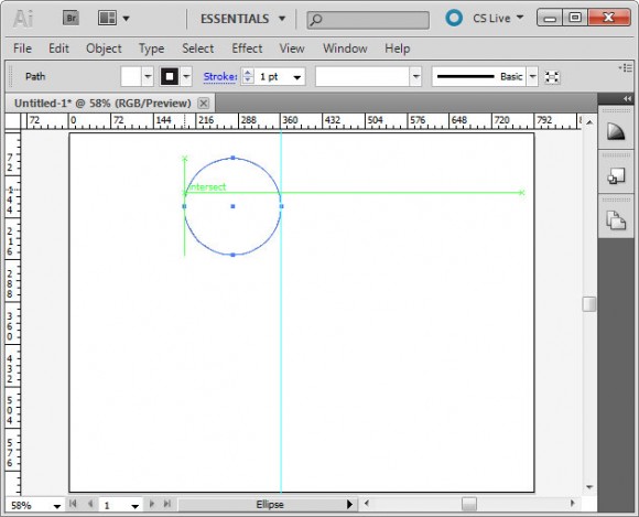
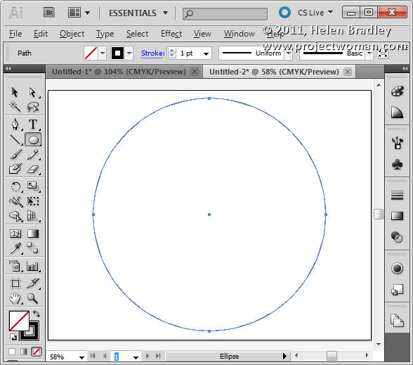
Start with any sized document in Illustrator. Select the Ellipse tool, hold Shift as you draw a circle on the screen. Set the Fill to No Fill and the Stroke to black.
Step 2

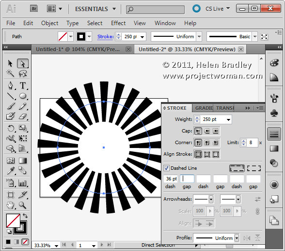
Choose Windows > Stroke to display the Stroke palette. Click the Dashed Line checkbox.

Here you determine the width of the rays and the gaps so don’t leave here till you have it right. Adjust the Weight value so you can see the rays – ignore the fact that they don’t meet in the middle but you will want to set a large enough value for weight that they come close to meeting – if you don’t the inside points will be difficult to select later on. Weight only affects the length of the rays and not their number or spacing.

Set the Dash value to a value that gives you the number of rays you want. The larger the Dash value the smaller the number of rays.

This is a Dash of 36 pt:
This is a Dash of 8 pt:
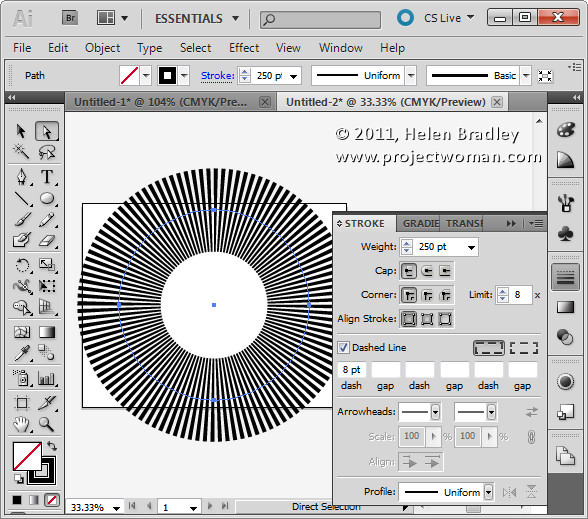
Make sure that you have an even arrangement of rays around the circle and that two rays aren’t joined together or too close to each other – which can happen. If it does, try a slightly different value for the Dash – sometimes changing it by one or two points is all you need to even everything up.

If you want to adjust the spacing between the rays, enter a value for Gap – again, check that the rays look balanced before continuing. The larger the value of the Gap, the fewer the rays you will have.

Step 3

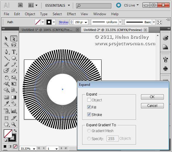
Now use the Selection tool (V) to select the Circle. Choose Object > Expand > Select Fill and Select the Stoke checkboxes and click Ok.

Now your vector shape is the rays themselves – not a stroked circle.
Step 4

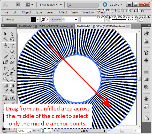
Click outside the shape to deselect it. Select the Direct Selection tool (A) and drag over all the inside anchors leaving the outside ones unselected. This is a little fiddly and you’ll find that the smaller the inside circle the easier it is to do.

If you have lots of narrow rays you may need to enlarge the Illustrator window and zoom in close to be able to start your selection not on a path.
Step 5

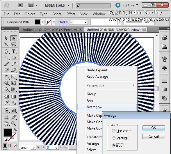
Right click your selection and choose Average > Both and click Ok. This positions all the anchor points at the center of the shape closing up the rays perfectly.
Step 6

Now you can select the shape and resize it.

You can change the fill color and add it as a symbol to the Symbol library by dragging and dropping it into the Symbol pane.


Step 7

While you’re on a roll, create a few more sunbursts with less or more rays that you can then add to the Symbols collection and then save as a Symbol set you can use any time.

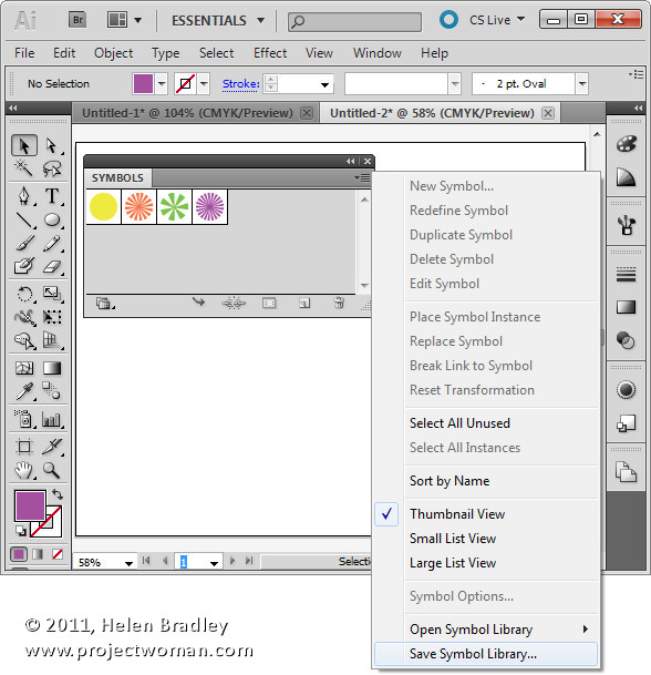
To save the Symbols, remove all but the symbols you just created from the Symbols pane by selecting them and drop them on the Delete Symbol icon.

Click the Symbol flyout menu and choose Save Symbol Library and save the symbols to a file on disk. In future you can select the same flyout menu on the Symbols pane and choose Open Symbol Library to import the symbols back into Illustrator so you can use them.
Step 8

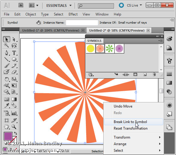
To use a sunburst symbol, drag it from the Symbol pane into the Artboard.

To recolor it, right click it and choose Break Link to Symbol, then select the shape and alter the Fill color and add a stroke color if desired. If you plan to crop the sunburst to the Artboard size following step 10 below, don’t recolor the shape right now.
Step 9

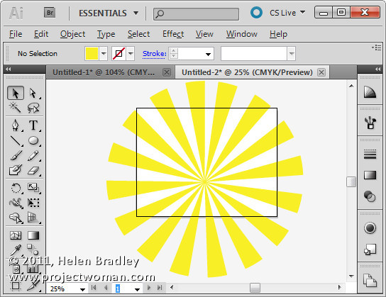
To trim the sunburst to the shape and size of the Artboard, first size it to fill the Artboard.
Step 10

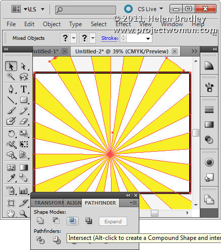
Drag a rectangle over the Artboard to the exact size of the Artboard.

Select both the rectangle and the sunburst under it using the Selection tool (V).

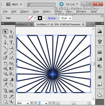
Display the Pathfinder palette by choosing Window > Pathfinder and select the Intersect option.
Step 11

The sunburst will be cropped to the Artboard shape.
Step 12

You can now set its fill color and stroke to suit.
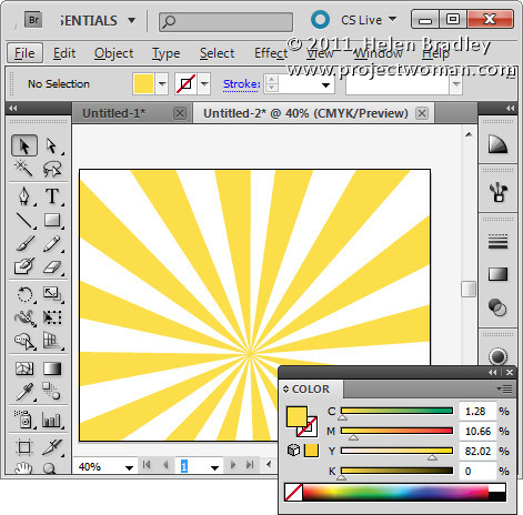
Helen Bradley

Wednesday, January 5th, 2011

Cool Photoshop Textures – free – commercial use

One of the biggest problem designers and graphic artists have is in finding content that can be used commercially. It often seems that even content you pay for you have to jump through hoops to read the fine print to determine what exactly you can do with it and it often  has overly restrictive limits.

Today I found a great site. Great because of a number of things:

1. The content is free.

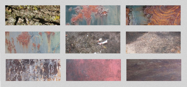
2. The textures are gorgeous and varied and hi-res.

3. You are free to use them for commercial purposes.

4. Attribution is appreciated but not required.

Verbatim, here is the terms of use: “Lost & Taken textures are made freely available for use in both personal and commercial projects including web templates, designs, and other materials intended for distribution. Attribution is appreciated, but not required.”

The textures fall into a  number of categories including: Vintage damask, torn paper, skin, bubbles, wallpaper, book covers, subtle grunge and lots more. Check out the vintage wallpaper ones on the home page they are so totally cool.

To view and download textures head to the Gallery.

Helen Bradley
Tuesday, January 4th, 2011

Microsoft PowerPoint – Free!


If you don’t already own Microsoft PowerPoint 2010, did you know you can download a 30 day trial version for free from Microsoft?

PowerPoint comes bundled with Office 2010 and the entire downloadable trial version of Office is available from the Microsoft web site. If you like what you see, you can purchase the full version later on.

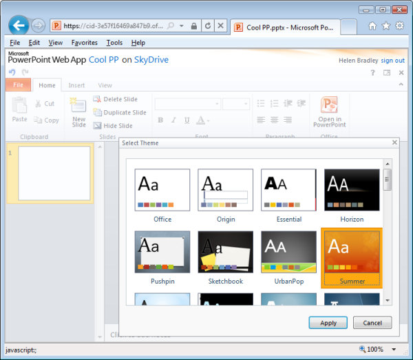
If you like PowerPoint but can’t afford to shell out for the suite, why not settle for a cut down version – free – available online? You can find PowerPoint at www.skydrive.com sign in using a Windows Live ID – if you don’t have one (but you probably will), you can sign up for one here. Then click the Office link at the top of the page and you can choose to create a new PowerPoint presentation online.

The PowerPoint tools are a cut down version of the full PowerPoint program but they are all you need to get a good start on a presentation – you even have access to a range of great looking themes to kick start your presentation.

Better still you can share your PowerPoint presentation with others so they can view it and even edit it online and you can download the finished file to your computer. Of course, your files are stored online too so you can access them any time you like and Microsoft gives you a hefty 25GB of online storage – more than enough to create all the presentations you’re ever likely to need.

Helen Bradley
Tuesday, January 4th, 2011

We make the “Best 50 Photoshop blogs”

Very cool… a site called Guide to Art Schools just published a list of their Best 50 Photoshop blogs and Projectwoman.com came in at number 17 of “the rest” meaning that after the top 5, this blog is rated 22. Not too poor a showing, thanks guys.

Interestingly they talked about the blog as being woman-centric which is pretty funny since there is nothing I see that is woman centric about this blog at all! But it made me think back to why it is projectwoman.com at all.

The name projectwoman.com harks back to a magazine that used to be around called Mac Home and I used to write project articles for them – sort of the how to style stuff that is my specialty.

Some time in early 2000, the editor David Weiss and I were kicking around ideas and he suggested we title my column Project Woman as in a woman who wrote projects – it sounded like fun so I took the opportunity to register the domain name just in case it all came to fruition and became something big.

As it happened only a few columns ever appeared in the magazine as it got sold then it crashed and burned along with some other stalwarts of the industry – many of which I wrote for – in the aftermath of the dot com crash. So, that’s the history of the name – thanks to David Weiss for the idea!

Helen Bradley
Friday, December 31st, 2010

Canal Cruise Slideshow

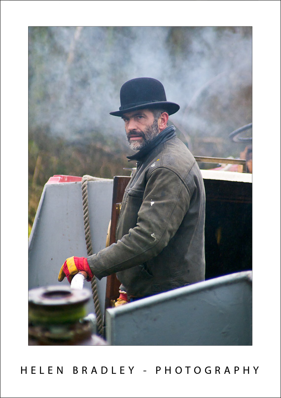
A couple of weeks ago I spent four days on the Isabella – a canal boat – travelling from her moorings at Bishop’s Stortford down to Tottenham in London.

I was totally pampered by owners Grahame and Sue and got to see some wonderful English scenery as we chugged along at a princely 4MPH which is pretty fast until you realise that every mile you hit a lock and those take around 15 minutes to get the boat in and out of – so 4MPH very quickly becomes about half that speed overall. It’s a great way to unwind and to really appreciate this beautiful country and the magnificent legacy of those people who built these great inland waterways and the continuing efforts of everyone charged with keeping them navigable.

Click here to view the slideshow of images from the trip.

Helen Bradley
Friday, December 31st, 2010

Creating a perfect heart shape in Illustrator

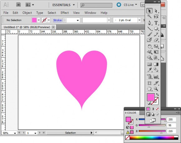
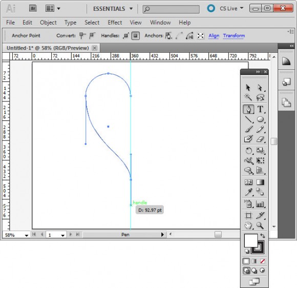
Here’s how to create a perfectly symmetrical heart shape in Illustrator:

Start in Illustrator and drag a guide to use to position the shape.

Select the Ellipse tool, click on the guide to start and draw a circle shape to one side of the guide. Add the Shift key to make a perfect circle.

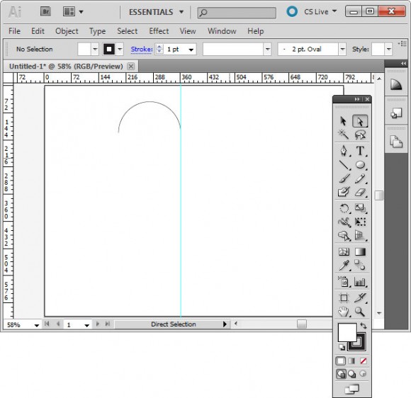
Select the direct selection tool, drag over the bottom half of the circle to select it and press Delete. You should now have a semicircle shape.

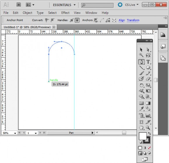
Click the pen tool and then click on the outermost anchor point, the one furthest away from the guide. Click and drag downwards adding the Shift key after you’ve started dragging to ensure the line curves correctly.

Click again on the guideline and immediately add the Shift key and drag downwards to create half of a heart.

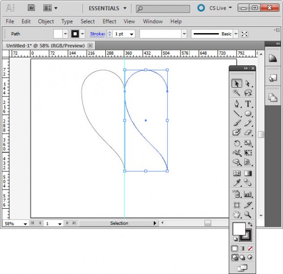
Click on the half heart shape to select it. Drag to the right and as you do, add the Alt and Shift keys (Option and Shift on the Mac) and move the shape until it snaps to the grid line. This should create a duplicate shape.

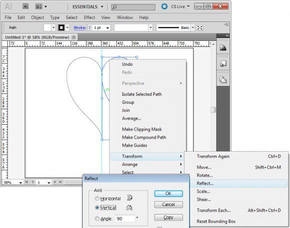
Right click this shape, choose Transform > Reflect > Vertical and click Ok. You now have two halves of the heart.

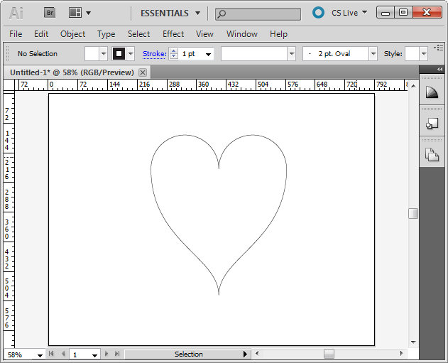
With the selection tool, drag over both sides of the heart to select them, choose Object > Path > Join to join these into a single shape. You can now remove the guide and you have a custom heart shape.

Helen Bradley
Thursday, December 30th, 2010

Kawaii Panda Shape – free download

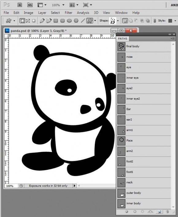
I’ve been messing around today making shapes in Photoshop. This is my final Panda Kawaii shape which I’m offering as a free downloadable shape that you can import into Photoshop and use yourself.

I find shapes are easiest to build up from pieces so I make each piece then build them up bit by bit into the final shape by combining the paths. It’s painstaking work but ultimately rewarding to have a custom shape you can use anytime and scale to any size.

Here is the link to download the shape file – you can use the shape for your own designs but you aren’t permitted to sell the shape or offer it for download from your own site.

Helen Bradley
Thursday, December 30th, 2010

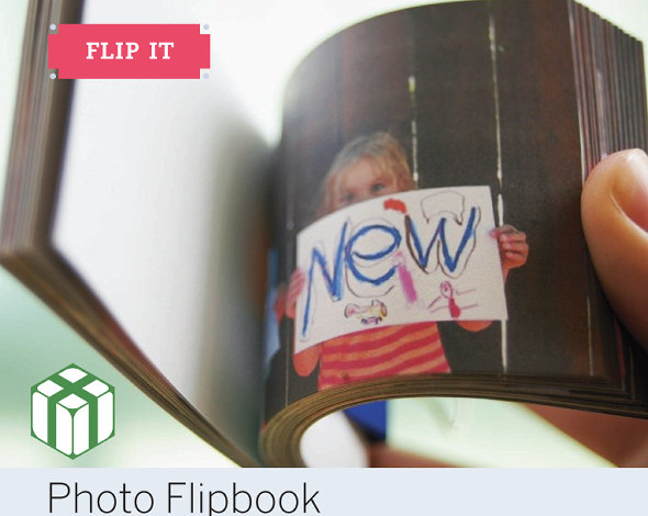
New Year Project – Photo flip books

I recently got asked how you make a photo flip book – you know one of those little books you flip the pages from and something happens?

Well as luck would have it those cool folks over at O’Reilly used to have a magazine called Craft! and they asked me to write an article for them on just this very topic. So, click this link and you will see how to create your very own photo flip book.

I used clips from a movie file for this flip book so there’s lots of fun for everyone involved from writing the signs to making the film and then the tech side of extracting the frames and making the book.

It’s a great snow day/rainy day project.

Helen Bradley