Articles | Photoshop blog | Photography blog | about me | e-mail

Helen Bradley - MS Office Tips, Tricks and Tutorials

I'm a lifestyle journalist and I've been writing about office productivity software for a long time. Here you'll find handy hints, tips, tricks, techniques and tutorials on using software as diverse as Excel, Word, PowerPoint, Outlook, Access and Publisher from Microsoft and other applications that I love. My publishing credits include PC Magazine, Windows XP mag, CNet, PC User mag, SmallbusinessComputing.com, Winplanet and Sydney Morning Herald.

Monday, April 30, 2007

PowerPoint - to fit or not - it's your choice
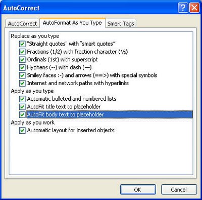


PowerPoint has a handy tool (or a very annoying one - depending on your perspective) for adjusting text on a slide.


In PowerPoint 2003 and earlier choose Tools > AutoCorrect Options > Autoformat as you Type and you will see that there is an option called Autofit body text to placeholder. Enabled this and all the text that you type on a slide is automatically sized to fit the slide - you can type gobs of text and it just keeps getting made smaller and smaller as PowerPoint shoehorns it in so it fits.


If you disable this option, you get to control the slide's text size yourself - a rough rule of thumb is that if it goes over the edge - it's too much text for one slide so make another one or edit your text.


Autofit is a tool you can disable or enable as you like - once you know it's there - it’s your choice what you do with it.

Labels: , ,

Add to Technorati Favorites

Sunday, March 18, 2007

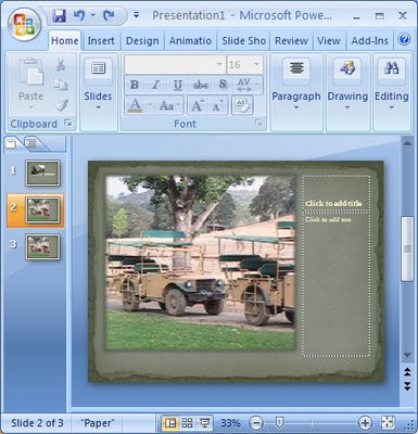
PowerPoint 2007 Torn Photo Edges


One of the cool things about PowerPoint 2007 is the way that you can create fab photo edges with no work at all.

To see this at work add a new slide using the Home tab, click New Slide and then from the Layout list choose Picture with Caption. Now click on the icon in the middle of the slide to add your picture.

Go to the Design tab and choose one of the designs to use for your slide. You’ll see that designs like Opulent create a stacked photo effect, Paper creates a rough paper edge effect, Solstice creates an effect where the photo looks adhered with sticky tape (this is soooo cool!), Concourse has an interesting shadowed edge effect, Flow tips the image on an angle, and Foundry rounds the opposing corners.

From here you can click the picture and then click the Picture Tools, Format tab to add other picture effects to your image such as a reflection or soft edges.

There’s really an almost unlimited number of variations available. I dare you to stop at just using one!

Labels: , , , ,

Add to Technorati Favorites