Tuesday, March 12th, 2013

Play time with Photoshop Gradient Map

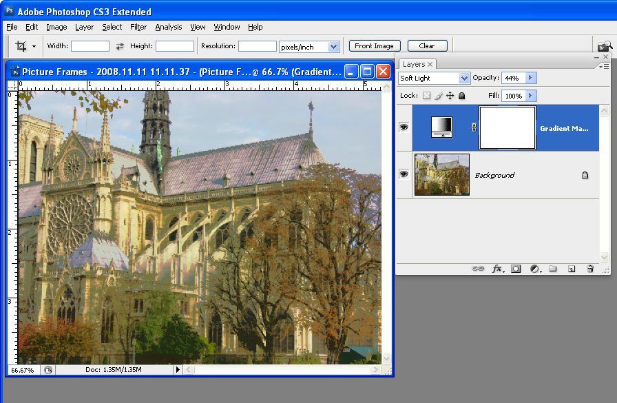
Playing with color using a Gradient Map Adjustment Layer

I’ve been fiddling around with halftones and grayscale posterized images lately – partly for a magazine project and partly for some things I am designing. Sometimes, however, I just play for the sake of it and today’s post is all about that playtime.

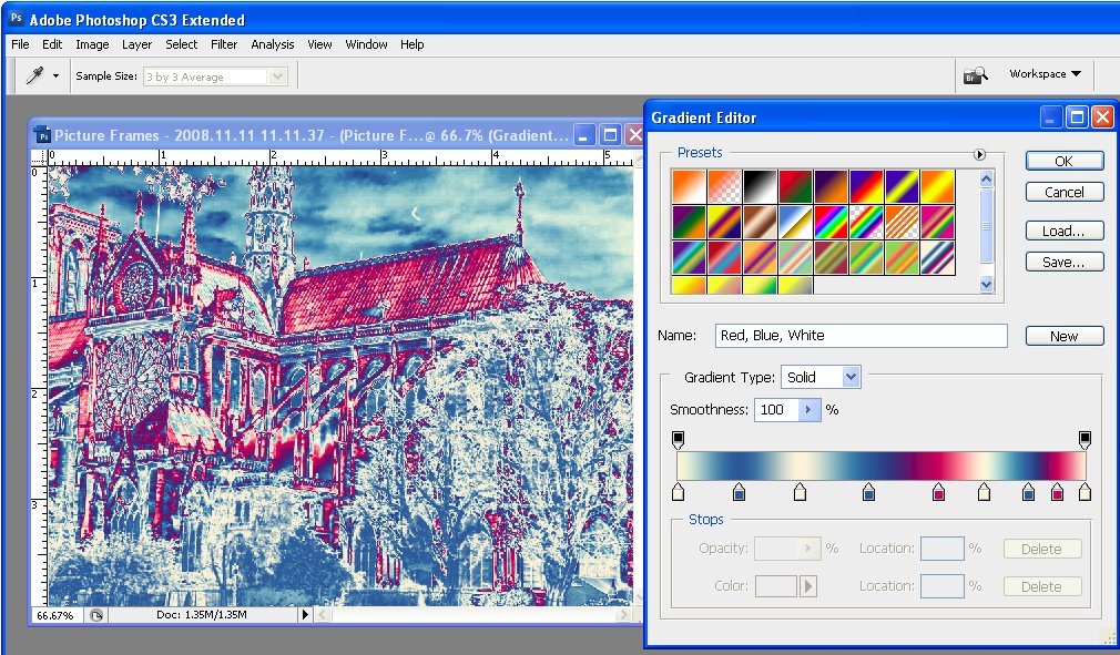
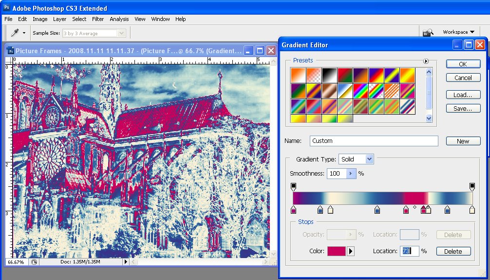
Posterized images have a flattened color look – the entire image is flattened to a few bands of color and I was interested to see what color variations I could get with a Gradient Map over an image. Gradient maps work by mapping a color onto a tone in the image and, with a regular image, the colors sort of blend across the image. However, posterized images are different – they have flat areas of color so the Gradient Map will not be seamless and instead it is going to recolor the posterized image in great big solid blocks of color.

Here is the image I started with:

To see this at work, first convert the image to black and white using Image > Adjustments > Black & White and create a nice contrasty black and white.

Then add the posterized effect by choosing  Image > Adjustments > Posterize and set the Levels to 4 or 5 – this makes the image into one that has 4-5 tones only in it.

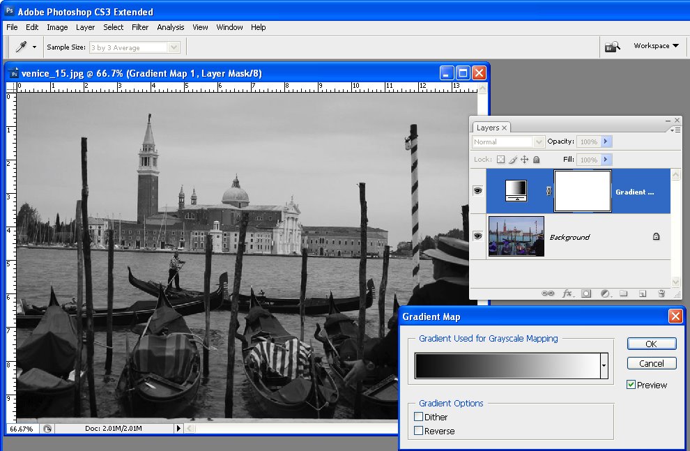
Now to recolor the image with the Gradient Map choose Layer > New Adjustment Layer > Gradient Map and click Ok.

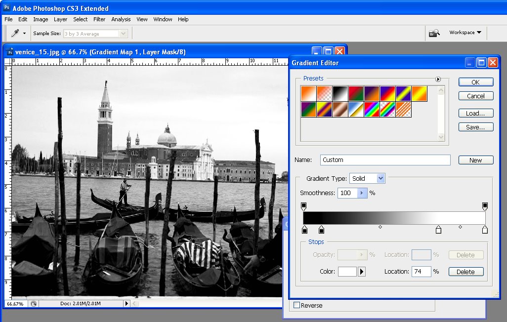
From the dialog select a color scheme to use. The new photo filters which are included in Photoshop CS6 are a great choice but absolutely anything will give a great result. The colors are mapped on to the image according to the light and dark tones in the image. If you click Reverse you’ll get a negative effect. Find the color to use and close the dialog.

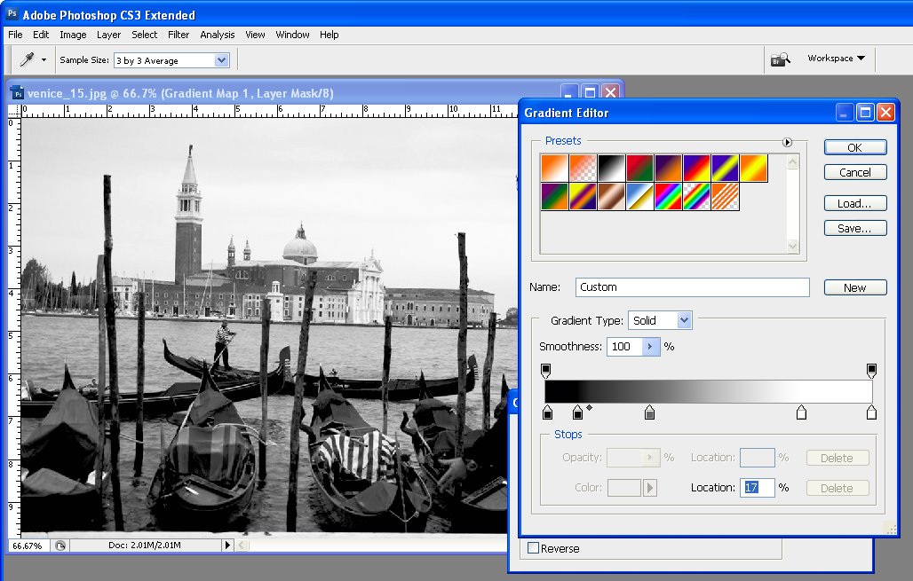
Because you’re using an Adjustment Layer you can change the colors anytime by just double clicking the adjustment layer and choose a different color combination.


I finished off by finding an image to use with this one. I flattened the camel to a single layer by pressing Control + Alt + Shift + E (Cmnd + Option + Shift +E on the Mac) and then dragged the flattened layer into a second image.

Then I used a mask on the camel layer to select and remove the background. I positioned the camel in an interesting place and cropped the image to square. I added a small vignette around the image too.

Helen Bradley

Sunday, April 26th, 2009

Photoshop: Color with Gradient Maps

When you’re looking for a fun effect to add to an image, the Gradient Map tool might be just the ticket. This tool has a serious side in creating custom black and white conversions and a more frivolous one in adding color to an image. I’ll show you how to use it for both purposes.

Before we start a word about how the Gradient Map works. It is an adjustment so you can find it on the Adjustment menu and you can also apply it using an Adjustment Layer. It applies a gradient of color to your image depending on the tones in the image. So, where the image is darker the tones at the left of the gradient are applied and where the image is lighter the tones at the right of the gradient are applied. The midtones are colored with the color in the middle of the gradient. If you want the effect reversed, you can reverse the gradient and the colors are applied in reverse.

The serious side of the Gradient Map tool is its black and white gradient. You can use this to convert an image to black and white. By changing the gradient, you can affect what parts of the image go to black and which parts go to white.

Step 1
To see this at work, open an image and add a Gradient Map adjustment layer by choosing Layer > New Adjustment Layer > Gradient Map. From the Gradient list choose the Black, White gradient and click Ok. The image now shows as black and white.

Step 2
To adjust the way the gradient is applied, double click the adjustment layer and double click the gradient to open the Gradient editing dialog. You can now add stops below the gradient bar to adjust how the colors are applied. For example, if you add a second black stop to the right of the first one, you can set all the tones that are mapped to this area of the gradient to black rather than them ranging from black to a dark grey.

Step 3
By adjusting the midpoint marker between two stops you can control how the gradient transitions from one color to the next. If you drag it to the left you steepen the transition from the left most color to a color that is half way between the colors in the stops either side of the midpoint marker. Of course, here we’re talking about black, grey and white as colors, but in a minute the stops will be applying colors to the image and they work the same way.

Step 4
To apply a color gradient to an image to give it a more creative look, repeat step 1 to open an image and to add a Gradient Map adjustment layer to it. This time choose one of the colored gradients. If the gradients aren’t to your liking, click the flyout menu on the Gradient tab and load a second gradient set and use one of those.


Step 5
These gradients, like the Black, White gradient can be edited so you can tweak the colors or add new ones until you get exactly the effect you want.

Step 6
Like any adjustment layer, you can achieve further creative possibilities by setting the blend mode of the adjustment layer to something other than Normal. You can also reveal some of the underlying color from the image if you reduce the layer opacity.

I blog for the Digital Photography School and this post first appeared on that site.

Helen Bradley