Thursday, May 14th, 2009

Photoshop: Creating Cool Duotones


A duotone is an image made up of just two colors. It’s often used in the printing world where a photograph is included in a publication and where the publisher wants to use some color on the page but not pay for full color printing. As a duotone, the image is created as a mix of two colors – hence its name duotone. Typically the colors are black and a spot color but they can be any two colors.

You can convert a photo to a duotone in Photoshop using its Duotone feature and you can customize the duotone and determine just how much of each color is applied to the image.

Here’s how to convert your photo into a duotone in Photoshop.


Step 1
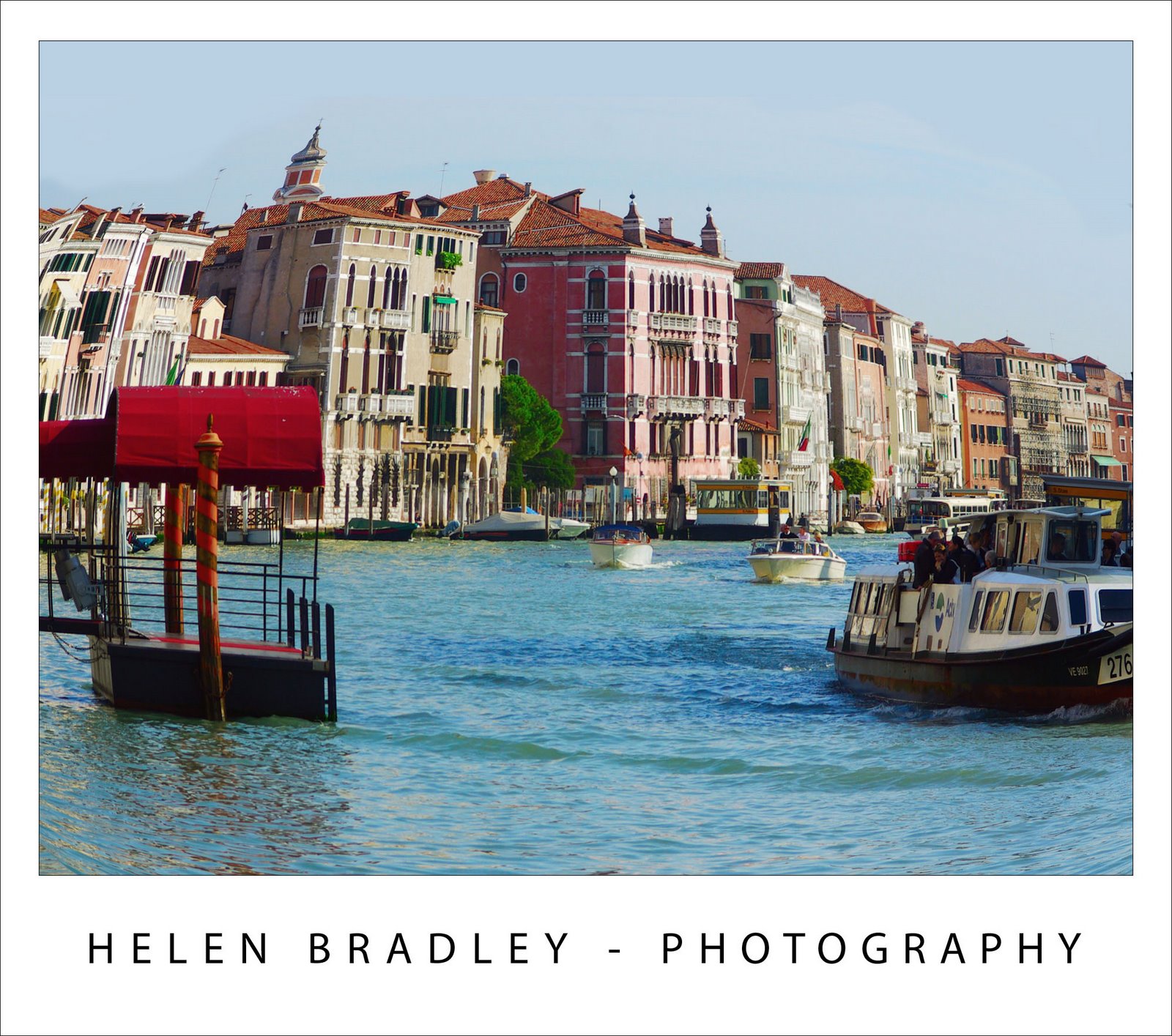
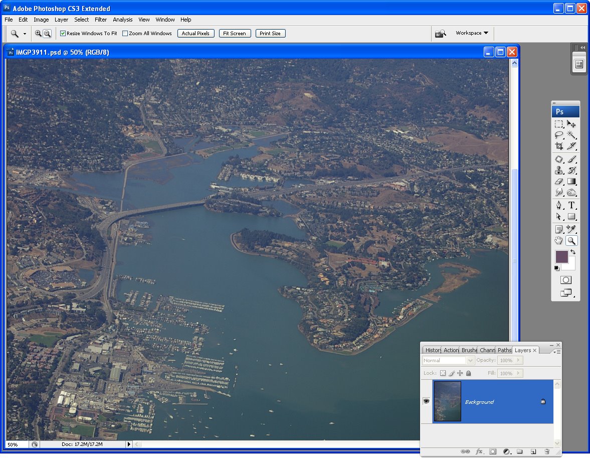
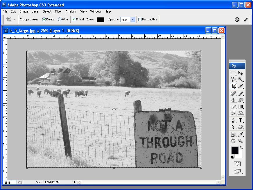
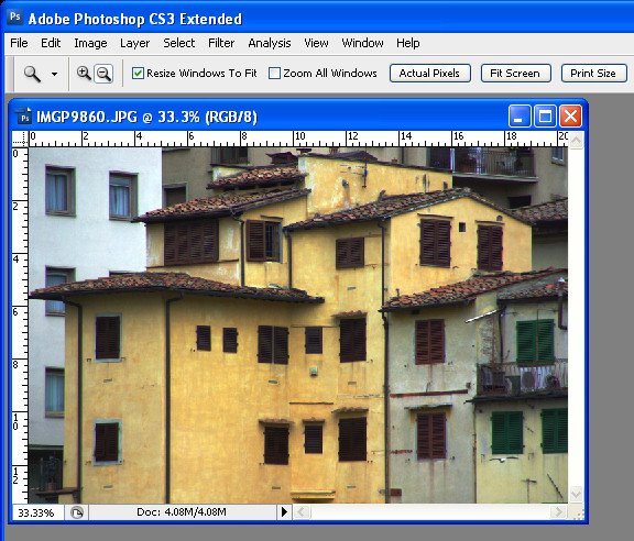
Open your photo in Photoshop and apply any desired adjustments to it – concentrate more on developing pleasing contrast in the image than on the colors because in the next step you will be removing the color.


Step 2
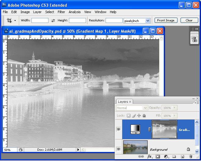
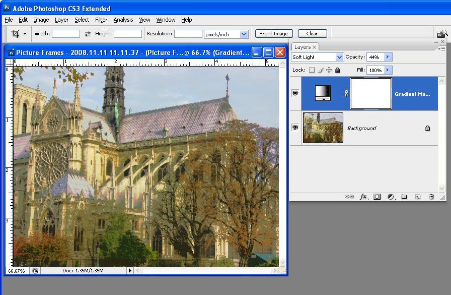
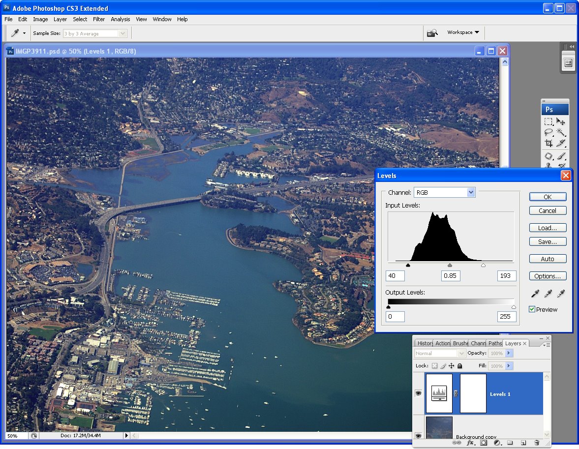
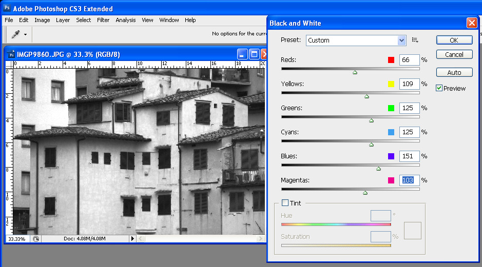
Create a black and white version of the image. Typically this is done by selecting Image > Mode > Grayscale. The problem with this conversion method is that you don’t get the chance to determine how the image is converted and it is often a lackluster result. You can do better by converting the image yourself.

I recommend using a specialist black and white conversion tool – in Photoshop CS2 you can use the Channel Mixer and in Photoshop CS3, choose the Black & White tool. To do this, choose Image > Adjustments > Black & White and drag the sliders to create your custom black and white image. Then choose Image > Mode > Grayscale and click Discard to discard the color.
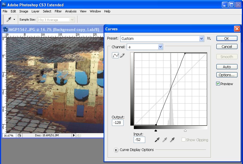
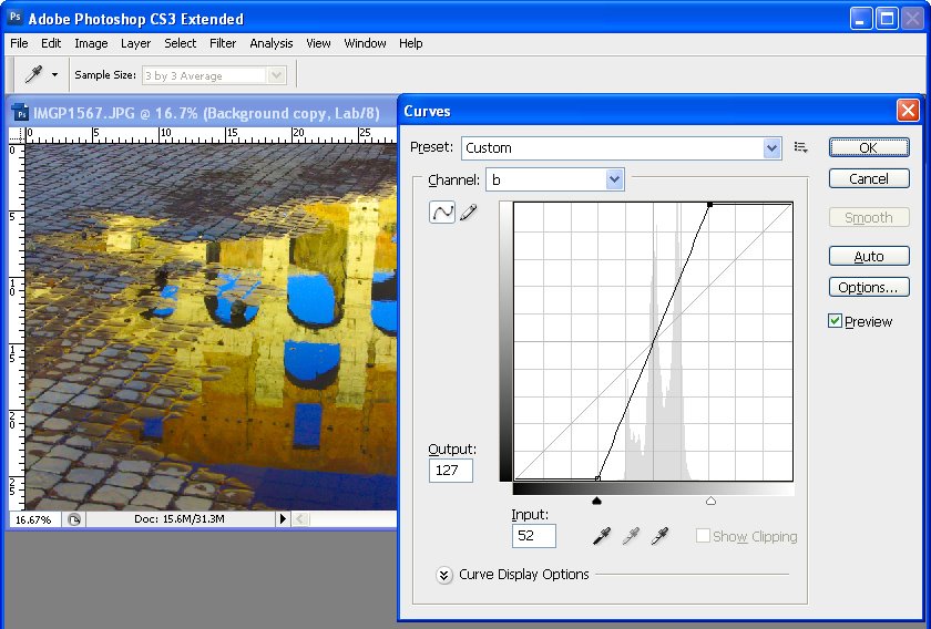

Step 3
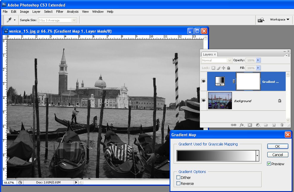
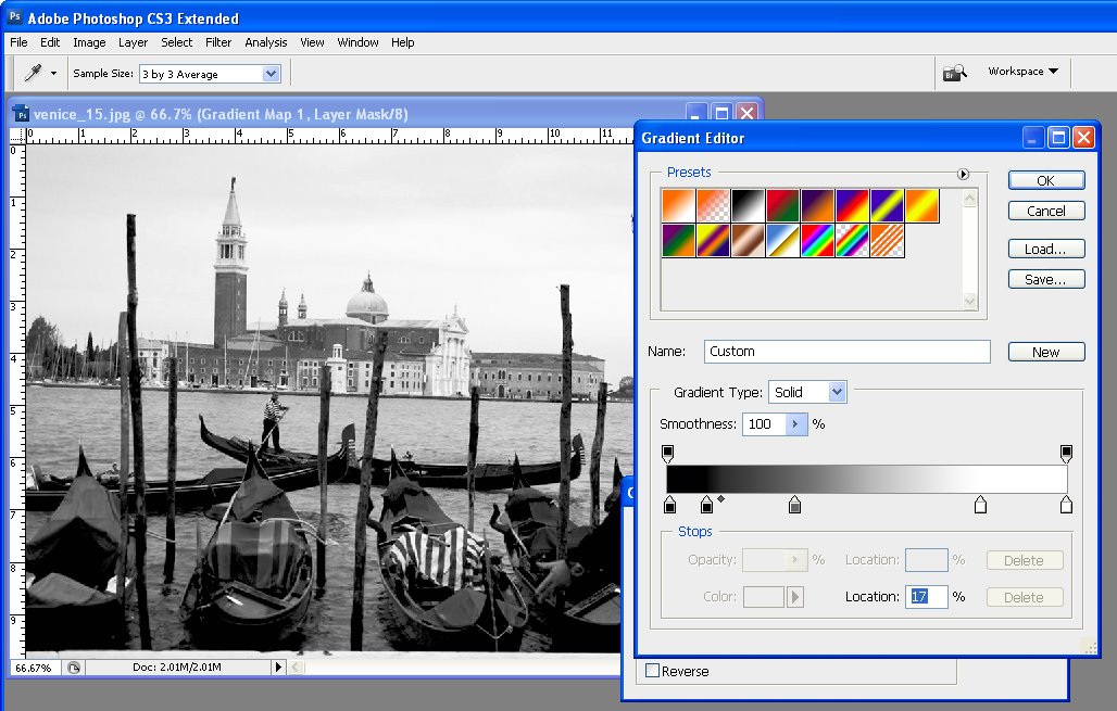
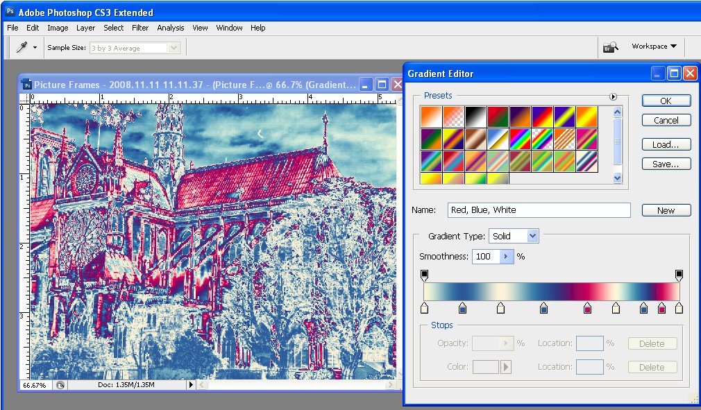
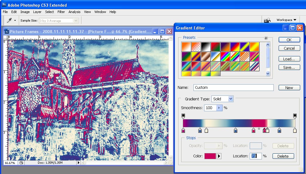
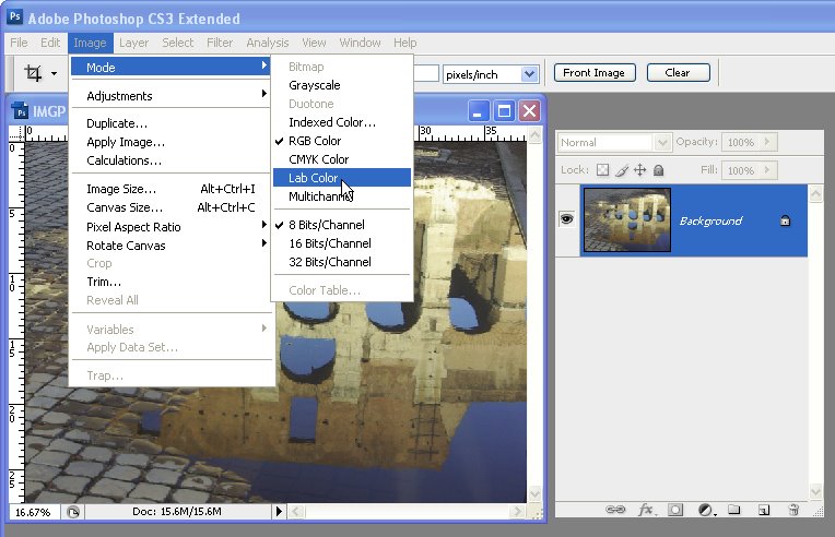
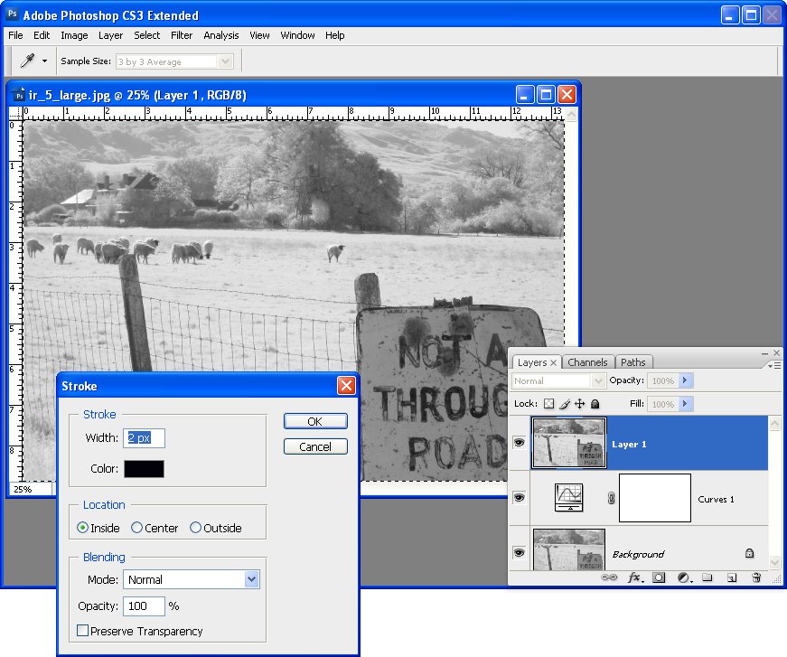
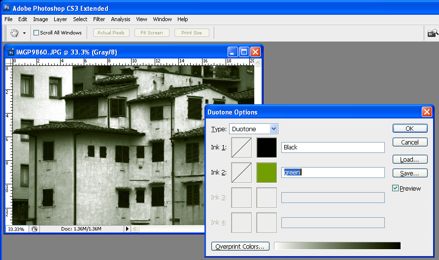
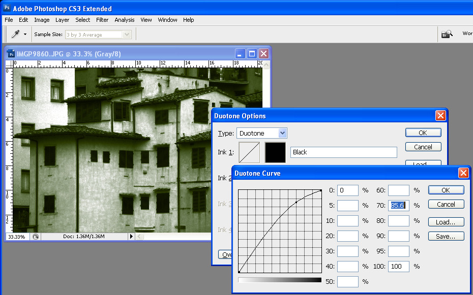
Choose Image > Mode > Duotone to display the Duotone Options dialog. From the Type list select Duotone. The first Ink color defaults to Black and you can now add a second ink color by clicking in the swatch box.

Because duotones are typically used in commercial printing, you are offered a choice of colors from a Pantone color swatch. If you aren’t printing commercially and if you prefer to use the color picker, click the Picker button and select a color this way – type a name for it in the text area.


Step 4
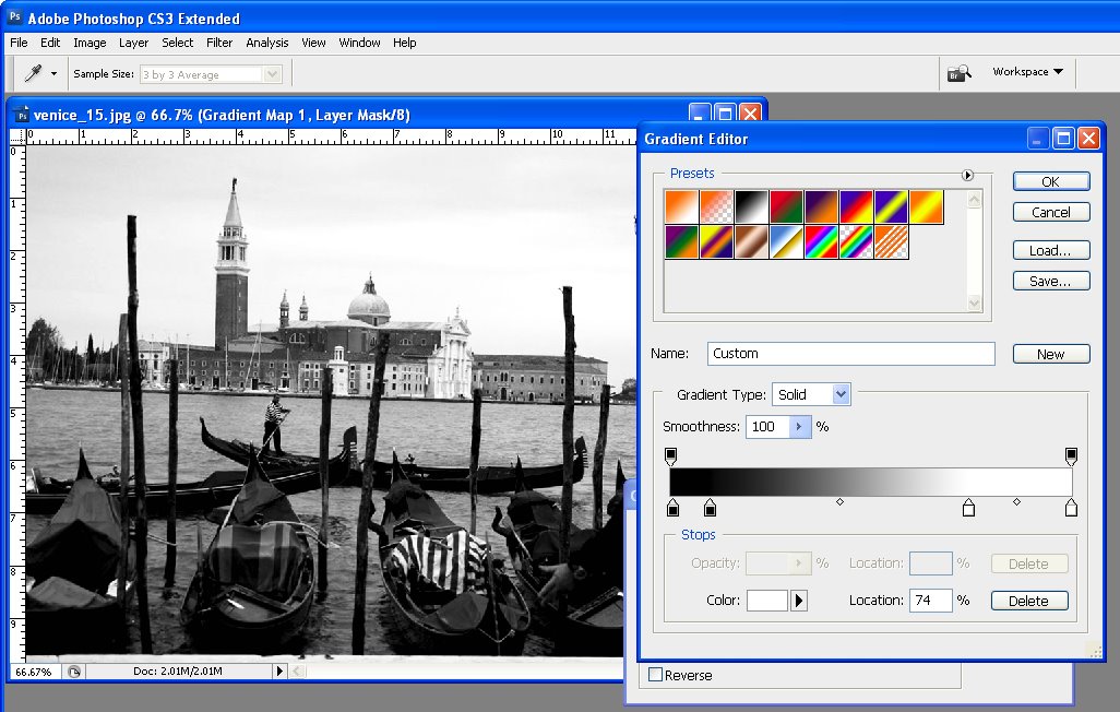
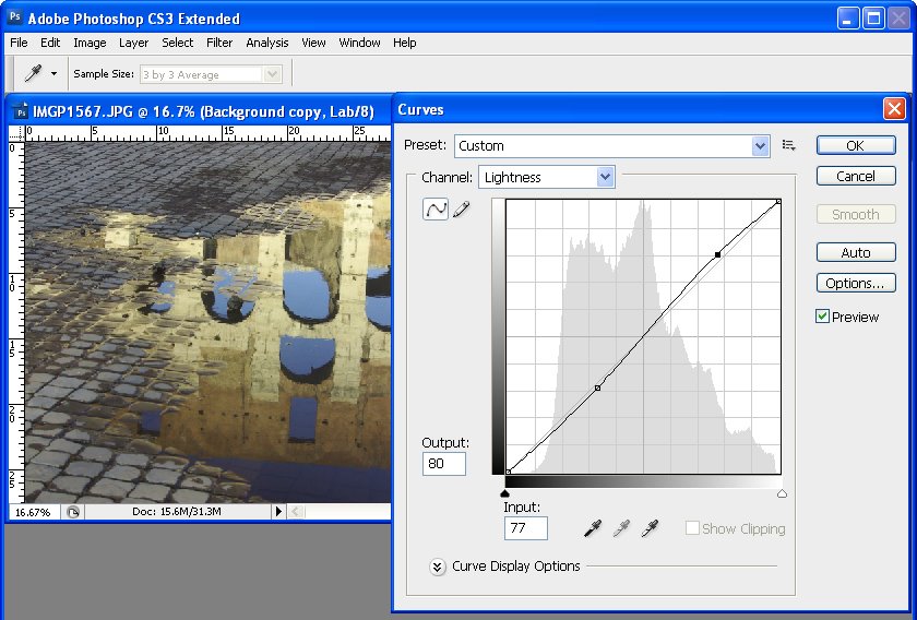
Click the curve icon to the left of each of the color in turn to adjust how the color is applied to the image. The highlights are on the right of the chart and the shadows on the left. Drag upwards on the curve to apply more color in that area of the image, or drag down to apply less color. This feature lets you add more of your second ink color, for example, to the highlights.


Step 5
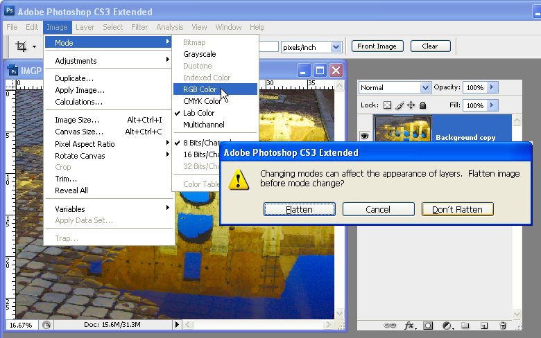
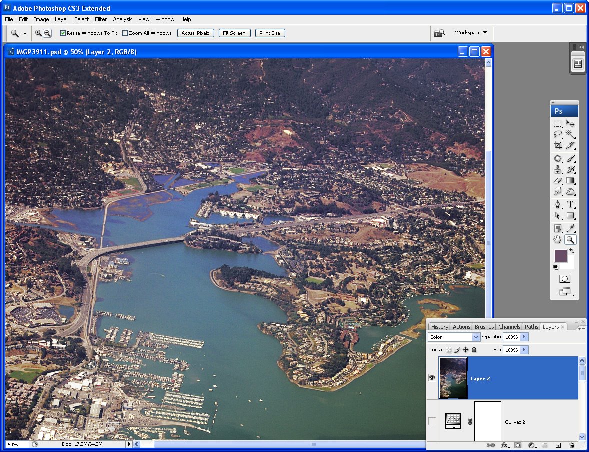
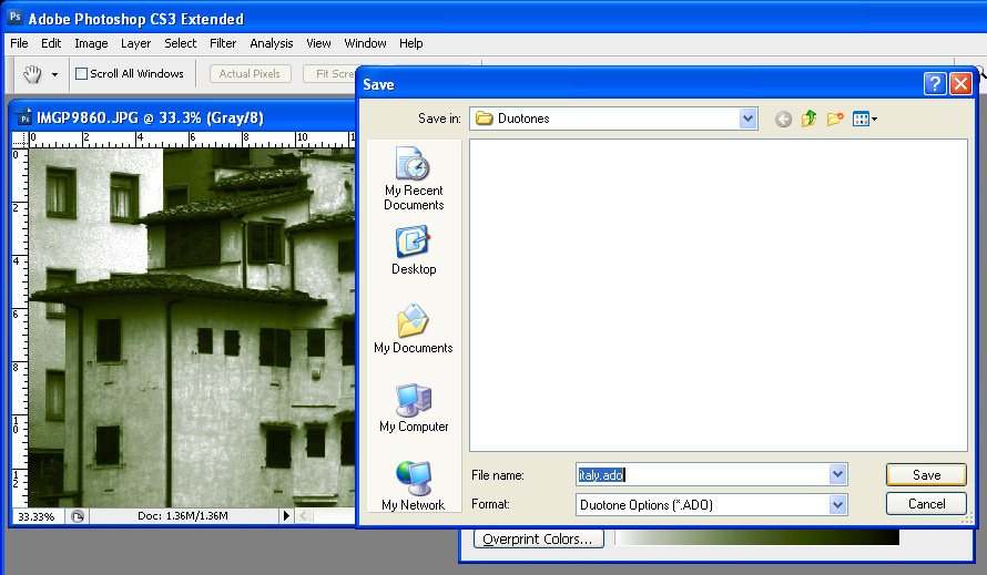
You can save the Duotone settings by clicking the Save button and type a name for it. Later you can load those colors and the curve into the dialog to use for another image. When you are done, choose Image > Mode > RGB Color to convert back to color mode so you can continue to work on the image or to save it.


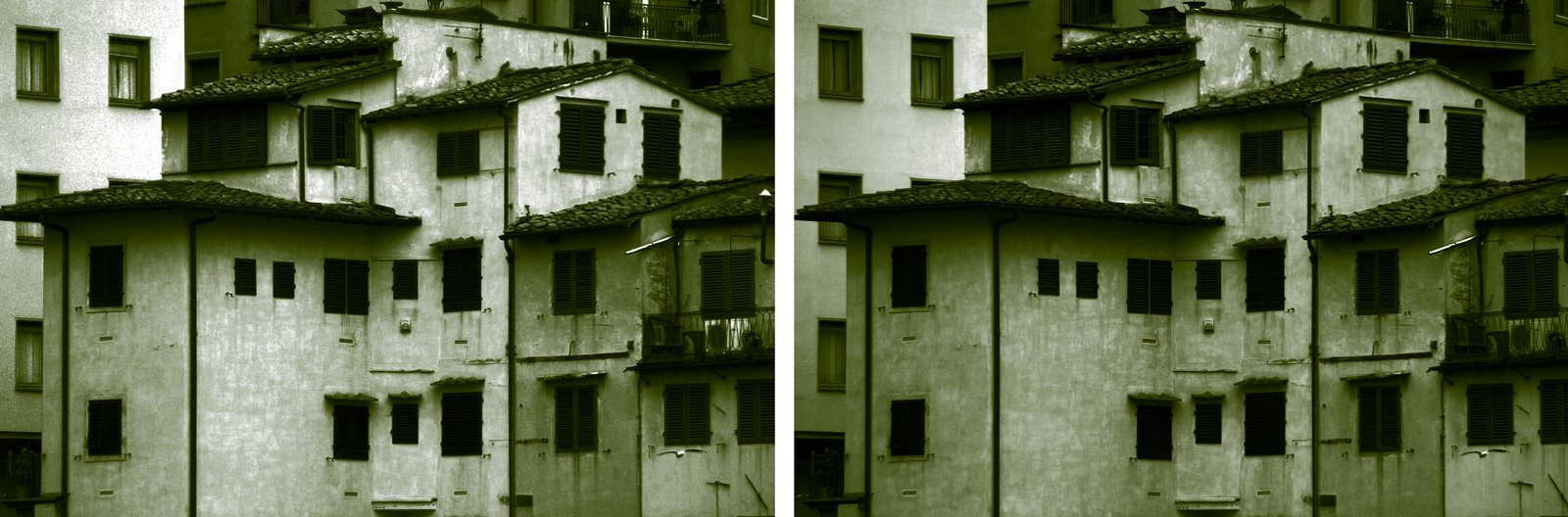
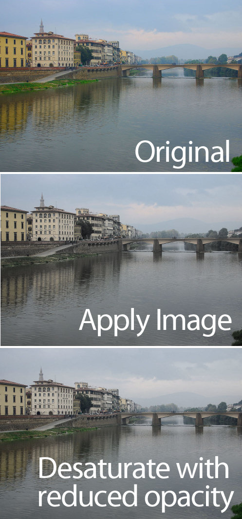
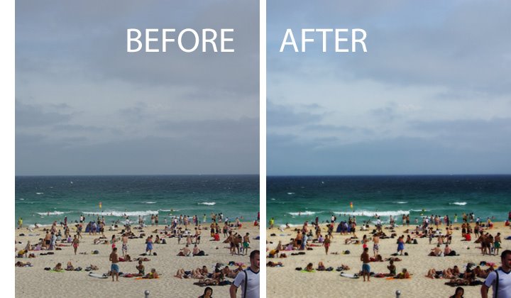
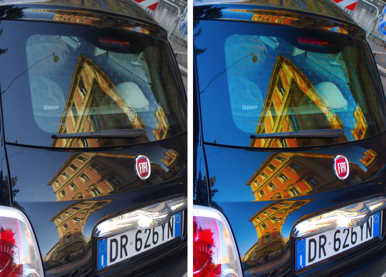
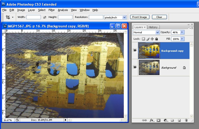
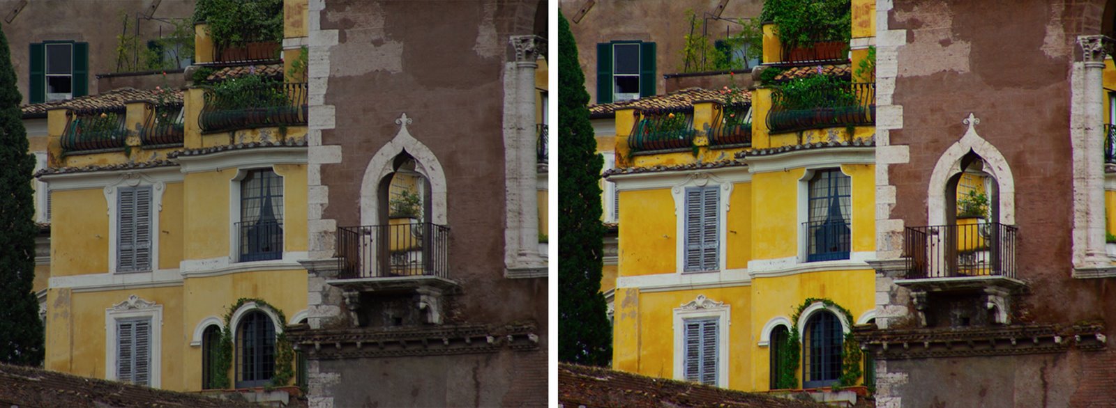
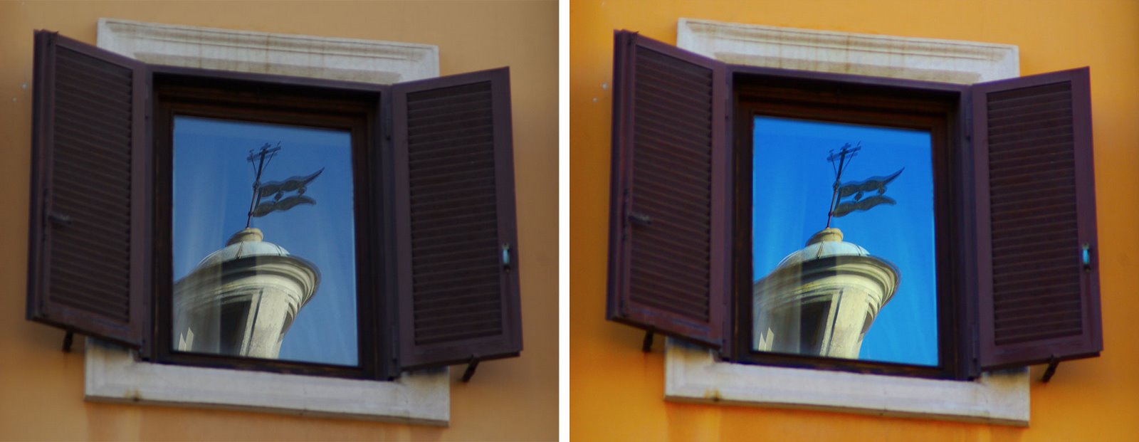
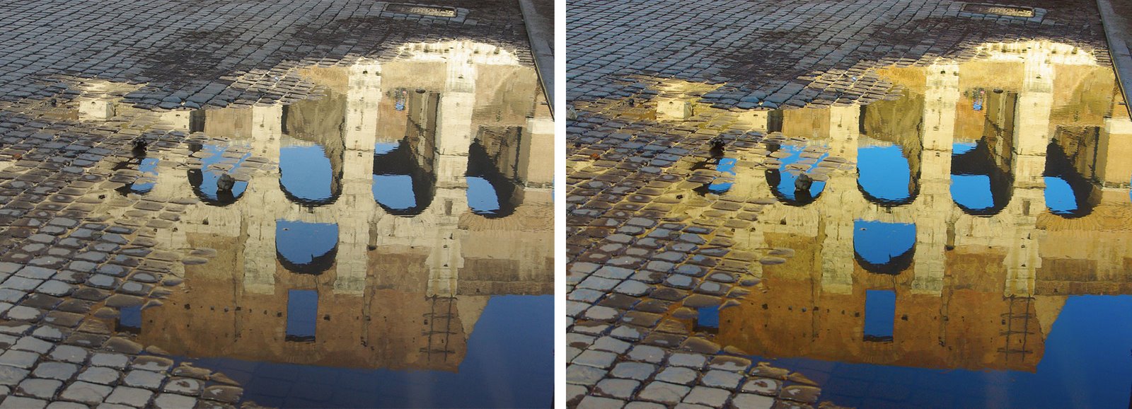
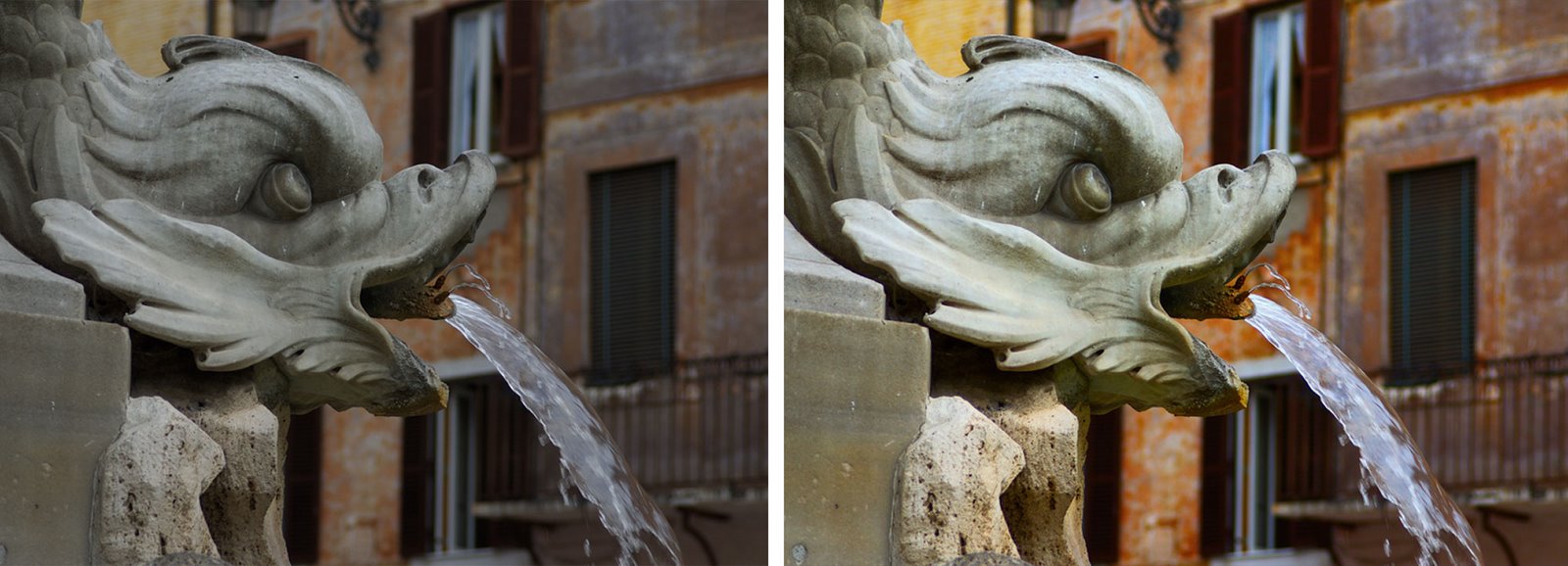
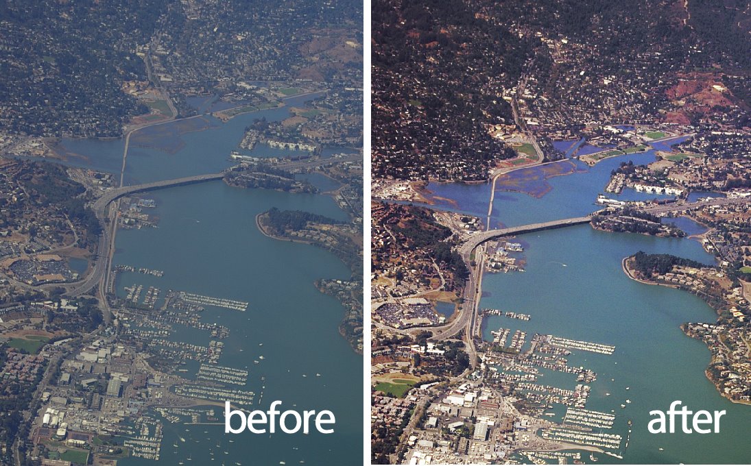
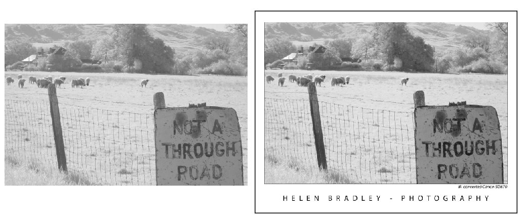
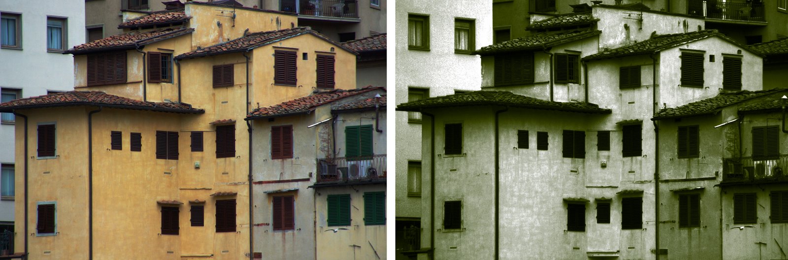
The Duotone on the right was created from an image converted to a monochrome image using Image > Mode > Grayscale. The one on the left uses a custom Black and White conversion first – notice the differences in how the duotone colors are applied.

Helen Bradley

Tuesday, May 5th, 2009

Photoshop: Partially removing color

While there are lots of ways that you can convert an image into black and white in Photoshop sometimes you want to remove some of the color but not all of it.

One method to do this, is to use a tool such as an adjustment layer to remove the saturation from the image or to apply a black to white gradient map adjustment. This removes all the color and you can then recover some of it by reducing the opacity of the adjustment layer to show some of color from the image layer underneath. However, when you adjust opacity, the setting is applied to every pixel in the image so light and dark pixels are treated equally.

You can achieve a richer effect by using the image as its own mask so that the desaturation effect is applied with different strengths to pixels in the image depending on their relative lightness or darkness.

To see how this effect can be achieved:


Step 1
Open a new image and add an adjustment layer to convert it to black and white. I used Layer > New Adjustment Layer > Gradient Map and used the Black, White gradient from the basic set of gradients.


Step 2
Click the Adjustment Layer’s layer mask to select it – this is the white box in the Layer palette to the right of the Adjustment layer thumbnail. Choose Image > Apply Image. This tool lets you apply the image to itself as a layer mask. The current image name should appear in the Source Image area and you need to apply it to the Merged layer. Experiment with selecting and deselecting the Invert checkbox, if you have Preview selected you’ll see how each setting affects the image. Choosing Invert typically gives the best looking results and it’s the option I chose. Click Ok to add the image as its own layer mask.


Step 3
Inspect the image and let’s talk about what’s happening. The screenshot here shows the mask (not the resulting image). You can toggle the mask’s visibility on and off by Alt + Click (Option + Click on the Mac) on the Layer Mask thumbnail in the Layers palette.

Masks are grayscale so they’re always black, white or shades of gray. They work like this: where they are white, the current layer is shown – that’s the black and white conversion in this example. Where the mask is black, we are seeing through the current layer to the colored layer below. Where the mask is grey we’re seeing some partial transparency in the black and white layer so some color is showing.

Here the mask is dark in the sky area and around two of the buildings on the left so you’re seeing some blue in the sky and color in the buildings in this area. Where the mask is white, the image is almost all desaturated.


So you can see how subtly different the results are using this method, here’s the original image, the version we just created using the Apply Image command and another version showing the result with the same Gradient Map adjustment layer but this time with a reduced opacity and no layer mask. The significant differences are in the sky which is bluer and the grass which is more desaturated in our example – a result you cannot achieve by simply adjusting the opacity.

Tip
Masks can be adjusted just like regular layers. So, you can create more variety in the mask by clicking on it, and choose Image > Adjustments > Levels. Adjust the levels to suit – if you lighten the mask you’ll make it whiter overall which means the image will become more black and white and less colorful. If you darken the mask then you will see more of the colored image below.

I contribute to the post production blog at Digital Photography School and this post first appeared there.

Helen Bradley

Sunday, April 26th, 2009

Photoshop: Color with Gradient Maps

When you’re looking for a fun effect to add to an image, the Gradient Map tool might be just the ticket. This tool has a serious side in creating custom black and white conversions and a more frivolous one in adding color to an image. I’ll show you how to use it for both purposes.

Before we start a word about how the Gradient Map works. It is an adjustment so you can find it on the Adjustment menu and you can also apply it using an Adjustment Layer. It applies a gradient of color to your image depending on the tones in the image. So, where the image is darker the tones at the left of the gradient are applied and where the image is lighter the tones at the right of the gradient are applied. The midtones are colored with the color in the middle of the gradient. If you want the effect reversed, you can reverse the gradient and the colors are applied in reverse.

The serious side of the Gradient Map tool is its black and white gradient. You can use this to convert an image to black and white. By changing the gradient, you can affect what parts of the image go to black and which parts go to white.

Step 1
To see this at work, open an image and add a Gradient Map adjustment layer by choosing Layer > New Adjustment Layer > Gradient Map. From the Gradient list choose the Black, White gradient and click Ok. The image now shows as black and white.

Step 2
To adjust the way the gradient is applied, double click the adjustment layer and double click the gradient to open the Gradient editing dialog. You can now add stops below the gradient bar to adjust how the colors are applied. For example, if you add a second black stop to the right of the first one, you can set all the tones that are mapped to this area of the gradient to black rather than them ranging from black to a dark grey.

Step 3
By adjusting the midpoint marker between two stops you can control how the gradient transitions from one color to the next. If you drag it to the left you steepen the transition from the left most color to a color that is half way between the colors in the stops either side of the midpoint marker. Of course, here we’re talking about black, grey and white as colors, but in a minute the stops will be applying colors to the image and they work the same way.

Step 4
To apply a color gradient to an image to give it a more creative look, repeat step 1 to open an image and to add a Gradient Map adjustment layer to it. This time choose one of the colored gradients. If the gradients aren’t to your liking, click the flyout menu on the Gradient tab and load a second gradient set and use one of those.


Step 5
These gradients, like the Black, White gradient can be edited so you can tweak the colors or add new ones until you get exactly the effect you want.

Step 6
Like any adjustment layer, you can achieve further creative possibilities by setting the blend mode of the adjustment layer to something other than Normal. You can also reveal some of the underlying color from the image if you reduce the layer opacity.

I blog for the Digital Photography School and this post first appeared on that site.

Helen Bradley

Monday, March 30th, 2009

Create a Faux Fisheye image effect in Photoshop


A fisheye lens is a wide angle lens which captures a lot of detail both in front of you and to the side – often as much as a 180 degree radius. While other wide angle lenses capture rectangular photos, a fisheye captures images which are distorted and which bulge in the middle and curve in at the edges.

While there is no real replacement for capturing an image using a fish eye lens on your camera because the field of vision is hard to duplicate you can still create a realistic faux fisheye effect in Photoshop.


Open the image in Photoshop and enlarge the canvas. To do this, drag the edges of the window containing the image so you can see plenty of the grey space around the image and click the Crop tool. Drag over the entire image to select it and let go the mouse button. Now drag outwards on the crop rectangle handles to select an enlarged area all the way around the image. You want a good amount of extra canvas. When you have done this double click to add the extra area to the image. It doesn’t matter what colour this is as you’re going to discard it later.


Choose Filter > Distort > Spherize to display the Spherize dialog. Set the Mode to Normal and set the Size to 100 percent and click Ok. This distorts the image by blowing up the middle of it to give a typical fisheye type effect.


Click the Crop tool, drag over an area of the image to retain and double click to crop to this size.


If necessary, clone areas of sky or other elements to fill the photo frame. Here I cropped the image so it would be nice and tall and knowing there was a little bit of work required to fill the missing areas of the sky.

Alternately, for a circular result, drag a circular selection across the image, choose Select > Inverse and choose Edit > Crop to Selection. You will now have a photograph which looks like it was captured using a fisheye lens.

Before you shoot (if you can!)
If you know you want to create a faux fisheye effect with the images you are capturing, then plan ahead and capture a 2 row by 3 column grid of images from a stationary point using a tripod and the widest angle that your lens can shoot at – in other words, don’t zoom in at all. Overlap the images around 25% on the edges so you can assemble them into a panorama later on.

Back in Photoshop or your software, assemble the images into a panorama. You may need to do this in three steps first assembling each row into a panorama and then assembling the two rows into a single image. This will give you more image data than you would typically have and will make the final result more believable.

Helen Bradley

Friday, March 27th, 2009

3 Step Photoshop Every Image Quick fix


Ok, so not technically Photoshop only – this tip works for any image software that supports layers, has layer blend modes and can do a gaussian blur. That includes Photoshop, Photoshop Elements and Paintshop Pro as well as lots of other great photoediting programs.

This is a very quick fix for boosting and image and giving it a really nice look.

Step 1
Start by duplicating the image layer by choosing Layer > Duplicate Layer.

Step 2
Add a Gaussian blur to the top layer by using Filter > Blur > Gaussian blur. You need to use enough radius to get a nice light blur on your image. For smaller images you need only a small value blur – say 2-4 and for larger images you will need a higher value. Click Ok when you’re done.

Step 3
Now set the Blend Mode for this blurred top layer to Soft Light or Overlay. You’ll get a nicer looking image and the colors will get a nice boost. Reduce the layer opacity a little if necessary.

This is a simple and effective fix and isn’t that the best type?

Helen Bradley

Sunday, March 15th, 2009

Stupid Photoshop tricks #1 – hold your own photo

There are heaps of creative things you can do with your images in Photoshop and one I think totally rocks is a collage technique that turns your photo into a photo of itself. If you’re totally confused, check out the image – you’ll see a hand holding up what appears to be a Polaroid image in front of a scene – the Polaroid image itself shows part of the background scene and it’s all done in Photoshop – here’s how:


To create this image you will need a photo with an interesting subject. I’ve used a spring landscape.


You will also need a photo of your hand held as if you are holding a photo in it. Take the photo of your hand with your point and shoot camera held in one hand and your other hand stretched out in front of you. You may need to use macro mode to ensure that the hand is in focus and not the scene behind. The ideal setup for photographing your hand is with a road or carpark as the background – the contrast between your skin and the road will make it easy to select around your hand.

While you can create your own faux Polaroid image, there is a good one you can download from http://lured2stock.deviantart.com/art/Polaroid-3262470.

Open the photo of your hand, the landscape and the Polaroid image in Photoshop. Crop the hand to remove excess background.

Select around the edge of the Polaroid image and remove its excess background so you have only the image itself.

Drag the background layer from the Polaroid image and the hand image into the landscape image. Each element will appear on its own layer.


Drag the hand to the top of the layer stack and hide the other two layers. Use your favourite section tool to select around the hand and add a layer mask by clicking the Add Layer Mask icon at the foot of the Layer palette (use Alt + Add Layer Mask if you selected the background rather than the hand). Using a layer mask makes it easier later on to remove parts of the hand so the Polaroid will look like it is held in your hand.


To transform the Polaroid image so it is the correct size, Ctrl + click on its layer thumbnail and select the Move tool. Press Ctrl + T to select the free transform tool and then Ctrl + 0 (zero), to scale the image so that you can see its sizing handles. Drag the Polaroid into the approximate position it should appear in the image and size it to suit. It should appear partially covered by the hand.


Make a selection around the inside of the Polaroid image and delete it or add a mask to hide it. Select the background layer and hide the two top layers. Move the selection over the underlying image – choose Select > Transform Selection and resize it in proportion if desired.


Choose Edit > Copy to copy the selection onto the clipboard, then Edit > Paste to paste it into a new layer, size it to fit the hole in the layer above. Brighten this layer if desired. Select this layer and the Polaroid image by Shift + clicking on each of them and choose Layer > Link Layers. Rotate the Polaroid slightly.


Make the hand layer visible again. Select the brush and black paint, click on the layer mask for the hand layer and paint out portions of the hand that should be behind the Polaroid. Add a new layer below this layer and paint a small drop shadow along the edge of the fingers over the Polaroid.

Helen Bradley

Monday, March 9th, 2009

Photoshop – change the color of your house


You can change the color of anything using Photoshop. A friend of mine is about to paint her house but before her husband goes shopping for paint, she wants to know that the result will look good and that the house will blend nicely with its surroundings. It’s a job for a digital camera and some Photoshop know-how. Here’s how to recolor your house (or anything else) and save color combinations to review with someone else later on. I’ve used Photoshop CS3 but almost any version will do.

Open a photo of your house in Photoshop. I’ve used a bathing box for simplicity but the principles are the same for a house or, indeed, anything at all. You’ll need one extra copy of the background layer for each item you’ll recolor. For this image I’ve duplicated the background layer three times so I have a background layer, a layer for the house color, one for the door color and one for the trim and I’ve named them appropriately.

Start with the house layer and hide the others. Choose Layer, New Adjustment Layer and add a Hue/Saturation adjustment layer and drag the Saturation slider to -100 and click Ok. Add a second adjustment layer by choosing Layer, New Adjustment Layer, Levels and adjust the sliders until the area you’re focusing on looks like it could be painted with white paint. You want to retain the detail but lighten the area. Ignore everything else in the image for now. Click Ok when you’re done.

Now add a third adjustment layer using Layer, New Adjustment Layer, Hue/Saturation. Click the Colorize option and adjust the Hue, Saturation and Lightness sliders until you have the color that you want for the area you are working on. Again, ignore the effect on the rest of the image. Click Ok when you’re done.

Now, to limit the effect to the area you want painted in this color, select the adjustment layer just above the layer you’re working with and choose Layer, Create Clipping Mask. Repeat for the other two adjustment layers. You should see the adjustment layers indented in the Layers palette. Now, you can paint on the color. Select the layer you’re working on, in my case this will be the layer named house and hold Alt as you click on the Add Layer Mask button at the foot of the Layer palette. This creates a Reveal All layer mask so your photo should now be its original color.

Select white as your foreground color and paint over the areas you want to be coloured with the color you just selected. If you paint over something by mistake, switch to black foreground color and paint the original color back.


Step 1
For each area of color in the image, add the same three adjustment layers, one to remove the color, one to adjust the lightness and one to add color back. Create the adjustment layers as a clipping group with the appropriate layer. Finally, add a layer mask and paint the effect onto an area to recolor it.


Step 2
Because you will use adjustment layers for all the changes, you can alter the settings at any time if desired. Simply double click on the Adjustment layer thumbnail and the dialog will open so you can make changes to its settings and then click Ok to reapply it to the image.


Step 3
To save a color scheme, add a new layer at the top of the Layers palette, select it and press Control + Shift + Alt + E to create a new merged layer. Name this and turn its visibility off. Now change the colors to test a different look and save that version the same way.

Helen Bradley

Thursday, March 5th, 2009

Photoshop: Color that packs a punch


I like to see lovely saturated color in my photos but sometimes the color I capture just doesn’t do justice to the subject and it isn’t what I remember the scene looked like. Boosting the color can turn a lackluster image into one that totally rocks. So, if you find that the color in your photos is lacking, here’s what I do to make it better. The process is ridiculously simple, it requires no selections to be made, and it can be recorded as a simple action. It’s my kind of fix – quick, easy and very powerful.

A word about LAB
The fix uses the LAB color space. This is not an often used color space and it isn’t available in most other programs so you won’t be able to mimic this effect in, for example, Photoshop Elements. However, LAB has been around in Photoshop for years.

In the RGB color space you work with the red, green and blue channels and in CMYK you work with cyan, magenta, yellow and black channels. In LAB you have three channels; L, a and b. The L channel is the lightness channel and, if you adjust it you adjust only the lightness in the image and you don’t change any of the color in the image. This sets Lab apart from RGB and CMYK as color and lightness are separate in LAB where they aren’t in the other modes.

In Lab the two color channels are a and b. The a channel contains color information for the green and magenta in the image. The b channel manages the blue and yellow colors in the image. If you were to look at these channels they would look very light because they contain only color information and no lightness data.

By separating lightness from color as LAB does you can make adjustments that would be difficult or time consuming to do in any other color space. However, that said, I think this fix works best on animals, landscapes and streetscapes – but not on close ups of people. On people it tends to destroy the natural skin tones.

How to fix in Lab
To see this LAB fix at work pick an image that has color in it but which you think could use a color boost.

Step 1
With the flattened image open in Photoshop, choose Image > Mode > LAB Color. If you’re working on a flattened image you won’t see anything except LAB/8 appearing in the title bar of the image.

Step 2
Duplicate the background layer of the image by right clicking it and choose Duplicate Layer. You’ll make your adjustments on this duplicate of the background layer so that you can blend them into the background layer later on.

Step 3
Choose Image > Adjustments > Curves to apply the curves adjustment to the duplicate background layer. Don’t use an adjustment layer as you’ll only have to flatten it on returning to RGB anyway.

In the curves dialog, the L channel is visible on the screen. This channel that contains only lightness and darkness values so that you can drag on the curve to adjust this if desired.

Step 4
Select the a channel – this is the magenta/green channel. In a standard Photoshop setup green is on the left and magenta is on the right. Drag the bottom edge of the curve inwards 2-3 squares. Then drag the top edge of the curve inwards the same number of squares. It doesn’t matter how many squares you drag but you must drag the same number on either end so the curve line crosses the middle of the grid – this stops you from inadvertently inducing a color cast into the image.

Step 5
When you’ve adjusted the a curve, repeat the process with the b curve. At this point the image is probably looking very scary indeed. However, you need to make the adjustment strong enough that you get too much color rather than too little at this stage. Click Ok to apply the curve to the top image layer.

Step 6
To return to RGB mode choose Image > Mode > RGB Color. When prompted, select the Don’t Flatten option. This is critical because you want both layers intact back in RGB mode.

Step 7
Now drag the Opacity slider for the top layer back to 0 so you see the original image and slowly walk the slider back up until you get the amount of color you want in your image. When you’re done, save the result.

Once you’ve done this a couple of times, you’ll appreciate how much of a boost in color you can get and how fast you can do it. Record the fix as an action and you can do it in one click and then just adjust the opacity to suit.

In some cases altering the blend mode of the top layer can yield pleasing results. The blend modes in the Overlay, Soft Light, Hard Light, Vivid Light, Linear Light and Pin Light grouping in the Blend Mode list give the best results. You can also duplicate the top layer and apply different blend modes to each copy to bring out different areas of the image.

So, if you want to produce eye-wateringly beautiful color in your photos, chances are that a Lab color fix like this is just what you need.

The images below show the original image on the left and the LAB color fix applied to it in the image on the right. No adjustments other than working LAB and blending the resulting layers have been used on the right hand versions.


Post Script: To learn more about LAB color mode and the fixes that you can perform using it, look no further than Dan Margulis’ book— Photoshop LAB Color: The Canyon Conundrum and Other Adventures in the Most Powerful Colorspace – it’s practically the definitive book on Lab by the master of Lab himself.

I contibute to the Post Production blog at Digital Photography School and this post first appeared there.

Helen Bradley

Wednesday, February 25th, 2009

Photoshop: Fixing photos shot from airplanes

One of the cool things about getting a window seat in an airplane is that you get a unique opportunity to photograph things from a high vantage point. On the flipside, when you get them home you often find photos taken from the air look washed out and the colour is poor. Luckily there is not much that Photoshop can’t recover provided the photographs are in focus. So if you scored a window seat lately and if you have images that fix, I’ll show you the Photoshop tools you need to fix them.

Understand the problems
Most airplane photos look washed out and they don’t have the richness of colour that you might expect them to have. The first step in fixing them is to boost the tonal range in the image using a levels adjustment – a by product of this is that the colour gets a boost.

Step 1
Start by making a duplicate of the background layer so that you’re working on a copy in case you need to refer to it later on. To do this, right click the background layer in the layers palette and choose Duplicate Layer.

Step 2
Select the background layer and choose Layer > New Adjustment Layer > Levels and click Ok. The Levels histogram tells you a lot about the state of your image. In most cases you’ll lack white whites and black blacks and most of the image content will be around the middle of the image. Drag the right and left sliders below the chart so that there are below the points where the chart data begins. This should give the image an immediate boost in contrast and some boost in colour too. Adjust the midtone slider if desired to fix the midtones in the image and click Ok to confirm your settings.

Step 3
Colour fixes: Often the image will contain too much blue and you can adjust this using a Curves adjustment. Choose Layer > New Adjustment Layer > Curves and click Ok to display the curves dialog. Click the Channel list and choose the Red channel. Drag up on the middle of the Red channel line to add some red to the image. Repeat with the Green channel adjusting it as required – drag down on the middle to remove green and up to add it. Finish with the Blue channel.

If you’re unsure which way to go with the adjustment, give the line a good pull in one direction or the other to see what happens, back off the adjustment to get something less intense. Different places on the curve line will give you different effects so experiment either side of the midline. Click Ok when you are done.

Step 4
Fixing uneven contrast: Photographs shot from high up are generally display better tonality in the areas closer to you and poor tonality in areas farther away. To fix this add another layer by choosing Layer > New Layer and click Ok. Fill this layer with a gradient by selecting the Gradient tool and select the Black to White gradient. Choose the Linear option and drag the gradient to fill the layer. You want black at the top of the layer and white at the bottom – if you get it wrong, drag in another direction till you get it right. Don’t worry that your photo has disappeared in the process!

From the Blend modes dropdown list choose Color Burn. This will darken the image considerably particularly in the areas where the black colour appears. Adjust the layer Opacity in the layer palette until you get an acceptable result.

Step 5
Final touches: To finish the colour fixing, boost the saturation using Layer > New Adjustment Layer > Hue/Saturation and increase the Saturation a little. If the image needs a little lightening and if you’re using Photoshop CS3 or CS4, use a Brightness/Contrast adjustment layer. If you’re using Photoshop CS2 or earlier, use a Curves adjustment and this time drag the composite RGB curve upwards to lighten the image. The Brightness/Contrast tool in earlier versions of Photoshop is to be avoided at all costs as it damages good pixels in the image – the new tool that first appeared in Photoshop CS3 is much different and much better.

step 6
Sharpening: The final step is to apply some sharpening to the image. To do this, you need a single image layer so press Ctrl + Alt + Shift + E to create a composite layer. Select this layer and use Filter > Sharpen > Unsharp Mask to sharpen the image. Set the Radius to between 0.5 and 1 and set the threshold to under 10. Adjust the Amount until you get a good sharpening of the image.

Helen Bradley

Sunday, February 22nd, 2009

Show Off! Frame your photos in Photoshop

When you’re displaying your photos on a blog or a website you’ll want them to look as good as they would if you had them framed on the wall. Here is a Photoshop technique for adding a frame, complete with your name and photo details, to a photo.

To see what we are aiming for, compare the two images below. The photo on the left is unadorned and the one on the right has been framed using the process outlined in this step by step. This frame gives the photograph a very smart and professional look.

Here’s how to achieve this:


Step 1
Once you have finished editing your photograph in Photoshop, click the topmost layer of the image and press Ctrl + Alt + Shift + E (Command + Option + Shift + E on the Mac), to create a new layer containing a merged version of the image.

Click this new top layer and choose Select > All and then Edit > Stroke. Set the Width to 2 pixels, the Color to black and select Inside and click OK. This adds a keyline around the image and makes sure that any white areas in the photograph do not bleed into the frame. Adjust the stroke width to match your image size – larger images can handle a wider stroke whereas small images may need only a 1 pixel stroke. Choose Select > Deselect or press Control + D (Command + D on the Mac).


Step 2
Enlarge the Photoshop image window by dragging on one corner. You want to see some of the gray edge around the photo. Set the background color to the desired frame color. Click the Crop tool, select the entire photo and let go the mouse button.


Step 3
Hold the Alt key (Option on the Mac) and drag on the left or right side of the crop marquee outwards into the gray area of the image. What you’re doing is marking the amount of space that you want for a frame around the left and right areas of the image.

Repeat using the Alt key (Option on the Mac), on the top or bottom border to create a matching amount of space above and below the image. Now, without holding down any other keys, drag the bottom border downwards to create a larger space at the bottom of the image.

Double click on the crop selection and this extra area you have marked out will be added to your photograph. If your image had a background layer the color is added to the background. If your background layer had been previously converted to a regular layer, the extra area will be transparent. If the area is transparent, add a new layer by choosing Layer > New > Layer and fill it with white or your chosen frame color by choosing Edit > Fill and choose the color to use from the Use list. Drag this layer underneath your topmost photo layer.


Step 4
Select the topmost layer, choose Select > All and then Edit > Stroke and add another 2 pixel black stroke on the Inside of the selection. Choose Select > Deselect or press Control + D (Command + D on the Mac).


Step 5
Click the Horizontal Type tool and select a relatively plain font such as Myriad Pro, black color and type your name below the photo. For example, I use “Helen Bradley – Photography”. To widen the spacing between the font characters so they fit better across the screen, select the text and press Alt + Right Arrow (Option + Right Arrow on the Mac). To center the text below the image, select the text and the image layer and choose Layer > Align > Horizontal Centers.

If desired, add the photo title and date captured on the right hand side underneath the photograph in the same font face but a smaller font size. This time, don’t stretch the characters apart and use an Italic font if desired. Align the last character in the title with the edge of the image.

Step 6
You’re now ready to save a version of this image as a JPEG file for web display.

Tip
Choose a ‘frame’ color that works for your images, you can use an off white color rather than white or reverse the colors and use white keylines and type, and a black frame. Whatever choice you make, it will ensure your photos are readily identifiable if you consistently use the same design for all your images.


Tip
If you are preparing a series of images to display on the web, you can create a frame shape with the keylines and type already in place on the frame layer and with a cutout area for the photograph to appear in. Save the frame image as a PSD or layered TIFF file ready for use. Open the frame and your finished photo. Flatten your photo image to a new layer using Control + Alt + Shift + E (Command + Option + Shift + E on the Mac) and drag this new layer underneath the “hole” that you have cut out of the frame image and size the image to suit. Save the framed version and repeat as required. When you have a lot of images to process and if you’re prepared to loose a little of the image edges for the sake of speeding up your workflow, you will find that adding an image to a frame is quicker than creating the frame for each image separately.

I blog for the online Digital Photography School and this post first appeared here Digital-photography-school.com.

Helen Bradley