|
|
|
|
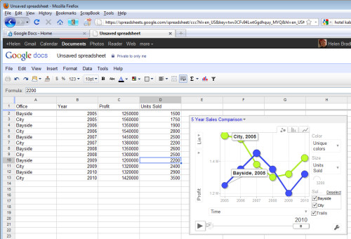
Google Docs Motion Chart Test Page Sample Google Docs spreadsheet motion chart. Made with the Motion Chart Gadget. Click the Play button to play the chart.
There’s a lot to love about Google Docs and gadgets are one of these. Gadgets allow you to do things with Google Docs that would be time consuming if not beyond most people's skills to create in a program like Excel. Here I’ll show you how to create a motion chart in Google Docs spreadsheet. Prepare the data In the next column, type the data to plot such as Profit. The next columns are optional but we’ll add one which records units sold. To have some data to work with, add at least five years of data for the two offices. Add the Gadget The chart appears on the screen but requires some customisation to work. From the fly out menu of Y axis options on the left select Profit and then from the X axis dropdown list select Time so you plot Profit against Time. From the Color dropdown list, select Unique Colors and from the Size dropdown list, select Units Sold. Click the Play button and the chart will play showing the change in your data over time. The Y axis movement shows movement in Profit and the size of the bubble shows change in Units Sold. The tabs change the chart from a Bubble to a Column or Line (this is not a motion chart). If you click the office checkboxes and Trails you will see additional labels on your data and to the right of the Play button is a slider which controls playback speed. Save the default
|
|
|
(c) 2019, Helen Bradley, All Rights Reserved. |


