There is so much of Lightroom that’s not apparent when you first begin using it and that takes time to discover and explore. Here are my five cool Lightroom techniques that you might want to add to your Lightroom toolkit.
Shortcuts
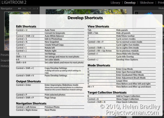
There are a lot and lots of keystroke shortcuts in Lightroom, and it takes time to learn them all. It’s also harder still to find them so you can learn them all! That is unless you know this one keystroke shortcut. Press Ctrl + / (Command + / on the Mac) to display an overlay of shortcuts over the top of your Lightroom window.
The list is module specific so check it in the Develop module for shortcuts for that module and in the Library for Library shortcuts and so on.
Go solo
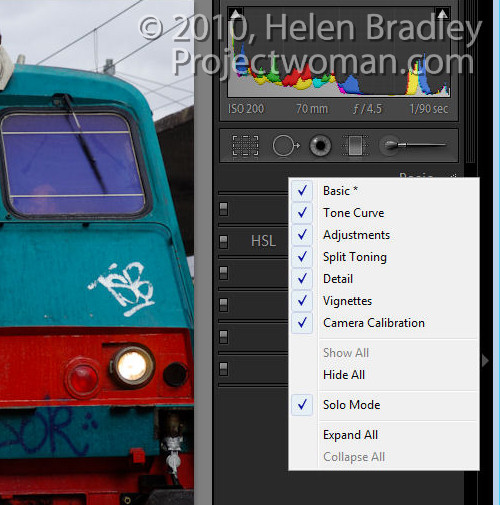
If you find that opening panels in Lightroom clutters your screen with lots of open panels why not have Lightroom automatically close each panel as you open a new one. This is called Solo Mode.
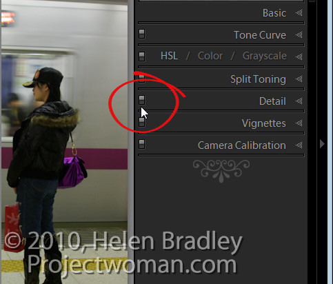
To change the panel behaviour, right click on one of the panel names and choose Solo Mode from the small dropdown menu which appears. With this enabled the disclosure triangles change appearance to show as a series of small dots instead of being filled with solid colour. This indicates that the panel is operating in Solo mode.
You can also enable this by Alt + Clicking (Option + Click on the Mac), on the panel name (not the disclosure triangle). The selected panel will open and the mode will toggle between Solo mode being selected and not.
Note that some items like the Navigator and the Histogram are not part of this behaviour so even if you have solo mode operating these panels won’t close down.
Colour your life
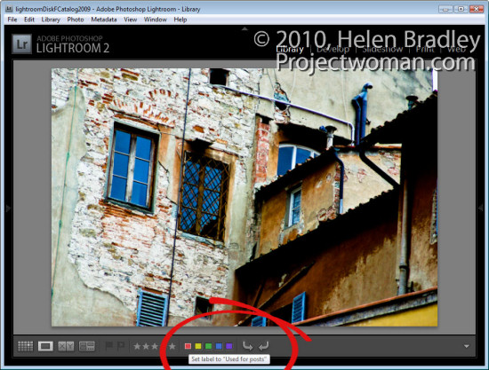
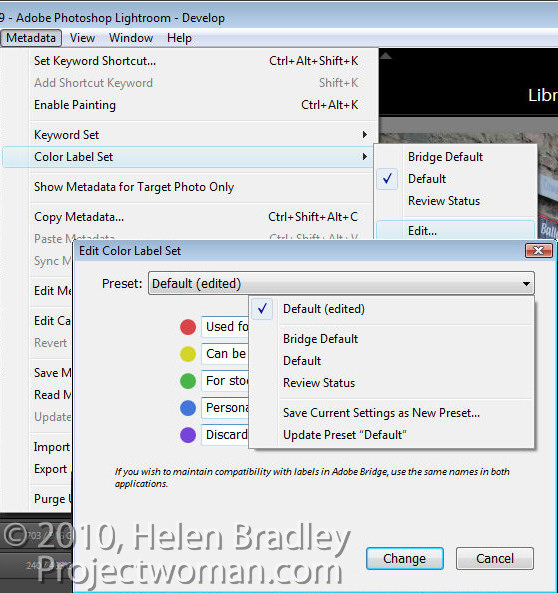
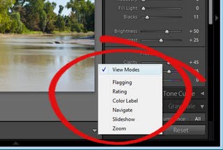
If you find the colour labels; Red, Yellow, Green, Blue and Purple just a little short of useless, why not customise them to suit your own needs. To do this, redefine what each stands for by switching to the Library mode, choose Metadata > Color Label Set > Edit and edit the colour labels to make them stand for whatever you like.
Type your own description for each colour and from the preset dropdown list, select Save Current Settings as New Preset and give the preset a name.
Alternatively, you can use one of the two other sets provided, Bridge Default, which matches the colour settings used in Adobe Bridge or Review Status, which is another option with preset descriptions for each colour.
When you choose either your own set or one of the other shipped presets and hold your mouse pointer over one of the colour labels you will see the custom description appear making colour coding images way more useful than before.
Faster Ranking
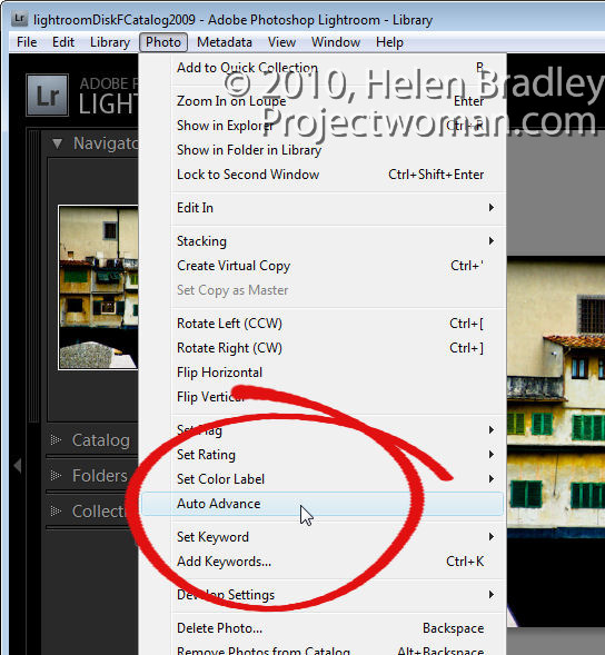
Until I discovered what was happening I used to find ranking photos a bit of a hit or miss affair. Sometimes when I pressed a number 1 to 5, to rank the image as a 1 – 5 star image the image would be ranked and Lightroom would progress to the next image. Other times Lightroom would rank the image but stay with the current image still selected.
The key to controlling this behaviour is to enable AutoAdvance mode. There are multiple ways to do this, and the simplest may be to set the Caps Lock key on. Then when you press a number to rank an image, Lightroom will automatically rank it and progress to the next image. You can also enable this option by selecting Photo > Auto Advance in Library mode.
Of course, it’s also possible to use Shift + one of the numbers 1 to 5 to do this too, but I prefer a single key solutions that do not require me to use two hands.
Before/After alternative
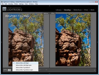
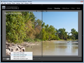
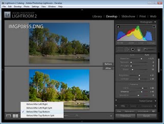
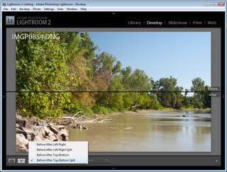
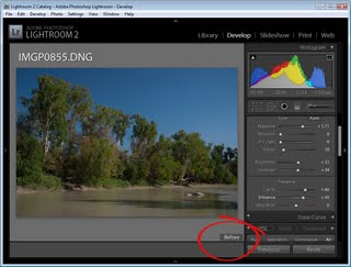
Often when you’re working in the Develop module you’ll want to see the effect of applying a single change to the image. This is most particularly the case when you are sharpening the image, and you want to see the result before and after sharpening.
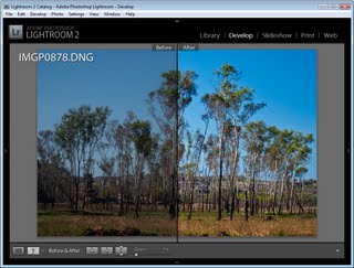
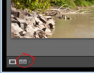
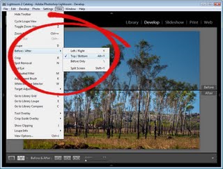
If you use the backslash key (\) you’ll see the Before and After view where the Before view shows the image as it was when you imported it into Lightroom. If you want to see just the Sharpening effect you can use the On/Off switch at the top left of the Detail panel.
This switch turns Detail panel settings on and off so you can see the results of just removing and reapplying your sharpening with all other changes to the image still in place – even if you applied them before the sharpening.
This gives you additional flexibility in determining whether the edits that you’ve made to the image are those that you want to use.
So, these are my five cool Lightroom techniques and now it’s over to you. If you were to share with someone your favourite (and not so obvious), Lightroom tips or tricks, what would they be?


