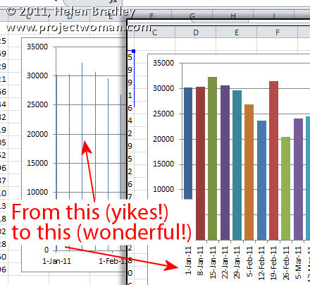
It’s probably happened to you, you’ve created an Excel chart and the columns are so narrow they are almost unreadable. The chart is ugly and it appears as if there’s nothing that you can do because nothing that should work does work.
The problem typically happens when you have a chart with an X axis that is has date data and where you aren’t plotting every day but, instead, for example, one day a week.
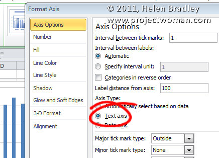
The solution is to click the X axis of the chart so that you have it selected, right click and choose Format Axis. From the Axis Options panel, select Text Axis. This turns your skinny bars into something a lot more attractive.
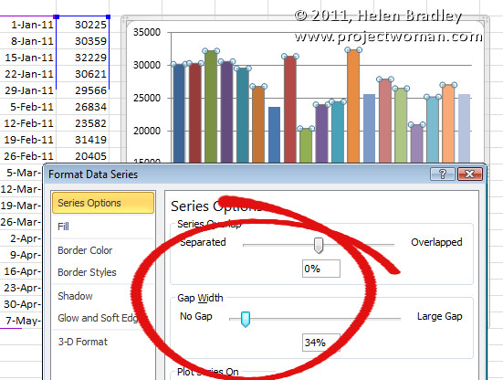
If the bars still not thick enough – and typically, for me, they aren’t – click on one bar to select the series, right click and choose Format Data Series. From the Series options, decrease the Gap Width value to around 35 percent. This option won’t work unless you first set the X axis to a Text axis although you and I both wish it would!


