Playing with color using a Gradient Map Adjustment Layer
I’ve been fiddling around with halftones and grayscale posterized images lately – partly for a magazine project and partly for some things I am designing. Sometimes, however, I just play for the sake of it and today’s post is all about that playtime.
Posterized images have a flattened color look – the entire image is flattened to a few bands of color and I was interested to see what color variations I could get with a Gradient Map over an image. Gradient maps work by mapping a color onto a tone in the image and, with a regular image, the colors sort of blend across the image. However, posterized images are different – they have flat areas of color so the Gradient Map will not be seamless and instead it is going to recolor the posterized image in great big solid blocks of color.
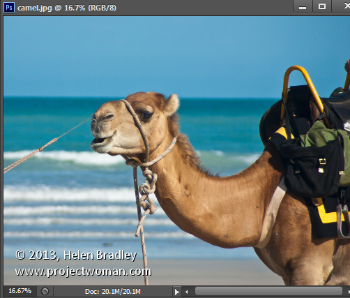
Here is the image I started with:
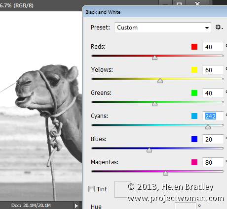
To see this at work, first convert the image to black and white using Image > Adjustments > Black & White and create a nice contrasty black and white.
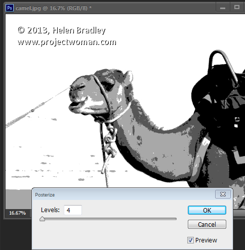
Then add the posterized effect by choosing Image > Adjustments > Posterize and set the Levels to 4 or 5 – this makes the image into one that has 4-5 tones only in it.
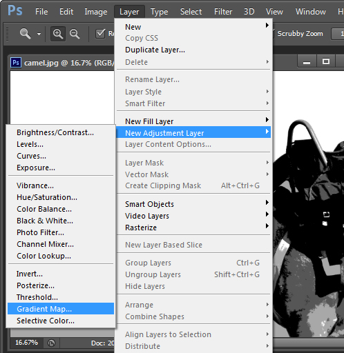
Now to recolor the image with the Gradient Map choose Layer > New Adjustment Layer > Gradient Map and click Ok.
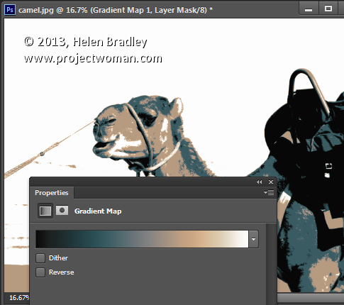
From the dialog select a color scheme to use. The new photo filters which are included in Photoshop CS6 are a great choice but absolutely anything will give a great result. The colors are mapped on to the image according to the light and dark tones in the image. If you click Reverse you’ll get a negative effect. Find the color to use and close the dialog.
Because you’re using an Adjustment Layer you can change the colors anytime by just double clicking the adjustment layer and choose a different color combination.
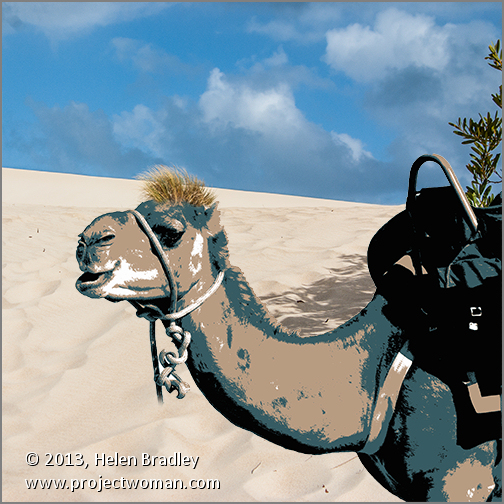
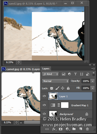
I finished off by finding an image to use with this one. I flattened the camel to a single layer by pressing Control + Alt + Shift + E (Cmnd + Option + Shift +E on the Mac) and then dragged the flattened layer into a second image.
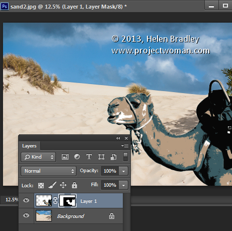
Then I used a mask on the camel layer to select and remove the background. I positioned the camel in an interesting place and cropped the image to square. I added a small vignette around the image too.


Post a Comment
Please feel free to add your comment here. Thank you!