Monday, April 23rd, 2012

Quickly adjust color in a photo on the iPad with Auto Adjust

Download: Auto Adjust in iTunes – 0.99

This is a no nonsense tool that has a few sliders and not much more. You can adjust Brightness, highlights, midtones, shadows and color saturation. The app won’t scale your photos so you don’t see everything on the screen and you can’t move the image around.

The tool really doesn’t do enough to warrant using it – there are plenty of other tools that have a broader feature set.

This program would have to be gobsmacking great to justify opening images in it since you’ll generally want to do more than just these adjustments.

Helen Bradley

Tuesday, September 27th, 2011

Color Correction in Photoshop

One of the most difficult things to do when you’re starting out in digital photography is to recognize and remove a color cast from an image. Not only do you need to work out that you’ve got a color cast, but you also need to find a means of fixing it.

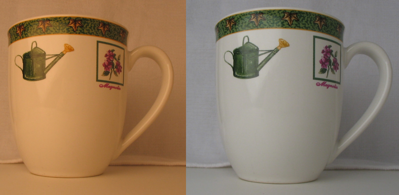
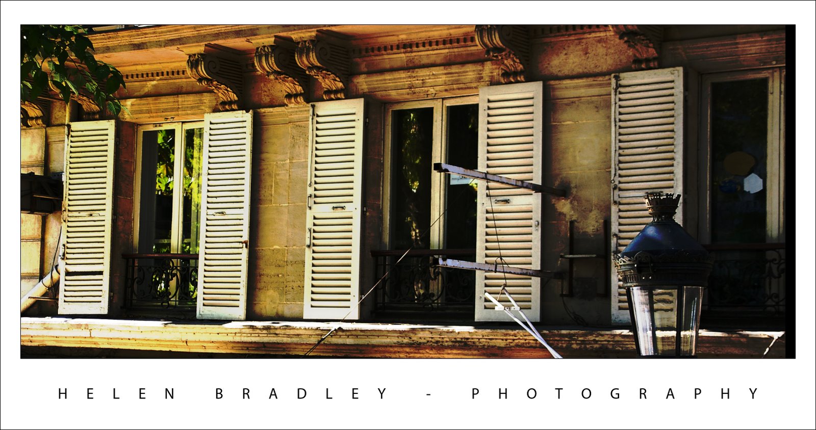
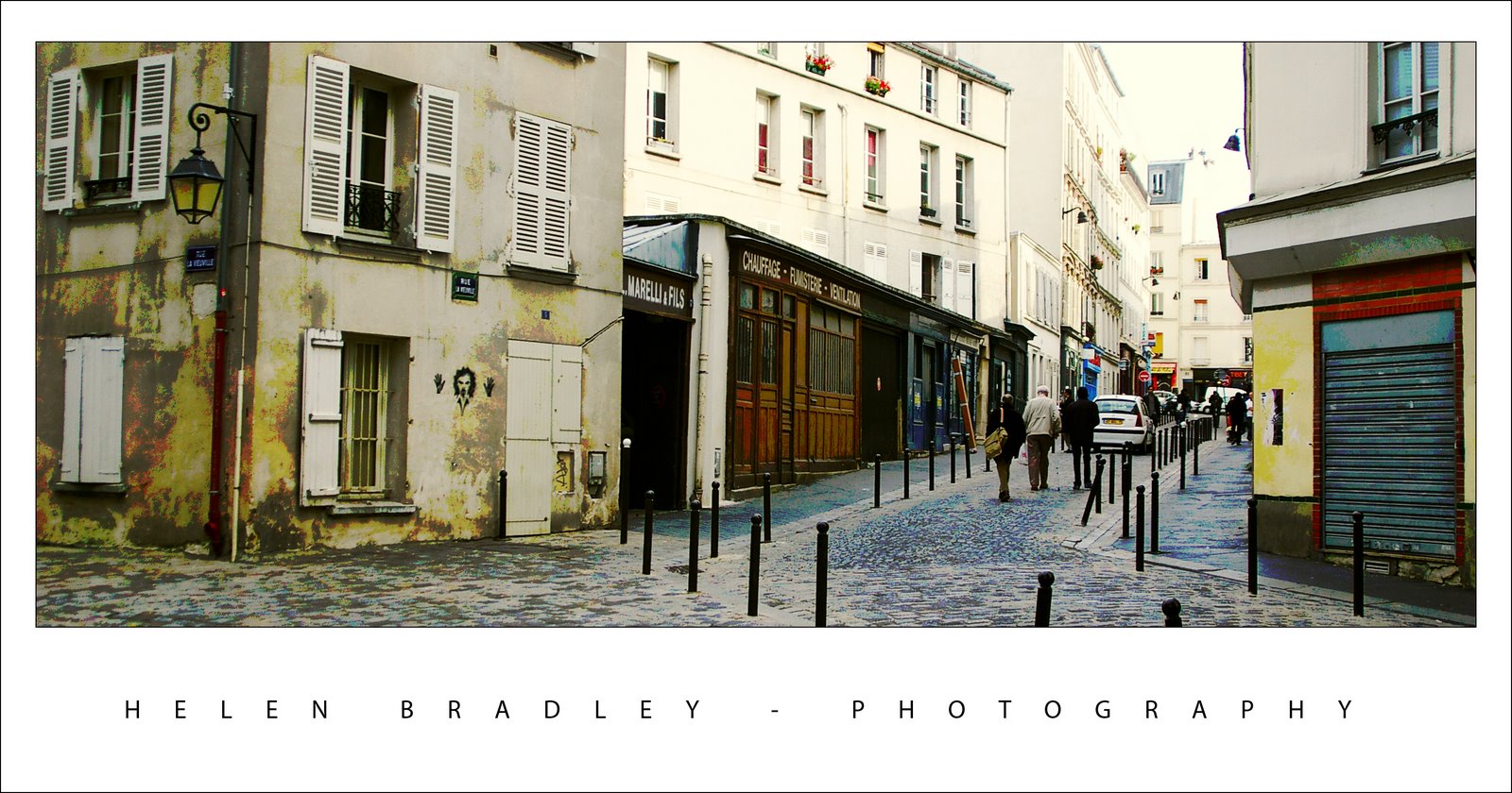
One method of color correction is one that I learned from Photoshop gurus, Dan Margulis and Taz Tally – any errors in this process are mine and not theirs. The process relies on reading data from the image and then adjusting the numbers that the image provides. It’s a way to remove a color cast that is relatively simple and which involves reading and setting RGB values rather than making objective decisions about an image. I’ll show you how to do this using an image shot in the early morning and which is hazy, underexposed and which has very poor color.

Step 1
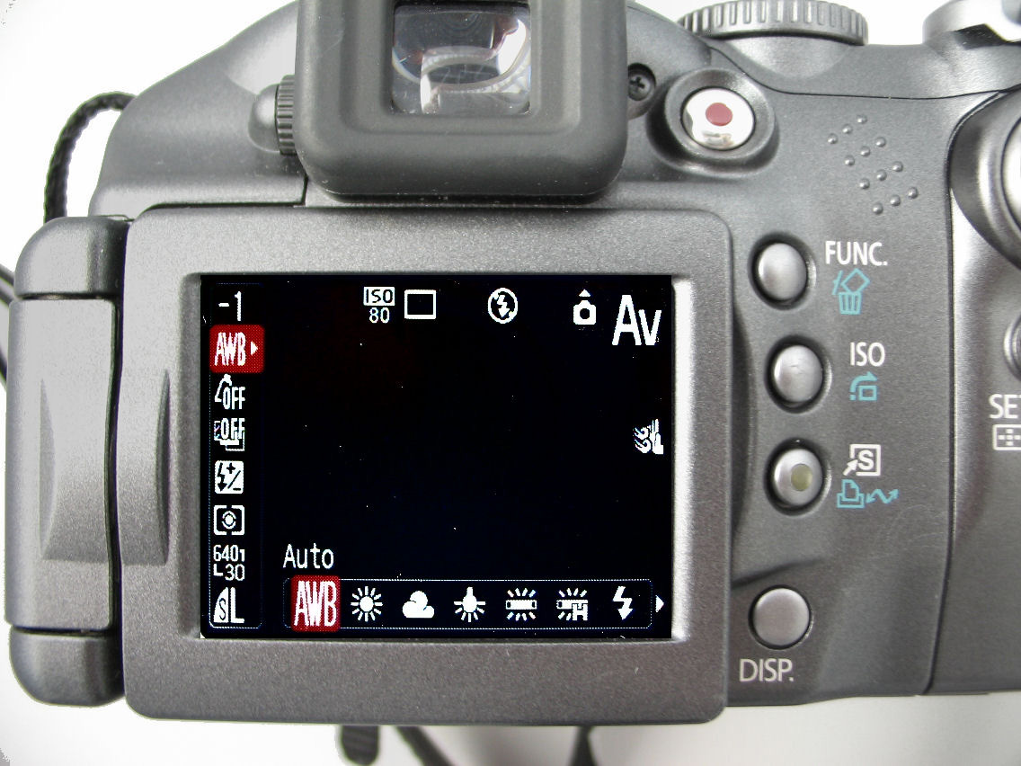
To get started, open an image that you think has a color cast. Choose Window > Info to display the Info palette. This gives you information about the pixels in your image and, if you’re working with a standard photo, you’ll have RGB mode displayed in the upper left corner of the dialog.

Step 2
To make the color correction I’ll use the Info palette to display information about the image. To do this I’ll need to make some color sample points on the image and I’ll do this using the Color Sampler tool which shares a toolbar position with the Eyedropper. Click the Color Sampler tool and, from the toolbar, select the 3 x 3 Average Sample. This is important as you’ll want to sample a larger area than just a single pixel.


Step 3
Now locate a place on the image which should be white or a light neutral gray in color. Click on it with the color sampler tool and you’ll see a marker appear on the image with the number 1 beside it. Make sure the point you select is one which should be white or light gray and don’t select an area of the image which is blown out such as a light spot.

Repeat the process, this time clicking on another point which should be either white, black or a neutral gray. This gives you a second sample point. You can continue and add a total of four markers if desired. Each should be placed in an area of the image which should be white, black or a neutral gray.

Step 4
Check back in the Info palette to read the color information for each of these points. For the lightest points you should see values of around 245 for the R, G and B channels. For the darkest points the value should be around 15 for each of the channels. For gray points you should have equivalent values of R, G and B, although they can be any value, they just need to be roughly the same for each.

Step 5
If your image has a color problem you’ll find that the numbers at each point are not within a range of 2 or 3 values of each other. To color correct the image what you’ll do is adjust the curves for each of these channels to bring them closer to each other. Choose Layer > New Adjustment Layer > Curves and click Ok. You’ll be correcting individual channels so from the Channel dropdown list select Red and then Ctrl + Click on the first point that you marked in your image. This adds a small marker on the curve line which shows you where this point in the image appears on the curve.

Identify whether you need to increase or decrease the value at this point. To increase it, drag upwards and to decrease the value drag downwards. You’ll see that you’re not making subjective judgments here; you’re simply adjusting the curve to bring the numbers closer together and closer to the desirable value of 245 for a white point and 15 for a black one.

Step 6
Repeat this last step for all the sample points that you created on the image and then repeat it for the Green and Blue channels so that you end up with all the sample points containing values that are within 2 to 3 values of each other.

Step 7
When you’re done, click Ok to close the Curves dialog. You can now apply other fixes such as adding contrast to the image with a further Curves adjustment or use the new Brightness/Contrast tool in Photoshop CS3.

Using the Info palette combined with sample points on the image makes it easier to remove color casts by reading and adjusting numbers.

Helen Bradley

Thursday, September 15th, 2011

Color correction in Lightroom

Lightroom has tools for correcting color not just across the entire image but also for correcting individual colors.

This image was captured in New York’s Time Square where the light is unpredictable at best especially at night because of the bright advertisements and neon signs. Because the colors of the lights change constantly it’s impossible to correct the color in camera using its white balance adjustment. Instead this has to be handled in post production.

Step 1
To start off color correcting an image in Lightroom’s Develop module, open the Basic panel and click the White Balance Selector which is the eyedropper in the top left corner of the panel.

Deselect the Auto Dismiss checkbox on the toolbar so the tool remains visible. Click on the image in a place that should be neutral gray to adjust it. If you don’t get the right correction the first time, click again on a different area of the image until you get an adjustment that looks correct to you. What you’re looking to do at this point is to remove the overall colorcast in the image.

Notice as you hold the White Balance Selector over the image that the Loupe shows a gird of pixels around the area you have the mouse held over and it also shows the relative percentages of red, green and blue in the pixels over which the mouse is hovering. Where the color in an image should be neutral grey, these values should be the same and if they are not, there is a color cast.

When you have a result you like, either return the White Balance Selector to its position in the Basic panel or press Escape.

Step 2
If some individual colors are still incorrect you can adjust these using the HSL panel. To do this, select HSL and then Saturation and use the Targeted Adjustment Tool to drag on an area of the image downwards to decrease or upwards to increase the color saturation at that point in the image. In this case, the skin needed to be desaturated because of the color of the light reflected on it.

Step 3
When you have adjusted Saturation, click Luminance and, if necessary use the same Targeted Adjustment tool to increase or decrease the Luminance in areas that are too dark or too light.

For this image I decreased the Saturation and increased the Luminance of the skin tones until I had a result I liked.

Once you’ve fixed the color problems, you can return to the Basic panel and continue to adjust the image using the tools there.

While sites like Times Square will never be an ideal place to capture images you can compensate at some level for poor color using the tools you have at hand in Lightroom.

Helen Bradley

Friday, September 18th, 2009

Understanding the need to White Balance

When filming indoors using light such as tungsten globes or florescent light, the color of the light will show in the photo.

Tungsten globes cast an orange colour on your photo and florescent light will give it blue/green look.

Your camera will have a setting that will let you compensate for these different color lights – it’s called White Balance.

While light settings peculiar to shooting on a sunny day or a cloudy day are probably easy to find on your camera, the settings that adjust for artificial light are usually tucked away elsewhere.

Check your camera’s manual to see how to adjust for artificial light so you ensure your photos don’t have a distracting colour cast. Most cameras, when they adjust for the light, show the adjusted image in the preview display so you can check you’ve got the right setting.

When using a flash you won’t generally need to adjust for the colour of surrounding light as the flash will cancel this out.

** In the image above, the same cup has been photographed in tungsten light with two different camera white balance settings. The right hand one (tungsten) correctly balances the orange color cast the one on the left (Auto, the default setting) leaves a bad color cast.

Helen Bradley

Wednesday, October 24th, 2007

More color – because I just can’t resist it

Here’s another of my Paris images. I had to drag color out of this image, kicking and screaming using the Curves feature. Problem was, all the Curves and levels caused grief with the light in the bottom right. I loved this light and it has a wonderful shape so I was bummed to see it as a big black blob.

So, back to the image, I corrected it separately for the light and then masked various portions of it until I had the best of both worlds – the light and the rest, sort of like having your cake and eating it too… kinda brings poor ol’ Marie Antoinette to mind doesn’t it? You know.. Paris, the revolution..

Helen Bradley

Tuesday, October 23rd, 2007

Monmartre – in color

One thing I love doing to photos is to mess around with the color. This photo was ripe for it and I dragged heaps of color out of the image and then worked to blend and tone it back down until I had a look I really liked.

The building is just by Abbesses Metro station in Montmartre, Paris. The station itself has the original Art Nouveau signage and canopy and it has a huge spiral staircase which is covered in art going up and photography going down – ask me, I climbed it and photographed every step of the way up and down. This building is just across the road from the station and it’s gorgeous. It’s a photographer’s delight and very, very French.

If you look really close you’ll even see a face and hands painted onto the face of the building.

Helen Bradley

Thursday, October 18th, 2007

Gotta love Paris

This photo captured me because of the shop’s wonderful name and the blue and red colours. It’s unexpected and funky.

The fixes included cropping it to remove excess and unwanted detail and colour correcting it to boost the colours in it. I also duplicated the final image layer, blurred the top layer then used a mask filled with a white to black gradient across the image to blur the right edge of the photo. I needed to also paint onto the mask to bring the tree back into focus.

It’s proof that even funky shots that you don’t think will amount to much can be great if you give them a chance to shine. I also love short wide crops.

Helen Bradley