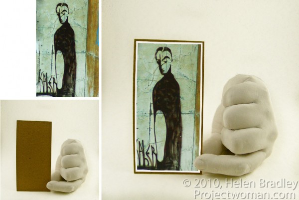
In this post, I’ll show you how to create a simple composite by placing one image in another. Along the way, I’ll not only bend one image to fit its new position but I’ll also show you a layer style trick that overcomes the problem that you’ll see if you scroll down to step 6 and take a look at what happens when I mask the image to make the fingertip show.
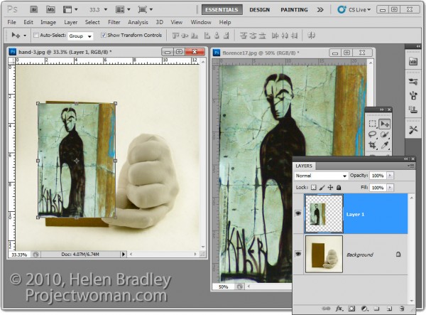
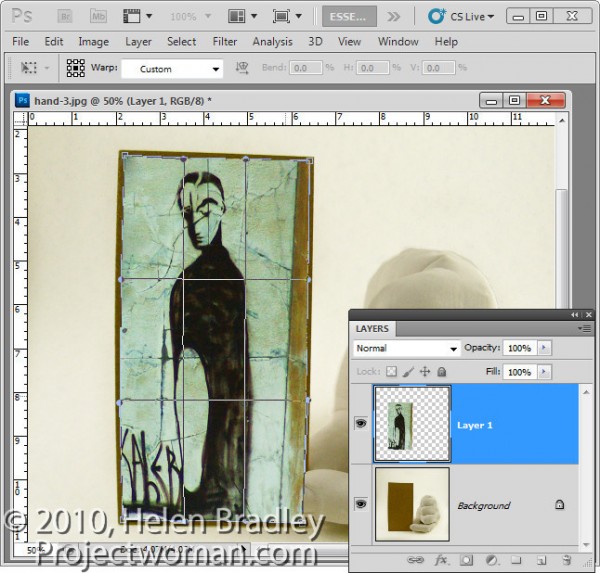
1 To create this composite, open the images to use. We’ll assemble the composite in the image of the plaster hand. Start by dragging the background layer from the photograph into the hand image. It will appear on its own layer and you can now close that image as it is no longer needed.
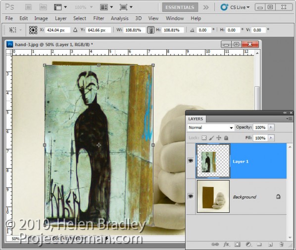
2 Size the imported image to fit where it needs to go. In this case the border will be added inside the image so I’ll make the image almost as large as the cardboard it will be ‘attached’ to.
Size the image in proportion so you don’t skew it. To get it to fit on in dimension it will probably be either too tall or too wide in the other dimension and that’s fine.
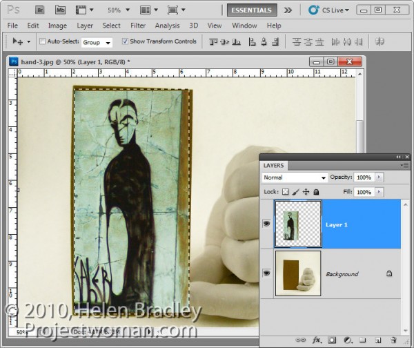
3 Once you’ve applied the transformation, select the rectangular marquee tool and drag over the area of the photo that you want to retain. Choose Select > Inverse to invert the section and press Delete to delete the excess image.
4 To warp the image to fit the shape of the card, select the image and choose Edit > Transform > Warp. This adds a series of warp handles to the image. Drag on these to bend the image so it fits over the area you want to cover.
When you’re done, confirm the transformation.
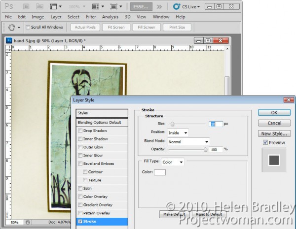
5 To add a white border around the image as if it were a photo stuck to the card, select the image layer, click the Add a Layer Style button at the foot of the Layers palette and choose Stroke.
Set the color to white and the size to a size appropriate for your image. Set the position to Inside so you get square corners on the image (if you choose Center or Outside the corners will be rounded).
When you are done, click Ok.
6 With this image layer still selected, click the Add Layer Mask icon at the foot of the Layers palette.
Select a medium hard brush, set the foreground color to black and paint on the mask to reveal the finger on the underlying layer. This makes the finger look like it is above the image and not behind it.
One simple way to do this is to hide the photo layer and use a tool like the Quick Selection tool to select over the finger on the background layer. Then, with the selection in place, display the top layer and select its mask. With black as the foreground color, press Alt + Backspace (Option + Delete on the Mac), to fill the selected area on the mask with black.
You’ll see that we have some problems with the mask because it distorts the stroke around the picture. We want the stroke applied to the image and we don’t want the mask to have any effect on it – right now it is having an unwanted effect.
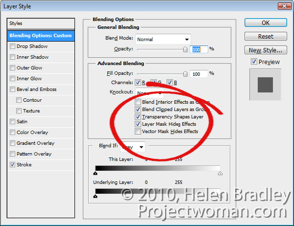
7 To solve the problem, double click the Effects entry in the Layers palette to open the Layer Styles dialog. In the Blending Options area of the dialog, select the check box for Layer Mask Hides Effects.
This configures the mask on the layer to hide not only the image content on that layer but also a style applied to that layer.


