Friday, September 13th, 2013

Photoshop – Hold your own photo collage

Learn how to make a collage effect showing a hand holding a Polaroid photo over the top of your own original photo. The process can be done in practically any version of Photoshop. It uses some simple masks and selections.

Transcript:

Hello, I’m Helen Bradley.

Welcome to this video tutorial. In this tutorial I’m going to show you how you can create a collage image that shows you holding your own photo. Before we get started let’s have a look and see the effect that we’re looking for.

What I have here is a Polaroid frame and I’ve extracted a portion of the image underneath to place inside the frame. And we have a hand here looking as if the Polaroid image is being held over the top of a scene.

So this is the image that we start with. We’re going to add a hand to it and also a Polaroid frame which we’re then going to fill with our image. We’re going to finish off with just a little bit of shading to help the realism of the situation. So, if you’re ready let’s get started.

To create this effect you’re going to need three images. You’re going to need your main starting image, an image of a hand and an image of a Polaroid frame. Now this image I shot on the street front in front of my house. All I did was hold  my hand up as if I was holding something and then shot it with a macro setting on the camera because that allowed me to focus at that hand.

Now the Polaroid image is from a website. I got it from this Deviantart.com website.

There’s a person there who has a Polaroid image. You’ll just open the Polaroid image up, right click and choose Save Image as. And I’ve got the link for that in the description for this video. So once you’ve got all three images open you’re ready to go.

Now I’m going to start by just dragging and dropping the Polaroid image into my main image. So here’s my main image. I’m just taking the background layer and just dropping it in and then I can move it and resize it.

Now if I’m resizing it I want to do that with the Shift key held so it’s constrained in the correct proportions. I’m just going to place it loosely where it’s going to go. Now with the hand image I don’t want all of the detail because this is straight out of the camera. So I’m just going to crop it fairly tightly so the only bits that I’m going to work on are the actual bits that I need in my image.

So I’m just going to crop it there and then just drag and drop it into position. So once we’ve got the three images all in one we’ve got a lot less stuff hanging around on our desktop. So the first thing I’m going to do is deal with the hand. So I’m going to turn off the other layers, click on the hand layer and I’m going to use the Quick Selection tool.

It really, if it works for your job, it’s the best tool to use because it’s quick. And so I’ve just gone too far there and we’ve selected everything. But let’s just go and deselect the hand. If you select a bit more than you need you can Alt and drag with the Quick Selection tool to deselect an area. So now I have all this outside edge selected and I could either delete that or I could mask it.

And since I’m going to need a mask later on I may as well just mask it for now. So I’m just going to click the Mask icon. Now the mask has gone in the wrong way around but all I need to do is to tap on the mask layer and Ctrl I to invert it.

Now it looks like I’ve got a bit of extra here. So I’m just going to select the black color here and just paint out along this line to make sure that it’s all gone, ok, so I don’t have anything trailing and I’m just going to move my hand back into the very corner of the image where it’s going to go. Now we can go and focus our attention on the Polaroid frame. Again, I’m going to turn everything off, focus on the Polaroid frame layer and again I’m going to use the Quick Select tool just because it is so good.

So I’m just going to select around the edges of this Polaroid because it comes in with quite a bit of edge detail and we don’t want that. All we want is the white Polaroid frame itself. So I’m going to need to get rid of that edge and we’re also going to want to select everything in the middle here so that all that is left is the white frame. Now let’s learn from the last mask that we created.

The last mask we created when we selected the background and just clicked the Mask tool what we got was a mask that gave us the background, the selection and nothing else. So let’s just undo that and this time if we Alt Click on the layer mask we’ll get a layer mask that actually shows us the frame and not the excess.

Now again, we’ve got some trailing little bits around the edge which is a bit annoying. But with black as my paint color I’m going to click at one end of it, Shift Click at the other and there’s a bit of a strip down here too. I’m just going to get rid of those so that I have just the frame itself. And now we can go ahead and we can bring back in our hand and we can have a look at the frame over the top of the image. So you can see how everything is starting to go together.

The next thing to do is to position this frame pretty much where I want it to be.

Now I’m going to want to tilt it. Before I do that I want to grab a selection of the middle of the frame so I can then go and get the image of Sacre Coeur that I need. So I’m going back to my Quick Select tool. I’m going to make sure that the polaroid itself is selected, that layer, not the mask, just the polaroid and I’m going to click inside it with the Quick Select tool so I get a selection of the area that is the inside of the polaroid and turn everything back off again.

And you can see my selection is in place. Now if I just wanted exactly the same size I could go ahead and make a copy but I actually want my Sacre Coeur to be a slightly different size in the frame. So I need to transform this selection. So I’m going to Select and then Transform Selection because that allows me to make the selection bigger so the portion of Sacre Coeur that I’m going to take will be scaled down inside the Polaroid frame.

So I’ve not only scaled it by holding the Shift key as I’ve sized it up but I’ve also positioned the selection exactly where I want it and I’m going to click the Transform or the Commit tool here. Now I want this image but I also what my background so I sort of want my cake and eat it too. So then I’m going to make sure that I have the background selected and I’m going to do Layer > New Layer via Copy.

And what that gives me is not only my original background layer but also a layer that has just this image on it. And so now I want to size it and position it inside this frame. So I’m going to turn everything off except for the Polaroid frame and the image portion. I’m going to make sure that the image itself is selected and click the Move tool. And now I’m going to size it down. I want it just the right size for fitting inside this Polaroid frame.

So it can be a little bit larger than the inside of the frame because it’s in a layer behind the frame but I won’t want it so large that it’s falling over the edges. So we just need to get it in the right position. So having done that I’m going to select the Polaroid frame layer and the picture layer and just tilt it. And now when I turn everything back on we can see how it’s all fitting together. And you can see that it’s probably not in the ideal place still.

So I’m going to with those two layers selected – actually I think I’m going to move the hand. I think it’s the hand that’s the problem more than the image itself so I’m just going to move the hand back down. And now let’s go to the Polaroid and the image and we’ll just move them over a little bit and perhaps even square them up a little bit more.

So I want it where it is going to appear held in my hand. So now let’s go to the image itself and let’s make the image a little bit different so it’s obvious that it’s a Polaroid and not the image behind. I’m going to do this using an adjustment layer with Layer > New Adjustment Layer and I’m just going to choose a black and white adjustment because this allows me to convert the image into black and white.

In fact everything is going to black and white and I’m not worried about that. I’m only focusing on what’s happening inside the Polaroid because we’re going to limit this fix in a minute just to the Polaroid. So I’m going to darken the sky up and lighten up the building a bit. So let’s call that done. And now we’re going to create a clipping group of that which will limit this adjustment layer to only affect the layer below.

And to do that we select the adjustment layer and choose Layer > Create Clipping Mask. Now you can see that this is clipped to the layer below. Now I don’t want it to be black and white. I just want it to be a little less than full color. So I’m just going to drag down the opacity of this layer so that we get the distinct impression that this image inside the polaroid frame is a different image to the one that we’re actually seeing.

Now we just need to sort out the hand issue. And the problem with the hand is that the polaroid frame is behind the hand and we’re not getting that sense that the hand is actually even holding the frame. So we’re going to zoom in. So I’m going to click the Zoom tool with the letter Z and then just zoom into the image and move it around by holding the Spacebar. We already have our mask and the mask will be white where the image is showing and black where it’s not showing. So we want to start painting with black and I want a brush that is fairly hard.

So I’ve got a small, hard brush here and what I want to do is start painting on the mask layer in black to remove the finger where it shouldn’t be. Now it’s a little bit hard to see exactly where it shouldn’t be so I will generally paint out too much of it and then go back and fill it in again. And if I go too far I can just fine-tune that as I go.

And I may want to move even more closely into the image to do this. I certainly will want to size my brush down quite a bit. Now you’re going to do a better and more considered effect than I am because I’m just trying to do this for the sake of the video but you’ll be able to do a better job of this. You obviously – I’ve taken the wrong part of the finger out here.

Let’s just deal with my stupidity here. This is a much better idea. Let’s take the part of the finger that is in front of the Polaroid and then let’s get back the portion of the finger that is behind it. Hum, much better, ok. Now we’ve got some problems here.

Again, this time now I’m getting too much of the background in but I can just deal with that. And then I’m going to get in close here as well. And I would get a bit more of this skin because this is actually the second finger showing behind. We want to ease that off a little bit so we don’t get quite that effect. And part of this is the roadway too. Now having done that let’s just zoom out and see where we’re at.

We’re pretty near done on this. The only thing that concerns me is that there probably would be a bit of shadowing around here. So to put the shadowing in I’m going to add a new layer. I’ll just click the Add New Layer icon, I’m going to select a brush and then I’m going to select a sort of brown paint color. And you can sample this from the image if you want to. Just click on something that’s sort of brown. And then we’re going to paint in where we think that there would typically be a bit of a shadow. And there might be perhaps a bit of shadowing here as well and maybe even across the top of the Polaroid itself.

Now obviously the opacity is going to be reduced enormously. We’re going to take it right down. And we could use multiply if we wanted to just to blend it into the layer below. And then I would just get the Eraser in to just neaten up the edges so that you can take out the effect where you don’t want it to be.

This Eraser has got a reduced opacity which is not helping me here right now, just take out the effect where you don’t want it leaving it in where you do what it. And you fine-tune this. You can also go ahead and soften the edges of the brush so that you sort of peter out this effect so it’s not totally at 100 percent at the very edges. So you can soften the shadow effect a little bit and soften it under here.

But that shadow effect it might be very, very subtle but it will make a big difference in the final image. So let’s just zoom out again and here is our hand held photo. We’ve done this using a Polaroid frame that we downloaded from the web. We’ve copied a portion of the image and adjusted it within the frame so it looks as if it is a Polaroid image and then we’ve placed everything over the top of our underlying photo.

Now apart from a little bit of tidying up for example I can see I’ve still got a slight edge down here that I need to deal with, that’s pretty much the effect that we’re going for. I’m Helen Bradley. Thank you for joining me for this video tutorial. I encourage you to subscribe to my video channel so that you’ll be advised when new videos are release.

And visit my website at projectwoman.com for more tips, tricks and tutorials on Photoshop, Illustrator, Lightroom, Photoshop Elements and a whole lot more.


Helen Bradley

Tuesday, August 27th, 2013

Make an illustration in Photoshop using free fractal tree brushes

Learn how to download and install free fractal tree brushes and a texture and see how to use these to create your own Photoshop art.

Covers how to install brushes in Photoshop. How to add new layers, how to use masks and a gradient fill. Also shows how to add a drop shadow and an outer glow layer style. The land is created using a filled shape and made more organic using the Warp transform feature.

Transcript:

Hello, I’m Helen Bradley.

Welcome to this video tutorial.

In this tutorial I’m going to show you how you can download and install the fractal tree brushes from projectwoman.com and how you can use them to make art in Photoshop.

Before we get started with this project let’s look and see what we’re going to do.

We’re going to create an image that’s something like this.

It uses one of the fractal tree brushes and also uses part of the brush to create a sort of highlight effect that is the result of the sun going down.

So we’re going to add our tree and then we’re going to make this sort of background look with this blue fill background and we’re going to use the texture that we’ve downloaded.

So I’m going to show you how you can put it all together using the brushes and a texture file.

I’m just going to tuck this away for now and let’s have a look and see where we’re going to get the bits and pieces that we need.

Well first of all we’re going to flicker to some images that are offered by a gentleman called Skeletal Mess and we’re going to download this image.

And it’s in his 2009 texture of the day.

So here it is, texture of the day 2009, and this is the one that you want.

So just click on it, from Actions choose View All Sizes and then you can just go and download the largest size of this image or the original.

It doesn’t really matter too much.

I’m just going to work on the larger size one for now.

So I’m going to open the folder that it has been stored in and its here.

And I’m just going to open it in Photoshop so I’m going to right click and I’m going to open with Photoshop CS6.

Well it’s not in the list there so I’m just going to go and grab Photoshop and we’ll just drag and drop it in there.

Okay, so the image is now in Photoshop and now we need to get our brushes.

And they’re available on my website so that is at projectwoman.com.

So you’re going to projectworman.com and click here on the Free Photoshop Brushes option and just scroll down because the ones we’re looking for here are the rendered fractural tree brush set.

So click on that and then click here to download the brush set and that’s going to download to your Download folder.

And what you’ll do then is just double click on the file so that you can locate and expand the fractal tree brushes file.

And you need this in Photoshop so again I’m going to tuck this just out of the way for now and open Photoshop because there’s a quick and easy way of installing brushes in Photoshop that I want to show you.

So the way I install brushes in Photoshop is to first go and get the brushes option here.

So I click on Brushes and I’ll choose the brush dropdown list here and then click here and go to Save Brushes.

And what that does is it shows me the folder where Photoshop brushes are saved and you can see here that it’s a long string of folders that you need to go through.

But it’s easier if you just open this up in Photoshop and then what you’ll do is you’re go and get your file, your brushes file that you downloaded and then just drag and drop it.

Now my machine is playing games with me right now so I’m just going to make Photoshop a little bit smaller and bring up my brushes file at the same time which is hiding all the way around here.

So let’s just go and get the brushes again and we’re going to open this up.

I’m going to go to Save Brushes.

So I open this folder.

Here are my fractal tree brushes and I’m just going to drag and drop them in there.

So that’s done now.

The brushes are installed where Photoshop can find them.

So what I need to do now with my brushes palette is to go and open that set of fractal tree brushes.

So here are the fractal tree brushes and when Photoshop asks me if I want to replace the current brushes, cancel or append I’m just going to select append because that’s going to add them to the very end of my brushes collection.

Now, I’ve added them twice but they’re here now.

So we’re ready to get started and create the effect that we had on this image here.

So any time that we work with an image like this we’ll want to be working on a new layer to paint our tree so I’m going to add a new layer.

I’m going to go and get my tree.

I’m just going to choose a tree to use.

I think this one this time.

I’m going to size it up using the open square bracket key and I’m going to select black.

So I want to be looking at my swatches.

So I’m going to select black as my foreground color and let’s also go and get our tools so that we can see what we’re doing here.

So I’m going to paint with black on this layer and I’ll probably press it a couple of times in the same place so I make sure I get a really dark tree there.

Now what I’d like behind the tree is some sort of a sort of land mass if you like so I’m going to select the Rectangular Marquee tool here and on a brand new layer I’m just going to drag out a rectangle behind the tree.

I’ve add a new layer below.

And I’m going to select a sort of dark reddish color as my foreground color.

That’s a sort of maroon.

Let’s go a bit more for dark red.

And I’m going to fill that layer with this.

Since it’s my foreground color I can press Alt Backspace, Option Delete to fill that layer.

To blend it in I’m just going to use the multiply blend mode because that gives me a darker sort of effect.

Now this is probably not dark enough for me so I’m just going to open the color up and let’s select a much darker version and again Alt Backspace, Option Delete.

So now I’ve pressed Command D to deselect the selection.

Now the land mass is a little bit too regular for me so I’m going to Ctrl Click on this layer and choose Edit and then Transform and then Warp because warp allows me to create a sort of a bit more organic land mass.

So I’m just going to do that very, very simple, not very much happening there at all.

Now we need our setting sun so again a new layer.

I’m going to select a sort of lighter color.

Let’s go for a sort of lighter orange color.

I’m going to use the Elliptical Marquee tool and drag a circle by holding the Shift key to constrain the ellipse to a circle.

I want to move it into position so I’m going to hold the Spacebar as I move the circle down into position, let go of the Left Mouse button and then let go the Spacebar and the Shift key.

Again, this orange is my foreground color so Alt Backspace, Option Delete on the Mac will fill the shape with this orange color.

Again, I think it’s way too light so I’m just going to redo that with a darker color.

Now I want my sun to be behind my land mass so I’m just going to drag on the sun layer and move it behind the land mass layer.

Now I think I’ll blend my sun in a little bit so I’ll probably select multiply as the blend mode to darken it.

And I also want to add a slight glow around the edge so I’m going to select the Add Layer Style option.

I’m going to add an outer glow here.

The white is not the color I want.

I really just want to grab the color that I had for the sun and maybe just go a little bit lighter than that as my outer glow.

Size is really the sort of ambit of the glow.

It’s not really how many pixels it is.

It’s a bit more feather than anything.

And spread is a bit more pixels.

So I’m just going to add that glow in.

And I can also multiply it if I want to so I can get a sort of darker glow.

Now I’m trying to keep things pretty light right now because I don’t want to be working on a totally dark image.

But what I do want here is I really want the tree all over.

Again, I want a sort of drop shadow for the tree.

So, one of the ways that I can do this is by just adding a light drop shadow layer.

2,368So I’m going to add a layer style.

I’m going to choose drop shadow but instead of doing a darker drop shadow I’m going to do a lighter drop shadow.

In fact let’s just sample the color from the sun for this and maybe just go a little bit lighter than that.

Maybe a little bit more yellow still, okay.

And this is going to be a drop shadow.

And we want it to look as if it’s coming from the sun so it’s going to be out this direction.

But we’re going to screen this because we want it to be lighter and we also don’t want it to be both sides of the tree.

So we’re going to just play around with the spread and the size until we get the slightest suggestion of lightening on this side of the tree but not too much, probably about 4 pixels.

Something like that looks pretty good to me so I’m going to click Ok to select it.

Now what I want is to be able to work on this shadow independent of the tree itself so I really want to move the shadow to a new layer.

So I’m going to right click that and choose Create Layer.

And what that does is it creates the drop shadow as a new layer so I’m just going to click Ok.

So here’s my drop shadow on a new layer.

And because it’s on a new layer I can add a mask to it by clicking the drop shadow layer and click the Add Mask icon.

I’m going to select my brushes.

Let’s just go and grab a brush.

And this time I’m going to select a soft, round brush, something like this, make it a bit larger.

I want to be painting with black because I want to paint out this shadow area and make sure I have the mask targeted and on this side of the tree I’m just going to remove the shadow.

Now because this is a mask layer I can switch and paint with white and I can bring the shading, the highlighting back anywhere I want it.

So I can just paint it on or off as I wish.

I think too I’m going to soften this edge because I think it’s a bit harsh.

And again a mask will do that.

Just click on the layer, click on the layer mask, click on black paint.

This time I’m going to reduce my opacity way down and just gently tip over the edge here, press X to go back.

So I can make that as dark or as light as I want and I can just sort of blend that in to the background by just switching colors, painting with black on the mask to blend it, painting with white to bring it back again.

Now what I did on the original image that we haven’t done right now is to add a blue to white layer over the top of this background layer to just blend everything in so I’m going to that now.

I’m just going to add a new layer.

I’m going to select the Gradient tool and then I’m going to select a sort of darkest blue.

I’m thinking it needs to be a bit darker and a big grayer than that.

So that sort of color blue to white.

So I’m just going to select white here or a light blue.

It doesn’t really matter too much.

And then we’re going to use the gradient to apply that.

So let’s just have a look.

We’re on this foreground to background gradient.

We have linear gradient selected.

We have the layer here and I’m just going to drag to fill it with the gradient.

And I’m holding the Shift key down as I do so my gradient goes in nice and level.

Now it’s going in blue at the top, white at the bottom and I’m just going to blend it using the multiply blend mode.

You can see that my edge here is way too much but we can go back and fix that, again with brush and again, painting with white this time.

I’m just going to be painting on this mask and just bring back that edge a little bit and then we could fix the tree up.

So there you have a small project that you can do using the fractal tree brushes to create a sort of sunset landscape image in Photoshop.

You now know how to download and install the brushes.

And you can find this interesting texture online at Flickr to use and you can go and create your own art in Photoshop.

I’m Helen Bradley.

Thank you for joining me for this video tutorial.

Look out for more of my video tutorials on this YouTube channel.

And visit projectwoman.com for more tips, tricks and tutorials on Photoshop, Lightroom, Illustrator and a whole lot more.
Helen Bradley

Wednesday, May 15th, 2013

Photoshop – Collage Effects with Blend Modes

Learn how to combine two images to make a collage. Includes use of Blend modes in Photoshop, color range color selection, clipping mask, layer mask, hue saturation adjustment layer, drop shadow layer style.

Transcript:
Hello, I’m Helen Bradley. Welcome to this video tutorial. In this tutorial I’m going to show you how you can create some simple collage effects using blend modes in Photoshop. This is the effect that we’re going to create in this video tutorial. I’m going to show you how you can put the pieces of this together in just a few minutes using a couple of images and some blend modes.

We’re going to start off with this image and another one that I shot at the neon boneyard in Las Vegas, and that’s giving us the texture. And we’re going to combine these two images with a blend mode. And then we’re going to extract the color from this original image, this sort of orange color. And we’re going to recolor it using a Hue/Saturation adjustment layer. But if we wanted to leave it at this point we could leave it just with that additional color. And we’ll also going to add a drop shadow with a different color behind it.

So let’s see how we would create this effect. And I’m going to start with my two images, and I’m going to put one image into the other. So I’m going to grab this neon boneyard image and I’m just going to drag and drop its background layer in on top of this original image. I’m just going to size it so that it’s right over the top. And the first thing I would do with a collage like this is look and see what sort of opportunities I had with blend modes.

So I’ll generally select the first blend mode in the list, Dissolve, which generally gives me nothing at all. And now I can just arrow down and see what happens when I click on each of these blend modes. And all I’m looking for is something interesting. And you’ll generally get a better effect with this if you use images that are a little bit more textural and a little less like something where you don’t really particularly want to bring out of the image exactly what was in it. But you want to discover how these two images can interact with each other and what you can do with them as they interact. So that’s all the way down through the blend modes. And so I’m going to go back up and I’m going to settle on something that I want to use. And generally the most interesting bits are going to be in the overlay or the contrasty area. So in this area and sometimes even with lighten and darken.

So let’s just go up through these and find something that we like. And I’m thinking actually I might like something like this perhaps with the Opacity dragged down a little bit. Now what I want to do is to bring out the orange color in the original flower so that I can lighten them a little bit in this layer here. And what I’m going to do is create a duplicate of the background layer. And I’m going to drag it above the image. So right now all we’re seeing is this original background. And what I want to is to select the leaves in it.

Now the leaves are really bright colored here. So I’m going to choose Select. And in this case I’m going to use Color Range because it’s going to be the easiest way to select these leaves. Now either I can select on the sampled color and add to it this way by just clicking on these leaves or I could use just the reds and just grab the reds. But I think Sampled Colors is actually going to give me a slightly better effect here.

So let’s just go back to this and let’s choose Sampled Colors here and just click Ok. Now that has isolated the leaves here and what I want to do is to keep these leaves but drop the rest of the image out. And I’ll do that with a mask. And because my leaves are selected, all I need to do is to click on the Add Layer Mask icon. And what happens is that the leaves are then masked and left behind and the rest of the image is just dropped away. So this is the before and this is the after. And you can see we have brought in the color from these leaves.

Now if we wanted to we could even lighten this color. We’ve got some of the orange color in. But we may want to brighten it up even more. So I’ll make sure that my image layer is selected and choose Image, Adjustments. And then I could use levels or curves. I’m going to use levels, and I’ll just lighten this is a little bit and click Ok. Now in the earlier image that you saw we had actually colored these blue and it’s very easy to color them blue.

To do that we’ll choose Layer, New Adjustment Layer and we’ll choose a hue/saturation adjustment layer and just click Ok. Now I want this adjustment layer to only affect the red leaves so I’m going to clip this. So with this adjustment layer selected I’m going to choose Layer, Create Clipping Mask. And so anything that I do to this adjustment layer here is only going to affect the layer below, just these red flowers. So now let’s double click on the Hue/Saturation adjustment layer and now we can go and make some changes to it. And I’m looking for a blue color which will either be at this end or this end of the hue slider. So I can get to either this sort of greeny blue if I wanted or I can get to a sort of purplely blue. I’m thinking the greeny blue will be pretty good here. And now I can adjust its saturation and its lightness from here. So when I have what I like I’m just going to close that dialogue. So that has recolored those leaves to a bluey color.

And finally let’s add a drop shadow behind the leaves. So I’m going to select the leaf layer, and I’m going to choose a drop shadow effect. Now drop shadows might start out being dark but they don’t have to end up being dark. So what I’m going to do is go and find a really cool color for this drop shadow. And I’m thinking a really, really bright pink will do me. So let’s choose that. And I want to up the opacity of this. I could set it to normal so it’s going to be a very, very pink shadow. And then I’m going to adjust the settings for this. Spread is going to be the size of the shadow and softness or size is going to give me some softness. But there’s a very small sweet spot here on this that I can very, very easily exceed. So I’m just going to add my shadow in. And I think I’m going to multiply blend mode my shadow, not apply it with the normal blend mode. Although I could use normal for example with a much lower opacity if I wanted to give it this sort of pinky color. I might leave it at that.

So there’s a way of creating some interesting collage effects. And all we’ve done is grabbed a couple of images and put them on top of each other and blended them with something that counts as being an interesting blend mode. And then I isolated the orange flowers in the image and brightened them up. I also added a drop shadow in a very contrasty color. And I added to a hue/saturation adjustment layer that only effects these orange flowers to use the brightness of them but to color them a different color. And you can do all sorts of things by just combining images. And that gives you lots of practice at making color selections, using clipping masks, using masks, using blend modes and just having a little bit of playtime and a little bit of fun creating interesting effects in Photoshop.

I’m Helen Bradley. Thank you for joining me for this video tutorial. Look out for more of my tutorials on this YouTube channel and please like and comment on the tutorials if you would. Also visit my website at projectwoman.com where you’ll find more tips, tricks and tutorials on Illustrator, Lightroom, Photoshop and a whole lot more.
Helen Bradley

Thursday, March 28th, 2013

Photoshop – Create Fractal Trees online for your Collage

Learn to use recursivedrawing.com to create a fractal tree that you can then use in a Photoshop collage. This video shows you step by step how to create the fractal tree and then how to copy and paste it into a Photoshop collage. Also, how to blend it seamlessly into the collage document.

Transcript:
Hello, I’m Helen Bradley. Welcome to this video tutorial. In this tutorial I’m going to show you how you can create fractal trees online that you can then use in collages and other images in Photoshop. This is the kind of recursive tree that we’re going to draw. And one of the benefits of this is that we can grab it and use it in a Photoshop image.

So let’s have a look and see how it’s put together. It’s put together with a single rectangle that’s a long rectangle and then we’re just going to draw it as a fractal tree. So I’m just going to click down here, this plus sign, to get started with a new image and let’s start with our first tree.

To create a tree we’re going to start with a rectangle or square and drag it to make a nice long thin rectangle which is going to be the trunk of the tree. And I’ll just place it in position at the bottom here. Then I’m going to go and drag this element which is the element I just created but this time I’ve got multiple versions of it. I’m going to push it so that I make this sort of recursive element.

Now it is really easy for this tree to get away from you. And if it does just stop it and just go and start again until you get really used to the tool and what it’s going to do it because it can behave really, really recursive and go everywhere really, really quickly. So I’ve now got that part of the tree. Now I’m going to go and grab the tree back again because I want it in here. And this is usually where if I’m going to lose it I’ll lose it at this point. But let’s call that good for our tree because that actually is quite a good tree. You’ll watch it until it’s finished drawing and when it’s finished drawing you won’t see any more changes around the edges.

So this is looking pretty good to me so I’m going to press the Print Screen key to take a screen print of it. And now I’m going to launch Photoshop. In Photoshop you can see I’ve already got a few trees hanging around. I’m going to choose File and then New and then click Ok because that is an image now the size of my clipboard. So all I have to do is do Edit Paste. And here is my tree.

So the first thing I’m going to do is make a selection around the tree itself and then I’m going to choose Select Inverse so the rest of the image is selected and I’m going to delete it just to get rid of it. I’m also going to get rid of the background layer so all I have right now is the tree itself. I’m going to select the magic wand tool and I can just click on the white and just press Delete and that will get rid of all the elements except the tree itself. And at this point I can just crop it down to size.

Now I would save it at this point because that means I’ve got a tree then I can use in anything in future. Now I have a texture image here and it’s a pretty big texture. And this image is pretty small so I’m probably just going to reduce the size of this down say 50 percent so that our tree is going to look a little bit better on it. With the texture image and the tree image both visible I’m just going to drag the layer of my tree image onto my texture. And here it is. I’m just going to make sure that I move the tree and not the background.

Now if you find that there’s a little bit of haloing around the edges of your tree so if you brought in a little bit of white that you want to get rid of you can do so. And the easiest thing probably is just to set this blend mode to darken because what that does is the white pieces on the tree anything that was a sort of legacy piece of white isn’t going to be brought in because it’s going to be lighter than the background.

So there are all sorts of trees that you can create using that tool. You can be successful and less successful depending on how you go. You can see I’ve got some really nice trees and I’ve got some pretty horrible ones as well. But that tool can be used to create fractal trees that you can then access to use in your images in Photoshop this way.

I’m Helen Bradley. Thank you for joining me for this video tutorial. I hope you enjoy the recursive drawing tool. Look out for more videos on my YouTube channel here and visit projectwoman.com for more tips, tricks and tutorials on Photoshop, Photoshop Elements, Illustrator, Lightroom and lots of other handy graphics techniques.

Helen Bradley

Saturday, March 23rd, 2013

Photoshop – Masking 101 for Use in a Collage

Learn to use Masks in Photoshop. Here we look at how to collage a series of images together, using masks in Photoshop.

Transcript:

Hello, I’m Helen Bradley. Welcome to this video tutorial. In this tutorial we’re going to look at Masking 101. So we’re going to get you started with masks in Photoshop.

In this introduction to masks I’m going to show you how you can use masks to create images like this collage image. This collage image has been built up from a number of images and they’ve all been masked so that everything can appear nicely on top of each other.

The first image was the tail end of some cows and then I added an image of a tree. And this image has been masked so that we can see part of the cows’ tails behind it. But you can see that these two images are sort of blending into each other with this mask effect. Then we have the cow by herself and again we’ve masked her so that we can see the image of the tree behind her. And then we’ve added an image of some hay over here, and again added a mask to the hay image around the edge of the cow so that we’re getting this sort of almost seamless blended effect all the way across the image. And then we’ve got some milk cans and then finally we had some different effects that sort of tied the whole thing in together. But we’re going to have a look at masks and we’re going to have a look at it doing the last three images in this particular collage, just seeing how that would have been put together.

So I’m going to open the images. I’ve got a couple here open already. I’ve got the milk cans and the hay and let’s just go and get the cow. And I’m going to create an image that these will all going into. I think a thousand pixels is a bit too big so let’s try 800. And to start off with I’ll just drag and drop these images in. But this cow needs to be flipped first of all because I had her flipped in the original. So I’m going to flip her there and then just drag her in here. I’m just dragging on the layers and then just pressing V for the move tool so that I can move her into position. I’m holding Shift as I scale her up to full size. I don’t want to save the cow image. I want the hay image now so I’m going to drag and drop it into position. And I’m going to make sure I’ve got a fairly hefty overlap here because the overlap is going to allow me to blend these images together. And finally the milk cans and drag and drop them into position. And that’s a pretty big image too. I think actually it’s much bigger than the others. I’m pressing Ctrl T and then Ctrl 0, that’s Command T, Command 0 on the Mac, to just re-size these milk cans and just drag them into position.

So I’ll start off with a collage like this by just grabbing my images and just pulling them into position with a nice hefty overlap. And in this case I’m going to crop these images so that we don’t have anything extra hanging around. And now let’s go ahead and do the blending. And I’m going to do this by first looking at this layer here the cow and the hay. So I’m going to zoom into this area so that I can see what I’m doing, move the image across, and I need to mask this hay layer.

So to do that I’m going to click the Add Layer Mask icon here and that adds a mask to the hay layer. I need to have that mask selected. I need to select a brush to use. I’m just going to make sure that I have a brush here. I’m looking for a sort of solid-ish brush. This is a hard mechanical 38 pixels. Now it’s too hard but I can soften it by just taking down its hardness to make it nice and soft. And then I’m going to make sure that my mask layer is targeted and I’m going to set these colors here to their defaults by pressing the letter D.

Now we can already see that if this mask is white we’re seeing the hay. So that means if I want to see the cow I need to paint on it with black. So I’ve got black paint now. I’ve got the mask targeted and I’m painting on the mask where the cow is to bring the cow back in through the grass. Now I’m not going to be a 100 percent fussy at this stage because one of the benefits of using masks is that we can come back later on and edit it. So I’m looking for the edges of the cow but I’m not worried that I’m getting a bit of extra green here because I want to know where her edges are so then I can get a little bit closer to her in a minute. So I’ve got her pretty much there.

Now I just need to neaten it up. And to neaten it up I’m going to switch to white being my foreground color. I’m going to get a much, much smaller brush, make sure I’ve got my mask targeted and I’m going in close to the cow’s face here to make sure that I get an edge that gives me none of this green because it’s a really, really bright green that she’s standing on. And it’s not really doing a lot. The hay image I think is the prettier image. So again I’m just going to get close in to her here. Now this might take me half an hour to do to get a really nice result and the sort of result that I want. And I can also start working with a larger softer brush so I can make sure that I have it even softer. And I can work with a lower opacity if I want to and I can even paint in mid gray because with masks you can paint in black or white or any shade of gray because a mask is a gray-scale image. Now I’m just having a look at these milk cans. And I think that probably there’s one too many. So before I go much further I’m going to select the milk can layer and get rid of this first one because I don’t really like it that much. Now I’m going to grab the next three, I’m just going to move them over a bit.

There’s a bit of excess image hanging around but I’m not too worried about that. I’m going to add a layer mask to this layer. So now we have the overlap. And I want to bring the grass through the milk can so I’m going to paint on this layer again in black and white. So again a nice big brush, I’m going to switch colors by pressing the X key because I want to blend these images in together. I want to sort of suggest that there’s a seamless transition from one image to the other. And I’ll do that with a very soft edge so we almost can’t see where the grass image ends and the milk cans begin. And with this particular image I found that there was enough shine on the milk cans that we could perhaps even suggest that the grass image was showing through the milk cans. And I’m doing that by just adjusting down the opacity of the brush. So I’m not painting it full opacity and I’m just tapping where I want perhaps a little bit of the grass image to appear, again to really blend these images together. And if I’ve made a mistake and if I want to go back then all I need to do is change my paint colors and I can go back and paint out the effect that I’ve just painted in. And I can do this over and over again until I get the exact effect that I’m looking for.

Masks are a handy way of blending images in a way that allows you to come back later on and make changes to it. If I were saving this masked image because I want to make changes to it later, I want to come back and work on it a little bit later, I would do so by saving this as a PSD file. So I’d choose File and then Save As and make sure that when I’m saving it, it’s being saved as a PSD image. That will ensure that the masks and the layers are all there when I come back next time. The biggest mistake you’re going to make when you’re working with masks is when you actually work on the image instead of the mask itself. So if you start seeing that you’re painting in black, that’s telling you that you have the image layer selected not the mask layer. If you’re working on a mask you really need to have that mask layer selected.

I’m Helen Bradley. Thank you for joining me for this video tutorial. Look out for more video tutorials on this YouTube channel and visit my website at projectwoman.com for more tips, tricks and techniques with Photoshop, Photoshop Elements, Lightroom, Illustrator and lots more.

Helen Bradley

Thursday, March 14th, 2013

Photoshop Collage with Textures, Masks, and Fractal Trees

Learn how to make a collage or montage in Photoshop using fractal trees, a texture image and some masks.

The images used in this video are free to download and an earlier video shows you how to make fractal trees so you can make the collage yourself. The tutorial covers beginner level masking to help make the collage and two pieces are created from the same basic elements.

This is the link to the video that shows how to create fractal trees to use in Photoshop collages: http://www.youtube.com/watch?v=_hTWkhHI90s

Transript:

Hello, I’m Helen Bradley. Welcome to this video tutorial. In this tutorial we’re going to look at using masks, textures and some fractal trees to create composite images in Photoshop. In this video tutorial I’m going to show you how you can create a couple of interesting effects just using images that you can find online.

The background image here is from Flickr and details are in the end of the video. And the house image is actually from sxc.hu, and again I’ve got details at the end of the video. The tree is a fractal tree and you can see one of my other video tutorials for how to create fractal trees. And this is just done with my masking so that’s one of the images we’re going to create. We’re just going to reverse the mask here to create this image. So let’s see how we would do that and I’m going to start by showing you the two images we’re going to use. This is the one from sxc.hu which is free for download online and this is the background from Flickr.

The first thing I’m going to do is just to bring this image in so I’m just dragging on the background layer and just bringing the image into my sort of collage area. Now what I wanted to do was actually line up this background and it actually worked perfectly. These images haven’t as far as I’m aware actually been adjusted from their downloaded original. But the horizon line just works perfectly on the back of this texture image so I’m just going to do that and then we’re going to mask the house. Now the easiest way to mask this house is probably to grab the quick selection tool. And with the quick selection tool you can select over those areas of the image that you want to select. And if it’s not perfect you can just go back with the Alt key and just drag over the areas that you want to take out of the selection. But it does a reasonably good job. And because we’re doing masking anyway it’s a little bit forgiving. So having done that we can choose Select and then Refine Edge. And Refine Edge will allow us to refine the edge of this and we can do this with marching ants or on black or whatever.

Now I’m going to ask Photoshop to have another look at some of these edges here because it hasn’t done the world’s best job of getting them right and particularly these edges around the bottom here. And once we’re happy with that if we are happy with it we can just make this into a selection or a new layer with layer mask. So I’m going to choose New Layer with Layer Mask and just click Ok. And that has created the image here this house image as a new layer with its own layer mask. And I can determine how much of this inside that I want to bring in.

So I’d actually thought in the past that actually bringing these windows in would be attractive and perhaps a little bit more worked on the door. And now I want to fill these areas with black in the mask. So I’m going to select or target the mask layer, black is my foreground color so I’ll do Alt Backspace and that allows me to see through the building to what’s behind. And then I’ll just go and open one of my trees. And I have some trees here and I’ll just grab one of my fractal trees, drag it into the image here.

I’ll make sure I’ve got the tree layer selected and drag it into position here. And when we were looking at these fractal trees we determined that actually using the darker blend mode or darken blend mode blended the trees into their background a little bit better because that meant that any residual white in the tree that was left over from the process of bringing it into Photoshop would be eliminated that way. So there’s the first of our images.

So having completed our first image the second one is done in a very similar way. In fact we can borrow the first to make the second. So I’m just going to make a duplicate of the image layer here. And what I’m going to do is just invert the mask so I’m just going to press Ctrl I on the mask and effectively that was pretty much the beginnings of this image. I then brought in the tree so it would be a little bit over the edge and then we’re going to create a shadow for the tree. So the first thing I’m going to do with that is on the tree layer once it’s already set, I’m going to add a drop shadow. And I’m just going to go with whatever I get here because I’m actually not going to use it exactly as it is here so I’m just going to click Ok.

And now I want to take the drop shadow layer off onto its own layer so I’m just going to click Create Layer and click Ok. And that takes the drop shadow back onto its own layer which means I can do things with it such as sizing it down, putting it in position and then rotating it so it becomes more like the kind of drop shadow that it should be. And I want it to come over the background there so I’m just going to click Ok and actually position it a little closer and perhaps even kill down its opacity a bit, multiply blend mode is what I wanted there.

Now on this layer too I had a drop shadow so let’s just go and add a drop shadow to this. Yes, it was a drop shadow but it was a lot smaller than that. So I just gave it a little bit of a softening effect that I wanted, not quite as harsh as it had been. And we could change the color of that if we want to. But I’ll just click Ok.

So there are the two possible effects that we can create using this particular image. It’s just done through layer masks and you can create all sorts of fun collage effects using layer masks in Photoshop. And I’ve combined these with nice textures and these fractal trees. And the beauty of all of this is that these images can be grabbed online. So you can go and create these image effects if you want to yourself by grabbing the images and playing around with these effects.

I’m Helen Bradley. Thank you for joining me for this video tutorial. Look out for more tutorials on my YouTube channel and visit projectwoman.com for more tips, tricks and tutorials for Photoshop, Lightroom, Illustrator, Photoshop Elements and more. And if you liked this please click Like and comment on it and think about subscribing to my YouTube channel.

Helen Bradley

Monday, March 5th, 2012

Templates in Photoshop

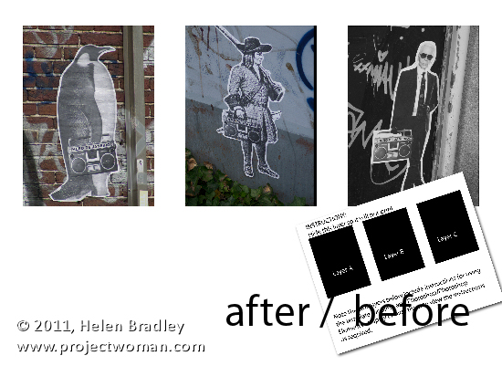
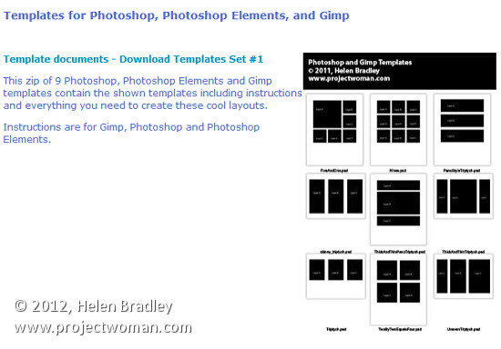
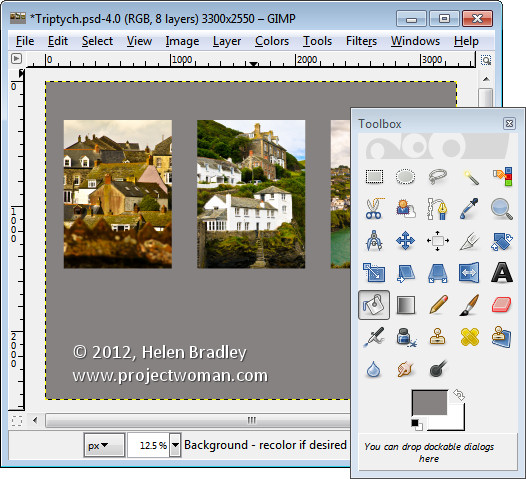
A short while ago I wrote an article on using templates to create a collage or montage of images in Gimp. Sometime after, the templates that I suggested you  could use were taken down from the original website.

To help out our Gimp readers, I created a new set of templates and as I was making them, it seemed like a good idea to include instructions for Photoshop and Photoshop Elements as well as for Gimp. Here, therefore is how to use a downloadable template to create a montage of images:

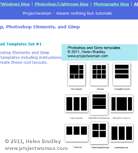
Start by visiting this site and download the template zip file: http://projectwoman.com/articles/45PhotoshopTemplates.html

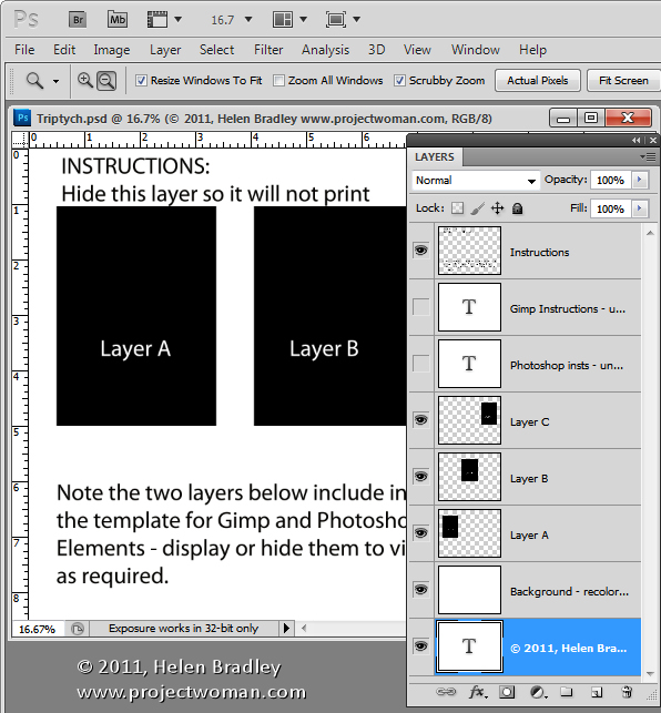
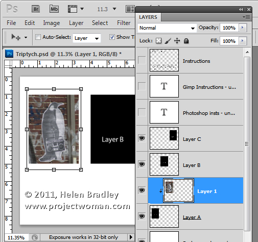
Then unzip the templates, save them where you can find them when you need to use them and open one of them. I’ve used the template triptych.psd.

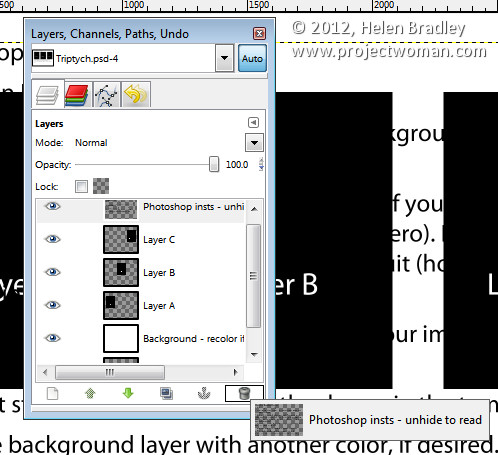
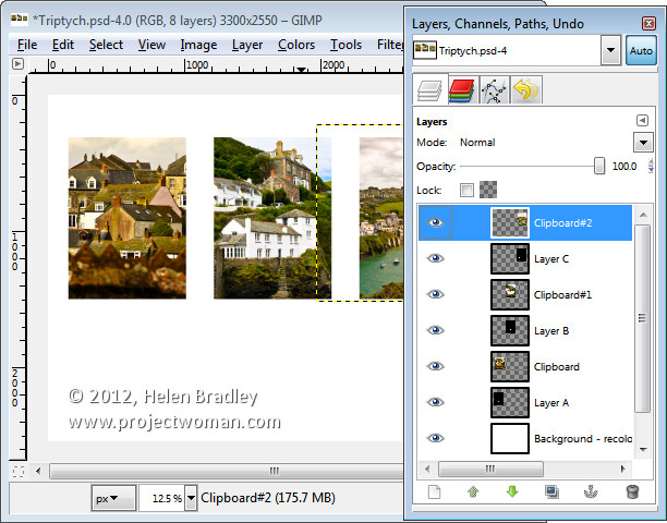
When you open it, you’ll find that there are a series of layers. The top layer can be disabled or deleted at this point. The next two layers are instructions for Gimp and Photoshop users. Again, you can discard these two layers.

Open up the three images that you plan to use for this triptych. Images that are in portrait orientation will look best but you can use anything that you like – just be aware that you’re going to take a portrait orientation slice of the image.

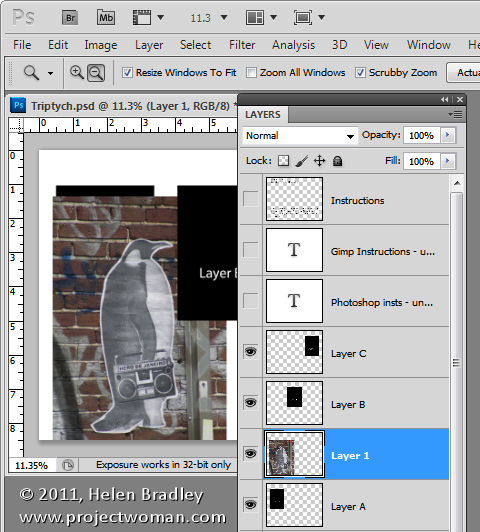
In the template, click on Layer A and then click on the first of your images and drag and drop the background layer from the first of your images into the main image.

Click on the Move tool and size and position the image so that the interesting portion of it is over the black background. Click to accept this size and positioning and then with the new layer still selected, choose Layer > Create Clipping Mask. You’ll see that your layer is clipped to the size of the underlying shape.

You can fine-tune the placement and sizing by moving the contents of the new layer.

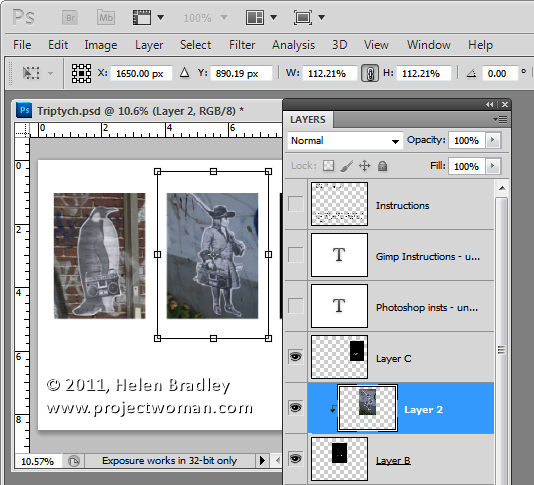
Now click on Layer B and again drag and drop the background layer from the second image into this template. Again, position the interesting portion of the image over the underlying background, sizing the image if desired. Create the clipping mask for that layer by selecting the image and choose Layer > Create Clipping Mask.

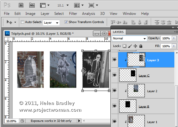
Repeat this for Layer C using your third image.

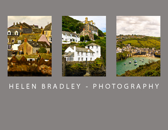
When you’re done, you can adjust the background of the image if desired by recoloring the layer marked background recolor if desired. You can now save and print the image or upload it to the web.

This same process can be used in Photoshop Elements.

Helen Bradley

Tuesday, February 7th, 2012

Create a collage in Gimp

One task I perform regularly in Photoshop and Lightroom is to assemble multiple images on a single page for printing.  I love displaying my photos, for example, as triptychs –which are three side by side images.

I’ve posted before on the process in Lightroom here (http://projectwoman.com/2009/07/creating-a-triptych-in-lightroom.html) and here (http://projectwoman.com/2009/10/how-to-select-and-compose-a-triptych-in-lightroom.html)and today I’ll show you how to do this in Gimp using a set of templates I have created for you and that you can download free.

These templates work with both Gimp and Photoshop and you can find them here: http://projectwoman.com/articles/45PhotoshopTemplates.html

Unzip the files and open the one to use in Gimp along with the images that you want to use. I’m using the Triptych.psd file.

Start by viewing the template you are using and, in the Layers palette select and discard the top three layers which include the instructions for using the template in Gimp and in Photoshop and Photoshop Elements.

Select the first of your images, choose Select > All  and then select > Edit > Copy to copy the image to the clipboard.

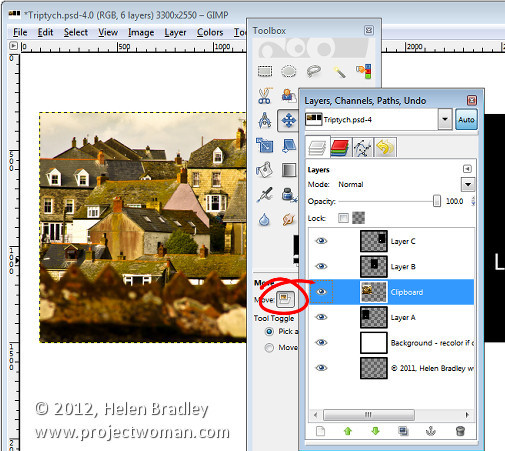
In the template click on the layer marked A and choose Edit > Paste as > New Layer. This pastes the image from the clipboard into the layer immediately above layer A.

Click the Move tool (set it to Layer) and drag the image over the top of the shape on the right. If desired, click the Scale tool and scale the image to size it larger than the black rectangle.

Move the portion of the image that you’re most interested in seeing over the shape.

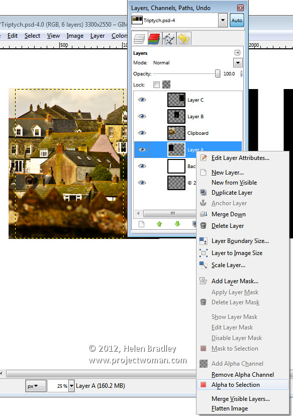
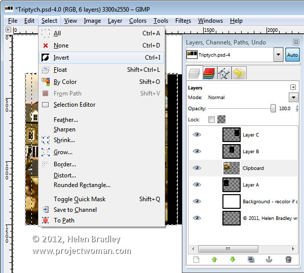
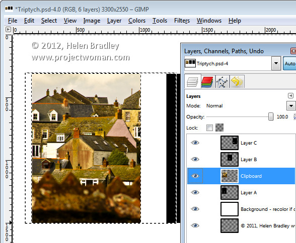
Now, to crop the image to size, click layer A, right click and choose Alpha to Selection.

Now select the Clipboard layer that you’ve been working on, choose Select > Invert and press Delete.

The image will be clipped to size using the template shape as a guide to the size. Choose Select > None before continuing.

Repeat this process for layers B and C – select and copy the image to use, click the layer you’re working with (B or C) and choose Edit > Paste As > New Layer.

Move the image into position and scale it if desired. When scaling, making sure to lock the width and height so that the image is scaled in proportion.

Right click the layer you’re working with – Layer B (or C) and choose Alpha To Selection. Click your newest clipboard layer and choose Select > Invert and then Delete.

When you are done you should have all 3 images in position.

This image has a background layer behind the pictures which currently shows white. If you prefer to add a solid color behind everything, delete this layer and add a new layer filled with your choice of color. Here I’ve added a new dark grey filled layer.

You can finish off the design with some text or simply save the resulting image.

These storyboard templates are a good place to start with your picture layouts. You can find similar templates elsewhere on the web so start with a search for “Free Photoshop Clipping Mask Templates” or “Free Storyboard templates”


Helen Bradley

Sunday, December 26th, 2010

Photoshop Creative: A Simple Composite


In this post, I’ll show you how to create a simple composite by placing one image in another. Along the way, I’ll not only bend one image to fit its new position but I’ll also show you a layer style trick that overcomes the problem that you’ll see if you scroll down to step 6 and take a look at what happens when I mask the image to make the fingertip show.

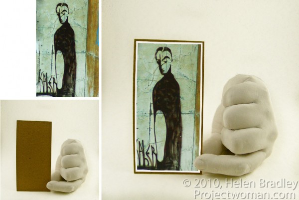
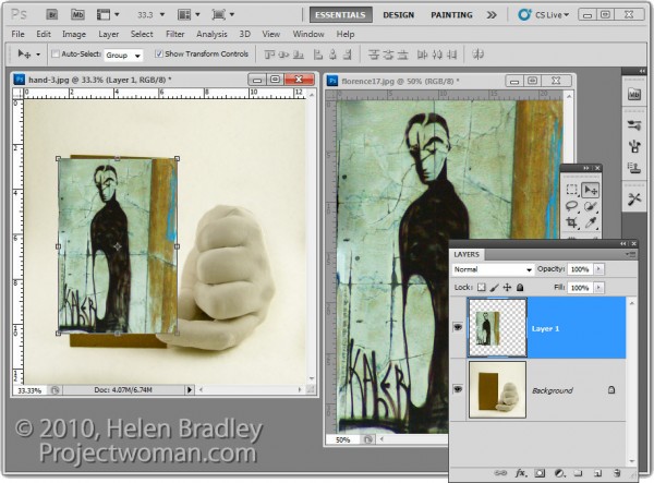
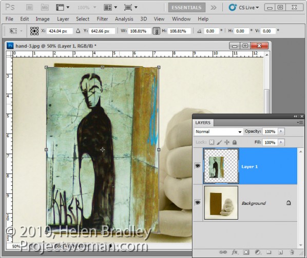
1 To create this composite, open the images to use. We’ll assemble the composite in the image of the plaster hand. Start by dragging the background layer from the photograph into the hand image. It will appear on its own layer and you can now close that image as it is no longer needed.

2 Size the imported image to fit where it needs to go. In this case the border will be added inside the image so I’ll make the image almost as large as the cardboard it will be ‘attached’ to.

Size the image in proportion so you don’t skew it. To get it to fit on in dimension it will probably be either too tall or too wide in the other dimension and that’s fine.

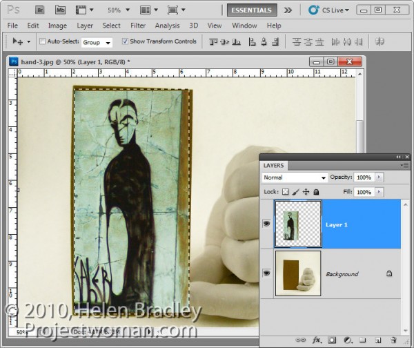
3 Once you’ve applied the transformation, select the rectangular marquee tool and drag over the area of the photo that you want to retain. Choose Select > Inverse to invert the section and press Delete to delete the excess image.

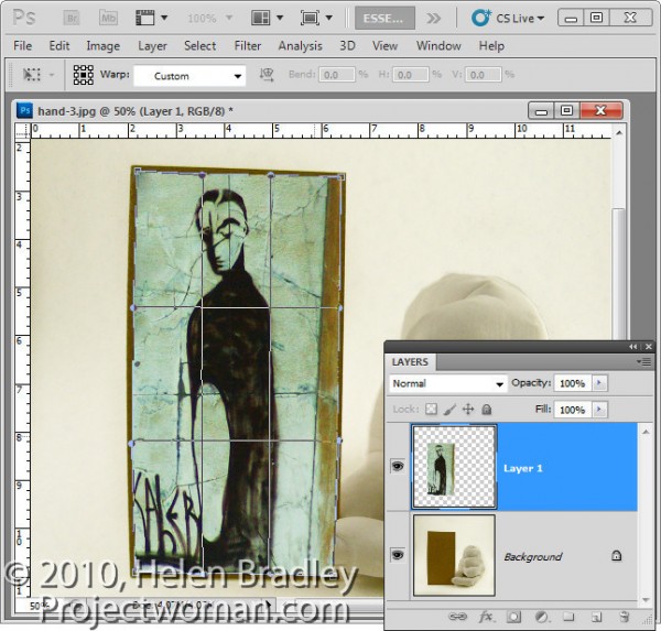
4 To warp the image to fit the shape of the card, select the image and choose Edit > Transform > Warp. This adds a series of warp handles to the image. Drag on these to bend the image so it fits over the area you want to cover.

When you’re done, confirm the transformation.

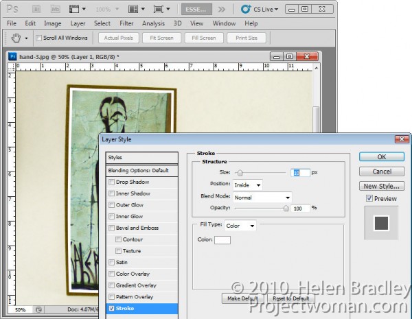
5 To add a white border around the image as if it were a photo stuck to the card, select the image layer, click the Add a Layer Style button at the foot of the Layers palette and choose Stroke.

Set the color to white and the size to a size appropriate for your image. Set the position to Inside so you get square corners on the image (if you choose Center or Outside the corners will be rounded).

 When you are done, click Ok.

6 With this image layer still selected, click the Add Layer Mask icon at the foot of the Layers palette.

Select a medium hard brush, set the foreground color to black and paint on the mask to reveal the finger on the underlying layer. This makes the finger look like it is above the image and not behind it.

One simple way to do this is to hide the photo layer and use a tool like the Quick Selection tool to select over the finger on the background layer. Then, with the selection in place, display the top layer and select its mask. With black as the foreground color, press Alt + Backspace (Option + Delete on the Mac), to fill the selected area on the mask with black.

You’ll see that we have some problems with the mask because it distorts the stroke around the picture. We want the stroke applied to the image and we don’t want the mask to have any effect on it – right now it is having an unwanted effect.

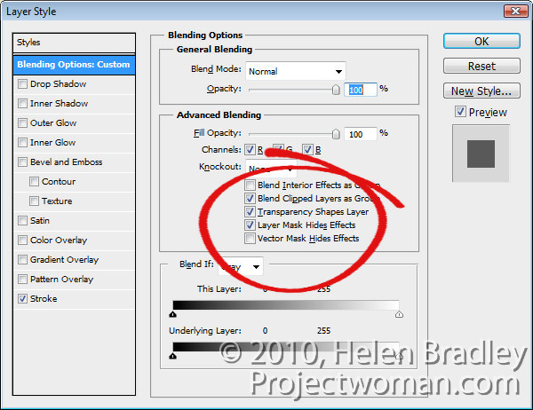
7 To solve the problem, double click the Effects entry in the Layers palette to open the Layer Styles dialog. In the Blending Options area of the dialog, select the check box for Layer Mask Hides Effects.

This configures the mask on the layer to hide not only the image content on that layer but also a style applied to that layer.

Helen Bradley

Saturday, March 27th, 2010

Thank you Kevin Ames

fantasy portrait collage

I have just returned from Photoshop World in Orlando and I am full of inspiration for upcoming projects. However one of the classes just inspired me so much that I had to start playing with the concept first. The idea is from Kevin Ames who taught it as a class called Fantastic Portraits…It’s Smoke, Mirrors & Photoshop.

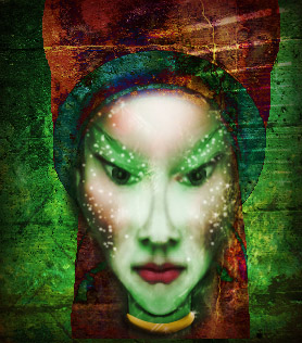
The starting point is half a face, mirrored and stuck back together and then it’s up to you. This is my finished project – it’s a tiny file as I did it on the plane home and I really wanted to conserve battery but still get a reasonable result. With smaller images in Photoshop, of course everything goes much faster but the downside is that the final image is less useful because it is very small.

Here in addition to mirroring the face, I replaced the lips, pupils and part of the nose to get the face I wanted. I used the liquify filter repeatedly to reshape the face and the dodge and burn tools to add highlights and shadows – my additon to the basic concept. Then I brushed on the dots, added lots of backround interest and fashioned her a gold necklet. It helps if you have lots of textures and other interesting elements to use – for example, her hat is a fancy street light from a local park and there is a metal grate, a stairwell and a rusty texture making up the background.

It is a fun way to blow a few hours.

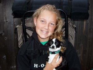
If you’re interested, here’s my starting image (courtesy of my friend Brenda), as you can see, the journey from start to end gave me something totally unrecognizable.

Helen Bradley

Page 1 of 212