Thursday, April 10th, 2014

If you always start a new page for a particular type of heading – include the page break in the style
When you always start a major heading item on a new page in a Word document you can configure your heading style so it has the page break built into it – saving you having to insert it manually.
To do this, select some text with formatted with the style that is to include the page break and locate the style in the Style gallery. If it does not appear there, display the Styles and Formatting task pane by clicking the dialog launcher in the bottom right of the Styles area in the ribbon.
Right click the Style name, choose Modify and then Format.
Click the Paragraph option and then click the Line and Page Breaks tab.
Enable the Page Break Before checkbox and click Ok twice.
The page break is now part of the style so a new page will be started each time you use that style. The style will also update and effect any text already formatted using that style in the current document.
Helen Bradley
Labels: heading style, Page Break, style, style tips, Tutorial, Word
Categories:office
posted by Helen Bradley @ 3:52 pmNo Comments links to this post
Tuesday, April 8th, 2014

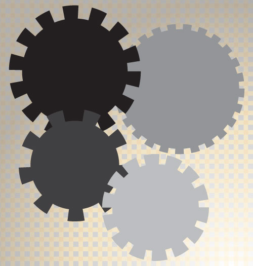
Here’s how to easily create a shape with a stepped edge much like a steampunk gear, in Illustrator
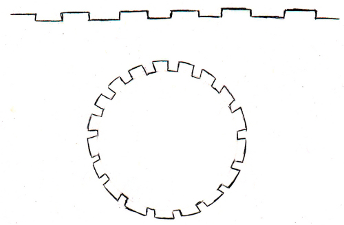
I love steampunk and I’ve even been known to create and give away a set of free steampunk brushes here on Projectwoman.com. Today, however I’m talking about how to make your own steampunk shapes. A reader approached me and kindly drew out the shape he was interested in achieving and this is what he wanted:

Here’s how to do it easily using the Stroke options in Illustrator.
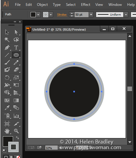
Draw a circle by clicking the Ellipse tool and holding Shift as you draw out a circle. I filled mine with black and added a thick grey stroke around the circle. You can make your stroke and fill the same, I’ve made them different so you can see what is happening.

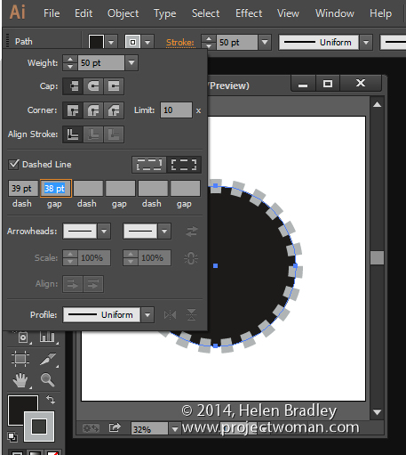
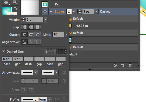
Click the underlined word Stroke on the Tool Options bar to open the Stroke panel. Set the Cap to Butt Cap, enable the Dashed line checkbox, set the Dash and Gap values to your preferred values. A good place to start is to set the Dash and Gap to the same (or nearly the same) value as the point size of your stroke. Then alter the Dash value to change the length of the dashes and the Gap value to change the gap amount. Click away when you are done.

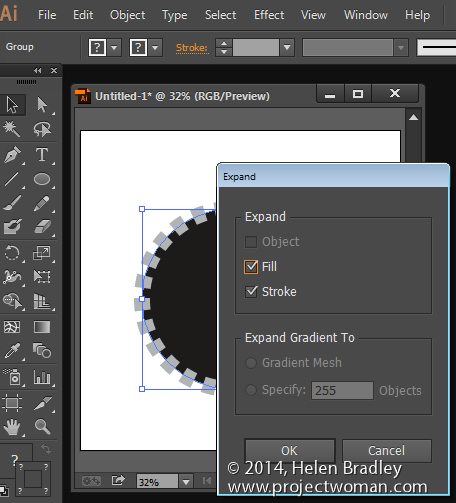
Now, with the shape still selected choose Object > Expand Appearance, then Object > Expand, leave Fill and Stroke checked and click Ok.

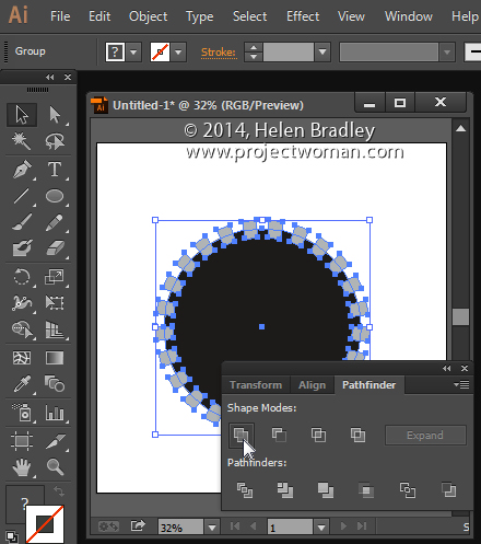
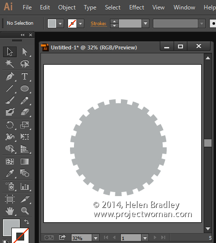
Now, with the shape still selected, in the Pathfinder palette (view it by choosing Window > Pathfinder), click the Unite icon (top row, far left). This creates a single shape with the edges you have described.

And that does it – there is your circle with a stepped edge and gear-like shape:

Helen Bradley
Labels: dashed line, gear, Illustrator, steampunk, step by step, stroke, Tutorial, vector drawing
Categories:Illustrator
posted by Helen Bradley @ 3:29 pmNo Comments links to this post
Monday, January 13th, 2014

Learn to add multiple strokes to a shape in Illustrator
One way I force myself to extend my knowledge of Illustrator is to take an existing illustration and to try to reproduce it. I don’t use these for anything but for learning and improving my skills. It’s a great tool because, when you try to copy someone else’s illustration you have to work out how to do things you may not typically do. You can’t just fluff yourself off and do the same old thing – if you don’t know how to achieve an effect you have to think about the problem and work it out using your existing skills or go research solutions.
Today I’ve been working on shapes that have neat edges and, in particular shapes with solid edges and dots – all in the one shape!
Start by drawing your shape – mine was a speech bubble but you can do it with anything. Then add a fill color and a stroke – this stroke is the thick band around the shape so make it the right size for the edge effect.
Now open the Appearance panel and add a second stroke by choosing the Add New Stroke icon. Make sure this is the top stroke – if not you can drag it up as if it were a layer. In the Appearance panel select a different color for this stroke and size it smaller than the previous one. You can now make it dots by setting up the panel so it looks like this – just note that your gap value should be the same or just larger than the stroke to make dots and that the cap shape is rounded – to get dots!

Helen Bradley
Labels: appearance, dot, how to, Illustrator, layered strokes, multiple strokes, solid color, stroke, technique, tip, trick, Tutorial
Categories:Illustrator
posted by Helen Bradley @ 10:32 amNo Comments links to this post
Monday, January 6th, 2014

So, you know how to make a sunburst in Illustrator – here’s how to color it
Some time ago I wrote a post and created a YouTube video to show how to make a sunburst in Illustrator. This is one of my most popular posts and the video has been popular too – seems like it really hit a spot with a lot of readers.
Now, today I received an email from a reader asking how to make the sunburst multicolored. Turns out it isn’t as simple as selecting a ray and recoloring it – because when you select one ray you select them all. However, once you know how to break them up, it works just fine.
To do this, follow the instructions to create the circle, add the dashed line, expand it, select the inside anchors and choose Path > Average. This gets the sunburst made.
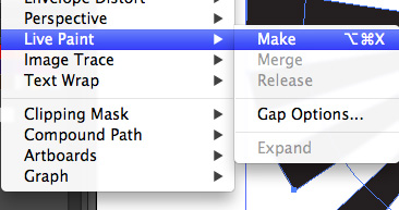
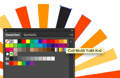
Now, to break the shape up, select it and choose Object > Live Paint > Make. Now you can use the Live Paint Bucket tool to color each piece of the sunburst – or not. You see the Live Paint > Make command breaks up the shape (in a way that Object > Expand does not) so you can now select each ray in turn and color it.

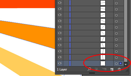
If you want to see the change happen, watch the Layers palette when you do the Live Paint > Make command – it turns the compound path into a set of individual vector objects – just what you need to have to be able to recolor them. The plus is that once the shape is broken up like this you can recolor it in the usual way by selecting each shape and color it or you can use Live Paint. You get to choose which works best for you.

Now, one side effect of this is that the spaces between the rays is filled with color – typically white. So you can’t put a solid color behind the rays and have it show through. There is a solution – open the Layers palette and locate the filled white circle shape at the bottom of the expanded sunburst shapes and delete it. Once it is deleted you can add your own background filed shape behind the sunburst.

It’s one of those things that is simple when you know how but not immediately obvious how you do it.
Thanks to the reader who asked the question!
Helen Bradley
Labels: burst, color, colored, how to, Illustrator, multi-color, multicolor, rays, sun burst, sun ray, sunburst, sunray, Tutorial
Categories:Illustrator
posted by Helen Bradley @ 6:52 amNo Comments links to this post
Friday, December 20th, 2013

Curious or confused about where brushes go? Here’s the info you need and how to do it
It’s pretty easy to find the wrong place to install brushes on the PC and the Mac. The Adobe program file folders are more accessible than the user areas where you really should be installing your brushes. So, to help you out, here is where the brushes should go and a couple of tips for showing the hidden and hard to find folders on the PC and the Mac:
In Mac OS X:
Photoshop CS4
~/Library/Application Support/Adobe/Adobe Photoshop CS4/Presets/Brushes
Photoshop CS5
~/Library/Application Support/Adobe/Adobe Photoshop CS5/Presets/Brushes
Photoshop CS6
~/Library/Application Support/Adobe/Adobe Photoshop CS6/Presets/Brushes
Photoshop CC
~/Library/Application Support/Adobe/Adobe Photoshop CC/Presets/Brushes
The tilde (~ ) indicates your hidden user library.
You can open it this way:
1 Launch Finder
2 Choose Go > Go to Folder
3 Type ~/Library and click Go
4 This opens the ~/Library folder and you can now navigate to the appropriate folder listed above.
On a Windows PC:
Follow these instructions to install the brushes where they can be found by both 32 and 64 bit versions of Photoshop (this is the prefered method of installing downloaded brushes):
Photoshop CS4
C:\Users\<your name>\AppData\Roaming\Adobe\Adobe Photoshop CS4\Presets\Brushes
Photoshop CS5
C:\Users\<your name>\AppData\Roaming\Adobe\Adobe Photoshop CS5\Presets\Brushes
Photoshop CS6
C:\Users\<your name>\AppData\Roaming\Adobe\Adobe Photoshop CS6\Presets\Brushes
Photoshop CC
C:\Users\<your name>\AppData\Roaming\Adobe\Adobe Photoshop CC\Presets\Brushes
To locate your c:\users\<your name>\AppData folder, launch Windows Explorer and type this in the address bar :
%USERPROFILE%\AppData
This automatically opens the AppData folder for you so you can now navigate to the desired folder as detailed above.

Helen Bradley
Labels: brush, brush preset, brushes, download, free, how to, install, location, mac, pc, Photoshop brushes, preset folder, step by step, Tutorial
Categories:photoshop
posted by Helen Bradley @ 11:42 am1 Comment links to this post
Friday, November 8th, 2013

Once you know how to achieve different depths of field, the question then becomes when would you use this in your photography?
Once you understand how you can achieve different depths of field in your photography – the question then becomes when would you use this knowledge to craft better photos?
Portraits and a shallow depth of field
There are a number of situations where it is a good idea to have a shallow depth of field and one of these is for portrait and pet photography. In this case you will want to remove any distracting background from around your subject. When the background is cluttered or distracting, a shallow depth of field helps you to isolate the subject from the background.
To achieve this effect, you would do one of these things or a combination of them:
1 Use a zoom lens and zoom in to your subject,
2 Get closer to the subject, and
3 Set your camera to use a large aperture, such as f/2.8 – f/3.8.
When you do this, take care to focus carefully on the subject. One disadvantage of working with a very shallow depths of field is that the amount of the area in the image that is in focus is very small so if you don’t get your focus right, your subject will be out of focus. You need to make sure that what you want to see in focus is the area you are focusing on.

Photographing flowers and products
Another situation in which you may want to use a shallow depth of field is when photographing flowers. The closer you get to the flower the more likelihood the background will be attractively blurred.
In product photography, you may also want to get a shallow depth of field and you’ll find that in many cases, the shallower the depth of field, the more attractive the image is. The difference between a shallow depth of field and a deep depth of field can often be the difference between an attractive photograph and one that looks more like a snapshot.

Landscapes benefit from a deep depth of field
While a shallow depth of field is extremely attractive for portraits and many other types of photographs, when you’re shooting landscapes and cityscapes you will typically want the opposite to be the case and you will want a deep depth of field. For landscape photography, you’ll typically want everything in the image to be in focus.

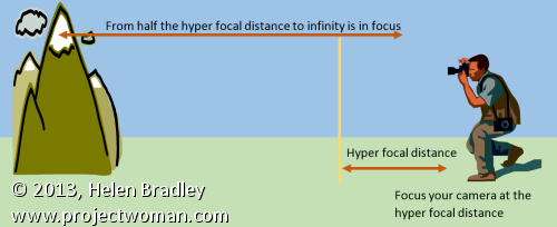
When photographing landscapes photographers often talk about hyper-focal distance. The hyper-focal distance is the point at which you point your camera at to focus the shot so that everything from that point to infinity is in focus and, in addition, an area halfway from the hyper-focal distance to your camera is also in focus. The image shows you how this hyper-focal distance affects the depth of field.

For landscape photography, you’ll typically want to use a small aperture such as f/9 – f/11, a short focal length such as 17mm and be a good distance away from your subject. Calculating the hyper-focal distance then becomes the issue. In many cases, people simply opt to focus the camera at infinity as this typically gives good results without needing technical calculations.
Too much of a good thing
If you’re tempted to increase the depth of field by simply dialing down your aperture to the smallest possible size such as f/35 or so, think again. While it may seem that this will give you a very deep depth of field it can be counterproductive. At very small apertures an effect called diffraction kicks in and this can cause a decrease in quality in your images. Instead you need to find the sweet point at which the smaller aperture gives you a good depth of field but stop short of where it gets so small that light is diffracted decreasing the image quality.
DSLR vs Point and Shoot for controlling Depth of Field
When you’re looking to achieve different effects with different depths of field, you’ll find that a digital SLR will give you much better results than a point and shoot camera. The reason for this has to do with the relative sensor size of the cameras – the larger the sensor size – the more control you’ll have over the depth of field.
Understanding depth of field and how it impacts the images that you take is a key way that you can impact the quality of your images. Choosing the right option for each shooting situation and knowing how to set your camera to achieve the desired result will enhance your photos.
Helen Bradley
Labels: aperture, control dof, deep depth of field, depth of field, dslr, how to, hyper focal, hyperfocal, Photography, point and shoot., shallow depth of field, Tutorial, Zoom
Categories:photography
posted by Helen Bradley @ 3:29 pm1 Comment links to this post
Tuesday, October 29th, 2013

Learn what depth of field is and how your camera settings affect it
Some subjects need to be fully in focus to be shown at their best and others need dreamy out of focus backgrounds to create the right setting. The feature that is key in both situations is called depth of field – it gives you both that ‘everything in focus’ look and it also gives you soft out of focus look. Depending on what you are photographing getting the depth of field right is often the difference between a snapshot and great image.
I’ll explain what depth of field is and how to control it with your camera settings.
What is depth of field?
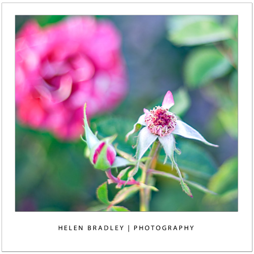
At its simplest, depth of field is the zone of sharp focus in front of, around and behind the subject in your photo when you are focused on that subject. When you have a shallow depth of field, only a small area around the subject will be in focus and quite often only a small part of the subject will be in focus. Everything else in the image will be out of focus with things further away from the subject, either in front of or behind the subject, being more out of focus the further away they are. This image has a shallow depth of field – it’s a great way to shoot flowers:

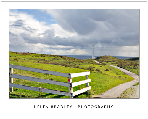
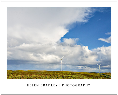
When the depth of field is deep, nearly everything in the shot is in focus. You control the depth of field in your images by adjusting the camera’s settings for aperture, adjusting the focal length of the lens and the distance you are from the subject. This image has a deep depth of field – that’s important as we want to see everything in this scene from the grass in front of us to the horizon miles and miles away.

Let’s look at each of these in turn.
Control depth of field with aperture
One way that you can control the depth of field in an image is to change the aperture that you are using. For this, you will need to have your camera set to Aperture Priority or Manual mode. Selecting an aperture that is very large, such as f/1.4 to f/2.8 will give you a shallower depth of field around your subject. The aperture used for this image was a huge f1.4 so only a small portion of it is in focus:

If you shoot with a small aperture, such as f/9 to f/11 or more you will find that more of the image will be in focus, which gives you a deeper depth of field. If everything else stays the same, the difference in the aperture setting you use can result in a very different image. The aperture used here was a small f11:

One benefit of shooting with a large aperture, such as f/1.4 to f/2.8, is that a lot of light is getting into the camera so you can use a fast shutter speed. Conversely, a down side of shooting with a small aperture such as f/9 to f/11 or more is that less light gets into the camera so you will need to use a slower shutter speed or a higher ISO value. In some cases you will be shooting with such a slow shutter speed that you will need to use a tripod.
Control depth of field with focal length
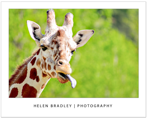
The focal length of your lens can also have an impact on the depth of field when you use this to make a subject bigger. So, if you are shooting with a 50 mm lens, you will get a much deeper apparent depth of field than you would if you were capturing an image with a 200 mm lens at the same aperture and if, in both situations the subject size is the same. The depth of field is actually not significantly different but it looks different because there is more background in an image when you capture it with a 50mm lens than you will get when you capture it with a 200 mm lens. So a rough rule of thumb is that the more zoomed into the subject that you are, the shallower the depth of field will appear to be. This giraffe was shot at f5.6 which isn’t a particularly large aperture but it was shot at 300mm zoom so the giraffe is quite sharp and the background is nicely out of focus:

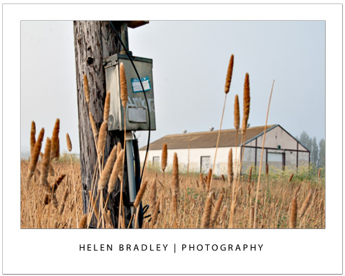
If you are shooting landscapes you will get best results when you use a short lens such as a 28 mm lens as the image will appear to have a much deeper depth of field. On the other hand, a zoom lens can be a good lens to use when shooting portraits because the further you’re zoomed in to the subject the less background will be in the image and the shallower depth of field you will appear to have. This image was shot at f11 with a 28mm lens so everything from the lamp post to the building is in focus:

Control depth of field by varying the distance from your subject
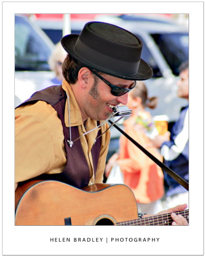
The distance between the subject and the camera is another way that you can impact depth of field. So, for example, if you photograph a subject close up, such as in the region of up to 10 feet away, then the depth of field will be much shallower and more of the image behind the subject and a little in front of the subject will be out of focus. On the other hand, if you move the subject further away from you so that the subject is 20 feet away then the depth of field will be much deeper and there will be a lot more of the image in front and behind the subject in focus. This image was shot with a 200mm lens – the singer was relatively close to the camera and the background was some distance behind him so the musician is in focus and the background nicely out of focus:

Whenever you’re considering depth of field, you should also note that, when the subject is in focus, the amount of the image that is in focus behind the subject will be greater than the amount of the image that is in focus in front of the subject. The ratio is approximately one-third to two-thirds, so the depth of field will extend roughly one-third in front of the subject and two-thirds behind the subject.
Helen Bradley
Labels: aperture, camera settings, control depth of field, depth of field, how to, landscape, Photography, Portrait, shallow depth of field, Tutorial, Zoom
Categories:photography
posted by Helen Bradley @ 9:03 am1 Comment links to this post
Thursday, October 10th, 2013

Adjusting your White Balance in Lightroom
Lightroom has a set of tools that you can use to adjust white balance in your images. To see these at work open an image in the Develop module. At the top of your Basic panel are the white balance adjustment tools.
White Balance Options
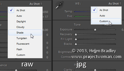
The dropdown list will show you some options for adjusting white balance – what is shown here will vary depending on how your images are captured. If you capture in raw then the white balance dropdown list will contain the same options as you have on your camera for setting white balance. If you’re capturing jpg images then there are fewer options – As Shot, Auto and Custom.

On the left are the options for a raw image and on the right those for a jpeg image.
The Temperature and Tint sliders also have different units of measure depending on whether you’re working with jpgs or raw images. For jpg images both the sliders range from +100 to -100. If you’re working on a raw image then the Temperature slider shows degrees Kelvin from 2000 – 50,000 and the Tint slider ranges between + 150 and – 150.
Kelvin is a measurement of the color of light – daylight is around 5,500 degrees Kelvin. Lights we consider to be warm or pink/orange in color including tungsten globes are around 3,000 degrees Kelvin and cool lights which are blue in color such as overcast daylight are around 7,000 degrees Kelvin and higher.
Adjust White Balance
To adjust the white balance in the selected image you can select an option from the White Balance dropdown list to use to fix the image or you can use it as a starting point and then fine tune the result.
You can also manually adjust the Temp slider to add warmth or remove it from the image. Drag the sider to the left to add a blue tint to the image (to cool it down), or to the right to add a yellow tint to it to warm the image.
Use the Tint slider to balance out any excess magenta or green in the image. Drag towards the right to add magenta to the image cancelling out any green tint and drag to the left to add a green tint cancelling out any unwanted magenta.
White Balance Selector
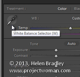
You can also use the White Balance Selector to adjust white balance. You can select the tool by clicking on it or press W.

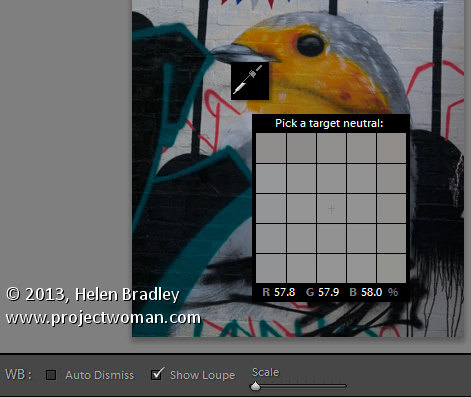
From the White Balance toolbar under the image you can select options that make the White Balance tool easier to use. I suggest you deselect Auto Dismiss as you can then click on the image in various places to attempt to fix it. If you have Auto Dismiss enabled you’ll only be able to click once before the selector is dismissed so, if that fix isn’t perfect then you’ll need to select the tool again to attempt another fix. This is a cumbersome way to work so I prefer to disable Auto Dismiss and put the tool away only when I am done with it.
If you click the Show Loupe checkbox then you’ll see a 5 by 5 pixel grid beside the mouse cursor. The center point in the grid is the pixel that you are currently targeting and which will be used to adjust the image if you click. This grid makes it easier for you to pick the correct point in the image to adjust to. The scale itself can be increased or decreased using the Scale option on the toolbar.
At the bottom of the loupe itself are the RGB percentage values of the pixel under the cursor. These values tell you if the pixel is neutral or not. If it is neutral then the percentages of R, G and B will all be equal – if they are not equal then there is color in that pixel.

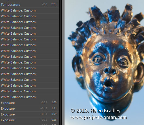
To balance the image using the White Balance selector, click on a pixel that should be neutral grey – not white or black. When you do so, Lightroom will adjust the image so that the selected pixel is a neutral grey and, as a result, all the color in the image will change. At the same time Lightroom adds an entry to the image History for that adjustment. This means that you can wind back the history to return to an earlier white balance fix, if desired.

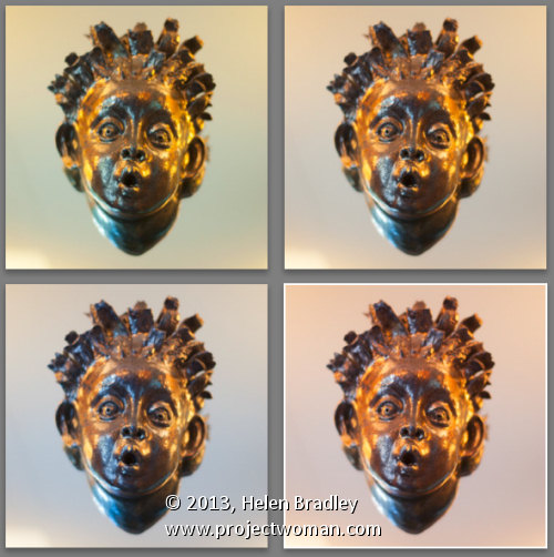
You should be aware that adjusting image white balance is to an extent a subjective assessment – so there is no one value that is “correct”. There are, instead, a myriad of different results that can be achieved so look for one that is it pleasing to you. In most cases viewers prefer to see some warmth in photos as they are more pleasing to the eye if they are warmer rather than cool.
I find that a good approach to take is to experiment with the white balance selector to see the effect on the image by selecting different pixels to adjust to. Then choose the most aesthetically pleasing result.
Helen Bradley
Labels: adjust, balance, Develop, Develop Module, Kelvin, Lightroom, Loupe, Photoshop, pixel, rgb, Selector, temperature, tint, tip, trick, Tutorial, w, white, white balance, White Balance Option, white balance selector
Categories:Lightroom, photoshop
posted by Helen Bradley @ 10:10 amNo Comments links to this post
Saturday, October 5th, 2013

Save Time in Lightroom when Resizing and Cropping Large Amounts of Output Images
If you’re working on a large shoot and need to output a lot of images at a fixed size then Lightroom can do the work for you. It isn’t obvious how you can crop all your images to a fixed size and output them at a certain set of pixel dimensions but it is easy to do when you know how. Here’s how to do it:
Step 1

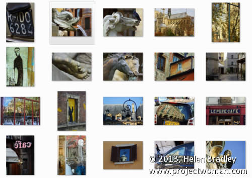
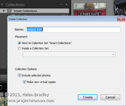
First locate the folder with your images in it. I prefer to make virtual copies of my images and put them in a new collection but you can do whatever makes sense to you.
Step 2

Select all the images in Grid view in the Library module in Lightroom.
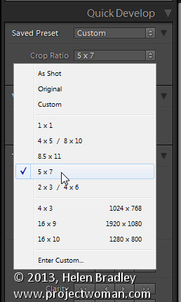
Open the Quick Develop panel on the right and, from the Crop Ratio dropdown list, select the crop ratio that you want to crop to. For example you can crop to fixed ratios such as 1 by 1 or printing sizes such as 5×7, 4×6 and so on.
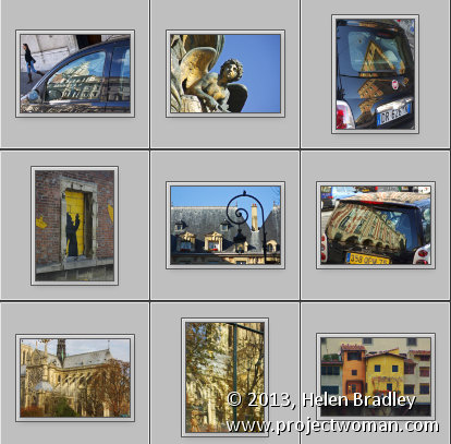
Here I’ve selected 5×7 and when I do so all the selected images are automatically cropped to this 5 x 7 ratio.
Lightroom is smart enough to understand that some images are portrait orientation and others are landscape. Portrait images are cropped to 5 x 7 and landscape orientation images to 7 x 5.

Step 3 (optional)

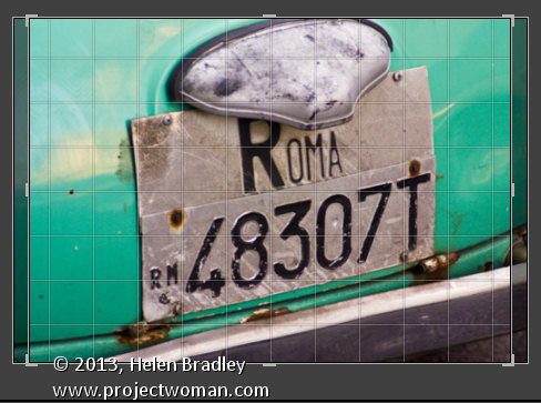
If desired, you can now move to the Develop module and check the crop for all the images. By default, Lightroom will center the crop rectangle on the image and this may not be exactly what you want for some images. However, it is easy to go to the Develop module, click the first image and click on the Crop Overlay Tool so you see the crop marquee in position on the on the image.
Now from the filmstrip you can click on each image in succession to preview it in the crop window and you can easily identify if any of them need an adjustment to the crop rectangle. If they do simply drag on the crop rectangle to reposition it. When you’re done return to the Library view.
Step 4

As the images are now all cropped to size, press Ctrl + A to select them and then click Export. Choose a folder to export the images into or click New Folder to create a new folder.
You can now set your desired preferences in the Export dialog.
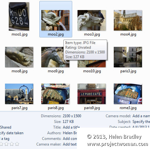
To control the output size – in pixels wide and tall – of the images easily because you already know the crop ratio. To do this, select the Resize to fit checkbox and choose Long Edge from the dropdown list. Then type a pixel dimension for the long edge. So, for example, to prepare 5 by 7 ratio images for printing at 300 dpi the longest edge will need to be 2,100 pixels (7 x 300) so type 2100 and set the resolution to 300.
Step 5

Click Export to export your images and they will be exported to a folder at the chosen size and resolution.
This process allows you to quickly and effectively prepare a batch of images for printing. It manages portrait and landscape images so that you don’t have to separately handle each type. It’s a simple workflow and a fast way to prepare images from a large shoot.
Helen Bradley
Labels: batch, batch resize, bulk, crop, Develop, Develop Module, export, image, Library, library module, Lightroom, output, Photoshop, quick develop, resize, tip, trick, Tutorial
Categories:Lightroom, photoshop
posted by Helen Bradley @ 10:05 amNo Comments links to this post
Thursday, August 29th, 2013

Editing your Image: Make your Image look as it did in you Camera
You may find that the Lightroom previews look different to those you’re used to seeing when you view the image in your camera.
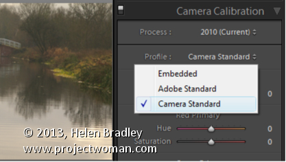
To make them closer to the camera version, select the Camera Calibration panel in the Develop module and from the Profile list choose Camera Standard – this better matches more closely the image you saw on the back of your camera.
These profiles are a starting point for further adjusting your image so choose the one which works best for you.
Helen Bradley
Labels: Adobe Standard, Calibration, camera, Camera Calibration, Camera Standard, Develop, Develop Module, edit, Embedded, Lightroom, match, Photoshop, Profile, Standard, Start, tip, trick, Tutorial
Categories:Lightroom, photoshop
posted by Helen Bradley @ 5:58 amNo Comments links to this post


