Thursday, November 28th, 2013

Rev Up Your Photo workflow – Part 3 – Organizing, Fixing and Sharing images

In this final part of our workflow series we look at organizing and selecting images, fixing and sharing them.


Organizing and selecting images

Once you’ve imported your images, you’ll need to determine which of those you want to work with and which you will not. For this you will need to use a system that is supported by your software – it needs to be quick and easy to use so you can quickly identify the best of your photos.

If you have already backed up your images, you may determine that your master file of images will contain only the best of the images, so you might give a low rating or mark as reject any images that you don’t want to keep so you can later find and delete them. Whatever the case, you need to determine what your process is going to be and then work within this process to get the task done as quickly as possible.

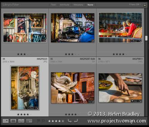
For example, in Lightroom you can use the flag feature to pick or reject images as you move through them – you can do this using the letters P and X. If you use Reject (X) for images you want to delete you can later choose Photo > Delete Rejected Photos to remove them. Then you might work through the picked images and allocate a star rating to them to indicate their relative value.

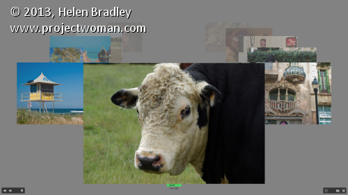
In Bridge you have various options for managing images and one is to select a folder of images and choose View > Review Mode to view the images in review mode. Here you can drag and drop images from the panel to select or reject them. As you rotate around the images only those you haven’t dropped off the screen will be left in this view. This feature allows you to quickly move through your images, previewing them at a good size and determining which you want to keep or reject.

Depending how you are working, when you exit the view the images you had visible will be selected. If they are the worst images you can now delete them. If they are the best, you can, while still in Review Mode click the New Collection button in the bottom right of the screen and create a new collection for them. Back in Bridge you can right click the selected images and chose Label and then add a label or star rating to them.

In other programs such as Photoshop Elements and Picasa, you can apply star ratings to your images – in Photoshop Elements you can use 1-5 stars and in Picasa just a single star. In Picasa, click on an image or select multiple images and click the star button in the middle bottom of the Library window. When you apply a single star to an image in Picasa you can filter out only those starred images later on by clicking the star icon at the top of the program window.


Fixing Images

In many programs, you can apply basic fixes to multiple images at a time. For example, in Lightroom’s Library module if you are in Grid view you can select a series of images and apply one of a range of fixes to the images from the options in the Quick Develop panel. The Auto-Tone option, for example, automatically adjusts every image that you have selected with the appropriate fix for that image’s particular needs. You can also adjust the relative Exposure and Brightness and the White Balance.

In Photoshop Elements, you can select multiple images and click the Fix panel. Click Auto Smart Fix and the selected images will all have a basic fix applied to them. Here too you can choose Auto Color, Auto Levels, Auto Contrast or Auto Sharpen.

In Picasa, you can select an image and double click it to move to the edit module. When you have fixed the image you can choose Edit > Copy All Effects and then move back to the Library view. Select one or more images to apply these same changes to and choose Edit > Paste All Effects. The changes that you made to the first image will be pasted onto the other images.

Sharing images

When it comes to sharing your images some programs include built in tools that let you upload images direct to sharing sites from within the program. These integrated tools save you time – you don’t have to export the images and then upload and you can do it all in one step.

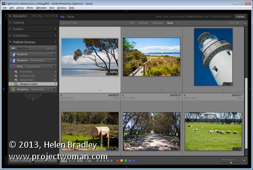
Lightroom, for example, is integrated with Facebook, Flickr and SmugMug allowing you to connect direct to your accounts with those services and upload images direct from inside Lightroom. If you are working in Picasa, you can upload direct to your web albums and you can send an image to your blog. In Photoshop Elements, you can share images in a number of ways including Flickr, Facebook and SmugMug.


In some cases, you may need a plug-in to integrate your software with an online site. For example the Picasa2Flickr plug-in for Picasa lets you send images direct from Picasa to Flickr. You’ll find this at http://picasa2flickr.sourceforge.net/index.html.

If you cannot link your software direct with a sharing site, look out for a download from your sharing site that lets you upload bulk images at a time such as one of the Flickr tools. While these aren’t a single step solution they can save time when you have a lot of images to upload and, if you make sure to include captions, titles and keywords in your editing program you can save having to do this when the images have been uploaded.

When it comes to managing your images, in most cases you have a choice of workflows – one that gets things done and one that gets things done efficiently and effectively. If you design a workflow that does things more quickly and more efficiently, you’ll get your shoots processed much faster and you can get back to taking more great photos.


Helen Bradley

Thursday, August 29th, 2013

Lightroom Tip – Make your Images look as Good as they Did in Camera

Editing your Image: Make your Image look as it did in you Camera

You may find that the Lightroom previews look different to those you’re used to seeing when you view the image in your camera.

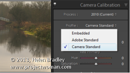
To make them closer to the camera version, select the Camera Calibration panel in the Develop module and from the Profile list choose Camera Standard – this better matches more closely the image you saw on the back of your camera.

These profiles are a starting point for further adjusting your image so choose the one which works best for you.

Helen Bradley

Monday, July 29th, 2013

Lightroom Tip – Introduction to Lightroom Smart Collections

Get Up to Speed with Lightroom Smart Collections

Lightroom has two types of collections: regular Collections and Smart Collections. Smart Collections are live and they are created as a result of filtering your photos according to rules that you write. You cannot add an image to a Smart Collection by dragging and dropping it into the collection. You can’t remove an image from a Smart Collection just because you don’t want it in there – it can only be removed if it fails to meet the criteria you set up for the collection.

Smart collections are a handy way to create collections and to manage your photos and here I’ll show you how to make use of them.

Shipped Smart Collections
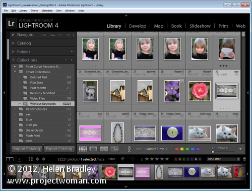
There are a few Smart Collections which ship with Lightroom. To find these, click the Collections panel in Lightroom and click on the Smart Collection Set. Click the Smart collection called Without Keywords. As its name suggests, this collection shows you all the images in your Lightroom catalog that do not have keywords associated with them.

If you’re like me you’ll want to close this one pretty quickly – it can be scary to see just how many images aren’t keyworded!

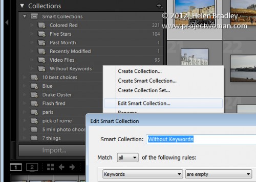
You can learn more about this collection by right clicking its name and choose Edit Smart Collection. You’ll see that the Smart Collection is configured to contain all those images for which the Keywords property is empty.

There are other collections which are shipped with Lightroom including Recently Modified which is a collection of images that have been edited recently.

You can, if desired, change the Recently Modified Smart Collection to span a different number of days. Click this collection , right click and choose Edit Smart Collection. You can see that the collection criteria is set to be Edit Date > Is in the last

When you do so, Lightroom checks the images in your catalog to determine which images meet this criteria and it displays these in this Smart Collection.

Make your own Smart Collections
In addition to those shipped with Lightroom you can create your own Smart Collections. For example, if you color your images red meaning a certain thing you can create a Smart Collection that contains all the images which are colored red.

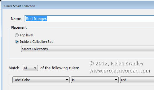
To do this, click to open the Collections panel, click the plus symbol and choose Create Smart Collection. Type a name for it such as Red Images, click Inside a Collection Set and choose to add it to the Smart Collections set. From the options below select Label color is red.

Click Create to create the collection – it will contain all images in your collection which have the red label color associated with them.

Remove an Image from a Smart Collection
The only way you can remove an image from a Smart Collection is to configure it so it no longer meets the criteria for the Smart Collection. For example an image will no longer appear in the Without Keywords collection if you add a keyword to it.

You can remove an image from the Red Images collection if you remove or change its color label. When it no longer has the red color label associated with it, it will no longer appear in the collection.

Similarly, if you apply the red color label to an image in Lightroom it will be automatically added to the Red Images Smart Collection.

One of the benefits of Smart Collections is that they’re continually updated by Lightroom. So Lightroom ensures that all the images which match the criteria you use to define the Smart Collection are in that collection.

How Smart Collections differ from Regular Collections
Smart Collections behave differently to Regular Collections in a few key ways. One difference is that you cannot arrange images in a Smart Collection into your own custom order.

The collection order can only be set to one of the Lightroom default Sort Order options; Capture Time, Edit Order, Edit Time, Edit Count, Rating, Pick, Label Text, Label Color, File Name, File Extension, File Type and Aspect Ratio. Regular collections, on the other hand, can be sorted into User Order which is useful for slideshows and web pages for example.

You also cannot set a Smart Collection as the Target Collection because you cannot add images to a Smart Collection manually. It can only be added if it matches the criteria which describes that collection.

Over to you .. Do you use Smart Collections in Lightroom and, if so, how do you use them? Do you use the shipped collections or make your own?

Helen Bradley

Tuesday, May 28th, 2013

Photoshop – 3 Blend Modes you MUST KNOW

Learn three must know blend modes for Photoshop and in particular for editing photos in Photoshop. Covers how to use Screen, Multiply and Overlay blend modes.

Transcript:
Hello, I’m Helen Bradley. Welcome to this video tutorial. In this tutorial I’ll introduce you to the three must know blend modes in Photoshop. I’ll explain how they work and how you might put them to use.

There are three blend modes that it’s really handy to know how to use in Photoshop, and we’re going to look at those three blend modes in this video tutorial.

In this particular image I have a picture of a building in Darwin and over the top of it I have a second layer. And on the right hand side is the exact duplicate of the layer below. And on the left hand side is just the color pink because we’re going to have a look and see how these blend modes work not only with images where you’ve got two layers that are identical but also what happens when you have for example a layer that is different. And the three blend modes that are really handy to use are got to by clicking this blend mode dropdown list in the layers panel in Photoshop.

If you can’t see your layers panel choose Window and then Layers and that will show you your layers panel. When you’re using blend modes you’ll always use the blend mode on the topmost layer or the layer that you want to affect. And it will affect how this particular layer blends in with the layer or layers below.

The first blend mode we’re going to look at it is this one here. It’s Screen. Now you’ll see that the blend modes here are grouped together. The blend modes in this particular group are the lightening blend modes. They are lighten, screen color, dodge, linear dodge and lighter color. And we’re going to look at screen in this particular group. And screen always lightens an image. So you can see here that the image is lighter than it was in the original. Here it’s colored this sort of pink tone. And here we’ve just got the original image over again, but it’s a lighter version. This is a blend mode that you can use to salvage an underexposed image. If you’ve got an image that doesn’t have enough light in it, you could use the image on each of the layers and then blend the top one into the bottom using the screen blend mode. And that will lighten the image and bring detail out of it.

The next blend mode we’re going to look at is similar but works in the opposite way. This is a darkening blend mode. And it’s accessible from this darken group of blend modes: darken, multiply color burn, linear burn and darker color. And in this case the one we’re going to use is multiply. And multiply darkens the image. You can see that we’ve got a darker version of the image with this sort of pink overlay. But here where we had the image on the two layers, the exact same image on each of the two layers, you can see that we’ve got a darkening of the image. This would be useful if we had an overexposed image. If we put the overexposed image on two layers and then blend them together with the multiply blend mode, we’ll bring back some of the detail in the overexposed image.

The other of the blend modes that you’ll typically use in Photoshop is overlay. It’s in this group of blend modes, and it’s one of the contrasty blend modes. What this does is it lightens everything that is lighter than a mid-gray and it darkens everything that is darker than mid gray. So it’s a nice contrasty blend mode. Let’s have a look here at what it’s doing to the image on the right. You can see that this is a flatter sort of image. And when I turn on this layer we’re getting a lot more contrasty image. And that’s what’s happening on the left too is we’re getting a contrasty, a colored version, of the original image. Anytime you want to boost the contrast in an image you can use the overlay blend mode.

So the three blend modes that I suggest that you look at using with your photos in particular are multiply to darken, screen to lighten, and overlay to add some contrast and punch. Now if you find that a certain blend mode is too much let’s just get rid of this particular layer and let’s duplicate the image itself. And let’s go and use the overlay blend mode. And if this is too much of a contrast enhancement to the image all you need do is to back off the opacity of this layer. This will give you some of the layer below and some of this additionally contrasty layer so that your image gets more contrast but perhaps not as much as it would have if you’d had this layer at 100 percent opacity.

I’m Helen Bradley. Thank you for joining me for this video tutorial. Look out for more of my tutorials on this YouTube channel. Comment on the video and like it if you like it. And look out for more tips, tricks and tutorials on Photoshop, Lightroom, Illustrator and a whole lot more at my website projectwoman.com.

Helen Bradley

Wednesday, May 22nd, 2013

Lightroom – Copyright Watermark Bulk amount of Images

If you have thousands of images to add a copyright watermark to, you can use Lightroom to do this very quickly. This video shows the workflow to use to import thousands of images into Lightroom and how to export them and create your own watermark to add to them. This is a minimalist workflow designed to process a lot of images very quickly.

Transcript:
Hello, I’m Helen Bradley. Welcome to this video tutorial. In this tutorial I’m going to show you how you can copyright in bulk the images as you export them from Lightroom. One of my blog readers recently contacted me and asked me how easy it would be to add watermarks to a series of images that they had. And so this video is for them and for anybody else who’s considering applying a watermark to a lot of images all at once. And my suggestion is, and she had something like two and a half to three and a half thousand images, is that Lightroom is the tool to use.

So I’m going to get started and I actually have a folder of images that I am going to import into Lightroom to show you exactly how it will work. So I’m going to click on Import and then I’m going to select the folder that contains the images that I want to import in. So this would be the folders that contain the two and a half thousand or so images that this particular reader has. So I’m just looking for my particular set of images. And I know they’re here. So all I’m going to do to start off with is just to select the folder of images. And it’s these Cornwall images that I’m going to import. Now I’m going to add them to Lightroom. And in this case because I want to do this very quickly because all I want to do is to add watermarks to them, I’m going to select Minimal as my previews because that’s going to render everything very, very quickly. And because I want lots of images I’m going to deselect Don’t import selected duplicates. So all I’m going to do at this stage is now to click Import and bring those all into Lightroom.

Now the images are coming into Lightroom and I can start getting ready as soon as they’re in to export them with their watermarks. Now some of these are portrait orientation and some of them a landscape. That may or may not be an issue. I’m going to select the first image and Shift click on the last so that we can export them. I’m going to Right click and choose Export and then Export again. And this takes me to the Export dialogue. So the first thing I need to do is to determine where I want to export them to. So I’m just going to put them into a folder in my My Documents folder. And I’m just going to create a brand new folder for them. But I’m going to select My Documents as the location, and I’m going to put in a subfolder called watermark. And then I will check if I want to rename my files. I don’t want to rename them. The idea of this is to get in and out as quickly as possible.

I can convert them if they were not JPGs and I could select the quality for them. Again 85 percent quality might be sufficient. If you’re that particular reader 100 percent quality might be your preferred quality. I can resize them or not. So if I want to leave them at the exact same size I just deselect everything.

What we’re most concerned about here is this Watermark option. So I’ve got it selected, and I’m going to click it, and I can choose Edit Watermarks. So this means that I can now create my own watermark. So I’m just going to delete what’s here. I’m going to press and hold the Alt key as I type out 0169 on the keyboard because that gives me the copyright symbol, and I’m going to type my copyright text. And I’m going to do two lines. And it’s Helen Bradley, projectwoman.com. And you can see it up here and it’s up there because that’s where I’ve got it positioned right

now. Here’s the anchor. If I wanted it down the bottom corner I could place it there. And then there’s an inset which is inset off that option.

So I could push it further down into the corner if I wanted to or not. It looks like it’s also centered right now. And no it isn’t. It’s right justified. So we could left justify it or center it if we wanted to. And we can also resize it either by dragging on its sides or we can drag it just to make it bigger if we wanted to. So I’m going to inset this a little bit horizontally and a little bit vertically. But you could see that we have a lot of power in where we place it.

Its opacity is 100 percent. And I always suggest that you do apply a shadow to your text because the shadow will help its readability if it’s over a lighter background. So I would normally put a very, very small shadow. And you can change the angle so that you can make the shadow come from whatever angle that you want it to come from. I prefer mine to come from about 30 to 45, something like that, so it’s coming in from this angle here. And if you’re happy with that that’s all you need to do. So you click Save. And we’re going to save this. And we’ll call it test watermark, you can call it whatever you want your watermark to be called, and I’ll click Create. And it’s now being selected as the watermark for my images.

I’m going to select to after export to show in Explorer. But literally at this point we could have two and a half or three and a half thousand images selected and they would all be ready for export. And all I do is click Export and now they’re going out. They’re exported out of Lightroom. And when they appear in that folder in My Documents, which we’re going to see in a minute, here it is now, they’re all going to have the watermark on them. So if I double click on this image we’re going to see that the watermark is in place.

So that’s how easy it would be to apply a watermark. If that were all you wanted to do and you had thousands of images to do it with, that’s all you need do to watermark your images. Bring them into Lightroom, don’t even bother rendering big previews, just use the minimal, select to export them, click and create your watermark and then just click Go and Lightroom will just go and do it all for you.

I’m Helen Bradley. Thank you for joining me for this video tutorial. Please if you have any questions feel free to pose them to me. I’m quite happy to make videos to answer questions. Look out for more of my videos on this YouTube channel. And follow me at projectwoman.com where you’ll find more tips, tricks and tutorials for Lightroom, Photoshop, Illustrator and a whole lot more.

Helen Bradley

Sunday, March 17th, 2013

Photoshop – Using Kuler Color Schemes

Learn how to use Kuler color schemes in Photoshop via the Kuler Extension.

This video includes details of how to add color schemes to swatches and how to edit, customize, and create Kuler color schemes inside Photoshop CS4, CS5 & CS6.

Transcript:

Hello, I’m Helen Bradley. Welcome to this video tutorial. In this tutorial I’m going to show you how you can use Kuler colors in Photoshop. In this video tutorial we’re going to have a look at Kuler which is a way that you can find custom color schemes from inside Photoshop.

Now Kuler is also available online but we’re going to work with the Photoshop extension. And that’s been there since CS4. To see it choose Window and then Extensions and then Kuler. And when Kuler launches you get to see some of the color schemes.

Now I last looked for vintage car and that’s in actual fact what we’re going to look for now. So I’ve typed in vintage car and clicked the Search button and here are color schemes that are related to vintage cars. And if I can’t see anything I like there I can click the View Next Set of Themes option and we can go forward to see other themes. Now these themes have been designed by other people and they’re available online. And people put them up online when they create them and then they are accessible for us to use if we want to use them.

So I’m looking for a theme to use for my car. And let’s say that I find one, so let’s just go and find one that we sort of like. I’m thinking this one here. And if I like it I can just click on this arrow icon here and I can add it to my swatches panel. And when I do that it becomes the last five colors in my swatches panel and I can click on any of these colors to add it as my new foreground color. And that allows me to paint on it for example to recolor my car.

Now if I sort of like it but think I like to edit a color for example maybe the red in this, then I can click here and choose Edit this theme. And this opens the Kuler panel but this time in the edit mode. And this is where I can change some of these colors.

For example I can take the red and walk it around to maybe make it an orange. And if I like that then I can use this particular color scheme. If I want to save this theme to my swatches panel I can do so by clicking here, Add this theme to swatches panel, again this time all five colors go into the swatches panel. I could upload it to Kuler if I wanted to and I can name and save the theme.

You can also create your own custom themes here so for example if you wanted to create an analogous color scheme you could do that. So you could just click there and then you can drag around on these sliders to make the color scheme that you want to use. If you want to use a complementary one you can do that and just drag in and out on these colors to create your own complementary color scheme. And if you like it then you can add it to your swatches panel. You can upload it to Kuler.

Kuler is a really handy tool for finding color schemes if you’re not sure what you want to use and so you can quickly and easily find color schemes and add them to your swatches panel. So it can help you get inspiration when you want to use a limited color palette on your images and you’re just not really inspired to find it yourself.

I’m Helen Bradley. Thank you for joining me for this video tutorial. Look out for more tutorials on this YouTube channel. Also visit my website at projectwoman.com for more tips, tricks and tutorials on Photoshop, Photoshop Elements, Lightroom, Illustrator and a whole lot more.

Helen Bradley

Friday, November 23rd, 2012

Trevor’s Quick Illustrator Tip – Edit in a Group

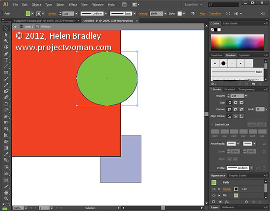
When you want to edit a specific part of a group of shapes without ungrouping everything to do so double click the grouped shape to enter isolation mode. Now select the object that you want to edit and make your changes. When you’re done double click outside the grouped shapes to exit isolation mode. This works for groups contained within groups as well.

Helen Bradley

Thursday, November 1st, 2012

Lightroom – Edit in Photoshop

Learn how to take an image from Lightroom to Photoshop and back again. This will ensure that the image appears back in Lightroom, automatically added to the catalog, with the original version backed up. I also demonstrate the different possible settings so that you may customize this process.

Transcript:

Hello, I’m Helen Bradley. Welcome to this video tutorial. In this tutorial I’m going to show you how you can take an image from Lightroom to Photoshop and back successfully. I’m here in the Develop module in Lightroom and I’ve already done some work on this particular image. And I’m pretty happy with it. The problem is in this animal’s eye though you can see that there’s a little shape here that I want to get rid of.

Now I could get rid of this in Lightroom but it’s going to be a whole lot easier to take this image into Photoshop. So we’re going to do that now. To take an image from Lightroom into Photoshop I’m going to let Lightroom control the process. I’ll right click and choose Edit in. Because Photoshop has already been installed and Lightroom is aware of that I’m going to click Edit in Adobe Photoshop CS6. If I was using a different version of Photoshop I would select that from the list. I’ll click here. And now what’s happening is that Lightroom is asking me what I want to edit, either a copy of this image with the Lightroom adjustments, just a copy of the original or the original itself. In this particular case I want to edit this image with the Lightroom adjustments. So I’m going to edit a copy with Lightroom adjustments and click Edit.

If Photoshop is not already open Photoshop will be opened now. But here’s our image inside Photoshop and I’m just going to size it so that we can see the area in question. And now I’m going to bring in the tools. I have here the spot healing brush tool which is going to be the tool that’s going to help me fix this problem. I think I need to zoom in a little bit closer still so let’s get right into this problem area. And now with the spot healing brush tool I can size it down to suit the problem area and just start working over it. I could also use the clone tool if I wanted to. Any of these tools are going to help me fix this issue. And working with this tool in Photoshop is going to be a whole lot easier than working with the similar tools in Lightroom because I can just be a whole lot more accurate in Photoshop. If I want to undo it I just press Ctrl Alt Z to undo the change.

So when I’m happy with the resulting eye I’m just going to zoom out, make sure it all looks fine, which it does for this particular eye. I’ll probably fix this one while I’m here, but let’s call this good for now. And because I’m ready to go back to Lightroom now I’ve fixed the problem, I’m just going to close this image. So I’m just going to click the X button to close it. I’ll get a message which will say do you want to save changes to the document and I’ll say yes. The important thing at this point is not to choose File, Save as because you want to send the image back to Lightroom in the format that Lightroom sent it to Photoshop.

Now we’re back in Lightroom. The image that we’re looking at is the one that has been the fixed eye. And you can see here it’s called lionanimaleyes edit.tif. What Photoshop has done in conjunction with Lightroom is it’s taken the image, applied the edits to it and then sent it back as a TIF file with -edit after it. This is the original file. We haven’t lost the original. We’ve just got a copy back with the edits applied to it. Now the settings that Lightroom uses when exporting to Photoshop and receiving the image back are in the preferences setting.

I’ll choose Edit and then Preferences. And we’ll go to External Editing. You can see here that edit in Photoshop CS6 is set up as a TIF file. If we wanted to we could bring it back as a PSD file but TIF was selected here. It’s being sent out as proPhoto RGB with a 16 bit depth, a resolution of 240. And here’s the file naming. It’s coming back with the same file name with -edit on it. You can see that we’re using custom settings. Here’s the edit and here are our custom settings, the original file name with –edit applied, and then either PSD or TIF depending on what it is that we have set here for the file format. So all of this is customizable and this is where it’s being controlled as to what it goes out to Photoshop as and what it comes back into Lightroom as. And provided you use that process of just choosing File, Close or File, Save from Photoshop and not Save As so you don’t give it a name, you let Photoshop and Lightroom deal with it, then you’re going to be able to work seamlessly between Lightroom and Photoshop and back again.

I’m Helen Bradley. Thank you for joining me for this video tutorial. If you enjoyed this tutorial place click Like. You can subscribe to my channel and hear more about videos that are launched regularly every week in future.

Wednesday, April 4th, 2012

Photo-editing in Photogene

Download: Photogene for the iPad $2.99

I have had Photogene now for a while but just cranked it up today to see just how it performs. I have to say it has some cool features – sort of an all-round app that could be all things to some people but which hasn’t a huge amount of depth.

It doesn’t have layers but it does have a mask you can paint on to paint on features such as the dodge and burn fixes. I got a bit confused with the presets – they are great for applying effects but they seem to have been added on rather than integrated with the program itself. It’s a minor complaint but you feel like filters and frames appear  in two different places – as regular tools and as presets. Problem is that if you use the presets you get access to some frames that you can’t get to elsewhere – which is a little frustrating if you are a DIY person and like to have better control over your images.

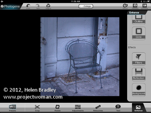
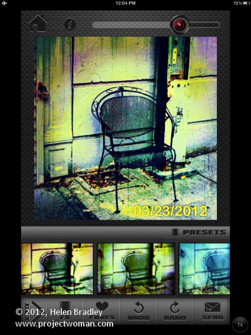
This image was shot in NY and I shot it specially to use for iPad editing. Here I gave it the treatment in Photogene. The image wasn’t perfectly straight so I started with the rotate tool and straightened it.

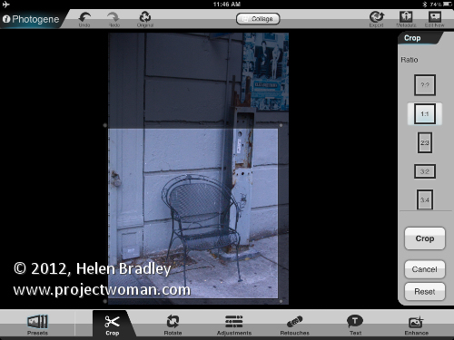
I cropped it using a 1:1 crop with the Crop tool.

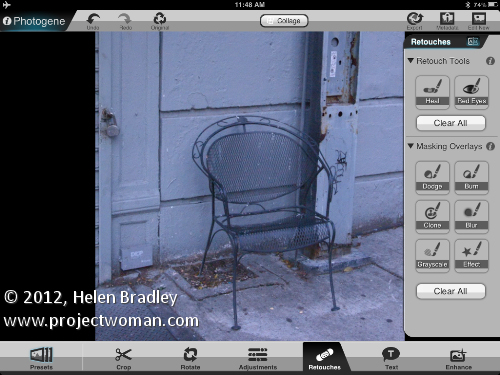
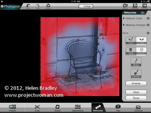
Then I added a vignette using the Burn brush which is a Retouching tool. The built in vignettes didn’t give me the control I wanted and being able to paint the vignette on is great.

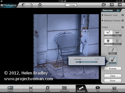
When you are dodging and burning you can change from paint to erase by tapping twice on the screen and there is an Intensity slider you can use to dial down the effect.

You can also choose to see the mask overlay which helps you when you’re trying to work out where you painted.

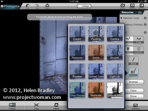
I used the Dodge brush retouching tool in the middle to lighten the image and then applied an effect from the effects collection.

Then I applied a cross process effect. You can do this to the entire image or it can be painted on using the retouch tools.

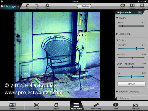
To finish some adjustments were made to the image saturation, vibrance and clarity.

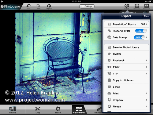
This was the end of the process in Photogene but I felt the image needed a little something extra. I saved it out of Photogene to the Photo Library.

Then took it to Scratch Camera to add the final touches you see here.

Helen Bradley