Saturday, May 25th, 2013

Photoshop Tip – Custom Workspaces

How to Create a Photoshop Workspace Just for You

I like Photoshop to open and “look the way I want to see it”. But sometimes ‘the way I want to see it’ is different than others. I’m fickle – but thankfully Photoshop plays nice with me – the secret is its Workspaces. These Workspaces let me preconfigure my Photoshop screen for various scenarios, to save them so I can reuse them, and to put everything back in its place when I mess them up.

If this sounds like something you could use – here’s how to give your Photoshop window a custom look with workspaces.

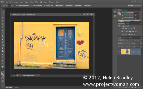
The first thing I do is to set up Photoshop the way you want it to look and that means hiding all the panels you don’t want to see and displaying those that you do.

Then arrange them on the screen exactly the way you want to see them. For me, I prefer my toolbar to be in two columns rather than one long one. I like my layers and paths palettes visible but not much else.

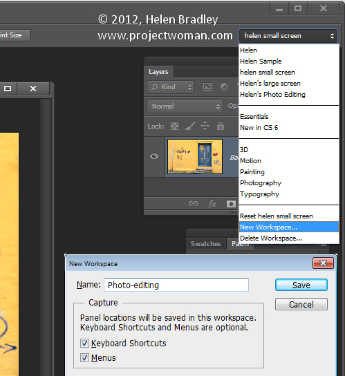
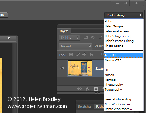
Once the screen is organized the way you want it to look, from the dropdown list in the top right corner choose Essentials > New Workspace and type a name for the workspace. Select the options for keyboard shortcuts and menus select and click Save.

You can repeat this process, if desired, and create other workspaces. You might make one for photo-editing, one for collage, one for illustration or one for videoing depending on your own personal needs.

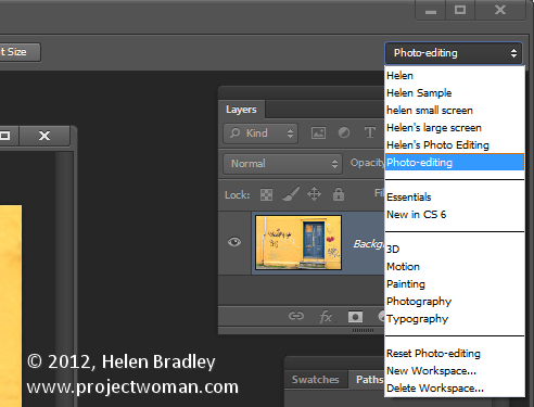
In future you can set up your screen by choosing the workspace of your choice from the dropdown list.

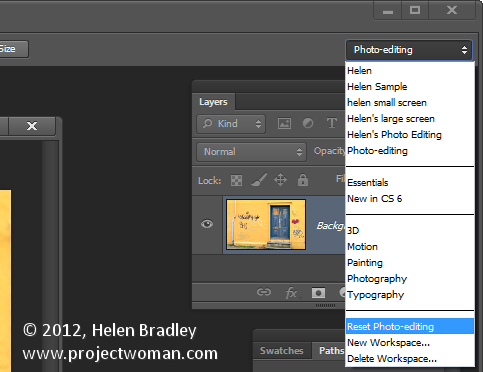
If you move things around and things go a bit crazy it is easy to reset a workspace back to how it was when you last saved it.

To do this, first make sure you are viewing the workspace to reset and then open the Workspace menu and choose Reset .

Likewise you can return to Photoshop’s default workspace anytime by selecting Essentials then click Reset Essentials.

And one last word on workspaces…
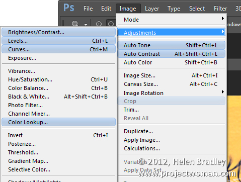
If you want to see what’s new in Photoshop CS6 click the New in CS6 workspace and you can see what is new in Photoshop. Open a menu and any new options in it will show as blue on the menu.

Helen Bradley

Monday, May 13th, 2013

Word 2010 and 2013 Tip – Misssing Page Numbers

Finding and Fixing Page Numbers that Can’t be Seen and/or Won’t Print

If you have included page numbers at the foot of a page and find that they’re missing from your printouts the problem lies with your page settings. The footer text is being forced to print so far down the paper that your printer is ejecting the paper before this point is reached.

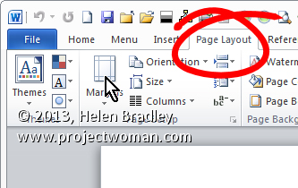
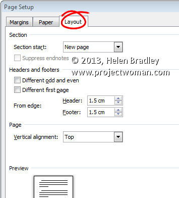
Solve the problem by selecting the Page Layout tab, click the Margins dropdown list, and click Custom Margins. Now, in this dialog select the Layout tab. Finally, increase the From edge: Footer measurement slightly. Experiment to find the smallest increase which will allow your page numbers to print.


Helen Bradley

Sunday, March 17th, 2013

Photoshop – Using Kuler Color Schemes

Learn how to use Kuler color schemes in Photoshop via the Kuler Extension.

This video includes details of how to add color schemes to swatches and how to edit, customize, and create Kuler color schemes inside Photoshop CS4, CS5 & CS6.

Transcript:

Hello, I’m Helen Bradley. Welcome to this video tutorial. In this tutorial I’m going to show you how you can use Kuler colors in Photoshop. In this video tutorial we’re going to have a look at Kuler which is a way that you can find custom color schemes from inside Photoshop.

Now Kuler is also available online but we’re going to work with the Photoshop extension. And that’s been there since CS4. To see it choose Window and then Extensions and then Kuler. And when Kuler launches you get to see some of the color schemes.

Now I last looked for vintage car and that’s in actual fact what we’re going to look for now. So I’ve typed in vintage car and clicked the Search button and here are color schemes that are related to vintage cars. And if I can’t see anything I like there I can click the View Next Set of Themes option and we can go forward to see other themes. Now these themes have been designed by other people and they’re available online. And people put them up online when they create them and then they are accessible for us to use if we want to use them.

So I’m looking for a theme to use for my car. And let’s say that I find one, so let’s just go and find one that we sort of like. I’m thinking this one here. And if I like it I can just click on this arrow icon here and I can add it to my swatches panel. And when I do that it becomes the last five colors in my swatches panel and I can click on any of these colors to add it as my new foreground color. And that allows me to paint on it for example to recolor my car.

Now if I sort of like it but think I like to edit a color for example maybe the red in this, then I can click here and choose Edit this theme. And this opens the Kuler panel but this time in the edit mode. And this is where I can change some of these colors.

For example I can take the red and walk it around to maybe make it an orange. And if I like that then I can use this particular color scheme. If I want to save this theme to my swatches panel I can do so by clicking here, Add this theme to swatches panel, again this time all five colors go into the swatches panel. I could upload it to Kuler if I wanted to and I can name and save the theme.

You can also create your own custom themes here so for example if you wanted to create an analogous color scheme you could do that. So you could just click there and then you can drag around on these sliders to make the color scheme that you want to use. If you want to use a complementary one you can do that and just drag in and out on these colors to create your own complementary color scheme. And if you like it then you can add it to your swatches panel. You can upload it to Kuler.

Kuler is a really handy tool for finding color schemes if you’re not sure what you want to use and so you can quickly and easily find color schemes and add them to your swatches panel. So it can help you get inspiration when you want to use a limited color palette on your images and you’re just not really inspired to find it yourself.

I’m Helen Bradley. Thank you for joining me for this video tutorial. Look out for more tutorials on this YouTube channel. Also visit my website at projectwoman.com for more tips, tricks and tutorials on Photoshop, Photoshop Elements, Lightroom, Illustrator and a whole lot more.

Helen Bradley

Tuesday, May 4th, 2010

Custom bullet layouts in Microsoft Word 2007

I don’t like Word’s basic bullet design and generally I’ll want bullets of my own liking. For example I’ll use bullet lists to create checkbox lists for things I need to do.

Bullet style

To get a checkbox list working in Word 2007 requires a little bit of list knowhow.If you’ve created your list items you can simply select the list and, from the Home tab, select the Multilevel list button and choose Define new list style.

You need to use this rather than the Bullet Lists > Define new bullet options because otherwise you don’t get control over the tabs and Word’s tab settings for bullets don’t always make good sense.

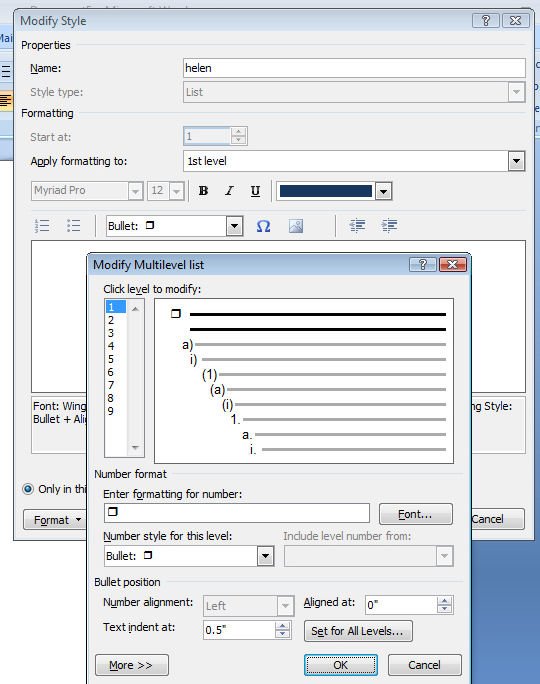
The Define New List Style option gives you the ability to control all of this. Start by typing a name for your list so that you can find it easily again later on. The select Bullets which is a small button to switch from numbers to bullet style. Click Insert symbol and select Wingdings as your font.

You can then select a bullet style such as a shadowed box, select it and click Ok.This is applied as the bullet style.

Spacing

To adjust the spacing between the edge of the page and the bullet and the bullet and the text, click the Format button and choose Numbering. Set the Aligned at value to the distance that you want between the left edge of the page and the bullet itself. I set this to 0 inches.

Set the text indent at a value to the distance you want between the bullet and the text. This is a hanging indent so it ensures that all lines of text are wrapped automatically to the value you set. I like to set this to .75 inches if I’m using large bullets. Click Ok. You can then click Ok again to set this as your bullet style.

You can ignore the rest of the numbering if you’re simply using a one level bullet. Click Ok.

To apply this bullet style to your document click the multilevel list and select the list style from the list styles area of the dialog. If you hold your mouse over it, you’ll see the list style appear in a small dialog with the name that you gave it showing. Click it to apply it to your list.


Helen Bradley

Wednesday, December 17th, 2008

Fix the Headings in your Excel 2007 tables


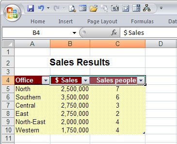
Excel 2007 has some great tools for working with and formatting tables (previously called Lists in earlier versions). To create a table, select the range that contains the table data and from the Home tab select Format As Table. Select a table format style and, when prompted to, confirm that the selected area contains all the data for your table, whether or not your table has headers and click Ok. When you do this you will see that each heading cell displays a dropdown arrow to the right of its contents.

Unfortunately, if your headers are right aligned, the table headings will run into the arrows and be partially hidden. I don’t know why Microsoft doesn’t create a fix for this because it looks awful. To avoid this happening, select the heading cells, right click and choose Format Cells. Click the Custom setting and type @ and four spaces and click Ok. This should add sufficient spaces to the right of a heading to move the headings a little to the left so the headings can be seen clearly. Now it all looks much nicer as you see above.

Helen Bradley