Sunday, March 17th, 2013

Photoshop – Using Kuler Color Schemes

Learn how to use Kuler color schemes in Photoshop via the Kuler Extension.

This video includes details of how to add color schemes to swatches and how to edit, customize, and create Kuler color schemes inside Photoshop CS4, CS5 & CS6.

Transcript:

Hello, I’m Helen Bradley. Welcome to this video tutorial. In this tutorial I’m going to show you how you can use Kuler colors in Photoshop. In this video tutorial we’re going to have a look at Kuler which is a way that you can find custom color schemes from inside Photoshop.

Now Kuler is also available online but we’re going to work with the Photoshop extension. And that’s been there since CS4. To see it choose Window and then Extensions and then Kuler. And when Kuler launches you get to see some of the color schemes.

Now I last looked for vintage car and that’s in actual fact what we’re going to look for now. So I’ve typed in vintage car and clicked the Search button and here are color schemes that are related to vintage cars. And if I can’t see anything I like there I can click the View Next Set of Themes option and we can go forward to see other themes. Now these themes have been designed by other people and they’re available online. And people put them up online when they create them and then they are accessible for us to use if we want to use them.

So I’m looking for a theme to use for my car. And let’s say that I find one, so let’s just go and find one that we sort of like. I’m thinking this one here. And if I like it I can just click on this arrow icon here and I can add it to my swatches panel. And when I do that it becomes the last five colors in my swatches panel and I can click on any of these colors to add it as my new foreground color. And that allows me to paint on it for example to recolor my car.

Now if I sort of like it but think I like to edit a color for example maybe the red in this, then I can click here and choose Edit this theme. And this opens the Kuler panel but this time in the edit mode. And this is where I can change some of these colors.

For example I can take the red and walk it around to maybe make it an orange. And if I like that then I can use this particular color scheme. If I want to save this theme to my swatches panel I can do so by clicking here, Add this theme to swatches panel, again this time all five colors go into the swatches panel. I could upload it to Kuler if I wanted to and I can name and save the theme.

You can also create your own custom themes here so for example if you wanted to create an analogous color scheme you could do that. So you could just click there and then you can drag around on these sliders to make the color scheme that you want to use. If you want to use a complementary one you can do that and just drag in and out on these colors to create your own complementary color scheme. And if you like it then you can add it to your swatches panel. You can upload it to Kuler.

Kuler is a really handy tool for finding color schemes if you’re not sure what you want to use and so you can quickly and easily find color schemes and add them to your swatches panel. So it can help you get inspiration when you want to use a limited color palette on your images and you’re just not really inspired to find it yourself.

I’m Helen Bradley. Thank you for joining me for this video tutorial. Look out for more tutorials on this YouTube channel. Also visit my website at projectwoman.com for more tips, tricks and tutorials on Photoshop, Photoshop Elements, Lightroom, Illustrator and a whole lot more.

Helen Bradley

Tuesday, April 24th, 2012

Add Custom Keyboard Shortcuts in Word 2010

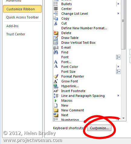
In Word 2010 you can set keyboard shortcuts for ribbon buttons using the program options. Choose File > Options and click Customize Ribbon. Click the Customize button at the foot of the dialog – this is available in Word 2010 but not in Excel 2010 curiously.

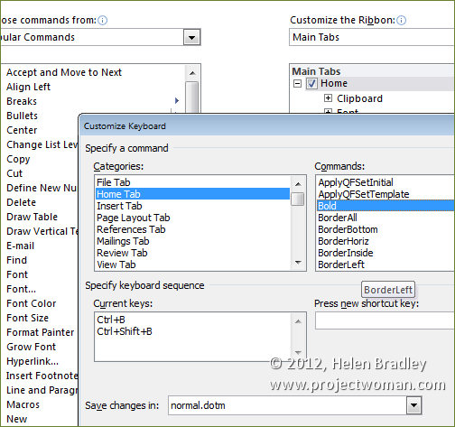
Click the tab that you’re interested in and locate the button on the tab that you want to customize. For example, if you choose the Home tab and click Bold as the command you’ll see that there are already keyboard shortcuts associated with that command.

Many other commands do not have keyboard shortcuts associated with them and if you want to add them you can do so.

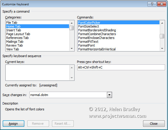
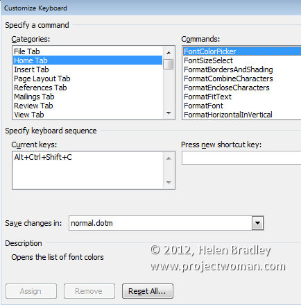
For example, there is no keyboard shortcut for the Font Color Picker. Select Home tab and then Font Color Picker and press a new shortcut key. For example the shortcut Alt + Ctrl + Shift + C is not currently assigned.

Click in the box and press that keyboard combination. If you want to use that for the Font Color Picker, you can do so by clicking Assign. This assigns this keystroke to the Font Color Picker tool.

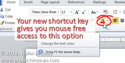
To test this, click Close and then Ok. Now when you select a piece of text you can apply the currently selected font color to it by pressing Ctrl + Alt + Shift + C.

Helen Bradley

Friday, March 30th, 2012

Print Contact Sheets in Lightroom

By Helen Bradley

Historically a contact sheet was a page of images each printed at the same size as the film negative – they were used as a reference for the images on the film roll. They were called contact sheets because the film was placed in close contact with the paper when printing them.

These days the term contact sheet loosely means an arrangement of multiple, small, same size images on a single page usually with some identifying information such as the image filename placed under the image. The purpose is to provide reference to a larger number of images. You may print them to keep or give to a client as a catalog of the images from a shoot, for example.

You can create a contact sheet inside Lightroom and here’s how to do it:

Select a template

Start by selecting the folder or the collection that contains the images that you want to add to the contact sheet.

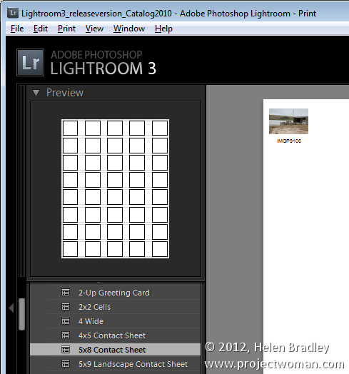
Launch the Print module and, from the Template Browser, select one of the contact sheet options. There are a few grid layouts including two with square image cells – a 4 x 8, and a 5 x 8. There are two with landscape orientation cells – one 5 x 9, and one 5 x 11.

I chose the 5 x  8 one.

Set up the print job

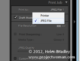
If you plan to ‘print’ the contact sheet to a jpg file, from the Print Job panel on the right of the screen, choose Print to JPG File. As contact sheets are just that – a contact sheet and not full scale images – select to use Draft Mode Printing to speed up their creation.

The page dimensions will be preset for 8.5 x 11in. You can set your own Custom File Dimensions but increasing the size of the page simply changes the page size not the size of the cells – you have to adjust them separately.

Adding images

If you have only one image selected in the Filmstrip then the contact sheet will only display one image.

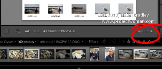
You’ll need to select all the images on the filmstrip to add them to the contact sheet. To do this, either click on the first image and Shift + Click on the last or select All Filmstrip Photos from the Use: list on the toolbar. If the Toolbar is not visible, press T to display it. You can also select Flagged photos, if desired.

The Toolbar shows you how many pages you will use and you can click the arrow keys on the toolbar to navigate the pages.

Add image captions

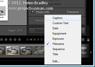
To add information below the images, from the Page panel on the right, select the Photo Info checkbox and choose the field to display. You can use one of the preset options such as Caption, Date, or Filename or click Edit to create your own field.

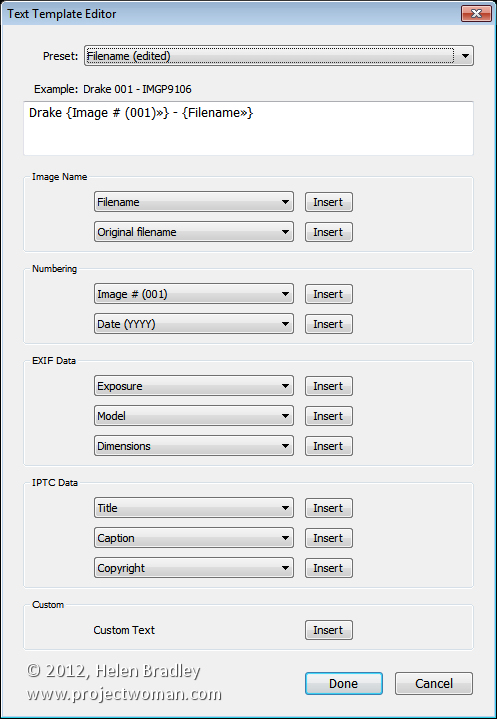
In the Text Template Editor, you can access to fields such as the filename, a sequential numbering or date as well as EXIF and IPTC data. You can also type your own custom text to create detailed photo info to add to the contact sheet. Here I typed some text, added a sequential number and the filename.

Customize the Contact Sheet

The template contact sheets are a starting point but you do not need to strictly adhere to their design if you don’t want to and they can be easily customized.

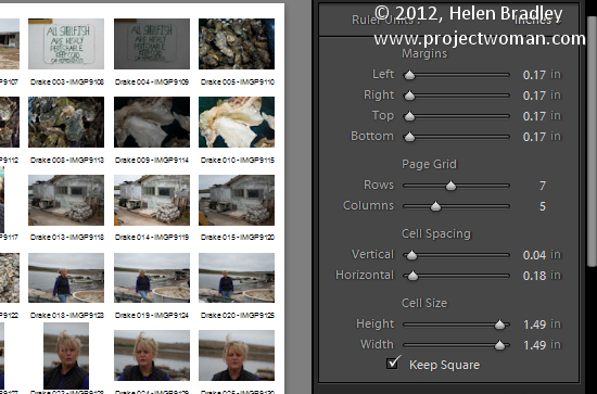
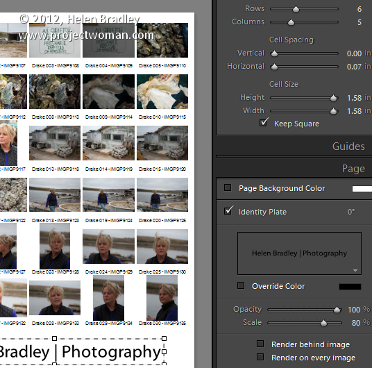
For example, from the layout panel if you click the Keep Square checkbox you will find that in some layouts your images may change orientation so the page will be a mix of portrait and landscape images.

You can adjust the maximum cell size and width using the Cell Size Height and Width sliders in the Layout panel. As you adjust the cell size, notice that the Cell Spacing values will change.

You can decrease the number of rows and/or columns using the Page Grid options. By decreasing the number of rows or columns, you can increase the cell size.

Adjusting margins

If you increase the Bottom or Top margin you can give yourself room to, for example, place an Identity Plate on the page.

Here I’ve reduced the number of rows and increased the bottom margin and added an Identity Plate from the Page panel options. In the Page panel, select the Identity Plate checkbox and then select the Identity Plate to use.

The Identity Plate will appear, by default, in the middle of the page so drag it into position on the page. Adjust its scale by dragging on the Scale slider.

You can adjust its Opacity if desired and, if it is a text identity plate (rather than a graphic), you can also select Override Color to make it any color you like.

Print the result

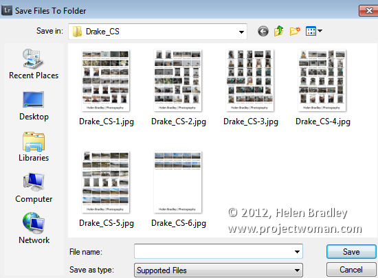
When you’re done, you’re ready to output the result. If you selected to print to a JPG file click Print to File and type a name for the file and select a location for them. The pages will be printed to a JPG file and if there are more than one they will be sequentially numbered.

Print to PDF

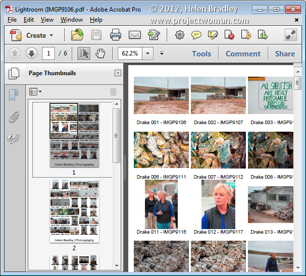
If you want to print to a PDF on a Windows machine you will need to have a PDF printer driver installed such as Adobe PDF or one you have downloaded from the web.

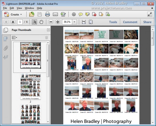
Select Page Setup, select the pdf printer driver and configure the page size so it matches the template size – such as letter paper portrait orientation. Then set the Print to: option in the Print Job panel to printer and click Print to print to a pdf.

Save the Template

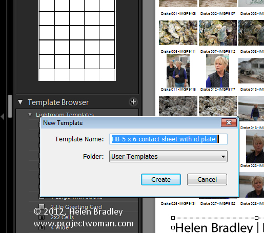
If you have customized a template and want to be able to use it again in future, save the design as a new template.

Click the plus symbol opposite the Template Browser panel header and type a name for your template. You can store it in User Templates or create a new folder for it. Click to create it.

In future you can save yourself the time setting up the template by starting with your customized version.

Helen Bradley

Monday, October 24th, 2011

Lightroom toolbar techniques

If you’ve seen items come and go in your Lightroom interface and if you’re confused about what exactly is happening chances are you hit a keyboard shortcut that displays or hides one of the interface features. When I was new to Lightroom it was the Toolbar – I could make disappear in a heartbeat – problem was it took a lot longer to work out what had gone and how to get it back.

As I soon learned, the toolbar can be hidden and displayed using the T shortcut or you can choose View > Toolbar. The toolbar is visible in Library, Develop, Slideshow, Print and Web view – but here’s the catch – there is a separate toolbar for each module and hiding one doesn’t hide them all – likewise displaying a toolbar only does so for the current module not all of them.

That said, you’ll want to have the toolbar visible in most of the modules most of the time because it has some handy features that you will use regularly.

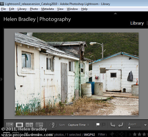
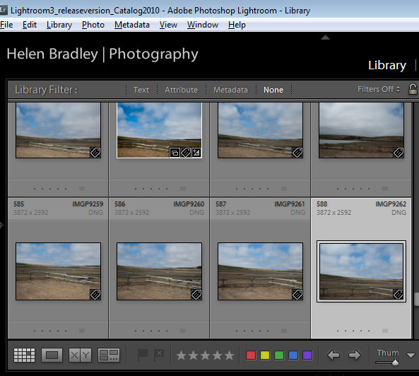
The toolbars in the Library and Develop modules are customizable – those in the other modules are fixed in what they display. To add to the general confusion, the toolbar you see in Grid view and the one you see in Loupe view in the Library module are both toggled on and off as if they were the same toolbar but they are separately customizable so you can select which tools appear in which view and they can look very different in each view as shown in these images of firstly Loupe view then Grid view:

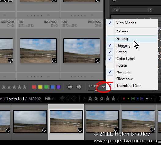
To customize a toolbar click the down pointing arrow at its far right and select the options to display and hide. When you are working on a laptop, for example, and where screen real estate is a valuable commodity, you’ll need to be judicious about what tools are visible and which are not.

One option on a laptop that I like to disable is the rotation tool in Grid view in the Library. The reason is that I can set the thumbnails in Grid view so they show rotation icons so I don’t need the additional tool on the toolbar. However, in Loupe view this rotation tool doesn’t appear so I add it to the toolbar.

If you often resize your thumbnails then including the Thumbnail Size slider is a good idea – if you need the space it takes up for other tools then hide it and learn the = and – shortcut keys for managing the thumbnail size instead.

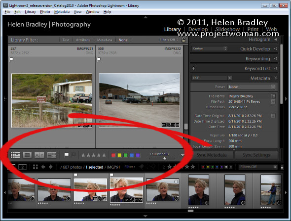
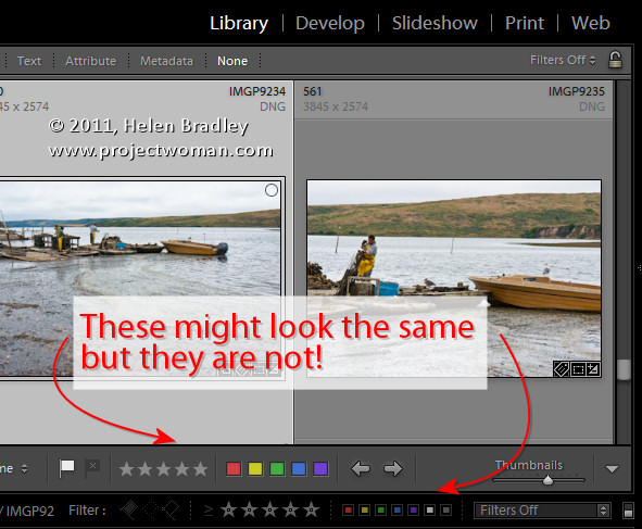
One gotcha that is a guaranteed disaster in the making for new Lightroom users is the apparent duplication of rating, color and flags on the Toolbar and on the bar across the top of the Filmstrip. These are NOT duplicates and instead they are each very different options. The tools on the Toolbar are used to apply a flag, color and rating to images in the Grid or Loupe views. Those above the filmstrip are filters that you use to filter your images based on the flags, colors and ratings you have applied to them. It is important to understand the difference. If you get into trouble and some of your images disappear, selecting Filters Off from the dropdown list above the filmstrip will display all your images again.

Helen Bradley

Friday, September 30th, 2011

Secrets of the Lightroom toolbar

If you’ve seen items come and go in your Lightroom interface and if you’re confused about what exactly is happening chances are you hit a keyboard shortcut that displays or hides one of the interface features. When I was new to Lightroom it was the Toolbar – I could make disappear in a heartbeat – problem was it took a lot longer to work out what had gone and how to get it back.

As I soon learned, the toolbar can be hidden and displayed using the T shortcut or you can choose View > Toolbar. The toolbar is visible in Library, Develop, Slideshow, Print and Web view – but here’s the catch – there is a separate toolbar for each module and hiding one doesn’t hide them all – likewise displaying a toolbar only does so for the current module not all of them.

That said, you’ll want to have the toolbar visible in most of the modules most of the time because it has some handy features that you will use regularly.

The toolbars in the Library and Develop modules are customizable – those in the other modules are fixed in what they display. To add to the general confusion, the toolbar you see in Grid view and the one you see in Loupe view in the Library module are both toggled on and off as if they were the same toolbar but they are separately customizable so you can select which tools appear in which view and they can look very different in each view as shown in these images of firstly Loupe view then Grid view:

To customize a toolbar click the down pointing arrow at its far right and select the options to display and hide. When you are working on a laptop, for example, and where screen real estate is a valuable commodity, you’ll need to be judicious about what tools are visible and which are not.

One option on a laptop that I like to disable is the rotation tool in Grid view in the Library. The reason is that I can set the thumbnails in Grid view so they show rotation icons so I don’t need the additional tool on the toolbar. However, in Loupe view this rotation tool doesn’t appear so I add it to the toolbar.

If you often resize your thumbnails then including the Thumbnail Size slider is a good idea – if you need the space it takes up for other tools then hide it and learn the = and – shortcut keys for managing the thumbnail size instead.

One gotcha that is a guaranteed disaster in the making for new Lightroom users is the apparent duplication of rating, color and flags on the Toolbar and on the bar across the top of the Filmstrip. These are NOT duplicates and instead they are each very different options. The tools on the Toolbar are used to apply a flag, color and rating to images in the Grid or Loupe views. Those above the filmstrip are filters that you use to filter your images based on the flags, colors and ratings you have applied to them. It is important to understand the difference. If you get into trouble and some of your images disappear, selecting Filters Off from the drop-down list above the filmstrip will display all your images again.

Helen Bradley

Tuesday, August 7th, 2007

Where is it? Office 2007 stole your fave command

I get a lot of emails from folk who have spent time agonizing about things missing from the new Office 2007. True, a few of your old favourite commands have probably bitten the dust but some are still there, just not visible.

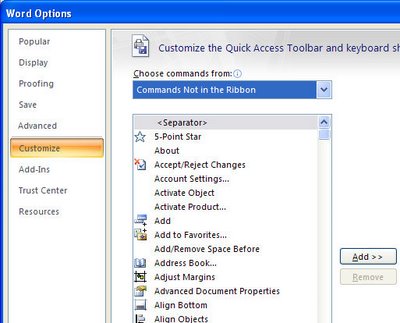
To see what you can’t see (if that isn’t a totally confusing statement) click the Office button, choose Word Options (or Excel Options if you’re using Excel etc) and then click Customize. This is where you can manage your toolbar. From the Choose Commands From list choose Commands not in the Ribbon. The list below shows all the commands that still function but which you just can’t see. Click any you can’t live without and click Add to add them to the Quick Access toolbar and they’ll be there for you to use.

This is also the first place to look when you are wondering if a certain command is on the ribbon. If you can’t see it, check here, this is a definative list of what still works but isn’t where it is easily accessed.

Helen Bradley

Friday, February 9th, 2007

Display an Excel Workbook’s path

Sometimes it’s handy to show the path of an Excel workbook on the screen. Here’s a workaround using a toolbar to do this.

  1. Right click on the menu bar and choose Customize and then the Commands tab.
  2. From the Categories list choose Web and, from the Commands list drag the Address option onto a toolbar or into the menu bar.
  3. Click Close and voila! the file’s full path will appear in the box.

Helen Bradley