Thursday, October 10th, 2013

Adjusting your White Balance in Lightroom
Lightroom has a set of tools that you can use to adjust white balance in your images. To see these at work open an image in the Develop module. At the top of your Basic panel are the white balance adjustment tools.
White Balance Options
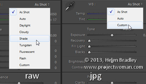
The dropdown list will show you some options for adjusting white balance – what is shown here will vary depending on how your images are captured. If you capture in raw then the white balance dropdown list will contain the same options as you have on your camera for setting white balance. If you’re capturing jpg images then there are fewer options – As Shot, Auto and Custom.

On the left are the options for a raw image and on the right those for a jpeg image.
The Temperature and Tint sliders also have different units of measure depending on whether you’re working with jpgs or raw images. For jpg images both the sliders range from +100 to -100. If you’re working on a raw image then the Temperature slider shows degrees Kelvin from 2000 – 50,000 and the Tint slider ranges between + 150 and – 150.
Kelvin is a measurement of the color of light – daylight is around 5,500 degrees Kelvin. Lights we consider to be warm or pink/orange in color including tungsten globes are around 3,000 degrees Kelvin and cool lights which are blue in color such as overcast daylight are around 7,000 degrees Kelvin and higher.
Adjust White Balance
To adjust the white balance in the selected image you can select an option from the White Balance dropdown list to use to fix the image or you can use it as a starting point and then fine tune the result.
You can also manually adjust the Temp slider to add warmth or remove it from the image. Drag the sider to the left to add a blue tint to the image (to cool it down), or to the right to add a yellow tint to it to warm the image.
Use the Tint slider to balance out any excess magenta or green in the image. Drag towards the right to add magenta to the image cancelling out any green tint and drag to the left to add a green tint cancelling out any unwanted magenta.
White Balance Selector
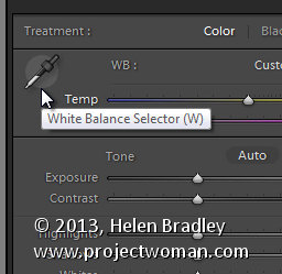
You can also use the White Balance Selector to adjust white balance. You can select the tool by clicking on it or press W.

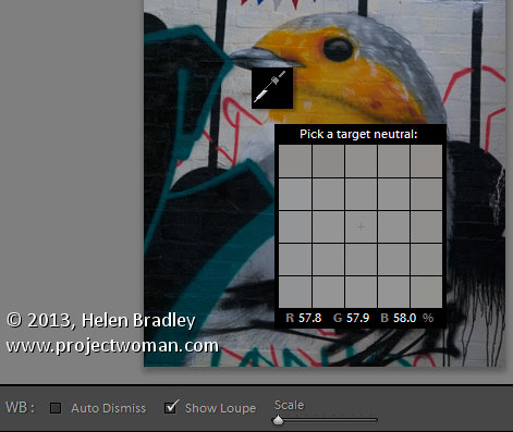
From the White Balance toolbar under the image you can select options that make the White Balance tool easier to use. I suggest you deselect Auto Dismiss as you can then click on the image in various places to attempt to fix it. If you have Auto Dismiss enabled you’ll only be able to click once before the selector is dismissed so, if that fix isn’t perfect then you’ll need to select the tool again to attempt another fix. This is a cumbersome way to work so I prefer to disable Auto Dismiss and put the tool away only when I am done with it.
If you click the Show Loupe checkbox then you’ll see a 5 by 5 pixel grid beside the mouse cursor. The center point in the grid is the pixel that you are currently targeting and which will be used to adjust the image if you click. This grid makes it easier for you to pick the correct point in the image to adjust to. The scale itself can be increased or decreased using the Scale option on the toolbar.
At the bottom of the loupe itself are the RGB percentage values of the pixel under the cursor. These values tell you if the pixel is neutral or not. If it is neutral then the percentages of R, G and B will all be equal – if they are not equal then there is color in that pixel.

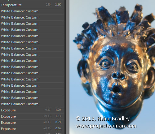
To balance the image using the White Balance selector, click on a pixel that should be neutral grey – not white or black. When you do so, Lightroom will adjust the image so that the selected pixel is a neutral grey and, as a result, all the color in the image will change. At the same time Lightroom adds an entry to the image History for that adjustment. This means that you can wind back the history to return to an earlier white balance fix, if desired.

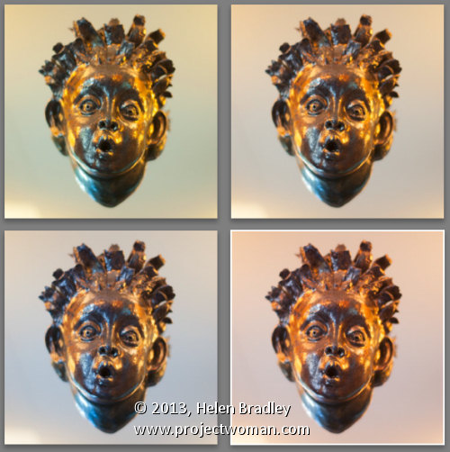
You should be aware that adjusting image white balance is to an extent a subjective assessment – so there is no one value that is “correct”. There are, instead, a myriad of different results that can be achieved so look for one that is it pleasing to you. In most cases viewers prefer to see some warmth in photos as they are more pleasing to the eye if they are warmer rather than cool.
I find that a good approach to take is to experiment with the white balance selector to see the effect on the image by selecting different pixels to adjust to. Then choose the most aesthetically pleasing result.
Helen Bradley
Labels: adjust, balance, Develop, Develop Module, Kelvin, Lightroom, Loupe, Photoshop, pixel, rgb, Selector, temperature, tint, tip, trick, Tutorial, w, white, white balance, White Balance Option, white balance selector
Categories:Lightroom, photoshop
posted by Helen Bradley @ 10:10 amNo Comments links to this post
Saturday, October 5th, 2013

Save Time in Lightroom when Resizing and Cropping Large Amounts of Output Images
If you’re working on a large shoot and need to output a lot of images at a fixed size then Lightroom can do the work for you. It isn’t obvious how you can crop all your images to a fixed size and output them at a certain set of pixel dimensions but it is easy to do when you know how. Here’s how to do it:
Step 1

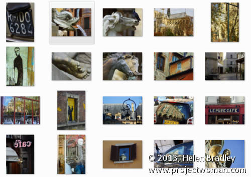
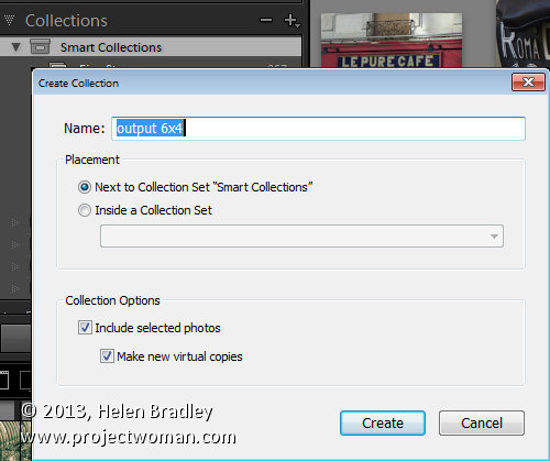
First locate the folder with your images in it. I prefer to make virtual copies of my images and put them in a new collection but you can do whatever makes sense to you.
Step 2

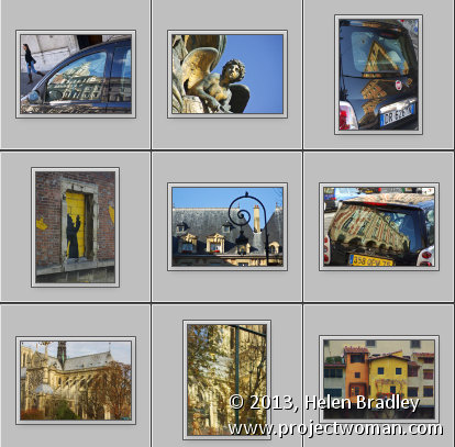
Select all the images in Grid view in the Library module in Lightroom.
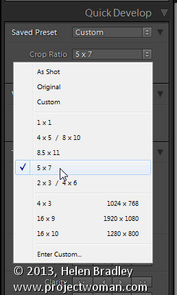
Open the Quick Develop panel on the right and, from the Crop Ratio dropdown list, select the crop ratio that you want to crop to. For example you can crop to fixed ratios such as 1 by 1 or printing sizes such as 5×7, 4×6 and so on.
Here I’ve selected 5×7 and when I do so all the selected images are automatically cropped to this 5 x 7 ratio.
Lightroom is smart enough to understand that some images are portrait orientation and others are landscape. Portrait images are cropped to 5 x 7 and landscape orientation images to 7 x 5.

Step 3 (optional)

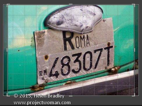
If desired, you can now move to the Develop module and check the crop for all the images. By default, Lightroom will center the crop rectangle on the image and this may not be exactly what you want for some images. However, it is easy to go to the Develop module, click the first image and click on the Crop Overlay Tool so you see the crop marquee in position on the on the image.
Now from the filmstrip you can click on each image in succession to preview it in the crop window and you can easily identify if any of them need an adjustment to the crop rectangle. If they do simply drag on the crop rectangle to reposition it. When you’re done return to the Library view.
Step 4

As the images are now all cropped to size, press Ctrl + A to select them and then click Export. Choose a folder to export the images into or click New Folder to create a new folder.
You can now set your desired preferences in the Export dialog.
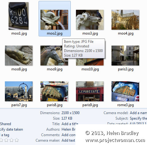
To control the output size – in pixels wide and tall – of the images easily because you already know the crop ratio. To do this, select the Resize to fit checkbox and choose Long Edge from the dropdown list. Then type a pixel dimension for the long edge. So, for example, to prepare 5 by 7 ratio images for printing at 300 dpi the longest edge will need to be 2,100 pixels (7 x 300) so type 2100 and set the resolution to 300.
Step 5

Click Export to export your images and they will be exported to a folder at the chosen size and resolution.
This process allows you to quickly and effectively prepare a batch of images for printing. It manages portrait and landscape images so that you don’t have to separately handle each type. It’s a simple workflow and a fast way to prepare images from a large shoot.
Helen Bradley
Labels: batch, batch resize, bulk, crop, Develop, Develop Module, export, image, Library, library module, Lightroom, output, Photoshop, quick develop, resize, tip, trick, Tutorial
Categories:Lightroom, photoshop
posted by Helen Bradley @ 10:05 amNo Comments links to this post
Thursday, August 29th, 2013

Editing your Image: Make your Image look as it did in you Camera
You may find that the Lightroom previews look different to those you’re used to seeing when you view the image in your camera.
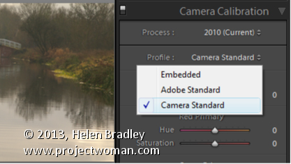
To make them closer to the camera version, select the Camera Calibration panel in the Develop module and from the Profile list choose Camera Standard – this better matches more closely the image you saw on the back of your camera.
These profiles are a starting point for further adjusting your image so choose the one which works best for you.
Helen Bradley
Labels: Adobe Standard, Calibration, camera, Camera Calibration, Camera Standard, Develop, Develop Module, edit, Embedded, Lightroom, match, Photoshop, Profile, Standard, Start, tip, trick, Tutorial
Categories:Lightroom, photoshop
posted by Helen Bradley @ 5:58 amNo Comments links to this post
Sunday, August 25th, 2013

Learn how to darken the edges of an image using a Vignette in Lightroom
Vignettes are a darkening or lightening of the edges of an image – they can make an image look very attractive.
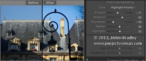
To add a vignette, open the Effects panel, set the Style to either Highlight Priority or Color Priority – Paint Overlay is the least attractive option. Drag to the left on the Amount slider to add a dark vignette and to the right to add a light one.
The Midpoint slider adjusts how the effect is applied to the edges of the image. Increase it to remove the vignette from the edges leaving it mainly in the corners.
Roundness controls the roundness of the vignette, drag to the left to make it more square, to the right to make it more circular. Feather controls the softness of the edges so use 0 for a hard-edge and 100 for a very soft edge.
Highlights applies when you use a negative Amount to create a darkened vignette. Zero gives no change and larger values preserve highlight contrast when you select Highlight Priority or Color Priority.
Helen Bradley
Labels: amount, color, Color Priority, dark, Develop, Develop Module, edge, Feather, Highlight, Highlight Priority, light, Lightroom, Midpoint, Paint Overlay, Photoshop, Post-Crop Vignetting, Roundness, slider, tip, trick, Tutorial, Vignette, vignette effect
Categories:Lightroom, photoshop
posted by Helen Bradley @ 6:50 amNo Comments links to this post
Thursday, August 22nd, 2013

How to use the Masking Slider to limit image sharpening to only the edges in the image
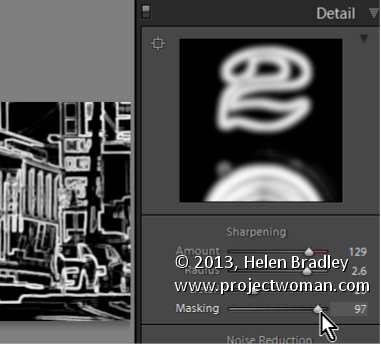
The Masking slider in the Lightroom Detail panel allows you to control the areas of the image that are sharpened and those that are not.
Hold Alt (Option on the Mac) as you drag on the Masking slider. As you do you will see a black and white overlay on the image. The areas that are black are not sharpened, those that are white are sharpened. The farther you drag to the right the more the sharpening is limited to just the edges in the image where you want it to be applied to.
Drag on the slider to control just how much of the image you want to have sharpened. When you’re done, adjust the Amount to a value that makes sense for the image.
Helen Bradley
Labels: Alt, amount, Amount Value, Black, blend, detail, Develop, Develop Module, edge, Lightroom, mask, masking, option, Photoshop, Sharp, Sharpen, Sharpening, sharpening in lightroom, slider, tip, trick, Tutorial, value, white
Categories:Lightroom, photoshop
posted by Helen Bradley @ 6:45 amNo Comments links to this post
Monday, August 19th, 2013

Learn how to suppress halos with the Detail Slider when Sharpening in Lightroom
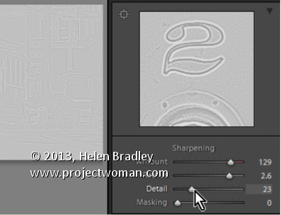
The Detail slider in the Detail panel in Lightroom lets you suppress the haloes you create with the Radius slider.
At zero position you will fully suppress any halos and at 100 you will have no halo suppression so you will see all the halos added using the Detail slider.
This means that a low value for the Detail sider sharpens only the largest edges in the image and a large value for Detail will tend towards sharpening everything.
Hold Alt (Option on the Mac) as you drag on the Detail slider to see the effect on the halos around the edges in the image.
Typically if you use a high Radius value then you will want to use a low value for Detail and vice versa.
Helen Bradley
Labels: 100%, Alt, detail, Develop, Develop Module, edge, halo, Lightroom, option, Photoshop, radius, Sharp, Sharpening, sharpening in lightroom, slider, tip, trick, Tutorial, zero
Categories:Lightroom, photoshop
posted by Helen Bradley @ 6:39 amNo Comments links to this post
Wednesday, August 14th, 2013

Learn how to fine tune sharpening with the Amount and Radius Sliders
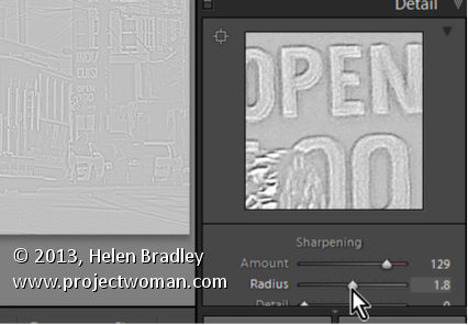
The Detail panel in Lightroom controls sharpening on the image. Use the Amount slider to manage the intensity of the sharpening – set this to a high value to begin.
The Radius slider adds halos around the edges in the image which is what gives the sharpening effect.
For an image with lots of fine lines and detail such as a building select a low radius. For a portrait or an image with softer detail, use a high radius value.
Hold the Alt key (Option on the Mac) as you drag on the Radius slider to see the halos.
Helen Bradley
Labels: Alt, amount, detail, detail sharpening, Develop, Develop Module, edge, effect, halo, Lightroom, option, Photoshop, radius, Sharp, Sharpening, sharpening in lightroom, slider, tip, trick, Tutorial
Categories:Lightroom, photoshop
posted by Helen Bradley @ 6:31 amNo Comments links to this post
Sunday, August 11th, 2013

How to prepare your image for sharpening so you can make a good adjustment
To sharpen an image, first make sure that the main image is visible at a 1:1 ratio in size so you can see the resulting sharpening effect more clearly.
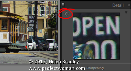
To control what appears in the Preview window, click the indicator in the top left of the Detail panel and click an area of the image to preview. Choose a good position on the image as a preview – something that needs to be good and sharp.
You can also click on the image in the Preview – click once to see the preview filled with the image and again to zoom into the image.
Drag the image in the Preview window to see different parts of it.
Helen Bradley
Labels: 1:1, Detail Panel, Develop, Develop Module, effect, Lightroom, Photoshop, preview, Sharpen, sharpening in lightroom, tip, trick, Tutorial
Categories:Lightroom, photoshop
posted by Helen Bradley @ 6:21 amNo Comments links to this post
Thursday, August 8th, 2013

Split Toning a Black and White Image – learn how to make the Highlights and Shadows Different Colors
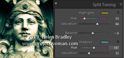
Split Toning applies one color to the highlights and another to the shadows in an image.
Good color choices when applying a split tone are colors that are opposite each other on the color wheel such as magenta and green, blue and yellow, or red and cyan – although you can choose any combination you like.
To apply the split tone effect, drag on the Hue slider or click the color picker to choose a color to use for the Highlights and then choose something else to use for the Shadows.
Adjust the Saturation of the colors as desired.
Balance allows you to fine tune how the colors are applied to the image – drag to the left to adjust the balance towards the shadow color and drag to the right to add more of the highlight color.
Helen Bradley
Labels: adjust, b & w, B&W, balance, Black, Black & White, Black & White Mix, black and white, color, color a black and white image, Develop, Develop Module, highlights, Hue, Lightroom, Photoshop, saturation, shadow, slider, split, split tone, splittone, tip, trick, Tutorial, white
Categories:Lightroom, photoshop
posted by Helen Bradley @ 6:48 amNo Comments links to this post
Monday, August 5th, 2013

How to use the Targeted Adjustment Tool to get a better Black and White Image
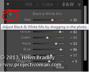
In the Black & White mix dialog is a Targeted Adjustment Tool (TAT).
You can use this TAT to craft your own black and white image.
To do this, select the TAT and drag up or down on an area of the image to lighten or darken the color under the TAT. This is often easier than dragging on the color sliders to adjust your black and white image.
The TAT is handy for crafting a black and white image to look the way you want it to look.
Helen Bradley
Labels: b & w, B&W, Black, Black & White, Black & White Mix, black and white, color sliders, Develop, Develop Module, dialog, Lightroom, Mix, Photoshop, Targerted Adjustment Tool, TAT, tip, trick, Tutorial, white
Categories:Lightroom, photoshop
posted by Helen Bradley @ 6:42 amNo Comments links to this post


