Wednesday, June 19th, 2013

Lightroom Tip – Faux Orton Effect

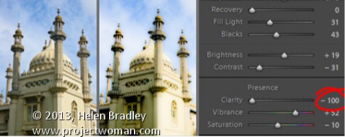
Create the Orton Effect in Lightroom with the Clarity Slider

The Orton Effect is named after photographer Michael Orton. This process results in a somewhat surreal image which has a slightly out-of-focus look while retaining lots of edge detail.

You can quickly give an image a faux Orton look using the Clarity slider in Lightroom. All you need to do is drag the Clarity slider to the left close to -100 and then, increase the Blacks in the image to an higher than usual value.

Of course there is a lot more to the Orton effect than this but this gives you a good start and, for many images, may be all you really need.

Helen Bradley

Thursday, June 13th, 2013

Lightroom Tip – Clarity and Portraits

Add that Softened Look to Your Portraits with the Clarity Slider

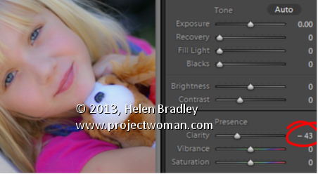
One time when you’ll want to use a negative value for Clarity in Lightroom is when you have a portrait that you want to give a softened look to.

Negative clarity softens an image so it’s a good choice to use. Just adjust the slider to the left to around -20 or more depending on the results.

Use this on portraits of women and children or to give an image an ‘Early Hollywood/Casablanca’ feel.

Helen Bradley

Monday, June 10th, 2013

Lightroom Tip – The Clarity Slider

Give an image’s Midtones a Boost with the Clarity Slider

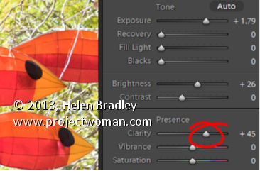
The Clarity slider helps you adjust the Midtones in the image so it adds Contrast to them which also results in them looking a little crisper and more saturated too.

It’s a great tool, but try not to overdo it. Typically, a Clarity adjustment of around 25 is a good choice for most images. In Lightroom 4 the adjustment has been tweaked a bit so you can add more Clarity in Lightroom 4 than you are perhaps used to doing in Lightroom 3.

Helen Bradley

Thursday, June 6th, 2013

Lightroom Tip – Recover Detail from Shadows in an image

Find Lost Details Hidden in Shadows and Darker Parts of an Image

When you have an image that has details lost in the shadows or darker areas of the image, the Fill Light slider in Lightroom 3 or the Shadows slider in Lightroom 4 can be used to recover this detail.

Don’t use either of these as a tool for lightening an image or to lighten shadows if there is nothing interesting in the shadows. Use them instead when you want to get some interesting detail out of the shadows.

The result of using the Fill Light and sometimes using the Shadow tool is that some contrast in the image will be lost – so you nay need to increase Contrast as a result of using the Fill Light slider in Lightroom 3 or apply a tone curve adjustment in Lightroom 4.

Helen Bradley

Wednesday, May 1st, 2013

Lightroom Tip – Bulk Crop and Resize Image

Learn how to crop and resize in bulk in Lightroom. If you have a lot of images you need to, for example, crop to 5 x 7 and then save at a particular pixel size and resolution, you can learn how to do this quickly and effectively in Lightroom. This makes use of the tools in the Quick Develop panel in the Library module.

Transcript:
Hello, I’m Helen Bradley. Welcome to this video tutorial. In this tutorial I’m going to show you how you can bulk crop and resize images and export them from Lightroom.

A reader recently posed a question to me and that was what do I do if I need to crop all my images to 5 by 7 in size and get them out as 500 by 700 pixel images. In Lightroom that’s not that difficult to do. What I suggest you do is you do it from the Library in Quick Develop mode. So I’m going to select the images here and then I’m going to select Crop Ratio and I’m going to choose 5 by 7. And that will crop all of these images to 5 by 7 images. But look what it’s done with the verticals. It’s cropped them to 5 by 7 but it’s kept that same vertical alignment.

So now let’s go to the Develop module and just see what we’re seeing here. This is the crop marquee. And you can see that this image, each one of these images in fact has been cropped to 5 by 7. And let’s go and find a vertical crop and see how it’s been cropped. Again, it’s been cropped to 5 by 7 but in a vertical direction. So this means that all of these images have automatically been cropped.

All we would do is have a quick look and make sure that important parts of the image have not been cropped off. If these were people we’d have a quick check to make sure that somebody’s head hasn’t been chopped off for example. And having done that now knowing that everything is cropped to 5 by 7, to export these images at 500 by 700 pixels in size or 700 by 500 we would select all of them by clicking on the first and Shift click on the last. I’m going to right click and choose Export and then Export again and we would just set up the Export option. So here I’m going to put this in a folder called 5 by 7.

I don’t want to rename these files. All we want to do is to resize them. But what I do want to do is I want to select Resize to Fit. And the longest edge since I know that these are all 5 by 7s is going to be 700 pixels and the resolution I can set to 100 pixels per inch. So these are then going to be 5 by 7 images at 100 pixels per inch resolution. And all I need to do is to click Export and Lightroom is going ahead and it is cropping and resizing all of those images so that they are all going to be the exact right size that we chose. And here they are including the ones that were verticals. You can see that these are 500 by 700 pixels in size. This one is 700 by 500 because it’s a landscape image.

So in Lightroom you could batch resize and export these images in just a matter of a few seconds by just choosing the right option. And that is here in the Quick Develop module setting a crop ratio for those images. This is not something you can do easily in the Develop module, but it’s something that you can do very, very simply here in the Quick Develop area of the Library in Lightroom.

My name is Helen Bradley. Thank you for joining me for this Lightroom video tutorial. If you liked the tutorial please comment, press the Like button, consider subscribing to my YouTube channel. You’ll also find more of my tutorials, tips and tricks on my website at projectwoman.com.

Helen Bradley

Friday, September 30th, 2011

Secrets of the Lightroom toolbar

If you’ve seen items come and go in your Lightroom interface and if you’re confused about what exactly is happening chances are you hit a keyboard shortcut that displays or hides one of the interface features. When I was new to Lightroom it was the Toolbar – I could make disappear in a heartbeat – problem was it took a lot longer to work out what had gone and how to get it back.

As I soon learned, the toolbar can be hidden and displayed using the T shortcut or you can choose View > Toolbar. The toolbar is visible in Library, Develop, Slideshow, Print and Web view – but here’s the catch – there is a separate toolbar for each module and hiding one doesn’t hide them all – likewise displaying a toolbar only does so for the current module not all of them.

That said, you’ll want to have the toolbar visible in most of the modules most of the time because it has some handy features that you will use regularly.

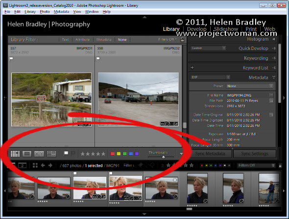
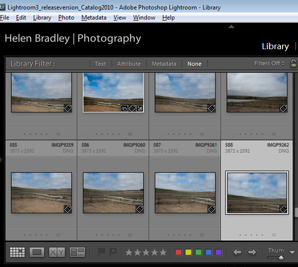
The toolbars in the Library and Develop modules are customizable – those in the other modules are fixed in what they display. To add to the general confusion, the toolbar you see in Grid view and the one you see in Loupe view in the Library module are both toggled on and off as if they were the same toolbar but they are separately customizable so you can select which tools appear in which view and they can look very different in each view as shown in these images of firstly Loupe view then Grid view:

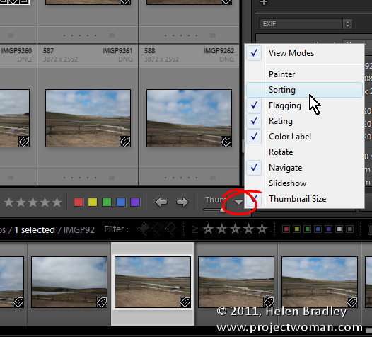
To customize a toolbar click the down pointing arrow at its far right and select the options to display and hide. When you are working on a laptop, for example, and where screen real estate is a valuable commodity, you’ll need to be judicious about what tools are visible and which are not.

One option on a laptop that I like to disable is the rotation tool in Grid view in the Library. The reason is that I can set the thumbnails in Grid view so they show rotation icons so I don’t need the additional tool on the toolbar. However, in Loupe view this rotation tool doesn’t appear so I add it to the toolbar.

If you often resize your thumbnails then including the Thumbnail Size slider is a good idea – if you need the space it takes up for other tools then hide it and learn the = and – shortcut keys for managing the thumbnail size instead.

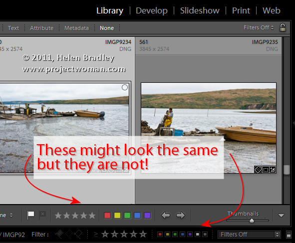
One gotcha that is a guaranteed disaster in the making for new Lightroom users is the apparent duplication of rating, color and flags on the Toolbar and on the bar across the top of the Filmstrip. These are NOT duplicates and instead they are each very different options. The tools on the Toolbar are used to apply a flag, color and rating to images in the Grid or Loupe views. Those above the filmstrip are filters that you use to filter your images based on the flags, colors and ratings you have applied to them. It is important to understand the difference. If you get into trouble and some of your images disappear, selecting Filters Off from the drop-down list above the filmstrip will display all your images again.

Helen Bradley

Tuesday, April 20th, 2010

Lightening backgrounds in Lightroom

I was recently asked by photographer Rhonda Pierce to look at an image that she’d taken and to suggest how the background could be lightened to white in Lightroom.

This image raises an interesting question for anyone involved in postproduction and trying to understand when to use Lightroom and when to use Photoshop for editing.

Ultimately, if this image is to be printed at a large size then Lightroom really isn’t the tool for the job. There is too much wispy hair, particularly on the left side of the model’s face just opposite her mouth, which is cumbersome to work with in Lightroom. Selecting around the hair and doing a detailed job really isn’t possible or feasible in Lightroom. Ideally, Photoshop and a good extraction tool such as Vertus Fluid Mask would be the best combination to use.

However, if the image is not going to be printed at a large size and, for example, it’s destined for the web or if it is a preview image for a client where they’ll choose their favorite image from a series, then Lightroom is a good tool for the job. While Lightroom won’t do such a good job, it will do it very fast and, at the resolution we’ll be using the image we probably won’t see any real difference anyway. For this use, we can compromise on quality and harness the superior speed of Lightroom.

Later on, if this is the image the client chooses and if it will be printed at a large size, then we can wind back the Lightroom changes, export the image to Photoshop and do a proper job. We’ll only be spending time fixing those images that the client is actually paying for and that need a quality fix applied.

Lightening the background in Lightroom
So, assuming this image is destined for the web or for client preview purposes, let’s go back to the original question as to how the background can be lightened in Lightroom.

Any solution will require us to isolate the background. It’s not possible to lighten the background in Lightroom without affecting everything else in the image and that will destroy the rest of the image. The Adjustment Brush is the obvious solution.

Step 1
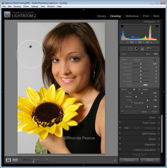
Click the Adjustment Brush in the Develop module and size Brush A so it is big enough to paint over the background. Add a small feather, and for this job, enable Auto mask so Lightroom will do most of the selection work for us. Set Density to 100.

Click and paint over the background with the brush. When you lift the brush you’ll see the Adjustment Pin. Make sure the cross hair in the middle of the brush stays on the background and then the Auto Mask feature will ensure that the brush doesn’t paint over anything but the background.

Step 2
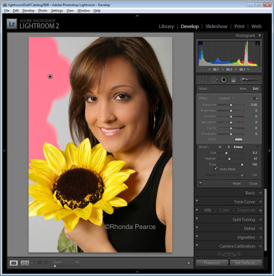
To see the painted area, press the O key and a red overlay will appear. This makes it easier to see where you are working.
Step 3
To get the background behind the very fine hairs you might be tempted to select a very small brush and try to isolate the areas manually. However, to do the job fast, it’s more efficient to size the brush very large so the center can be positioned over an area of the background and the rest of it extends over the wispy hair area. It might help to significantly decrease the density at this point to around 30 so that you only partially select the background in the wispy hair area.

Position the brush over an area of the background so the rest of it extends over the wispy hair area and click once.


Step 4
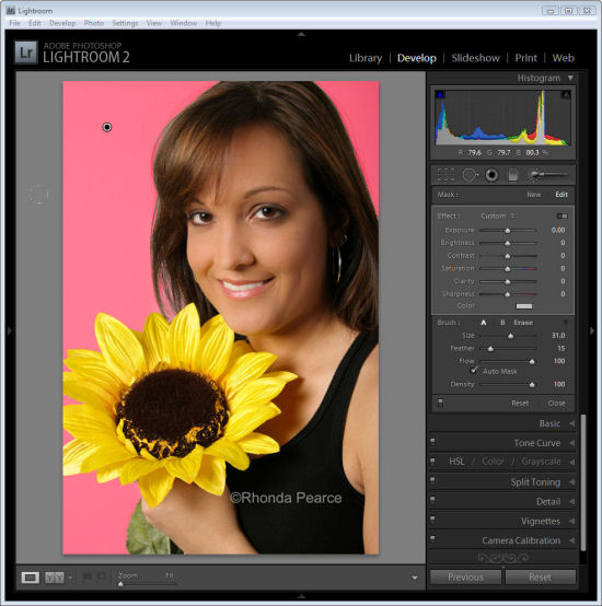
Return to 100% density and continue to work in the other background areas making sure to avoid the wispy hair.

When the area that you want to effect are selected, press O to hide the mask.
Step 5

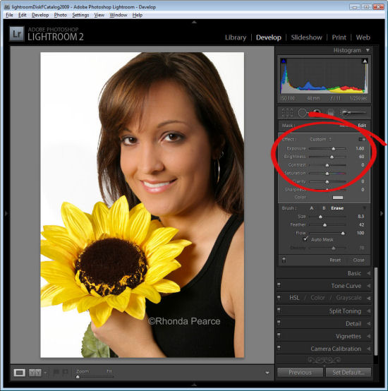
Now adjust the settings for the Adjustment Brush. Increase the exposure and brightness until the background is white.

Click Close to close the panel and deselect the Adjustment Brush.
Step 6
Check the wispy hair area and you’ll see that not all the grey has gone but, when viewed in context of the remainder of the image the results are acceptable.

Press the backslash key (\) to see the image before and after the fix.

Helen Bradley

Page 3 of 3123