Sunday, August 25th, 2013

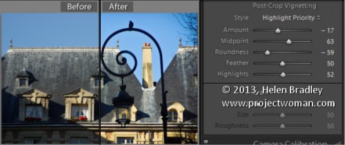
Learn how to darken the edges of an image using a Vignette in Lightroom
Vignettes are a darkening or lightening of the edges of an image – they can make an image look very attractive.
To add a vignette, open the Effects panel, set the Style to either Highlight Priority or Color Priority – Paint Overlay is the least attractive option. Drag to the left on the Amount slider to add a dark vignette and to the right to add a light one.
The Midpoint slider adjusts how the effect is applied to the edges of the image. Increase it to remove the vignette from the edges leaving it mainly in the corners.
Roundness controls the roundness of the vignette, drag to the left to make it more square, to the right to make it more circular. Feather controls the softness of the edges so use 0 for a hard-edge and 100 for a very soft edge.
Highlights applies when you use a negative Amount to create a darkened vignette. Zero gives no change and larger values preserve highlight contrast when you select Highlight Priority or Color Priority.
Helen Bradley
Labels: amount, color, Color Priority, dark, Develop, Develop Module, edge, Feather, Highlight, Highlight Priority, light, Lightroom, Midpoint, Paint Overlay, Photoshop, Post-Crop Vignetting, Roundness, slider, tip, trick, Tutorial, Vignette, vignette effect
Categories:Lightroom, photoshop
posted by Helen Bradley @ 6:50 amNo Comments links to this post
Thursday, August 22nd, 2013

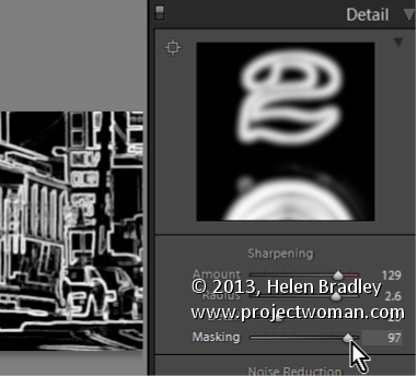
How to use the Masking Slider to limit image sharpening to only the edges in the image
The Masking slider in the Lightroom Detail panel allows you to control the areas of the image that are sharpened and those that are not.
Hold Alt (Option on the Mac) as you drag on the Masking slider. As you do you will see a black and white overlay on the image. The areas that are black are not sharpened, those that are white are sharpened. The farther you drag to the right the more the sharpening is limited to just the edges in the image where you want it to be applied to.
Drag on the slider to control just how much of the image you want to have sharpened. When you’re done, adjust the Amount to a value that makes sense for the image.
Helen Bradley
Labels: Alt, amount, Amount Value, Black, blend, detail, Develop, Develop Module, edge, Lightroom, mask, masking, option, Photoshop, Sharp, Sharpen, Sharpening, sharpening in lightroom, slider, tip, trick, Tutorial, value, white
Categories:Lightroom, photoshop
posted by Helen Bradley @ 6:45 amNo Comments links to this post
Monday, August 19th, 2013

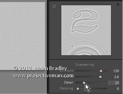
Learn how to suppress halos with the Detail Slider when Sharpening in Lightroom
The Detail slider in the Detail panel in Lightroom lets you suppress the haloes you create with the Radius slider.
At zero position you will fully suppress any halos and at 100 you will have no halo suppression so you will see all the halos added using the Detail slider.
This means that a low value for the Detail sider sharpens only the largest edges in the image and a large value for Detail will tend towards sharpening everything.
Hold Alt (Option on the Mac) as you drag on the Detail slider to see the effect on the halos around the edges in the image.
Typically if you use a high Radius value then you will want to use a low value for Detail and vice versa.
Helen Bradley
Labels: 100%, Alt, detail, Develop, Develop Module, edge, halo, Lightroom, option, Photoshop, radius, Sharp, Sharpening, sharpening in lightroom, slider, tip, trick, Tutorial, zero
Categories:Lightroom, photoshop
posted by Helen Bradley @ 6:39 amNo Comments links to this post
Wednesday, August 14th, 2013

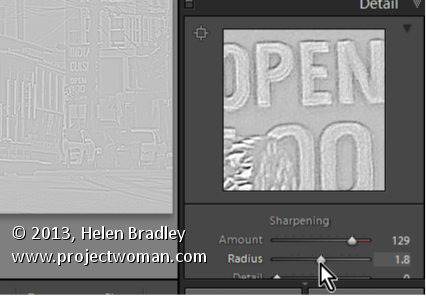
Learn how to fine tune sharpening with the Amount and Radius Sliders
The Detail panel in Lightroom controls sharpening on the image. Use the Amount slider to manage the intensity of the sharpening – set this to a high value to begin.
The Radius slider adds halos around the edges in the image which is what gives the sharpening effect.
For an image with lots of fine lines and detail such as a building select a low radius. For a portrait or an image with softer detail, use a high radius value.
Hold the Alt key (Option on the Mac) as you drag on the Radius slider to see the halos.
Helen Bradley
Labels: Alt, amount, detail, detail sharpening, Develop, Develop Module, edge, effect, halo, Lightroom, option, Photoshop, radius, Sharp, Sharpening, sharpening in lightroom, slider, tip, trick, Tutorial
Categories:Lightroom, photoshop
posted by Helen Bradley @ 6:31 amNo Comments links to this post
Thursday, August 8th, 2013

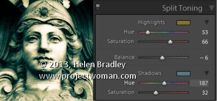
Split Toning a Black and White Image – learn how to make the Highlights and Shadows Different Colors
Split Toning applies one color to the highlights and another to the shadows in an image.
Good color choices when applying a split tone are colors that are opposite each other on the color wheel such as magenta and green, blue and yellow, or red and cyan – although you can choose any combination you like.
To apply the split tone effect, drag on the Hue slider or click the color picker to choose a color to use for the Highlights and then choose something else to use for the Shadows.
Adjust the Saturation of the colors as desired.
Balance allows you to fine tune how the colors are applied to the image – drag to the left to adjust the balance towards the shadow color and drag to the right to add more of the highlight color.
Helen Bradley
Labels: adjust, b & w, B&W, balance, Black, Black & White, Black & White Mix, black and white, color, color a black and white image, Develop, Develop Module, highlights, Hue, Lightroom, Photoshop, saturation, shadow, slider, split, split tone, splittone, tip, trick, Tutorial, white
Categories:Lightroom, photoshop
posted by Helen Bradley @ 6:48 amNo Comments links to this post
Sunday, July 28th, 2013

Quickly Converting your Image to Black and White with this shortcut key
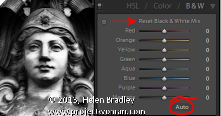
The simplest way to convert an image to black and white is to press the letter V. This is a toggle so press it once to turn the image into black and white and again to make it a color image.
You can also convert an image to black and white by clicking the B&W option in the HSL/Color/B&W panel.
If Auto is enable click it to get a black and white conversion tailored to the needs of the image.
And, if the sliders are already all at different values you can reset them all to zero by holding Alt (Option on the Mac) and then click the ‘Reset black and white mix” option. Choose which is the best starting point for your conversion and progress from there.
If Auto is enabled, click it to get a black and white mix appropriate to the image.
Helen Bradley
Labels: Alt, Auto, B&W, Black, Black & White, black and white, color, convert, Develop, Develop Module, HSL, Lightroom, option, Photoshop, Reset Black & White Mix, slider, tip, trick, Tutorial, V, white
Categories:Lightroom, photoshop
posted by Helen Bradley @ 6:27 amNo Comments links to this post
Monday, July 15th, 2013

Blackest of Blacks and Lightest of Lights
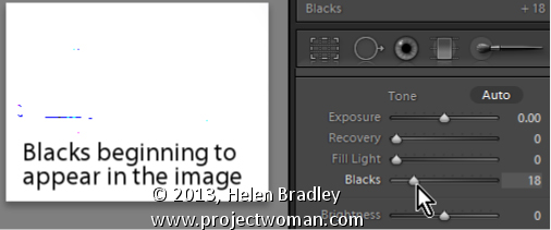
When you’re printing, you’ll want a good range of tones across your image from the blackest of blacks to the lightest of lights. Use the Blacks adjustment slider to ensure that you will have some black tones.
To see the blacks in the image, hold the Alt key (Option on the Mac) as you drag on the Blacks slider and stop when you see the first few colored pixels appear on the screen
Helen Bradley
Labels: adjust, Alt, Blacks, dark, Develop, Develop Module, image, key, light, Lightroom, option, pixel, slider, tone, white
Categories:Lightroom, photoshop
posted by Helen Bradley @ 7:47 amNo Comments links to this post
Wednesday, July 10th, 2013

Understand the differences between Vibrance and Saturation
The difference between Vibrance and Saturation is often misunderstood. If you drag the Vibrance slider to the right, you increase the saturation in under-saturated colors in the image. Fully saturated colors are adjusted less and skin tones are protected.
In contrast, increasing the Saturation boosts the saturation across the entire image which can destroy skin tones and which can oversaturate already saturated colors.
Typically you’ll use Saturation if your image needs an overall boost to all colors and use Vibrance to boost under-saturated colors.
Helen Bradley
Labels: color, Develop, Develop Module, difference, image, Lightroom, saturation, skin tone, slider, tone, under-saturated, vibrance, vs
Categories:Lightroom, photoshop
posted by Helen Bradley @ 10:07 amNo Comments links to this post
Wednesday, June 19th, 2013

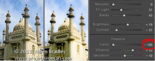
Create the Orton Effect in Lightroom with the Clarity Slider
The Orton Effect is named after photographer Michael Orton. This process results in a somewhat surreal image which has a slightly out-of-focus look while retaining lots of edge detail.
You can quickly give an image a faux Orton look using the Clarity slider in Lightroom. All you need to do is drag the Clarity slider to the left close to -100 and then, increase the Blacks in the image to an higher than usual value.
Of course there is a lot more to the Orton effect than this but this gives you a good start and, for many images, may be all you really need.
Helen Bradley
Labels: -, 100%, Blacks, blur, clarity, detail, Develop, Develop Module, edge, effect, faux, focus, image, Lightroom, negative, orton, out, out of focus, Photoshop, slider, surreal
Categories:Lightroom, photoshop
posted by Helen Bradley @ 6:15 amNo Comments links to this post
Thursday, June 13th, 2013

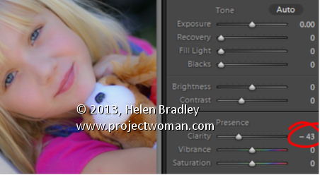
Add that Softened Look to Your Portraits with the Clarity Slider
One time when you’ll want to use a negative value for Clarity in Lightroom is when you have a portrait that you want to give a softened look to.
Negative clarity softens an image so it’s a good choice to use. Just adjust the slider to the left to around -20 or more depending on the results.
Use this on portraits of women and children or to give an image an ‘Early Hollywood/Casablanca’ feel.
Helen Bradley
Labels: clarity, Develop, Develop Module, Lightroom, negative, Photoshop, Portrait, slider, soft, soften
Categories:Lightroom, photoshop
posted by Helen Bradley @ 6:09 amNo Comments links to this post


