Saturday, October 5th, 2013

Lightroom Tip – Batch Crop & Resize

Save Time in Lightroom when Resizing and Cropping Large Amounts of Output Images

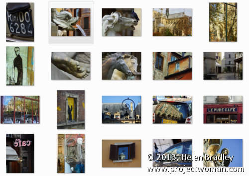
If you’re working on a large shoot and need to output a lot of images at a fixed size then Lightroom can do the work for you. It isn’t obvious how you can crop all your images to a fixed size and output them at a certain set of pixel dimensions but it is easy to do when you know how. Here’s how to do it:

Step 1

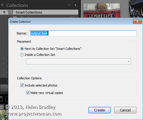
First locate the folder with your images in it. I prefer to make virtual copies of my images and put them in a new collection but you can do whatever makes sense to you.

Step 2

Select all the images in Grid view in the Library module in Lightroom.

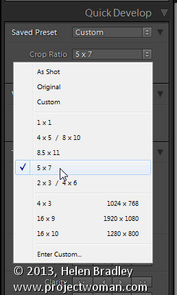
Open the Quick Develop panel on the right and, from the Crop Ratio dropdown list, select the crop ratio that you want to crop to. For example you can crop to fixed ratios such as 1 by 1 or printing sizes such as 5×7, 4×6 and so on.

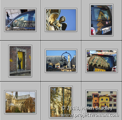
Here I’ve selected 5×7 and when I do so all the selected images are automatically cropped to this 5 x 7 ratio.

Lightroom is smart enough to understand that some images are portrait orientation and others are landscape. Portrait images are cropped to 5 x 7 and landscape orientation images to 7 x 5.

Step 3 (optional)

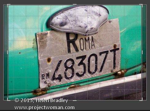
If desired, you can now move to the Develop module and check the crop for all the images. By default, Lightroom will center the crop rectangle on the image and this may not be exactly what you want for some images. However, it is easy to go to the Develop module, click the first image and click on the Crop Overlay Tool so you see the crop marquee in position on the on the image.

Now from the filmstrip you can click on each image in succession to preview it in the crop window and you can easily identify if any of them need an adjustment to the crop rectangle. If they do simply drag on the crop rectangle to reposition it. When you’re done return to the Library view.

Step 4


As the images are now all cropped to size, press Ctrl + A to select them and then click Export. Choose a folder to export the images into or click New Folder to create a new folder.

You can now set your desired preferences in the Export dialog.

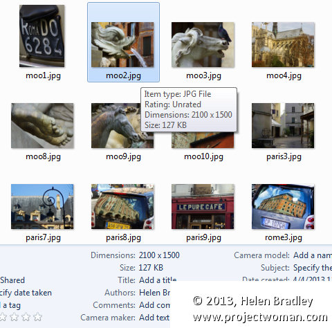
To control the output size – in pixels wide and tall – of the images easily because you already know the crop ratio. To do this, select the Resize to fit checkbox and choose Long Edge from the dropdown list. Then type a pixel dimension for the long edge. So, for example, to prepare 5 by 7 ratio images for printing at 300 dpi the longest edge will need to be 2,100 pixels (7 x 300) so type 2100 and set the resolution to 300.

Step 5

Click Export to export your images and they will be exported to a folder at the chosen size and resolution.

This process allows you to quickly and effectively prepare a batch of images for printing. It manages portrait and landscape images so that you don’t have to separately handle each type. It’s a simple workflow and a fast way to prepare images from a large shoot.

Helen Bradley

Tuesday, August 6th, 2013

Photoshop Tip – Create an Image Watermark

Make a Watermark Reminiscent of a Post Office Stamp Cancellation

In a older post I talked about using an image watermark in Lightroom to apply to your images.

Lightroom Tip – Using Image Watermarks

Finally, in this post, I’ll show you how to create the watermark image to use.

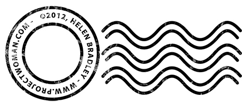
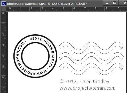
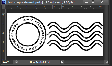
This watermark has two concentric circles with text between them and a set of wavy lines making it look like a post office stamp cancellation. The watermark also has a slightly grunge look.

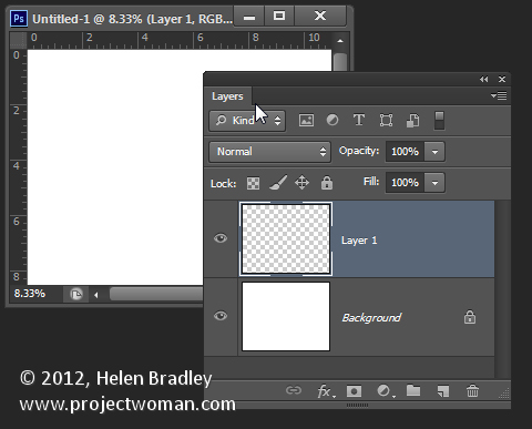
To make it, start in Photoshop with a letter size image. I set mine to landscape orientation with a white background. This will make it easy to create a black watermark and I will be able to see it as I work.

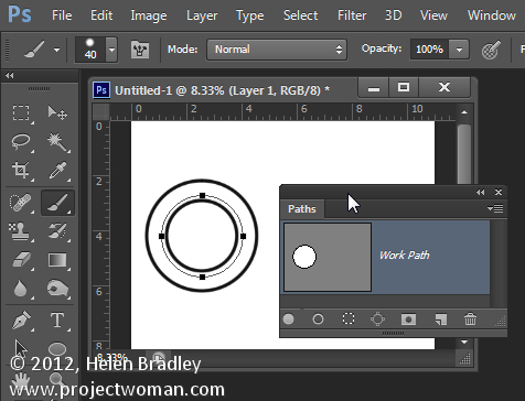
Add a new layer by choosing Layer > New > Layer. This is a transparent layer on which you’ll place the circles.

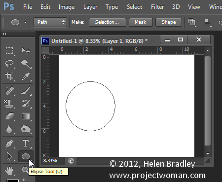
Start with the Ellipsis Tool which shares a position in the Tools with the Rectangle tool – it is a shape tool – don’t use the Elliptical Marquee Tool.

Make sure that the option on the Tool Option bar is set to Path and hold Shift as you drag a circle on the screen.

When the circle is in position choose Window > Paths to view the Paths palette.

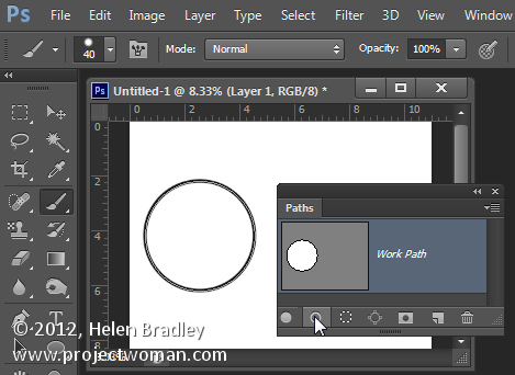
Select the Brush tool and select a brush. I used a Hard Round brush sized down to around 40 pixels.

Set the foreground color to black, click the Work Path in the Paths palette to select it and then click the Stroke Path with Brush icon at the foot of the Paths palette. This strokes the path with the current brush.

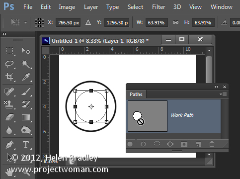
Click the Path Selection Tool which shares a position in the Tools palette with the Direct Selection Tool. Click on the path and it will select the entire path.

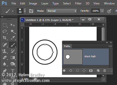
If the transformation handles do not appear press Ctrl + T (Command + T on the Mac). Hold Shift and Alt (Shift and Option on the Mac) and drag inwards to create a circle which is concentric with the previous circle.

Repeat the process of selecting the Brush, click on the path so it is selected and click to Stroke Path with Brush.

Click the Path Selection Tool and, with this smaller circle selected, press Ctrl + T (Command + T on the Mac). Hold Shift and Alt (Shift and Option on the Mac) and drag a little outwards to create a circle path for typing the text along.

Select the Text tool and hold the mouse over this third path.

Look for the text tool to show as an I-beam pointer with a bent line through it – this tells you Photoshop will align the text along the path.

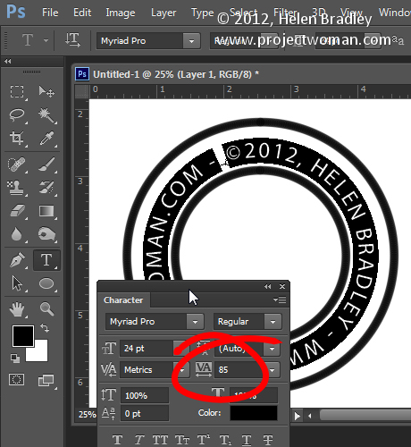
Click once to anchor the Text tool to the path. Select the text color – in my case I chose black – and select the font and font size – I used Myriad Pro – 24 points. Type the text to use – I typed:

© 2012, Helen Bradley – projectwoman.com –

To enter © hold Alt and type 0169.

With the text selected display the Character palette by choosing Window > Character and adjust the tracking to expand the text so it wraps all the way around the shape.

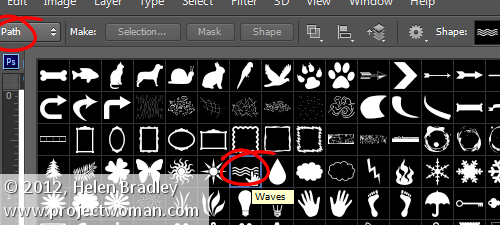
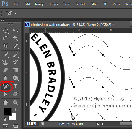
You can draw your own lines for the cancellation lines using the Custom Shape Tool. First create a new layer then select the Wave shape and on the Tool Options bar make sure that it is set to Path.

Drag to make your curved lines.

Select the Add Anchor Point Tool (it shares a position with the Pen tool) and click once in the middle of each end of the path to add a point.

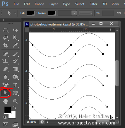
Target the Direct Selection Tool, click one at a time on the Anchor points you just added and press Delete – this breaks the 3 paths in half to make 6 paths. When the Anchor is selected it will show as a dark filled square.

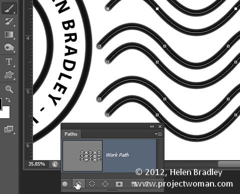
Select your Brush and black paint and select the path in the Paths palette and click the Stroke Path with Brush icon.

Once you’ve done this you can add a grunge effect.

Start by hiding the background layer, target the top layer and press Control + Alt + Shift + E to create a flattened layer with transparency. Hide all layers but this top one.

If the lines aren’t dark enough duplicate this layer a few times and they will darken. Then merge all these duplicated layers

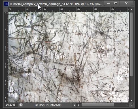
To add the grunge effect click Add a Layer Mask icon at the foot of the layers palette to add a mask to the layer. Locate an interesting texture image to use such as this one from www.mayang.com/textures.

Make it the same size as your image by choosing Image > Resize, deselect the Constrain Proportions checkbox and click Window and click your copyright image file to use its dimensions. Click Ok.

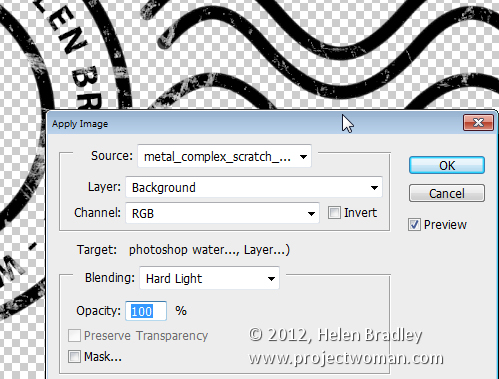
Now return to your Copyright image, click the mask to target it and choose Image > Apply Image. From the Source box select the texture image (it won’t appear in the list if it isn’t the right size), and then set the other options to suit so you get a distressed look to your copyright symbol. Click Ok.

Add a new layer and press Control + Alt + Shift + E to create a flattened version of the image on this layer but maintaining its transparency. Make all other layers invisible and crop the image close around your shape.

Then choose File > Save As and save it as a .PNG image to use in Photoshop or Lightroom as a copyright overlay.

If you select the top layer and press Control + I you’ll invert it to make a white version of the copyright image that you can then save as a second .png file.

Make sure to also save your file as a .psd file if you think you might need to make changes to it – for example, to change the date – a .png file is flattened so it won’t be easy to edit – a .psd file will be much easier to update.

Helen Bradley

Friday, August 2nd, 2013

Photoshop – Create an Oval Frame Effect

Learn how to create an oval frame effect in Photoshop. This video includes how to use a clipping mask, sample a color from an image, make a leaf brush, paint multi-color leaves on an image, add a stroke border to the oval frame and even change its color. This is a jam packed tutorial suitable for a competent beginner or intermediate level Photoshop user.

Transcript:
Hello, I’m Helen Bradley. Welcome to this video tutorial. In this tutorial I’m going to show you how you can make an oval framed photo effect in Photoshop. Before we get started doing this effect let’s have a look and see what it is that we’re aiming for.

What I’m going to do is take this image here and frame it inside an oval frame. And we’re going to add a little border stroke around the frame and then add these decorative elements. The colors for each of these elements is going to be sampled from the image and this is just a single brush that paints in different colors. So if you’re ready let’s get started with this tutorial. So if you’re ready let’s get started with this tutorial.

I’m going to begin here with a new image so I’ll click File, New and I’m just going to do an 11 by 8-1/2 letter size image. But you can make yours whatever size that you like. And here’s my image.

I’m going to center the oval so I’m going to start with a couple of guides. I want a 50 percent guide horizontal and a 50 percent vertical. It’s just a little bit easier to do this with guides. Then I’m going to target my marquee tool. I want the elliptical marquee tool. It shares a toolbar position with the rectangular marquee. But it’s the elliptical marquee that you want. I’m going to hold my mouse pointer over the intersection of these two gridlines and then hold Alt down as I drag out to create my oval. This creates an oval that’s centered over those lines. Of course if I add a Shift key at this point I’ll have everything constrained to a perfect circle centered on this document. But I want an oval so I’m going to let go of the Shift key but make sure that I keep the Alt key held down until I’ve finish drawing my shape. I’ll let go the left mouse button and then let go of the Alt key. This is my shape.

I’ll need a new layer so I’ll click the New Layer icon here and I’m going to fill this with black. So I’m just going to set black as my foreground color and Alt Backspace, Option Delete on the Mac. You can fill it with any color at all but I’m just using black. Now I can get rid of my guide so I’m going to click View and I’m going to clear my guides. I’m going to bring in my image here so I’m just going to drag on the background layer and just add it to this image. Now I want it centered so I’m going to press the Shift key as I center it over this image. I can now close this because I don’t need it any longer. I have my oval still selected. You can probably just see the marching ants there. Now that’s going to get in the way when I start to resize and move this image so I’m going to press Ctrl or Command D to deselect the marching ants. Now I’m going to target my move tool, Ctrl T, Ctrl 0 so I can see my handles. I’m just going to drag everything into position. I’m going to use the Shift key with that corner handle because that will drag everything in proportion. I’m now going to create a clipping mask.

So with this layer selected, Layer, Create Clipping Mask. Now I need to select that checkmark before I can do that so let’s create the clipping mask. And now let’s just fine- tune this image. And I think that’s a pretty good position for it. Now I want to focus on the background layer because I want to sample one of the colors from this image for the background layer. Now the image that we saw had a background which was sampled from the image. So I’m going to target the eyedropper tool here and I’m just going to target this little girl’s dress to get a color from her dress. And when I do you can see that the color is in the top of the ring here. That’s the one I’m going to select. And I have a 3 by 3 average so I’m averaging out the colors under the cursor. So I could go for a slightly lighter blue if I wanted. Let’s select that. And now with the background layer selected I’m going to Alt Backspace, Option Delete to add that color. Now let’s go and add a border around this oval. And to do that I’m going to need to reselect the oval. So I’m going to target the oval shape here, click on the magic wand tool here, it shares a toolbar position with the quick selection tool, but we want the magic wand. We want to make sure that Contiguous is selected. And now I’m just going to click here on this underlying shape which is this black shape here and that gives me this selection.

I’m going to add a new layer so I’m just going to make sure that my new layer goes in at the top and it’s not part of this clipping group. If it were I would have to right click it and choose Release Clipping Mask but it’s now not part of that group. You could see that the marching ants are in position so what we need to do now is to select the color to use. So again I’m going to use the eyedropper and I’m going to select a greeny color from the grass in the background here. So we’ll select that, Edit, Stroke. And you’ll need to experiment a bit with the stroke to see what works best with your image. But I found that a 20 pixel stroke on this particular image is pretty good so I’m just going to settle for a 20 pixel stroke. And I’m doing it over the center and I’ll click Ok. And there’s my stroke. To deselect the marching ants Ctrl or Command D. Now we’re in a position to brush on some leaves around the edge of this image. But to do so we’re going to need to create a brush first up. So let’s go and create a brush. If you’ve already created a brush or you have a brush that you want to use you can skip this step but I’m just going to show you quickly how I created my brush.

I’ll choose File, New and just click Ok. I just need any old document here. I’m going to select the custom shape tool here. It shares a toolbar position with the rectangle tool and these other tools. But it’s custom shape that I want. From the options here on the toolbar I want to select Pixels and I’m going to select black and white as my colors. In earlier versions of Photoshop you’ll still have these three options but they’re going to be side by side here. You just want to make sure that you select the fill pixels or the pixels option. Here I’m going to select a shape which is a leaf shape.

Now last time I selected this shape so let’s make a different shape this time. I’m going to select this one here and then I’m going to drag to draw it on the image. And I’m going to hold the Shift key down as I did so it’s constrained to a nice proportion. Now all I need do is to select Edit and then Define Brush Preset. And I’m going to call this leaf and click Ok. And that is now that shape is now saved as a brush so I can just discard this image. I don’t need it any longer. Now I can go and select my brush. So I’m going to target the brush tool and from the brush dropdown list here I’m going to select my brush. And my brush is always going to be the very, very last one in this brushes palette if I’ve just created it. So this is my brush.

I’m just going to click to select it and then just click outside here to hide that window. Now you can see that the brush is huge and way, way too big right now. So I’m just going to press the square bracket key, the opening square bracket key, to just size it down to size. Now if I start painting I’m first of all going to add a new layer and I’m going to just sample a color from this image. So let’s sample this orange color and let’s just see what happens if I start to paint. Well it’s not looking anything like what it is that we want it to look like. So I’m just going to Ctrl Z to get out of there and let’s go and set up our brush so it paints a little bit more intelligently. I’m going to click here to open the brush panel.

Now in the brush panel here the first thing I want to do is go to brush tip shape, tap on it and I’m going to increase the spacing because I want this brush to be spaced out quite a bit. I could change the size at this point if I wanted to but I’ve already measured this and it’s a pretty good size so I’m going to leave that. I’m going to enable Shape Dynamics and click on Shape Dynamics. Now I want the size to vary a little bit so I’m going to adjust the size jitter. That will make it size in different size brushes as I paint. And I’m also going to adjust the angle jitter. Now I can adjust it to quite a high value here because I don’t mind if these leaves point in completely the opposite direction. In fact that’s going to look pretty good for my leaves. And then I’m going to tap Scattering to enable that and to go to get the Scattering controls. I’ve got Scattering enabled here on both axes and I can just pull it out or push it in to see what I’ve got. I think I want a little bit better control than adjusting count because this is going to give me way too many leaves so I think I’d rather paint more and have less of a count. So I think that’s going to be pretty good.

The last thing I need to do is to enable Color Dynamics. What I want with Color Dynamics is I’d really like this brush to do all the work for me and I want it to paint in color. So I’ve got orange as my background color. Now I’m going to tap here and I’m going to select a color from the image to be the foreground color. So I’m thinking sort of a lighter yellow, maybe I’ll just pick it up from the palette here. So this is my foreground color. This is my background color and I have Apply per Tip enabled and foreground, background jitter at 100 percent. I’ve got hue jitter, saturation jitter and brightness jitter all at zero percent and purity at zero percent as well. What this brush is going to do is it’s going to toggle its colors between these two and so I won’t have to do any of the work myself. I’m going to close this dialog, make sure that I’m painting on a brand new layer, and I’m just going to start to paint. And you can see that the colors are toggling between the foreground and background color. And that just lets me paint my autumn leaves without having to do really much work at all.

Now I can paint as much or as little of these leaves as I want. I’m painting over the edge a little bit here because I’d like some leaves to be eventually underneath this stroke border so I’m just going to add plenty of leaves in there. And I’ll add a couple of stray leaves in the bottom here as well. I can add them by just single tapping or I can paint. When I’m happy with that the last thing I need to do is to get rid of the leaves that are actually over the image here. So I’m going back to my magic wand tool and I’m going back to my stroke layer here and with Contiguous enabled I’m just going to click inside this stroke layer. And what that does is it selects everything inside that layer. And now I can come onto my paint layer and I could do one of two things. I could just press Delete to delete the leaves that are inside this shape but perhaps if I wanted to add some more leaves later on it would be a better idea if I actually added a mask. And that’s very easy to do.

I’m just going to click here the Add Layer Mask icon. Now when I add my layer mask it’s working the wrong way around. You can see what it’s done is it’s clipped and hidden all the leaves around the outside and just left the ones in the middle. We want the exact opposite to be the case so I’ll click on my mask and press Ctrl and I and that just inverts the mask. So you can see now we’ve got the leaves on our image and they’re all around the edge of the image. It’s just that the stroke is underneath the leaves. There’s a very, very easy solution to that. I’m going to select the layer that contains the stroke and just move it up above the leaves and now the stroke is over the leaves. Before we leave this tutorial let’s have a look and see what would happen if we decided that instead of this green edge we would like a pink edge perhaps sampling the pink from this little girl’s headband. Well let’s go first of all and sample the pink. And this is the pink that I’m going to use so I have it selected as the foreground color. I want to make this stroke which is now green into pink.

Now if I press Alt Backspace I’m just going to make the whole layer pink and that’s not what I want to do. I just want to fill the pixels that are already filled on that layer. So I can click here to lock the transparent pixels on this layer, looking for this lock icon to appear. Now if I press Alt Backspace I’m just going to change the color of that stroke. And it’s picked up the foreground color in the image. And now I would just either drag this lock icon into the trash can here or I can just click this icon again. That would unlock it. So there you have an oval framed effect with some autumn leaves that you’ve created using a brush of your own in Photoshop.

I’m Helen Bradley. Thank you for joining me for this video tutorial. Look out for more of my video tutorials on this YouTube channel and visit projectwoman.com for more tips, tricks and tutorials on Illustrator, Photoshop, Photoshop Elements, Lightroom and a whole lot more.

Helen Bradley

Friday, July 26th, 2013

Photoshop – Create Art from Photos using Textures

Here I show you how to create works of art using your images in Photoshop. Included is how to find and select texture images to use, how to blend these into the image and, how to add a lightening effect to highlight areas of the image to draw attention. Also, included is one method of adding a vignette to an image.

Transcript:
Hello, I’m Helen Bradley. Welcome to this video tutorial. In this tutorial I’m going to show you how you can make art from your photos using textures in Photoshop. Before we get started with this video tutorial let’s have a look and see what we’re aiming for. This is the image that we’re aiming for. And quite often when I’m doing these tutorials I’ll play around with a few images before I come up with something that I really want to share. But today it was just this one image, this one texture and the whole thing just blew my mind. So here it is in video form.

To start off with I’m going to show you where I got my textures because these textures are totally awesome and I love this guy’s work and I want to introduce it to you. So this is a Flickr photo stream and the guy is called Skeletal Mess. And he has a whole lot of textures that you can download. Now I downloaded this one. It’s very big but I just want to show you his set that he has on Flickr so you can see the sort of potential for what there is available. Now with this particular image I was having a look through his sets and just having a look to see what I might use. And this one really spoke to me and I’m going to show you why because we’ll go back to the image that I have and we’ll see why blue worked particularly well for this image. So let’s just wind back what I’ve done.

So I’m just going to the layers palette for this image and let’s go and create a brand new image. Okay, so here’s our duplicate image that we’re going to work with. That was what we were aiming for so now I’m going to take away the pieces that went to make up this image. Now you’ll see why I thought that that blue texture would work particularly well here because this image has no sky and if we can borrow the blue from this texture then that would give us an awesome result. We could have used this one too or this one and perhaps just rotated them. But this one really spoke to me so I downloaded that. So I’m just going to grab it now because whenever I download an image even though I can just drag and drop it into Photoshop I’ll also save it just in case I want to use it again later on.

So I’m just going to bring it in here. It’s a whole lot smaller than my image but because it’s a texture that doesn’t really matter. So now I’m going to grab the move tool and just size it to fit all the way across my image. And again because it’s a texture it doesn’t matter that it’s pulled a little bit out of square. So it’s been pulled a little bit wider than it was tall. The next thing I’ll do is just run down these blend modes and just see what it gives me because this is like totally the most exciting thing that you get to do. So I’ll just select Dissolve and then we’ll just run down these blend modes until we get what we’re looking at. And Multiply I think is probably the one I’m going to come back and use but let’s just see what there is in this list. And it was at the point at which I got to that Multiply blend mode that I thought I actually had something I really wanted to work with but you might find other things here that are speaking to you. There’s a whole lot of potential. I usually run down the list and then come back up and by then I’ve pretty much made my choice as to what is working for me. This one possibly but it’s not nearly as good as the Multiply one. So here’s the Multiply blend mode applied to this image.

Now having achieved that I thought in actual fact the middle of the image could be a bit lighter. So what I did was I added a brand new layer and from my tools palette which has gone walkabout here I just grabbed the elliptical marquee tool and just dragged out an oval on that image. I switched so that white and black would be my colors and I also added a feather to this. So I’ll choose Select and then Modify Feather. This is not a very sophisticated feather option but I’ll just add a 100 pixel feather radius to it. That just really softens this edge so now when I fill it by pressing Ctrl Backspace, Command Backspace on the Mac, it’s going to have this feathered soft edge. So now Command or Ctrl D to deselect the selection.

Now I have a big white splat right in the middle of image. That’s obviously not going to work but what I’d want to do then is to blend it in so again I’ll just select the first blend mode in the list and then just run down until I find something that works for me. And here’s Overlay blend mode. That’s lightening that image really well in the area where the lightening effect was. I’m thinking that’s probably the blend mode of choice. But let’s just go and check these others particularly in this lighter area with soft light, hard light, vivid light and pin light. You’re never really sure that they’re not going to give you something so I always run through those just in case one is better than the other. So we’re pretty much to the end and Overlay is going to be our choice. So I’m going back up to pick up Overlay. Now this is too white for me so I’m just going to drag down on the opacity of that layer just to make it a little less opaque. I’m also going to test around this area. I’m thinking that some of this lightness is coming through from this layer and it’s probably a bit more than I want.

So again I’m going to add a layer mask to this layer, go and grab a paintbrush and just paint with black with a very small opacity brush, you can see it’s only 26 percent opacity, just to knock out the bits where I think the lightening effect is too much. I really just want it on the front part of this boat. So once I’ve neatened that effect up now I’m thinking a vignette around the edge. Now there’s umpteen ways of adding vignettes. I’m just going to show you one of them. So a brand new layer, I’m going to go back to my marquee tool, this time the rectangular marquee, I’m just going to drag in around about probably an inch into the image and then I’m going to invert the selection, select Inverse so everything that was selected is now not selected.

So I’ve got this outside edge selected. Now I’m going to sample a color from the image by clicking the eyedropper. I’m thinking one of the colors around here is kind of pretty good. It’s sort of dark but not really, really dark. I’m thinking that color was pretty good. And now I’ll Alt Backspace, Option Delete on the Mac, to create that as my fill color. Now I can deselect my selection with Ctrl or Command D. Now this is not looking like a vignette but that’s fine because we’re going to again run down our blend modes and look for something that is going to give us a darkening effect at the edge. Things you would look for are going to be in this light field. Obviously Overlay is going to do it. Multiply will do it as wells. That will always darken everything up a little bit.

So they’re the ones to look out for but also look out for any surprises as you run down. You might see something that gives you an effect that makes you go oh, wow, that is just too amazing. So I’m headed towards probably Overlay. So now it’s still not the vignette effect that I want but I’m going to blur this. So with that layer selected I’m going to go Filter > Blur > Gaussian Blur. Gaussian Blur is an awesome blur for just blurring things to almost oblivion. So here it is at zero radius effectively and now we’re just going to wind it up to soften this edge and pretty much just blend it into the image. And at some point it just becomes a really, really nice soft vignette effect for our image. So I’m just going to click Ok.

So there we have the effect. It’s very, very simple. This is a throwaway image. It’s just the sky is gone. It’s Hong Kong. It’s smoggy. It’s an overcast day. The sky is just nonexistent and I really wouldn’t have given this image a second look except that I was looking for a challenge. Add a really nice texture from Skeleton Mess free online textures from Flickr, add a bit of a highlight in the middle and then add this vignette effect and we’ve got an image that is now a keeper.

I’m Helen Bradley. Thank you for joining me for this video tutorial. Look out for more of my tutorials on this YouTube channel. Please subscribe and also visit my website at projectwoman.com for more tips, tricks and tutorials on Illustrator, Photoshop, Lightroom, iPad and a whole lot more.

Helen Bradley

Thursday, July 25th, 2013

Word 2010 and 2013 Tip – Making shapely images


Crop your image to a shape in Word
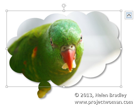
It is easy to crop an image to a shape such as a star or a heart in Word by using the Crop to Shape feature.

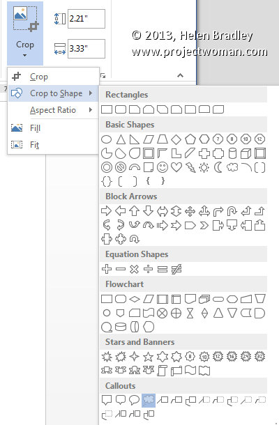
First add the image to your document then click to select it. From the Picture Tools > Format tab click Crop > Crop to Shape.


Select the shape to use to crop the image to. You can then add a shadow or reflection or other effect to the shape as desired.

Helen Bradley

Monday, July 15th, 2013

Lightroom Tip – How to perfectly adjust the Blacks in a photo

Blackest of Blacks and Lightest of Lights

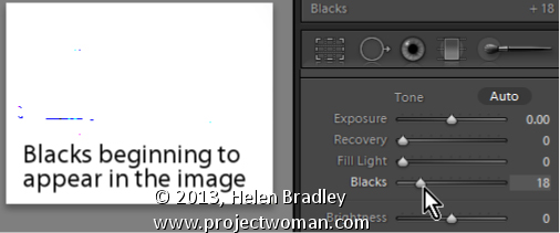
When you’re printing, you’ll want a good range of tones across your image from the blackest of blacks to the lightest of lights. Use the Blacks adjustment slider to ensure that you will have some black tones.

To see the blacks in the image, hold the Alt key (Option on the Mac) as you drag on the Blacks slider and stop when you see the first few colored pixels appear on the screen

Helen Bradley

Wednesday, July 10th, 2013

Lightroom Tip – Vibrance vs. Saturation


Understand the differences between Vibrance and Saturation

The difference between Vibrance and Saturation is often misunderstood. If you drag the Vibrance slider to the right, you increase the saturation in under-saturated colors in the image. Fully saturated colors are adjusted less and skin tones are protected.

In contrast, increasing the Saturation boosts the saturation across the entire image which can destroy skin tones and which can oversaturate already saturated colors.

Typically you’ll use Saturation if your image needs an overall boost to all colors and use Vibrance to boost under-saturated colors.

Helen Bradley

Sunday, July 7th, 2013

Lightroom Tip – Recovering Clipped Highlights


Recover Detail with the Recovery Slider for Clipped Highlights

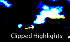
When you have clipped highlights you can recover detail from them in Lightroom 3 if you hold the Alt key (Option on the Mac) and drag on the Recovery slider.

As you do this you will see the clipped highlights in the image and they will disappear as you drag to the right. Do not adjust the Recovery slider any further than you need to to recover your clipped highlights.

In Lightroom 4 you can achieve the same effect if you hold Alt or Option as you drag on the Whites slider – the whites are the lightest portion of the image.

Helen Bradley

Thursday, July 4th, 2013

Lightroom Tip – Viewing Clipped Highlights


Learn how to check to see if you have any Clipped Highlights in your image

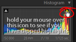
You can see the clipped highlights in the image by clicking on the white triangle in the top right corner of the histogram. Portions of the image that show red are clipped highlights.

Next time we’ll show you how to recover detail in these clipped highlights.

Helen Bradley

Friday, June 28th, 2013

Photoshop – Adding Images to your Reusable Layout Template

Learn how to populate the layout template that we created in an earlier post with images of your own.

Click Here for Part 1


Transcript:
Hello, I’m Helen Bradley. Welcome to this video tutorial. In this tutorial I’m going to show you how you can actually make use of your reusable layout template that we made in an earlier video. In the previous video I showed you how to create this template.

It has a background color of white but that could be any color. It has space for two images. And then it has two copyright symbols here. One is black and one is white depending on which we want to use for any particular layout.

Now I’m going to show you how you can take this particular template and make it into this by adding images to it. I’m just going to hide this one away and we’ll focus on the one that we created.

I haven’t saved that yet but that doesn’t matter too much. Now I’m going to open some images that I want to use in it. So I’m going to go and select the images that I’d used previously. That’s winter7. And I want bird7 as well. So I’m just going to move these images into position. This is the main template and these are the individual images.

So to start off with I’m going to just drag and drop the background layers from each of these images into my main template. So this is this image first. I’m going to drag and drop it into position and I’m going to drag and drop this one in. Now you can see that the images that I’ve dragged and dropped in are way, way bigger than the template is. But that doesn’t matter because we know how to make them smaller. I’m going to click on the layer thumbnail, Ctrl T and then Ctrl Zero. You can see how much bigger these images are than the actual template itself. I’m going to size the image down quite small, click on this link here so I make sure that I don’t destroy its ratio of width and height, and I’m just going to move it roughly into position as to where it’s going to be in the final template. Now I’ll click the checkmark here and let’s go ahead and resize this one.

Click on the layer thumbnail, Ctrl T, Ctrl Zero. And now I’m going to scale it small, place it roughly in position, make sure that the width and height are scaled correctly in exactly the same proportion, finish off the positioning of it and then click the checkmark here. Now let’s zoom into the image. To make sure that this now works as we expect it to we need to bring back this line down here and we probably need to crop these images. Now the template has those crops already built into it.

The first thing I’m going to do is to drop this particular layer immediately above the layer that’s going to control its size. And then I’m going to drop this one immediately above the layer that’s going to control its size. And we’re going to use a simple feature called Clipping Path. With the topmost of this pair of layers selected, I’ll choose Layer and then Create Clipping Mask. And what that does is it clips this image to the exact size of the rectangle below. And now let’s do that with this one, click on the layer, Layer, Create Clipping Mask. And you can see that that’s clipped this particular image here to the exact size of the black box below.

The black has disappeared. It has nothing to do with it. These colors could be any color you like. But you can see that in doing so we’ve brought back the color from this layer here. And we can prove that that’s where the color is coming from. So I’m just going to select a blue color here and I’ll just fill this layer with blue. And you can see now that the space between those two images is the exact same blue as I just filled the background layer with. I’ll just undo that because I don’t really want blue.

To finish off I’m just going to decide which of these two copyright symbols is going to work better in this instance. Well I think the white one is. So I’m going to click its eyeball or its visibility icon and turn off the black one. So that’s how we would fill that template that we created in an earlier video.

Now your templates don’t have to be as simple as this one. They can be quite complex. And you may be aware that I have templates available on projectwoman.com. This is a free set of templates that you can download and use exactly as you’ve seen here. There are some triptychs and there are also some layouts with 9, 4 and 6 images in them.

I’m Helen Bradley. Thank you for joining me for this video tutorial. If you liked this tutorial place click the thumbs up to give it a like. Think about subscribing to my YouTube channel and visit my website at projectwoman.com for more tips, tricks and tutorials on Illustrator, Photoshop, Lightroom, Photoshop Elements, iPad and a whole lot more.

Helen Bradley

Page 1 of 41234