Friday, July 26th, 2013

Photoshop – Create Art from Photos using Textures

Here I show you how to create works of art using your images in Photoshop. Included is how to find and select texture images to use, how to blend these into the image and, how to add a lightening effect to highlight areas of the image to draw attention. Also, included is one method of adding a vignette to an image.

Transcript:
Hello, I’m Helen Bradley. Welcome to this video tutorial. In this tutorial I’m going to show you how you can make art from your photos using textures in Photoshop. Before we get started with this video tutorial let’s have a look and see what we’re aiming for. This is the image that we’re aiming for. And quite often when I’m doing these tutorials I’ll play around with a few images before I come up with something that I really want to share. But today it was just this one image, this one texture and the whole thing just blew my mind. So here it is in video form.

To start off with I’m going to show you where I got my textures because these textures are totally awesome and I love this guy’s work and I want to introduce it to you. So this is a Flickr photo stream and the guy is called Skeletal Mess. And he has a whole lot of textures that you can download. Now I downloaded this one. It’s very big but I just want to show you his set that he has on Flickr so you can see the sort of potential for what there is available. Now with this particular image I was having a look through his sets and just having a look to see what I might use. And this one really spoke to me and I’m going to show you why because we’ll go back to the image that I have and we’ll see why blue worked particularly well for this image. So let’s just wind back what I’ve done.

So I’m just going to the layers palette for this image and let’s go and create a brand new image. Okay, so here’s our duplicate image that we’re going to work with. That was what we were aiming for so now I’m going to take away the pieces that went to make up this image. Now you’ll see why I thought that that blue texture would work particularly well here because this image has no sky and if we can borrow the blue from this texture then that would give us an awesome result. We could have used this one too or this one and perhaps just rotated them. But this one really spoke to me so I downloaded that. So I’m just going to grab it now because whenever I download an image even though I can just drag and drop it into Photoshop I’ll also save it just in case I want to use it again later on.

So I’m just going to bring it in here. It’s a whole lot smaller than my image but because it’s a texture that doesn’t really matter. So now I’m going to grab the move tool and just size it to fit all the way across my image. And again because it’s a texture it doesn’t matter that it’s pulled a little bit out of square. So it’s been pulled a little bit wider than it was tall. The next thing I’ll do is just run down these blend modes and just see what it gives me because this is like totally the most exciting thing that you get to do. So I’ll just select Dissolve and then we’ll just run down these blend modes until we get what we’re looking at. And Multiply I think is probably the one I’m going to come back and use but let’s just see what there is in this list. And it was at the point at which I got to that Multiply blend mode that I thought I actually had something I really wanted to work with but you might find other things here that are speaking to you. There’s a whole lot of potential. I usually run down the list and then come back up and by then I’ve pretty much made my choice as to what is working for me. This one possibly but it’s not nearly as good as the Multiply one. So here’s the Multiply blend mode applied to this image.

Now having achieved that I thought in actual fact the middle of the image could be a bit lighter. So what I did was I added a brand new layer and from my tools palette which has gone walkabout here I just grabbed the elliptical marquee tool and just dragged out an oval on that image. I switched so that white and black would be my colors and I also added a feather to this. So I’ll choose Select and then Modify Feather. This is not a very sophisticated feather option but I’ll just add a 100 pixel feather radius to it. That just really softens this edge so now when I fill it by pressing Ctrl Backspace, Command Backspace on the Mac, it’s going to have this feathered soft edge. So now Command or Ctrl D to deselect the selection.

Now I have a big white splat right in the middle of image. That’s obviously not going to work but what I’d want to do then is to blend it in so again I’ll just select the first blend mode in the list and then just run down until I find something that works for me. And here’s Overlay blend mode. That’s lightening that image really well in the area where the lightening effect was. I’m thinking that’s probably the blend mode of choice. But let’s just go and check these others particularly in this lighter area with soft light, hard light, vivid light and pin light. You’re never really sure that they’re not going to give you something so I always run through those just in case one is better than the other. So we’re pretty much to the end and Overlay is going to be our choice. So I’m going back up to pick up Overlay. Now this is too white for me so I’m just going to drag down on the opacity of that layer just to make it a little less opaque. I’m also going to test around this area. I’m thinking that some of this lightness is coming through from this layer and it’s probably a bit more than I want.

So again I’m going to add a layer mask to this layer, go and grab a paintbrush and just paint with black with a very small opacity brush, you can see it’s only 26 percent opacity, just to knock out the bits where I think the lightening effect is too much. I really just want it on the front part of this boat. So once I’ve neatened that effect up now I’m thinking a vignette around the edge. Now there’s umpteen ways of adding vignettes. I’m just going to show you one of them. So a brand new layer, I’m going to go back to my marquee tool, this time the rectangular marquee, I’m just going to drag in around about probably an inch into the image and then I’m going to invert the selection, select Inverse so everything that was selected is now not selected.

So I’ve got this outside edge selected. Now I’m going to sample a color from the image by clicking the eyedropper. I’m thinking one of the colors around here is kind of pretty good. It’s sort of dark but not really, really dark. I’m thinking that color was pretty good. And now I’ll Alt Backspace, Option Delete on the Mac, to create that as my fill color. Now I can deselect my selection with Ctrl or Command D. Now this is not looking like a vignette but that’s fine because we’re going to again run down our blend modes and look for something that is going to give us a darkening effect at the edge. Things you would look for are going to be in this light field. Obviously Overlay is going to do it. Multiply will do it as wells. That will always darken everything up a little bit.

So they’re the ones to look out for but also look out for any surprises as you run down. You might see something that gives you an effect that makes you go oh, wow, that is just too amazing. So I’m headed towards probably Overlay. So now it’s still not the vignette effect that I want but I’m going to blur this. So with that layer selected I’m going to go Filter > Blur > Gaussian Blur. Gaussian Blur is an awesome blur for just blurring things to almost oblivion. So here it is at zero radius effectively and now we’re just going to wind it up to soften this edge and pretty much just blend it into the image. And at some point it just becomes a really, really nice soft vignette effect for our image. So I’m just going to click Ok.

So there we have the effect. It’s very, very simple. This is a throwaway image. It’s just the sky is gone. It’s Hong Kong. It’s smoggy. It’s an overcast day. The sky is just nonexistent and I really wouldn’t have given this image a second look except that I was looking for a challenge. Add a really nice texture from Skeleton Mess free online textures from Flickr, add a bit of a highlight in the middle and then add this vignette effect and we’ve got an image that is now a keeper.

I’m Helen Bradley. Thank you for joining me for this video tutorial. Look out for more of my tutorials on this YouTube channel. Please subscribe and also visit my website at projectwoman.com for more tips, tricks and tutorials on Illustrator, Photoshop, Lightroom, iPad and a whole lot more.

Helen Bradley

Tuesday, April 2nd, 2013

Photoshop – Thicken and Thin out Lines

Learn to make lines thicker or thinner using a Filter in Photoshop. This is useful for adjusting scanned line art images, as well as, for thickening up lines on images which you have converted to a line drawing inside Photoshop.

Transcript:
Hello, I’m Helen Bradley. Welcome to this video tutorial. In this tutorial I’m going to show you how you can easily make lines thicker or thinner on line art images that you either scan into Photoshop or create in Photoshop yourself. In this video tutorial I’m going to show you a really quick technique for making lines a lot thinner or a lot thicker. And this is handy for images where you’ve actually converted it to line art or where you’ve got line art like this that we’ve actually scanned in.

To make the lines thicker choose Filter and then Other and then Minimum. And with Minimum you can then select the minimum radius which is going to make the image lines a lot thicker and you can test these out. Generally just one or two pixels is like all you need to do. And this is the original image and this is the thicker lined image. So let’s perhaps take this up to 4 and I’ll click Ok. And that has just thickened the line. So if that were all we wanted to do we could just save this and be off. But let’s have a look and see how we can make the lines thinner.

I’m going to choose Filter and this time, Other, and this time we’re looking at Maximum. And we’re just going to set the maximum line width. And so we want this down to something that gives us the lines that we’re looking for. So here I have it set to 5. This is what it was. This is what it is now. If I go a bit smaller the lines are going to get thicker. If I get bigger the lines are going to get thinner to the extent where they actually totally disappear. So you need to find this sweet spot here for your particular image. But if you do want to make the lines that are fairly thick right now to be a little bit finer then you can do that here with this tool. And these are again Filter, Other. Maximum allows you to set it so it’s smaller and minimum allows you to set the width so it’s larger.

I’m Helen Bradley. Thank you for joining me for this video tutorial. Look out for more tutorials on my YouTube channel. Please like and comment on this video if you do like it. And look out for more videos, tips, tricks and techniques on my website at projectwoman.com.

Helen Bradley

Wednesday, October 24th, 2012

PowerPoint 2013 – What’s new and cool

PowerPoint just got a whole lot cooler, so come check out what’s new. I’ll walk you through many of PowerPoint 2013’s features, including the new start screen and account screens, how saving is new, using the new task panes, charting options, and discovering theme variants.

Transcript:

Hello, I’m Helen Bradley. Welcome to this video tutorial. Today we’re going to be looking at the new PowerPoint 2013 and asking what’s new and cool for PowerPoint users. There is a lot to like about the new PowerPoint 2013. And we’re going to have a look at some of the features of it here in this video.

The first thing is the Start screen. This opens as soon as you open PowerPoint 2013. And there’s a lot here for new users. You can actually turn the screen off. But I think most people are going to opt to turn it on. The default is to start with a new presentation with a default theme, but you can see here that we’ve got recent files that we’ve opened in PowerPoint so they’re all available to us. We could go online and search for templates and themes online. And there are some suggested searches here. We can also click here to open other presentations that we might have stored on SkyDrive or on our local computer or SharePoint. And up here is the current account. So when You open PowerPoint 2013 or any of the new Office 2013 applications you’re going to be logged into your SkyDrive account, and this is access to it. And here we could switch accounts if we wanted to. These are just for testers so I think that they’re probably going to go in the final production.

But let’s have a look and see what would happen if we selected one of these templates. So I’m just going to click this one to open it. And you can see here that there’s some variants in this theme. We’re having a look right now at the More Images so we can see what this layout is going to look like if we select this particular one. And there’s this title layout, and this is what the chart would look like, and then smart art graphics, and this is a photo layout. And then there are different variants, different color combinations that we could use in this particular theme. Now what they’ve done in PowerPoint 2013 is that they’ve removed some of the color options that we had previously and sort of scaled them down to a more manageable group. So this particular design has four color options and you choose one of them and go with it rather than having to select from a set of color schemes that are probably twenty or thirty of them.

So I’m really liking this sort of red one so let’s click Create. And we’re now all ready to start our PowerPoint presentation. None of this is going to be unusual for PowerPoint users. A little bit has changed with the interface here. You can see that it’s got a metro style look to it so everything is a lot flatter. There’s no dimension in the screen, no shading. The buttons have sort of all gone to the back and really what we’re doing is focusing a little bit more on the content of our presentation.

Let’s go to Backstage View before we come back here though and see what’s there. I’ll click File to go to Backstage View. Now some of these options have changed. There’s Save and Save as. If we go to Save as you’ll see that by default we’re now saving to SkyDrive so this is the SkyDrive account that I was already logged into. Details are up here, and it’s opting to save it to SkyDrive by default. If I want to I can save it to my own computer so I can click Computer and this gives me access to my own folder structure. I can also add a place. So I could add things like a SharePoint location or a different SkyDrive account. Print is pretty standard. There’s not much changes here but Share has some options. You can invite people to share your document on your SkyDrive account. You can email it. You can present it online or publish your slides here. Export here we’ve got our PDF, XPS document support. Here’s the video option. Here’s packaging it for a CD, creating handouts and changing our file type. Down here are the standard options. This is general options for working inside PowerPoint and there’s not much changed here. Let’s go back here however to this Account area. And this is where you manage your accounts. So at the moment you can see that I’ve got a connected service with my Facebook account, my SkyDrive account, Twitter. I can also add LinkedIn if I wanted to. I could add Flickr. There’s the ability to add SharePoint or another SkyDrive account, lots of options here. And I imagine that over time we might see even more appearing here. This is also showing me where I am with my product. I can get updates and get information about whether the updates are installed, whether there are any, and it’s just telling me which version of Microsoft PowerPoint I’m using. So there’s our Backstage View. There’s our Start screen.

So let’s go back now and have a look and see what’s different inside the PowerPoint interface itself. The ribbon is pretty standard from the older versions of the ribbon. The difference is that the Design tab is split in two now with the themes and the variants. So here we have the various themes that we can use. We’re using this one here, but you can see that what we’re using this variant of it. This is another one of the built in themes for PowerPoint 2013, and here are the variants so we could make it blue or pink, whatever we want to do here.

The Developer tab is now visible by default so that’s a big change for people who want access to macros. I’ve got some additional things open here, and it’s picked up my old handy Tools tab which is one that I added to my PowerPoint 2010 and it’s been brought forward into 2011. So too has the add-in Visual Bee. But these are things that I’ve added in myself. They’re not actually in the default PowerPoint install. There is a new button here on the toolbar. It’s the Touch Mode button, and you can enable it if you’re on a touch screen. With that enabled, if I just tap it what happens is that the buttons become a little bit further apart and everything is a little bigger for work on a touch screen. Click it again and everything shrinks down just a little bit.

Let’s have a look at adding a chart so I’m just going to go back to the Home screen. And we’ll do a new slide with a chart so I’m going to choose a title and a content slide. And let’s just add a chart to our Presentation and close this down. These settings here are new, and these are in Excel as well. So these give you the ability to add chart elements or remove them. For example if we don’t want a legend we could just disable the legend here. We could also for example disable the chart title if we planned to add the chart title in as the slide title. There’s access here to styles and color options. And you can see that we could change the colors but we’ve got a smaller subset of colors this time. And they’re more true to the theme itself. So we’ve been given smaller numbers of options but probably more relevant options if you could think of it that way. And then here we’ve got other settings. We can change the values and the names. So there’s options here for working with our chart.

Let’s go again and let’s add another new slide. This time I want to add an image. So I get a choice of selecting pictures from my own computer or online pictures. Online pictures allows me to select images from Office.com clipart. I can search them using Bing or I could go and get them from my SkyDrive account. It’s also possible for me to get them from my Flickr account. So let’s just go and get an image right now. Let’s go and get a coffee image. Okay, let’s grab this one here. And I’m going to insert it so I’m just clicking it and tap Insert. And now we’ve got our image inserted on our slide.

Now if we wanted to make changes to this image we would typically go to the Picture Tools Format tab. But watch what happens when I right click the image here and choose Format Picture. What we get is this new format picture pane here. It’s a task pane. And in it are all the things that we can use to format our pictures. So let’s go ahead and let’s add a reflection to this picture, just add a very simple reflection to it.

Okay, let’s go now and add another slide and this time I’m going to add a small art graphic. So let’s just add a default smart art graphic. But look what’s happened to our pane. Now we’re seeing Format Shape options because these are the options that we can use with this smart art graphic. If we go back to this slide here and click on the picture the pane is still there. It stays in place if we want it to, but it changes to show us the kind of options that we have for the object that we’re working with. And I think users are going to really like this because you don’t have dialogue sitting over the top of your slides. This is all tucked away on the side and you can leave it open as you work. And it’s just giving you much quicker access to things. You can see we haven’t moved away from the Home tab and yet we’ve got most of the smart art tools available that allow us to format the smart art as we work.

Now another handy tool we’ve got is the eyedropper tool. So I’m just going back to this image and I am going to click on the image and go to Picture Tools Format tab. And I’m going to select Picture Border. So instead of actually choosing one of these theme colors what I can do is use the new eyedropper tool. What the eyedropper tool does is to allow me to select a color from the image itself. So I can just mouse over an area of the image and select that as the color of my picture border for example. So it’s now my selected color so I can now add a border to the image that is a color that I’ve selected from the image itself. Now you may be missing the color options that you used to have inside PowerPoint, but we still have access to them. We just have access to them in a limited way.

So let’s say that we like this general layout, but we’d really like it to be a different color combination. In this case we’ll go to the View option and we’ll go to Slide Master View. In Slide Master View we can control the slide master that controls the look and feel of out presentation. And you can see here that the All Theme Color options are back again. So for example if we wanted to use a theme color for example medium we could do that. And here’s our medium color scheme that’s now been applied to the presentation. I’ll close Master View and let’s go back into the Design View.

We’ve still got the four options that came with this slide presentation, but we also have our own custom option that’s a Slide Master that we can use. Now if we like this color scheme in preference to the other variants we can save it as we always could, just drop down this theme option and save the current theme. So you do get the customization options of being able to change colors, but you get it where they really should have been all along which is in the Slide Master because you really want it to be thematically strong and you want this color scheme to be applied throughout the entire presentation. Now some of the other options that are available inside PowerPoint 2013 is the Video options so you can select Online Video or Video on your PC. There are a few more options in working with video content. You’ll find things in the Slide Show menu.

When you go to rehearse a slide show or set up a slide show you’ll have different options in terms of viewing presenter view so you can actually see presenter view if you want to. So let’s just do that. And let’s send the slide show to the monitor and the primary monitor which is not the one I’m using right now, and let’s do Presenter View. And let’s just view the slide show. So here’s our Presenter View. You can see that we can see which slide we’re on and we can navigate through the slides. In fact this is my title slide and this is the next one up. And there’s two and three. We can also use a See All Slides option where you can see the slides themselves. You can press Escape here and you’re just going back into Presenter View, not ruining the presentation which is actually running on my second monitor right now. You’ve got the ability to zoom into the slide show so you can click on here and zoom it up full screen. And there are the standard laser pointers so you can use a laser pointer on your screen and you can see other slide show options here.

So there’s plenty to like about this new PowerPoint 2013. I think you’ll like it a lot. If you haven’t already done so why not go and download the customer preview and install it and have a play around with it. I’m Helen Bradley. Thank you for joining me for this presentation. You can find more of my videos here on my YouTube channel. I encourage you to subscribe to the video channel as we’re releasing at least two new videos every week. And also follow me at projectwoman.com where you’ll find tips and tricks for all the Office applications as well as much, much more. If you liked this video please go ahead and like it and I’m always happy to hear your comments.

Helen Bradley

Saturday, June 11th, 2011

When is the art yours and when is it not?


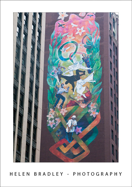
I’m not talking copyright here but rather, when is a photo about your vision and when it is just recording someone else’s. I think that when you take a photo of something someone else created it’s probably more about the recording process than that the result is truly art. Take this image below – it’s a piece of building art that I photographed but really, beyond placing myself in position to capture the image I didn’t contribute any of my vision to the result.

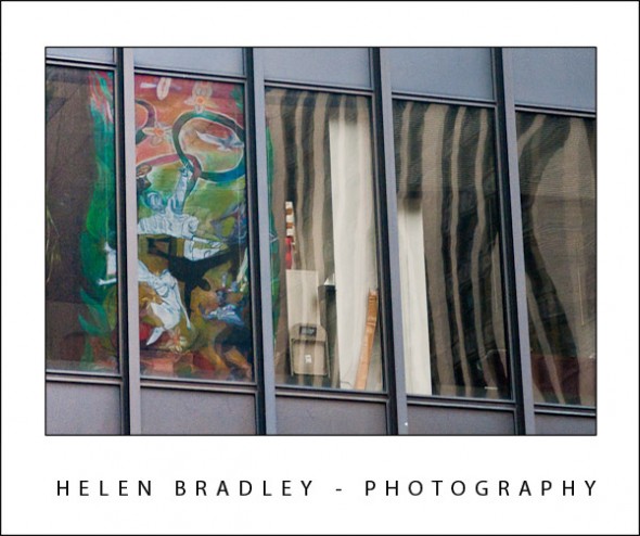
However, the image at the top of this post is something else indeed. Here the same piece of art appears but it looks very different. I had to find this image – it was a reflection in the windows of a building across the street. Here I made a creative choice about what I captured and what I left out, where the reflection appeared and how the result would look. I contributed my artist’s vision to the photograph.

Ask yourself next time you’re out photographing – are you recording someone else’s work or creating your own?

Helen Bradley

Thursday, May 26th, 2011

30 Second Photoshop Background

Here’s a quick and easy way to make an interesting background in Photoshop that totally rocks.

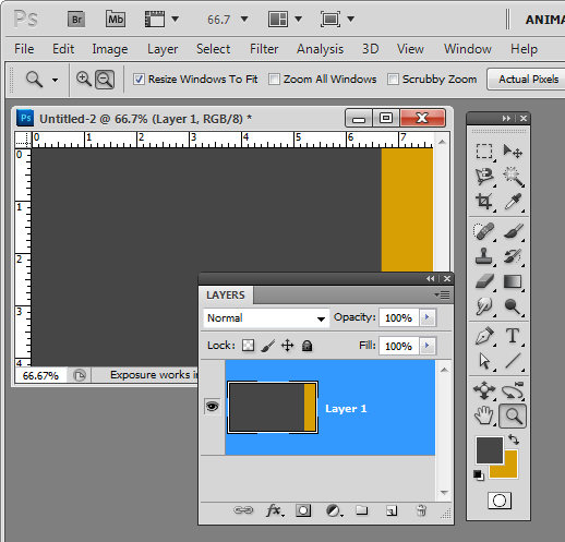
Create a new image the size of your background and fill it with a color. Make a selection on either edge of the image – I made mine on the right – and fill it with your second color.


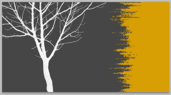
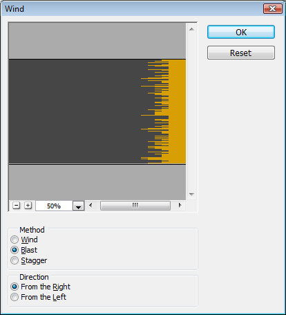
Now choose Filter > Stylize > Wind and select the Blast and the From the Right options and click Ok. When you do the filter will be applied to the image and the edge will begin to fracture.

Continue to apply the filter by pressing Ctrl + F (Command + F on the Mac) – this shortcut repeatedly reapplies the last filter you applied. Stop when you get the effect that you want.

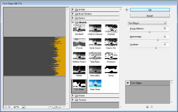
You can stop here or you can go ahead and apply and additional filter to the image.

Filters such as Splatter, Patchwork, Glass, Torn Edges, Water Paper and Rough Pastels all give an interesting result.

Finally, I’ve been using some cool tree silhouette brushes lately and I’ve finished the design off with a simple tree brush stroke.

Helen Bradley