Sunday, April 20th, 2014

Luxuriating in chalkboard goodness


Find all the resources you need to create and print your own chalkboard designs.

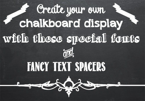
Grocery stores and cafes seem to be chock-full of hand drawn chalkboard menus these days. Of course, who can blame them when they look so great? While most of us are not skilled enough artists to reproduce the fancy flowing chalkboard fonts, our computers certainly are. Recently the chalkboard craze has come online, and font artists across the internet have given us dozens of wonderful chalk-like fonts to choose from. I’ve compiled a list of my favorites of these fonts, including some special symbol fonts for text dividers and flourishes. I’ll step you through the process of finding these fonts so that you can get to work on your own chalkboard designs.

Chalk Board Backgrounds

To create a chalkboard you’ll need a background. I have a couple of recommendations here. There are some nice backgrounds available from foolishfire.com – these are available in black, blue, and green: foolishfire chalkboards. If you wish, you can do a search and find your own. I like to use Compfight (www.compfight.com) – it’s an easy way to find images with commercial and creative commons licences and many of them are a good size. Just be sure to check the licence for any image you download. If you want a fast solution, lots of choices and you’re prepared to shell out a few bucks, then buy a chalkboard background from shutterstock.com.

Of course, if you’d like to make a chalk board design for commercial purposes you’ll have to ensure the image owner has given you the right to do so – in this situation cases using a Shutterstock stock image might be the prudent choice.

Chalk Board Fonts

Fortunately there are many great fonts available for free on the web. The following list contains only free fonts (although some charge for commercial use) that I think look great on a chalk board. If you don’t know how to add new fonts to your computer check out my font installation tutorial first. It’s really easy and once you do it a couple of times you’ll be an ace at doing it!

Chalk Hand Lettering Shaded

Appleberry

Grutch Shaded

Return to Sender

Drawing Guides

These two fonts are comprised of symbols that are perfect for breaking up text and adding some extra flair to your design.

Adhesive Nr. Seven

From this Moment


And that’s it! With these wonderful fonts and a chalkboard background the possibilities for your chalkboard designs are endless. If you find yourself wanting more, a quick Google search for chalkboard fonts should turn up lots of fun fonts to use.


Helen Bradley

Helen Bradley

Friday, June 28th, 2013

Photoshop – Adding Images to your Reusable Layout Template

Learn how to populate the layout template that we created in an earlier post with images of your own.

Click Here for Part 1


Transcript:
Hello, I’m Helen Bradley. Welcome to this video tutorial. In this tutorial I’m going to show you how you can actually make use of your reusable layout template that we made in an earlier video. In the previous video I showed you how to create this template.

It has a background color of white but that could be any color. It has space for two images. And then it has two copyright symbols here. One is black and one is white depending on which we want to use for any particular layout.

Now I’m going to show you how you can take this particular template and make it into this by adding images to it. I’m just going to hide this one away and we’ll focus on the one that we created.

I haven’t saved that yet but that doesn’t matter too much. Now I’m going to open some images that I want to use in it. So I’m going to go and select the images that I’d used previously. That’s winter7. And I want bird7 as well. So I’m just going to move these images into position. This is the main template and these are the individual images.

So to start off with I’m going to just drag and drop the background layers from each of these images into my main template. So this is this image first. I’m going to drag and drop it into position and I’m going to drag and drop this one in. Now you can see that the images that I’ve dragged and dropped in are way, way bigger than the template is. But that doesn’t matter because we know how to make them smaller. I’m going to click on the layer thumbnail, Ctrl T and then Ctrl Zero. You can see how much bigger these images are than the actual template itself. I’m going to size the image down quite small, click on this link here so I make sure that I don’t destroy its ratio of width and height, and I’m just going to move it roughly into position as to where it’s going to be in the final template. Now I’ll click the checkmark here and let’s go ahead and resize this one.

Click on the layer thumbnail, Ctrl T, Ctrl Zero. And now I’m going to scale it small, place it roughly in position, make sure that the width and height are scaled correctly in exactly the same proportion, finish off the positioning of it and then click the checkmark here. Now let’s zoom into the image. To make sure that this now works as we expect it to we need to bring back this line down here and we probably need to crop these images. Now the template has those crops already built into it.

The first thing I’m going to do is to drop this particular layer immediately above the layer that’s going to control its size. And then I’m going to drop this one immediately above the layer that’s going to control its size. And we’re going to use a simple feature called Clipping Path. With the topmost of this pair of layers selected, I’ll choose Layer and then Create Clipping Mask. And what that does is it clips this image to the exact size of the rectangle below. And now let’s do that with this one, click on the layer, Layer, Create Clipping Mask. And you can see that that’s clipped this particular image here to the exact size of the black box below.

The black has disappeared. It has nothing to do with it. These colors could be any color you like. But you can see that in doing so we’ve brought back the color from this layer here. And we can prove that that’s where the color is coming from. So I’m just going to select a blue color here and I’ll just fill this layer with blue. And you can see now that the space between those two images is the exact same blue as I just filled the background layer with. I’ll just undo that because I don’t really want blue.

To finish off I’m just going to decide which of these two copyright symbols is going to work better in this instance. Well I think the white one is. So I’m going to click its eyeball or its visibility icon and turn off the black one. So that’s how we would fill that template that we created in an earlier video.

Now your templates don’t have to be as simple as this one. They can be quite complex. And you may be aware that I have templates available on projectwoman.com. This is a free set of templates that you can download and use exactly as you’ve seen here. There are some triptychs and there are also some layouts with 9, 4 and 6 images in them.

I’m Helen Bradley. Thank you for joining me for this video tutorial. If you liked this tutorial place click the thumbs up to give it a like. Think about subscribing to my YouTube channel and visit my website at projectwoman.com for more tips, tricks and tutorials on Illustrator, Photoshop, Lightroom, Photoshop Elements, iPad and a whole lot more.

Helen Bradley

Friday, June 21st, 2013

Photoshop – Make a Reusable Layout Template

Learn how to make a reusable layout template for your photos in Photoshop. This is part one of a two part series.

The second video/post shows how to use the template to populate it with images. This can be done with any version of Photoshop.

Click Here for Part 2

This technique shows a quick way to create even complex layouts using selections and layers in Photoshop. It is simple to achieve for any one with advanced beginner skills or better in Photoshop.

Transcript:
Hello, I’m Helen Bradley. Welcome to this video tutorial. In this tutorial I’m going to show you how you can use Photoshop to make a reusable layout template. In a later video I’ll show you how you can go ahead and reuse that template.

This is the type of template that I’m going to show you how to create in this video and in the next video I’m going to show you how to populate it. Basically the template is made up here of a background layer which can be any color you like and you can also change the color if you want to. And into the template we’re going to put two black boxes and these later on are going to be filled with images. Here’s one image and here’s another. And it’s going to be done in a way that’s going to be very easy for you to limit the size of these images to match these black boxes. And then you can add copyright symbol.

Now I’ve got two in this particular template because I’m not sure whether I’m going to need a black one or a white one. And that will pretty much depend on what the images are that I’m using. So into this template I’m going to put both of them so they’re both available. So in this particular video this is the point at which we’re going to have the template created. We’ll have a backing, the two boxes and then two alternate copyright symbols that we can use. So let’s get started.

The first thing to do is to choose File, New and then make a size for your template. I’m using one that could be used for a blog so it’s a mere 650 by 300 pixels in size, 72 pixels per inch because this is going to the web, RGB color mode, and because I want a white background I’m just going to select Background Contents White. But we could color that later on if we wanted to, and I’ll just click Ok. And here is my new document. It has just a background layer.

The next thing to do is to add a guide that I’m going to use to make it just a little bit easier to make those black boxes. I’m going to choose View and then New Guide and I want this one to be at 40 percent vertical. So that’s a little bit more than one-third of the way across this document. Now I’m going to add a new layer by clicking the Add New Layer icon here at the foot of the layer pallete. I’m going to target the Rectangular Marquee tool. And making sure that I’m pointed to this new layer I’m going to drag over to create a rectangle. Now I’m going to do that again so that you can see that I start my rectangle here outside the edge of the image to make sure that I get all the image up to this line. And because View is set to Snap I’m snapping to this guide so I’m making sure that I’m filling this exact area.

I have black selected here as my foreground color so I’m going to press Alt Backspace or Option Delete on the Mac to fill my rectangle with that black color. Now I’m going to add another new layer and this time I’m going to choose Select, Inverse because what that does is to select everything that I didn’t have selected before. Now I’m going to fill this with black again, Alt Backspace, Option Delete.

Now right now I’ve got two black boxes. And if I turn off these guides, I’m just going to clear the guides, you’ll see that these two boxes in fact butt onto each other so they’re creating an entire document. That’s not what I want. I want a marker between the two of them.

So I’m going to click on the topmost layer, click the Move tool and then just tap with the right arrow key and I’m just visually deciding how much space I want between these two boxes. And I think that’s a pretty good amount. So having done that I’m just going to select a different tool and that will turn this off. So here I’ve got my two layers and my background layer.

And all I need to do now is to add the copyrights so I’m just going to choose File, Open Recent because I recently opened my black and my white copyrights. So here they are. I’m going to just pull these images out of the way so that I can see my main image. And this is the white copyright here that is selected so this is its layer. So I’m just going to drag and drop it into my image. It’s way too big but we’ll worry about that in a minute. I’ll close it down. And now this is my black copyright image and I’m going to drag and drop its background layer into my image. And again, it’s way too big too. I’m now going to select the black copyright layer here and I’m going to press Ctrl and T and then Ctrl and zero. And what that does is it lets me see my sizing handles because this image this copyright image is really, really huge.

So I’m just going to size it down so it’s going to fit better in this area here. I’m going to make sure that I click this link here so that it’s sized in proportion. And now I’m going to just drag it back to approximately where I want it to be and click the checkmark. I can hide that now. And now let’s focus on the white layer exactly the same, click the layer thumbnail to select it, Ctrl and T and then Ctrl and zero. Now I’m going to drag in on the sizing handles to make my copyright small enough to position it in place on my image. I’m just going to click this link again just to make sure that this is scaled in proportion and click the checkmark.

So this is my template. It’s all done and now I can save it. So I can choose File and then Save as and I would give it a name such as 40, 60 something, like that to indicate to me that this is a template that I can now use to create other documents in future. In the next video I’ll show you exactly how to do that.

I’m Helen Bradley. Thank you for joining me for this video tutorial. If you liked the tutorial please click Like. Think about subscribing to my YouTube channel and look at my website at projectwoman.com for more tips, tricks and tutorials on Photoshop, Lightroom, Illustrator, iPad and a whole lot more.

Helen Bradley

Monday, January 21st, 2013

Photoshop Layers Tips and Tricks

Learn how to create and use layers in Photoshop, in all versions. Includes how to unlock the background layer and how to add and fill new layers.

Transcript:

Hello, I’m Helen Bradley. Welcome to this video tutorial. In this tutorial we’re going to look at some tips, techniques and tricks for working with layers in Photoshop. When you’re working with an image in Photoshop CS4 and later you’ll probably be working in this tabbed interface. It’s not my personal preference but we’re going to look at working in it and then also why you might look at other ways of working in Photoshop.

The first thing we’ll look at is the Background Layer. Now any image that you open from your camera is always going to have just one layer and it’s always going to be the Background Layer and it’s always going to be locked. In addition if you add a layer, I’m just going to add a filled layer to this image, I can’t drag this layer below the Background Layer. I can’t move the Background Layer above it. The Background Layer is in a sense fixed and there’s nothing much we can do with this image until we unlock the Background Layer. There are few a few ways to do that and the easiest I think is just to grab this little icon here which is the Lock icon and just drag and drop it into the trash and then this converts the Background Layer to a regular layer. Let’s just undo that and see some other ways. We can right click and choose Layer from Background. That has the same effect except that this time we get a chance of naming our layer. We can just click Ok. Let’s undo that again. We can also go up here with the layer selected and choose Layer, New and choose Layer from Background and again click Ok. But honestly I think dragging and dropping this Lock icon is probably the easiest way to convert a Background Layer into a regular layer.

Now you saw me earlier create a new layer. There are lots of ways again that you can create a new layer in Photoshop. You can do Layer, New, Layer or if you have a selection you can choose Layer, New, Layer via Copy so the selection will be copied to a new layer or Layer via Cut where your selection will be cut from the current layer and copied to a new layer. But another way of doing that is just clicking here on the New Layer icon that just creates a brand new layer. And you can drag it into position. You can also delete it by just dropping the layer onto the Delete icon. If I hold the Ctrl key as I click this New Layer icon the layer that I add is below the current layer. So just clicking on this icon adds a layer above. If we Ctrl Click on the icon we add a layer below. So you can target exactly where the layer goes. Let’s add one below this image, Ctrl and click on this icon.

Now I want to fill this layer with this green color which is the current foreground color. A quick and easy way to do that is to hold the Alt key and press Backspace on the PC. That’s Option and Delete on the Mac. That fills this layer with the currently selected foreground color. If I do Ctrl Backspace, Command Delete on the Mac, we fill this layer with the background color. Now we could do that just as easily using this Paint Bucket tool, target the layer and click on the layer that we want to add the color to. But it’s whatever suits you. I find those Alt and Option, Ctrl and Command, Backspace and Delete keys really easy to remember and very easy to do. I’m Just going to trash this layer.

Now I have another image open here and I want to start creating a collage from these two so I want to take this particular layer and drop it onto this image here. Now previous to Photoshop CS4 that used to be easy. Now it’s a pain in the neck but we live with it. I’ve created this as a new layer so it’s not the Background Layer any longer. I’m going to target the Move tool and I’m going to with this layer content selected I’m going to drag on it. And I’m going to drag it up here to the image that I want to paste it into and then I’m going to bring my cursor down. And because I want this centered I’ll hold the Shift key to center it over the middle. And now you can see I have two images, one on one layer, one on the other layer.

Now previous to Photoshop CS4 we didn’t have this tabbed interface. What we had was documents that were just floating and that made life just I think a lot easier. So I’m just going to trash this layer now and see. If you want to unfloat your windows by dragging them off the top bar here then you can simply target this layer and just drag and drop it into another image that easily. So I find that an easier way to work. If you do like the tabbed interface then let’s go back into this tabbed interface.

What we could do is choose Arrange two up Vertical and this would allow us to drag and drop. So in this case I’m going to take this Background Layer and drop it into here. So you can do it with the tabbed interface. It’s just your preference of ways of doing it.

Now we’re back with these two images. I’m going to close down one of them. Well actually I’m going to go back and arrange these images so I’m seeing just the images on a tab and I want this particular one which has two layers on it. I’m going to add a layer mask so I’ll just click the layer I want a Layer Mask on and click the Layer Mask. I’m just going to fill this mask with a Gradient because I want to show you a trick with layers. So let’s just blend these two layers together using a mask to do so. I’ve got my mask selected, a black and white gradient and I’m using a linear gradient. I’m just going to drag a simple linear gradient into the image. So we’ve now got these two images blended together, not particularly attractive, but that’s not really a big problem right now. I’m going to add an adjustment layer so let’s just add an Adjustment Layer. We’ll convert this to black and white just so that we have something to look at here. And I’m going to just make the blues a little bit lighter. Now we have this image.

Now if I wanted to sharpen it for example more appropriate to the web or something I would need to flatten it because you can’t sharpen multiple layers at once. So I would typically go and flatten this image. But if I hold Ctrl and Alt and Shift and press the letter E, that’s Command Option Shift E on the Mac, look what happens. I get a layer which is the merged image. It’s called stamp but what I also have is the original layers still underneath so I could use those later if I for example wanted to come back here and make this layer a little bit transparent so we got some of the color removed but not all of the color. So then I could go back and recreate my merged layer with Ctrl Alt Shift E, Command Option Shift E on the Mac. And then I could sharpen this layer. So this is a sort of have your layers and eat it too so you’ve got everything on one layer but you’ve also got the existing layers in case you ever need them.

Now up until now I’ve been dragging and dropping a layer onto the trashcan to remove it. Let’s just undo that. There’s also a way to delete a layer and that is just pressing the Delete key on the keyboard. You want to be in the layer itself. Right now I seem to be stuck in the opacity area here so let’s just click in the layer, press Delete and the layer has been deleted.

So there are some layer tips and tricks for you in Photoshop. I’m Helen Bradley. Thank you for joining me for this video tutorial. Look out for more of my tutorials here on this YouTube channel and visit projectwoman.com for more tutorials, tips, tricks and techniques for Lightroom, Photoshop, Photoshop Elements and lots more.

Helen Bradley

Thursday, May 26th, 2011

30 Second Photoshop Background

Here’s a quick and easy way to make an interesting background in Photoshop that totally rocks.

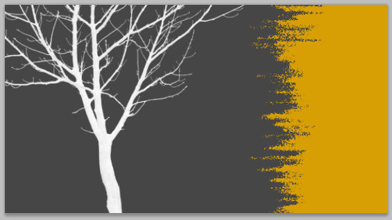
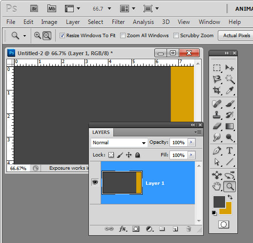
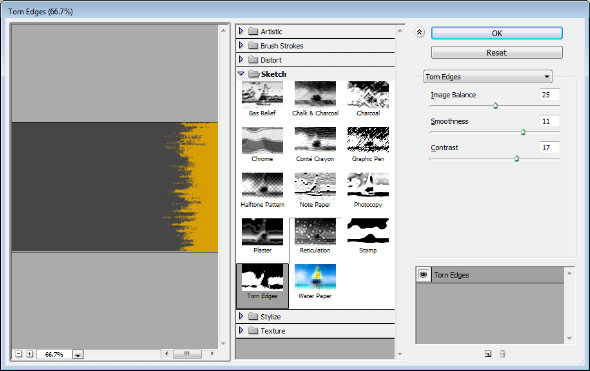
Create a new image the size of your background and fill it with a color. Make a selection on either edge of the image – I made mine on the right – and fill it with your second color.


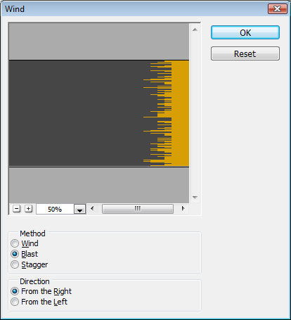
Now choose Filter > Stylize > Wind and select the Blast and the From the Right options and click Ok. When you do the filter will be applied to the image and the edge will begin to fracture.

Continue to apply the filter by pressing Ctrl + F (Command + F on the Mac) – this shortcut repeatedly reapplies the last filter you applied. Stop when you get the effect that you want.

You can stop here or you can go ahead and apply and additional filter to the image.

Filters such as Splatter, Patchwork, Glass, Torn Edges, Water Paper and Rough Pastels all give an interesting result.

Finally, I’ve been using some cool tree silhouette brushes lately and I’ve finished the design off with a simple tree brush stroke.

Helen Bradley

Monday, May 9th, 2011

Set a background for a MadPattern pattern

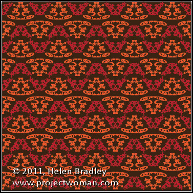
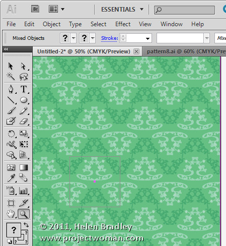
If you’ve started using the MadPattern templates to create repeating patterns you may have run into some problems when trying to change the background color.

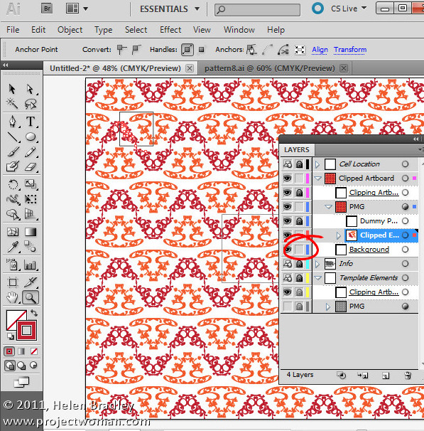
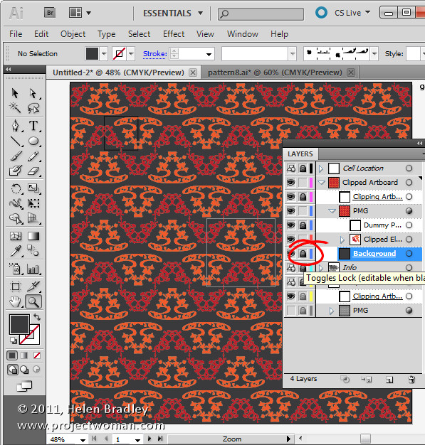
To do this first display the Layers palette using Window > Layers and locate and select the background layer. Click the lock icon for this layer to turn it off – this unlocks the layer making it editable.

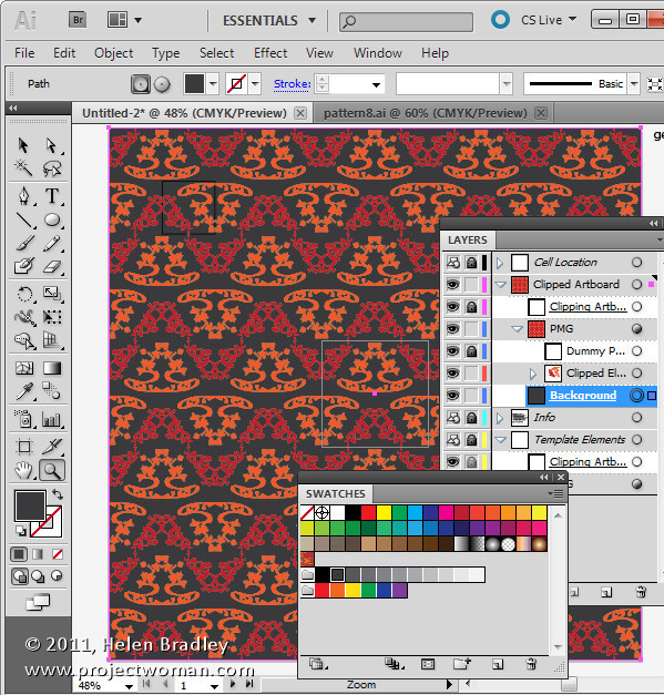
Target the background layer by clicking the circle to its immediate right in the layer palette now select the fill color icon in the Tools palette and select a fill color for the background.

When you’ve done this you can reselect the lock icon in the Layer palette so the background layer is protected.

Click again on the clipped elements path to continue to work with your design.

In a future post I’ll show you how to quickly and easily create new color combinations to use to recolor the pattern.

Helen Bradley

Tuesday, April 20th, 2010

Lightening backgrounds in Lightroom

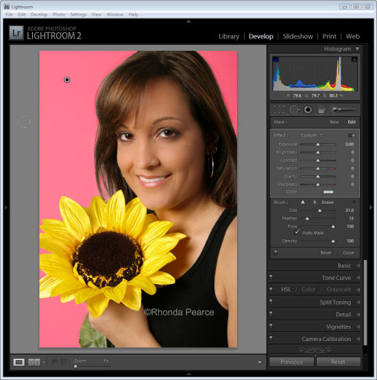
I was recently asked by photographer Rhonda Pierce to look at an image that she’d taken and to suggest how the background could be lightened to white in Lightroom.

This image raises an interesting question for anyone involved in postproduction and trying to understand when to use Lightroom and when to use Photoshop for editing.

Ultimately, if this image is to be printed at a large size then Lightroom really isn’t the tool for the job. There is too much wispy hair, particularly on the left side of the model’s face just opposite her mouth, which is cumbersome to work with in Lightroom. Selecting around the hair and doing a detailed job really isn’t possible or feasible in Lightroom. Ideally, Photoshop and a good extraction tool such as Vertus Fluid Mask would be the best combination to use.

However, if the image is not going to be printed at a large size and, for example, it’s destined for the web or if it is a preview image for a client where they’ll choose their favorite image from a series, then Lightroom is a good tool for the job. While Lightroom won’t do such a good job, it will do it very fast and, at the resolution we’ll be using the image we probably won’t see any real difference anyway. For this use, we can compromise on quality and harness the superior speed of Lightroom.

Later on, if this is the image the client chooses and if it will be printed at a large size, then we can wind back the Lightroom changes, export the image to Photoshop and do a proper job. We’ll only be spending time fixing those images that the client is actually paying for and that need a quality fix applied.

Lightening the background in Lightroom
So, assuming this image is destined for the web or for client preview purposes, let’s go back to the original question as to how the background can be lightened in Lightroom.

Any solution will require us to isolate the background. It’s not possible to lighten the background in Lightroom without affecting everything else in the image and that will destroy the rest of the image. The Adjustment Brush is the obvious solution.

Step 1
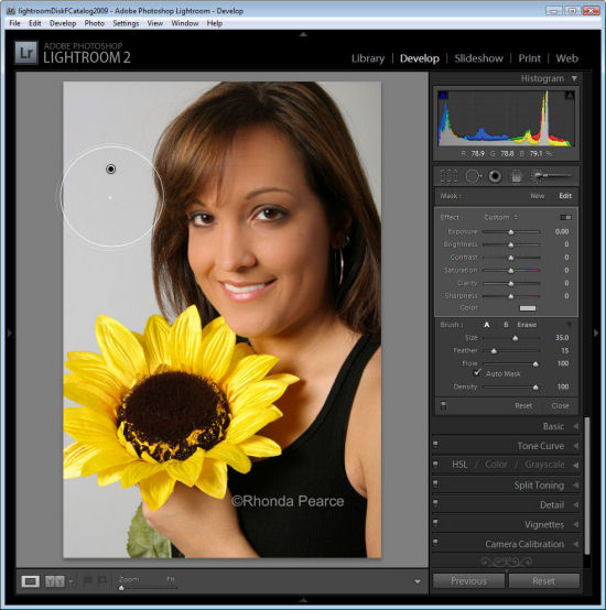
Click the Adjustment Brush in the Develop module and size Brush A so it is big enough to paint over the background. Add a small feather, and for this job, enable Auto mask so Lightroom will do most of the selection work for us. Set Density to 100.

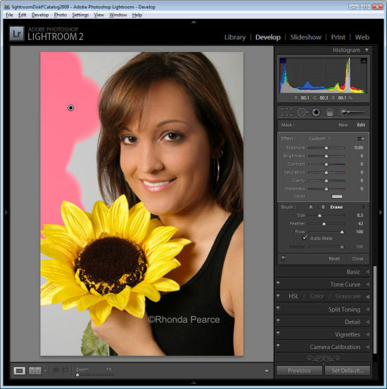
Click and paint over the background with the brush. When you lift the brush you’ll see the Adjustment Pin. Make sure the cross hair in the middle of the brush stays on the background and then the Auto Mask feature will ensure that the brush doesn’t paint over anything but the background.


Step 2
To see the painted area, press the O key and a red overlay will appear. This makes it easier to see where you are working.

Step 3
To get the background behind the very fine hairs you might be tempted to select a very small brush and try to isolate the areas manually. However, to do the job fast, it’s more efficient to size the brush very large so the center can be positioned over an area of the background and the rest of it extends over the wispy hair area. It might help to significantly decrease the density at this point to around 30 so that you only partially select the background in the wispy hair area.

Position the brush over an area of the background so the rest of it extends over the wispy hair area and click once.


Step 4
Return to 100% density and continue to work in the other background areas making sure to avoid the wispy hair.

When the area that you want to effect are selected, press O to hide the mask.

Step 5

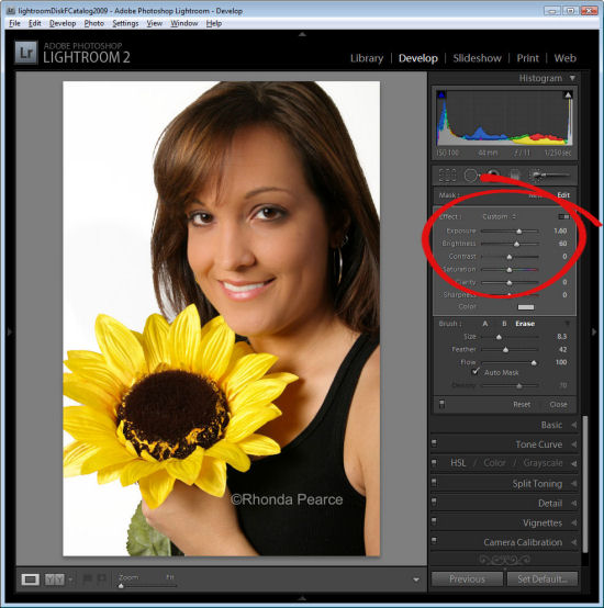
Now adjust the settings for the Adjustment Brush. Increase the exposure and brightness until the background is white.

Click Close to close the panel and deselect the Adjustment Brush.

Step 6
Check the wispy hair area and you’ll see that not all the grey has gone but, when viewed in context of the remainder of the image the results are acceptable.

Press the backslash key (\) to see the image before and after the fix.

Helen Bradley

Thursday, June 7th, 2007

Love the theme, hate the background image?

Yum, PowerPoint’s new themes. They’re fun, colorful and a far cry from the drab and boring ones we’ve lived with for so long. So, what happens when you love everything about a Theme except its background?

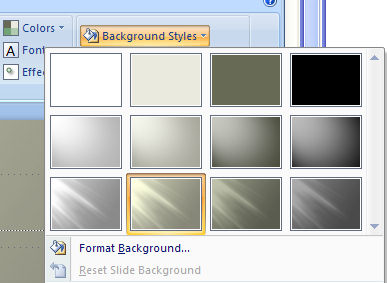
Well, since I’m waxing lyrical about PowerPoint you can probably guess I’m about to let you in on a trick for fixing the background problem in your PowerPoint 2007 theme love affair? Click the Background Styles option in the Design tab and there is an entire selection of different backgrounds all coordinated with the theme. If you change your color scheme the background’s colors change too – sweet!

Helen Bradley

Friday, March 2nd, 2007

Background Graphics in OneNote

One of the improvements in OneNote 2003 SP1 is the addition of background graphics which appear on a separate layer of the note page and which are stable and won’t move.

To create a graphic as a background, insert it onto the page and then right click and choose Set Picture as Background.

To alter the graphic later on, you must promote it back onto the page by right clicking somewhere over the top of it and disable the Set Picture as Background checkbox.

This feature is useful for creating custom stationery and for adding notes over the top of your graphics – the graphic stays more stable and you’re less likely to encounter the situation where your pointers move out of position.

Helen Bradley