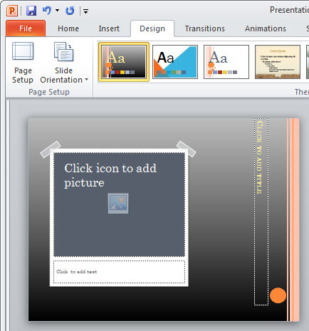
This stickytape image border comes from the Solstice Theme and here I’ve added it as a new layout in my Oriel Theme.
I saw a recent post on a blog which referred to one of my earlier posts about creating torn edge image effects in PowerPoint 2007. You can see my original post here: http://www.projectwoman.com/2007/03/powerpoint-2007-torn-photo-edges.html.
Someone who responded to the post asked if there was a way of using the photo edges from a theme but not the theme itself. Their problem was they loved the edges but because their organization had a custom theme that was always used, the person wasn’t allowed to change it. The question got me thinking about a solution and here it is!
To use an image design from a PowerPoint theme first create a new file by choosing File > New > Blank Presentation and then choose the New Slide > Picture with Caption Layout – this is the layout typically used to apply fancy styles to images.
Click on the image locator and add an image to the slide – it doesn’t matter what image you add – you just need something so you can see how the image design looks.
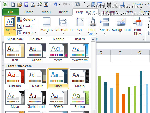
Now go to the Design tab and arrow over each of the Themes in turn to see what the image layout looks like. For example, Solstice has a sticky tape edge to the image, Pushpin adds the image with a pushpin background and Opulent has a layered frame look. Flow has a bent corner on the image, Couture has an interesting beveled edge and Summer has a series of illustrative dots around the image. You may find other interesting designs in other Themes such as those that you download from Office Online.
Select the Theme that has the look you want to borrow.
Now choose View > Slide Master and locate the Picture with Caption Layout. Drag over the elements that create the look that you want such as the Pushpin and frame, the sticky tape frame or the circles. Make sure to include the image placeholder. Right click the selected elements and choose Copy.
Now open a file that uses your corporate Theme – or the Theme you prefer to use. Choose View > Slide Master and locate the Picture with Caption Layout slide layout. Right click it and choose Duplicate layout.
Click the image placeholder on this duplicate layout and delete it. Right click on the layout and choose Paste to paste the elements that you copied from the other layout. Move the design elements into a new position, if desired.
You can now adjust the text and title boxes on the layout so that they don’t encroach over the elements that you’ve just added to the design.
When you’re done, click Close Master View.
To save the Theme with the new Layout, from the Design tab open the Themes dropdown palette and choose Save Current Theme and save it.
In future you can use this Theme for your slideshows and to use the layout you created select it from the Layout list where it appears with all the other layouts from the original theme.
Helen Bradley


