When you have a great big Excel column chart with heaps of delicious data but all in one series, it makes sense for the chart to be plotted in wonderful technicolor. However that’s an option Excel 2010 doesn’t make it very easy to find. If you try the Chart Tools > Design tab you can choose a multi-color chart but that only colors each series a different color so it won’t work when all your data is in one series.
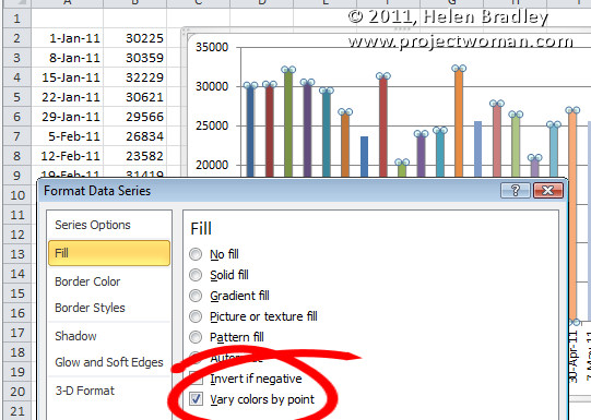
The solution is to click on one column to select it then right click and choose Format Data Series > Fill group. Locate and check the Vary Colors by Point option and you’ll have a wonderful multi-colored series – much more enlightening than a plain old single color chart don’t you think?
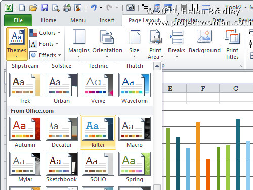
If the colors aren’t to your liking (you are getting just a little bit fussy but I do know exactly what you mean) select the Page Layout tab and check out the Themes – there’s sure to be one which will make your chart perfect.


