Friday, April 27th, 2012

Edit images on the iPad with PhotoPower

Download: PhotoPower on the iPad – 2.99

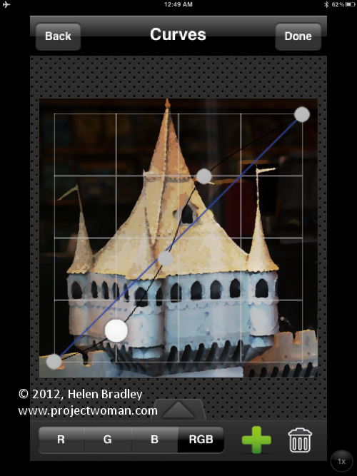
This is an iPhone app that runs on the iPad. It totally rocks and it’s an example of what a photo fixing app should do. It is simple to use but extraordinarily powerful it even includes a curves tool!

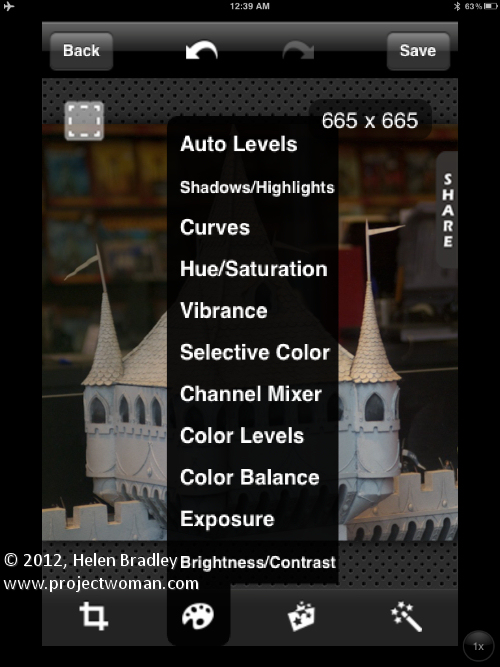
Open an image, crop  it and then adjust it. There are tools from Exposure to Vibrance and in many tools you can adjust the separate color channels or the composite channel.

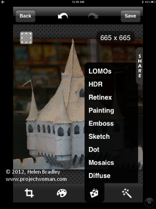
Tap any of the Adjustments, Effects or Filters and you’ll see a long list of options to choose from. This is a seriously awesome program with heaps of cool features. It’s a pity it isn’t available for the iPad at full screen size but that gripe aside it is well worth looking at as a tool for adjusting your images.

Helen Bradley

Wednesday, April 25th, 2012

Create spot color effects on the iPad with ColorUP Lite

Download: ColorUP on the iPad – Free

This free program will only let you adjust images captured by the iPad – if you want to be able to use images from your camera roll you have to upgrade to a paid version.

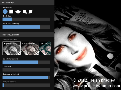
Here, because I wasn’t online to get the upgrade, I just shot the cover of a copy of Vanity Fair which I was reading on a flight home from Washington DC!

The app turns the image into monochrome and you then paint over the areas of the image to bring back color.

You can adjust the brush size and see the mask. If you make a mistake just erase the brushstrokes.

You can blur the background, adjust its contrast and even change the color in the image by adjusting the hue.

If you like the effect it is worth shelling out for the full version as not many programs let you do this as easily as this one does and the extra features for adjusting the background are great.

Helen Bradley

Monday, April 23rd, 2012

Quickly adjust color in a photo on the iPad with Auto Adjust

Download: Auto Adjust in iTunes – 0.99

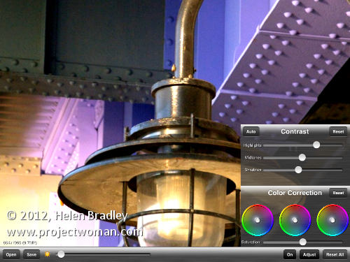
This is a no nonsense tool that has a few sliders and not much more. You can adjust Brightness, highlights, midtones, shadows and color saturation. The app won’t scale your photos so you don’t see everything on the screen and you can’t move the image around.

The tool really doesn’t do enough to warrant using it – there are plenty of other tools that have a broader feature set.

This program would have to be gobsmacking great to justify opening images in it since you’ll generally want to do more than just these adjustments.

Helen Bradley

Thursday, April 19th, 2012

Age an image on the ipad with OldPhotoPRO

Download: OldPhotoPRO on the iPad – Free

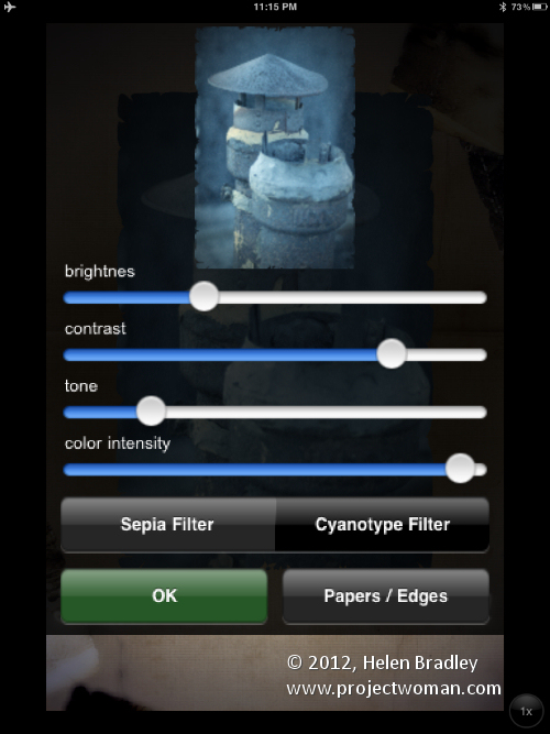
This free app doesn’t promise much and doesn’t disappoint, in fact quite the opposite. You simply open an image and it applies an old photo effect to it. Click Edit and you get a heap of edits you can make from Brightness, Contrast, Tone and Color intensity and a couple of options for Sepia and Cyanotype.

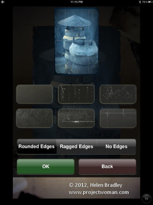
Tap Papers / Edges and you can add edge effects and scratches.

This is a no frills app. It is simple to use and can crank out some fun effects for aging images.

Helen Bradley

Tuesday, April 17th, 2012

Photo editing with Snapseed on the iPad

Download: Snapseed on the iPad – 4.99

Snapseed comes from the folks at Nik Software. It’s an interesting app but can leave you more confused than enlightened regarding what you did to your image.

When you open the image there are selectable options all down the left of the screen – big icons to click on. Then everything gets really small and not a little confusing.
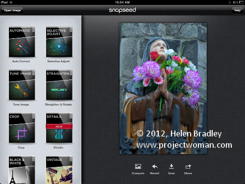
Some features let you add a control point to the image that you use to adjust just that position on the image – in others you swipe across the image to apply a change.

In the brightness fix, for example, you will drag across the image to adjust the brightness.

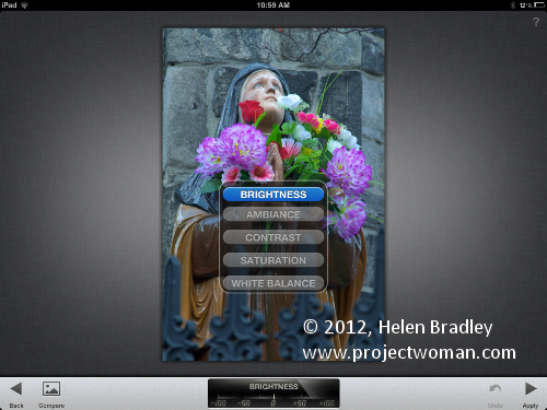
In other cases you swipe down to reveal different options. In Tune Image this means that options for Brightness, Ambience, Contrast, Saturation and White balance are all hidden from view and you have to ‘discover’ them to use them.

All these features are hard to discover when you first start working with the program and eave you wondering just who designs iPad interfaces and why they think that  hiding features is smart? There is plenty of room on the screen to put some sliders or options which would make this program much easier to use than it is.
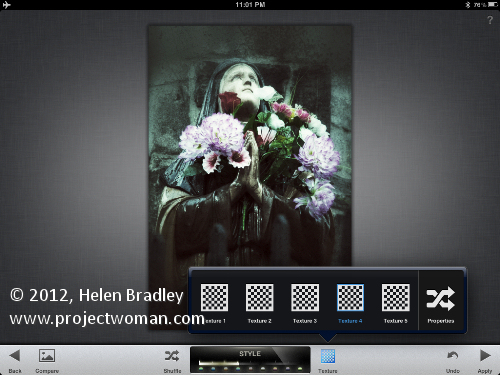
The Grunge fix has thousands of Styles which all tend to morph into each other – they aren’t different enough to even care too much about. I’d settle for 20 really different effects to choose from than this range of thousands of similar ones. Worse still, if you choose Shuffle to apply an effect you can’t easily see what number it is so you can reuse it. When applying styles you can also apply textures but the preview shows nothing about what that texture will look like!
The program doesn’t really seem to be too clear as to whether it is a serious fixing tool or a fun one for applying effects – it tries to take a bet each way and misses a bit on both counts.

At first looks it appears to be serious and the sample image is very attractive and well shot so grunge and vintage aren’t the first things that come to mind when you open the app. The tools however, lend themselves more to the fun side with the Vintage, Grunge and Tilt shift features.

In the scheme of things, this isn’t an app I’d use much. It is a bit too messed up for me and doesn’t do anything well enough to be a tool of choice for general day to day work. Perhaps for the occasional photo it might offer something but this will be occasional only.

I don’t dislike Snapseed I just don’t really understand the point of it – it seems a bit haphazardly put together. I think if you used it a lot you could grow to like it, I just don’t want to put that much effort into something that isn’t feature rich.

Helen Bradley

Friday, April 13th, 2012

iPad Photo editing and sharing with Instagram

Download: Instagram on the iPad – Free

Instagram is more about a photo sharing community than fixing photos per se. It is also an iPhone app so it’s tiny and runs in portrait orientation on the iPad.

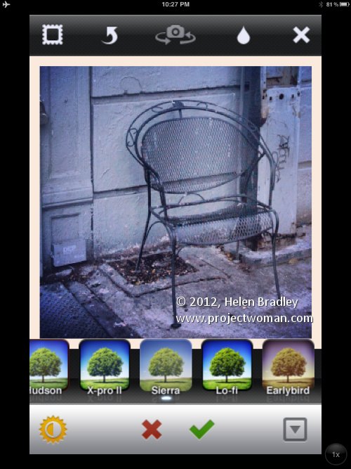
Instagram crops everything to a 1:1 crop and offers 13 filters with a range of removable borders.

There is a one click contrast enhancement and you can apply a soft focus effect or a faux tilt shift and that’s about the sum of it.

This app is ridiculously popular with iPhone users and probably better used on the iPhone where you’ll be able to share images online from there and where the tiny interface makes more sense.

Behind Instagram is a web site for sharing Instagram photos. You can share your images so others can view them and you can view other people’s photos too.

If you are into photo sharing this is a great app. If you love the Instagram look then this is the app that gives it to you.

If you want to be more creative with your images then look elsewhere – this app is free and it is good but it is far from great as a photo enhancing tool.

Helen Bradley
Wednesday, April 11th, 2012

Photo editing with Photoshop Express on the iPad

download: Photo Express on the iPad – free

When it comes to apps sometimes you get great value in free apps and other times you get rubbish. Photoshop Express falls somewhere between the two extremes – it isn’t rubbish but it’s far from great.

Photoshop Express has a very strange interface which left me tapping furiously on the screen trying to get it to do something – anything!  The problem is you have to swipe the screen to adjust the intensity of the edit? So, to increase saturation you choose the Saturation option then swipe across to the right to increase it or to the left to decrease – Ok – where exactly did that interface metaphor come from? I feel like I missed class that day and there is nothing  on the screen that makes this behaviour easy to discover.

Interface complaints aside this app lets you crop and fix your images and apply some effects to it.

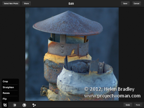
Here is the crop/straighten/rotate/flip options:

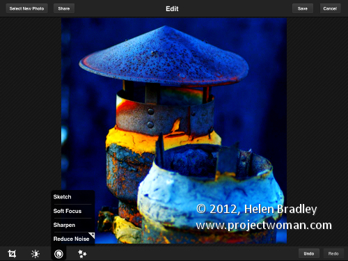
Here is the image with contrast and saturation improved:

The noise reduction tool requires you to buy an add-in – OMG Adobe just gets some things sadly wrong and this is one of them! Either give the program away or don’t but why do they make one fix a pay for feature? It makes no sense – and they could just have easily left out noise reduction altogether. If you want this feature, expect to pay a hefty $4.99 for it.

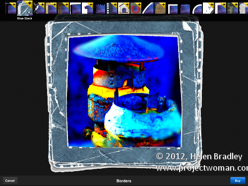
In the border area there are a handful of free borders and others you can buy but which you can preview on your image first – this is useful so you get to see how they look before you commit to buying them. They come as an all in pack of 22 borders for $1.99.

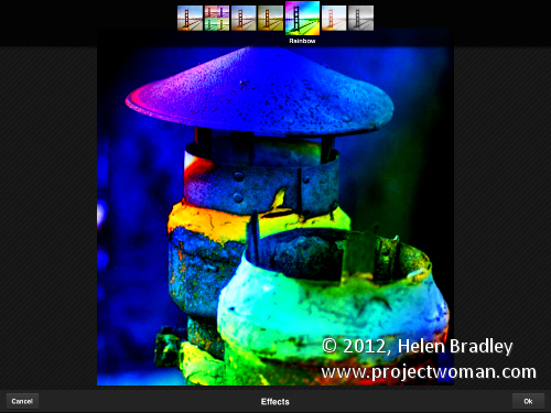
There is also a small range of effects you can apply by selecting the effect to add to the image.

A lot of folks will download this app because it is from Adobe. Lots of these same folks will be wondering why they bothered to do so. This app is competent but it is hard to look past the silly in-app purchases and the screwball interface – Adobe is better than this – this app damages the company’s reputation – why not do something like they have at photoshop.com?

You don’t have to reinvent interfaces for the iPad and you don’t have to make up new interface gestures for adjusting images when a slider will do just fine – if you use sliders folks can see the slider and work out quickly how to use it – instead here with the swiping you really have to guess how to make the thing work and you shouldn’t have to do that.

Helen Bradley

Monday, April 9th, 2012

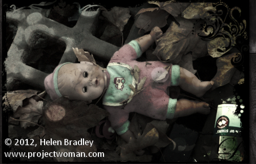
Grunge an image with Pixlr-o-matic on the iPad

Download: Pixlr-o-matic on the iPad free

I love this app but wish it worked in landscape and didn’t force me to work in portrait. It is from Autodesk who are the unsung heroes of the iPad photo editing app world. They do great stuff – way better in general than Adobe when it comes to iPad stuff.

Not only that but this app is also available online so you can use it on your desktop in a browser or download a standalone version – all cool and all free! You can buy extras if you like so you can buy extra frames and effects and you get lots for your money.

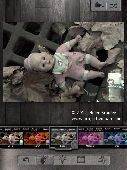
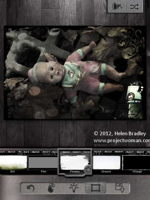
Start by capturing an image or import one from your gallery. Then click the first of the options across the foot of the screen – these are filters. Here you can browse the gallery of options – you can instantly view the filter on the image or keep scrolling to try something out if you don’t like the result of your first choice. I chose Lucas for this image:

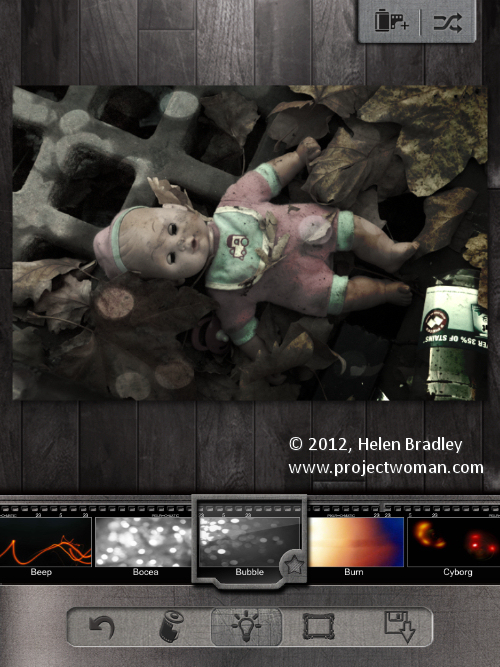
Then select the Lightbulb icon and apply a lighting effect to the image. I added Bubble to this image.

Then click the frame option and add a frame – I chose Flowery.

I would like a tool for cropping the image as I really prefer to use square images for these types of effects and you cannot do it in Pixlr-o-matic so you  have to do it before you come to this program.

The icon in the top right of the screen lets you apply a random mix of settings to your image – it’s a sort of “I feel lucky solution” – worth trying if you just want to see what the program can do.

Your save options are to the Photo Gallery or iTunes – it would be nice to see some integration with, say, Facebook or Twitter too?

I love Pixlr-o-matic on the desktop and the iPad. I have bought all the extras because you can never have too many cool features and I am willing to overlook some minor frustrations like no crop and portrait mode for the sake of art!

Helen Bradley
Thursday, April 5th, 2012

Photo fixing and painting with PhotoPad

Download: PhotoPad by Zagg for the iPad free

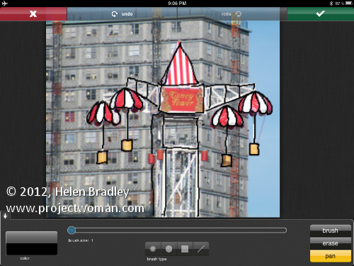
This app is interesting and would be useful if it were more functional. It has a few problems and most annoying is the inability to preview changes on the image before you select them. So you have to apply the effect and then undo it if you don’t like it. It just seems a whole lot more cumbersome to use than many other apps of this genre.

The rotate tool has no grid so lining up a rotation is total hit or miss. And worse still the program adds a colored matt background around the rotated image – wtf? Most photographers won’t want an image on an angle with a colored background showing up just what you did to the image. In reality what we need and want is the option to rotate the image and, at the same time to crop or resize the image to get rid of this skewed background.

There are a range of paint tools which let you sample colors from the image or select your own color and paint onto the image. This paint goes on a layer above the image so you can erase it if desired. There are 4 brush types – soft, hard, square and line but they’re not really different enough or a wide enough range to do much – you’d go to another program if you were serious about doing real painting of an image. Here I just did some fun brush lines.

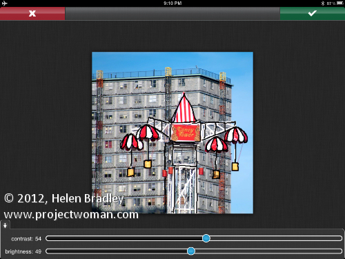
The fixing tools are limited to color levels, saturation and hue, contrast and brightness and things like redeye.

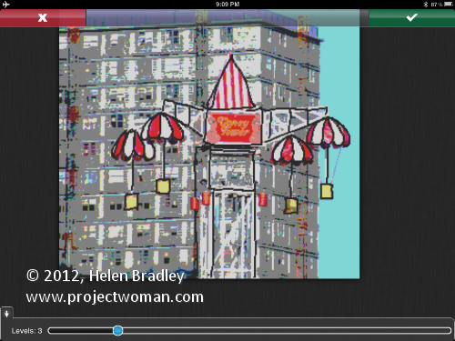
There are a few filters but the thumbnails don’t indicate well enough what they do so you have to apply them to the image to test them. Basically they’re a pretty lacklustre range of filters which just about sums up this app – lacklustre and hardly worth bothering with – there are far better apps out there which do all this does and more and way more to boot.

Helen Bradley
Wednesday, April 4th, 2012

Photo-editing in Photogene

Download: Photogene for the iPad $2.99

I have had Photogene now for a while but just cranked it up today to see just how it performs. I have to say it has some cool features – sort of an all-round app that could be all things to some people but which hasn’t a huge amount of depth.

It doesn’t have layers but it does have a mask you can paint on to paint on features such as the dodge and burn fixes. I got a bit confused with the presets – they are great for applying effects but they seem to have been added on rather than integrated with the program itself. It’s a minor complaint but you feel like filters and frames appear  in two different places – as regular tools and as presets. Problem is that if you use the presets you get access to some frames that you can’t get to elsewhere – which is a little frustrating if you are a DIY person and like to have better control over your images.

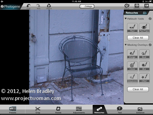
This image was shot in NY and I shot it specially to use for iPad editing. Here I gave it the treatment in Photogene. The image wasn’t perfectly straight so I started with the rotate tool and straightened it.

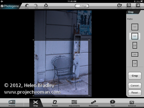
I cropped it using a 1:1 crop with the Crop tool.

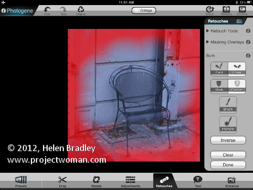
Then I added a vignette using the Burn brush which is a Retouching tool. The built in vignettes didn’t give me the control I wanted and being able to paint the vignette on is great.

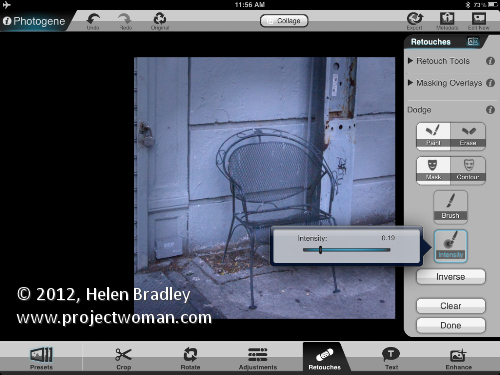
When you are dodging and burning you can change from paint to erase by tapping twice on the screen and there is an Intensity slider you can use to dial down the effect.

You can also choose to see the mask overlay which helps you when you’re trying to work out where you painted.

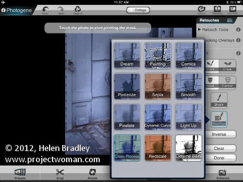
I used the Dodge brush retouching tool in the middle to lighten the image and then applied an effect from the effects collection.

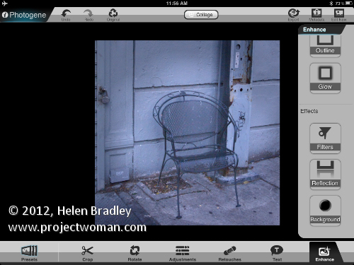
Then I applied a cross process effect. You can do this to the entire image or it can be painted on using the retouch tools.

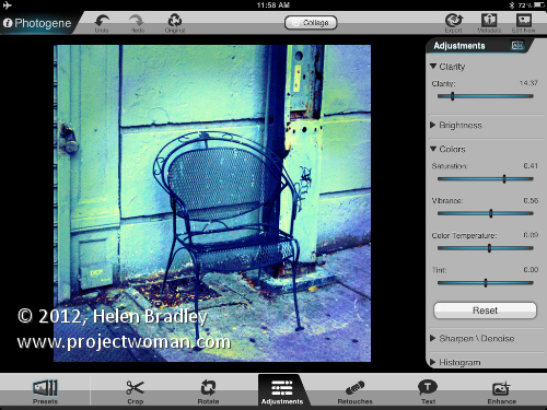
To finish some adjustments were made to the image saturation, vibrance and clarity.

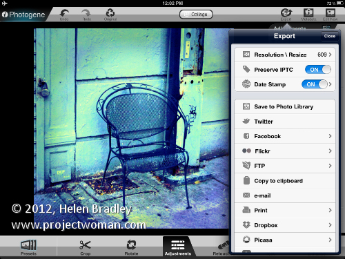
This was the end of the process in Photogene but I felt the image needed a little something extra. I saved it out of Photogene to the Photo Library.

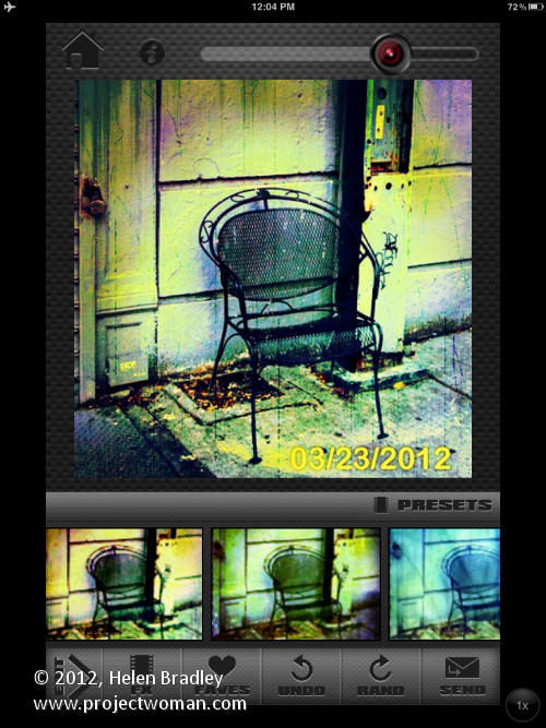
Then took it to Scratch Camera to add the final touches you see here.

Helen Bradley
Page 2 of 3123