Learn to fix images that have iPhone filters applied to them using Photoshop Elements. Remove unwanted color casts from the images using two different methods.
Transcript:
I was sent this image by a gentleman who wanted me to fix the color in the image because this was shot with an iPhone and the young lady had applied a filter to it. I sent him a few copies back each one of them altered a little differently. And this is the one that he came back and said this is the truest to what her hair color looks like. So now I’m going to show you how you go ahead and fix an image like this.
Now I’ll always work on a copy of the original image, so I’ve made a copy. I’m just going to size this down so we can see both images side by side. Now there are a couple of tools that I would typically use. One of them is Enhance, Adjust Color, Adjust Color for Skin Tones. In this case what we do is we just click on some skin tone in the image and try and fix it that way.
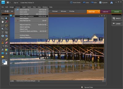
Now it’s not giving me great results here so I want to show you another tool that we could use. And that is just the colorcast tool, Enhance, Adjust Color and then Remove Colorcast. And here we would click on somewhere in the image that was supposed to be a sort of neutral gray, black sort of white area. So we could sample some of her clothes here to see if we get a good fix. We could sample around her teeth as well. And I think that this is a pretty good result as a match for this image over here, so I’m just going to click Ok.
Let’s just zoom out here and see. So these two images have pretty much the same look in them. The hair color is pretty much the same. If anything I might just reduce the saturation a little bit on this image which I could do by choosing Enhance and then Adjust Color. And we could do hue/saturation and then we could just decrease the saturation a little bit across the entire image. And that would get rid of some of the yellow. In fact I think I’ve actually got a better fix on this image probably than I had on the original.
So there’s one way of fixing a colorcast in an image. I have another pair of images of the same young girl. Let’s have a look at them here. And I have one here that was said to be a reasonably good fix for that image. Now I’m going to show you some means of getting this result from this sort of an image. The first thing I’m going to do with this image is because it’s got a sort of reddy orange colorcast on it I think that if I apply a filter to this image we might be able to kill some of that color. So I’m going to choose Layer, New Adjustment Layer, Photo Filter. And here’s my photo filter dialog, click Ok. And what I want is a cooling filter. That’s a blue filter. So I’m going to go for one of these cooling filter effects. I’m going to wind it up quite high. So let’s see which is the better of them. And I think the 82 is a better cooling filter. You can see that now we’ve got some sort of reasonably good skin tones here. So I’m thinking about 65 is pretty good there. So let’s call that done.
Now one of the things that I would like to do with this image is to get rid of the sort of grain that there is on her skin. So I’m going to take this cooling filter and click on it and just press Ctrl Alt Shift E which will give me a duplicate of that image as it was. So I haven’t got rid of these two layers, but what I’ve got is a layer that contains everything that was in those two layers. And I’m going to duplicate this as well. So I’m going to drag it onto the New Layer icon so we have two versions of her face. This one I’m going to blur. So I’m going to use a blur. I’m going to choose Filter, Blur and then we’ll use a surface blur. Now surface blur is a blur that will blur the surface but not around the edges. It tends to keep edges very crisp. We don’t actually want crisp edges but we do want the edges around her face not to be blurred. So I’m going to reduce the threshold and the radius to small values. What I want to see on this image is a lessening of this grain so it’s sort of blurring out. I don’t want it too blurred, but I do want it blurred. And since I’m only going to use the lightened values here, I’m not really too concerned about the fact that it looks a little unreal at this point, I’m just going to click Ok.
And now I’m going to blend this back in using lighten. So with the lightening we’re actually lightening the pixels underneath so that’s a pretty good result there. But let’s have a look at what we’re sort of targeting. I don’t think this is great, but I don’t think this is quite there either. So let’s have a look and see what we could do.
Well we could apply another photo filter. So let’s go to Layer, New Adjustment Layer. Let’s go and get another photo filter and again, a cooling filter. So I’m thinking one of these others might be appropriate. Let’s just wind the value down and let’s check those again. This one’s pretty good. It’s a little bit red but it’s not a bad sort of cooling filter for this image if we could get the density of it correct. Let’s have a look at this other one. Again, that’s having quite a nice effect on her skin tone. So I might choose one or other of these cooling filters to apply to the image.
So now if I was continuing to work on the image I might want to for example apply a curves adjustment to it. So let’s just go and get our layers. We’re working on an adjustment layer right now so I’ll need to give us a full image layer to work on. So I’ve pressed Ctrl + Alt + Shift + E so we’ve got a new layer to work on. And now we could use a curves adjustment, Enhance, Adjust Color, Adjust Color Curves. And here what I’d be looking for is to sort of just generally lighten the image. So, I think the backlight will give us a reasonably good start here. And I’m just going to adjust this curve so that everything is just a little bit lighter. So I’m just looking at pulling all of these curve marks up a little bit. Here’s our before and after. And you can see that we’ve got a little bit better skin tones here so I’ll click Ok.
And I think in actual fact this time round I’ve probably got a better fix than I had the first time. Perhaps if I have a look at that smart blur again I might to do something else or what I could do is just blur a duplicate of the image using for example a Gaussian blur and then just bring back these areas into the image. Let’s see what we would do there.
I’m just going to duplicate this layer. I’m going to apply a blur for example, a Gaussian blur to this layer looking to get the smoothest skin tones. That’s really all I’m interested in here is the slight smoothening of the skin so that we get rid of the grain that we got in from the iPhone, click Ok.
I’m going to add a layer mask to this layer. And what I’m going to do now is to just paint out the areas where we’ve got some softening of the image. The softening areas are going to be around the eye and perhaps over the lips. So I’m going to bring these areas of detail back a little bit in these areas. So there’s how I would fix these images to remove the impact of using an iPhone to take the images in the first place. Let’s just go back to the Undo history on this image and let’s see how far we’ve come. This is the original image and this is what we’ve got now, a much more pleasing result for the family of this young woman.
I’m Helen Bradley. Thank you for joining me for this video tutorial. I encourage you to subscribe to my YouTube channel so you’ll be advised when new videos are released. And look out at projectwoman.com for more Lightroom, Photoshop, Photoshop Elements and Illustrator tutorials.


