Monday, November 18th, 2013

Rev Up Your Photo workflow

Learn some tips and techniques to speed up your photo workflow.

When you return from a shoot or vacation with hundreds, if not thousands, of photos you need a smart workflow in place to process them. The more effective your workflow is, the less time you’ll waste on processing your images and the quicker you can get back to shooting. In this column, I’ll show you some techniques to use to streamline your workflow from downloading your images to adding metadata and keywords and then fixing and sharing the best of them.

Downloading

Before you begin to download any images from your camera you need a plan for storing and working on them. You should have a plan for how you will organize your images and how you will name your folders and whether the images will be renamed or not.

When it comes to structuring a system, be aware that what works best for someone else may not work best for you. You need to develop a system that you understand and that you can work with. Once you have a plan, it will help to write it down so you have a step by step process for working with the images from any shoot at any time. Any software that you use today or in future should be chosen so it supports this workflow.

Start by downloading images from your camera cards. How you do this can impact how easy it is to do other things later on. For example, if you’re using Lightroom and you have multiple cards from a shoot, you might consider downloading all the images from all your cards into one folder on your computer before importing the images into Lightroom. This way you will have all the images in the Current/Previous Import folder in your Catalog panel allowing you to isolate all these images to deal with them as a group.

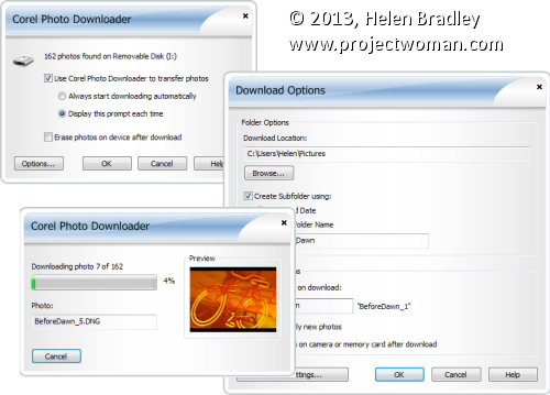
In any application you will need to set the import dialog so that the downloaded images are handled in accordance with your image handling workflow. Programs like Photoshop Elements include a special photo downloader and if you accept its download defaults then your images will be stored subfolders by date. If this isn’t what you want to happen you need to change the settings before downloading so you don’t have to fix the problems later.

So, in Photoshop Elements Photo Downloader dialog, select the source location for your images and the place to store them in. While the default is your My Pictures folder you can change this as necessary. Select a subfolder for the images and then determine how to name this – either by date or a custom name. If your workflow calls for your images to be renamed then you can do so as you import them – there are options in this dialog to name files by date, or to apply a custom name and sequence number.

Taking the time to not only get your images into the right place the first time and to rename them on import will save you hours of work later on.

In addition, in Photoshop Elements for example, if you select the Advanced dialog, you can add creator and copyright metadata to the images as you import them – something that you can’t do later on. This Advanced dialog is the same dialog that you would use if you are importing images via Adobe Bridge but in the case of Bridge it is possible to edit and add metadata  later on.

Whichever program you are using, check the program’s import options carefully to see what features it includes for renaming files, organizing images into folders, applying simple fixes and adding metadata as you import the images. Anything that can be done automatically as you import your images will save time later on.

Making backups

If you store all your images on just one disk there is a risk that you will lose them if your disk crashes or something happens to your computer. As a precaution and as part of your import process, and before you do anything more to your images, you should create at least one backup copy of them.

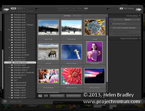
Some programs like Lightroom make this easy to do. In Lightroom’s Import dialog you can chose to backup your images to a second location as part of the import process. This is only the case if you choose Copy, Move or Copy as DNG as the import option, if you choose Add this option is not available. In the File Handling panel is a checkbox you can select to make a second copy of the images to a different location.

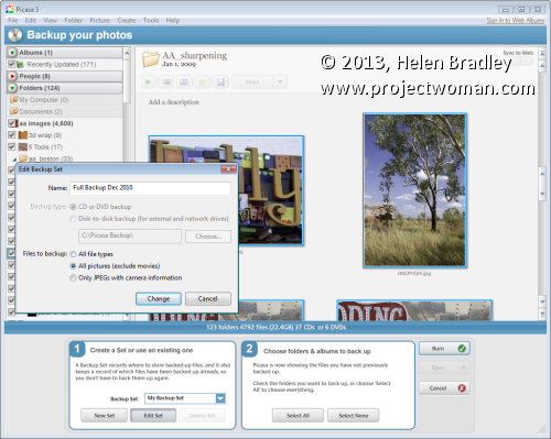
In other programs, you may need to back up the images manually. For example, in Picasa you can select the images to back up and choose Tools > Back Up Pictures. This opens up a set of step-by-step panels from which you will first select a Backup set or create a new one. The you can choose the folders or albums to back up and then click to Burn these to a series of CDs or DVDs or copy to an external or network drive.

A  benefit of using this Picasa backup tool is that it will take note of which files you have backed up so that you won’t have to back them up again. This will reduce the time involved in backing up new downloads in future and will save you unnecessary duplication of effort.

Whatever your program offers, backing up is a task that should be done routinely whenever you download your images so you’ll be protected if your computer crashes or if you make mistakes while editing and need to restore an image from the backed up version.


In the next part of this series: Keywording and Copyright Metadata

Helen Bradley

Wednesday, March 13th, 2013

Updated review – Photoshop Express for the iPad

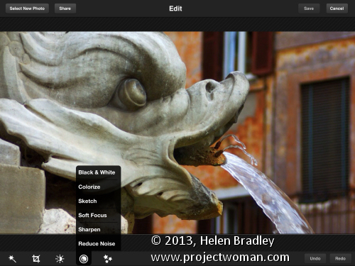
I’ve been revisiting some of the apps I’ve previously reviewed to see what changes have been made to them recently and how they have developed. One of these apps is Adobe Photoshop Express for the iPad. This app is free but it does have some in app purchases – one of which – the Camera pack that includes Noise removal – you can safely ignore. I think it is expensive and not worth the $4.99 that Adobe charges for it. However, ymmv.

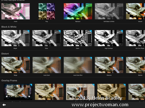
The free Effects in Photoshop Express are pretty limited and there are just nine of them so unless you buy the add on Effect Pack ($2.99) you won’t have a lot of creative options. That said, the Effect Pack has a lot of fun effects in it. You could get access to similar effects for free in other apps, but if you want everything in one place you might consider this pack worth shelling out for. There is also a Border pack for 99¢.

Like many free apps the add on borders and effects are shown in the app so you can see them but not use them unless you buy them. You can’t hide them either so this might be a bit off putting – personally I’d rather not see what I don’t own, but that’s my take on it.

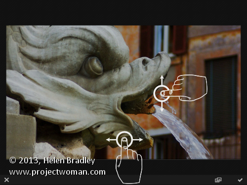
One change to the app that I like is the on screen prompts showing you how to use the app. This was a huge complaint that I had initially with the app as it had no indication as to how you made your adjustments. I thought at the time that this made it very hard for inexperienced users to use the app as it wasn’t clear how to do so. In a free tool aimed at beginner users I thought this was inexcusable.

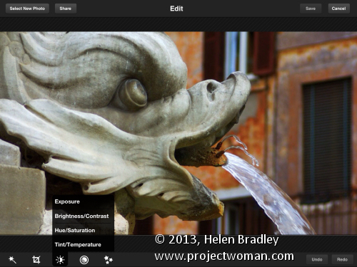
Now the first time you choose an option like Brightness and Contrast an overlay appears showing you how to adjust these options. It’s much less confusing and a whole lot easier to work with. So much so that I’d wholeheartedly recommend this app for beginner to intermediate users.

In Photoshop Express you can edit images from your Camera Roll or capture images using the app. What you cannot do is upload images to Adobe Revel – the new online replacement for photoshop.com (and which was previously called Adobe Carousel – have I confused you yet?). You can also not download images from Adobe Revel to edit them in the app. Since Adobe owns all these sites and apps it would be nice if all its apps and storage locations talked to each other instead of operating in isolation.

Other changes I noticed is that the feature for adding effects and borders has been revamped allowing you to see the full range of effects and borders in one large screen already in place on a small version of your images. Those that are not enabled have a blue mark on the corner and there is a shopping cart link in the bottom right of the screen that you can use to buy add on packs, if desired.

So far as sharing is concerned, Photoshop Express is light on options when compared with some other apps. You can share to Facebook, Twitter, Tumblr and email images but that is all. You can also save images to your Camera Roll.

In all, the changes to Adobe Photoshop Express are welcome and make the app a lot more usable for its target audience. I now actually like this app and would heartily recommend it particularly for beginner to intermediate users looking for a simple and easy to use photo fixing tool.

Helen Bradley

Tuesday, December 21st, 2010

Lightroom: Embracing Brightness

In previous posts I’ve advocated using the Exposure slider to lighten an image but lately I’ve added the Brightness slider to my workflow. I’d encourage you, if you haven’t already done so, to experiment with it on your images.

However, before we begin a word of warning about Brightness/Contrast in general. Brightness adjustments in some programs aren’t as good as in others. If you’re using Photoshop CS2 or earlier, for example, use Curves or Levels to lighten an image not Brightness. In Photoshop CS3 the Brightness/Contrast tool was re-engineered and instead of adjusting all pixels equally as it used to do with the result that highlight areas were routinely destroyed in the process, it now protects the lightest pixels as it lightens the image. Before trusting your image to a program’s Brightness and Contrast tool, check your histogram before and after using it and make sure you aren’t blowing out highlights in your quest for a lighter/brighter image.

Now, back to Lightroom.


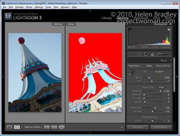
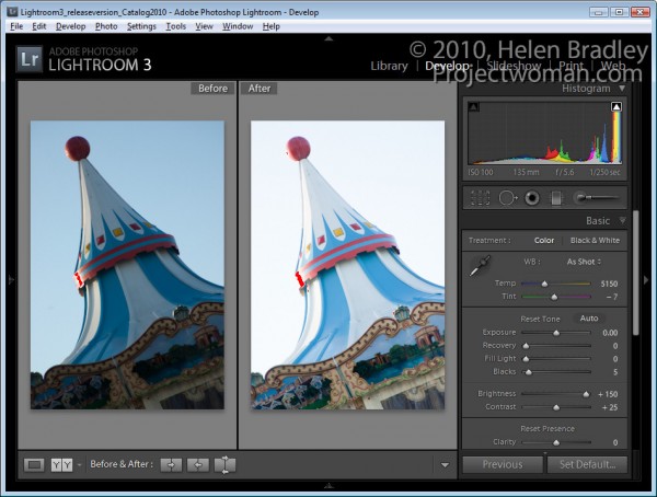
Take a look at the image shown here. If I leave Brightness at the default value – which for my camera is +50 but which may be different for yours, and if I crank up the Exposure to the maximum value, a lot of the lighter  pixels in the image get blown out.

Of course I would never adjust an image to this value but it’s a useful exercise to see how Exposure works.  


When I do the same thing in reverse and leave Exposure at its default value of 0 and crank Brightness up to its highest value only a small number of pixels are blown out.

Using the Brightness slider lightens the image while at the same time protecting the lightest pixels in the image from being blown out as a consequence.

So what does this knowledge mean to you in a typical Lightroom workflow? Well, my new Lightroom workflow for lightening and brightening an image involves using the Exposure slider first of all to adjust the overall exposure of the image but I stop short of where too many highlights get blown out.

Next I test the Recovery tool on the image. Hold the Alt key as you drag on the Recovery slider to check to see if there are blown out highlights (they show as varying colors on the black background). Drag to the right to see if they can be recovered . If they can’t be recovered ease off on the Exposure and check again.

If I have shadow areas in the image that are still overly dark I’ll adjust these using the  Fill Light slider. This tool helps recover detail hidden in shadows, but it’s not a tool I’d use for an overall brightening effect.

Finally, I use the Brightness slider to increase the overall image brightness. Somewhere between the Exposure slider and the Brightness slider is the sweet spot for lightening an image.

From there, I’ll adjust Vibrance and Clarity and sharpen the image.

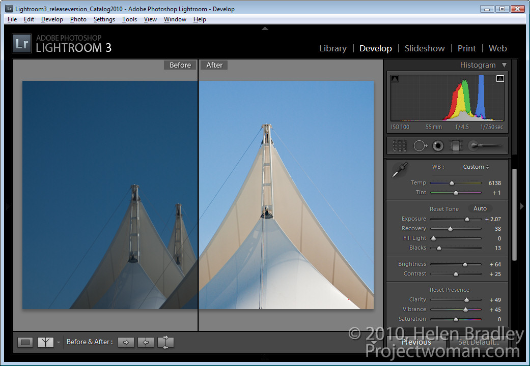
While we’re on the topic of the Brightness slider, check out the default value on an unedited image so you know where your starting point is. For most raw images, Lightroom defaults to a Brightness of +50 and Contrast of +25 as its starting point.

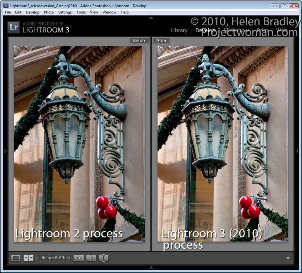
Also take care when working with images you had processed in Lightroom 2 with Lightroom 2 settings. When you upgrade to Lightroom 3, you’ll have a choice of Updating your images to the new Lightroom 2010 Process. My experience is that this can result in a significant lightening of images which were processed in Lightroom 2 so I apply this update on an image by image basis so I can reverse it or adjust for it as I go if necessary.

Helen Bradley

Thursday, December 16th, 2010

Using Lightroom Compare View

In an earlier post, I showed you how to use Lightroom’s Survey View to choose one image from a selection of images. In this post I’ll show you how to use another of Lightroom’s specialty views – Compare View which has a similar purpose but which operates very differently.

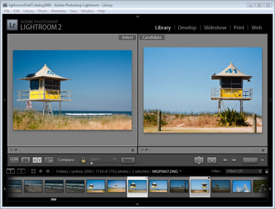
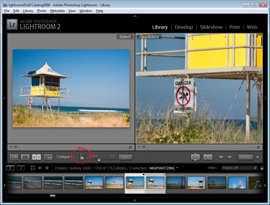
Start in the Library module, select an image and then click Compare View or press C. When you do, Lightroom shows two images, the one you had selected and the one you most recently selected before this one in this same folder.

If you didn’t previously select an image, for example if you selected Compare View immediately after you selected a folder, the first image in that folder will be the only one selected so Compare View will show the first image and the one immediately to its right in the Filmstrip.

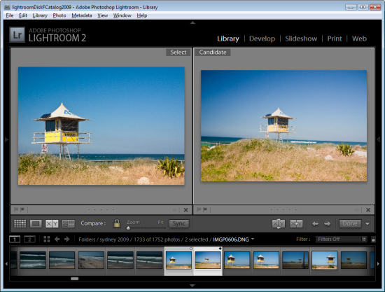
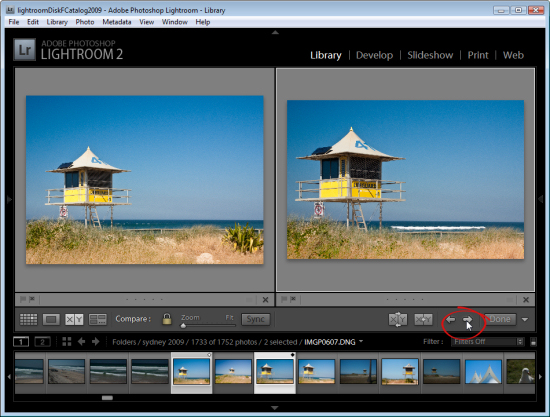
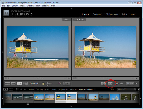
The two images you see are labeled Select and Candidate. The Select image is fixed and the Candidate image can be changed. To do this, click the left or right arrows underneath the Candidate image to move in the direction of the arrow through the folder. This replaces the Candidate image each time you click an arrow with the next image in the Filmstrip.

When you find an image that you want to use as your new select image, click the X<Y (Make Select) button and the Candidate image moves to become the Select image and the next image in the filmstrip in the direction that you had been moving will be the new Candidate.

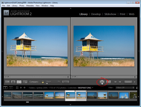
To simply swap the two images, click the Swap button to swap the two images. The current Select image becomes the new Candidate and vice versa.

Continue to work through the images on the filmstrip comparing them until you have the Select image that you want to use.

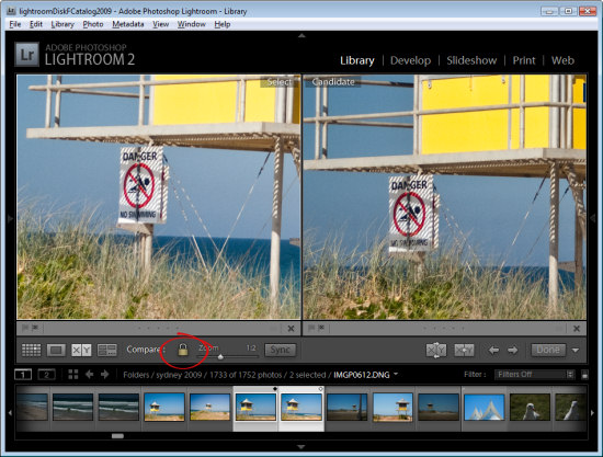
In Compare View, unlike Survey View, you can zoom the images. The lock icon on the toolbar, when locked, lets you scale both images at the one time using the Zoom slider.

If you unlock the padlock icon by clicking it, just the currently selected image (which can be either the Select or Candidate image) will zoom when you click the Zoom button.

You can also use Compare View with just one image by deselecting one of the images in the Compare View. Each image has a small X under its bottom right hand corner, which you can click to remove it. If you remove the Select image this way, you can work through images as Candidate images until you find a Candidate worthy of being a Select image and, when you do, click the Make Select button and the Candidate will become the Select image and the next image in the sequence will become the Candidate.

Click Done to exit Compare View with the Select image selected.

How Compare View and Survey View compare

While Survey View allows you to compare multiple images with each other and to remove images you do not want until you get the one that you do what, Compare View works a little differently in allowing you to view only two images. The Select image always remains in place, but you can scroll through multiple images very quickly to determine if any of them are a better candidate for your needs than the select image. If it is, you can replace them and continue your comparison.

While Compare View allows comparison between only two images, it is more complex to use and understand than Survey View. However it’s a useful way to make a choice from two images as to which is the better and then continue to compare your current ‘best’ pick with others in a sequence.

Helen Bradley

Wednesday, May 26th, 2010

Step 10 Simple Photo-editing workflow – Fixing redeye

Redeye is caused by the camera’s flash and is often difficult to avoid. Some photographers, and I count myself in that group, would prefer to have to deal with redeye if that means we get good photos. Often the redeye reduction feature on a camera signals to your subject that the image has been taken before it has – they relax and start moving and you get unwanted movement in the shot. When there is a balance to be struck between redeye and movement – I’ll take redeye everytime.

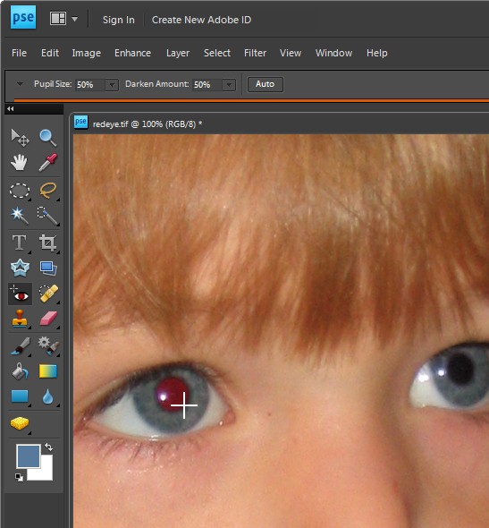
If your photograph has a subject with redeye you can fix it using the redeye tool in Photoshop Elements.

Click the Zoom Tool and click and drag over the eyes in the image to make them large enough that you see them clearly.

Click the Redeye removal tool and click on the red part of the eye. If necessary, adjust the Darken amount and the Pupil Size on the toolbar to get a good result. Fix each eye and then save the image.

Helen Bradley

Monday, May 24th, 2010

Step 11 Photo-editing workflow – Getting to black and white

Some images look much better in black and white than they do in colour.

Increasingly photo editing programs are shipping with very good tools for converting to black and white. These allow you to select which portions of an image become black and which become white which is necessary when you want to differentiate between colours which have the same intensity such as green and red values which would, otherwise, be converted to the same shade of gray.

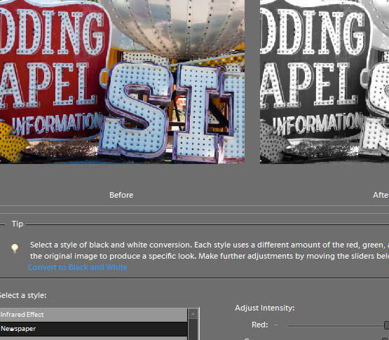
In Photoshop Elements, choose Enhance > Convert to Black and White and select a style from the list at the left of the dialog. These include Infrared, Newspaper, Urban Snapshots, Scenic Landscape, Vivid Landscape and Portraits. While the names suggest the type of image they are well suited to it is a matter of personal preference as to which you use.

Once you have chosen the image type you can select from options at the bottom of the image to adjust the various colours to darker or lighter shades of grey. You can also select the more or less contrast options to adjust the image contrast.

When you have a result that you like, click Ok.

Helen Bradley

Wednesday, March 10th, 2010

Step 9 Photo-editing workflow – Fixing imperfections

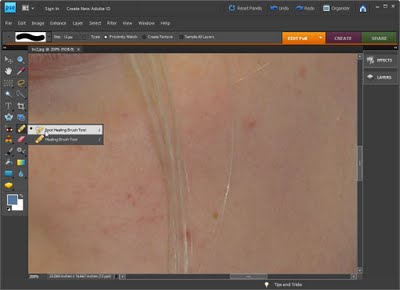
If you have a photograph of someone who has blemishes on their skin you can remove these by using the Spot Healing Brush tool.

Select the Zoom tool and zoom in onto the areas that require fixing.

Click the Spot Healing Brush tool and adjust the brush size so it is just big enough to cover the problem area.

Click once on the area and the blemish will disappear. If the fix is not perfect choose Edit > Undo Spot Healing Brush, adjust the brush size and try again.

Helen Bradley

Sunday, March 7th, 2010

Step 8 Photo-editing workflow – Fix skin tones

Often you will encounter difficulties when fixing colour problems in an image where there are significant areas of skin tones. Skin tones are more difficult to fix than general colour casts, in part because we’re all so familiar with what skin tones should look like that we ‘know’ immediately when they look wrong.

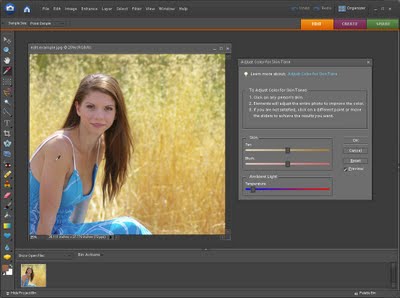
Luckily Photoshop Elements has a good tool for fixing skin tones. To apply this fix to your image choose Enhance > Adjust Color > Adjust color for skin tone. The mouse cursor will change to an eyedropper and you should use this to click on an area of skin tone in the image.

If you don’t get good results sampling from a person’s face, try sampling on their neck or arm – sometimes makeup on the face can give poor results and skin not covered in makeup gives better results.

Once you have selected the skin tone, if the fix isn’t good enough, use the Blush and Tan adjustments until you match what the skin should look like. The Ambient Light temperature slider lets you warm up or cool down the colour fix.

Helen Bradley

Thursday, March 4th, 2010

Step 7 Photo-editing workflow – Fixing colour problems

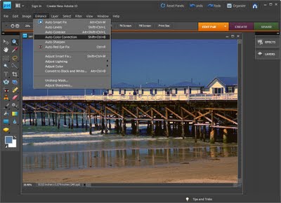
Whenever you believe that there is something wrong with your photo’s colour or tonal range a good place to start fixing it is with your software’s automatic fix options.

In Photoshop Elements choose Enhance > Auto Smart Fix and preview the result. If you do not like it choose Edit > Undo and try one or all of the Auto Levels, Auto Contrast, Auto Colour correction options under the Enhance menu.

Each of these adjusts the image in a different way and if they work on your image then they’re a simpler way of fixing it than having to do it manually.

Helen Bradley

Sunday, February 28th, 2010

Step 6 Photo-editing workflow – Fixing muddy images

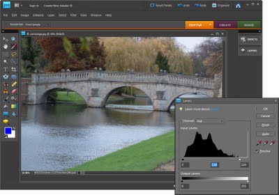
Images which lack a full tonal range (a range of colors from very light/white to very dark/black), often look muddy and the colour in these images will also look flat. To adjust the tonal range of an image to darken the dark areas and lighten the light areas thus stretching the colour you have over the widest possible range.

In Photoshop Elements choose Enhance > Adjust Lighting > Levels. The levels histogram shows the tonal range of pixels in the image – ideally the chart should stretch the full width of the area it is contained in. If it doesn’t reach from the very left edge to the very right edge, drag the sliders underneath the chart inwards so that they sit under the points where the chart data begins and ends. You can adjust the middle slider to lighten or darken the midtones in the image.

Helen Bradley

Page 1 of 212