Sunday, July 21st, 2013

Lightroom Tip – Convert a Tone Curve to a Point Curve

Change the Tone Curve to allow it to behave as a draggable Point Curve

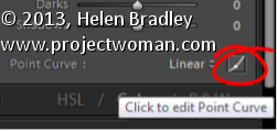
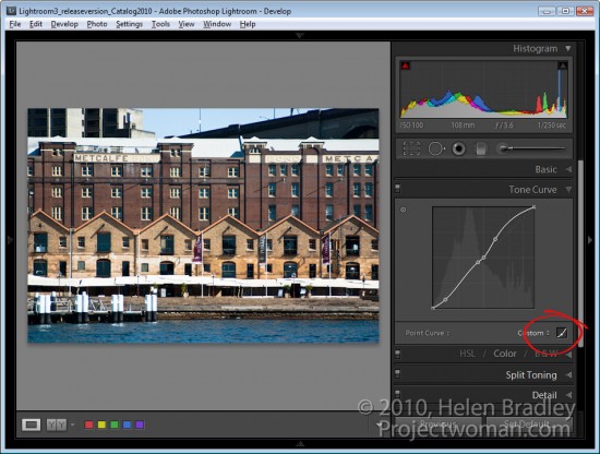
In Lightroom, you can make the Tone Curve behave as a Point Curve clicking the Click to edit the Point Curve indicator at the foot of the Tone Curve panel.

When a tone curve is set to be a point curve you can drag on any point on the curve to adjust the tones in the image at that correspond to that point on the curve.

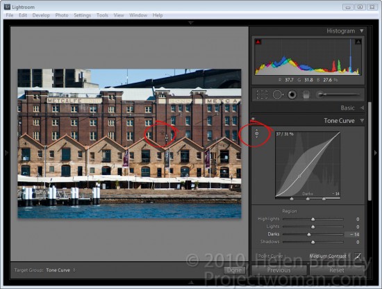
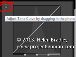
With the point curve selected, click on the Targeted Adjustment Tool in the top of the Point Curve dialog and drag on the image to lighten or darken the image at that point. Drag upwards to lighten, down to darken.

To delete a point on the curve, hold your mouse over the point, right click (Command + Click on the Mac), and select Delete Control Point.

Helen Bradley

Friday, May 25th, 2012

Add a Photo Border in Lightroom

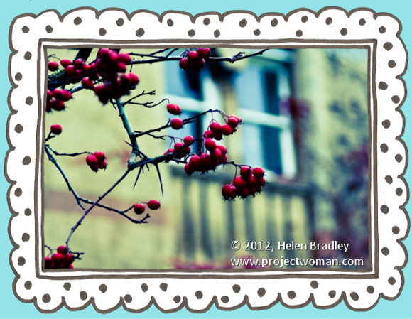
One hidden feature of the Lightroom print module is the ability to add a frame to an image. In this post I’ll show you how to add a frame to an image before exporting it as a JPEG image ready for uploading to the web or printing.

In Lightroom 3 you can create an image and export it as a JPG image from the Print module – however before you set this up, it’s a good idea to create a frame to use. I’m going to use a hand drawn border but you can use anything of your own design.

Step 1

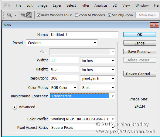
Start in a program like Photoshop and create a new image the size that you want to print from Lightroom. This is a critical step because the border image that you’re about to create cannot be resized any larger in any dimension than the Lightroom file dimensions that you plan printing to.

So, for example, if you want to print a landscape image on letter paper you need to create a frame image of the exact dimensions (or at least the exact ratio of dimensions) of an 11 x 8.5 inch sheet of paper. If you do this, the frame can be sized to the full size of the image in Lightroom.

Set the resolution of the new image as desired – I do this so it matches the resolution that I want to print from Lightroom at – so I use 300 dpi

Step 2

Design your frame making sure the inside of the frame is transparent if you plan for your frame to be placed over the image in Lightroom.

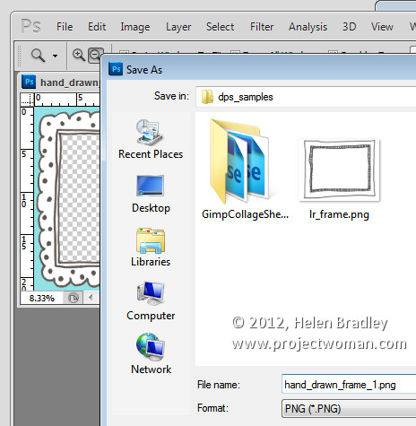
When you are done, choose File > Save As and save the image as a PNG format file so that the transparency information is retained – the JPEG image file format doesn’t support transparency.

Step 3

Close Photoshop, open Lightroom, select the image to print and click to open the Print module.

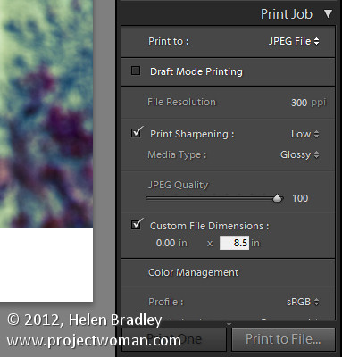
From the Layout Style panel select Custom Package. In the Print Job panel select Print To: JPEG File. Select Custom File Dimensions and set the size to the same 11 x 8.5 inches that you set the frame to be.

Set the File Resolution to the desired resolution – I’ve used 300 dpi.

Step 4

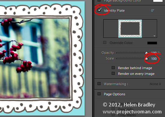
You will add the frame as a graphical Identity Plate. So open the Page panel and select the Identity Plate checkbox. Click on the identity plate box and, from the menu which appears, choose Edit then select the Use a Graphical Identity Plate option button. Click Locate File, select the frame png file you just saved and click Choose. You will most likely be warned that the file is very large – if so, click Use Anyway and click Ok.

The frame will appear as an Identity Plate over the top of the image. Adjust the Scale slider to size it up to 100 percent which should ensure the frame fills the page size that you are working with.

Step 5

As the middle of the frame image was created as transparent, the image underneath it shows through it.

You can use the Render Behind Image option to place the frame under the image if that’s the way you have designed it to work.

Once you’ve added your identity plate select to print to file and the framed image will be printed to a new file.

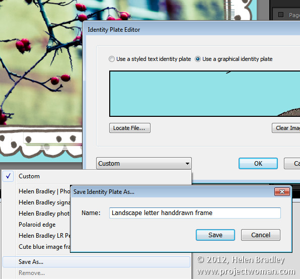
Before I am done, I click the Identity Plate box again and choose Edit and then from the Custom dropdown list I choose Save As to save the graphic frame as an Identity Plate I can use at any time in the future.

Armed with Photoshop you can create any sort of frame and import it as an identity plate to add a border to an image in Lightroom.


Helen Bradley

Tuesday, May 15th, 2012

Create a Fisheye Effect in Lightroom

If you don’t have a fish-eye lens or don’t have yours on hand when you need it, don’t worry. With Lightroom (or Adobe Camera Raw) you can create a fish-eye effect with any photo. Here’s how:

Start with an image that lends itself to being made a fish-eye image. You want something that was shot with a fairly wide angle lens to begin with so you don’t want to be zoomed in very close on your subject.

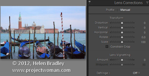
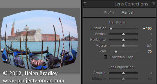
With the image open in Lightroom go to the Develop module and select Lens Correction and then the Manual tab. You’ll see the Distortion slider at the top of the Transform tools. Drag the Distortion slider to the left to blow out the middle of the image.

Deselect Constrain Crop and decrease the value for Scale so that you can see the image edges very clearly. If you like the result you can stop at this point.

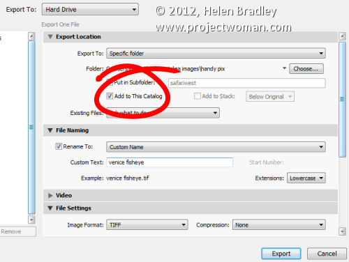
Alternately if you want to give the image a bit more punch, you can go one step further by exporting the image and importing it again and repeating the process. To do this, right clicking the image and choose Export. Export the image as a non-lossy format image such as TIFF, enable the Add to This Catalog checkbox so the image comes back into Lightroom automatically and select a folder for the image – the same folder that the original image is stored in is the best choice. Click to Export the image.

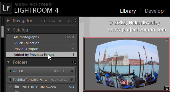
The exported version will then be automatically imported back into Lightroom. You can find it by returning to the Library module, open the Catalog panel and click the Added by Previous Export collection – it will be in that collection.

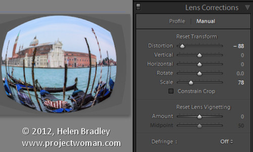
Select the newly imported image, return to the Develop module and again drag the Distortion slider to the left to increase the bowing in the image. Make sure Constrain Crop is not selected and decrease the Scale until you get a good result on your image.


Helen Bradley

Sunday, March 25th, 2012

Use Lightroom Presets in Adobe Camera Raw

If you’re like me, you have some presets that you’ve created in Lightroom that you would like to use in Adobe Camera Raw. Unfortunately the format of the preset files in each program is different so you can’t just install a Lightroom preset in ACR. However you can make an ACR preset from a file that has had that same preset applied to in Lightroom. Here’s how:

Apply the Preset

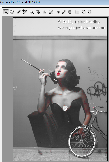
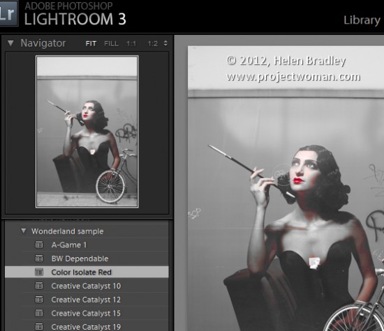
To begin, open an image in the Develop module in Lightroom. Without applying any other changes to the image, apply the Preset that you want to take to ACR. Here I have applied one of the free Wonderland presets from wonderlandpresets.com.

Export the Image

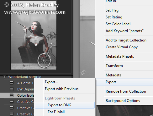
Now export the image as a DNG file so that the changes will be written to the file. To do this, right click the image and choose Export > Export to DNG and export the image to folder of your choice.

Open in ACR

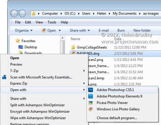
Launch Windows Explorer and locate the image on disk. Right click it and choose Open With > Photoshop CS5. Because it is a DNG file, it will open automatically in ACR.

Create the Preset

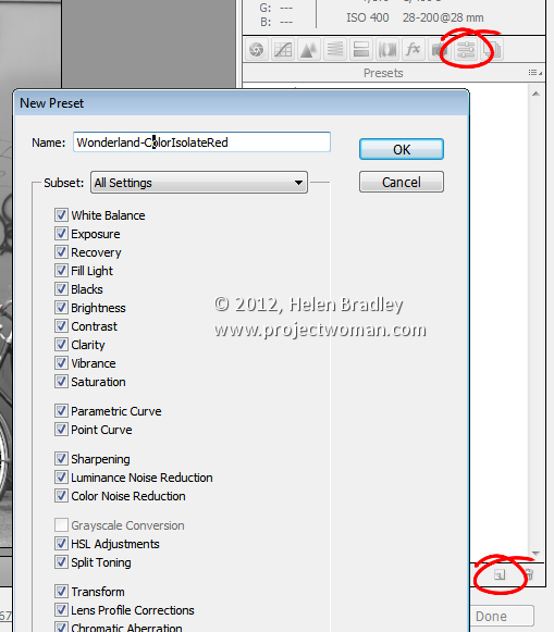
Click the Presets tab and click the Create New Preset option at the foot of the Presets panel. Type a name for your preset and then select the options that you want to include as part of the preset. Type a name for the preset and click Ok.

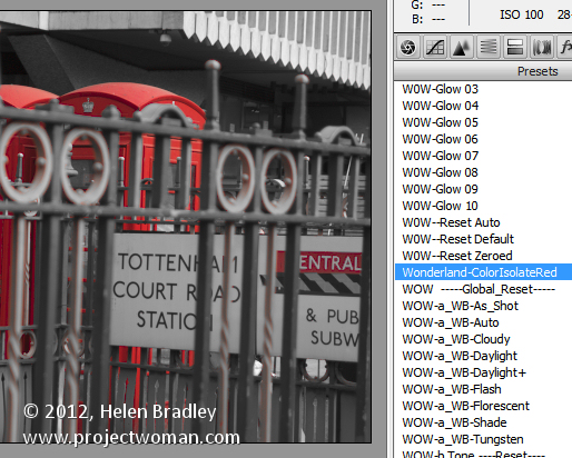
The preset will now be available from the Presets panel in ACR and will be able to be used to adjust any image.

Features not included

You should note that while most of the Lightroom adjustments that can be stored in a Lightroom Preset can also be saved as an ACR Preset, one exception is any Graduated Filter adjustment.

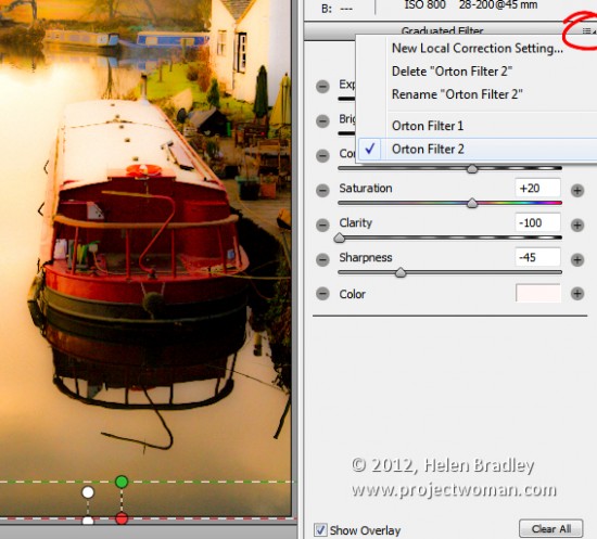
In Lightroom any adjustments you make using the Adjustment Brush cannot be saved in a Lightroom preset and in ACR those made using the Graduated Filter cannot be saved either. You will see the Graduated Filter adjustments that you made in Lightroom in ACR if there are any but you cannot save them in your preset as a Graduated Filter adjustment. What you can do however, is to save the settings for the Graduated Filter but not its placement as a separate setting. To do this, click the Graduated Filter icon in ACR to select the tool then click the Graduated Filter to save the settings for. Click the icon in the top right of the Graduated Filter panel and choose New Local Correction Setting and save it giving it a name.

You can apply this to an image in future using the Graduated Filter tool – just select the setting to use from this menu and drag to create the Graduated Filter for the image. The solution isn’t perfect but it can save you some work as shown here with the two Graduated Filters which are part of my Orton Preset for Lightroom. I can apply the preset then switch to the Graduated Filter and quickly apply the two Graduated Filter adjustments with their individual settings.

Advantages of taking Lightroom presets to ACR

One of the reasons you may want to take presets from Lightroom to ACR using this process is to take advantage of the free presets available for Lightroom. There are lots more of these than there are presets for ACR. If you use ACR as well as Lightroom then having your favorite presets available in both program will be useful.

Helen Bradley

Monday, December 5th, 2011

Work in the Lightroom Quick Develop panel


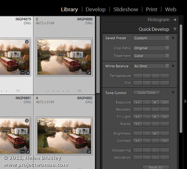
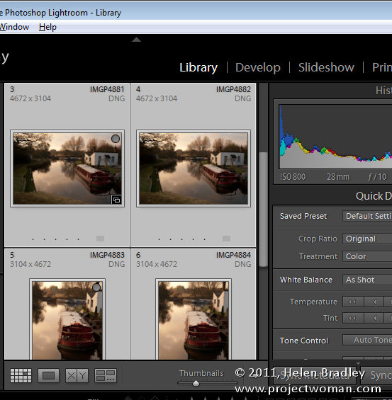
In Lightroom you can fix a series of images all at once using the Quick Develop Panel in the Library Module. While this tool lacks the precise adjustments you can make to an image in the Develop Module, it offers a quick solution for getting started fixing your images.

To make use of the Quick Develop panel you should be working in the Library Module, in Grid View. So open the Library module and click G to select Grid view. If you are in Loupe view the changes you make will be applied only to the most selected image regardless of how many images you have selected in the Filmstrip.

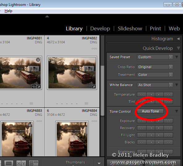
If you typically use the Auto Tone feature in the Develop module to quick start fixing your images, select all the images to fix in grid view and click the Auto Tone button. Every image will be assessed and then adjusted according to its particular needs.

How fixes are applied

In the Quick Develop module, when you choose to adjust, for example, the Exposure on a series of selected image, each image will be adjusted by the same relative amount. So, if you select a series of images and click the single right pointing arrow, you will add +0.33 to the current Exposure value for each image. So, if an image had a starting Exposure setting of 2.00 it will be increased to 2.33. The single left pointing arrow moves Exposure -0.33. If you click the double arrows you will increase or decrease exposure by 1.0 for every image. Each adjustment works in a similar way although the relative values will vary.

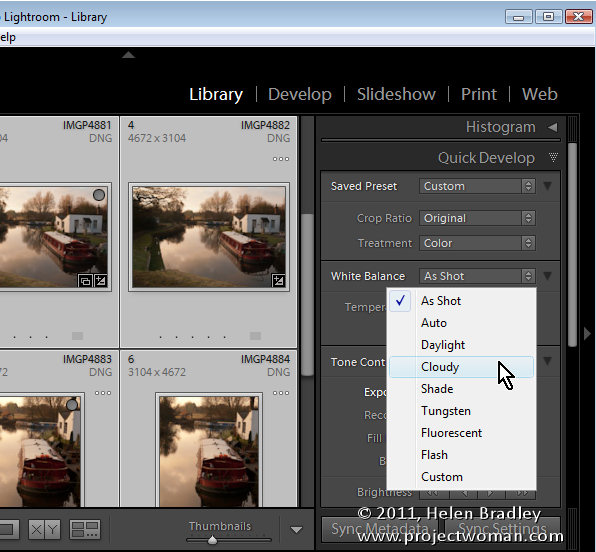
One feature of the Quick Develop module which is useful is the White Balance tool. If you have a series of images all shot in similar light you can select them and adjust the white balance for all of them by choosing a different White Balance setting from the dropdown list or by adjusting the Temperature (Blue/Yellow) and/or Tint (Green/Magenta) sliders.

Hidden Options

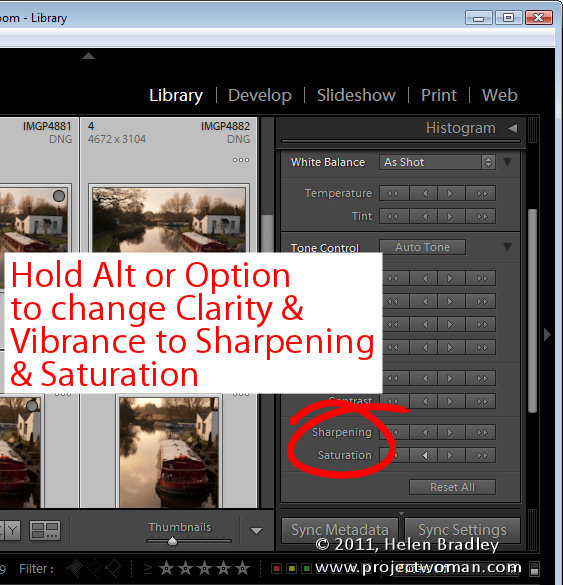
There are some options hidden in the Quick Develop panel. If you hold the Alt key (Option on a Mac) the Clarity and Vibrance adjusters change to allow you to adjust Sharpening and Saturation. Notice that Sharpening is an all in one setting and that it lacks the ability for you to alter the Radius, Detail and Masking which you can do with the Detail panel sliders in the Develop module.

How I use it

I use the Quick Develop panel to make quick edits to a series of images at one time. I’ll assess the images to see if they need a particular adjustment such as increasing the Exposure if they are all a little underexposed. I also like to increase Clarity and Vibrance.

So, I’ll select the images in the Grid, click to increase Exposure and then again increase Vibrance and Clarity.

Using the Quick Develop panel to make fixes to all images saves me a little time later on when I switch to the Develop module and apply additional fixes on an image by image basis.

One Gotcha to be aware of

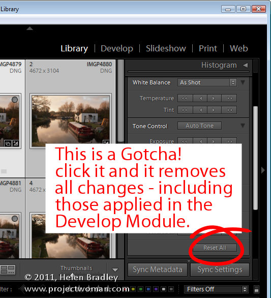
If you want to remove the settings applied to an image you can do so using the Quick Develop panel. Select the image and choose Reset All. However, be aware that when you do this, you will remove not only all settings applied to the image using the Quick Develop panel but also any changes made to it using the tools in the Develop module.


Helen Bradley

Wednesday, November 9th, 2011

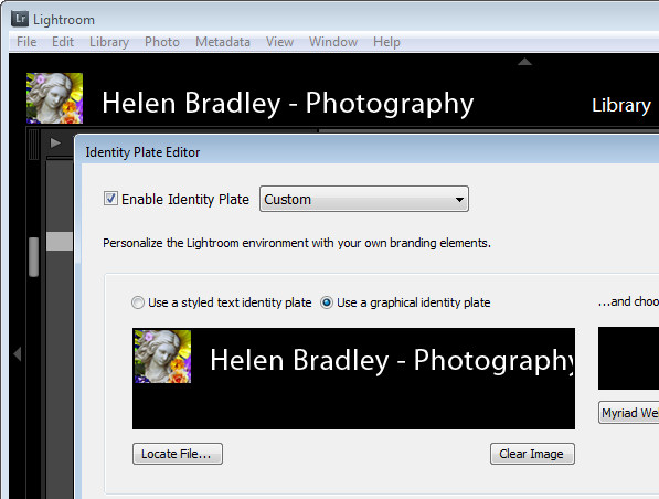
Personalize Lightroom with identity plates


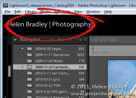
If you’re a professional photographer, teacher, someone who routinely shows off images in Lightroom or if you just like the personal touch, why not personalize your Lightroom interface? The Lightroom branding which appears in the top left corner of the screen is customizable using the Lightroom Identity Plate feature. Identity Plates are usable throughout Lightroom to brand your prints, slideshows and some web sites but what suits one of these modules won’t necessarily work for customizing the interface.

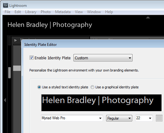
The Identity Plate that appears in the top left of the Lightroom screen is configured by selecting Edit > Identity Plate Setup (on the Mac choose Lightroom > Identity Plate Setup).  To create a simple Identity Plate, choose Use a Stylized Text Identity Plate and type the text into the text area. You can select and format the text in the font, font size and color of your choice. Click the Enable Identity Plate checkbox and the changes you make will appear in place so you can check how they look. You may need to size the text to fit the space – Lightroom won’t scale it to fit automatically.

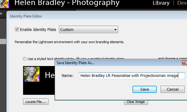
To save the Identity Plate, choose Save As from the dropdown list and type a name for the Identity Plate. You can then select and use it in one of the modules later on – for example you can add it to a print layout.

If you prefer to use graphics in your design such as your signature or a graphical design element you can create a graphical Identity Plate in another application such as Photoshop. The file you use should be no more than 60 pixels in height so it fits in the space available – there is no option to scale it to a smaller size, for example. For this reason, if you plan to use a Graphical Identity Plate such as this for more than just customizing your Lightroom interface you will need two of them – one small image for customizing Lightroom and another one sized appropriately for printing at a high resolution.

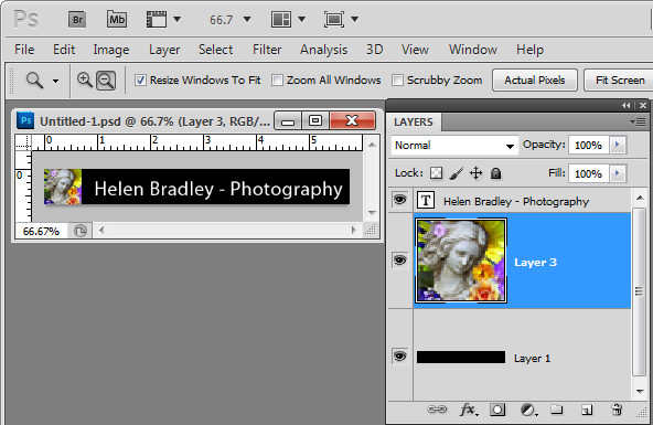
When creating your Identity Plate in an application like Photoshop, build it in a layered file and make sure the bottom layer of the document matches the color of the Lightroom interface – ie make it black. This way you test the Identity Plate to make sure it will look good when placed on a black background. Then turn off the visibility of the black background layer and save the file as a .png, .psd or another format that maintains transparency (not jpg). If you save as a .jpg image the transparent background will be white and you will probably also have small unsightly artifacts in your design.

Back in Lightroom, open the Identity Plate Editor and choose Use a graphical Identity Plate, click Locate File and browse to find the file on disk.

Save this Identity Plate so you can always reuse it if you change the Identity Plate in future.

You can use this same process to create a transparent image in your graphics program to use as a graphical Identity Plate for the other modules. In that case make sure that the Identity Plate is created at an appropriate size for printing. Crop closely around the image so that it can be easily sized and moved into position later on. You need to do this because it is not possible to size an Identity Plate any larger than the screen or page size and you cannot skew an Identity Plate out of shape when resizing it – its proportions will be constrained as it is sized up or down.


Helen Bradley

Tuesday, September 20th, 2011

Stacking images in Lightroom

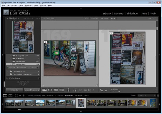
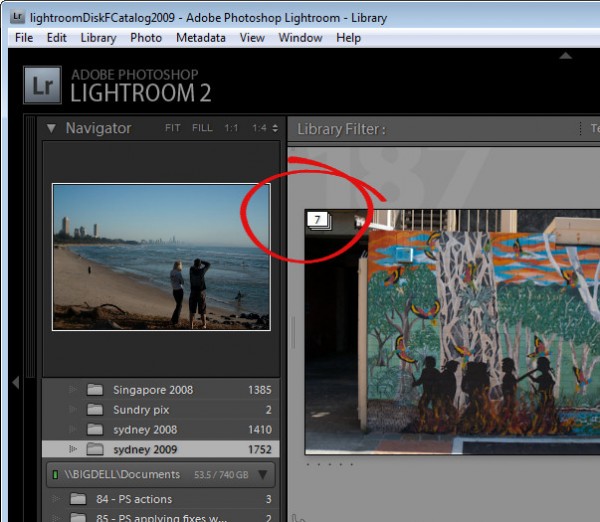
When you have a lot of similar images from a shoot, you can organizing them using the Lightroom Stacks feature. This allows you to stack images together so that only one image representing the stack appears in the Grid, Filmstrip and Loupe. This can clean up the screen reducing the number of images you see.

Get started with Stacks in Lightroom
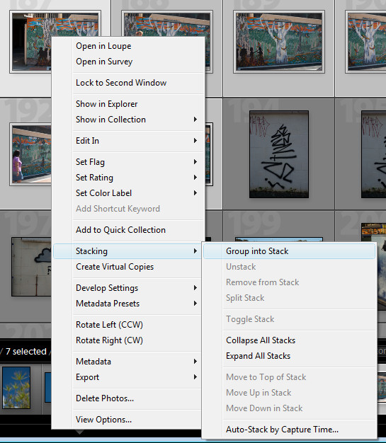
To stack images, in the Library module, select the images to stack, right click and choose Stacking > Group Into Stack. This stacks the images on top of each other.

In Grid view you will see a small number in the top corner of the image at the top of the stack showing the number of images in the stack.

You can add an image to a stack by dragging and dropping it on top of a stack.

Expand a Stack
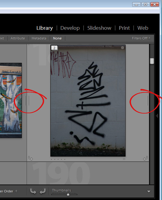
To expand a stack, right click on the number showing the number of images in the stack and choose Expand Stack from the Stacking shortcut menu or click the double line marker either side of the stack. Click the double line marker again to collapse the stack or right click an image in the stack and choose Stacking > Collapse Stack.

When you expand a stack, the images from the stack have a darker color underneath them indicating that this is an expanded stack.

There is some important terminology to know about stacks. You collapse and expand a stack to view or hide the images in the stack. If you unstack a stack you permanently remove the stack – you do not remove the images just the stack. There is no restack command so, when you unstack a stack, your only option for getting it back is to reselect the images and stack them again. You also cannot create a stack in a collection – you may only stack images in a folder.

Change the visible image
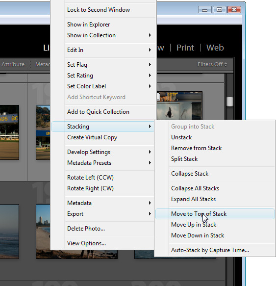
To change the image at the top of the stack, expand the stack, click the image to use as the top image and choose Stacking > Move to Top of Stack. The topmost image is the one that is visible when you collapse the stack again.

Remove an image from a Stack
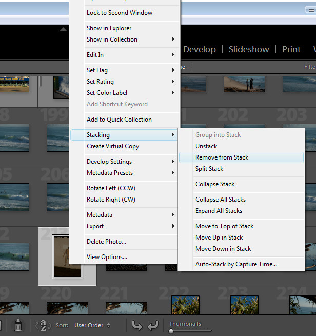
You can remove an image from a stack by expanding the stack, right click the image to remove and choose Stacking > Remove from Stack.

Stack for HDR
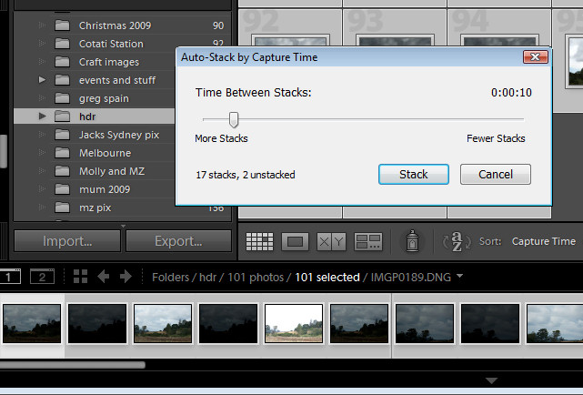
There is another stacking option you can use, for example, where you have captured a series of images to use for a panorama or where you have captured a series of bracketed exposures for HDR processing. Because these images will have been captured within a short period of time, you can stack them based on capture time. To do this, select all the images, right click and choose Stacking > Auto-Stack by Capture Time. Set the time between stacks value – as you do you will see an indicator telling you how many stacks this will give you and how many images will remain unstacked. Use this as a guide to the optimal value to use. Click Stack to have Lightroom create your stacks for you.

Once this is done, right click and choose Stacking > Collapse Stacks to view the stacks that you have made. This is a quick way to group images that are most likely to be part of the same sequence of images and if one or more stacks aren’t correctly formed, you can either unstuck them or split a stack in two by right clicking the image at the point that the split should be made and choose Stacking > Split Stack.

Stacks are a useful way to restore order to a large folder of images containing a lot of similar images. By stacking images you’re not altering the images in any way, simply organizing them a little more neatly.

Helen Bradley

Monday, September 12th, 2011

Targeted adjustments in Lightroom

Many of the features in the Lightroom 3 Develop module have targeted adjustment tools available to help you make the adjustment. Here’s where to find and how to use these on image adjustment tools.

Tone curve
When you select the Tone Curve panel you can adjust an area of the image by clicking the targeted adjustment tool and then drag on the area of the image that you want to lighten or darken.

Click and drag up to lighten and click and drag down to darken.

If you click the Point Curve icon at the bottom of the dialog, you will change the look of the Tone Curve panel and the sliders will disappear. Now if you drag on the image using the targeted adjustment tool you will create control points on the curve. You can adjust these control points by dragging on them.

Control points are not added if you do not have the Point Curve icon enabled. So if you’re seeing the sliders, you’re not in this point curve editing mode.

To delete a control point, double click on it or right click it and choose Delete Control Point.

When you are working on the point curve in the tone curve panel, you can decrease the mouse sensitivity by holding the Alt or Option key as you drag on the image. This decreases the sensitivity so you will make smaller changes in the curve with even quite significant movements of the mouse.

HSL Adjustments
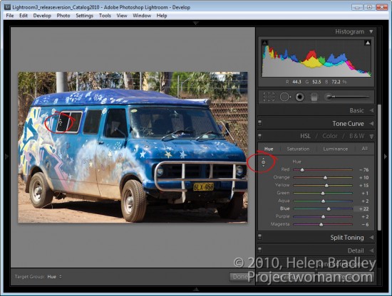
There is also a targeted adjustment tool in the HSL adjustment panel.

Here you can select Hue, Saturation or Luminance and then select the targeted adjustment tool and drag on the area of the image that you want to change. If you’re working in Hue, you’ll be applying a color shift to the selected area of the image. If you’re working in Saturation, you’ll be adjusting the saturation of the color under the mouse pointer as you drag on the targeted adjustment tool. Drag up to increase saturation and down to decrease it.

If you’re working in Luminance dragging up will lighten the color under the cursor and dragging down will darken it.

B&W Adjustments
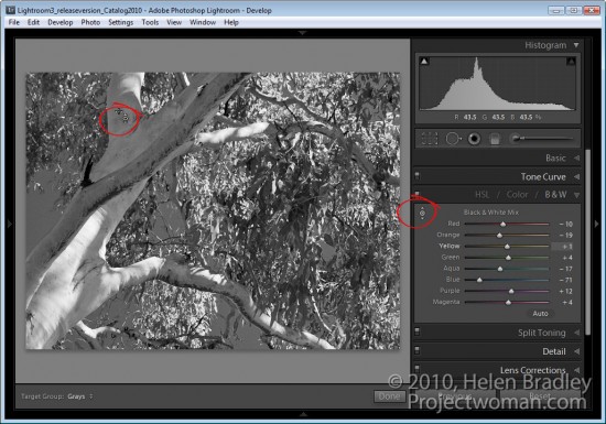
In the B&W or black and white adjustment area there’s also a targeted adjustment tool. In this case, when you drag up or down on a selected area of the image, you’ll lighten or darken that area so you can craft your own greyscale image.

Unlike in other versions of Lightroom, when you exit a panel while you have the targeted adjustment tool enabled it will be automatically disabled and you don’t have to remember to turn it off.

Helen Bradley

Saturday, July 9th, 2011

Copyright watermark your images in Lightroom 3

In Lightroom 3 Adobe built watermarking into the Export module (and it is available in the Print, Slideshow and Web modules as well).

To watermark your images, select one or more images in the Library module, right click and choose Export > Export. In addition to choosing options such as the export location, file name and file type and sizing an image you will find the new watermarking option near the bottom of the dialog.
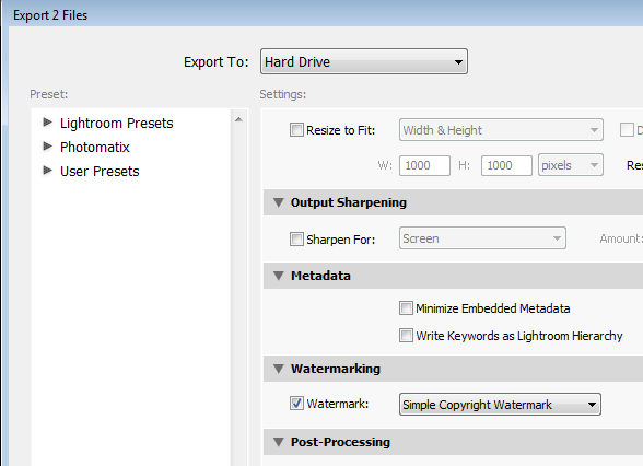
Enable the Watermark checkbox and from the dropdown list, select Edit Watermarks to display a watermark dialog. You can apply a text or a graphic watermark. For a text watermark, click the Text option button, then from the Text Options select your Font and Style.

Alignment controls the text alignment within the small box that it is placed inside so you will use this option if you have multiple lines of text. Color is the text color which you can select from a color picker – unfortunately there is no contrasting shadow added so you have to choose a text color that works on most images.
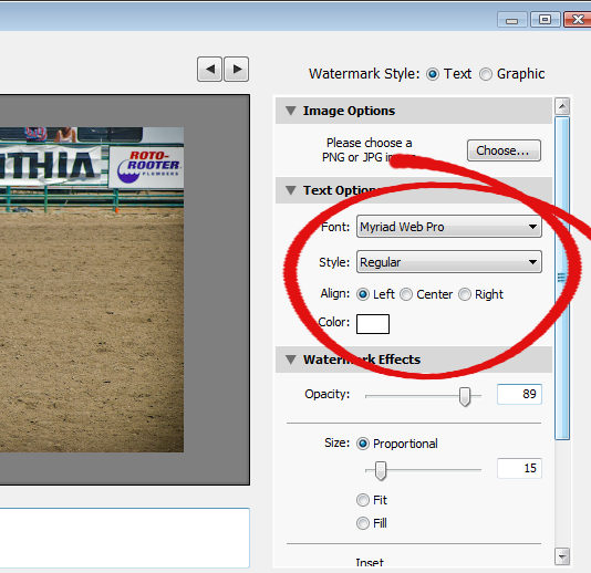
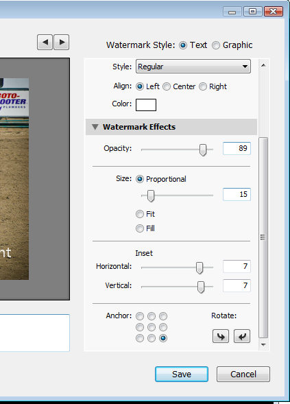
The Opacity setting adjusts the transparency of the copyright text and you can adjust this downwards to blend the copyright text in with the underlying image a little. Select Proportional size, Fit or Fill as desired. For my watermark I selected Proportional which is typically the option you will want to use.

The Anchor options allow you to place the copyright text within one of nine areas on the screen varying from top/left through center and to bottom/left.

Once you’ve selected the Anchor, adjust the Inset values to bring the text in from the vertical and horizontal margins so that it doesn’t sit at the very edge of the image.

You can rotate the text by clicking one of the Rotate options.
On the left of the dialog under your image is a text box with the word “copyright” in it. You can replace this with your own text – to create the copyright symbol type (C).
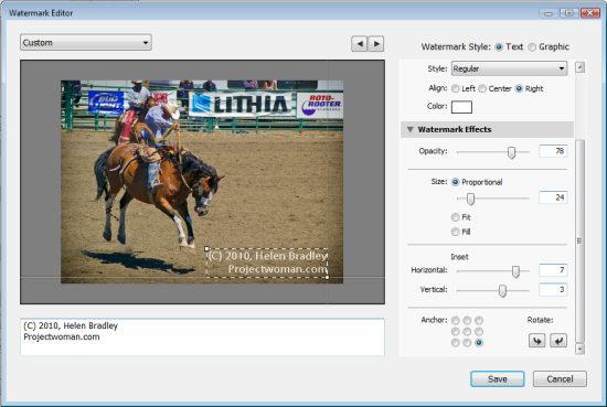
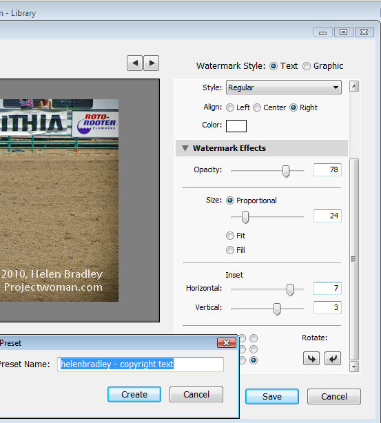
When you’re done, click Save and type a name to save the copyright data as a preset so you can use it again in the Export or any other module that supports watermarking of images.

If you are editing an existing watermark, click the down-pointing arrow in the top left of the dialog where it will show (edited) after the preset name and choose Update Preset or Save Current Settings as a New Preset depending on what you want to do.
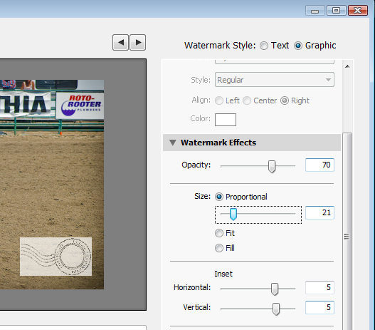
Instead of a text watermark, you can use an image you have created. To do this, enable the Image option at the top of the dialog and click to select the image to use.

A watermark saved as a JPG image will not be transparent so the watermark will appear as a solid rectangle on your image, as shown here.
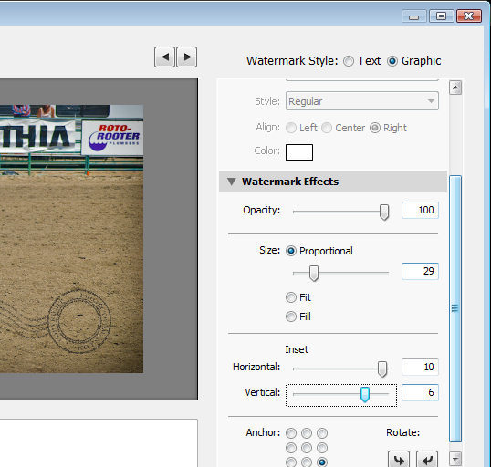
If you want to have a transparent background around your watermark, create the watermark as a PNG image with transparency in Photoshop or another editor, and import that as your watermark.

When you export your images, your watermark will be automatically added to them.
These same watermark options are also available, for example, in the Flickr Publish Services so you can automatically watermark images as you upload them to your Flickr account.

Helen Bradley
Page 1 of 212