Thursday, October 25th, 2012

Droste Effect in Photoshop

Create the Droste Effect in Photoshop CS4 or CS5 or CS5.5 (not supported in CS6). Uses Bender and the Droste Filter.

Check out all our tutorials on our YouTube channel.

Complete transcript of this video:

Hello, I’m Helen Bradley. Welcome to this video tutorial. I’m going to show you here how to create the Droste effect using Pixel Bender in Photoshop. Now you need Photoshop CS4, CS5 or CS5.5. This does not work at the time of recording with Photoshop CS6. Before we start creating the Droste effect let’s have a look and see what it is that we’re trying to achieve. And this is the Droste effect that we’re going to create. And you can see it’s just a set of repeating images inside of each other. They’re actually based on a cocoa company’s advertisement. Their box had the cocoa packet being repeated within itself. And it’s been named the Droste effect because of that. Now we’re going to do it using Pixel Bender which is not being supported in Photoshop CS6. And in the description of this video on YouTube you’ll find that there is details about where you can get Pixel Bender and how to install it. So I’m assuming that you’re working with Photoshop CS4, CS5 or CS5.5 and that you have Pixel Bender installed and the Droste filter installed. So let’s get going with this. Let’s just put this image aside and we’ll go and get our original image. As I said it works particularly well when you have somebody off center so let’s just zoom out of this image a little bit. And the first thing we’re going to do is to add some extra area around the image. And I’m going to do this using the crop tool. So I’m going to select the crop tool, select over the image and then hold Alt or Option and then just drag out to create some extra canvas around the area of this image and just click the checkmark here. Now the canvas has come in with the current background color which has suited me really well because that gives me a white edge. Let’s flip these colors around and let’s go and do the same thing. Again, Alt or Option, and this time I’m only going to add a very small black canvas. Now you can do this any way you like. I just want to do it the quickest way possible. So now we have an image that is a black and white frame around our image. We’re going to go and see just how big this image is, reading it off with Image, Image Size. And the image is 1,076 by 905. Now this is an important because the filter needs to know this. So you’ll want to write this down. And we’re ready to get started with the filter. So we’re going to choose Filter and then Pixel Bender and then Pixel Bender Gallery. Now we already have the Droste filter selected. If you haven’t used this filter before you’ll probably have something like Cassini so you’ll just want to go down and select Droste. And this is the Droste effect. And we’re just going to first of all regardless of what it looks like here we’re going to start with entering the values that we read off for the size of the image. So it’s 1,076 by 905. And then we’ll adjust things like the radius inside and radius outside when we actually need to. We’re going to leave strands ate 1 and periodicity at 1. Strands and periodicity are the number of times that this will rotate. So if we send it up to 2 you’ll see that we get something that’s actually got two rotations. We don’t want that for this effect. We really only want one. And periodicity at 1 is fine too. The zoom is going to allow us to zoom in or out of this image. And at the moment we’re just going to leave zoom all the way out. Center is going to center the image itself. So when I drag on this the image rolls over, not the center of the actual portion of the image that we’re working with. You can see that if I just center shift I’m getting a very different effect on the image. Now center shift is something that I typically will adjust because I want to make sure that she is sitting opposite the image and the image is not actually over the top of her which it would be here. I’m going to adjust the rotation because at the moment it’s rotated at an angle and I really want it straight. So I’m going to rotate it a bit so that she is straight up and down. And having done that I want to bring the center of the image down. So I’m just going to adjust the vertical and perhaps also the horizontal so that I get the effect that I’m looking for. And I can combine that with zoom. Background RGBA is just the background of the image if this were showing any background, which it’s not. And levels and levels start you just don’t need to be working with at all. Transparent inside just makes it circular so we don’t want to use that. There’s really nothing below these settings that we’ve been working with that we really even want to see. So let’s just check and make sure that we’re getting the result that we want. Perhaps adjust these radius values to get a bigger image. And I’m thinking I like that a bit better, straighten it up with the rotate, perhaps move the center a little bit. And when we’re happy with the result that we’ve got, we’re just going to click Ok. And there’s our finished Droste effect. If we added some more levels we would see some more repeats in here. You can see that the repeats have sort of stopped. So we could go back and add more levels and that would give us a better result. Let’s just go and do that because all our settings will be still in place. And so what we’ll do is we’ll just increase the number of levels here and click Ok. And that’s giving us more repeats in the image here. But there’s the Droste effect filter created using the Pixel Bender plug-in in Photoshop CS4, CS5 and CS5.5. I’m Helen Bradley. Thank you for joining me for this video tutorial. If you liked this video please give it a thumbs up in YouTube. You’ll find more video tutorials on my YouTube channel and look out at projectwoman.com for more tutorials and articles on Photoshop, Illustrator and Lightroom.

Helen Bradley

Thursday, October 18th, 2012

Photoshop Masks 101 – Spot Color effect

Create a spot color or isolated color effect in Photoshop. The image is black and white and only a portion of the image is in color. Learn how to do this and how to get started with masks as you do this.

Check out all our tutorials on our YouTube channel.

Complete transcript of this video:

Hello, I’m Helen Bradley. Welcome to this video tutorial. In this tutorial I’m going to show you how to begin to use masks in Photoshop and I’m assuming that you’ve never used a mask before. And so that we actually create something in this tutorial we’re going to use it for a spot color effect. Before we get started on actually introducing what a mask is let’s have a look at the effect that we’re looking at here. This is my original image and it was shot in color on a very wet night in Wales. And what I’ve done is converted the image to black and white but I’ve left this person in the middle of the image in color. And I’ve done it in such a way that we can edit it. So if I didn’t make the selection correctly to begin with I can adjust it at any time. I can also remove the effect. So you can see here I’ve removed the mask here and the image has been reverted to fully black and white. I can reinstate the mask and this converts the image into black and white but leaving this person in color. This is a black and white adjustment layer here, a very simple adjustment layer. But because I’ve got a mask here I’m able to control where the color is on the image. And with masks you can paint with black and white. Black will reveal the layer underneath or the color underneath and white hides it. So if I get a really big brush right now, let’s go and get a really big brush on this image, and just see what happens when I paint on that mask. Can you see that I’m bringing color back into the image because I’m painting was black. If I paint with white I’ll removes the color from the image. I’m painting on the mask so I have the mask targeted but my paint is being painted onto the image itself. So I’m painting here. You can see that the color is going on the mask and we’re poking a hole in this black and white layer to see the color below. If we change to paint in white we’re removing it so we’re seeing what is on this particular layer. So now that we’ve seen what we’re aiming for let’s go and see how we could achieve that result with another image. Here I have another image. This one was shot in Cambridge. And I’m just going to size it down. And to make a start on this image we’re going to convert it to black and white using an adjustment layer. I’ll choose Layer, New Adjustment Layer, black and White and click Ok. And now I can make my black and white adjustment. But because my phone boxes are going to be colored red later on I’m not worried about the color in the phone boxes but I am worried about how the black and white is converted in the image around the edges. So I’m just going to focus on these edges. I do want it to look a little bit dark. So I’m probably going to go to the black end of the scale on most of these. And there’s my black and white image. And now we’re ready to add the color back into it. There any number of ways that we can bring the color back into the image. I’m going to show you a couple of them. Because we created a new adjustment layer you can see that there’s already a mask in place. So we can use this mask just by painting on it. Because it’s white that’s automatically telling us that we’re seeing just the black and white elements in the image. So if we start painting with black, and I’m just going to choose a paintbrush to use, I’m going to choose a slightly softer one to start off with. Now if we paint with black on the mask we’re going to start seeing the color appear underneath. And if we go too far then we can paint over it by painting in white. And you can see that we would really need a harder edge brush to really get a good effect here. But we could get a soft effect if we wanted to with this sort of almost not really quite transparent but it almost is in the edges brush. So I could just brush that effect on. It’s not fully opaque at these edges but it’s still giving me a spot color effect. Now I’m just going to trash that mask, drag it off and I’m going to delete the mask. At any time I want to add a mask I can just click this Add Layer Mask icon and that will add it to an adjustment layer or to a regular layer. Now let’s turn off this entire adjustment layer. Let’s go to the background layer and let’s use the quick selection Tool to select over these telephone boxes because this is another way that we could mask things. And now because I have my selection in place we can go back to our adjustment layer, turn it on, make sure I have the mask selected. I have black as my foreground color, I can Alt Backspace, Option Delete on the Mac to fill the mask with the black color that then shows the red through it. If I press Ctrl or Command D I’ll deselect the selection. And now I can zoom into areas that I think may need to be fixed a little bit, move them into position and go and get my black paintbrush. I’m going to make it a fairly hard edge paintbrush because the edges of these phone boxes are pretty hard. And I’m just going to paint over these edges and just make sure that in every place that I created my mask or my selection that everything is working correctly. I’ve actually got some color here so I’m going to switch colors by pressing X to make white my foreground color. I’m just going to tidy up a little area here where I had too much of the background color. And now I’ve gone the other way, again press X and this time bring it back in by painting with black. I’m painting on the mask. Although I’m using the image, I’m actually physically painting on the image but it’s appearing on the mask layer. And again I can just check around here to make sure that I have everything looking the way I want it to look. Let’s just zoom out again. Now there’s another way that I could have created this entire effect and that would have been to have made a duplicate of this background layer, Layer, Duplicate Layer. And I could have converted this to black and white just using Image, Adjustments, Black and White. Now for this one I’m just going to select the default adjustment. And now I’ve got a black and white layer on top of a color layer. Again I can add my mask here and I could paint on that with the paintbrush and black paint to bring my color back in or I could go to this layer and make my selection on this layer just as we did earlier. I’ll just go and quick mask this, really quick mask it. This is a very quick and dirty mask this one. Ok and then let’s go back into this layer and because I have this selection made, in fact it needs to be a little bit better made, I can just Alt Backspace, Option Delete on the Mac to again mask this layer. And then we can go back and tidy it up with the paintbrush and just paint over any areas where we want to bring back the color from the layer underneath. So this is done with two layers, one of which is black and white and one of which is color. But you could do it with an adjustment layer. There are lots of different ways to do it. It’s this Add Mask icon that allows us to add a mask. We’ll always put the mask on a top most layer because we want to poke a hole through this layer to see the one below. We’ll paint with black or white on the mask, and we can also paint with shades of gray. So let’s go and get a shade of grey here. It’s under my paintbrush so let’s see what happens when I paint with it. What we get is part of the current layer here but not all of it. So you can see I’m getting a mix here of the layer below and this layer because I’m painting with gray. Anywhere I paint with black I’m going to get only the layer below. Anywhere I paint with white I’m only going to get this particular layer. So there’s an introduction to masks by creating a spot color effect which is fully editable. Provided we save this as a PSD file, the image is going to be editable at any time by just painting on that mask. I’m Helen Bradley. Thank you for joining me for this video tutorial. If you liked this video please give it a thumbs up on YouTube. Subscribe to my channel if you’d like to know when new videos are being released. And visit Projectwoman.com for more tutorials for Photoshop, Illustrator and Lightroom.
Monday, October 15th, 2012

Photoshop Make Custom Buttons

Make your own custom glossy buttons in Photoshop – shows how to layer pieces on top of each other, and how to use Styles, a gradient and Warp to quickly and simply create a button in just a few steps.

Check out all our tutorials on our YouTube channel.

Complete transcript of this video:

Hello, I’m Helen Bradley. Welcome to this video tutorial. In this tutorial I’m going to show you how to make custom buttons in Photoshop. This video was really born of necessity. What I needed was for a project that I was working on I needed a stop and a go sign. And all I could find on the stock websites that I liked and that really worked for me was a stop sign. I couldn’t find a matching go sign. So instead of buying just the stop button and then going ahead and reworking it to make my go button I decided I’d make it from scratch.

So here’s my stop button, and we’re going to make it. And I’ll show you have to turn it into a go button so that you can do that as well. I’m going to start with a new document. And I’m going to start with a relatively small one but you can make yours as large as you want and if you were using this at a lot size you’d want a large size document. So I’m just going to click Ok. And it has a white background and that’s Ok for now.

So I’m going to choose Window and then Layers so we can see our layers palette. I’m going to start with the shape that I’m going to use. So I’m going to show my toolbar which has disappeared here, and I’m going to go and get a custom shape. Now there is already a shape that I can use here and what it is is the polygon shape. And all I need to do is to set the number of sides.

Now this is a sided figure so it’s already preset. Let’s just click on a new layer and we’re going to choose pixels. And I’m going to go and get a red color to use. So now that I have Pixel selected and my red color and a brand new layer I’m just going to draw my polygon. Now I’m going to hold the Shift key so it’s constrained to a regular shape. And because it’s being drawn in exactly the wrong place I’m going to hold the Spacebar down and move it into the middle of my image. And only when I’m ready am I actually going to let go the left mouse button which I’m doing now. As you can see it’s not actually rotated correctly but we can fix that with the move tool.

I’m going to go to Edit Free Transform and I’m just going to rotate it 15 degrees because that’s all it needs to be straightened up. So we’ve got our starting shape now. Now we need this white bit. So what I’m going to do is to actually just put this on a new layer. So I’m going to create New Layer via Copy which means I’m going to copy the exact shape into a brand new layer. I’m going to make white my foreground color. I’m going to fill this layer with white using Alt Backspace on the PC, Option Delete on the Mac.

Now if I click on this icon here you can see that now I have a white shape. I want it to smaller than this bottom shape. So I’m going to click and drag on the corner but I’m going to do it with the Alt key selected because that is going to size that relative to the middle portion of the shape. So now I’m just going to size it in and let go the left mouse button and then let go the Alt key. So now I have a second shape on that layer.

So again once I’ve created this layer I’m going to choose Layer New Layer via Copy. And this time we’re going back to our red color. So I have that selected. I’m going to click here to lock these pixels, Alt Backspace Option Delete to fill it with that color. And again I’m going to size it in by dragging with the move tool and do that with the Alt key selected so that I can actually set this border here so it’s sort of even all the way around and then let go and click the checkmark here. And now we have our shapes.

Now we’ve got basically all the bits that we need except for the text. So let’s go ahead and put the text on. So I’m going to go and grab the text tool. I’m going to reset these so that I have white as my foreground color. I’m just going to go and find a font to use. I’m really not that fussed about what font we use because you can go ahead and find a really good font yourself. I think I might just use Calibri. Nowhere near big enough in actual fact, so let’s just go in here and let’s make it 200.

Not nearly big enough even still. 350 pixels is pretty good. And let’s just move that down into position. Ok, so there’s my stop sign. What it’s missing right now is this sort of look that gives it a sort of dimension. Now the dimension that we’re going to give our shape is going to be created using styles so I’m going to click here and add a style. And I’m going to choose bevel and emboss. Now we’re on the back layer so we’re on this outside edge. And what I want to do is to add quite a deep bevel. And we’re just going to size that to suit.

Now you can see that the highlight mode here is Screen but it doesn’t have to be screen. We could actually multiply it and we could use a slight color here if we wanted to darken up the edges of the highlight. And here around the shadow areas we’ve got again multiply and a darker color. In this case I may want my dark red, but I may want it a bit redder. So instead of using a sort of black color to multiply I’m multiplying with a darker version of the color I’m using. But you can play around with that.

You can also play around with the shape of the bevel. So you can make it all sorts of different shapes. And you can even click here and change it manually by dragging on the curve. But I’m just looking for a beveled edge here. And it needs to be an inner bevel, but we could make it chisel hard or we could make it chisel soft as well. They’re alternatives that we could use. Once we’ve done that I’ll just click Ok. So that’s taken care of the outside edge, and we’ve got the white mark. All we need to do is to deal with the middle.

So again I’m going to select the middle and I’m going to again add a slight bevel to it. So let’s go to bevel and emboss. This time again in a bevel I want quite a large one, but I want it to be really, really soft in shadow. I just want it there, only just barely. So I’m going to call that good for that inner bevel right now. If you have a look at this particular stop sign you can see that it’s got a line through it. And now we’re going to create that affect again here in Photoshop.

There are any number of ways that you can create that sort of custom shape. But I’m going to show you just one way that you can do it. I’m going to start with a new layer and I’m going to drag a rectangle on it. And this rectangle is going to be over the top of my stop sign. And I’m going to go and grab the same colors as I’ve used in my stop sign, this red, and I’m going to choose a slightly darker version of the red. And let’s make this a slightly lighter version of it, but again all in the same color palette.

Now that I have these colors I’m going to fill this shape with a gradient made from those colors. And the gradient I want is this foreground to background gradient. So I’m going to select it, and I’m going to drag it into here. And I want a linear gradient. And I want it the other way around because I want the lightness at the top. So I’m going to reverse it. So once I’ve got my linear gradient in place I’m going to call that good. And I’m going to then clip it because what I’ve got right now is a gradient that’s going to give me the beginnings of the effect that I want.

The problem is is that it’s much bigger than the shape underneath. But if I create a clipping mask it’s all going to work perfectly. So with this layer selected I’m going to choose Layer, Create Clipping Mask. And you can see that that shape is now clipped to the shape of the layer below. Now I just need to drag down the opacity a bit. Ok, now we want to make that nice shape. So with this layer selected I’m going to choose Edit and then Transform and then Warp. And now I can warp this shape to the shape that I want. So I’m just going to drag down on this edge. And I’m going to look to make a smooth warp over my image.

If I want some more darkness into my image I can just pull up the darker edge of this rectangle. I don’t want to twist these if I can help it. I did in my shape and it didn’t end up quite the way I wanted it to look. But here we’ll be a bit more careful. So now that I’ve got my sort of warp look I’m just going to click the checkmark here. And that’s now in place. And if I want it a little bit differently I can just drag on this shape and just bring it down or I could re-warp it. But there’s the basics of a stop sign. And that’s all been created now inside Photoshop. So I could save this off as stop. Now to recolor this and make this the go sign all I need to do is to put in an adjustment layer.

So I’ll choose Layer, New Adjustment Layer, Hue/Saturation and click Ok. And this hue/saturation adjustment layer is going to affect everything below it. And so all I need to do is to drag around until I find a green for go. And somewhere in here is a pretty good green, decrease the saturation a bit and just work out exactly where my correct green is. Ok. So now we’ve actually turned stop into go. And we’ve done that just using this layer. And all I’d need to do now is to just go ahead and type a layer that has go written on it. Let’s click the text tool. Let’s make sure we’re typing in white, click here and just type go. So my stop sign is now a go sign.

Here is the stop version. And then with the adjustment layer that changes the color and then a text layer here’s my go sign. And these two signs match exactly. And it was really fairly quick to create them inside Photoshop. I’m Helen Bradley. Thank you for joining me for this video tutorial. If you liked this tutorial place give it a thumbs up and like it on YouTube so that you tell others that it’s a good tutorial. You’ll find more of my tutorials on this YouTube channel. If you subscribe you’ll be advised when new videos are launched. And look out for my website at projectwoman.com where you’ll find more tutorials, Tips and tricks for these applications.

Helen Bradley

Monday, October 8th, 2012

Photoshop complex designs from simple shapes

Learn how to create complex designs in Photoshop from simple shapes. Learn how to quickly rotate shapes, how to find and fill them and some ideas for using them in your own work.

Check out all our tutorials on our YouTube channel.

Complete transcript of this video:

Hello, I’m Helen Bradley. Welcome to this video tutorial. In this tutorial I’m going to show you how to create complex designs from simple shapes in Photoshop. And this will work in practically any version of Photoshop. Before we start on this tutorial I’m going to show you exactly what you’re going to end up with so that you can get an idea as to what we’re aiming for. This is the kind of complex shape that we’re going to create in Photoshop, and we’re going to do it using Photoshop shapes. And what I’ve done is I’ve created a shape on this middle layer and then another shape on the top layer. And what I’ve done is actually blended the two together using a blend mode. But if you liked it you could actually just settle for this shape. You can take any part of this tutorial and use the pieces of it in your own art. So let’s just tuck this image away and let’s get started. And the first thing that we’re going to do is to create a brand new file. And I want to make this file a fixed size because I’m going to need to use some of these dimensions in a minute. And I’m going to make it 4,000 by 4,000 pixels because that’s going to make the math really easy. I’m going to set it to RGB color and I’ll have a white background. So that’ll be just fine. I’ll click Ok. The first thing I’m going to do is add a new layer to make sure that everything is kept separate of this background layer. And then I’m going to choose View and then New Guide and I’m going to add two guides. I’m going to add them at 50 percent horizontal and then another one at 50 percent vertical. And I’m going to choose View and make sure the Snap is turned on and that we’re snapping to guides. Now let’s go and find a shape. Now the shape tools in Photoshop CS6 that I’m using are a little different to in the earlier versions but they work pretty much the same as long as you just follow along here. Now the first thing I’m going to do is select a shape. Now this is the shape that I used earlier. So let’s just click on that to use it. I’m to set my foreground color. I’m going to make sure that I’m working in pixels. Now in earlier versions of Photoshop there’s icons here not a dropdown list. But what you want is Filled Pixels. And then I’m going to make sure my shape is selected, and I’m going to select my layer and draw my shape. And I’m going to set it away from the center line. But before I finish drawing it I’m just going to hold the spacebar and position it. Now I’m going to want it more accurately positioned but we can do that in a second, just let go and it’s filled. I’m going to click the move tool and I’m going to zoom in here because I want to make sure that this is in the exact right position. So yes it has snapped into the correct position. So I’m going to leave it there. Now I’m going to choose Layer, New Layer Via Copy. Now this is critical that you use these steps that we made a second layer and then we’re going to press Ctrl or Command T to get into Transform mode. Now we want to rotate this shape but we want to rotate it around the center point. So I’m going to grab this sort of marker here in the middle and drag it over the center point of my image. And I can check up here and this should say 2,000 pixels by 2,000 pixels. And if it’s not dead right I can come in here and change it. We want it to rotate around the exact midpoint. Then we need to change its angle. And I’m going to rotate this one 30 degrees. So each one of them is going to be rotated 30 degrees from the previous one. And I’ll click the checkmark. To save myself having to do that repeatedly I’m just going to press Ctrl Alt Shift T, which is Command Option Shift T on the Mac. And as you can see every time I press that key I get a rotated shape. I’ll do that until I rotate around the full 360 degrees. I’m then going to click on the first of these layers I’m going to Shift Click on the last of them so they’re all selected and then choose Layer, Merge Layers. And I could just press Ctrl or Command E. And that’s put that shape on a layer all by itself. And really that’s all we’re going to do to create this small complex shape. Let’s go and add a brand new layer, and now let’s go and find a different shape. Here’s the Custom Shape tool. Let’s go and find a different shape to use. Now earlier I used this shape. So let’s just select it. It’s sort of like a little rickrack design. I’m going to change my foreground color so it’ll be a little easier to see and I’m going to drag it on the image. Now I’m not concerned that it drags in proportion here. I think it’s more interesting perhaps if it doesn’t. I’m going to position it roughly where it goes, then zoom in with the Z or Zoom tool.     I’m going to choose the Move Tool and make sure that it is directly on that line, so it’s snapped to that line. Now I’m going to make a new layer, Layer, New Layer Via Copy. With this new layer I’m going to make sure I have Move Tool selected. I’m going to move its center point so that its rotation point is right over the middle of my image. I’m going to check up here and if it’s not at 2,000 by 2,000, and X and Y at 2,000 and 2,000 I’m going to make it 2,000 and 2,000. And now I’m going to rotate it. And this one I’m going to rotate just 10 degrees and click the checkmark. And then I’m going to Ctrl Alt Shift T a number of times, in fact 35 times, for this to rotate around and finish its rotation. Then I’m going to grab this layer, click on it, scroll down to the last of these layers, Shift Click on it and then merge them with Layer, Merge Layers or press Ctrl or Command E. So let’s just zoom out here and this is our new shape. And this is the shape with the original one underneath. And now I can impact how these shapes relate with each other by for example setting an Overlay Blend Mode. You can see that we’re getting a different effect. And we can use all sorts of blend modes for these layers to control how they interact with each other to get different effects in our pattern. Now I like that one so I’m going to settle for that. And let’s just add one final layer to this. I’m going to click on the layer. I’m going to add another color. It’s going to be a dark purple. And this time I’m just going to add a circle, a filled circle. And I’m going to add it out here. Actually let’s make it an oval. Now a filled oval, I’ve just dragged the oval out. I need to fill it. The foreground color is the dark purple that I want. So I’m going to Alt Backspace, Option Delete on the Mac. Now I could if I wanted to add some additional circles. So if I wanted to align these or not align them as I wish I can do that. So let’s just add a few different shapes in here. And we’re going to use these to decorate our piece. So having created those shapes I’m now going to select the Move Tool and Ctrl Click on this layer so that I’m going to affect the entire layer. I’m just going to move this down so it’s centered. Now we’re going to do exactly the same thing as we did before, Layer, New Layer Via Copy. We’re going to use the free transform Ctrl or Command T. We’re going to move this transformation point into the center of the circle because we want everything centered nicely. We’re going to change this to 2,000 by 2,000 pixels in case it is not already set up to be that. And then we’re going to choose an angle. I’m just choosing an angle there is a factor of 360 degrees. So I’m going to choose 36 this time and click the checkmark. And now Ctrl Alt Shift T, Command Option Shift T on the Mac, to create my rotations. The same as before, select the first layer, Shift Click on the last of these layers, Ctrl or Command E to merge them. And now let’s see what we have. I’m going to zoom out. You can see that these dots have given us a little bit more visual interest in our design. And we can just run through these blend modes to see what sort of effect we can get with the blend mode. So I’m just running through down the blend mode list to see if any of these are giving me an effect that I like on my design. Well I kind of like the green that I’m getting with this exclusion. So there you have the way of creating a complex pattern in Photoshop. And all we’re doing is creating shapes and rotating them around a known center point. When I’m through I’m going to choose View, Clear Guides and that will get rid of the guides so that we can see our finished pattern. And we could use that as a repeating pattern in Photoshop. We could make it into a shape. We could do all sorts of things with it. We could even make it into a brush if we wanted to. I’m Helen Bradley. Thank you for joining me for this Photoshop tutorial. You can find more of my tutorials on the this YouTube channel. And visit projectwoman.com for tips, tricks and articles on Photoshop, Illustrator and Lightroom.
Helen Bradley

Monday, September 24th, 2012

Photoshop CS6 Shapes, Paths, Vectors and Selections

Photoshop CS6 has new tools for working with Paths and Shapes. Learn how to use these and how to turn shapes into paths and how to fill and stroke paths and shapes.

Check out all our tutorials on our YouTube channel.

Complete transcript of this video:

Hello, I’m Helen Bradley. Welcome to this video tutorial. In this tutorial we’re going to look at the new vector tools in Photoshop CS6. And we’re going to answer questions like what’s a path, how do I find it, how do I turn a path into a selection, how do I make a path from a selection, and how I can work with the new vector tools.

Photoshop CS6 has some new vector tools and we’re going to have a look at those in this video. And we’re going to work out how you can use those tools to do exactly what you want to do.

Now the Custom Shape tool is in the position it always used to be and it’s sharing a toolbar position with things like the Rectangle, Rounded Rectangle, Ellipse, Polygon and Line tool. And all of these are Path tools. But we’re going to select the Custom Shape because it’s a little bit of an interesting tool.

And here are my Custom Shapes so I can select any of these custom shapes to draw on my space. Now I’m going to choose a filled shape such as this one here and just click it so it is selected. Now I can draw it on my workspace, but the way I draw it depends on what I have chosen here.

And I can choose a shape, a path or pixels, and we’re going to look at the shape and path options. So let’s start with shape. And let’s select some colors for this shape because when you’re working with shapes color is important. Now I have a shape selected I’m just going to drag this flower shape into my workspace.

If I hold the Shift key it’s going to be constrained to the shape of a flower that was originally drawn. If I don’t hold the Shift key you can see that I can make it wide or tall. And if I draw it with the Alt key pressed it’s going to be drawn around my initial starting point. Let’s just let go of that for now and let’s click and drag here to start drawing my flower.

Now if I want it placed around the initial starting point I’m going to press the Alt key and you can see that it jumps back into position. If I add the Shift key I can get it constrained to the right shape. And only when I let go the left mouse button does anything happen.

So what’s happening is I’m getting a filled flower. And we can see up here that the fill is the current foreground color, but it can be changed. While this shape is selected we can select a different fill for it. You can see that blue is now its fill but that’s not the foreground color for our workspace. And you can see that it has no stroke but we can add a stroke if we want to.

So let’s add a pink stroke to this shape. At the moment the Stroke is 3 points but we can increase that so we can make it thicker or thinner. And we can also change the nature of the stroke. For example we could have a dashed stroke or a dotted stroke. And there are other options that we’ll look at in future videos. But this shape is a path, so we can actually make changes to it.

I’m going to grab here the Direct Selection Tool because that allows me to select points on this path. And you can see by dragging over these points I can select anyone of these points. I’m just going to turn the stroke off for the moment because I think it might be easier to see the points without the stroke in the way.

When one of these points is filled and the others are empty this is the one that we’re going to affect. So let’s just drag out on that. And you can see that my shape has now changed shape because I have altered that point. So it is a path that is able to be adjusted. But still we can change the fill. And when we change the fill the fill of the entire shape is affected.

When we add a stroke back onto this the stroke of the entire shape is being affected by our choices. Now there are some other things that we can do with shapes. I’m just going to add a new layer to this image, just put it at the top, and I’m going to fill it with the red.

Now let’s consider the situation where we may want to for example cut out a shape from inside this red selection. So let’s go back and grab our custom shape tool. And we have our same flower shape selected. And I’m going to draw the shape onto my area. And because I was working with a red fill it has a red fill. But let’s just color it green so that we can see it clearly.

Now let’s consider the situation where really what we wanted to do was to create a path from this. Well, we don’t have to undo it and start all over again, particularly if this is a complex shape because what we can do is go to the paths palette. And here is our shape path, and we can do with that anything that we could do with a path originally in Photoshop.

One of the things that we can do is click on it and load that path as a selection. Now if that path is a selection then we can do things with it. For example we could come down to this red filled layer and we could poke a hole in this layer by just pressing Delete. And that will delete the contents of the layer where this selection is made.

One of the other things that we can do, I’m just going to Ctrl Z to undo that, one of the other things that we can do with selections is we can stroke them. So we could choose Edit Stroke and we could stroke this selection with a different color. So let’s stroke it around its inside.

Let’s press Ctrl D to undo the selection, and you can see that now we have a stroked flower because we’ve been able to stroke that selection. I’m just going to undo this again. And let’s go back to our shape up here. I want to just make sure that we just have a red filled layer here and we have our shape up here.

And here it is as a shape. And it can be moved around because it is a shape. So we can move it around the workspace. Let’s go back to the Path’s tool and there’s something else that we can do with shapes. What we can do in addition to loading the path as a selection is that we can stroke it with a brush. But to do this we’re going to have to make a work path out of the shape.

So what I’m going to do is with the shape selected I’m going to choose Edit Copy so I’ve copied the shape onto the clipboard. And now I’m just going back to this layer here and I’m going to do Edit Paste. And look what happens in my Paths palette. This time I have a Work Path. And a work path not only can be turned into a selection and not only can be filled with a foreground color, but I can also stroke it with a brush.

Let’s go and get my Brush and let’s go and get a brush to use. Now I’ve got lots of brushes here, but let’s create something like this particular little leaf brush. And I’ve got it at a fairly small size. I’m hoping that this is going to work just fine here for this particular image.

We’ve got a foreground color so I’m going to click Stroke Path With Brush. And what that does is it applies that brush to the current path. But we need to of course make that into a work path before that’s going to work. Now let’s have a look at how we can turn a selection into a path. Let’s just go and get another filled layer. I’m just going to get rid of everything that I have here right now.

Let’s fill this with white, and then we’ll just get rid of the Work Path as well. So I’m going to press Alt Backspace on the PC, Option Delete on the Mac, and I’m going to make up a selection here. So I’m going to make a rectangle, and then I’m going to go and grab the elliptical marque, and with Shift held down I’m going to add to that. So this is now my selection.

Now let’s say I want to make this into a shape that I can use over and over again. Well with the Paths palette open I can create a work path from this selection. So I’m just going to click to Make Work Path From Selection. And now this is a path. Now because it’s a path we can do all sorts of things with it.

For example we can click on it to select it and we can change its points. And we can also do things like turn it back into a selection, stroke it with a brush and fill it, and we can make it a shape. Let’s choose Edit and then Define Custom Shape. And this now becomes a custom shape in my shapes collection. I’m going to call that a Tab shape and just click Ok. Let’s get rid of our Work Path.

And now let’s go back into our shapes collection. So I’m going to click on Custom Shapes. And this time I’m going to make it a shape and I’m going to give it a fill and I’m going to give it a stroke. And let’s go into our shapes collection and let’s go and grab our new custom shape.

And now when I drag it onto the workspace it’s going to behave like any of the custom shapes inside Photoshop. It has this stroke and we can adjust the stroke size. We can adjust the type of stroke that it has. We could fill it with everything that we can fill a regular shape with.

So there’s the basic introduction to some of the new shape and path features of Photoshop CS6. My name is Helen Bradley. Thank you for joining me for this video. You’ll find more of my video training sessions on my YouTube channel.


Helen Bradley

Tuesday, September 18th, 2012

Photoshop Sunburst Tutorial

Learn how to use Distort filters to create a cool sunburst in Photoshop.

Check out all our tutorials on our YouTube channel.

Complete transcript of this video:

Hello, I’m Helen Bradley. Welcome to this video tutorial. In this tutorial I’m going to show you how to create a quick and easy sunburst in Photoshop. To create my sunburst I’m going to start with a new image. I’m going to make mine 3,000 x 3,000 pixels in size so it’s a reasonable size. I’ve yellow selected as my foreground color. I’m just selecting the Rectangular Marquee Tool and just selecting about half of this image and filling it with the foreground column by pressing Alt Backspace on the PC, Option Delete on the Mac. I’m going to do Select Inverse so that I have the other half of the image selected. Again, I’ll select white as my foreground color and fill it with that color and then Ctrl or Command D to deselect the selection. So all I have right now is an image where half of it is yellow and half of it is white and it’s all on one layer. To distort it I’m going to start with the Filter Distort Wave, and that’s the first part of my sunburst. I’ll select Square as the type. And now I’m going to set the Wavelength. And you’ll find that the larger you set the Wavelength you get more of these stripes. Don’t worry that they don’t extend yet. What you’re worried about at this stage is the number of them. So I want about that number of stripes. Now I’m going to increase the Amplitude until I get stripes all across my image. So all I’m doing is square, equal values or nearly equal values for Wavelength and then adjusting the Amplitude until I get what I want in this little diagram here in this little preview window. And then I’m just going to click Ok. Before I leave here I’m just going to make sure that I Crop this because what I want is the exact same starting point and ending point. So here I’m starting on an orange stripe and I’m going to end over here on a white stripe. I’m just going to make sure that I have a pretty good crop here because that will make my wraparound work well in the next step. And the next step is to use the Filters again. We’ll choose Filter, and again this Distort option, but we want Polar Coordinates. And all I do is select the Polar to Rectangular or Rectangular to Polar that gives me the effect. If you don’t remember which one to use just flick between the two because it’s going to be really obvious which one gives you your sunburst and which one doesn’t. And obviously Rectangular To Polar is what I want so I’ll just click Ok. And here is my sunburst shape. It really is as easy as that. And I have a silhouette because I love to use silhouettes with sunburst shapes. So let’s just drag and drop a silhouette layer into here and then we can size it to suit. Now you can do all sorts of things with your sunburst effects. We could grunge this. We could texturize it. We could do all sorts of things with it. But to create it is as simple as a layer that is half of one color, half of the other color. Then you’ll Filter Distort, Wave to create a series off stripes, then you’ll Crop it so that you get the beginning of a stripe on one side and the end of the corresponding stripe on the other side. So you get this seamless sort of sunburst effect and you don’t have one really large stripe and then use Filter Distort Polar Coordinates to rotate it around. So there you have a sunburst effect in Photoshop.

Helen Bradley

Thursday, September 6th, 2012

Photoshop Repeating Pattern

Learn how to create a half drop repeating pattern in Photoshop. Also see how to fill a layer with a pattern and how to scale a pattern in Photoshop.

Check out all our video tutorials on our YouTube channel and subscribe to receive all of our videos as soon as they come out.

Complete transcript from video:

Hello, I’m Helen Bradley. Welcome to this video tutorial. Today I’m going to show you how to create half-drop repeating patterns in Photoshop. To create a repeating pattern I’m just going to create a new document of a fixed size. So I’m going to make mine 100 x 100 pixels in size, RGB color with a transparent background and I’ll click Ok. I’m going to zoom in here so we can see it a little more clearly on the screen. And I’m going to use a path for mine but you could start with anything you like at all. And I’m just going to click and drag and then click and drag in this direction because I want to make a sort of boomerang shape and click back over the starting point. Now I’m going to select my Direct Selection Tool, click on this point because I want to adjust it and Alt drag to split these two handles from each other, Alt drag again so that I can create this sort of boomerang shape. And I’m thinking that that looks pretty good. So now I’m going to turn this path into a selection by clicking here on the Load Path as Selection. I’m going to display my Layers palette so we can see what’s going on here. I have a color already selected so I’m just going to Alt Backspace Option Delete on the Mac to fill this shape with my color. Now I’m thinking I would like a stroke around this as well so I’m just going to stroke it. I could stroke it from the work path but it’s easier just to stroke this selection. So I’ll choose Edit and then Stroke and then let’s select a darker version of this color for the stroke. And we’ll stroke it in the center. And we’ll stroke it by 2 pixels and just click Ok. So there’s my shape and now I can deselect my selection using Ctrl D or Command D on the Mac. So now I have my shape I’m ready to create my half-drop repeat. To create a half drop repeat I have to break this up into four pieces and put it in the corners of the image. Luckily Photoshop can do that for me. So I’m going to start by making a duplicate of this layer and I do that by dragging and dropping it onto the New Layer icon. So I now have two copies of the image. I’m going to turn off the background copy so I have only the top version visible. And now I’m going to choose a filter that’s going to do all the splitting work for me, Filter Other Offset. And the offset filter will break the shape up for me. All I need to do is to tell it what half the distance is of the vertical and horizontal size of this image. Now I set up my image to be 100 pixels by 100 so half of that is 50 x 50. And all I need to do is type 50 and 50 into these boxes. And you can see that Photoshop has now broken this image up into the required pieces. I set the undefined areas to wrap around and just click Ok. And there is the breakup for my half drop repeat. And all I need to do now is to drop this middle shape back into position. And this is exactly the pattern I need for a half drop repeat. So I’m going to choose Select All and then Edit Define Pattern. And I’m just going to click Ok. I could call it something if I want to. I’m not going to bother at this stage. Let’s hide this. And now let’s create an image with that half drop repeats in it. So I’m just going to get rid of these tools over here and let’s create a brand new image File New. Let’s choose a US paper, let’s do it letter size. But I’m going to do it landscape. No background, we’ll just do a transparent background and click Ok. And here’s our image that we’re now going to fill with our half-drop repeat. And we do that using Edit Fill. And here we have in the Fill dialog the option of choosing a Pattern. And your pattern is always going to be the very last one in the list. It’s the last one because you just created it and click Ok. And here’s our half-drop repeat. Now I’m just going to drop a layer in behind this and we’ll fill it with white so I’ll just make white my foreground color, Alt Backspace or Option Delete on the Mac. And there we have our shape filled with our half drop repeating pattern. Now if that’s not the half drop repeat that you wanted but it’s too small or too large we could use a different way of doing this. I’m going to choose Layer New Fill Layer Pattern. I’m going to create it just as pattern fill layer, just click Ok. And now what we’re doing is we’re filling it with our pattern. But since we decided our pattern was either too small or too large, let’s say it was too small, we can now scale it up to 200 percent by typing 200 percent in here and click Ok. And now we have a pattern that is much larger than the original. So there are different options that you have for using your half-drop repeat pattern once you’ve created it in Photoshop.

Helen Bradley

Sunday, June 3rd, 2012

Edit and Create on the go with Adobe Photoshop Touch

By Helen Bradley

On Monday, Adobe launched its Photoshop Touch application for the iPad. This long sought after app runs on the iPad 2, and not on the iPad 1, and it requires that you have iOS 5 installed. The app costs $9.99 which is at the high end of the price range for photo-editing apps in general but Photoshop Touch seems to have got the feature set about right so most people will probably consider it worth the money.

I use the iPad a lot for working with photos I’ve shot using a digital SLR camera in raw and which I’ve resized, converted to jpeg and downloaded to the iPad. Those images I have on the iPad are there because they are funky or because they lend themselves to some artistic play. So, I looked at Photoshop Touch in this light – I wanted to see if it would be part of my iPad image creative workflow. For heavy duty work, Photoshop and Lightroom will remain my tools of trade.

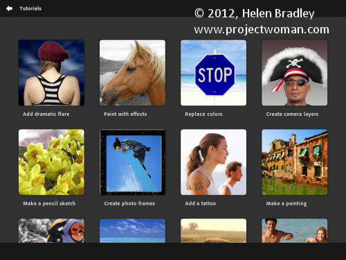
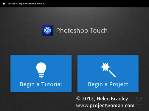
When you launch Photoshop Touch you get two options, viewing the tutorials or doing some work.

There are 10 tutorials that you can work through each of them is project based so you learn the program by learning a technique not by learning how individual tools work. These are text and image tutorials and not video ones, but they are interactive so you can learn as you go.

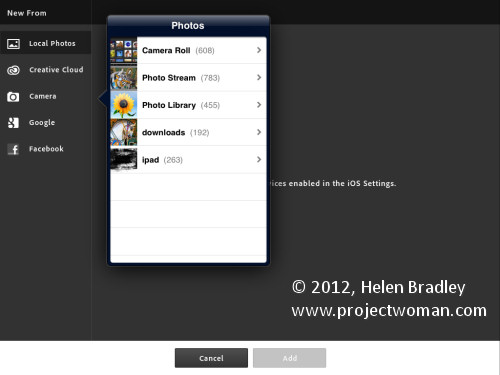
The second option is Begin a Project which is where I’ll start. You get the choice of adding an image from your iPad, the Adobe Creative Cloud, the Camera, Google or Facebook. I chose Local Photos then the Photo Library and an image from my iPad.

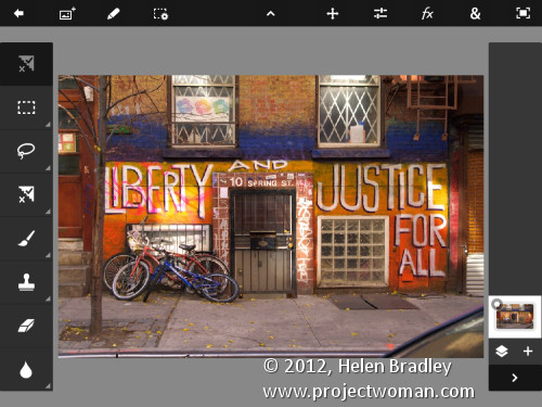
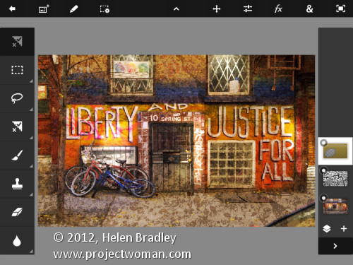
In the main editing area you’ll find the tools on the left, layers on the right and menus across the top. The program pays lip service only to Photoshop.  Some icons are familiar but others are more iPad than Photoshop so Photoshop users may find it a bit confusing where iPad artists will find it more familiar.

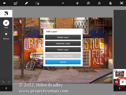
You can add multiple images and multiple layers. I wanted to texture this image so I clicked the Add Layer button and selected Photo Layer.

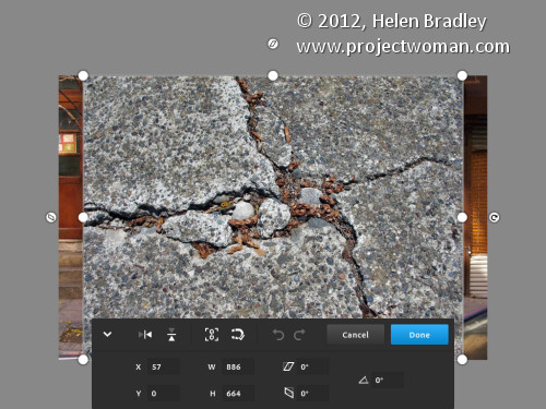
Once you select a second photo you get to size it as you import it – you can also rotate, flip or skew it too. Click Done to proceed to the editing area.

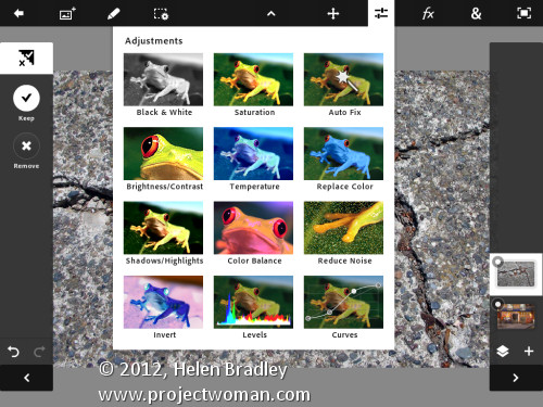
Now, with the layer selected, you can apply adjustments to it.

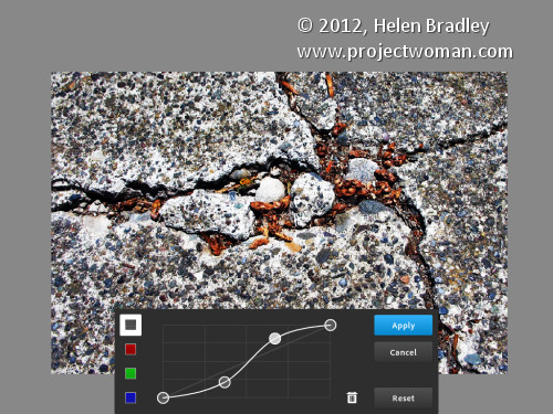
I chose Curves as this was a texture and I wanted more contrast. There are no adjustment layers so the Curves adjustment is being applied just to the targeted (top) layer. As you can see, you can adjust the RGB composite channel or the individual red, green and blue channels.

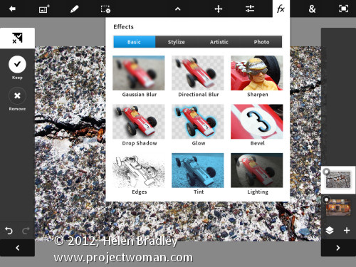
With the texture layer still targeted you can apply a filter to it by clicking the FX button. There is a range of filters including Basic, Stylize, Artistic and Photo. Some add things like drop shadows, blurs and glows and others are more artistic.

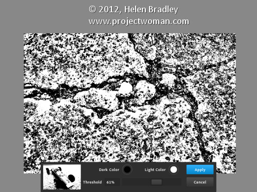
I chose Stylize > Old Photo, configured the settings and tapped Apply. Unlike Photoshop where the foreground and background colors need to be selected before you run a filter, here you can select the colors to use in the filter settings – this really is a feature that Photoshop should have.

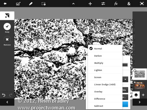
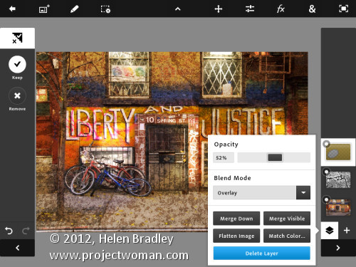
To blend the layers you click the Layer icon and you get a choice of blend modes and the chance to adjust the layer opacity.

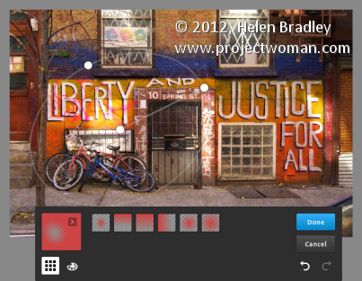
There are no masks but you can use a gradient to fade the effect – when you do the gradient is applied to the layer and you can only undo it by tapping Undo – you can’t go back and edit it.

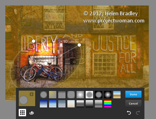
You can also add a new Empty Layer and fill it with a gradient.

And then blend it using a layer blend mode as I have done here.

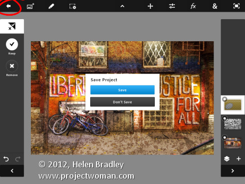
I finished by cropping the image and then saving it.

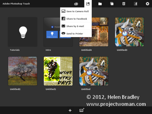
You can then email it or send it to the Camera Roll or upload the project to the Adobe Creative Cloud so you can access them from there.

There are limits to Photoshop Touch and one is the 1600 x 1600 pixel image size limit. The text tools are rudimentary and, as a long time Photoshop user, I’d like to see editable masks and editable text. That said, for fixing photos and tinkering with creative projects this program is a welcome addition to the Adobe family.

This app will appeal to a range of users. There are plenty of basic tools that are easy to use but also some more advanced features for working with images. The Scribble Extract tool does a reasonable job of extracting a subject from a background and you can tinker with gradients and fades to get some interesting effects. You don’t need to know how to use Photoshop to use the app but your knowledge won’t go astray.

Helen Bradley

Thursday, November 3rd, 2011

Photoshop CS5: Oil Painting with Pixel Bender

One of the cool new tools from Adobe Labs is Pixel Bender. This free extension lets you apply any one of a series of filters that comes with the extension to your images in Photoshop CS5. But that’s not all – Adobe also provides a simple interface for Pixel Bender that lets you create your own filters. As a result a community is building around Pixel Bender with users sharing custom created filters with others. In this post I’ll show you how to get started with Pixel Bender.

You will find the Pixel Bender extension here for download: http://labs.adobe.com/downloads/pixelbenderplugin.html this is the version for Photoshop CS5 and CS5.5. Go to this site to find the Pixel Bender download for Photoshop CS4 you will see the link in the top right of the page. Make sure to download the version that matches your operating system and your version of Photoshop CS4, or 5/5.5 (32 or 64 bit). The extension is an .mxp file and you need to install it using the Adobe Extension Manager.

You can install the extension by double clicking on the file to launch the Adobe Extension Manager. If you’re using Windows Vista or Windows 7, you should run the Adobe Extension Manager as an Administrator. So, from the Start menu, locate the Adobe Extension Manager entry, right click it and choose Run as Administrator. The reason for this is that the extension needs to be placed in a folder that you can only access if you have administrator privileges. If you launched the program manually choose File > Install Extension and locate and select the extension that you just downloaded.

Accept the license terms and the extension will be automatically installed inside the appropriate Photoshop CS5 program folder.

When you’re done, close the Extension Manager, close Photoshop and reopen it.

Pixel Bender won’t work on images larger than 4096 x 4096 so start by resizing your image if necessary. If desired, you can convert an image to a Smart Object before applying a filter.

To run Pixel Bender open an image and choose Filter > Pixel Bender > Pixel Bender Gallery. You’ll see a list of filters in the dropdown list which currently displays CircleSplash. Select the OilPaint filter and then adjust its settings. Using Stylization, you can adjust the length and bend of the brush strokes – the larger values look best.

Cleanliness will adjust the smoothness of the effect and typically looks good at around 7 or 8. Colorization allows you to apply more or less color to the image. BrushScale changes the size and length of the darker brush strokes – a small value gives thin long lighter brush strokes and a larger value gives shorter thick very dark brush strokes. BrushContrast will adjust the contrast of the brush strokes and is probably better left at a value approaching 1.

In short, adjust the sliders until you get a result you like. If you are unsure how a slider is affecting the image drag it all the way to the left or right to see the effect. Then adjust from there.

When you’re done, click Ok to apply the result to the image. Unlike most filters which convert images to look like an oil painting, this one does well at identifying edges in the image so the painting looks more realistic.


Helen Bradley

Page 1 of 212