Tuesday, February 19th, 2013

Photoshop Masks 101

When it comes to fixing images in Photoshop or Photoshop Elements the ability to use masks to do your edits is invaluable. By using a mask instead of, for example, the Eraser you get an edit which can be changed or even removed any time in the future.

However masks aren’t easy to use or even understand when you first get started. In fact they can be downright scary. To help you get started here is a quick and easy technique that can be achieved using masks. Doing it will show you a situation in which a mask is a good editing choice. You will see how to add a mask to a layer and how to use it to edit the image. By the end of the process you will be on your way to understanding how to use masks in your photo editing workflow.

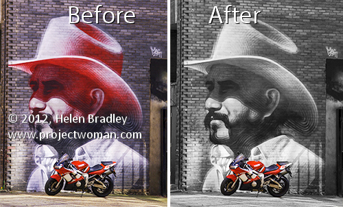
The effect that I’ll be creating is one that you see in a lot of wedding albums and advertisements. It is an element of color in an otherwise black and white image. It can be achieved using masks and that’s what we’ll do here.

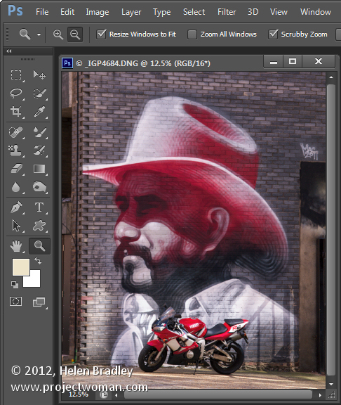
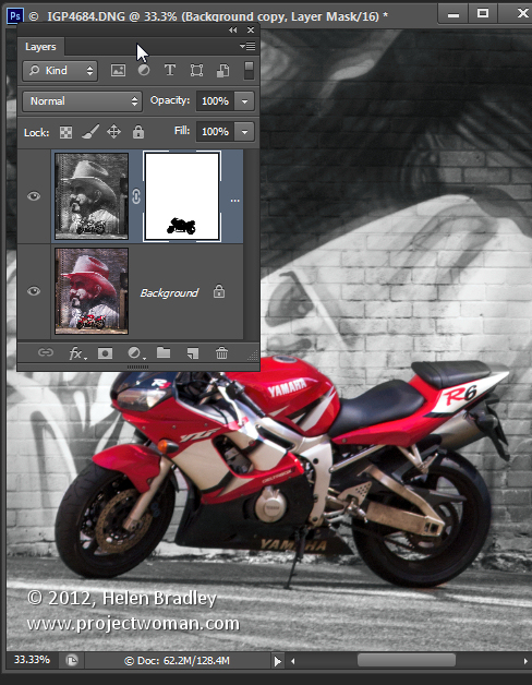
Start by opening an image that has some colorful element of interest that you can show in color while you turn the remainder of the image into black and white. Here I’ll turn this graffiti image black and white and leave the bike in color.

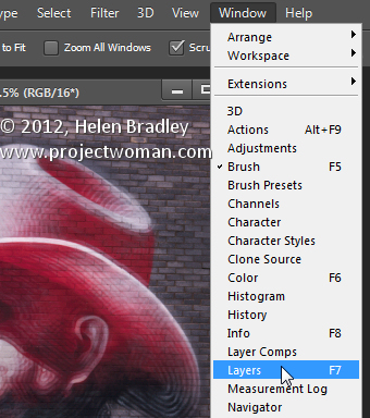
Make sure your Layers palette is visible. If not, choose Window > Layers to display it.

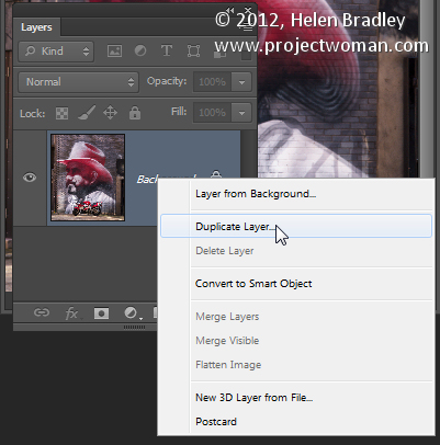
Right click the Background layer in the Layers palette and choose Duplicate Layer and click Ok. This makes a duplicate of the image layer.

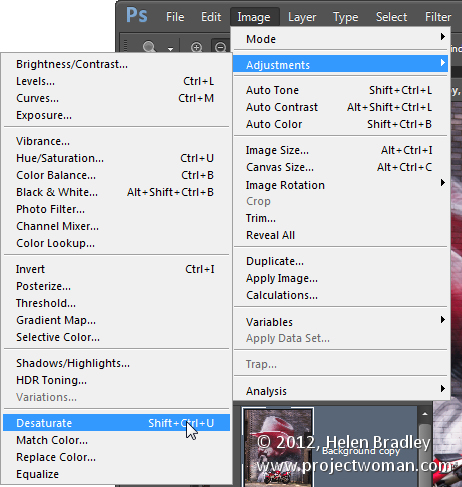
With this layer selected, choose Image > Adjustments > Desaturate to turn the image into black and white.

Notice that the Layer palette contains a black and white layer and a color layer. The black and white layer is at the top of the stack which is why you are seeing a black and white image.

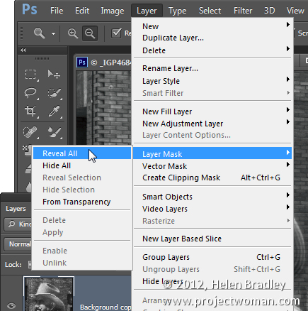
At this point we’ll add the mask so we can use it to bring back the color in a specific are of the image. To do this with the Background Copy layer still selected choose Layer > Layer Mask > Reveal All.

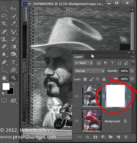
This adds a white filled layer mask to the layer – notice the white box which appears in the layer palette next to the image thumbnail – that’s the mask.

A word about masks

Right now all you need to know about masks is that you can paint on them with black, white or shades of gray.

When you paint with white on a mask you reveal any content on the current layer – in our case that is the black and white layer.

If you paint with black you’ll reveal the content on the layer below the current layer – in this case the color layer. You might like to think of it as poking a hole in the top layer so that you can see part of the layer below.

If you paint with a shade of gray you’ll be seeing part of the layer below and part of the current layer. The hole that you’re punching through the top layer will be semitransparent.

Bring back the color

To work on this image, select the brush tool and select a small brush with a hardness of around 75%. Make sure black is set as the foreground color and click on the white mask thumbnail in the Layers palette to target the mask. It should have a border around it as in this image:

Now paint on the photo over the areas that you want to bring back color in. Instead of seeing black paint on your image as you might expect to see, you will see the color coming back.

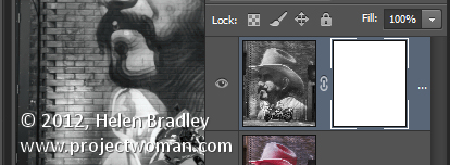
Look at the mask thumbnail in the Layers palette and notice it has some black markings in it where you painted on the image.

If you make a mistake and paint back too much color, switch the paint color so that you are painting with white and paint out the areas that you want to return to black and white.

Oops!

If you are working with a mask and find that the brush is painting black or white paint on your image it is because the image thumbnail is selected in the Layers palette and not the mask thumbnail. When you select the mask thumbnail it will have a small white border around it so you can tell it is active and selected.

The benefit of using a mask for this type of effect is that you can paint the effect on or off the image as desired. This gives you a lot more flexibility in editing your image. While this is a very simple example it does give you a starting point for learning to use masks in your photo editing.

When you save this photo, save it as a psd format file if you want to be able to come back later and adjust the mask – the psd format saves layers and layer masks.

If you are familiar with using Adjustment Layers in Photoshop you could apply this effect using an adjustment layer to desaturate the image and paint on the Adjustment Layer’s mask to bring the detail back. If you are not familiar with using Adjustment Layers then the process that I have outlined will give you the same results but just a different way of achieving it.

Helen Bradley

Thursday, October 18th, 2012

Photoshop Masks 101 – Spot Color effect

Create a spot color or isolated color effect in Photoshop. The image is black and white and only a portion of the image is in color. Learn how to do this and how to get started with masks as you do this.

Check out all our tutorials on our YouTube channel.

Complete transcript of this video:

Hello, I’m Helen Bradley. Welcome to this video tutorial. In this tutorial I’m going to show you how to begin to use masks in Photoshop and I’m assuming that you’ve never used a mask before. And so that we actually create something in this tutorial we’re going to use it for a spot color effect. Before we get started on actually introducing what a mask is let’s have a look at the effect that we’re looking at here. This is my original image and it was shot in color on a very wet night in Wales. And what I’ve done is converted the image to black and white but I’ve left this person in the middle of the image in color. And I’ve done it in such a way that we can edit it. So if I didn’t make the selection correctly to begin with I can adjust it at any time. I can also remove the effect. So you can see here I’ve removed the mask here and the image has been reverted to fully black and white. I can reinstate the mask and this converts the image into black and white but leaving this person in color. This is a black and white adjustment layer here, a very simple adjustment layer. But because I’ve got a mask here I’m able to control where the color is on the image. And with masks you can paint with black and white. Black will reveal the layer underneath or the color underneath and white hides it. So if I get a really big brush right now, let’s go and get a really big brush on this image, and just see what happens when I paint on that mask. Can you see that I’m bringing color back into the image because I’m painting was black. If I paint with white I’ll removes the color from the image. I’m painting on the mask so I have the mask targeted but my paint is being painted onto the image itself. So I’m painting here. You can see that the color is going on the mask and we’re poking a hole in this black and white layer to see the color below. If we change to paint in white we’re removing it so we’re seeing what is on this particular layer. So now that we’ve seen what we’re aiming for let’s go and see how we could achieve that result with another image. Here I have another image. This one was shot in Cambridge. And I’m just going to size it down. And to make a start on this image we’re going to convert it to black and white using an adjustment layer. I’ll choose Layer, New Adjustment Layer, black and White and click Ok. And now I can make my black and white adjustment. But because my phone boxes are going to be colored red later on I’m not worried about the color in the phone boxes but I am worried about how the black and white is converted in the image around the edges. So I’m just going to focus on these edges. I do want it to look a little bit dark. So I’m probably going to go to the black end of the scale on most of these. And there’s my black and white image. And now we’re ready to add the color back into it. There any number of ways that we can bring the color back into the image. I’m going to show you a couple of them. Because we created a new adjustment layer you can see that there’s already a mask in place. So we can use this mask just by painting on it. Because it’s white that’s automatically telling us that we’re seeing just the black and white elements in the image. So if we start painting with black, and I’m just going to choose a paintbrush to use, I’m going to choose a slightly softer one to start off with. Now if we paint with black on the mask we’re going to start seeing the color appear underneath. And if we go too far then we can paint over it by painting in white. And you can see that we would really need a harder edge brush to really get a good effect here. But we could get a soft effect if we wanted to with this sort of almost not really quite transparent but it almost is in the edges brush. So I could just brush that effect on. It’s not fully opaque at these edges but it’s still giving me a spot color effect. Now I’m just going to trash that mask, drag it off and I’m going to delete the mask. At any time I want to add a mask I can just click this Add Layer Mask icon and that will add it to an adjustment layer or to a regular layer. Now let’s turn off this entire adjustment layer. Let’s go to the background layer and let’s use the quick selection Tool to select over these telephone boxes because this is another way that we could mask things. And now because I have my selection in place we can go back to our adjustment layer, turn it on, make sure I have the mask selected. I have black as my foreground color, I can Alt Backspace, Option Delete on the Mac to fill the mask with the black color that then shows the red through it. If I press Ctrl or Command D I’ll deselect the selection. And now I can zoom into areas that I think may need to be fixed a little bit, move them into position and go and get my black paintbrush. I’m going to make it a fairly hard edge paintbrush because the edges of these phone boxes are pretty hard. And I’m just going to paint over these edges and just make sure that in every place that I created my mask or my selection that everything is working correctly. I’ve actually got some color here so I’m going to switch colors by pressing X to make white my foreground color. I’m just going to tidy up a little area here where I had too much of the background color. And now I’ve gone the other way, again press X and this time bring it back in by painting with black. I’m painting on the mask. Although I’m using the image, I’m actually physically painting on the image but it’s appearing on the mask layer. And again I can just check around here to make sure that I have everything looking the way I want it to look. Let’s just zoom out again. Now there’s another way that I could have created this entire effect and that would have been to have made a duplicate of this background layer, Layer, Duplicate Layer. And I could have converted this to black and white just using Image, Adjustments, Black and White. Now for this one I’m just going to select the default adjustment. And now I’ve got a black and white layer on top of a color layer. Again I can add my mask here and I could paint on that with the paintbrush and black paint to bring my color back in or I could go to this layer and make my selection on this layer just as we did earlier. I’ll just go and quick mask this, really quick mask it. This is a very quick and dirty mask this one. Ok and then let’s go back into this layer and because I have this selection made, in fact it needs to be a little bit better made, I can just Alt Backspace, Option Delete on the Mac to again mask this layer. And then we can go back and tidy it up with the paintbrush and just paint over any areas where we want to bring back the color from the layer underneath. So this is done with two layers, one of which is black and white and one of which is color. But you could do it with an adjustment layer. There are lots of different ways to do it. It’s this Add Mask icon that allows us to add a mask. We’ll always put the mask on a top most layer because we want to poke a hole through this layer to see the one below. We’ll paint with black or white on the mask, and we can also paint with shades of gray. So let’s go and get a shade of grey here. It’s under my paintbrush so let’s see what happens when I paint with it. What we get is part of the current layer here but not all of it. So you can see I’m getting a mix here of the layer below and this layer because I’m painting with gray. Anywhere I paint with black I’m going to get only the layer below. Anywhere I paint with white I’m only going to get this particular layer. So there’s an introduction to masks by creating a spot color effect which is fully editable. Provided we save this as a PSD file, the image is going to be editable at any time by just painting on that mask. I’m Helen Bradley. Thank you for joining me for this video tutorial. If you liked this video please give it a thumbs up on YouTube. Subscribe to my channel if you’d like to know when new videos are being released. And visit Projectwoman.com for more tutorials for Photoshop, Illustrator and Lightroom.

Sunday, June 3rd, 2012

Edit and Create on the go with Adobe Photoshop Touch

By Helen Bradley

On Monday, Adobe launched its Photoshop Touch application for the iPad. This long sought after app runs on the iPad 2, and not on the iPad 1, and it requires that you have iOS 5 installed. The app costs $9.99 which is at the high end of the price range for photo-editing apps in general but Photoshop Touch seems to have got the feature set about right so most people will probably consider it worth the money.

I use the iPad a lot for working with photos I’ve shot using a digital SLR camera in raw and which I’ve resized, converted to jpeg and downloaded to the iPad. Those images I have on the iPad are there because they are funky or because they lend themselves to some artistic play. So, I looked at Photoshop Touch in this light – I wanted to see if it would be part of my iPad image creative workflow. For heavy duty work, Photoshop and Lightroom will remain my tools of trade.

When you launch Photoshop Touch you get two options, viewing the tutorials or doing some work.

There are 10 tutorials that you can work through each of them is project based so you learn the program by learning a technique not by learning how individual tools work. These are text and image tutorials and not video ones, but they are interactive so you can learn as you go.

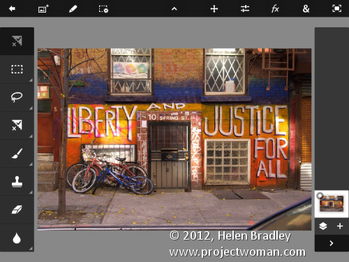
The second option is Begin a Project which is where I’ll start. You get the choice of adding an image from your iPad, the Adobe Creative Cloud, the Camera, Google or Facebook. I chose Local Photos then the Photo Library and an image from my iPad.

In the main editing area you’ll find the tools on the left, layers on the right and menus across the top. The program pays lip service only to Photoshop.  Some icons are familiar but others are more iPad than Photoshop so Photoshop users may find it a bit confusing where iPad artists will find it more familiar.

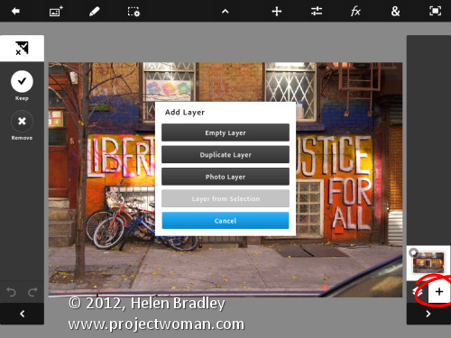
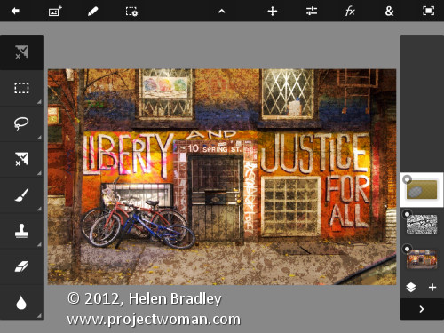
You can add multiple images and multiple layers. I wanted to texture this image so I clicked the Add Layer button and selected Photo Layer.

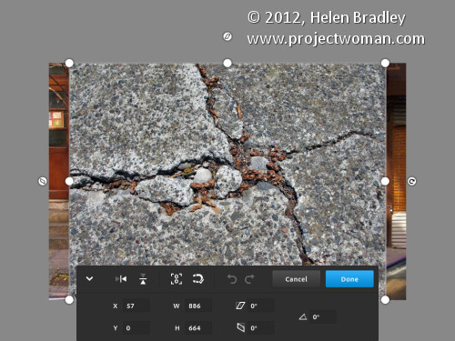
Once you select a second photo you get to size it as you import it – you can also rotate, flip or skew it too. Click Done to proceed to the editing area.

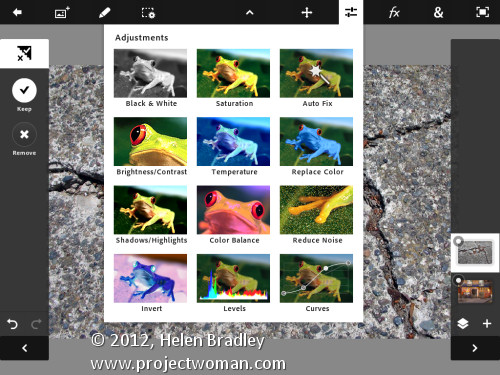
Now, with the layer selected, you can apply adjustments to it.

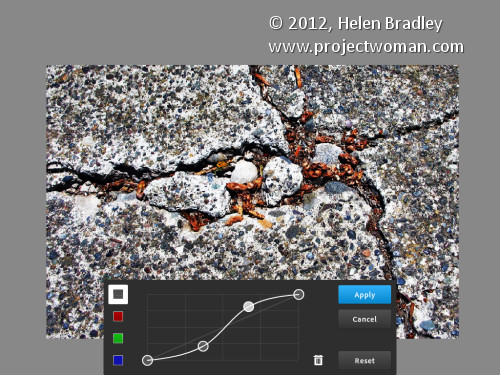
I chose Curves as this was a texture and I wanted more contrast. There are no adjustment layers so the Curves adjustment is being applied just to the targeted (top) layer. As you can see, you can adjust the RGB composite channel or the individual red, green and blue channels.

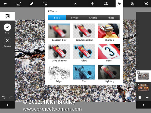
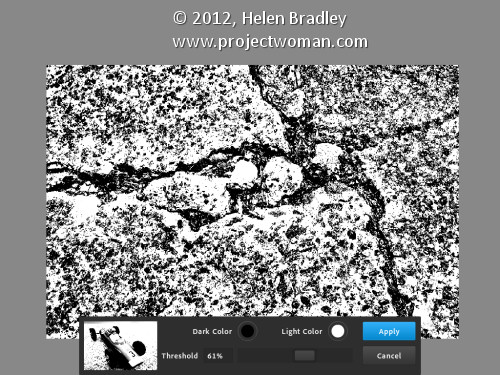
With the texture layer still targeted you can apply a filter to it by clicking the FX button. There is a range of filters including Basic, Stylize, Artistic and Photo. Some add things like drop shadows, blurs and glows and others are more artistic.

I chose Stylize > Old Photo, configured the settings and tapped Apply. Unlike Photoshop where the foreground and background colors need to be selected before you run a filter, here you can select the colors to use in the filter settings – this really is a feature that Photoshop should have.

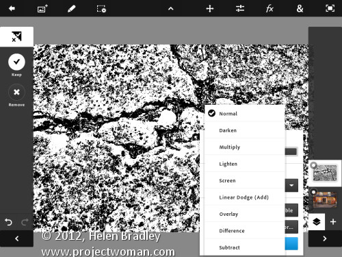
To blend the layers you click the Layer icon and you get a choice of blend modes and the chance to adjust the layer opacity.

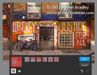
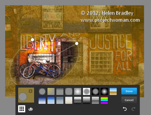
There are no masks but you can use a gradient to fade the effect – when you do the gradient is applied to the layer and you can only undo it by tapping Undo – you can’t go back and edit it.

You can also add a new Empty Layer and fill it with a gradient.

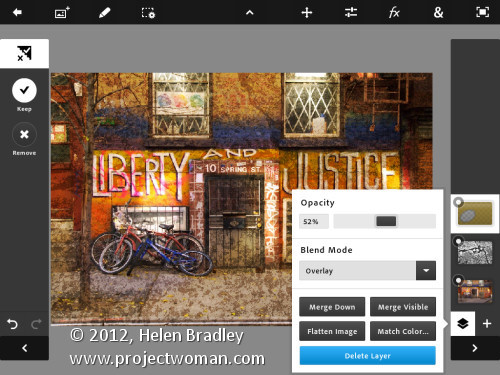
And then blend it using a layer blend mode as I have done here.

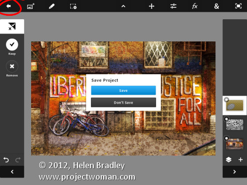
I finished by cropping the image and then saving it.
You can then email it or send it to the Camera Roll or upload the project to the Adobe Creative Cloud so you can access them from there.

There are limits to Photoshop Touch and one is the 1600 x 1600 pixel image size limit. The text tools are rudimentary and, as a long time Photoshop user, I’d like to see editable masks and editable text. That said, for fixing photos and tinkering with creative projects this program is a welcome addition to the Adobe family.

This app will appeal to a range of users. There are plenty of basic tools that are easy to use but also some more advanced features for working with images. The Scribble Extract tool does a reasonable job of extracting a subject from a background and you can tinker with gradients and fades to get some interesting effects. You don’t need to know how to use Photoshop to use the app but your knowledge won’t go astray.

Helen Bradley

Wednesday, February 29th, 2012

Adobe Launches Photoshop Touch for the iPad

It has been a long time coming – way too long – but Adobe finally launched Photoshop Touch for the iPad.

I have reviewed it here for PC World and I wrote a how to for creatively editing images with it for Digital-Photography-School.com.

The app costs $9.99 so it isn’t cheap by iPad app standards but I think it is worth it. Downsides are non editable text, 1600 x 1600 px file size limit, no true editable masking tools and no adjustment layers. But it does have good layer tools (unlike Adobe Ideas you don’t have to shell out 99c for each new layer!), blend modes and it is easy to use.
Helen Bradley

Friday, September 23rd, 2011

Photoshop: Applying fixes using masks

Sometimes a photo needs two opposing fixes applied to different areas of the image. This poses a dilemma – if you fix one area you’ll make the other areas far worse than they started out being and vice versa. The solution is to apply both fixes but to do this on different layers and to blend the results together using a mask. Here’s how to do it:

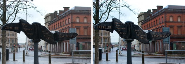
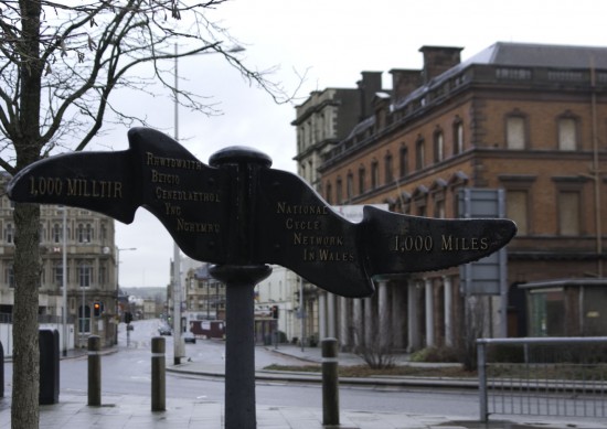
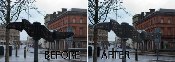
Look at this photo – the sign in the middle is dark and hard to read and the area behind it is lighter than it should or could be. The camera has exposed primarily for the lighter areas in the image but the entire image needs work.

Step 1

Make multiple duplicate layers

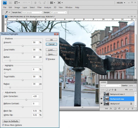
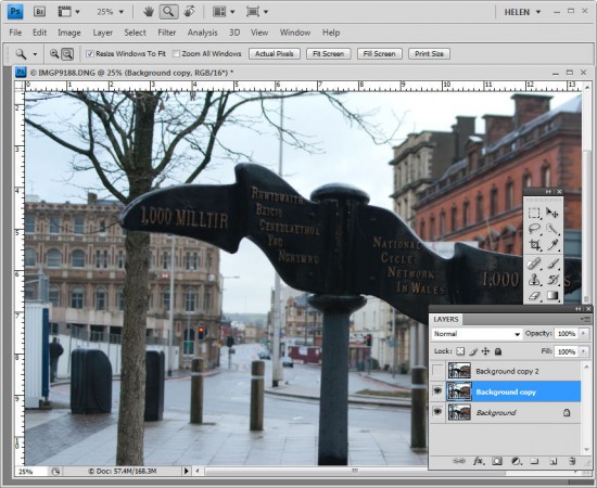
To fix the image make two copies of the background layer so that you do your work on duplicate layers. To do this, right click the Background layer in the Layers palette and choose Duplicate Layer and then repeat this step a second time. Disable the visibility icon on the topmost layer and select the middle layer.

Step 2

Using Shadow/Highlights to lighten the darks

To bring detail out of the darker area in the sign, I’ll use the Shadow/Highlights tool. To do this choose Image > Adjustments > Shadows/Highlights and adjust the Shadows but leave the highlights settings untouched. Typically the default setting will be all you need but you can fine tune the settings using the sliders which appear when you click Show More Options if desired. Ignore the impact that this fix has on the lighter areas of the image.

If you prefer to use another tool for this fix, do so. The important thing is to fix the shadows and ignore any changes to the highlights.

Step 3

Levels to fix the highlights

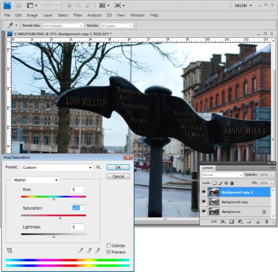
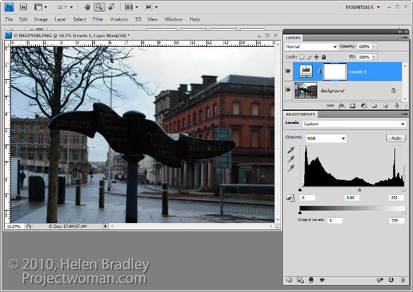
Enable the visibility icon on the top layer and select the top layer – this hides all the changes you have made so far. Choose Image > Adjustment > Levels and adjust the levels to improve the contrast in the lighter areas of the image – this time ignore the darker areas entirely as they are not part of this fix. You can also adjust the saturation using Image > Adjustments > Hue/Saturation if desired.

Again, if you prefer to use another tool, do so. The important thing is to fix the highlights and ignore any changes to the shadows.

Step 4

Blending the results with a mask

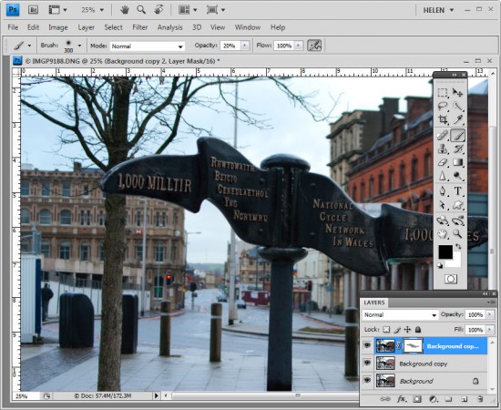
The top layer contains the adjustment for the lighter areas of the image and the middle layer contains the adjustment for the dark areas of the image. To blend these layers, I’ll use a layer mask to selectively adjust the opacity of the top layer so I can see the fix applied on the middle layer through it.
Unlike the layer opacity slider which sets every pixel to the same opacity value, a mask lets you adjust the opacity selectively so one area can be 100% opaque and others can be partially or fully transparent.
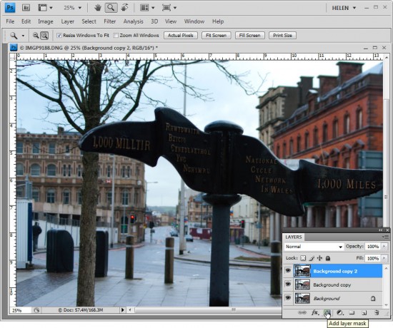
To add a mask to the top layer, first select the topmost layer and click the Add Layer Mask button at the foot of the layer palette. This adds a white layer mask to this layer. When working with masks, “black conceals and white reveals” so the white mask reveals everything on the top layer and the image is unchanged.
Step 5
Set the foreground color to black, select a soft round brush and set its Opacity to approximately 20%. Click on the mask to select it – it will have a small border around it showing that you have it selected. Now paint over the darkest areas of the image to reduce the opacity of the top layer where you are painting – this reveals the fix from the layer below. Using a low opacity brush lets you reduce the opacity gradually to build up the effect.

Continue and paint over the darker areas of the image to reveal more of the layer below through the mask. It can help to see how much more detail you can still recover if you turn the visibility of the top layer on and off. Make sure to select the layer mask again before painting on the mask – if you don’t do this, you’ll paint on your image.

If you go too far, make white your foreground color and paint on the mask to bring back parts of the top layer of the image. This is one of the benefits of using a mask – simply by painting you can apply or remove the fix. You wouldn’t have this flexibility if you used the Eraser tool on the top layer, for example.

To finish, I rotated the image to straighten the sign and cropped it to remove the distracting elements on the left side of the image.

Helen Bradley

Tuesday, August 31st, 2010

Photoshop: Applying Fixes using Adjustment Layers and Masks

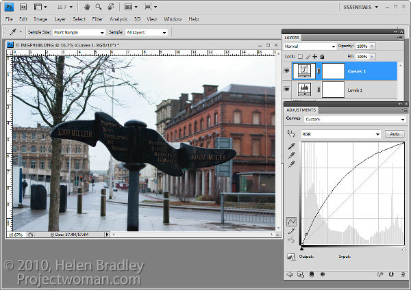
Sometimes a photo need two opposing fixes applied to different areas of the image. This poses a dilemma – if you fix one area you’ll make the other areas far worse than they started out being and vice versa. The solution is to apply both fixes but to do this using adjustment layers and to blend the results together using a mask. Here’s how to do it:

To fix the background of the image, choose Layers > New Adjustment Layer > Levels and adjust the levels to improve the contrast in the lighter areas of the image. Ignore the darker areas of the image as they are not part of this fix.

If desired, you can also adjust the saturation using Layers > New Adjustment Layer > Hue/Saturation.

To bring detail out of the darker area in the sign you will use an additional adjustment layer. In the original blog post I used the Shadow/Highlights tool but this is one fix you cannot apply using an Adjustment Layer so you will have to use a different adjustment for this image. I will use a Curves adjustment layer here.

To do this choose Layers > New Adjustment Layer > Curves and adjust the darker end of the curve –on the left side. Drag upwards on the curve line to lighten the shadows.

If you prefer to use another tool, you can do so. However, the important thing is to fix the shadows and ignore any changes to the highlights.

The top adjustment layer contains the adjustment for the darker areas of the image and the bottom adjustment layer(s) contain the adjustment for the lighter areas of the image. To blend these layers, you will use the layer masks attached to the adjustment layers to selectively add the fixes to the image.

Unlike the adjustment layer’s Opacity slider which sets every pixel to the same opacity value, a layer mask lets you adjust the opacity selectively so one area can be 100% opaque and others can be partially or fully transparent.

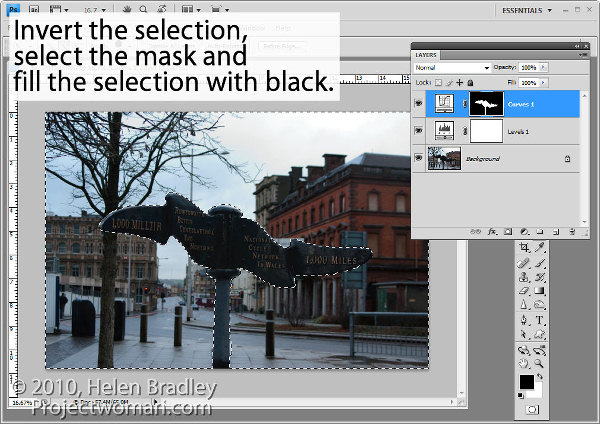
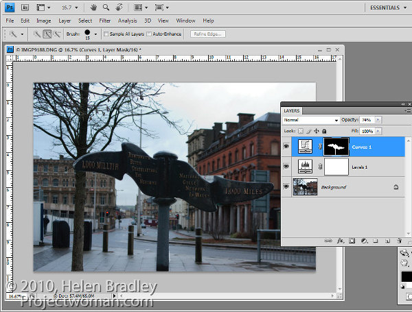
For this image, as I want to lighten the sign but not anything else, it will be quickest if I start by selecting the sign on the background layer.

Select the mask on the Curves layer. When you are working with masks remember that “black conceals and white reveals” so painting with white on the mask reveals the adjustment on this layer and painting with black on the mask hides the adjustment.

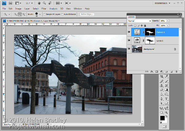
Press Control + Shift + I (Command + Shift + I on the Mac) to invert the selection so now we have everything except the sign selected. Set the foreground color to black and press Alt + Backspace (Option + Delete on the Mac) to fill the mask except where the sign is with black.

Press Control + D (Command + D) to deselect the selection.

If the fix looks too intense, you can adjust the opacity of the top Curves layer down a little.

When adjusting opacity you may find it easier to judge an ideal value if you drag the Opacity slider to zero and then increase the value until you find a good fix rather than dragging it down from 100% looking for the ideal setting.

If you want to remove the sign from the Levels adjustment you can do so using an inverse of the layer mask you have already created.

To copy and invert the mask, press Alt + Shift (Option + Shift on the Mac) as you drag the mask from one adjustment layer and drop it on top of the mask on another layer. When prompted to replace the mask, answer Yes. (If you simply want to copy a mask use Control + Alt or Command + Option instead).

If you do this, you’re removing the Levels fix from the pole and you may need to adjust the Opacity of the Curves adjustment layer to compensate for this.

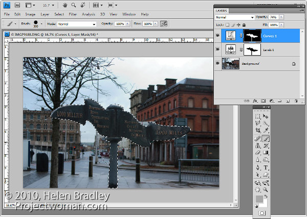
You can also adjust  masks by painting on them in black, white or a shade of grey. Painting in black hides the fix on this layer, painting in white reveals the fix on this layer and painting in grey partially hides the fix.

Here I have Control + Clicked on the mask on the top Curves adjustment layer to select the white areas of the mask, then painted in grey on the mask to hide some of the lightening effect on the pole. By selecting the white area of the mask before painting I limit the paint to only the selected area which lets me work quickly.

If you go too far, switch colors and paint back the effect back.

To finish, I rotated the image to straighten the sign and cropped it to remove the distracting elements on the left side of the image.

Helen Bradley

Thursday, March 11th, 2010

Photoshop – Copy and Invert Masks

Photoshop copy and invert a mask

This is totally cool. I was playing around in Photoshop the other night and needed to duplicate a mask and then invert it. I remember that you can copy a mask using two fingers and the mouse button so that means it’s some combination of the Control, Alt and Shift keys – that’s all you really need to remember – the rest is experimentation.

Well, I did the two finger drag using Shift and Alt and this must be a keystroke combination I haven’t used before because lo and behold! it not only copies the mask but it inverts it too!

So, to copy a mask, drag it using Control + Alt (Command + Option on the Mac). To copy and invert the mask, Shift + Alt (Shift + Option on the Mac).

Helen Bradley

Friday, February 16th, 2007

Shameless Self Promotion

Ok, so it’s not exactly a tip of the day, but I already did today’s so I feel it’s justified.

I have lots of cool Photoshop tutorials around my site, check these out:

Photoshop Brushes tutorial
Learn how to create your own Photoshop Brushes

How to use Adjustment Layers
Make photoediting a simple and undoable process using Adjustment layers

Photoshop Gradients
Fix images and create colorful effects using Photoshop Gradients

Straighten an image in Photoshop, Elements and Paintshop Pro
Straighten your images with this simple to follow tutorial that covers the popular photoediting programs

Photoshop Shapes -New!
Helen Bradley explains how to use Photoshop Shapes to edit your photos and create fun shape overlays.

Create and use Photoshop Masks
Masks aren’t as hard as you think they are and this tutorial makes them simple to use.

Create seamless patterns in Photoshop
Whether you need them for the web or for a background for an Excel worksheet, here’s how to create great seamless patterns and we’ve included a mini tutorial on TV scan lines.

Color match photos in Photoshop
Even if your photos were taken in totally different lighting

Color Swatches in Photoshop
Create your own custom color swatches and use them in your photo editing work.

Ok, so that’s done, now back to the tips..

Helen Bradley