Wednesday, April 25th, 2012

Create spot color effects on the iPad with ColorUP Lite

Download: ColorUP on the iPad – Free

This free program will only let you adjust images captured by the iPad – if you want to be able to use images from your camera roll you have to upgrade to a paid version.

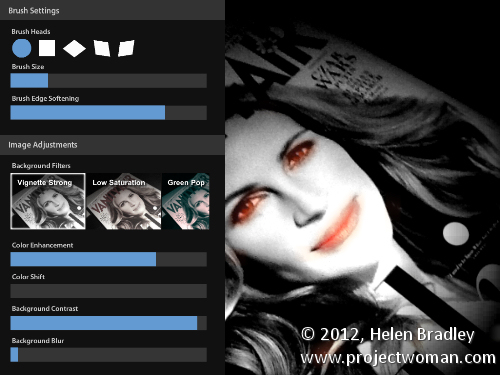
Here, because I wasn’t online to get the upgrade, I just shot the cover of a copy of Vanity Fair which I was reading on a flight home from Washington DC!

The app turns the image into monochrome and you then paint over the areas of the image to bring back color.

You can adjust the brush size and see the mask. If you make a mistake just erase the brushstrokes.

You can blur the background, adjust its contrast and even change the color in the image by adjusting the hue.

If you like the effect it is worth shelling out for the full version as not many programs let you do this as easily as this one does and the extra features for adjusting the background are great.

Helen Bradley

Monday, April 9th, 2012

Grunge an image with Pixlr-o-matic on the iPad

Download: Pixlr-o-matic on the iPad free

I love this app but wish it worked in landscape and didn’t force me to work in portrait. It is from Autodesk who are the unsung heroes of the iPad photo editing app world. They do great stuff – way better in general than Adobe when it comes to iPad stuff.

Not only that but this app is also available online so you can use it on your desktop in a browser or download a standalone version – all cool and all free! You can buy extras if you like so you can buy extra frames and effects and you get lots for your money.

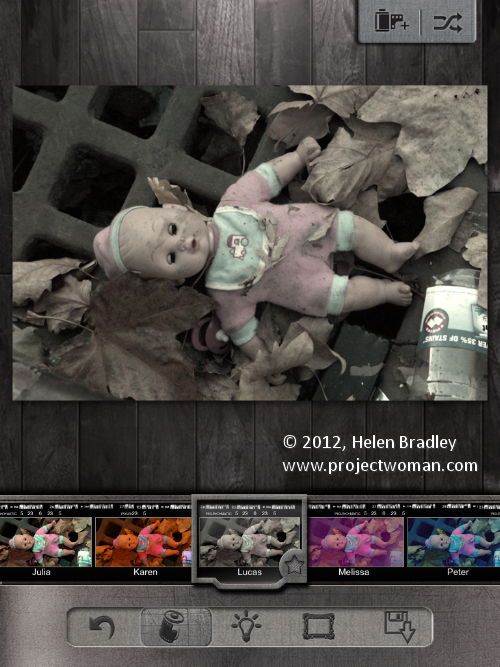
Start by capturing an image or import one from your gallery. Then click the first of the options across the foot of the screen – these are filters. Here you can browse the gallery of options – you can instantly view the filter on the image or keep scrolling to try something out if you don’t like the result of your first choice. I chose Lucas for this image:

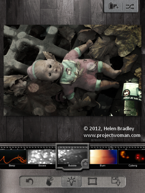
Then select the Lightbulb icon and apply a lighting effect to the image. I added Bubble to this image.

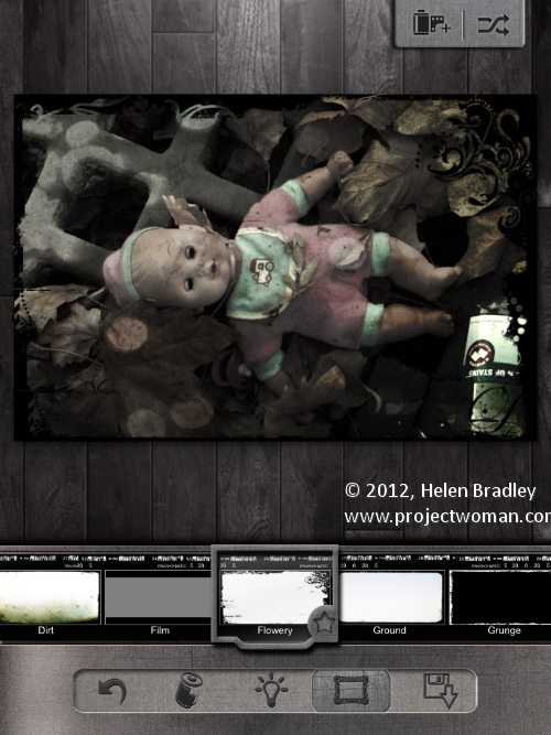
Then click the frame option and add a frame – I chose Flowery.

I would like a tool for cropping the image as I really prefer to use square images for these types of effects and you cannot do it in Pixlr-o-matic so you  have to do it before you come to this program.

The icon in the top right of the screen lets you apply a random mix of settings to your image – it’s a sort of “I feel lucky solution” – worth trying if you just want to see what the program can do.

Your save options are to the Photo Gallery or iTunes – it would be nice to see some integration with, say, Facebook or Twitter too?

I love Pixlr-o-matic on the desktop and the iPad. I have bought all the extras because you can never have too many cool features and I am willing to overlook some minor frustrations like no crop and portrait mode for the sake of art!

Helen Bradley

Monday, March 5th, 2012

Templates in Photoshop

A short while ago I wrote an article on using templates to create a collage or montage of images in Gimp. Sometime after, the templates that I suggested you  could use were taken down from the original website.

To help out our Gimp readers, I created a new set of templates and as I was making them, it seemed like a good idea to include instructions for Photoshop and Photoshop Elements as well as for Gimp. Here, therefore is how to use a downloadable template to create a montage of images:

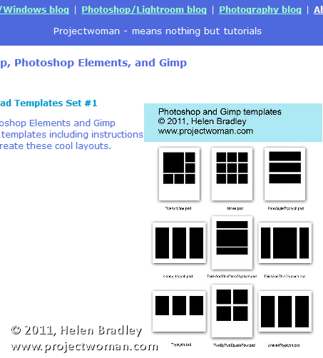
Start by visiting this site and download the template zip file: http://projectwoman.com/articles/45PhotoshopTemplates.html

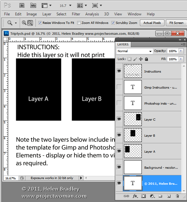
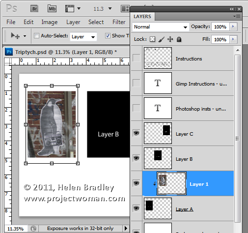
Then unzip the templates, save them where you can find them when you need to use them and open one of them. I’ve used the template triptych.psd.

When you open it, you’ll find that there are a series of layers. The top layer can be disabled or deleted at this point. The next two layers are instructions for Gimp and Photoshop users. Again, you can discard these two layers.

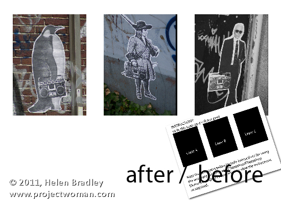
Open up the three images that you plan to use for this triptych. Images that are in portrait orientation will look best but you can use anything that you like – just be aware that you’re going to take a portrait orientation slice of the image.

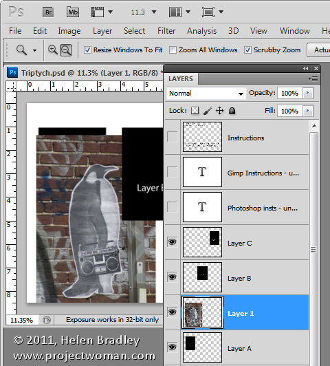
In the template, click on Layer A and then click on the first of your images and drag and drop the background layer from the first of your images into the main image.

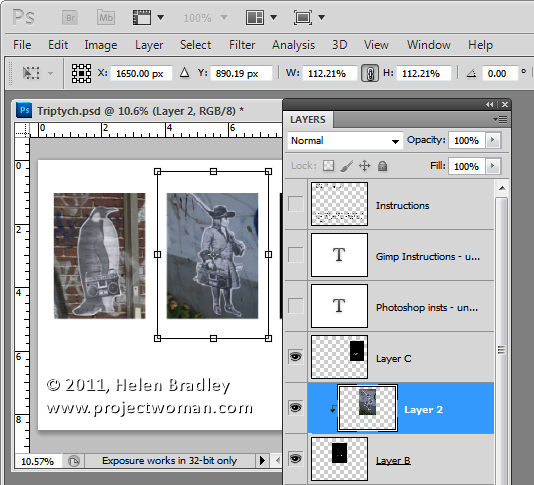
Click on the Move tool and size and position the image so that the interesting portion of it is over the black background. Click to accept this size and positioning and then with the new layer still selected, choose Layer > Create Clipping Mask. You’ll see that your layer is clipped to the size of the underlying shape.

You can fine-tune the placement and sizing by moving the contents of the new layer.

Now click on Layer B and again drag and drop the background layer from the second image into this template. Again, position the interesting portion of the image over the underlying background, sizing the image if desired. Create the clipping mask for that layer by selecting the image and choose Layer > Create Clipping Mask.

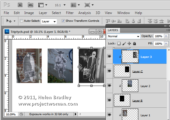
Repeat this for Layer C using your third image.

When you’re done, you can adjust the background of the image if desired by recoloring the layer marked background recolor if desired. You can now save and print the image or upload it to the web.

This same process can be used in Photoshop Elements.

Helen Bradley

Friday, February 10th, 2012

Ho-Hum to Wow! in Gimp


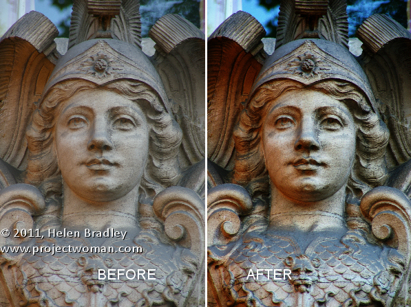
Some time ago I wrote a blog post http://projectwoman.com/2009/03/photoshop-color-that-packs-a-punch.html which involved using the LAB color space to adjust an image. In the interests of those of you who use Gimp, this blog post is a revisit on the topic of dragging color out of lackluster images this time using Gimp.

One of the hidden secrets of Gimp is that it supports the LAB color space so you can get access to the L, a and b channels in an image. This adjustment therefore produces similar results to those you can achieve with my earlier post using Photoshop it’s just that the process in Gimp is a little different.

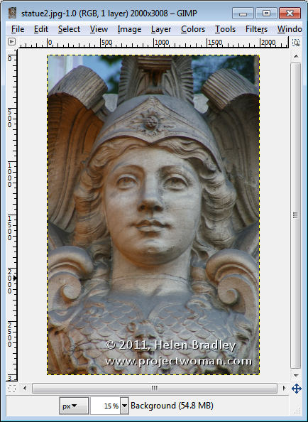
Start out with an image that could use a color boost. This image of a statue over a door in Paris is very monochromatic so it’s a great contender for this process.

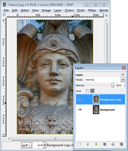
Start by making sure your Layers panel is visible – if not, choose Window > Dockable Dialogs > Layers (or Control + L) to display it. Right click the Background layer and choose Duplicate Layer. Select this new top layer.

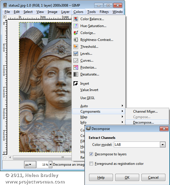
To convert the image to LAB color, choose Colors > Components > Decompose. From the color model dropdown list, select LAB. You will want to decompose to layers so select Decompose To Layers and click Ok.

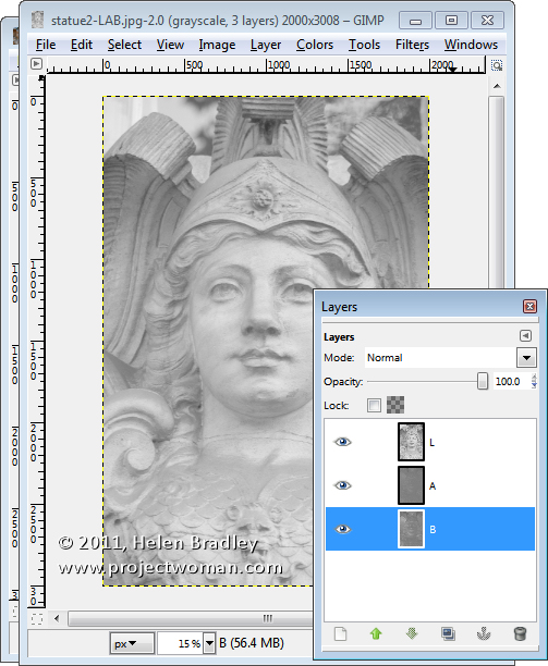
You’ll have a new image on the screen with three layers. Right now you’ll be looking at the L channel and below it in the Layers palette are the A and B channels.

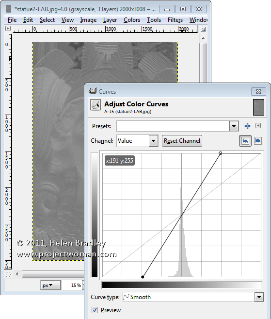
Disable visibility on the L layer and click the A layer to select it. You should have a dark murky almost negative looking image on this layer. Choose Colors > Curves and adjust the curves by dragging the top right and bottom left points on the curve one, two or three boxes inwards on the grid. You can read off the values so pairs of values  like (30,0) and (225,255) or (64,0) and (191,255) are good.

You need to make sure the line goes through the middle of the grid, or you will get an unwanted color cast in the final image. This A channel controls the Magenta and Green in the image and you’re boosting it now to very high levels. Click Ok.

Repeat this by disabling the visibility on the A channel and do the same on the B channel. This is the Yellow/Blue channel. When you’re done, turn back on the visibility of all three channels. You should see no difference in the image at this stage.

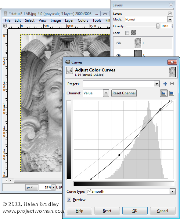
If desired, you can adjust the contrast in the L channel using curves – this will give you some additional boost in contrast in the final image. The L channel is the luminosity channel and it has no color in it at all so you can create a different shape curve here and there is no requirement for the line to go through the middle of the grid.

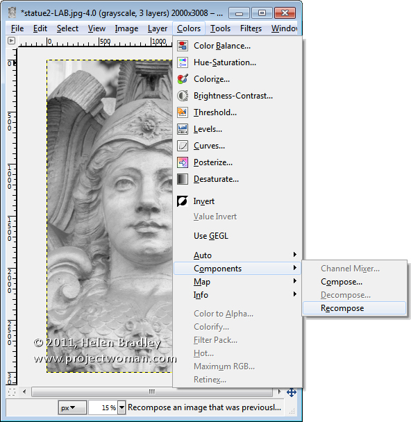
When you’re done, choose Colors > Components > Recompose. The layers will be recomposed back into the original image.

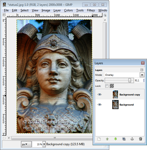
To see it, you will need to close the LAB version and return to your original image. Because you’re working on a duplicate layer, you can now blend the top layer by selecting a different blend mode such as Overlay for the top layer and then adjust down the Opacity to suit.

Helen Bradley

Tuesday, February 7th, 2012

Create a collage in Gimp

One task I perform regularly in Photoshop and Lightroom is to assemble multiple images on a single page for printing.  I love displaying my photos, for example, as triptychs –which are three side by side images.

I’ve posted before on the process in Lightroom here (http://projectwoman.com/2009/07/creating-a-triptych-in-lightroom.html) and here (http://projectwoman.com/2009/10/how-to-select-and-compose-a-triptych-in-lightroom.html)and today I’ll show you how to do this in Gimp using a set of templates I have created for you and that you can download free.

These templates work with both Gimp and Photoshop and you can find them here: http://projectwoman.com/articles/45PhotoshopTemplates.html
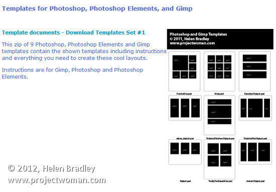
Unzip the files and open the one to use in Gimp along with the images that you want to use. I’m using the Triptych.psd file.
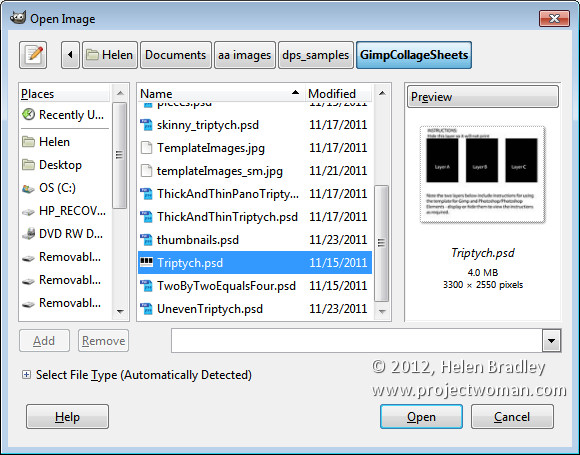
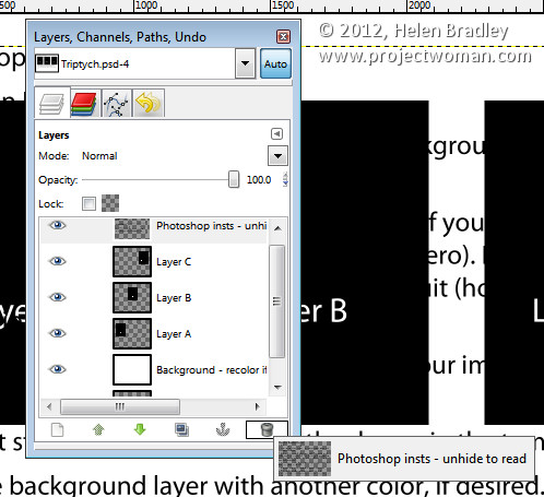
Start by viewing the template you are using and, in the Layers palette select and discard the top three layers which include the instructions for using the template in Gimp and in Photoshop and Photoshop Elements.
Select the first of your images, choose Select > All  and then select > Edit > Copy to copy the image to the clipboard.

In the template click on the layer marked A and choose Edit > Paste as > New Layer. This pastes the image from the clipboard into the layer immediately above layer A.

Click the Move tool (set it to Layer) and drag the image over the top of the shape on the right. If desired, click the Scale tool and scale the image to size it larger than the black rectangle.
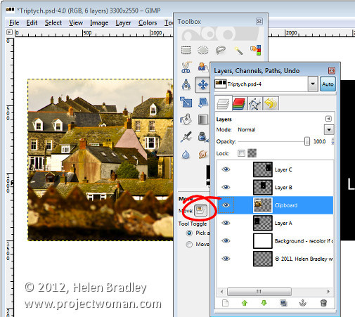
Move the portion of the image that you’re most interested in seeing over the shape.

Now, to crop the image to size, click layer A, right click and choose Alpha to Selection.
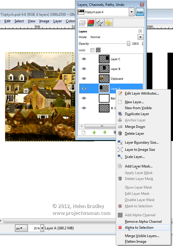
Now select the Clipboard layer that you’ve been working on, choose Select > Invert and press Delete.
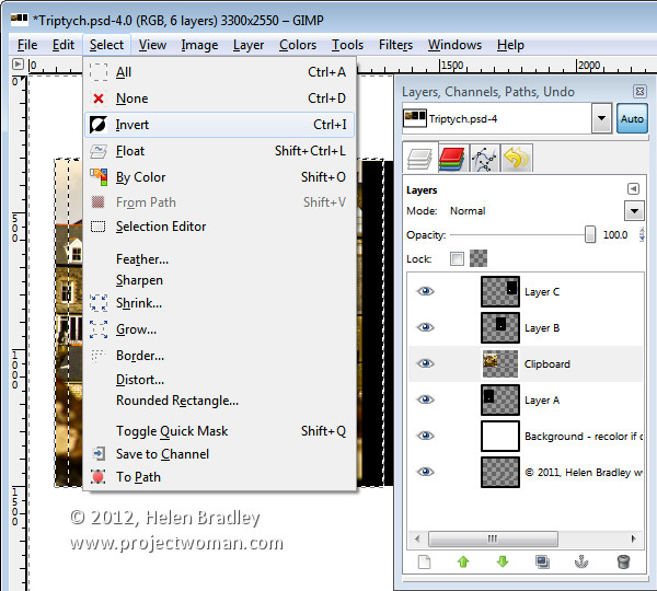
The image will be clipped to size using the template shape as a guide to the size. Choose Select > None before continuing.
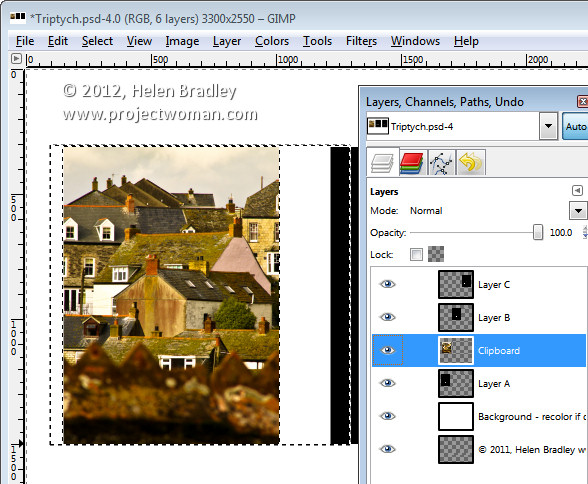
Repeat this process for layers B and C – select and copy the image to use, click the layer you’re working with (B or C) and choose Edit > Paste As > New Layer.

Move the image into position and scale it if desired. When scaling, making sure to lock the width and height so that the image is scaled in proportion.

Right click the layer you’re working with – Layer B (or C) and choose Alpha To Selection. Click your newest clipboard layer and choose Select > Invert and then Delete.

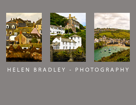
When you are done you should have all 3 images in position.
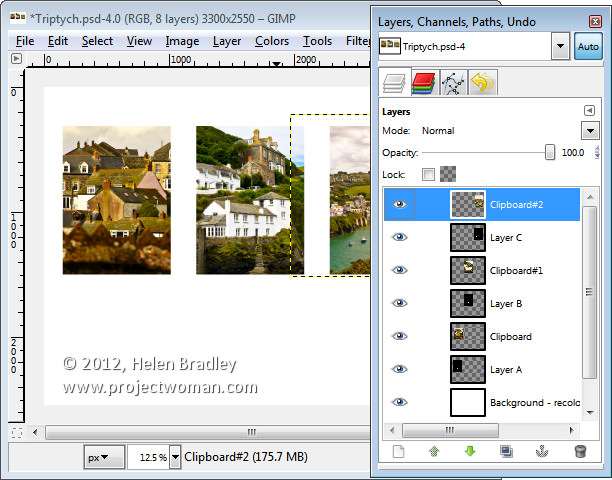
This image has a background layer behind the pictures which currently shows white. If you prefer to add a solid color behind everything, delete this layer and add a new layer filled with your choice of color. Here I’ve added a new dark grey filled layer.
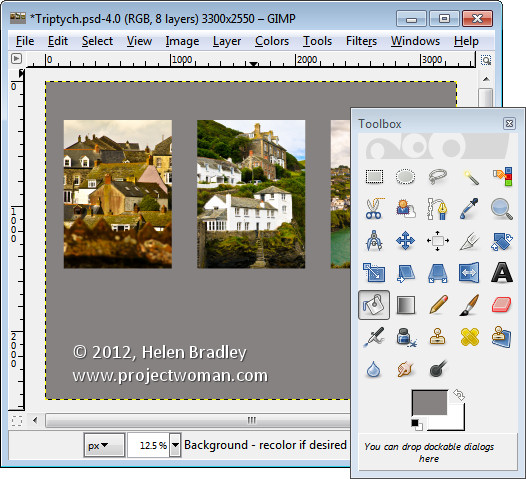
You can finish off the design with some text or simply save the resulting image.

These storyboard templates are a good place to start with your picture layouts. You can find similar templates elsewhere on the web so start with a search for “Free Photoshop Clipping Mask Templates” or “Free Storyboard templates”


Helen Bradley

Tuesday, January 10th, 2012

Pattern fills for your Excel 2007 charts

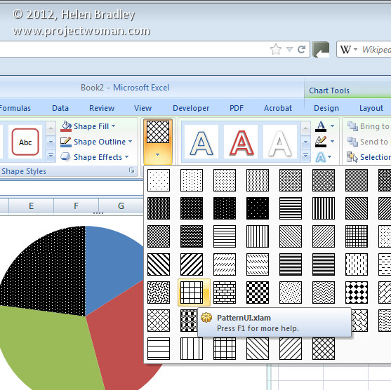
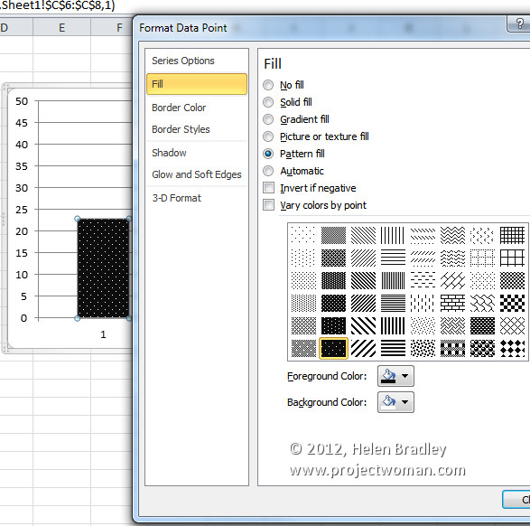
In Excel 2003 and now in Excel 2010 , there are pattern fills which you can use to fill chart bars so your charts print just great in black and white.

Unfortunately the same feature was removed from Excel 2007 – wtf? I have no clue why but it was but it has to be a very silly thing to have done.

If you are using Excel 2007 and you need to use pattern fills with a chart you are out of luck – well not really – you just need to read the rest of this tip because I can tell you how to put the fills back into Excel 2007.

To begin, download this handy add-in: http://officeblogs.net/excel/PatternUI.zip 

Update: This link is no longer live so patternui.zip is not longer available. You can find an add-in here (with instructions which achieves the same thing) courtesy of Andy Pope.

The zip file contains a single file patternUI.xlam which you need to extract and place somewhere you will find it easily and where it won’t get deleted by accident. You could make an Excel add-ins folder for it, for example.

Once you’ve done this, open Excel 2007 and choose the Office button > Excel Options > Add-ins and from the Manage dropdown list, select Excel Add-ins and click Go. This opens the old Add-ins dialog from earlier versions of Excel. Click Browse and locate the .xlam file that you just unzipped and placed somewhere safe. Select it and click Ok. Ensure that the PatternUI option appears in the Add-ins available list and that it is checked and click Ok.

Now create an Excel chart. Once you have you chart, click on the data series to fill with a pattern – if you have a single series plotted then select just one of the columns at a time. Select the Chart Tools > Format tab and notice that you now have an option called Patterns available. Click the Patterns option and select a pattern to apply to the currently selected chart series or column. Click on each series or column in turn and apply a pattern to it. When you are done, you can print your chart as usual.

Installed add-ins are managed automatically by Excel so you will find that the add-in will still be there and accessible next time you use Excel.

If you are using Excel 2010 you don’t need this add-in as the pattern fills are back where they should have been all the time.

Helen Bradley

Monday, January 24th, 2011

Photoshop – Free Valentine heart shapes download

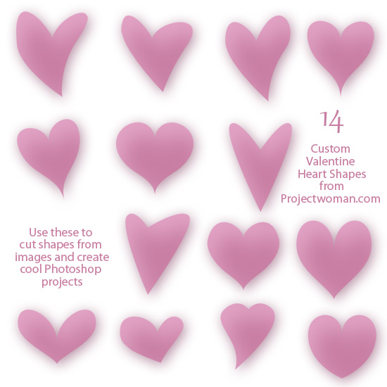
free download 14 valentine heart shapes for photoshop

I’ve been messing around in Photoshop this week making heart shapes. As a result I wrote a blog post to show you how to make these shapes yourself.

Just in case you want to take the easy way out, here is a free download with a collection of 14 hearts just in time for you to use for Valentine’s Day projects.

As with all  my downloads, you are free to use them for non commercial purposes, they may not be given away, they may only be downloaded from this site. Commercial licenses are available by request.

Helen Bradley

Wednesday, January 5th, 2011

Cool Photoshop Textures – free – commercial use

One of the biggest problem designers and graphic artists have is in finding content that can be used commercially. It often seems that even content you pay for you have to jump through hoops to read the fine print to determine what exactly you can do with it and it often  has overly restrictive limits.

Today I found a great site. Great because of a number of things:

1. The content is free.

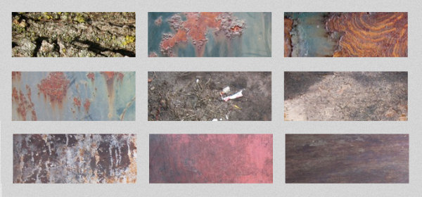
2. The textures are gorgeous and varied and hi-res.

3. You are free to use them for commercial purposes.

4. Attribution is appreciated but not required.

Verbatim, here is the terms of use: “Lost & Taken textures are made freely available for use in both personal and commercial projects including web templates, designs, and other materials intended for distribution. Attribution is appreciated, but not required.”

The textures fall into a  number of categories including: Vintage damask, torn paper, skin, bubbles, wallpaper, book covers, subtle grunge and lots more. Check out the vintage wallpaper ones on the home page they are so totally cool.

To view and download textures head to the Gallery.

Helen Bradley

Tuesday, January 4th, 2011

Microsoft PowerPoint – Free!


If you don’t already own Microsoft PowerPoint 2010, did you know you can download a 30 day trial version for free from Microsoft?

PowerPoint comes bundled with Office 2010 and the entire downloadable trial version of Office is available from the Microsoft web site. If you like what you see, you can purchase the full version later on.

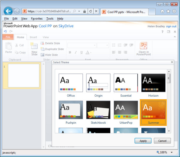
If you like PowerPoint but can’t afford to shell out for the suite, why not settle for a cut down version – free – available online? You can find PowerPoint at www.skydrive.com sign in using a Windows Live ID – if you don’t have one (but you probably will), you can sign up for one here. Then click the Office link at the top of the page and you can choose to create a new PowerPoint presentation online.

The PowerPoint tools are a cut down version of the full PowerPoint program but they are all you need to get a good start on a presentation – you even have access to a range of great looking themes to kick start your presentation.

Better still you can share your PowerPoint presentation with others so they can view it and even edit it online and you can download the finished file to your computer. Of course, your files are stored online too so you can access them any time you like and Microsoft gives you a hefty 25GB of online storage – more than enough to create all the presentations you’re ever likely to need.

Helen Bradley

Thursday, December 30th, 2010

Kawaii Panda Shape – free download

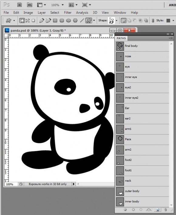
I’ve been messing around today making shapes in Photoshop. This is my final Panda Kawaii shape which I’m offering as a free downloadable shape that you can import into Photoshop and use yourself.

I find shapes are easiest to build up from pieces so I make each piece then build them up bit by bit into the final shape by combining the paths. It’s painstaking work but ultimately rewarding to have a custom shape you can use anytime and scale to any size.

Here is the link to download the shape file – you can use the shape for your own designs but you aren’t permitted to sell the shape or offer it for download from your own site.

Helen Bradley

Page 2 of 212