Sunday, September 15th, 2013

3 Photoshop Filter tips and tricks

Learn three things about using Filters in Photoshop – including how to control the colors used (and why sometimes the colors look horrible), how to combine and reorder filters and how to add them so you have maximum flexibility when using them.

Transcript:

Hello, I’m Helen Bradley.

Welcome to this video tutorial. In this tutorial we’re going to look at three things that you need to know about using filters in Photoshop. In this video I’m going to cover some of the important things that you need to know about filters.

And the first one is that what you have selected as the foreground and background color is critical when you’re using filters. Now I’m going to convert this layer into a Smart Object layer. So I’m going to choose Filter > Convert for Smart Filters and that makes this a Smart Object so that the filters will be editable.

If you’re using Photoshop CS4 or later you’ll want to do this. Now I’m going to choose Filter > Filter Gallery and notice that my foreground and background colors are sort of a lime green a bright pink. And they’re exactly the same colors that are being applied here with this halftone pattern filter.

Now you might come into this filter dialog and take one look at this result and say well this is not for me. Well the reason why it’s probably not for you is that you’ve got selected these foreground and background colors and if you weren’t using those colors then this halftone filter wouldn’t look like this.

Let’s just click Cancel to exit out of here and I’m going to press the D key which sets the default foreground and background color. Now let’s go back into the filter gallery and you can see that the halftone pattern looks very different this time.

It’s black and white. And it’s black and white because of this black and white here. Now again if I exit this dialog and if we switch black and white around and I go back into the filter gallery you’ll see that we’re getting this sort of negative look on our image. Because white is now the foreground color we’re getting the effect of a digital negative with a halftone on it.

So you can see how critical it is that you’re using these colors as black and white with the darker color in the foreground before you go into the filters if you want a sort of standard filter effect. So I’m just going to make this sort of a brown color so that I can use brown and white and I’m going into Filter and then Filter Gallery.

And now we’ve got a brown and white sort of color halftone effect. So that’s the first trick in Photoshop, always make sure that you have the correct foreground and background colors selected. And if things look funky in here then just exit the dialog and start again. Now this is not going to be the case for most of these effects.

The artistic effects for example do not generally rely on those colors the foreground and background color so you’ll probably find that most of these work just fine. For example sponge is working just fine. With brush strokes you might find that the colors are being used but you can always test this to make sure by choosing some really, really bright colors and see if you see these colors in the resulting filter.

If you do see the colors then you can say to yourself well yes these colors are being used by the filter and if I don’t like the effect then I’m going to need to exit this filter gallery and go and do something about it. You can see that the diffuse glow filter is using the background color, the pink that we have selected as a background color. Again, glass knot, ocean ripple knot, all the sketch filters, pretty much all of them use these foreground and background colors.

Chrome is an exception to that but all the others are using it. Water paper is different, again glowing edges will be different. The texture filters probably aren’t going to use these colors but certainly all of these sketch ones are. Now the other thing to be aware of here is that you can add multiple filters.

So for example I’m just going to set up this filter pretty much the way I want it to look on this image. I just probably want the size to be a bit smaller. But having done that to the image I can now click here on this New Effect Layer option and I can add a second effect. So for example I could go and put some sort of painterly effect over the top of this, for example accented edges. And this is accented edges over a halftone pattern filter.

But if I reverse these I may find that the result is quite different and it is in this combination. If I do the halftone first and accented edges second the entire result looks very different. So working these filters out the ones that you want to use and the order in which you want to use them is critical.

To turn a filter off deselect its eyeball here and that just turns its effect off in the image. You can add new effects layers, new filter layers by clicking New Effect Layer and if you to remove an effect layer just click it, for example accented edges, and click the Delete button and it’s now been removed. I’m just going to go back and put accented edges in and click Ok.

Now because of the way I set this up with Smart Filters there’s one option here for the filter gallery. When I open it I can then change both of these filters. It is also possible to create separate filters. So while this object has been created for Smart Filters I’m just going to trash my filters and let’s go back and put them in one at a time.

So first of all I’m going to go in and add my accented edges. So I’m going to remove the halftone filter. So I’m just going to click that and click Ok. And now I’m going to add a second filter. This one’s not going to be accented edges. This is going to be my halftone pattern. And then I’ll click Ok.

You’ll notice that what we’re seeing is pretty much the halftone filter. This is the halftone filter on top and this is the accented edges underneath. Now in this case these two filters can be dragged around inside the layer palette to reverse the order. So I get a bit more flexibility here if I add the filters separately because in this case I can drag to reorder them outside of the filter gallery.

I don’t have to go back into the filter gallery to edit them and I can also disable a filter if I want to by deselecting its eyeball here. So that’s another thing to consider when you’re applying filters to images inside Photoshop. Before we finish up let’s have a look at another reason why I like to add my filters one at a time and then reorder them as required.

At the moment we have green and pink selected as our foreground and background colors but I’m going to press the letter D to change these around so that they’re now the default colors. I have my image selected and I’m going back into the filter gallery. And this time I’m going to choose a different sort of filter effect.

I’m actually going to choose a sketch filter because I want to make use of the black and white. So I’m thinking graphic pen will probably be a good choice here so I’ll just click Ok. And now this is the filter that we’ve just applied and it’s been applied on top of the other filters. Now I can click here to change the blending on this filter and instead of normal I’m going to choose multiple so I get this darkening effect on the image.

But you’ll notice that this filter is using the black and white colors and these other two filters are using the original pink and green. And if I go in and try and edit this filter by double clicking on it you can see that we’re working with the pink and green filter. I’m working on accented edges. Although I’m seeing the halftone dots it’s the accented edges filter that I’m making changes to while I’m in here.

And I can change the edge brightness and the smoothness. I’ll click Ok. And now I want to have a look at the halftone filter and that’s this one here. I’m going to double click on it to open it. This time we’re looking at the halftone pattern filter and any changes that we’re making are to that pattern filter only.

So I’m going to make it a little bit larger size dots and click Ok. And you can see the result in the image. Halftone pattern filter, accented edges filter, both of these were they using a foreground and background color are using the original pink and green because that was the color combination when we applied those filters.

This filter is the brush strokes on the top and it’s black and white because when we applied this filter we were applying it using the then current black and white colors. So you can see that there’s really a lot more to filters in Photoshop than may first meet the eye.

I’m Helen Bradley.

Thank you for joining me for this YouTube video. Look out for more videos on this YouTube channel.

Subscribe to my channel and visit projectwoman.com for more tips, tricks and tutorials on Photoshop, Photoshop Elements, Lightroom, Illustrator and a whole lot more.

Helen Bradley

Saturday, July 13th, 2013

Create a reusable layered image effect in Photoshop

Learn how to create a layered image effect that can be reused any time. The process can be done in most versions of Photoshop and it uses smart objects, simple to create clipping masks and some layer blending. It is pretty easy to create and can be used over and over again.

Transcript:


Hello, I’m Helen Bradley.

Welcome to this video tutorial. In this tutorial I’m going to show you how you can create a quick cut and layer image effect that’s sure to turn any image into something that looks just a little bit more spectacular.

Before we get started with this project let’s look and see what it is that we’re aiming at. Here is my original image and this is the effect we’re going to create. We’re going to create a number of layers or what look like layers of the image and we’re going to blend them together. Now this effect is customizable.

It’s really easy to select one of the shapes and to move it so that everything gets rearranged and it’s also really easy to replace the base image. So let’s get started. And I have a new image to work with here. I’m going to start by converting the image to a Smart Object.

So I’m going to right click the background layer and choose Convert to Smart Object. And now we’re going to start adding our layers of shapes. So I’m going to click to add a new layer. Let’s get my tool bin. I’m going to select the Rectangular Marquee tool. And let’s create a shape. I’m going to create this big rectangle here.

With this layer selected I’m going to make white my foreground color and Alt Backspace, Option Delete to fill the shape with white. Now in each case I need the layer and the image so I need multiples of this pair of image. So I’m going to right click and choose Duplicate Layers and click Ok. Now I’ve got my second shape up here.

I’m just going to turn off my images so that we can see the shapes alone. And I’m going to move this shape out of the way and I’m just going to resize it to a different size shape here. I’m going to select these two layers, right click and duplicate them again. And now I’m going to this top version and I’m going to again alter it a little bit.

You don’t have to alter it. You can leave it exactly the same shape if you want to. Select the two layers, right click, Duplicate Layers, click Ok, again selecting this top one and just moving the shape into position and resizing it to suit. Now that we’ve done this we can start to create the effect.

And what we’re going to do is we’re going to crop these images. So I need one more of this Smart Object layer so I’m just going to duplicate this layer once more and drop it on the top. Now I’m going to create a clipping mask. So with these layers all visible and all selected first of all I’m going to select the topmost layer and I’m going to choose Layer > Create Clipping Mask. And what that does, let’s just have a look, is it clips the top layer to the shape and size of the layer below.

So when we turn these two on and create a clipping mask here, Layer > Create Clipping Mask, we’re going to get a built up effect. Let’s do that again here and create a clipping mask. First of all we need to turn these two layers on and then with the picture layer selected we can choose Layer > Create Clipping Mask or you can do it using the keys.

What I do is hold down Ctrl and Alt, which is Command and Option on the Mac, and just hold my mouse over the intersection between these two layers until I get this icon and then click once. Now I find that a whole lot easier and you may too if you create a lot of clipping masks. It’s really important that the clipping masks are filled with white.

Now in normal circumstances it doesn’t matter too much what you fill your clipping mask layer with but in this case it’s going to because we want to reduce the opacity of the layers a little bit so that we can see some of the background through. And so when we add two layers together, when we overlap two layers, we’re going to get a darkening in the area where they overlap.

So first of all I’m going to adjust the opacity down a little bit and now I’m going to select all of these layers by Ctrl or Command clicking on each of them in turn and set their blend mode to multiply. And what that does is it multiplies the fill layers so that the layers are built up so that we get some overlap between these layers so we can start seeing where they’re overlapped.

And from here you can just tweak the effect to darken or lighten the individual layers as you want to so that you get the effect that you’re looking for. And you can also fill in the background. So we can add a new layer, drag it to the very bottom of the layer stack and then fill it with whatever we like. I’m actually going to sample some of the yellow color from this leaf and with the layer selected I’ll Alt Backspace on the background layer to fill it with that.

But I could also fill it with a gradient. I could do all sorts of things. Now the important thing to know is that once you’ve created this effect it is fully customizable. So it’s very easy to replace this image with another image. All we need to do is to right click the layer, one of these layers that is a Smart Object, any one of them will do, and choose Replace Contents. So now what I’m looking for is an image to replace the contents with.

The image doesn’t have to be in the exact same proportions. We were using a landscape image but these are square images. But they do need to be good size images. So I had a really large image that I was working with so I want this image to be nice and big. And this one is 3,100 pixels so it’s pretty big. So I’ll select it and click Place and when I do it’s replacing the original image.

And I may want to adjust the opacity of these so that I get the effect that I’m looking for. For example, I mightn’t get enough of a layering effect without adjusting the opacity. And I may also want to adjust the background of this image to give it a darker background in these circumstances.

But it’s very easy to just reuse all of the basic work that you’ve done with this image and just replace it with another image. So I’m just sampling a color to use, Alt Backspace to fill the background. And there we have our effect. You could also use a color for these clipping mask layers but be aware that any color that you use is going to come through the images.

So let’s just make black our foreground color. Let’s just target this particular layer here and I’m going to Alt Backspace to fill it with black. Well you can see that the multiply effect has totally blackened that out. But if I use a sort of fairly light color here, well this is sort of a pale blue, but you’ll get the same effect, and fill it here you’ll see that we get a slightly darker look.

So we can darken this and have an effect on the image. The darker the color we use we’re going to not only see the color itself or example if we use pink we’re going to see the color through the image but we’re also going to darken up the effect.

Now it would be possible for example to choose different colors. So I’ve got some pastel colors that I’m filling these with. Let’s go for a sort of pastel blue here. And you can see the effect that it’s having, well I chose the wrong layer there. Let’s just undo that. Let’s go to this one and actually select the layer and fill it with a pastel blue.

So you could do that as well. And of course any time you choose to replace the image these color layers are going to stay in place so that you’ll get the effect on the new image that you’re replacing this one with. So there’s plenty of creative possibilities here in creating a layer image effect in Photoshop.

I’m Helen Bradley.

Thank you for joining me for this video tutorial. Subscribe to my YouTube channel so you’ll be advised when new videos are released.

And visit my website at projectwoman.com for more tips, tricks and tutorials on Photoshop, Lightroom, Illustrator, Photoshop Elements and a whole lot more.
Helen Bradley

Tuesday, November 20th, 2012

Photoshop – Understanding Smart Objects

Smart Objects are a great tool for working with images in Photoshop but did you know there are two ways to make copies of them. One way you duplicate the Smart Object so every instance of it will always be the same image and the other way you copy the Smart Object but unlink it so you can change out one image without changing the other.

Also make sure to watch my video on Smart Objects here.

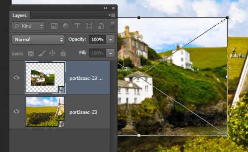
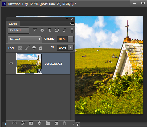
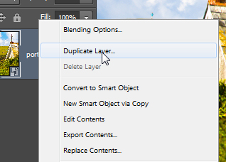
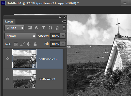
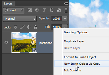
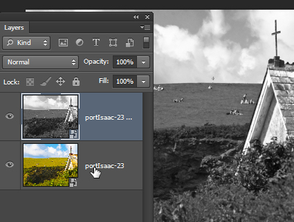
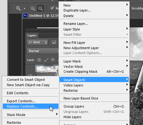
Here’s how it works: Start with a new Photoshop document and add an image as a Smart Object – my favorite way to do this is to choose File > Place and place the image inside the file.  This gives you one image as a Smart Object in the Layers palette. Now, the first way to duplicate a Smart Object is to right click and choose Duplicate Layer. This makes an exact copy of the layer so anything you do with the Smart Object on this layer will be done to both layers. Here I double clicked on one of the layer thumbnails and opened the actual image on that layer. I converted it to black and white then closed and saved it and this is what I have now in Photoshop. The two Smart Object layers are both changed. The alternative is to right click the Smart Object layer and choose New Smart Object via Copy. You get the same result as the earlier option with one exception – the two images are separate and they can be altered individually. Here I did the same alteration as before, only this time the image on the top layer is changed an not the one on the bottom layer. If desired you can change the image on the layer. To do this, click the layer to select it and choose Layer > Smart Objects > Replace Contents. Locate a different image to use, click it and click Place. Here I have resized the placed image so you can see they are different. If I had done this with the Duplicate layer then both images would be replaced. Which of these options you use really depends on what you want to do with the image. Sometimes  you want two of the same image, sometimes not.

Helen Bradley

Monday, November 19th, 2012

Photoshop Smart Objects

Learn how to link Smart Objects so, when one changes, they both change and how to un-sync them so they are separate. I’ll also show you how to replace the contents of a Smart Object with another image. Useful for wedding photographers and for creating albums in Photoshop.

Transcript:

Hello, I’m Helen Bradley. Welcome to this video tutorial. In this tutorial I’m going to show you how to work with smart objects in Photoshop. In this video I’m going to show you how you can use smart objects to assemble complex images, and you can do it in a way that harnesses the value of the smart objects. For example, I’m going to create a smart object for this background and then a smart object for this couple. This will allow me to go to this smart object and choose Replace Image. This will allow me to go to this smart object layer, right click and choose Replace Contents. And I can then replace the contents of that smart object with any of the images from that album. And so I can quickly and easily create images for an album with a background in place. But there is a catch and you’ll want to use the right tool for creating these smart objects so I’m going to show you that too.

Let’s just hide this away and let’s go and get our starter document. I’ve already got a vignette that I’m going to use, but we’re going to put in here the original background. So I’m going to choose File and then Place because that’s a way of getting an image in as a smart object. Here’s the portion of this image that I want to use as my background. I’ve already extracted it as a separate image so I’m going to click Place. And I know that this needs to be enlarged a little bit so I’m just going to enlarge it to 75 percent and then click the checkmark. So it’s now in place and it’s a smart object. It has a special little smart object icon. And I’m just going to show you that you have this vignette which is separate and it just goes over the top.

Now we want to create another smart object, but we want this smart object to be unhooked or unlinked to this one. So I’m going to right click and I’m going to choose New, Smart Object via Copy. And what that does is makes a copy of the existing smart object as a separate layer,  but it is not linked to the original layer. So now if I go into this and resize it, I’m just going to link these two together, this gives us a new smart object layer in the image which is not linked to the background layer although the two share the current image. I’m just going to add a drop shadow to it. So if we were creating a bridal album we could use this as the starting point for our album. I’m just going to get a slightly nicer drop shadow here and pull that vignette down so that it’s over the top of the background and not the image here. So having created this, this could be the first image in our album. And we can then go ahead using the same background image and just change the smart object out without having to recreate this document, right click, choose Replace Contents.

This time I’m going for an image of the bride and groom, and here they are in place. They’re a little large so I’m just going to choose the transform tool with Ctrl or Command T. I know they need to be taken down to about 10 percent so I’m going to scale them down to 10 percent and just move them into position. You can see that the drop shadow is still in place, the background is still in place, the vignette is still in place, and we’ve got another page of our album already created. If I right click and choose Replace Contents I can go and select yet another image to go in here. And again, the border and everything are already on that image. So it gives me a smart way of creating an album very quickly.

I’m just going to discard that for now and let’s have a look at what you might want to use and which would be a bad choice in this situation. And that would be to right click and choose Duplicate Layer. Now that would give us on the face of it exactly what we had before, a smart object with a second smart object layer over the top. Let’s just go ahead and select that and let’s add our drop shadow to it. Let’s position it where we want it to be above the vignette. And here’s what we had, an image over the background. And we’re ready to print that out.

But look what happens if we go to replace the contents of this image with our bride and groom. Not only do we replace the contents of the image with our bride and groom, and we can scale them back down to the 10 percent size that we were using before, but let’s just link that so that it’s going to be 10 percent in both directions. But look what’s happened to our background. These two smart objects instead of just being a duplicate of each other are in actual fact an exact copy of each other. And so anything that happens to this background smart object is also going to happen to this one and vice versa. If we change this one we’re going to change this one. So if we want the ability to create a smart object from another one but to unlink it so that they’re no longer the same image each time, we need to right click and choose New Smart Object via Copy.

But if we do want two smart objects that are linked and they’re always going to be the same image even if they’re different sizes of the same image then we would simply use Duplicate Layer. Smart objects are a really good tool to use when you’re assembling an album like this because it gives you the ability to create a background image and a smaller image on top and to easily replace that image and create an album very quickly.

I’m Helen Bradley. Thank you for joining me for this YouTube video tutorial. If you liked the tutorial please like it and feel free to add comments to the video tutorial. I encourage you to subscribe to my video YouTube channel. We release videos twice a week at the very least and you’ll be alerted to the new video releases. And don’t forget to visit my website at projectwoman.com. There you’ll find more tips, tricks and techniques for Photoshop, Lightroom, Illustrator and lots of other programs.

Helen Bradley

Sunday, November 11th, 2012

Smart Objects and Strokes in Photoshop

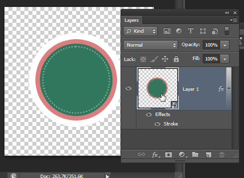
One relatively unknown benefit of Smart Objects in Photoshop is the ability to use it to apply multiple strokes to an image. You can’t do this with Layer Styles on their own but you can do it with Smart Objects.

Here’s how to do this.

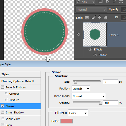
First add a Stroke Layer Style to your layer.

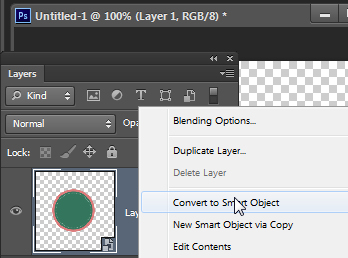
You can’t add a second stroke but you can convert the object to be a Smart Object. To do this, right click and choose Convert to Smart Object.

Now click the Smart Object layer and go ahead and add a new stroke to it. It all remains fully editable and you get multiple strokes – or multiple “anything” you want in Photoshop.

Helen Bradley

Wednesday, February 8th, 2012

More Flexible Lightroom to Photoshop editing

If you work in Lightroom, at some stage you’ll probably want to take an image to Photoshop for some additional processing. How you send it to Photoshop will have an impact on the options available to you. One option in Lightroom is to take an image to Photoshop as a Smart Object and that has some advantages. Here’s how to do it and why you might consider using this feature.

Open as a Smart Object

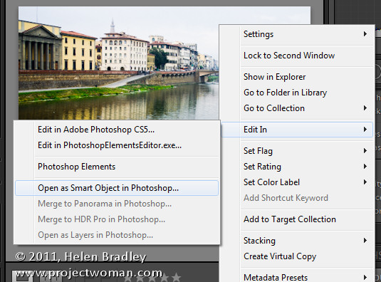
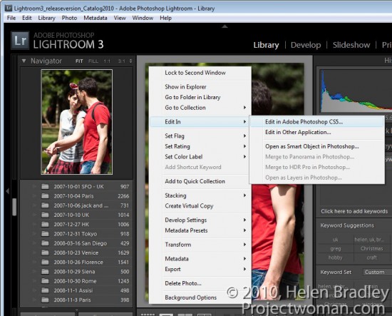
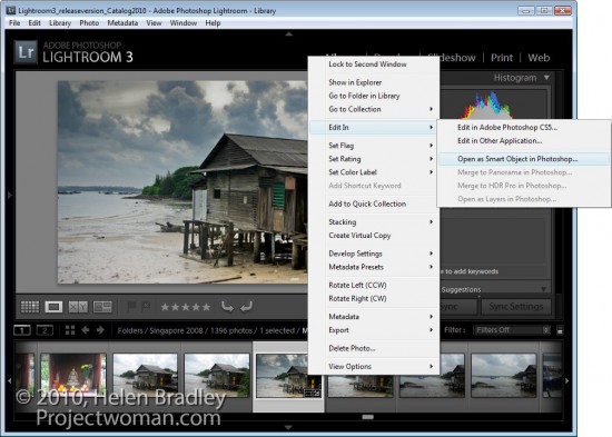
In Lightroom, when you’ve finished processing the image and you’re ready to head to Photoshop, right click the image and choose Edit in > Open as Smart Object in Photoshop (this is available if you’re using Photoshop CS5, CS4 or CS3 – Smart Objects weren’t available in earlier versions of Photoshop).

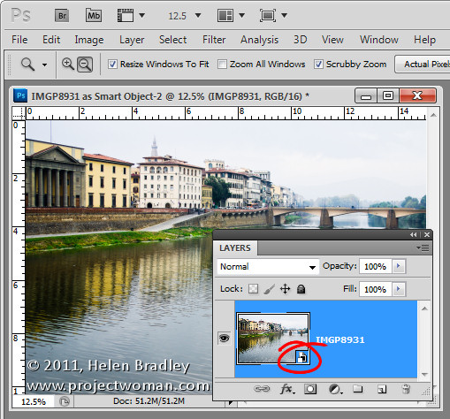
Photoshop will open with your image open on the screen. If you look at the Layers palette you’ll see the layer has an icon in the bottom right corner of its thumbnail. This tells you the image is a Smart Object.

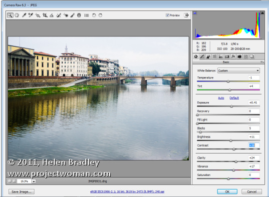
If you want to make further adjustments to the image you don’t have to start over. Instead, double click the image thumbnail in the Layers palette and the image will open in Adobe Camera RAW (ACR). The processing options in ACR are the same as you have in Lightroom so you can change how the image is processed.

When you are done making changes, click Ok. The changes to the image will appear in the Smart Object back in Photoshop.

Double processing

The obvious advantage of opening an image in Photoshop as a Smart Object is being able to make changes to the image even after it has been brought into Photoshop and even after you have made changes to it – such as adding an Adjustment Layer, for example.

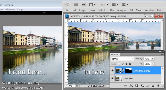
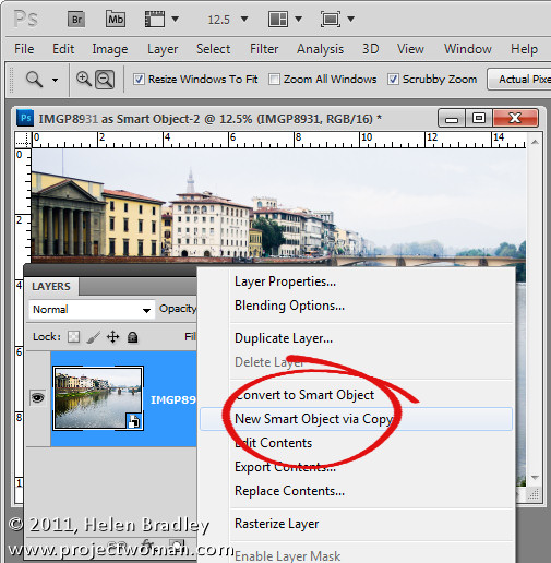
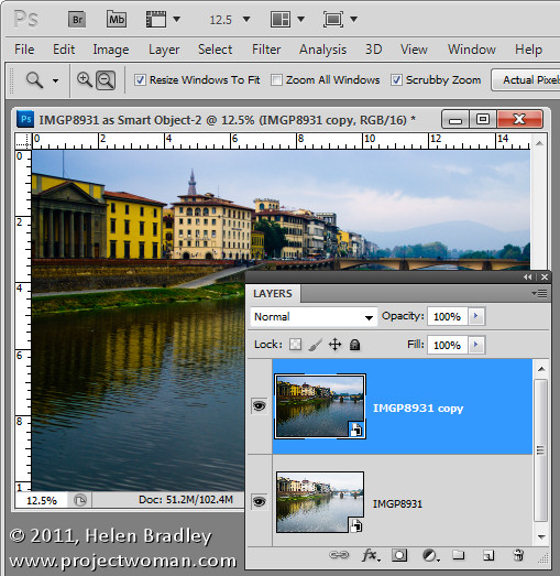
In addition you can use this feature to process an image in more than one way and to blend the two versions together. To do this, right click on the smart object layer and choose New Smart Object via Copy. This creates a copy of the smart object layer.

Double click on the thumbnail of this second Smart Object to open it in ACR and now process it a second time to bring out detail in another part of the image. In this case I adjusted to get a better sky. When you’re done click Ok to return to Photoshop.

The changes have been applied to only the second copy of the image and not the first so there is a different version of the image in each layer.

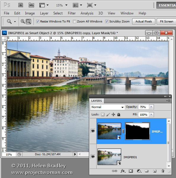
To blend the two layers together add a Layer Mask to the topmost layer – to do this, select the layer and click the Add Layer Mask icon at the foot of the Layers palette. Target the mask by clicking its thumbnail in the Layers palette and paint on the image with black to bring back detail in the layer below.

If any of the layers still needs fine tuning, return it to ACR to fix it.

Because the two versions of the image are on separate layers you can blend those two layers together using a blend mode or adjust the Opacity of the top layer.

When you are done, click Save to save the file, close it and return to Lightroom. Your edited version of the image will be saved in the same location as the original image and will appear in Lightroom too.

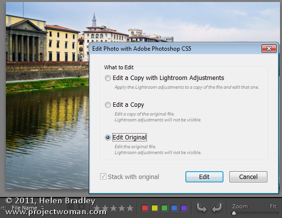
If  you want to edit this image again at a later date and have the Smart Objects still in place, when you right click the image and choose Edit In > Adobe Photoshop CS5 (or CS4 or CS3), choose Edit Original.

Taking your images to Photoshop as Smart Objects gives you additional tools for working with your images in Photoshop – it’s a handy technique to add to your Lightroom/Photoshop toolkit.

Helen Bradley

Friday, October 7th, 2011

Round tripping with Lightroom

One of the most confusing things for new Lightroom users is understanding how documents get round tripped from Lightroom to Photoshop and back.

Step 1
To start, open Lightroom with the image displayed in the Develop, Library, Slideshow or Web modules. Right click the image and choose Edit In > Adobe Photoshop.

If you chose a raw file then the image is sent direct to Photoshop.

Step 2
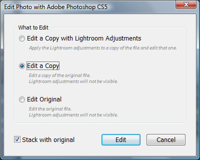
If you chose a jpg or tiff file, then other options are available. You can choose Edit a Copy, Edit Original or to Edit a Copy with Lightroom Adjustments. If you want to take the changes that you’ve made to the image in Lightroom with you to Photoshop, then use the Edit a Copy with Lightroom Adjustments option.

This is exactly what happens if you are working with a raw image – you don’t see the dialog – and the image is sent direct to Photoshop with the Lightroom adjustments in place.

Edit Original ignores any changes that you have made in Lightroom and sends the unedited original image to Photoshop.

Edit a Copy sends the image direct to Photoshop ignoring any changes you’ve made to the image in Lightroom but at the same time it creates a copy of the image so you won’t be editing your original.

Step 3
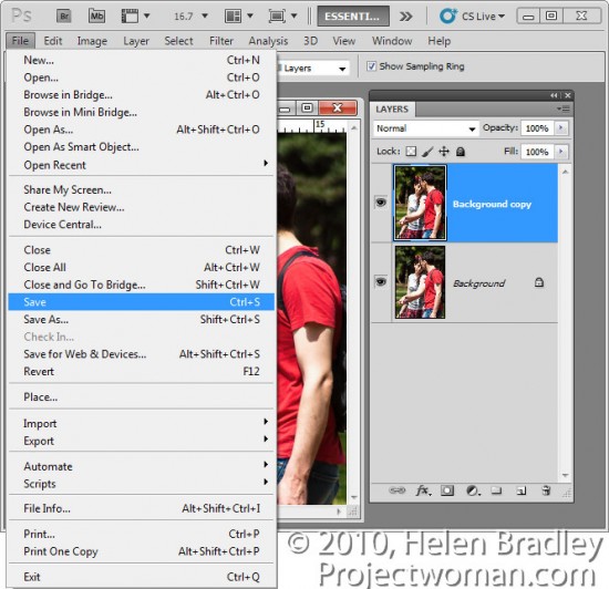
When you’ve finished editing the image in Photoshop, click File > Save to save the image.

The one thing you should avoid when saving a photo that you have taken from Lightroom to Photoshop is to rename it when you save it. If you rename an image by choosing File > Save As then the link between the image in Lightroom and Photoshop won’t be retained and the edited saved version won’t appear in Lightroom catalog. To get the image back into Lightroom you have to find it and then import it into the catalog. This is typically the step where new Lightroom users fall foul of the process and get understandably frustrated.

Step 4
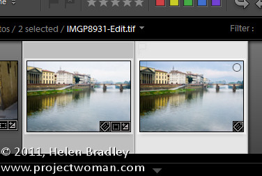
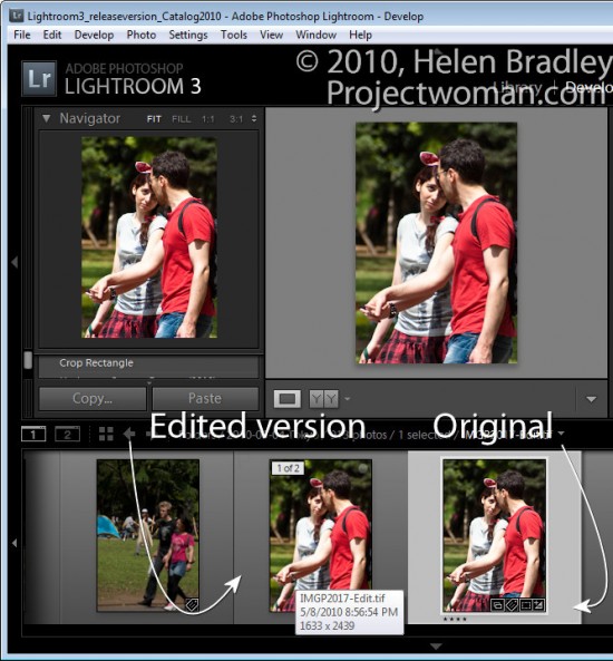
When you return to Lightroom, if you were editing a raw file or if you chose to Edit a Copy, you will find your original file and the edited version in place in the Lightroom catalog. The edited version of the file is stored in the same folder as the original.

The edited version has the same file name as the original but with -edit added to it. In the case of a raw file, the edited version will be saved by default as a tiff file.

If you chose Edit Original then only the original file with its edits will appear in Lightroom.

Step 5
If you wish to do so, you can send also send an image to Photoshop as a Smart Object by right clicking it in Lightroom, choose Edit In > Open as Smart Object in Photoshop.

This opens the document in Photoshop with the image on a layer converted automatically to a Smart Object. You can do this for tiff, raw and jpg images.

When you save the file it is saved as a tiff with –edit added to the filename – the tiff file format supports Photoshop Smart Objects so the Smart Object will be there when you edit the file again.

Step 6
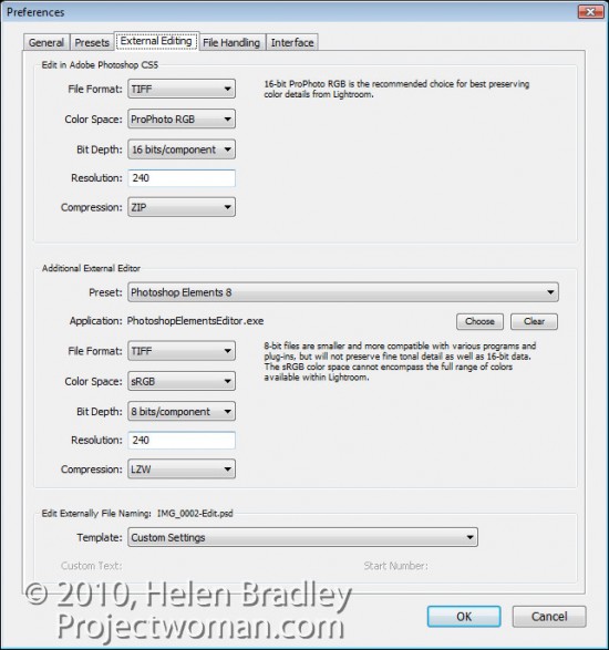
You can determine how Lightroom sends files to Photoshop by choosing Edit > Preferences and click the External Editing tab. Here you can select the file format to be used, the color space that will be applied to the image, the bit depth, resolution and any compression available for the chosen file format.

From the foot of the dialog you can also configure the file naming convention used for files sent from Lightroom to Photoshop. By default, it will be the original file name with –Edit attached to it, although you can change this if desired.

Here too you can add other programs to the shortcut menu so you can take your images from Lightroom direct to programs such as Photoshop Elements or your favorite editor.

Helen Bradley