Thursday, March 11th, 2010

Photoshop – Copy and Invert Masks

Photoshop copy and invert a mask

This is totally cool. I was playing around in Photoshop the other night and needed to duplicate a mask and then invert it. I remember that you can copy a mask using two fingers and the mouse button so that means it’s some combination of the Control, Alt and Shift keys – that’s all you really need to remember – the rest is experimentation.

Well, I did the two finger drag using Shift and Alt and this must be a keystroke combination I haven’t used before because lo and behold! it not only copies the mask but it inverts it too!

So, to copy a mask, drag it using Control + Alt (Command + Option on the Mac). To copy and invert the mask, Shift + Alt (Shift + Option on the Mac).

Helen Bradley

Friday, January 8th, 2010

Video! Painting with the Art History Brush in Photoshop

Here is a new video on painting with the Art History Brush in Photoshop:

A video on how to paint a photo using the Photoshop Art History Brush.

Helen Bradley

Wednesday, December 23rd, 2009

Photoshop – Making Steampunk gears

I’m very much into steampunk and creating steampunk gears and brushes. Here’s a simple way to create a gear using a Photoshop shape.
Step 1
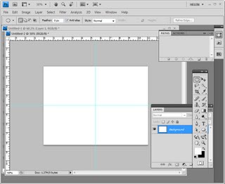
Create a new document and add two guides using the rulers by selecting View > Rulers and then drag a horizontal and a vertical guide from the ruler lines into the middle of the image. These guides make it easier to line everything up. Add a new layer and select it so you aren’t working on the background layer.Step 2
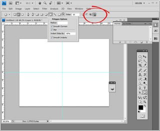
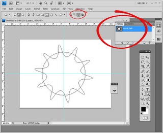
Select the polygon tool. Select the down-pointing arrow next to the shape options and set Smooth Corners, Star, Indent Sides by 65% , Smooth Indents and set the Sides value to 10. Make sure at the far right of the tool options bar you have Exclude Overlapping Path Areas selected.
Step 3
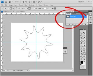
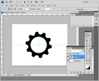
Hold the Shift key, click and drag over the intersection of the gridlines and drag outwards to create the star shape. Check the Paths palette to make sure that you have a white shape in the middle of the image. If not, stop and start over again. Step 4
Now with the Subtract From Path Area Option selected on the tool options bar, select the Ellipse shape tool, hold the mouse pointer over the intersection of the gridlines and start drawing. Add the Alt key (Option key on the Mac) to center the circle over the shape.

Drag the shape across the star shape so that it intersects each of the star points. Let go the mouse pointer, then let go the Alt and Shift keys.

Check the paths palette to ensure that you still have a sort of circular white shape in the middle of the image. If not, you will need to undo this last step and start over.
Step 5
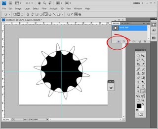
Select black as the foreground color and in the bottom of the paths palette, select the Fill Path With Foreground Color option. You should now have a gear shape filled selection.
Step 6
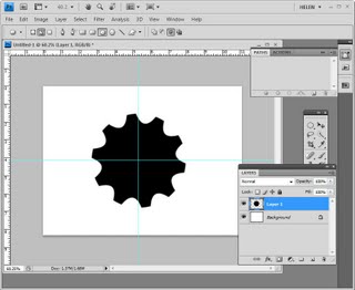
Delete the Working Path by dragging and dropping it on the trashcan icon in the Paths palette.
Step 7
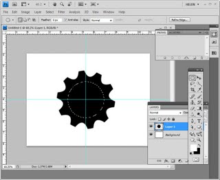
Return to the Layers palette and select the layer that you’re working on. Select the Elliptical Marquee Tool and holding the Shift key, click and drag from the intersection of the gridlines outwards. Before letting go of the mouse button, add the Alt or Option key so that the shape is centered inside the gear shape. Position and size the circle inside the gear as this will be the middle hole. When you have what you want, let go the mouse button and then release the Alt (Option) and Shift keys.Step 8
Press the Delete key to delete the contents of this layer. As you’re working on a separate layer, this will make a hole through the image to reveal the background layer underneath.

Select Ctrl (or Command) + D to remove the marquee and choose View > Clear Guides to remove the guides. Step 9
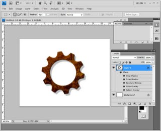
You now have a shape that you can make a brush from or add layer styles to make it look more like a gear.

Helen Bradley

Saturday, December 19th, 2009

Photoshop: Quick and easy tourist removal

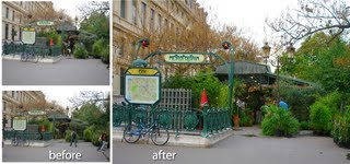
Being a tourist would be more fun if there weren’t thousands of other tourists getting between you and the shot you want to capture.

When you are visiting a popular location and if you have difficulty getting a photo that is free of people, take two (or more) photos making sure that somewhere in each you have a good clean portion of the sight you are interested in photographing.

On your return you can assemble the images in Photoshop and create one good, tourist free image.

Here’s how to do this with two images. This process relies on a feature called Auto-Align Layers which was first introduced in Photoshop CS3. If you have an earlier version of Photoshop you can manually align the layers but Photoshop won’t do it automatically for you as shown here.

Step 1

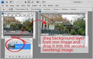
Open both images in Photoshop and drag the background layer from one into the other image so you have two different layers in one image. This will be your working image – you can close the other one as you no longer need it.

Step 2

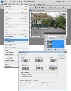
Select both layers in the Layers palette by clicking on one and then Shift + Click on the second. Choose Edit > Auto-Align Layers, click Auto and click Ok.

This feature automatically aligns the layers relative to each other. (You may not have noticed this tool before – it’s on the Edit menu when logic would suggest it should be on the Layers menu.).

Step 3

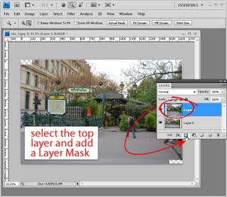
Select the topmost layer in the image and add a mask to it by selecting the Add Layer Mask icon at the foot of the layers palette.

Step 4

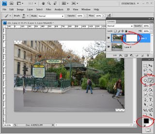
Set black as the foreground color, select a round soft edge brush and click on the mask icon in the layers palette so it is selected.

Step 5

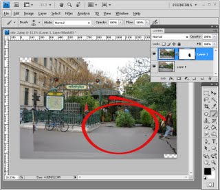
Paint over the person or other thing in the top layer that you want to remove. Painting in black on a mask reveals the layer underneath so you should see the image underneath through this one. (If you need to paint back in some of the image, switch to white foreground color and paint on the mask in white).

Step 6
When you’re done you can merge the layers (Layers > Merge Visible). If you still have other tourists to remove, return to step 1 and continue with another of the images you captured.

If you are done, crop the image and apply any required fixes to the image before saving it.

Helen Bradley

Friday, December 11th, 2009

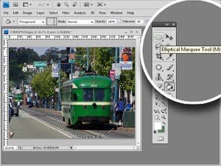
Five secrets of the marquee tools

There are two key marquee selection tools in Photoshop: the rectangular and elliptical marquee tools and they share a toolbar position. Here are some things you may not know about these tools.

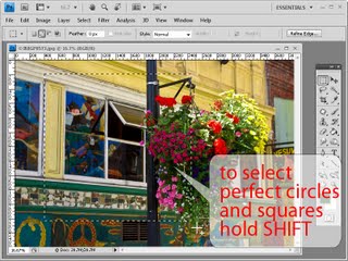
1 Squares and circles


The rectangular and elliptical marquee tools can be used to draw perfect squares and circles. When you click and drag the marquee, hold the Shift key to constrain the shape to a circle or square.

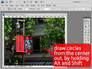
2 A circle is a square? No thank you!


Try and draw a circle or ellipse in a fixed position on an image and you may be confused about just where the shape starts. A circle or ellipse is drawn as if it were placed inside a square or rectangle shape so you start drawing the shape from a corner of its square or rectangular container. All this makes it very hard to position a shape accurately. To make things easier you can draw your shapes from the center outwards by holding the Alt key (Option on the Mac), as you drag on the marquee tool. Add the Shift key to constrain the ellipsis to a circle.

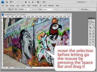
3 Right shape, wrong place?

What do you do when you’ve drawn a perfect shape but in the wrong place on the image? Don’t let go the mouse! Instead, hold the Spacebar and you can now move the shape into the desired position. Let go the Spacebar and then let go the left mouse button fix the marquee in position.

4 Right shape, wrong rotation?


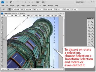
When you want to create a rotated shape such as a rectangle, square or ellipse, first create your shape using the marquee tool and ignore the rotation issue. Now let go the mouse button and choose Select > Transform Selection. The shape now shows a set of transform handles that you can use to rotate it. Hold the Ctrl key (Command on the Mac) and you can drag on a corner of the shape to distort it. Press Enter or Return to commit the transformation and remove the handles. You can now continue to work with the marquee selection.

5 Exact size selection


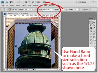
If you want to make a selection that is an exact size, from the Style dropdown list choose Fixed Size. Type the pixel width and height into the boxes and click on the image and a selection exactly the desired size will appear on it. Use Fixed Ratio to make a selection at a fixed ratio like 1:1 shown here.

Next time you need to make a selection on an image using the marquee tool remember that there’s a lot more to it than might meet the eye.

Helen Bradley

Tuesday, December 8th, 2009

Photoshop image framing template

I love things that look good and which are simple to use and this custom framing technique is one of them. Here’s how it is done:

Step 1
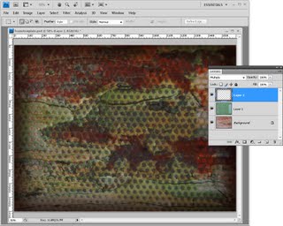
Open an image to use as a template background. Here I’ve stacked two texture photos on top of each other and blended them with the Color Burn blend mode. I then added another layer with a brown blurred edge to give the design a vignette effect.

Step 2
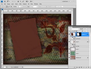
Next create a new layer on the image and make a selection on it for the photo. Fill the selection with a solid colour. You can, if desired, add a grunge layer mask to this layer as I have done – I used a grunge edge from Graphic Authority and added a blended flower for decoration. I think the Graphics Authority grunge effects totally rock.

Step 3
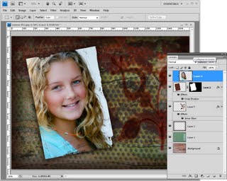
Open the photo to frame with this design and drag its background layer into your template design. Rotate the image to match the rotation of the shape on the layer below and drag it on top of that shape. Choose Layer > Create Clipping Mask to mask the image to the shape below.

Once it is made, you can reuse this template by simply replacing the image layer.

Helen Bradley

Monday, November 2nd, 2009

Changing color in Photoshop

Sometimes in post production you will want to change the colors of an object in your photos. Photoshop has a number of tools that you can use to change the color in an image, and in this post I’ll show you some of these which you can use without having to make a selection on the image.

Before I begin, a word about the photographs I’m using. They were shot by Jacinta Oaten, a 15 year old Australian sports photographer with a promising career ahead of her as you can see. Jacinta kindly let me browse her photo collection to select some images to use for this post – thanks Jacinta!

Color Replacement Tool
On the Photoshop toolbar sharing a position with the Brush tool is the Color Replacement tool. For this tool you’ll need to select the color that you want to paint with and then click and paint over the image.
The tool reads the color immediately under the cursor as you start painting and looks for similar colors to paint over. This allows you to paint somewhat outside the lines and still replace only the color that you want to replace.

Using the Tool Options you can set the Tolerance to so, for example, if you are recoloring an area that is a fairly solid color, you can use a low tolerance to isolate the color. On the other hand if you’re recoloring an area where there is quite a bit of variety in the color because of shadows or texture, for example, you can increase the tolerance to recolor a wider range of colors similar to those under the cursor.

As you paint, you can let go the mouse button and click again somewhere else to change the sampled color so you can replace a different shade of that color, for example.

This tool is handy for detailed work as it allows you to resample and paint a number of times so that you can get in around certain areas avoiding other areas if you don’t want to paint over them.

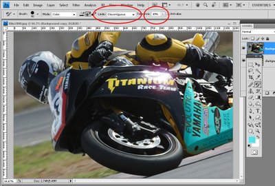
The options with this tool include the Limits option which allows you to specify whether only areas of color contiguous to those under the sampling point of the brush are altered or if all matching areas under the brush are painted over. The Find Edges option attempts to preserve edge detail as you paint. Here I used Discontiguous to ensure the yellow inside the advertiser’s names on the bike was changed too.
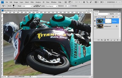
The Color Replacement Tool must be used on a layer that has colored pixels in it so it’s best to duplicate the background layer and work on the duplicate layer. Then, if you make a mistake you can mask out the changes that you’ve made to the duplicate later to recover detail from the image layer underneath.

Selective Color
The Selective Color tool lets you adjust the colors in the image by selecting which colors to adjust and then adding more or less of another color to them. To use it, select Layer > New Adjustment Layer > Selective Color. Using it as an adjustment layer fix lets you later remove the recoloring from any part of the image by painting on the adjustment layer mask.
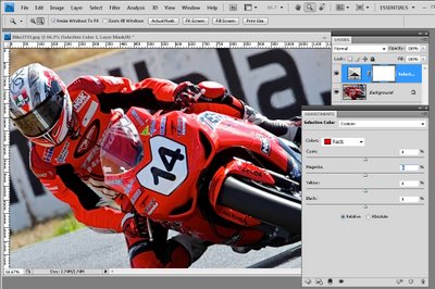
In the dialog you can select the color to alter from the Colors dropdown list. In this image I wanted to change the Reds so they are selected.

The color sliders below this show Cyan, Magenta, Yellow and Black. It helps to understand these colors and their opposites; Cyan is opposite Red, Magenta is opposite Green and Yellow is opposite Blue.

So, for example, if you drag the magenta slider to the right, you will add magenta to the image but if you drag it to the left, you will add green – its opposite. The other sliders work in the same way.
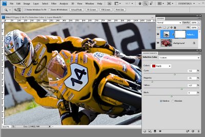
This tool works well when you have an image such as this one where most of the color that you want to change (the reds) only appear in the area that you want to change and not elsewhere in the image. To change the color, drag the sliders to add more of the colors you want to add and to remove the opposite color.
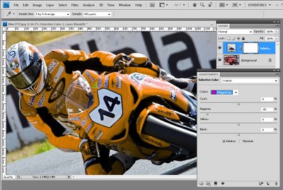
Sometimes multiple colors contribute the color to the image so here I’ve knocked out some of the pink tones in the bike windscreen by adjusting the Magenta color too.

Replace Color
Another tool that you can use to change color is the Replace Color tool. To see this tool at work, select Image > Adjustments > Replace Color. This tool must be applied as an adjustment and cannot be used as an adjustment layer so, again, apply it to a duplicate of the background layer.
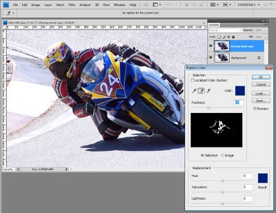
With this tool you click on an area in the image that you want to change the color of. Click the Add to Sample eyedropper and then click to select more of the color to change.

You’ll need to click on all the colors in the image that represent the color that you need to alter. You can test the result by dragging on the Hue slider at the foot of the dialog to see if the selection is accurate and that the color change is affecting the area you want to affect.

The Fuzziness slider lets you add more or less adjacent pixels to the fix – use it to obtain a smoother change from one color to the next. When you’re done, click Ok. Use the Saturation and Lightness sliders to tweak the effect.

The Localized Color Clusters checkbox can help refine the color selection so it’s worth testing to see if it makes a difference. Here it isolated the selected colors and removed a problem that I had with the number and the silver metal of the bike being recolored where it shouldn’t have been.
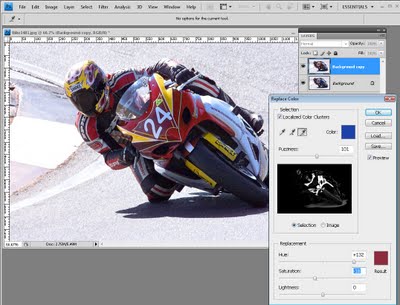
When you apply this fix to a duplicate of the original image layer you can add a layer mask to the top layer and use it to mask out any areas that are affected by the recoloring which should not be affected.

Choosing the right tool for the job
There are just some of the tools you can use to recolor an image. You will find one may work better than another depending on the image you are working on so experiment to see what works best for you.

Helen Bradley

Monday, October 19th, 2009

Photoshop: Enhancing midtones


If you’re a Photoshop and Lightroom user you may, like me, love the Clarity adjustment in Lightroom and wish it were available in Photoshop too. The Clarity slider lets you adjust the contrast in the midtones of an image which gives an over all sharpening and color boost to the image midtones.

As yet, there is no Clarity tool in Photoshop (although there is one in Camera RAW). There is, however, a technique which has been popularized by Mac Holbert which does a similar thing. While the Photoshop technique is more cumbersome than using the Clarity slider in Lightroom it does work very well and gives very similar results.

Once you’ve performed the fix a couple of times you may want to create this as an Action so that you can run it on your images at any time you need to do boost the midtones.


Step 1
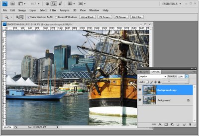
For an already flattened image, duplicate the background layer by right clicking it and choose Duplicate Layer.

For an image that already has multiple layers, click the topmost layer and press Ctrl + Alt + Shift + E to create a merged layer to work on.


Step 2
In the layers palette set the Blend Mode of this new top layer to Overlay and set its Opacity to somewhere around 20 to 25 percent.


Step 3
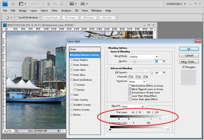
Select the Add a Layer Style button at the foot of the Layers palette and choose Blending Options.

In the Blend If section of the dialog, locate the This Layer slider. Drag the indicators under the slider in to approximately one-third of the width of this slider so you’re dividing it into thirds.

Hold the Alt key (Option on the Mac) to divide each slider into two pieces and position the outside halves at approximately the 1/6th mark, use the image as a guide.

The positioning of the sliders does not have to be exact. All you’re doing here is removing the very lightest pixels and the very darkest pixels on this top layer from this fix, so it remains applied to the midtones only.

By splitting the sliders, you’re ensuring that there is a gradual change from where the effect is applied and not applied.


Step 4
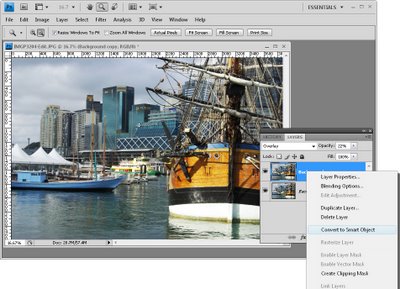
If you’re using Photoshop CS3 or CS4, you can convert the topmost layer to a Smart Object before continuing. To do this, right click the top layer and choose Convert to Smart Object.


Step 5
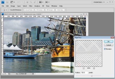
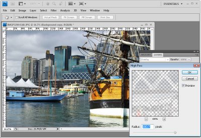
Choose Filter > Other > High Pass and set the Radius to approximately 50 pixels. Click Ok.

The High Pass filter sharpens the image and the Overlay fix applies a contrast and saturation boost. The Blend If sliders ensure that the fix is applied only to the image midtones.


Step 6
Any of these adjustments can be changed. You can adjust the Radius of the High Pass filter to a larger or smaller value and, if desired, increase or decrease the layer Opacity to apply more or less of a contrast boost.

You can also adjust the Blend If sliders to apply the fix to a larger or smaller range of the image tones.

Helen Bradley
Monday, October 5th, 2009

Photoshop – fix Chromatic Aberration


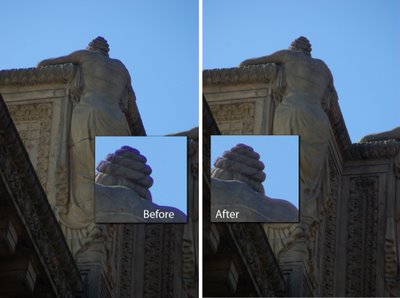
Chromatic Aberration is the bane of digital photographers. It can be seen as a halo or fringe around the edges of an object in a photograph when you photograph it in certain lights – you might see it for example, when you photograph a darker object in front of a bright sky. Some tools like Lightroom have settings that help remove chromatic aberration but sometimes it’s so obvious and so distracting that a bigger fix is required.

In this image, the statue has a very obvious blue edge to it and not even Lightroom could fix this. The solution is to open the image in Photoshop and to fix it there.


Step 1
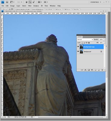
Duplicate the background layer by choosing Layer > Duplicate Layer.


Step 2
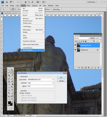
For this image, because the problem area is so distinct and the edges are so crisp, the easiest solution is to make a selection of the portion of the image to fix and then apply a fix to it. Using the Quick Selection tool I made a selection of the sky. Save it as a selection using Select > Save Selection and give it a name.


Step 3
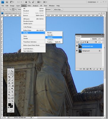
Now enlarge it so the selection covers the problem area. I used Select > Modify > Expand and added enough pixels to select over the problem area. How many pixels will be variable – on a high resolution image you’ll need a bigger value than on a low resolution image. I used 30 pixels on this large image.


Step 4
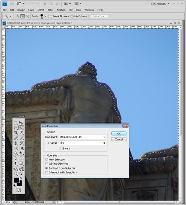
Now you need to subtract the first selection you made from this new selection so you end up with just the blue edges selected. To do this, choose Select > Load Selection and select the selection you just saved. Set the Subtract from Selection option and click Ok.


Step 5
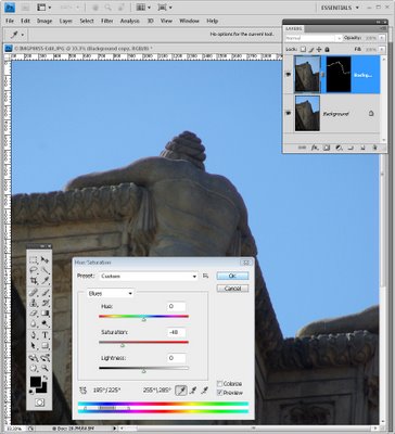
You now have the blue area selected so click the Add layer mask icon at the foot of the layer palette to add a mask to this layer. This isolates the blue area in the image.

In this case the simplest way to the problem is to desaturate the top layer so the blue disappears. To do this select the top layer, choose Image > Adjustments > Hue/Saturation and adjust the Saturation down until the blue goes – you can do this on the Master channel or just the Blue and Magenta channels or wherever you find the color problem is residing.

You could also fix the problem using a Curves adjustment and select the Blue channel and adjust it. The exact fix is going to depend a lot on what image data that is affected by the color halo – you need to remove or desaturate some of the blue but keep as much of the remaining image data intact and correctly colored as you can.


Step 6
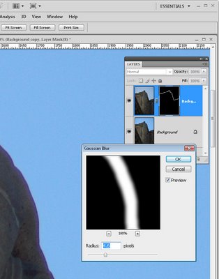
If the edge of the fix is too harsh, you can blur the mask layer by selecting the mask thumbnail and choose Filter > Blur > Gaussian blur.

Helen Bradley

Friday, September 18th, 2009

Understanding filters in Photoshop and PS Elements


When I was young, my dad told me that if at first you don’t succeed you should try and try again until you do. In today’s post, I am going to tell you why this adage relates to editing photos by working with filters in Photoshop Elements and in Photoshop.
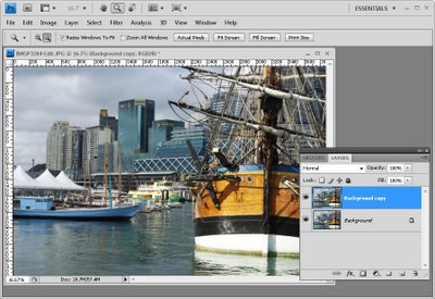

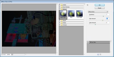
Not good! start with the wrong colours and filters suck, big time!

Step 1
Start by opening an image that you like, set the foreground color to white and the background color to black and choose Filter > Distort > Diffuse Glow. When you do this, the image will take on a rather nasty dark glow. There is pretty much nothing that you can do to this image that is going to make it look good. You can try to remove the graininess and glow and increase the clear amount to 20 but if you do that, you’ve effectively removed the filter effect. The short answer is it looks ghastly and you might be wondering just what you did wrong?


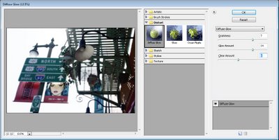
Same image, better result, it’s the colors that are the difference

Step 2
Exit the Filter Gallery, switch the foreground and background colors so that black is now the foreground color and white is the background color. Reapply the filter using Filter > Distort > Diffuse Glow. This time the filter looks very different.

The explanation is that Photoshop Elements (and Photoshop) use the foreground and background colors when applying the filter. This time go ahead and crank up the Graininess and adjust the Glow Amount until you get a nice glow on your image. Adjust the Clear value to suit and click Ok. Now you have a very different looking result.


Understanding colors and filters
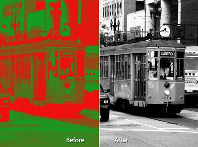
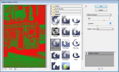
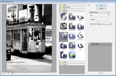
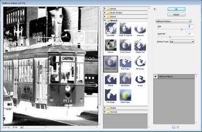
There are many of Photoshop Elements Filters that work differently depending on the current foreground and background colors settings. The Halftone Filter is one of these so, for example, if you have red and green selected the halftone pattern will appear in red and green – not always the desired look.


Instead, set the foreground to black and the background to white and apply the Halftone Filter using Filter > Sketch > Halftone Pattern. This time you’ll get something more like the result that you are looking for.


Switch black and white in the color swatch and try again – and the result is different and not so appealing.

What you need to know
The short lesson to take away from this post is that when you are applying filters in Photoshop Elements or in Photoshop the foreground and background colors that you have selected will have a big impact on how some of the filters work. In most cases the filters affected are the Sketch filters but others use the colors too.

Select the right color mix and the result is pleasing to the eye. Select the wrong color mix and you could be excused for thinking filters just aren’t for you.

Helen Bradley