Tuesday, September 27th, 2011

Color Correction in Photoshop

One of the most difficult things to do when you’re starting out in digital photography is to recognize and remove a color cast from an image. Not only do you need to work out that you’ve got a color cast, but you also need to find a means of fixing it.

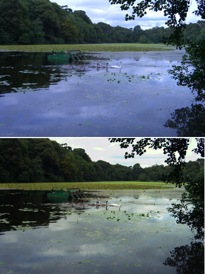
One method of color correction is one that I learned from Photoshop gurus, Dan Margulis and Taz Tally – any errors in this process are mine and not theirs. The process relies on reading data from the image and then adjusting the numbers that the image provides. It’s a way to remove a color cast that is relatively simple and which involves reading and setting RGB values rather than making objective decisions about an image. I’ll show you how to do this using an image shot in the early morning and which is hazy, underexposed and which has very poor color.

Step 1
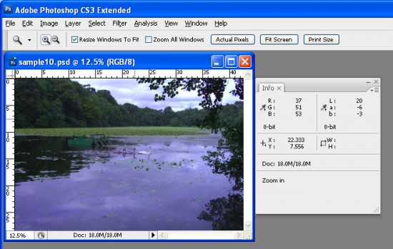
To get started, open an image that you think has a color cast. Choose Window > Info to display the Info palette. This gives you information about the pixels in your image and, if you’re working with a standard photo, you’ll have RGB mode displayed in the upper left corner of the dialog.

Step 2
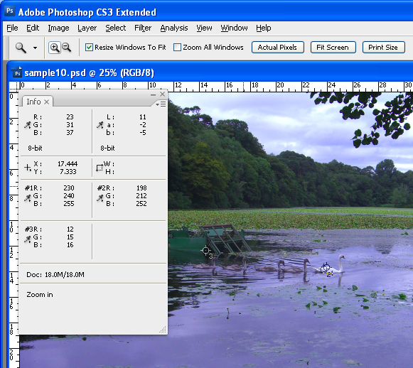
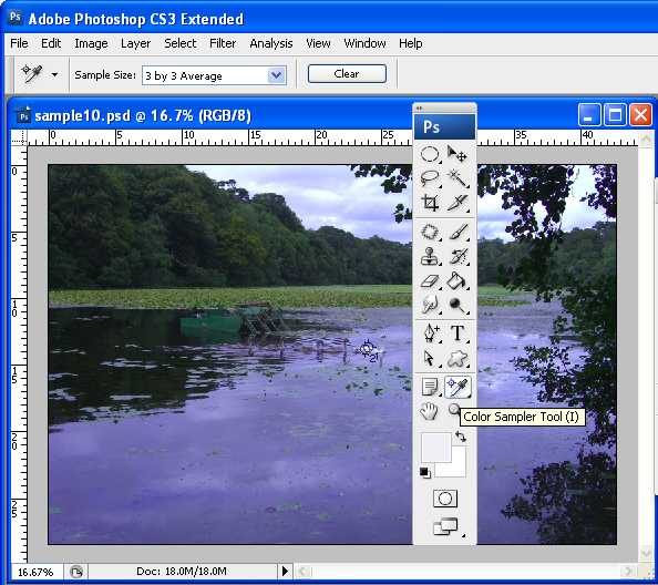
To make the color correction I’ll use the Info palette to display information about the image. To do this I’ll need to make some color sample points on the image and I’ll do this using the Color Sampler tool which shares a toolbar position with the Eyedropper. Click the Color Sampler tool and, from the toolbar, select the 3 x 3 Average Sample. This is important as you’ll want to sample a larger area than just a single pixel.

Step 3
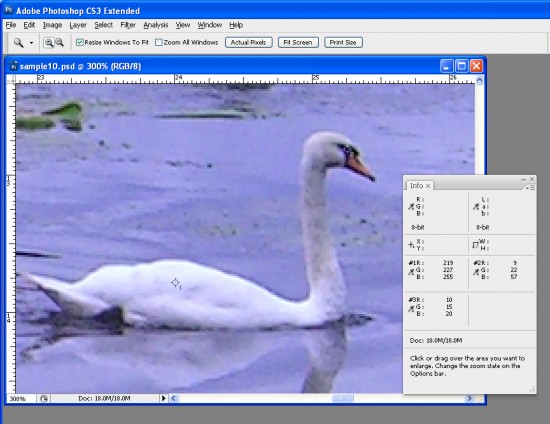
Now locate a place on the image which should be white or a light neutral gray in color. Click on it with the color sampler tool and you’ll see a marker appear on the image with the number 1 beside it. Make sure the point you select is one which should be white or light gray and don’t select an area of the image which is blown out such as a light spot.

Repeat the process, this time clicking on another point which should be either white, black or a neutral gray. This gives you a second sample point. You can continue and add a total of four markers if desired. Each should be placed in an area of the image which should be white, black or a neutral gray.

Step 4
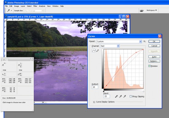
Check back in the Info palette to read the color information for each of these points. For the lightest points you should see values of around 245 for the R, G and B channels. For the darkest points the value should be around 15 for each of the channels. For gray points you should have equivalent values of R, G and B, although they can be any value, they just need to be roughly the same for each.

Step 5
If your image has a color problem you’ll find that the numbers at each point are not within a range of 2 or 3 values of each other. To color correct the image what you’ll do is adjust the curves for each of these channels to bring them closer to each other. Choose Layer > New Adjustment Layer > Curves and click Ok. You’ll be correcting individual channels so from the Channel dropdown list select Red and then Ctrl + Click on the first point that you marked in your image. This adds a small marker on the curve line which shows you where this point in the image appears on the curve.

Identify whether you need to increase or decrease the value at this point. To increase it, drag upwards and to decrease the value drag downwards. You’ll see that you’re not making subjective judgments here; you’re simply adjusting the curve to bring the numbers closer together and closer to the desirable value of 245 for a white point and 15 for a black one.

Step 6
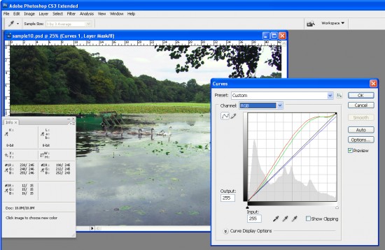
Repeat this last step for all the sample points that you created on the image and then repeat it for the Green and Blue channels so that you end up with all the sample points containing values that are within 2 to 3 values of each other.

Step 7
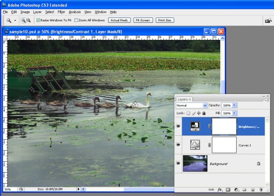
When you’re done, click Ok to close the Curves dialog. You can now apply other fixes such as adding contrast to the image with a further Curves adjustment or use the new Brightness/Contrast tool in Photoshop CS3.

Using the Info palette combined with sample points on the image makes it easier to remove color casts by reading and adjusting numbers.

Helen Bradley

Thursday, May 26th, 2011

30 Second Photoshop Background

Here’s a quick and easy way to make an interesting background in Photoshop that totally rocks.

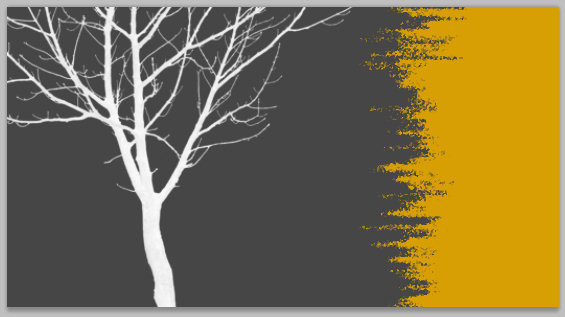
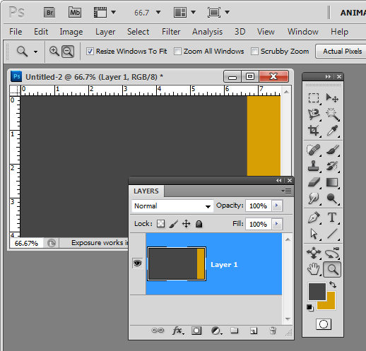
Create a new image the size of your background and fill it with a color. Make a selection on either edge of the image – I made mine on the right – and fill it with your second color.


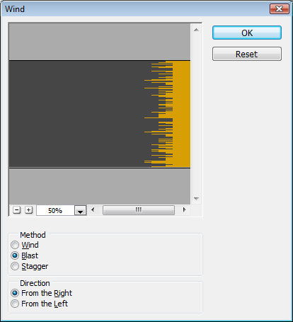
Now choose Filter > Stylize > Wind and select the Blast and the From the Right options and click Ok. When you do the filter will be applied to the image and the edge will begin to fracture.

Continue to apply the filter by pressing Ctrl + F (Command + F on the Mac) – this shortcut repeatedly reapplies the last filter you applied. Stop when you get the effect that you want.

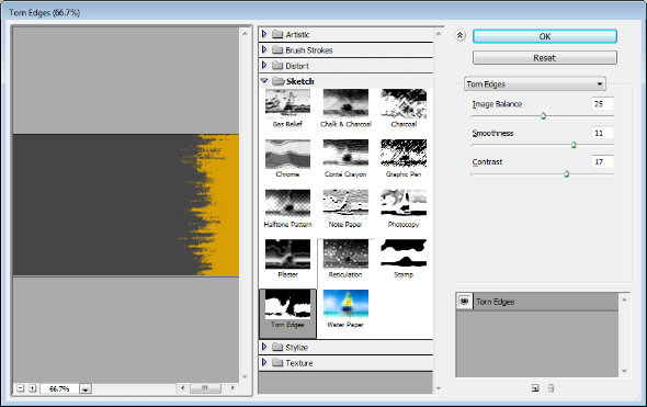
You can stop here or you can go ahead and apply and additional filter to the image.

Filters such as Splatter, Patchwork, Glass, Torn Edges, Water Paper and Rough Pastels all give an interesting result.

Finally, I’ve been using some cool tree silhouette brushes lately and I’ve finished the design off with a simple tree brush stroke.

Helen Bradley

Sunday, April 24th, 2011

Photoshop – “repeat rotate with a copy” shortcut

This week I discovered a totally cool new keystroke combination which I just have to share. Here’s the back story…

I love making regular shapes from irregular ones. Think kaleidoscopes but not always made from images – sometimes I make the kaleidoscope shapes from other shapes. Shapes are the best kept secret in Photoshop because, unlike brushes, they can be scaled up or down to any size and they don’t lose their smoothness.

So, here’s how to make shapes from shapes and how to put my new keystroke to use:

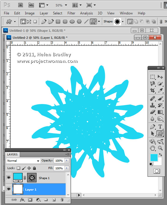
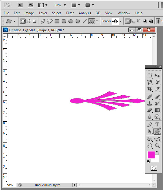
Click the Custom Shape tool and select a shape to use – you can use anything – I’ve used an ornament. On the Tool Options bar, click the Shape Layer icon – it’s the first of the three at the far left of the bar.

Drag the shape onto the image. It will appear as a new layer. It doesn’t really matter what color your shape is right now.

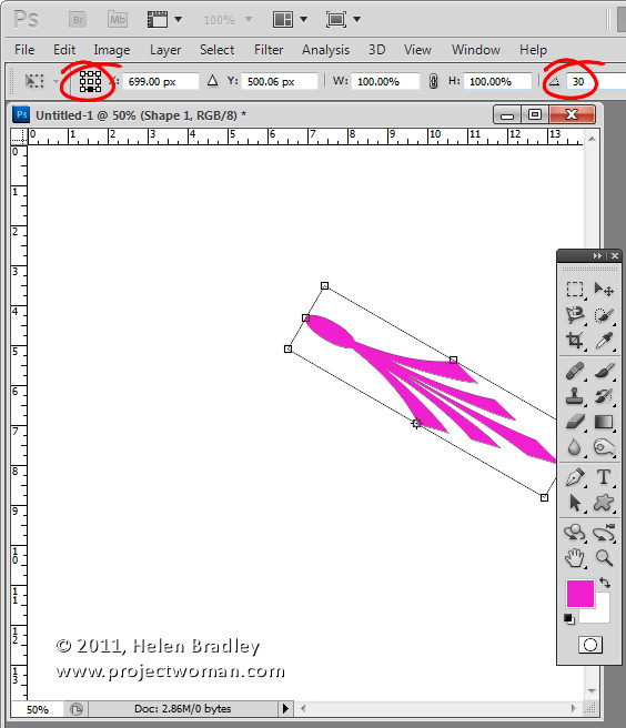
Click the Move tool then choose Edit > Free Transform Path (or press Control + T), click to select the point around which the shape will rotate. You do this using the small indicator on the toolbar – you can choose any of the squares to get an interesting effect – each one will give a different result.

On the Tool Options bar set the Angle to something which is a factor of 360 – 10, 15, 30, 45, 60 and so on. I typically use 30. Press Enter to confirm the rotation.

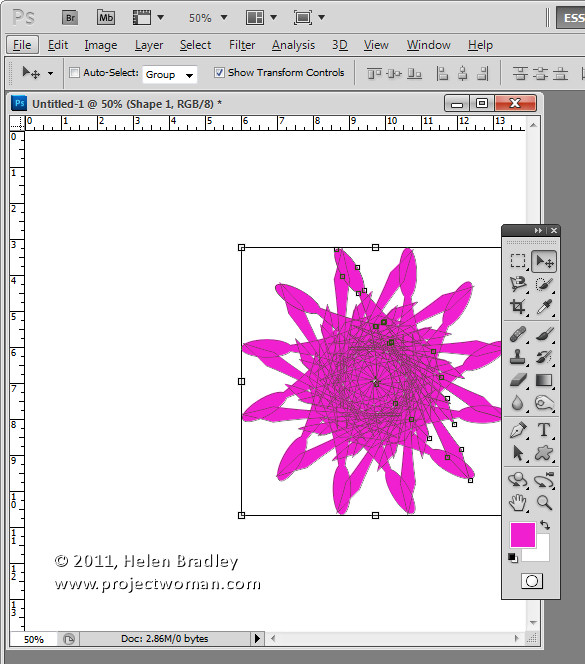
So far you have created a shape and rotated it. Now for the fun stuff – it is time to use the new keystroke combination. With the shape layer selected press Control + Alt + Shift + T (Command + Option + Shift + T on the Mac). Press it a few times until you have duplicated the shape sufficient times to rotate around 360 degrees. The key combination Control + Alt + Shift + T (Command + Option + Shift + T on the Mac) repeats the most recent rotation with a new copy of the shape. Totally cool stuff.

If the final shape goes off the edge of the image you can automatically resize the canvas to include the shape by selecting Edit > Reveal All.

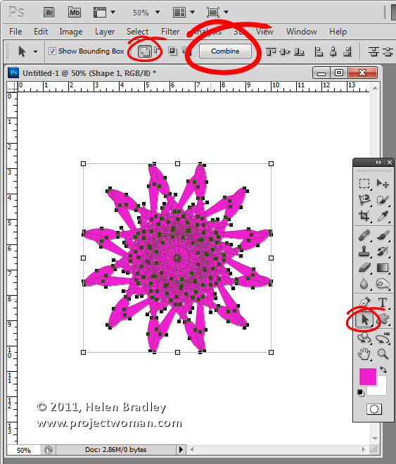
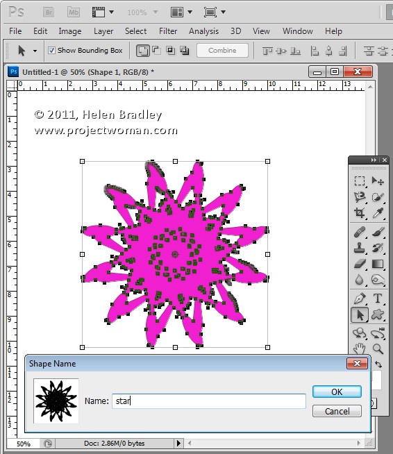
If you like the final shape you can make it a single shape – instead of multiples – by selecting the Path Selection tool and drag over all the shape so you have it selected. From the Tool Options bar select the Add to Shape Area icon and click the Combine button. This makes a single shape from all the combined shapes.

To save the shape so you can use it again in future – with it still selected, choose Edit > Define Custom Shape. Now your kaleidoscope shape is a shape you can use any time in Photoshop by selecting it from the Custom Shape collection.


Helen Bradley

Wednesday, April 20th, 2011

Photoshop – How to fill a shape with a gradient

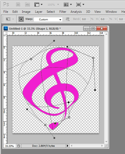
Tricky this one. There are three ways to create a shape in Photoshop and I’ve been working with shape layers so I can warp the result. So far so good. You select the Custom shape tool and then from the tool options you select the Shape Layer option and create your shape. You get a Fill layer with a vector mask showing the shape.

To change the color – double click the Fill layer thumbnail and choose another color. Again – so far so good.

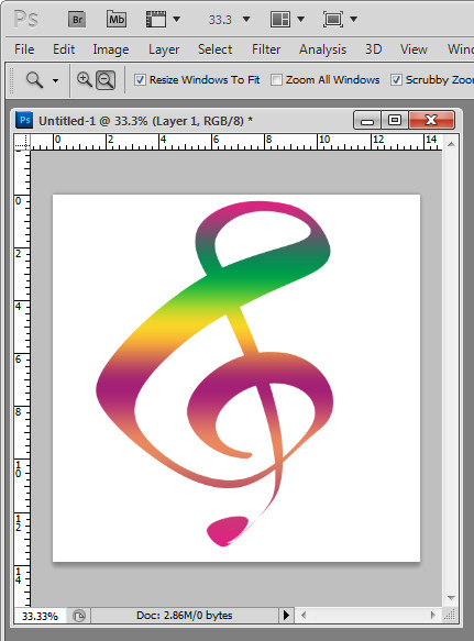
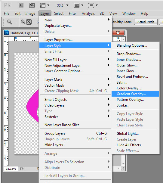
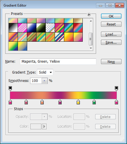
To fill the shape with a gradient – yikes.. there is no obvious option. Here’s a hint – Layer styles! Click the shape layer so you have it selected, choose Layer > Layer Style > Gradient Overlay. Select the gradient to use or make your own custom gradient and click Ok.

Now you know…

Helen Bradley

Monday, February 21st, 2011

Replacing skies in Photoshop

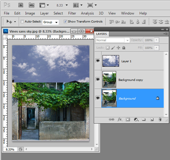
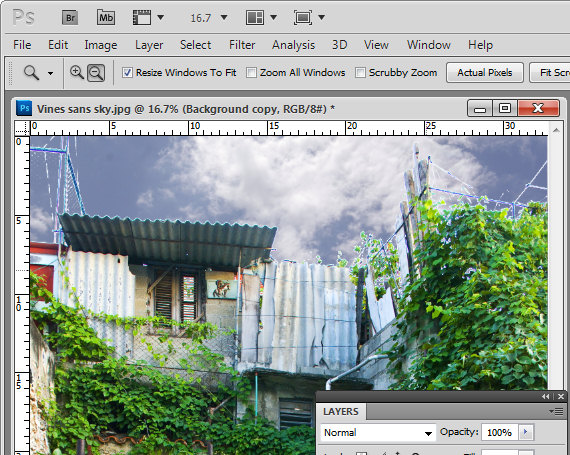
Reader Michael P. recently sent me an image he’s been working with – his challenge was to replace the sky in the image. The problem was that in replacing the sky the image had ended up with a lot of halos around the edges making the sky replacement look less than believable.

Kindly Michael sent me some of the images he wanted to work on to explain how to fix them more realistically.

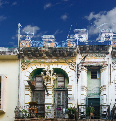
This is the building we’ll work with:

Here’s what I did:

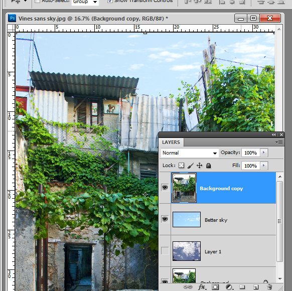
Start by duplicating the background layer.

Drag the background layer from your sky image into your image – if you hold Shift as you do this it  will be positioned in the middle of the image.

Move this layer so it is over the blown out sky.

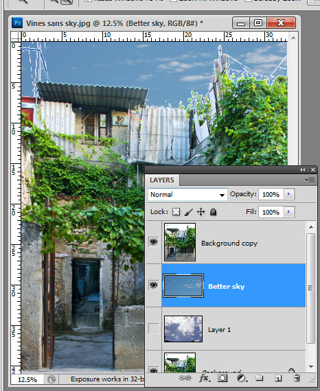
Move the sky layer so it sits between the two image layers.

Select the topmost layer of the image, select the Add a Layer Style icon at the foot of the layer palette and select Blending Options.

In the Blend If  area locate the This Layer bar and drag in from the right hand side of the bar. To split the adjuster in two, hold the Alt key as you drag one marker away from the other.

If you have a really blown out sky set the right side of the marker at 255 and the left side at a value that gives you a good blend effect for the sky – such as 248 or so.

Each image will require different settings.

Look at the result and see if the sky that you’ve brought in really suits the image.

Unfortunately I don’t think this sky works particularly well for this image and the image needs something a lot less dramatic.

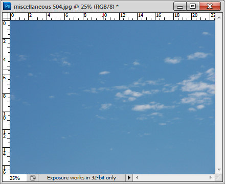
Here is a sky from my own collection which I think will work better.

I dragged it into the image above the first sky layer but under the second image layer. The original Blend If adjustment settings work just fine with this sky so there is nothing more to do there.

However, there are still problems along the skyline. These can be easily fixed by lightening the sky which I think is still way too dark for this image.

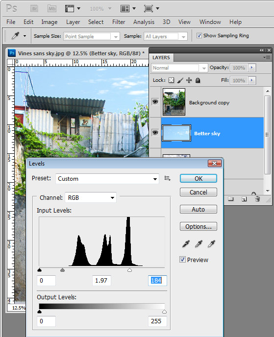
Select the sky layer and choose Image > Adjustments > Levels. What I am looking for here is to lighten the sky so that it blends in more with the image and looks more like it belongs.

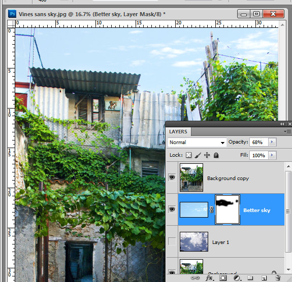
Having lightened the sky, you’ll can further blend it into the image by adjusting the opacity of the sky layer down a bit.

Because the original image is underneath the sky as well as on top of it the effect of reducing opacity is to blend the sky into the underlying image.

If you find some bleeding of the sky into the buildings you can add a mask to the sky layer by selecting that layer and click the Add Layer Mask icon at the foot of the layer palette.

Paint with black on the mask to remove any blue sky in lighter areas of the building.

Typically if you find that you’re getting distinct over-lapping of sky around the edges where the blown out sky meets buildings or other elements in the image, the problem will be that you’re trying too hard to replace the blown out sky with something that is too much sky for the image.

You’ll get a better result if you work with a much lighter but still interesting sky.

If you find that you have some very light elements in the original image that are showing white fringing over the blue sky you can avoid these by placing a portion of the sky with white clouds in it under these areas to minimize the obvious white edges.

Helen Bradley

Wednesday, February 2nd, 2011

Photoshop: High Pass Softening

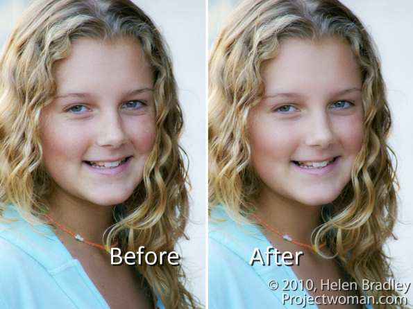
You may already know that it is possible to sharpen an image using the High Pass Filter. But did you know it’s possible to use the filter to soften an image?

To see this at work, start with an image open on the screen.

Step 1

Duplicate the image background layer or if you have an image that has adjustments in it, create a flattened version of the image on a new layer at the top of the layer stack. To do this target the topmost layer and choose Layer > New > Layer.

Target this new layer and press Ctrl + Alt + Shift + E (Command + Option + Shift + E on the Mac) to create a flattened version of the image on this new layer.

Step 2

You will apply the High Pass Filter to this layer.

To do this, you can convert the layer to a Smart Object by choosing Filter > Convert for Smart Filters.
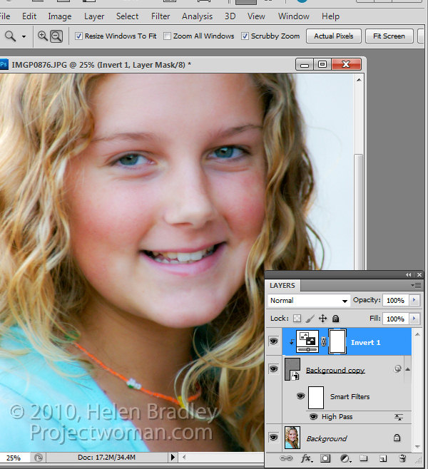
If you’re working on a version of Photoshop earlier than CS4, you can still use this process without converting the layer to a Smart Object.

Choose Filter > Other > High Pass and set the High Pass filter Radius to a value that shows gray and white lines on the image. Stop short of the image showing too much color. The larger the radius value, the more the softening effect although too large a Radius will be counter-productive. Click Ok to apply the filter to the image.

Step 3

In the Layers palette, set the Blend Mode of the top layer to Soft Light.

To soften the image, select the High Pass filter layer and choose Layer > New Adjustment Layer > Invert. You’ll need to create a Clipping Group between the Adjustment Layer and the High Pass Filter layer by selecting the Adjustment Layer and choose Layer > Create Clipping Mask.

Step 4

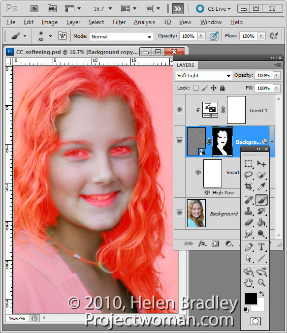
Create a black filled mask on the High Pass Filter layer by Alt + Clicking on the Add a Layer Mask button at the foot of the Layer palette (Option + Click on the Mac).

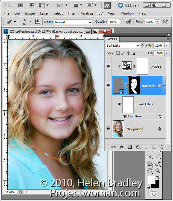
Set the Foreground color to white and paint on the mask with a soft round brush in the areas that you want to soften the image such as the skin tones here. This image shows the masked area – you won’t see this as you work.

Step 5

If you created a Smart Object the High Pass Filter can be adjusted by double clicking on the filter in the Layers palette and adjust the Radius value.

You can use a different blending mode on the masked layer such as Overlay if that gives results you like better and you can also change the opacity of the layer to reduce the intensity of the effect.

Helen Bradley

Tuesday, January 25th, 2011

Color an object to match an exact color in Photoshop

Completed image color matched to a selected=

Finished project: a garage door color matched to a selected Pantone color. Image (c) Sarej, sxc.hu.

One issue that a lot of people face is matching color in Photoshop. You may have a Pantone color that you want to match to or some other color and you want an image to be colored this way.

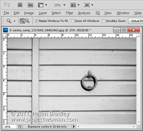
The solution is to start with a Grayscale version of the image, so desaturate the image to start with and make sure it is light enough to take your color – so if you want to use a light color brighten it to suit.Image of desaturated image ready to apply color to it

Now add a new fill color layer to the image by choosing Layer > New Fill Layer > Solid Color and click Ok.

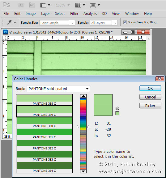
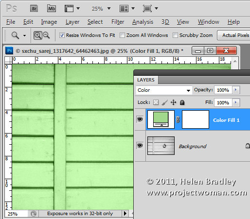
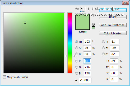
Set the solid color to the RGB or CMYK values of the color that you want to match. Set the Blend Mode for the layer to Color.

Color blended layer showing initial recoloring of subject to match a pantone color

I chose Pantone 359C which has RGB values of 161, 216 & 139.

Right now you’ll have a reasonable match for the color but not as good a one as you can get.

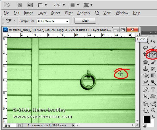
To improve it, select the Color Sampler Tool, which sits under the Eyedropper tool in the tool palette, and click in an area of the image that you want to be that particular color.

Because the grayscale values will vary, you need to identify a place in the image that you want the color to be exactly your chosen color. Around it, the other tones in the image will vary as they should – some will be lighter and some will be darker. Click on that point to add a color sample point.

Image showing color sample point in place we want to exactly match the Pantone color

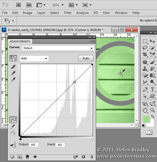
Now add a curves adjustment layer by choosing Layer > New Adjustment Layer > Curves. Click Ok to create the curve adjustment. If you’re using Photoshop CS3 or earlier, Ctrl + Shift + Click (Command + SHift + Click on the Mac) on the color sample point to mark this point on the curve in the Red, Green and Blue channels.
If you’re using CS4 or later, the functionality of the curves dialog has changed. In this case, you should use the On Image Adjustment tool, which is the tool in the top left corner of the curves dialog, which has a hand on it. Click this, then Ctrl + Shift + Click (Command + Shift + Click on the Mac) on the sample point to add the marker to the Red, Green and Blue channels.

Image showing marking color sample point on the RGB curves

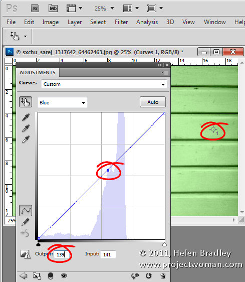
Now select the Red channel, click on the marker you just added and adjust the Output value to the Red value of the RGB color number that you want to match. Repeat this for the Green and the Blue channels. Then close the dialog. In my case I’ve set the Red output value for this selected point to 161, the Green to 216 and the Blue to 139 to match the Pantone color values. If you are trying to match a CMYK value then you’d do the same thing but for the Cyan, Magenta, Yellow and Black channels.

Image showing curves dialog and adjusting the Red green and blue curves to match the RGB values of the chosen Pantone or CMYK color

To remove the Color Sample Point, select the color sample tool and hold Alt as you hover over the sample point. It turns into an icon like a pair of scissors which you then click to remove the sample point.

You will end up with an image where, at your designated point, the color is exactly as you wanted it to be.

Thanks to blog reader Lesley Clarke for posing the question.

Helen Bradley

Monday, January 24th, 2011

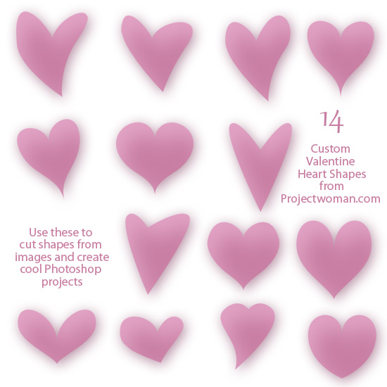
Photoshop – Free Valentine heart shapes download

free download 14 valentine heart shapes for photoshop

I’ve been messing around in Photoshop this week making heart shapes. As a result I wrote a blog post to show you how to make these shapes yourself.

Just in case you want to take the easy way out, here is a free download with a collection of 14 hearts just in time for you to use for Valentine’s Day projects.

As with all  my downloads, you are free to use them for non commercial purposes, they may not be given away, they may only be downloaded from this site. Commercial licenses are available by request.

Helen Bradley

Tuesday, January 11th, 2011

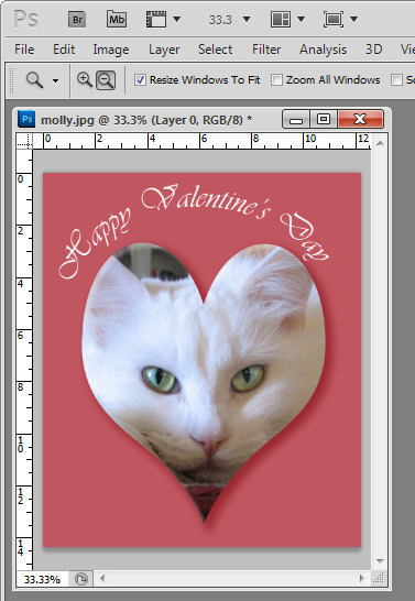
Crop to a Valentine heart shape in Photoshop

With Valentine’s Day coming up shortly you might be wondering how you create heart shape images in Photoshop. Well, here’s how:

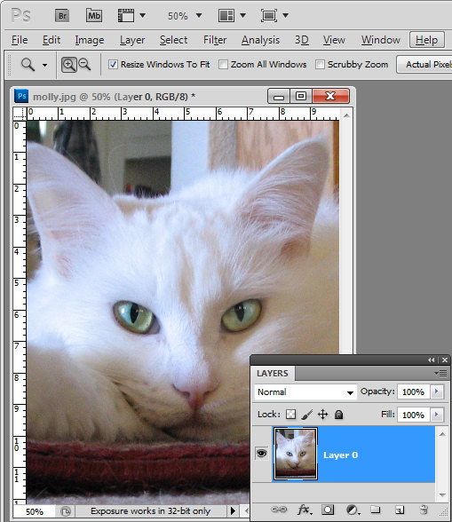
Start by opening an image that you want to use and convert the background layer to a regular layer by double clicking the background layer in the layers palette and click Enter.

Crop image to Valentine's heart shape in Photoshop

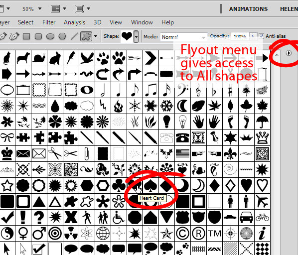
From the tool palette, select the Custom Shape tool, which sits below the Rectangle tool.

From the Shapes dropdown list on the Tool Options bar, select a heart shape.

If you don’t have a heart shape in your list, click the flyout menu and select All. Click Append to append all the shapes available which will give you access to at least one heart shape. In fact you probably have a Heart Card shape, a Heart shape and a Heart Frame shape.

To cut a heart shape out of your image you’ll want the Heart shape or the Heart Card shape.

Crop an image to a heart shape in Photoshop

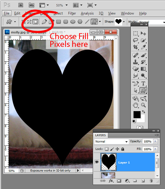
Click the New Layer icon at the foot of the layers palette or choose Layer > New > Layer.

From the toolbar, select the option that says Fill pixels. Drag a heart shape over your image. Don’t worry that there is a fill color associated with the heart and that it is covering up your image. Size the shape using the move tool until it’s positioned pretty much where you want it to be.

Crop image to valentine heart shape

Now with the heart layer selected, drag it below the image layer and select the image layer again.

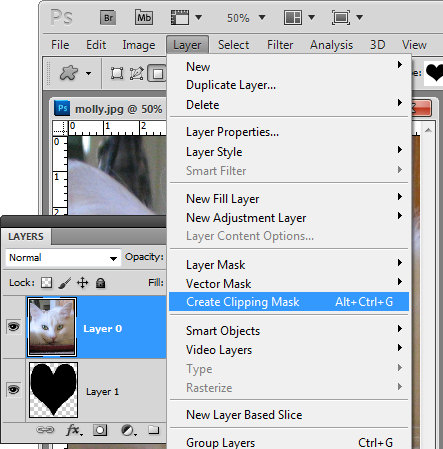
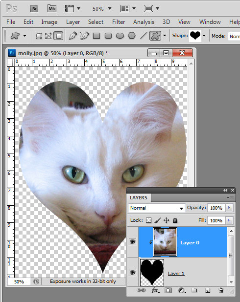
Choose Layer > Create Clipping Mask and your image will be clipped to the heart shape.

crop image to valentine heart shape

This method of creating a heart shape is ideal as the heart can be moved into a different positioned and resized by selecting the heart layer and resizing the heart appropriately.

In addition, you can click to select the image layer and drag with the Move Tool (V) on the image to place the image inside the heart in an appropriate position.

Crop an image to a Valentine heart shape

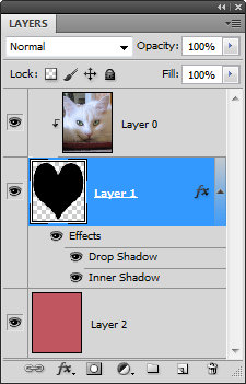
If you want a background for your image, click the bottommost layer and then Ctrl + Click (Command + click on the Mac) on the new layer icon at the foot of the layers palette.

This adds a new layer below all the other layers.

Select a foreground color to use, target your new layer and press Alt + Backspace (Option + Delete on the Mac) to fill  this layer with the foreground color.

Finish your Valentine heart effect by selecting the heart layer and apply a drop shadow to it by clicking the Add a Layer Style fx button at the foot of the layer palette and choose Drop Shadow.

Add some text and you’re ready to save and print the file.

There is a YouTube video of this process using Photoshop CS6 here – it is the same in any version of Photoshop.

Helen Bradley

Wednesday, January 5th, 2011

Cool Photoshop Textures – free – commercial use

One of the biggest problem designers and graphic artists have is in finding content that can be used commercially. It often seems that even content you pay for you have to jump through hoops to read the fine print to determine what exactly you can do with it and it often  has overly restrictive limits.

Today I found a great site. Great because of a number of things:

1. The content is free.

2. The textures are gorgeous and varied and hi-res.

3. You are free to use them for commercial purposes.

4. Attribution is appreciated but not required.

Verbatim, here is the terms of use: “Lost & Taken textures are made freely available for use in both personal and commercial projects including web templates, designs, and other materials intended for distribution. Attribution is appreciated, but not required.”

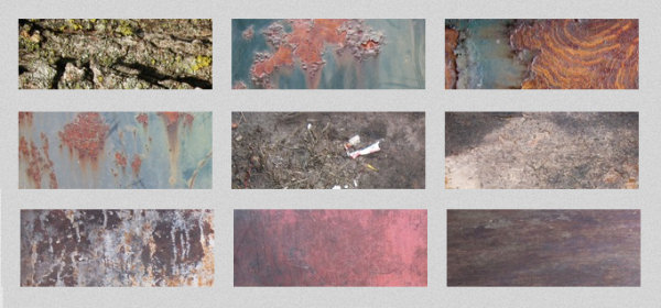
The textures fall into a  number of categories including: Vintage damask, torn paper, skin, bubbles, wallpaper, book covers, subtle grunge and lots more. Check out the vintage wallpaper ones on the home page they are so totally cool.

To view and download textures head to the Gallery.

Helen Bradley