Tuesday, January 4th, 2011

We make the “Best 50 Photoshop blogs”

Very cool… a site called Guide to Art Schools just published a list of their Best 50 Photoshop blogs and Projectwoman.com came in at number 17 of “the rest” meaning that after the top 5, this blog is rated 22. Not too poor a showing, thanks guys.

Interestingly they talked about the blog as being woman-centric which is pretty funny since there is nothing I see that is woman centric about this blog at all! But it made me think back to why it is projectwoman.com at all.

The name projectwoman.com harks back to a magazine that used to be around called Mac Home and I used to write project articles for them – sort of the how to style stuff that is my specialty.

Some time in early 2000, the editor David Weiss and I were kicking around ideas and he suggested we title my column Project Woman as in a woman who wrote projects – it sounded like fun so I took the opportunity to register the domain name just in case it all came to fruition and became something big.

As it happened only a few columns ever appeared in the magazine as it got sold then it crashed and burned along with some other stalwarts of the industry – many of which I wrote for – in the aftermath of the dot com crash. So, that’s the history of the name – thanks to David Weiss for the idea!

Helen Bradley

Thursday, December 30th, 2010

Kawaii Panda Shape – free download

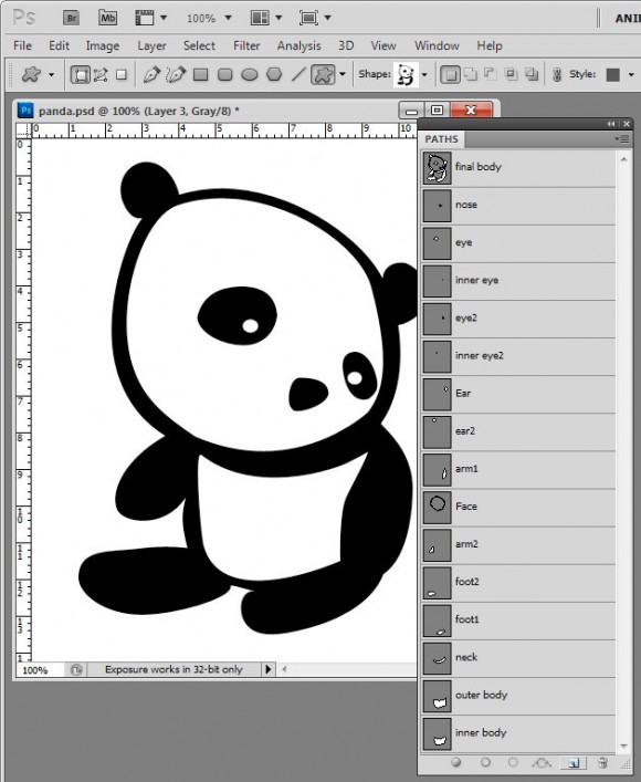
I’ve been messing around today making shapes in Photoshop. This is my final Panda Kawaii shape which I’m offering as a free downloadable shape that you can import into Photoshop and use yourself.

I find shapes are easiest to build up from pieces so I make each piece then build them up bit by bit into the final shape by combining the paths. It’s painstaking work but ultimately rewarding to have a custom shape you can use anytime and scale to any size.

Here is the link to download the shape file – you can use the shape for your own designs but you aren’t permitted to sell the shape or offer it for download from your own site.

Helen Bradley

Tuesday, December 28th, 2010

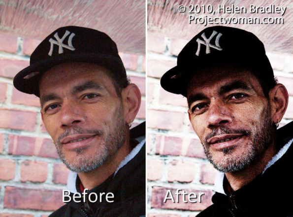
Photoshop: Grunge Portrait Effect

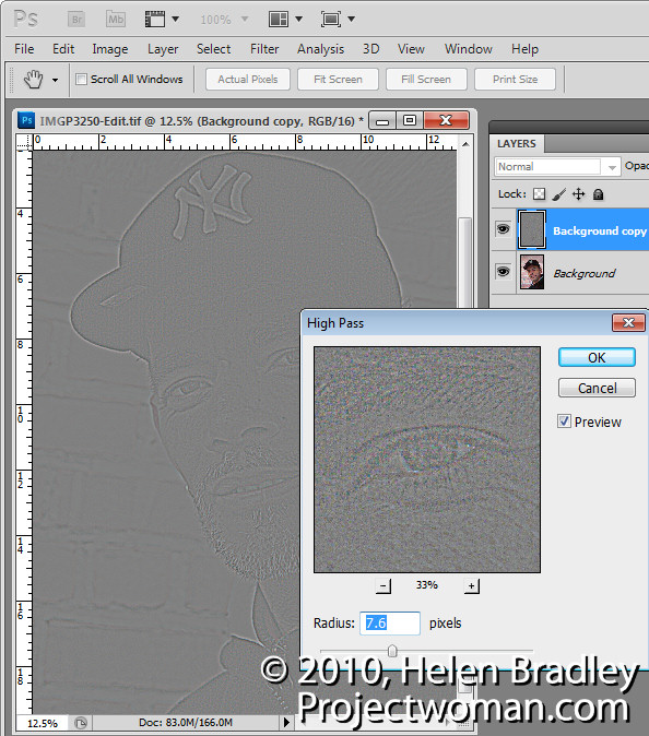
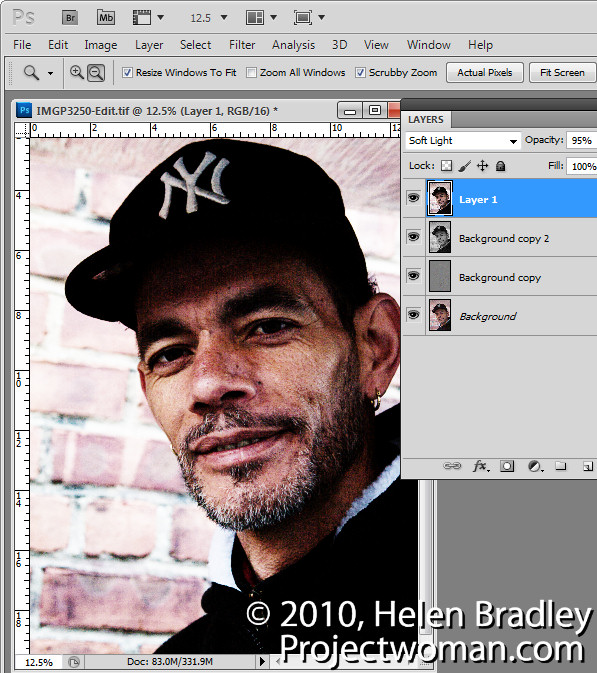
To create a high contrast grunge portrait effect, first duplicate the image background layer, then choose Filter > Other > High Pass, select a Radius that shows lines on the image but not a lot of colour – typically a value of around 5 is sufficient – and click Ok. Set this layer’s Blend Mode to Overlay.

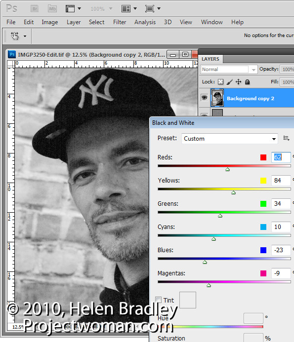
Duplicate the background layer again, moving the duplicate to the top of the layer stack and convert the layer to black and white by choosing Image > Adjustments > Black & White. Adjust the sliders to create an interesting black and white image – dragging the red slider to the left often to darken the reds often works well. Set the blend mode of the layer to Hard Light.

Select the top layer and press Ctrl + Alt + Shift + E to create a flattened version of the image and set this layer’s blend mode to Overlay, Soft Light or Hard Light as desired. Adjust the opacity to suit.

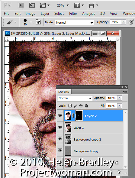
Make a new flattened layer by pressing Ctrl + Alt + Shift + E and use the same process as before to fix the eyes. Choose Image > Adjustments > Curves and adjust to brighten the eyes only. Add a black filled layer mask by pressing Alt as you click on the Add Layer Mask icon. Paint with white on the layer mask to bring details back in the eyes and adjust the opacity of the layer to suit.

Helen Bradley

Sunday, December 26th, 2010

Photoshop Creative: A Simple Composite


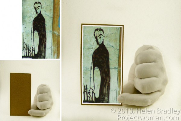
In this post, I’ll show you how to create a simple composite by placing one image in another. Along the way, I’ll not only bend one image to fit its new position but I’ll also show you a layer style trick that overcomes the problem that you’ll see if you scroll down to step 6 and take a look at what happens when I mask the image to make the fingertip show.

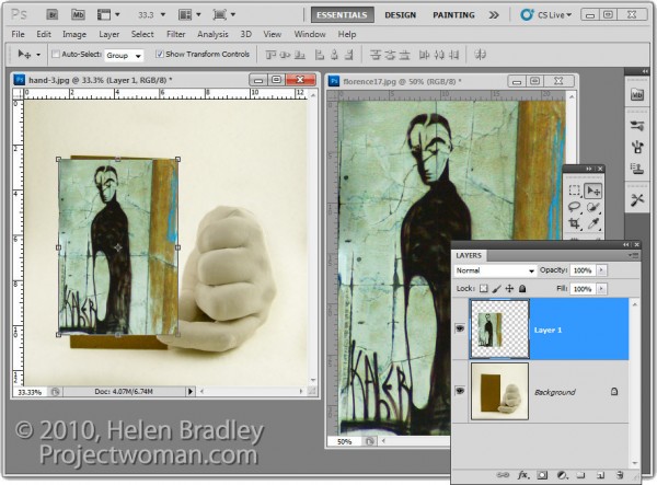
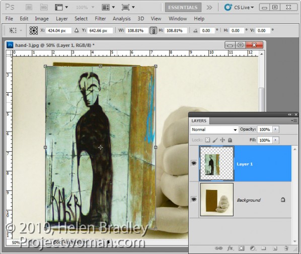
1 To create this composite, open the images to use. We’ll assemble the composite in the image of the plaster hand. Start by dragging the background layer from the photograph into the hand image. It will appear on its own layer and you can now close that image as it is no longer needed.

2 Size the imported image to fit where it needs to go. In this case the border will be added inside the image so I’ll make the image almost as large as the cardboard it will be ‘attached’ to.

Size the image in proportion so you don’t skew it. To get it to fit on in dimension it will probably be either too tall or too wide in the other dimension and that’s fine.

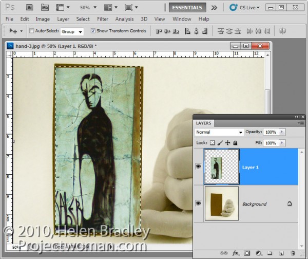
3 Once you’ve applied the transformation, select the rectangular marquee tool and drag over the area of the photo that you want to retain. Choose Select > Inverse to invert the section and press Delete to delete the excess image.

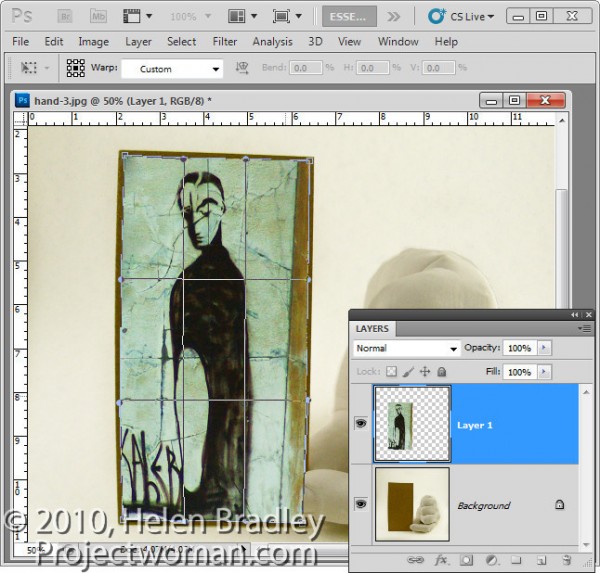
4 To warp the image to fit the shape of the card, select the image and choose Edit > Transform > Warp. This adds a series of warp handles to the image. Drag on these to bend the image so it fits over the area you want to cover.

When you’re done, confirm the transformation.

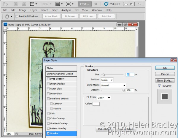
5 To add a white border around the image as if it were a photo stuck to the card, select the image layer, click the Add a Layer Style button at the foot of the Layers palette and choose Stroke.

Set the color to white and the size to a size appropriate for your image. Set the position to Inside so you get square corners on the image (if you choose Center or Outside the corners will be rounded).

 When you are done, click Ok.

6 With this image layer still selected, click the Add Layer Mask icon at the foot of the Layers palette.

Select a medium hard brush, set the foreground color to black and paint on the mask to reveal the finger on the underlying layer. This makes the finger look like it is above the image and not behind it.

One simple way to do this is to hide the photo layer and use a tool like the Quick Selection tool to select over the finger on the background layer. Then, with the selection in place, display the top layer and select its mask. With black as the foreground color, press Alt + Backspace (Option + Delete on the Mac), to fill the selected area on the mask with black.

You’ll see that we have some problems with the mask because it distorts the stroke around the picture. We want the stroke applied to the image and we don’t want the mask to have any effect on it – right now it is having an unwanted effect.

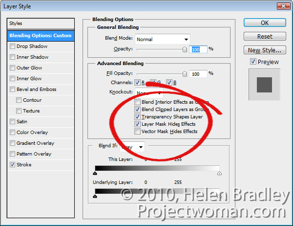
7 To solve the problem, double click the Effects entry in the Layers palette to open the Layer Styles dialog. In the Blending Options area of the dialog, select the check box for Layer Mask Hides Effects.

This configures the mask on the layer to hide not only the image content on that layer but also a style applied to that layer.

Helen Bradley

Friday, December 3rd, 2010

DIY Photoshop Panels using Adobe Configurator

Most users don’t realize that you can create your own custom panels for Photoshop CS4 and for the new CS5. You do this using a free download called Adobe Configurator. In this post, I’ll show you how to get started making your first Photoshop CS4 panel using Configurator 1.0.

To make your panel you need to make sure that you have AIR installed. If not, visit http://get.adobe.com/air/, download and install it.
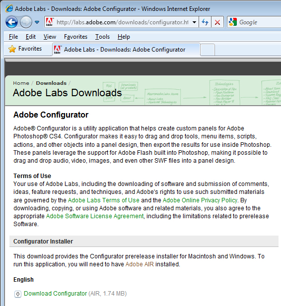
You then need to download the version of Configurator compatible with your operating system and your Photoshop version. Find your version at http://labs.adobe.com/downloads/configurator.html and install it.

Launch Configurator if it does not start automatically once installed.
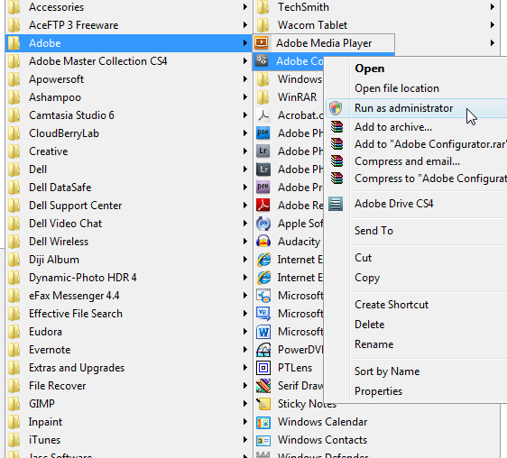
If you are using Windows Vista or Windows 7 you must run the program as administrator – if you do not do so, you will have difficulty saving your panels in the correct location. So, if you are using either of these operating systems, close Configurator, return to your Programs menu, locate Configurator, right click it and choose Run as Administrator. Of course, you’ll need to be using an administrator account to do this.
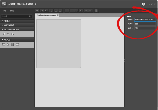
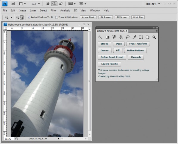
Inside Configurator, choose File > New Panel to create your new panel. The panel doesn’t have a title and it is the default size. On the right of the screen, type a title for the panel and either type a new size or alter its size by dragging on the sizing marker in the bottom right corner of the panel.
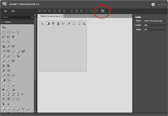
On the left are lists of tools and commands as well as action scripts and widgets that you can add to your panel.

For now go to the Tools list, and drag and drop the tools that you want to include on your panel onto it. For example, if you do a lot of collage work, you can add tools such as the Rectangular Marquee, Lasso Tool, Brush, Clone Stamp, Gradient Tool and all the other tools you regularly use. If you use both the Lasso Tool and the Magnetic Lasso Tool, drag both into your panel as each tool is separate and not stacked as a group as they appear on the regular tool panel.

To align them, click the Auto Layout button on the toolbar.
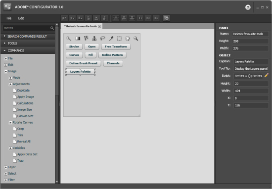
You can also add menu items to the panel by selecting them from the Commands panel. Open up each menu name in turn to view the commands available. Drag and drop those you want access to onto your panel. Each of these installs as a button.

Change the size of the button by dragging on its sizing handles or adjust its height and width in the panel on the right. You can also change the button caption and tool tip.

Add those commands that make sense for the panel that you’re creating.
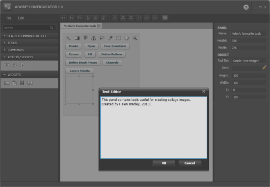
For now, we’ll ignore Action/Scripts and all Widgets except Simple Text. Open the Widgets panel, select Simple Text and drag and drop it into your panel.

Use this control to add some descriptive text to your panel. To do this, click the pencil icon in the right hand panel to open the text editor and type your text into it.

Size and place the text in position. Arrange your panel items by clicking the Auto Layout button.

If you have two or more items selected you can use the other alignment tools on the toolbar to align their edges, centers and so on.
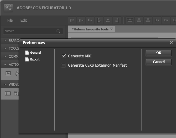
When you are done, select Edit > Preferences > Export and make sure Generate MXI is selected. If you choose Generate CSXS Extension Manifest, you can create your panel as a file that you can share with others. For now, Generate MXI is all you need.
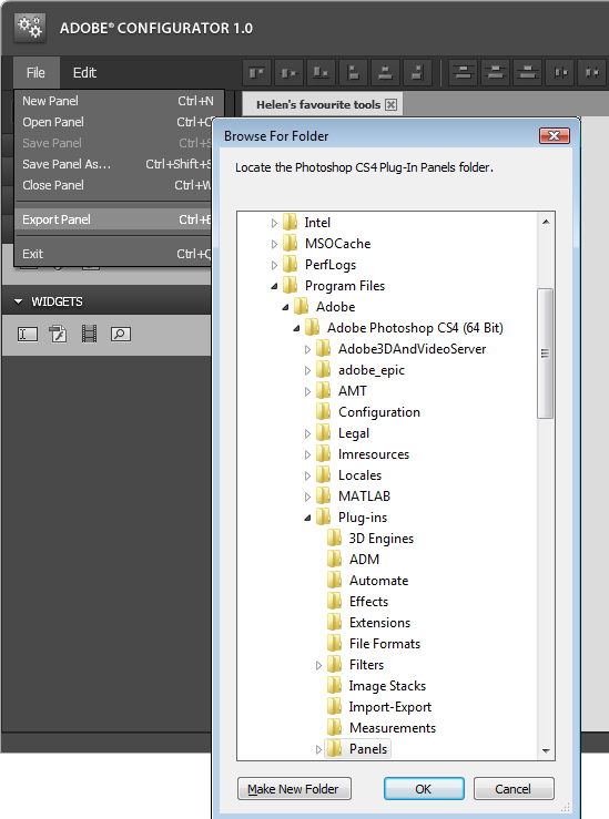
Choose File > Save Panel as and save your panel layout as a .gpc file. You will need this if you want to come back later and edit your panel as you cannot edit the exported panel files.

To export your panel in a format that is compatible with Photoshop, choose File > Export Panel and select the your Adobe\Adobe Photoshop CS4\Plug-ins\Panels folder (or the equivalent folder on your Mac).

This is where you’ll strike problems if you are using Windows Vista or Windows 7 and if you do not have administrator privileges because you won’t be allowed to save the files in that folder.

Click Ok and your panel files will be saved to the Panels folder and you’ll see a message confirming this.
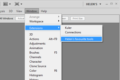
Close Photoshop and then reopen it. You’ll find your panel by selecting Window > Extensions and your panel will be listed in the extensions list. Select the panel and it will open and appear as a Photoshop panel.
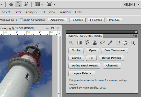
You can create multiple panels, each for a different purpose. For example, one panel may have all the tools you need for creating collages and another for making vector selections

In a future post, I’ll go into more detail about some of the other elements that you can add to custom Photoshop panels and how you can create panels that support typical workflows and that you can share with others as teaching tools. In the meantime, have fun creating your first panel.

Helen Bradley

Friday, September 3rd, 2010

Run out of canvas using Photoshop’s Pen tool?

I’m sure this has happened to you – you’re zooming along drawing a path around an object using the Photoshop pen tool and all of a sudden you’re running out of room – the image is off the screen. The solution is simple, press and hold the Spacebar and the cursor turns into the Hand tool so you can move the canvas around to get the next bit of the image in view. Let go the Spacebar and you’re back to working on your path.

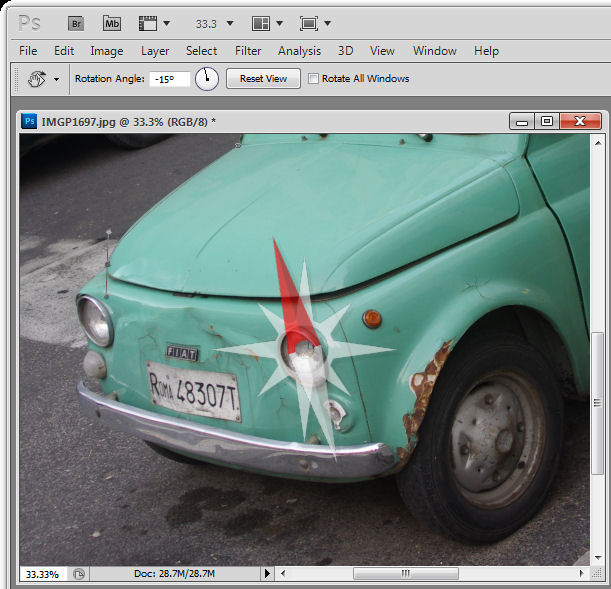
And, while you’re there – wanna rotate the canvas so you can draw your path more easily? Easy! Press and hold R (R for rotate) then drag the canvas to rotate it.

Helen Bradley

Tuesday, August 31st, 2010

Photoshop: Applying Fixes using Adjustment Layers and Masks

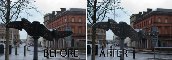
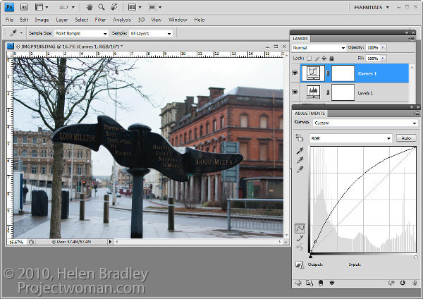
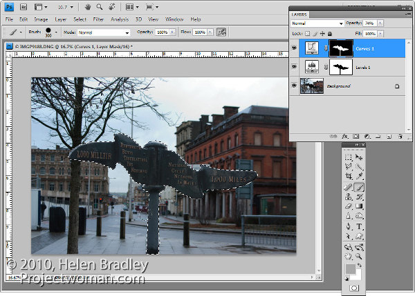
Sometimes a photo need two opposing fixes applied to different areas of the image. This poses a dilemma – if you fix one area you’ll make the other areas far worse than they started out being and vice versa. The solution is to apply both fixes but to do this using adjustment layers and to blend the results together using a mask. Here’s how to do it:

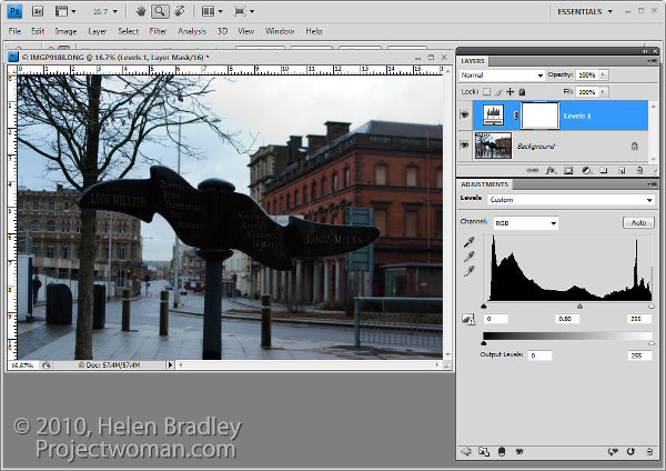
To fix the background of the image, choose Layers > New Adjustment Layer > Levels and adjust the levels to improve the contrast in the lighter areas of the image. Ignore the darker areas of the image as they are not part of this fix.

If desired, you can also adjust the saturation using Layers > New Adjustment Layer > Hue/Saturation.

To bring detail out of the darker area in the sign you will use an additional adjustment layer. In the original blog post I used the Shadow/Highlights tool but this is one fix you cannot apply using an Adjustment Layer so you will have to use a different adjustment for this image. I will use a Curves adjustment layer here.

To do this choose Layers > New Adjustment Layer > Curves and adjust the darker end of the curve –on the left side. Drag upwards on the curve line to lighten the shadows.

If you prefer to use another tool, you can do so. However, the important thing is to fix the shadows and ignore any changes to the highlights.

The top adjustment layer contains the adjustment for the darker areas of the image and the bottom adjustment layer(s) contain the adjustment for the lighter areas of the image. To blend these layers, you will use the layer masks attached to the adjustment layers to selectively add the fixes to the image.

Unlike the adjustment layer’s Opacity slider which sets every pixel to the same opacity value, a layer mask lets you adjust the opacity selectively so one area can be 100% opaque and others can be partially or fully transparent.

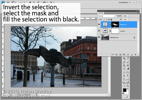
For this image, as I want to lighten the sign but not anything else, it will be quickest if I start by selecting the sign on the background layer.

Select the mask on the Curves layer. When you are working with masks remember that “black conceals and white reveals” so painting with white on the mask reveals the adjustment on this layer and painting with black on the mask hides the adjustment.

Press Control + Shift + I (Command + Shift + I on the Mac) to invert the selection so now we have everything except the sign selected. Set the foreground color to black and press Alt + Backspace (Option + Delete on the Mac) to fill the mask except where the sign is with black.

Press Control + D (Command + D) to deselect the selection.

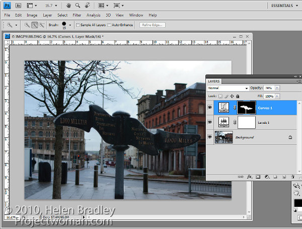
If the fix looks too intense, you can adjust the opacity of the top Curves layer down a little.

When adjusting opacity you may find it easier to judge an ideal value if you drag the Opacity slider to zero and then increase the value until you find a good fix rather than dragging it down from 100% looking for the ideal setting.

If you want to remove the sign from the Levels adjustment you can do so using an inverse of the layer mask you have already created.

To copy and invert the mask, press Alt + Shift (Option + Shift on the Mac) as you drag the mask from one adjustment layer and drop it on top of the mask on another layer. When prompted to replace the mask, answer Yes. (If you simply want to copy a mask use Control + Alt or Command + Option instead).

If you do this, you’re removing the Levels fix from the pole and you may need to adjust the Opacity of the Curves adjustment layer to compensate for this.

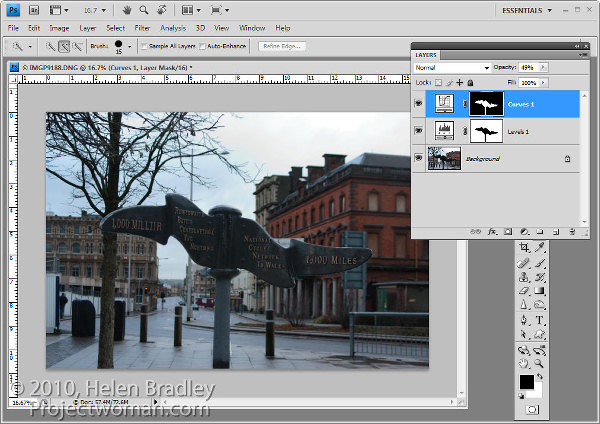
You can also adjust  masks by painting on them in black, white or a shade of grey. Painting in black hides the fix on this layer, painting in white reveals the fix on this layer and painting in grey partially hides the fix.

Here I have Control + Clicked on the mask on the top Curves adjustment layer to select the white areas of the mask, then painted in grey on the mask to hide some of the lightening effect on the pole. By selecting the white area of the mask before painting I limit the paint to only the selected area which lets me work quickly.

If you go too far, switch colors and paint back the effect back.

To finish, I rotated the image to straighten the sign and cropped it to remove the distracting elements on the left side of the image.

Helen Bradley

Monday, August 2nd, 2010

Photoshop – invert a path

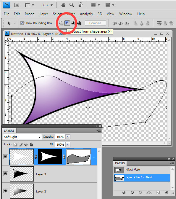
When you use a Vector Mask in Photoshop you can use the pen tool to create your path. All you need to do is to close the path and you will have a custom editable vector mask. However, if your mask is white where it should be not be selected and you need to invert it you need to invert the path.

To do this, click the Path Selection tool and target the Vector Mask and click on your path. On the tool options bar you will see an icon called Subtract From Shape Area – click it and the path will be inverted so anything which was masked before will not be now and vice versa.

Helen Bradley

Monday, July 26th, 2010

Photoshop: Pen tool trick


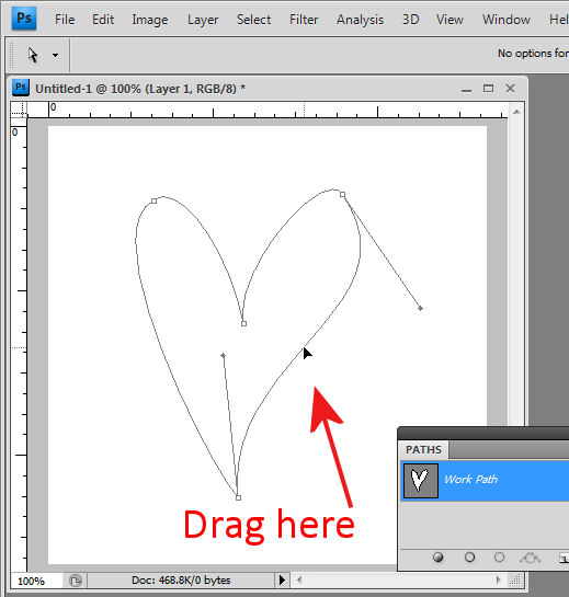
Ok, I am first to admit it, when I stumbled across this trick I went “Wow! I didn’t know you could do that!” I was designing a small heart using the pen tool and I dragged near one side of the shape with the Direct Selection tool and woah! The entire side of the heart moved. Amazing what you find when you get some time to play – well I was going over some notes for a Photoshop presentation I was doing but all the same – it was a lightbulb moment and I just love them when they happen.

 So, here’s how to do it. Make a shape with the pen tool or choose the Custom Shapes tool and the Paths option and draw a path in an image. Click the Direct Selection tool (it shares a toolbar position with the Path Selection tool). Drag over one of the nodes to select it and now drag near the path either side of that node. When you do, the path moves with you.  It’s yet another way of reforming your paths and it’s not what I would call intuitive but it is very handy when you know how it works.

Helen Bradley

Wednesday, March 17th, 2010

Photoshop: High Impact Sharpening

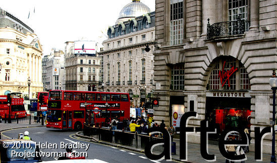
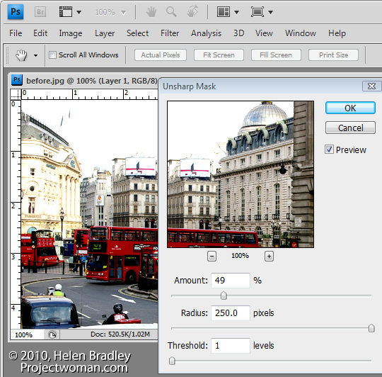
after image high radius low amount sharpening

There’s a lot been written about sharpening your images and traditionally when you sharpen you’ll choose a low radius value. In fact, Photoshop will let you choose really large radius values when sharpening even though, for correct sharpening what you need is a Radius of around 0.5 – 1 for a sharp image and just a little larger for an image that lacks sharpness.
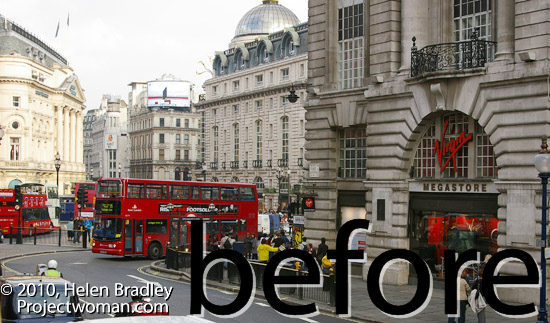
before high radius low amount sharpening

So what is the value of being able to select really large radius values? The answer lies in a technique known as high radius low amount sharpening. It’s a way to add a huge visual impact to your images.

To see it at work, choose Filter > Sharpen > Unsharp Mask. Reduce the Amount to around 30 and push the Radius value up very high. You’ll need to keep the Threshold amount very low.

What Amount does is adjust the amount of sharpening so you don’t want a lot of this type of sharpening. By setting the Radius to a high value you’re pushing the sharpening halos away from the edges in the image into the image content areas so that everything is being given a significant contrast boost.

The Threshold setting is an amount representing the difference between pixels on the edges that you want to effect. It works the opposite to how you might think it would work – a small value gives you much more impact than a large value. So a value of 1 or 2 up to 10 is sufficient.

Once you have a high Radius and low Threshold value set, adjust the Amount to suit your taste.

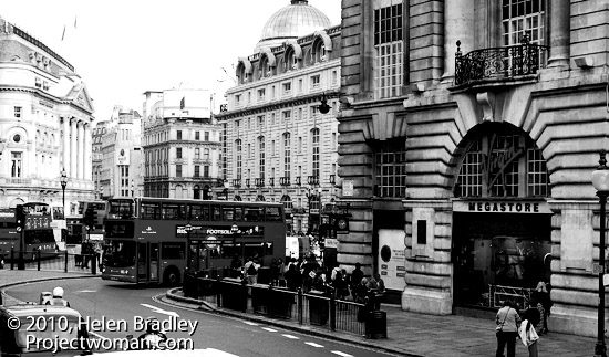
While this feature works really well on color images particularly busy color images, it also gives black and whites a really big shot in the arm.

Apply high radius low amount to a black and white photo of london

And while you’re in Photoshop, know that this is the only place you can apply this fix. You cannot do this in Lightroom or in Camera RAW. The reason is that both Lightroom and Camera RAW allow a maximum radius setting of 3.0 and here, because we want to crank up the radius really high, Photoshop is our only option.

Helen Bradley