Thursday, March 15th, 2012

Content aware resizing in Gimp

In a previous post, I looked at content aware resizing in Photoshop CS4 http://projectwoman.com/2009/09/smart-scaling-with-content-aware-scale.html which is the same as in CS5. I also mentioned the online application called Rsizr http://www.rsizr.com. Today I’m going to show you a plug-in for Gimp that does pretty much the same thing.

The tool is called Liquid Rescale which you can download from here: http://liquidrescale.wikidot.com/. Close Gimp, install the application and then reopen Gimp and you will see the application on the Layer menu.

This plug-in is an alternative to the crop tool. You use it to reduce an image’s size but, where the crop tool removes the data from one or more sides of an image, content aware resizing removes it from the middle of the image. This gives you basically the same looking image but smaller in one dimension. You might use this, for example, to remove some empty area from the middle of an image where the more interesting parts of the image are to either side of it.

The same tool can scale an image up to make it larger in one direction – and this time it will create extra data in the image to fill the space. You might use this, for example, where you have a rectangular image that you want to make into a square image without losing any detail.

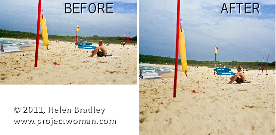
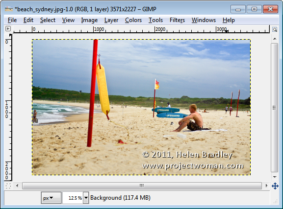
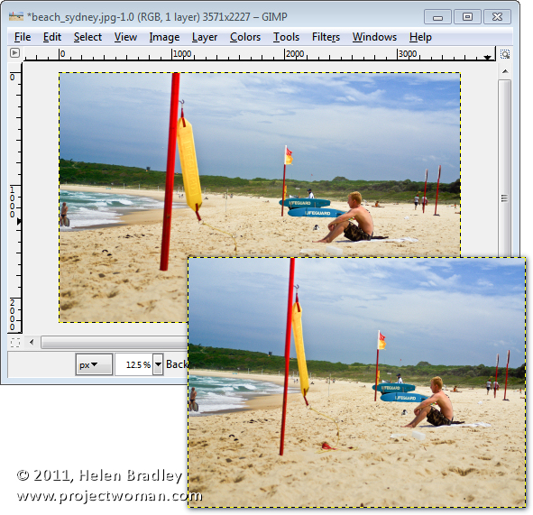
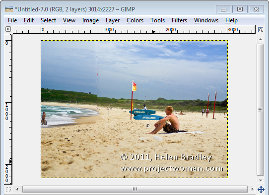
To see how this can be done, I’ll take this beach image and size it down from 3571 pixels wide to 3000.

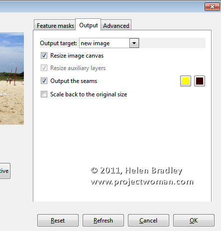
Open the image in Gimp and choose Layer > Liquid rescale. When the dialog appears, click the Output tab and set Output Target to a New Image. Enable the Resize image canvas checkbox and click Ok.

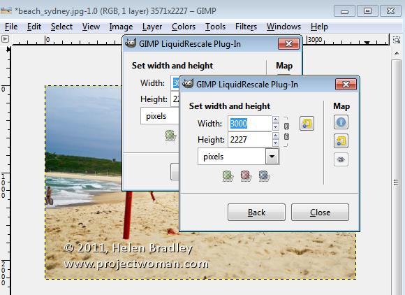
Set the new image width – I set this to 3000 but made sure that the link icon was disabled as I don’t want the height altered. Click Interactive and wait as the image is resized.

The program resizes the image by removing unimportant details from it and keeping what it understands to be the important bits. This is the result:

If you find that some elements in the image are squeezed or damaged by the process, you can create a mask to prevent this from happening.

To do this, click the original image again and choose Layer > Liquid rescale and set up the Output tab options.

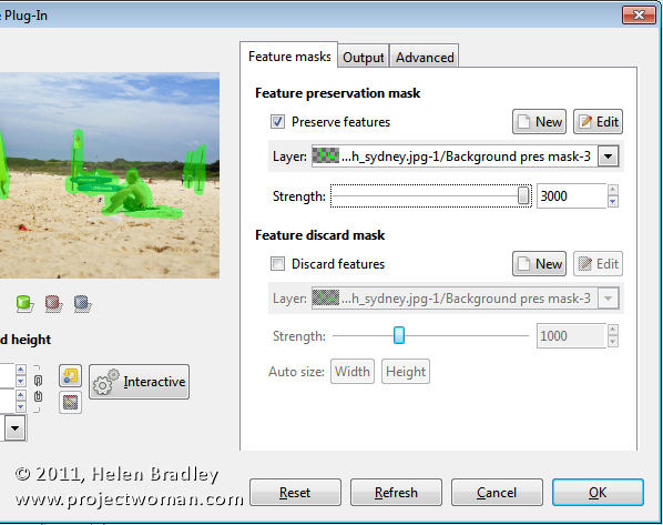
Click Feature Masks and, to create a protective mask, click the Feature Preservation Mask option and click New. The paint color will be set to green so select a brush, enlarge it to an appropriate size and paint over anything on the image that you do not want to change as the image is resized.

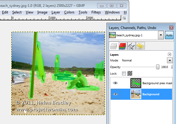
In my case, that is the swimmer at the front of the image and the lifeguard and boards at the back. I’ve added some other bits I don’t want skewed out of alignment like the vertical poles too. Anything else can be adjusted except these elements. When you’re done, click Ok.

Type the size for the new image and click Interactive and wait as the image is resized. Here I chose for the image to be reduced from 3571 to 2500 pixels wide, and the surfer, boards and flags have all reduced well. The protected areas have not been touched.

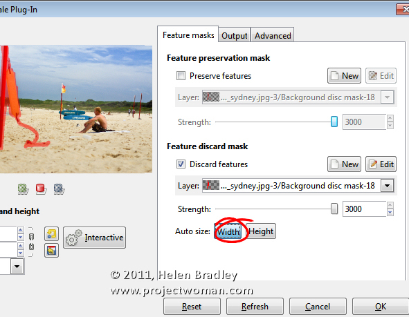
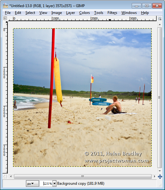
The plug-in also has a tool that you can use to remove elements from the photo. In my image let’s take out the large pole in the foreground. In this case you use a Feature Discard Mask – and paint in red over the area that you want removed from the image. Adjust the strength to the highest value, set the width value by clicking Auto size: Width so that the image is scaled to the appropriate width for the item you are removing and click Interactive.

In this case, the flag has gone but we’ve got a bit of a repair job to do with the rest of the image to fix it up. It would require some work with the clone tool to fix up the image but Liquid rescale has got us some part of the way towards where we are headed.

You can also use the plug-in to enlarge an image. In this case, we’ve enlarged the image to create a square image.

The rescaling process isn’t perfect but generally you’ll get a good enough result that with a small amount of cloning afterwards using the clone tool you’ll be able to produce a realistic result.

Helen Bradley

Monday, March 12th, 2012

Deleting catalog backup files

I’ve been talking to a few people lately about deleting catalog backup files. If you backup and optimize your catalog every time you close Lightroom then, over time, you will end up with a lot of excess catalog backups.

Each of these backups will consume disk space so the question becomes – what is in these backups? What use are they? And can they be deleted safely?

Backup your catalog

When you set Lightroom to make a backup of the catalog what it does is to make a backup of just the catalog and not your images, or your previews, or the sidecar xmp files for your raw files, or your presets. While having a catalog backup is undoubtedly a useful thing, it is incomplete so you will need to have a system backup system in place to backup what Lightroom does not.

In fact, because Lightroom’s backup is only a catalog backup, some people don’t do a backup this way and instead rely on their regular system backup to take care of backing up everything – catalog included. I prefer to at least have Lightroom do a regular catalog backup but that’s my personal preference.

Which backups to keep?

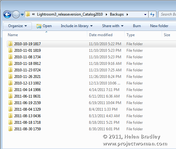
Because the catalog backup files are all stored in different folders by date they will build up over time and keeping them all is not a necessity.

You can be selective about which ones you keep – you should, at least, keep the most recent backups because if your catalog is corrupt you will want to be able to recover using these. If the most recent backup has issues then you would progress backwards until you get one which isn’t corrupt.

So, if I use Lightroom every day, I would keep the backups from this week and then one from last week and one from last month and beyond that I could feel pretty safe about deleting the others.

Delete a catalog backup

To delete a backup, locate the backup folder and identify the backup folders to delete and go ahead and delete them.

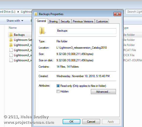
You will find your catalog backups, if you didn’t change the default location for them, in a folder called Backups inside your Lightroom catalog folder.

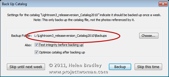
If you changed its location you can find the location you selected when you’re next prompted to backup Lightroom – the location is reported in the dialog prompting you to backup. Here too you can change that location if desired.

One issue with the Lightroom catalog backups is that the location, by default, is inside the folder that contains the Lightroom catalog. So, if the disk containing the catalog becomes corrupt you could lose your Catalog backups too. You may prefer to backup to a different disk to protect against this likelihood.

Every one of us will have different preferences for how we backup, where we backup to, the frequency of backup and what we backup. It’s over to you now – do you use the Lightroom Catalog backup tool? If you do, do you store your backups in the default location? Do you delete excess backups regularly?

Helen Bradley

Monday, March 5th, 2012

Templates in Photoshop

A short while ago I wrote an article on using templates to create a collage or montage of images in Gimp. Sometime after, the templates that I suggested you  could use were taken down from the original website.

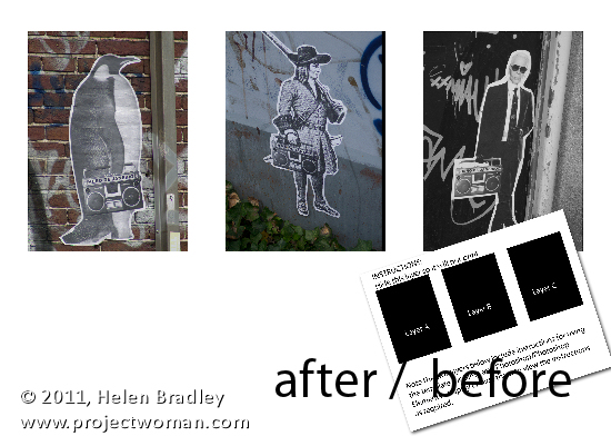
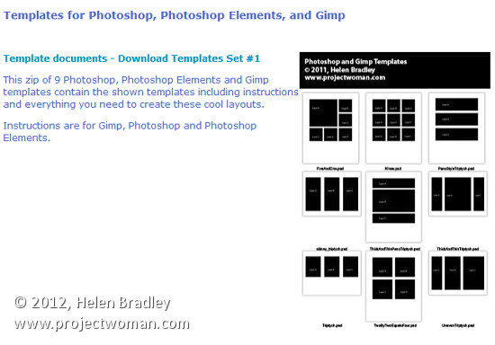
To help out our Gimp readers, I created a new set of templates and as I was making them, it seemed like a good idea to include instructions for Photoshop and Photoshop Elements as well as for Gimp. Here, therefore is how to use a downloadable template to create a montage of images:

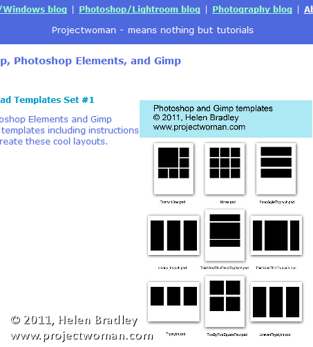
Start by visiting this site and download the template zip file: http://projectwoman.com/articles/45PhotoshopTemplates.html

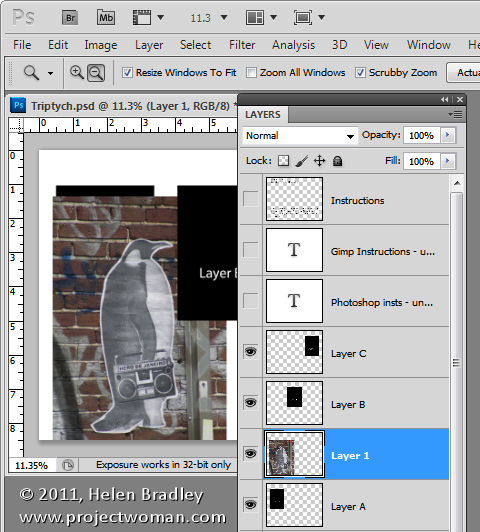
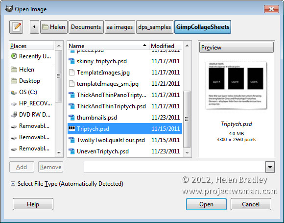
Then unzip the templates, save them where you can find them when you need to use them and open one of them. I’ve used the template triptych.psd.

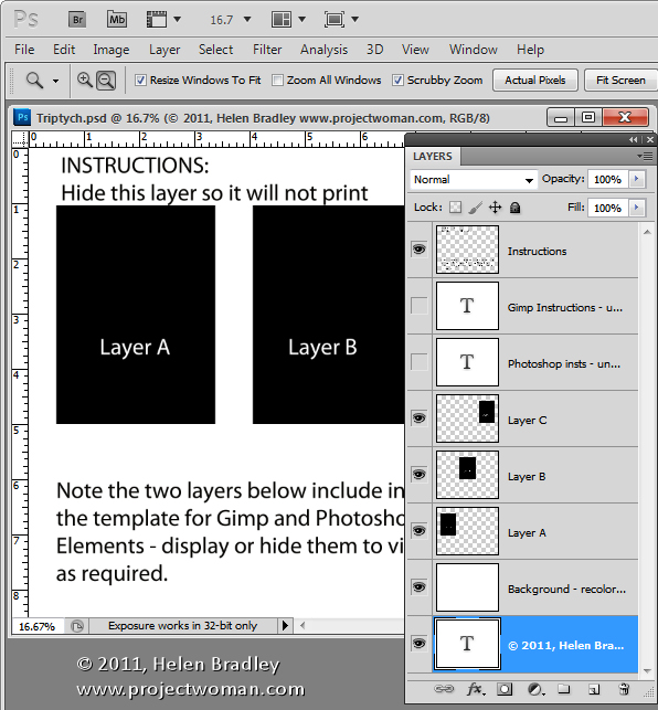
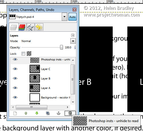
When you open it, you’ll find that there are a series of layers. The top layer can be disabled or deleted at this point. The next two layers are instructions for Gimp and Photoshop users. Again, you can discard these two layers.

Open up the three images that you plan to use for this triptych. Images that are in portrait orientation will look best but you can use anything that you like – just be aware that you’re going to take a portrait orientation slice of the image.

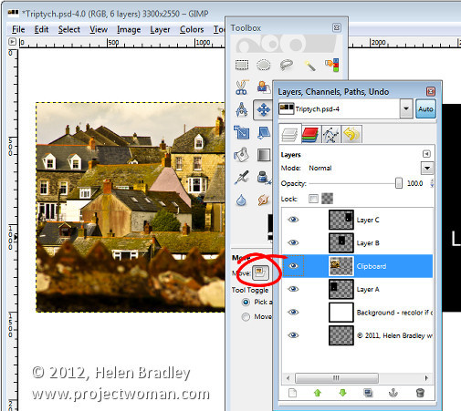
In the template, click on Layer A and then click on the first of your images and drag and drop the background layer from the first of your images into the main image.

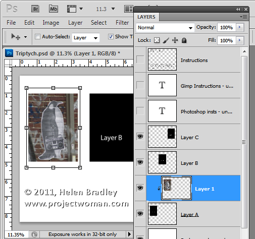
Click on the Move tool and size and position the image so that the interesting portion of it is over the black background. Click to accept this size and positioning and then with the new layer still selected, choose Layer > Create Clipping Mask. You’ll see that your layer is clipped to the size of the underlying shape.

You can fine-tune the placement and sizing by moving the contents of the new layer.

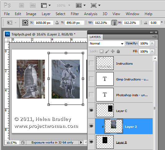
Now click on Layer B and again drag and drop the background layer from the second image into this template. Again, position the interesting portion of the image over the underlying background, sizing the image if desired. Create the clipping mask for that layer by selecting the image and choose Layer > Create Clipping Mask.

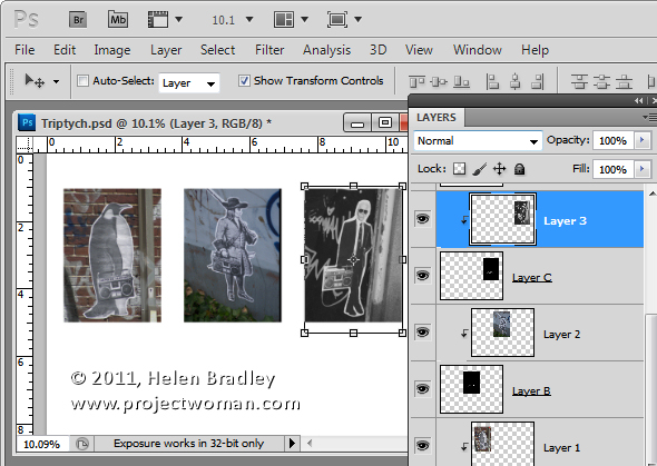
Repeat this for Layer C using your third image.

When you’re done, you can adjust the background of the image if desired by recoloring the layer marked background recolor if desired. You can now save and print the image or upload it to the web.

This same process can be used in Photoshop Elements.

Helen Bradley

Saturday, February 25th, 2012

Photoshop – Replace a Face

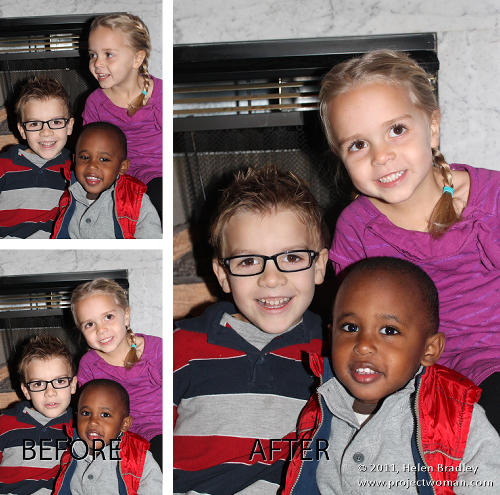
A reader recently emailed me a couple of photographs of her children. Unfortunately, as often happens with small children, one image had two of the three children looking at the camera and smiling and the other image had the exact opposite combination – only one child looking great. Her question was – could she take the good face from one of the images and paste it into the second image.

The answer is yes, and here’s how to do it in Photoshop without any need to cut and paste:

Step 1

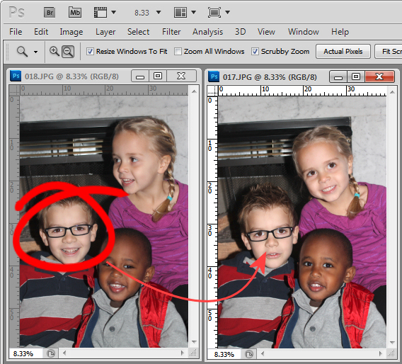
Open both images in Photoshop. Drag the background layer from one image onto the other – in my case I dragged the background layer from the image with two out of the three faces correct and dropped it into the image that has only one good face.

You will have an image with two layers – the top has two good faces and the one below has the other one. Close the other image.

Step 2

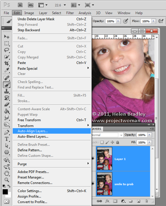
Select both layers in the image that you’re working on and choose Edit > Auto-Align Layers and select Auto.

Photoshop will now align the two layers so that the faces in both layers will be aligned on top of each other. To do this you need to have two images with very little difference between them and this image lined up pretty well as a result.
Step 3

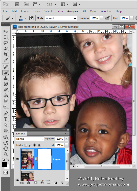
Click on the topmost layer and add a layer mask to it by clicking the Add Layer Mask icon at the foot of the Layers palette.

The mask is filled with white by default which means that the entire contents of the top layer is visible and the bottom layer not visible at all.

Step4

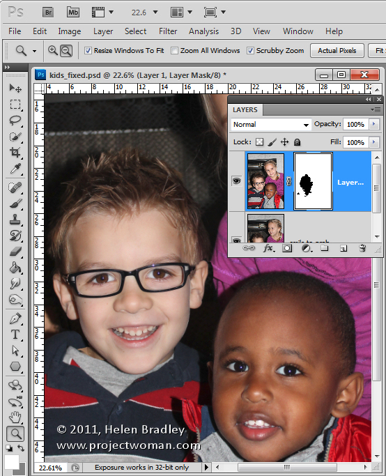
Select black as your foreground color and choose a soft edge brush. Target the mask by clicking on it so you’re painting on it and then paint over the child’s face in the image to reveal the face from the layer image below.

Step 5

You’ll need to make some small choices about how much of the layer below you reveal with the mask – if you take too much you can paint back on the mask with white to reveal the top layer again.

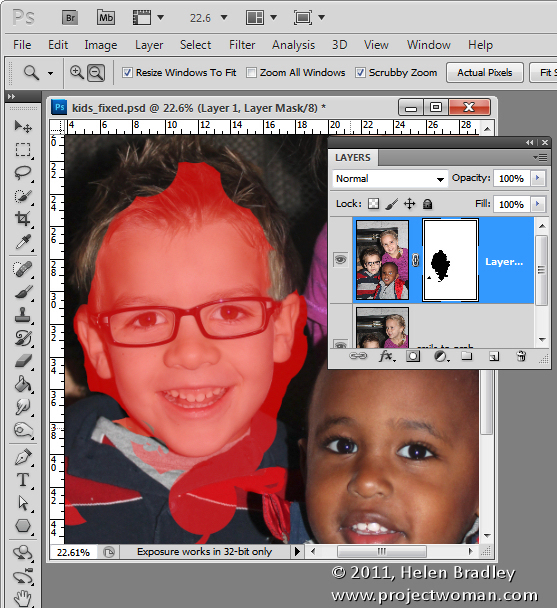
I made some small adjustments around the child’s collar to hide the fix. The red portion of the image shows the mask – I turned this on – it won’t typically be visible to you as you work.

Step 6

Finish by taking a critical look at the final image and, if necessary, adjust the mask or add a new layer and clone elements from the layers below to fine tune the image.

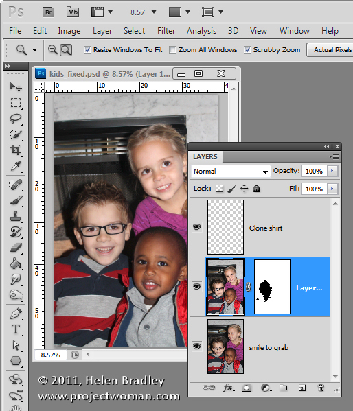
I had to do a small amount of cloning of the little girl’s shirt to fix a small problem and then I cropped the image and it was complete.

The entire process took all of around ten minutes.

Photoshop Elements

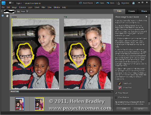
You can get similar results in Photoshop Elements 7 and above by opening the two images and choose File > New > Scene Cleaner and follow the instructions there.

Helen Bradley

Friday, February 10th, 2012

Ho-Hum to Wow! in Gimp


Some time ago I wrote a blog post http://projectwoman.com/2009/03/photoshop-color-that-packs-a-punch.html which involved using the LAB color space to adjust an image. In the interests of those of you who use Gimp, this blog post is a revisit on the topic of dragging color out of lackluster images this time using Gimp.

One of the hidden secrets of Gimp is that it supports the LAB color space so you can get access to the L, a and b channels in an image. This adjustment therefore produces similar results to those you can achieve with my earlier post using Photoshop it’s just that the process in Gimp is a little different.

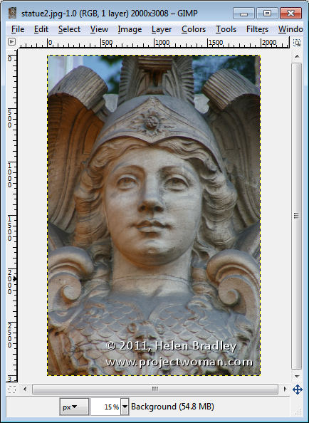
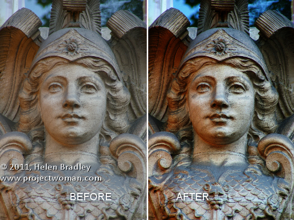
Start out with an image that could use a color boost. This image of a statue over a door in Paris is very monochromatic so it’s a great contender for this process.
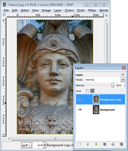
Start by making sure your Layers panel is visible – if not, choose Window > Dockable Dialogs > Layers (or Control + L) to display it. Right click the Background layer and choose Duplicate Layer. Select this new top layer.

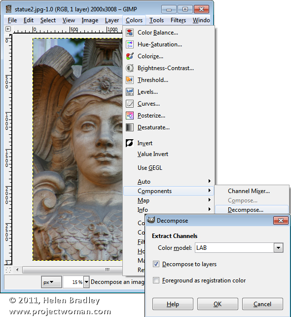
To convert the image to LAB color, choose Colors > Components > Decompose. From the color model dropdown list, select LAB. You will want to decompose to layers so select Decompose To Layers and click Ok.

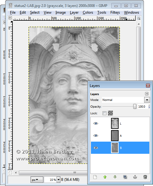
You’ll have a new image on the screen with three layers. Right now you’ll be looking at the L channel and below it in the Layers palette are the A and B channels.

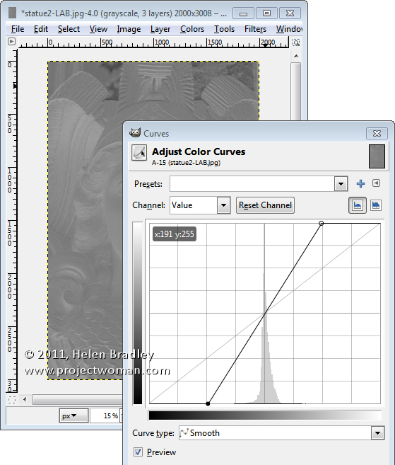
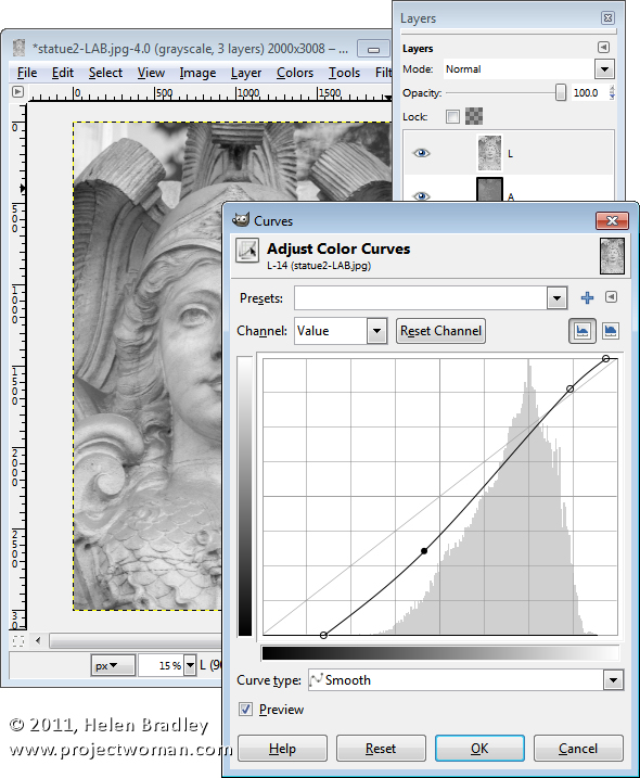
Disable visibility on the L layer and click the A layer to select it. You should have a dark murky almost negative looking image on this layer. Choose Colors > Curves and adjust the curves by dragging the top right and bottom left points on the curve one, two or three boxes inwards on the grid. You can read off the values so pairs of values  like (30,0) and (225,255) or (64,0) and (191,255) are good.

You need to make sure the line goes through the middle of the grid, or you will get an unwanted color cast in the final image. This A channel controls the Magenta and Green in the image and you’re boosting it now to very high levels. Click Ok.

Repeat this by disabling the visibility on the A channel and do the same on the B channel. This is the Yellow/Blue channel. When you’re done, turn back on the visibility of all three channels. You should see no difference in the image at this stage.

If desired, you can adjust the contrast in the L channel using curves – this will give you some additional boost in contrast in the final image. The L channel is the luminosity channel and it has no color in it at all so you can create a different shape curve here and there is no requirement for the line to go through the middle of the grid.

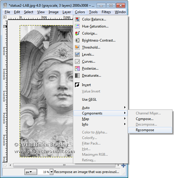
When you’re done, choose Colors > Components > Recompose. The layers will be recomposed back into the original image.

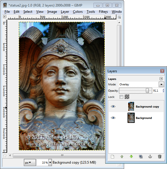
To see it, you will need to close the LAB version and return to your original image. Because you’re working on a duplicate layer, you can now blend the top layer by selecting a different blend mode such as Overlay for the top layer and then adjust down the Opacity to suit.

Helen Bradley

Wednesday, February 8th, 2012

More Flexible Lightroom to Photoshop editing

If you work in Lightroom, at some stage you’ll probably want to take an image to Photoshop for some additional processing. How you send it to Photoshop will have an impact on the options available to you. One option in Lightroom is to take an image to Photoshop as a Smart Object and that has some advantages. Here’s how to do it and why you might consider using this feature.

Open as a Smart Object

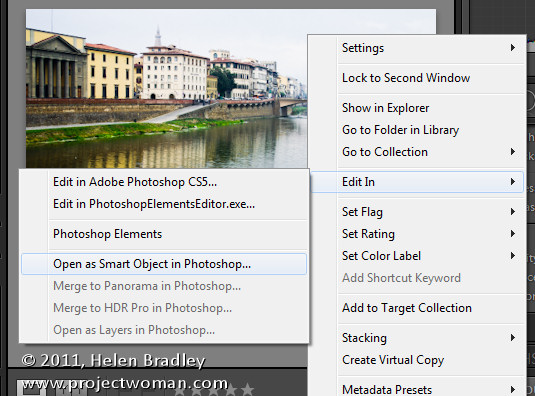
In Lightroom, when you’ve finished processing the image and you’re ready to head to Photoshop, right click the image and choose Edit in > Open as Smart Object in Photoshop (this is available if you’re using Photoshop CS5, CS4 or CS3 – Smart Objects weren’t available in earlier versions of Photoshop).

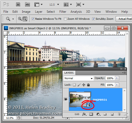
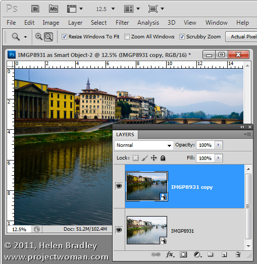
Photoshop will open with your image open on the screen. If you look at the Layers palette you’ll see the layer has an icon in the bottom right corner of its thumbnail. This tells you the image is a Smart Object.

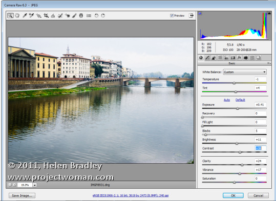
If you want to make further adjustments to the image you don’t have to start over. Instead, double click the image thumbnail in the Layers palette and the image will open in Adobe Camera RAW (ACR). The processing options in ACR are the same as you have in Lightroom so you can change how the image is processed.

When you are done making changes, click Ok. The changes to the image will appear in the Smart Object back in Photoshop.

Double processing

The obvious advantage of opening an image in Photoshop as a Smart Object is being able to make changes to the image even after it has been brought into Photoshop and even after you have made changes to it – such as adding an Adjustment Layer, for example.

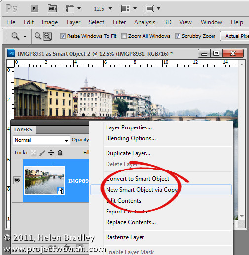
In addition you can use this feature to process an image in more than one way and to blend the two versions together. To do this, right click on the smart object layer and choose New Smart Object via Copy. This creates a copy of the smart object layer.

Double click on the thumbnail of this second Smart Object to open it in ACR and now process it a second time to bring out detail in another part of the image. In this case I adjusted to get a better sky. When you’re done click Ok to return to Photoshop.

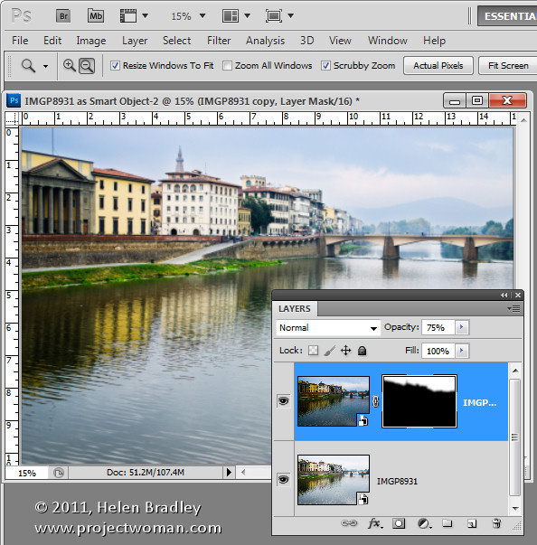
The changes have been applied to only the second copy of the image and not the first so there is a different version of the image in each layer.

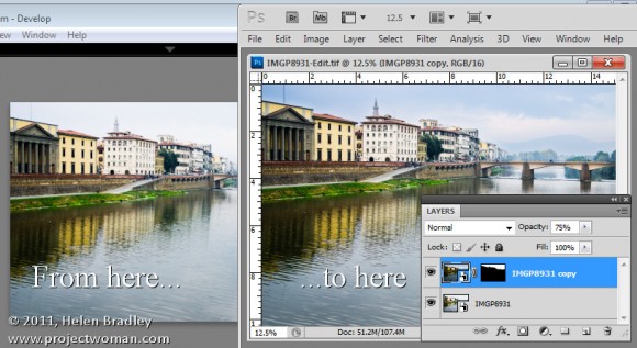
To blend the two layers together add a Layer Mask to the topmost layer – to do this, select the layer and click the Add Layer Mask icon at the foot of the Layers palette. Target the mask by clicking its thumbnail in the Layers palette and paint on the image with black to bring back detail in the layer below.

If any of the layers still needs fine tuning, return it to ACR to fix it.

Because the two versions of the image are on separate layers you can blend those two layers together using a blend mode or adjust the Opacity of the top layer.

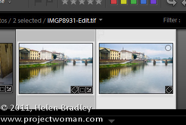
When you are done, click Save to save the file, close it and return to Lightroom. Your edited version of the image will be saved in the same location as the original image and will appear in Lightroom too.

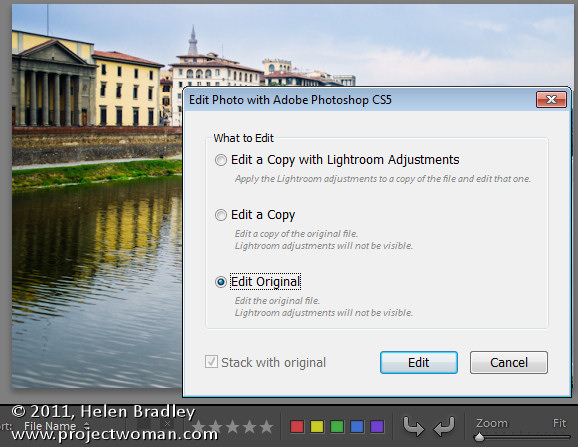
If  you want to edit this image again at a later date and have the Smart Objects still in place, when you right click the image and choose Edit In > Adobe Photoshop CS5 (or CS4 or CS3), choose Edit Original.

Taking your images to Photoshop as Smart Objects gives you additional tools for working with your images in Photoshop – it’s a handy technique to add to your Lightroom/Photoshop toolkit.

Helen Bradley

Tuesday, February 7th, 2012

Create a collage in Gimp

One task I perform regularly in Photoshop and Lightroom is to assemble multiple images on a single page for printing.  I love displaying my photos, for example, as triptychs –which are three side by side images.

I’ve posted before on the process in Lightroom here (http://projectwoman.com/2009/07/creating-a-triptych-in-lightroom.html) and here (http://projectwoman.com/2009/10/how-to-select-and-compose-a-triptych-in-lightroom.html)and today I’ll show you how to do this in Gimp using a set of templates I have created for you and that you can download free.

These templates work with both Gimp and Photoshop and you can find them here: http://projectwoman.com/articles/45PhotoshopTemplates.html

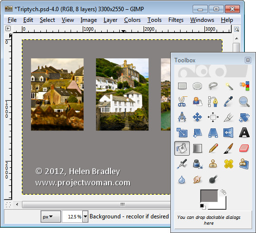
Unzip the files and open the one to use in Gimp along with the images that you want to use. I’m using the Triptych.psd file.

Start by viewing the template you are using and, in the Layers palette select and discard the top three layers which include the instructions for using the template in Gimp and in Photoshop and Photoshop Elements.

Select the first of your images, choose Select > All  and then select > Edit > Copy to copy the image to the clipboard.

In the template click on the layer marked A and choose Edit > Paste as > New Layer. This pastes the image from the clipboard into the layer immediately above layer A.

Click the Move tool (set it to Layer) and drag the image over the top of the shape on the right. If desired, click the Scale tool and scale the image to size it larger than the black rectangle.

Move the portion of the image that you’re most interested in seeing over the shape.

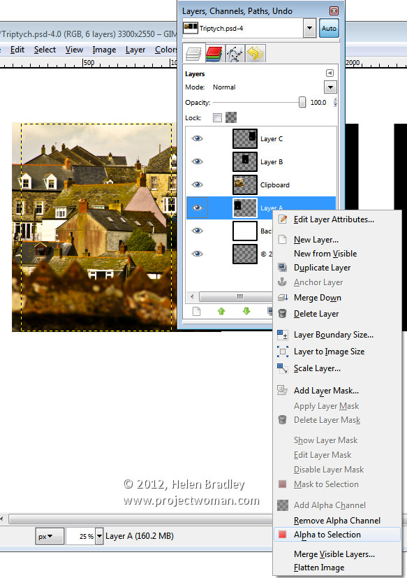
Now, to crop the image to size, click layer A, right click and choose Alpha to Selection.

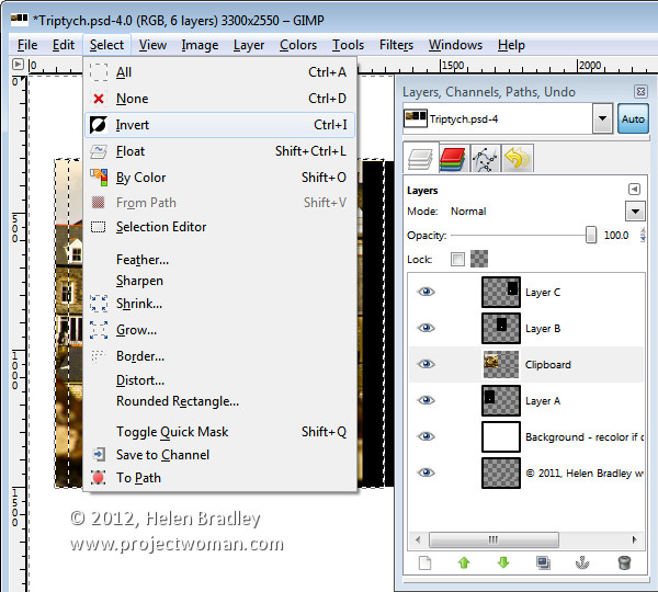
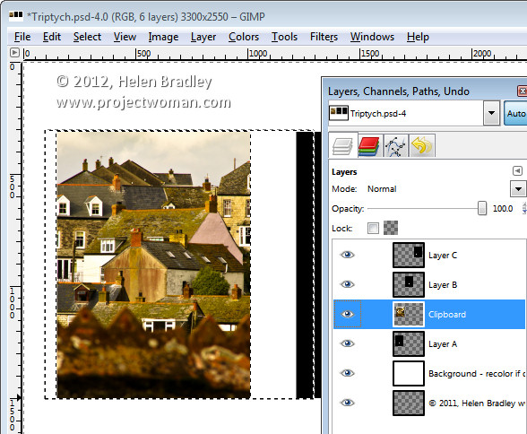
Now select the Clipboard layer that you’ve been working on, choose Select > Invert and press Delete.

The image will be clipped to size using the template shape as a guide to the size. Choose Select > None before continuing.

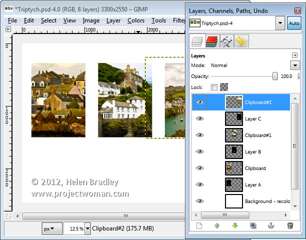
Repeat this process for layers B and C – select and copy the image to use, click the layer you’re working with (B or C) and choose Edit > Paste As > New Layer.

Move the image into position and scale it if desired. When scaling, making sure to lock the width and height so that the image is scaled in proportion.

Right click the layer you’re working with – Layer B (or C) and choose Alpha To Selection. Click your newest clipboard layer and choose Select > Invert and then Delete.

When you are done you should have all 3 images in position.

This image has a background layer behind the pictures which currently shows white. If you prefer to add a solid color behind everything, delete this layer and add a new layer filled with your choice of color. Here I’ve added a new dark grey filled layer.

You can finish off the design with some text or simply save the resulting image.

These storyboard templates are a good place to start with your picture layouts. You can find similar templates elsewhere on the web so start with a search for “Free Photoshop Clipping Mask Templates” or “Free Storyboard templates”


Helen Bradley

Thursday, January 12th, 2012

Ten best Photoshop shortcuts

Photoshop has a huge range of shortcut keys for speeding up your day. Here are my ten best shortcut keys that I suggest you add to your Photoshop toolkit:

Find the sizing handles

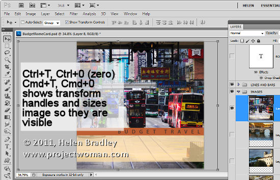
When you paste a layer or selection into a Photoshop image – if it is larger than the current image it can be difficult to find the sizing handles.

To find them, press Ctrl + T, then Ctrl + 0 (zero) or on the Mac – Command + T, Command + 0. This selects Transform and sizes the image inside the window so you can see the sizing handles.

Flatten layers but keep them too

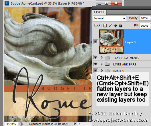
Sometimes you need, for example, to flatten the layers in an image to sharpen the result but you don’t want to get rid of the layers either. Here’s how to have your cake and eat it too (or more accurately, flatten your layers and keep them too).

Add a new empty layer to the top of the layer stack, click in it and press Ctrl + Alt + Shift + E (Command + Option + Shift +E on the Mac). This adds a flattened version of the image to the new layer but leaves the layers intact too.

Fill a layer

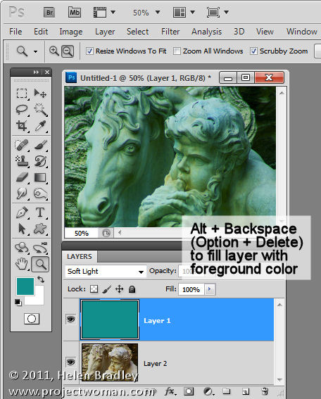
To fill an empty layer with the current foreground or background color use Alt + Delete or Option + Backspace on the Mac to fill the layer with the Foreground color or Ctrl + Delete or Command + Backspace on the Mac or to fill with the Background color.

Select a color from the image

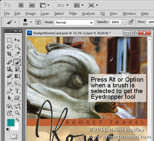
When you’re working with a Photoshop brush and you want to sample a color from the image, instead of clicking the Eyedropper tool and then the Brush tool again, you can do it with a keystroke.

Hold the Alt the key (Option on the Mac) to switch temporarily to the Eyedropper tool and click to select a new foreground color. Let go the Alt/Option key to return to the brush.

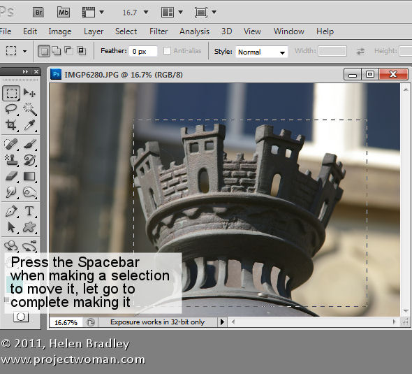
Move a selection

Moving a selection is notoriously cumbersome without this keystroke: to move a selection while you are still drawing it, press and hold the Spacebar. Continue to hold the it while you move the selection and let it go when the selection is in the correct place.

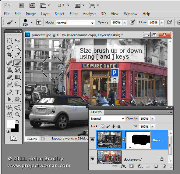
Adjusting brush size

When you’re using a brush as an eraser, to paint with or in any tool that uses brushes, you can size the brush up or down using the [ and ] keys on the keyboard. In Photoshop CS5, you can hold the Alt key and the right mouse button (on the Mac use the Control + Option keys) and drag up to increase or decrease brush hardness and drag left and right to size the brush.

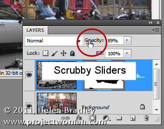
Scrubby sliders

Not technically a keystroke but a “must know” tool are scrubby sliders. In Photoshop CS3, and later, most options in most dialogs that can be adjusted using a slider can also be adjusted using a scrubby slider. Scrubby sliders appear as a hand with a pointing finger icon when you hold your mouse over the slider name. Drag on the name to adjust the slider value.

Zoom and Move with dialogs open

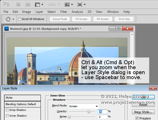
When a dialog such as the Layer Style dialog is open you can access the Zoom and Move tools by using Ctrl (Command on the Mac) to zoom in and Alt (Option on the Mac) to zoom out of the document. Use the spacebar to access the Hand tool to move the document around.

Hidden tools

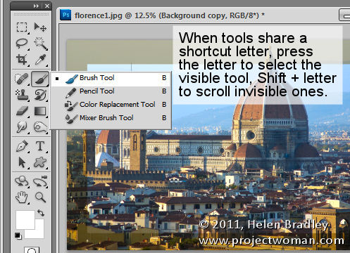
Tools that share a tool palette position and a shortcut keystroke letter can be easily selected using the keystroke letter. So, for example, to access the Mixer Brush which shares a tool position with the Brush tool and if the Mixer Brush is hidden, press B to get the Brush tool. The press Shift + B until the Mixer Brush appears. In a similar way press M to get the Rectangular Marquee tool and Shift + M to get the Elliptical Marquee tool.

Precise and crosshair cursors

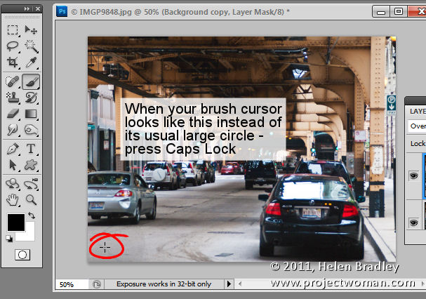
Finally, not so much a keyboard shortcut as something that can go horribly wrong –  pressing the Caps Lock key switches the Brush cursor into precise mode. This is a small crosshair cursor and hides the actual size of the brush. To return to the regular normal or standard brush tip, press the Caps Lock key again.

If I were helping a new user learn Photoshop, these are ten keystrokes I’d be teaching them. Do you agree or what keystrokes do you think are the most important to learn in Photoshop?

Helen Bradley

Tuesday, January 10th, 2012

Photoshop – 6 “must save” settings

One feature of Photoshop is its ability to store things like custom shapes, brushes and workspaces so you can use them again and again. Saving settings you use a lot in Photoshop will save you time in future when you need to repeat the process.

Here are six handy ways to speed up your work in Photoshop by saving custom settings:


Curves (and other) Dialog presets

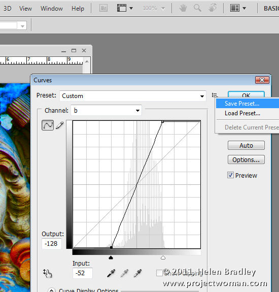
One of my favorite fixes is one involving a curves adjustment in the LAB color space which I introduced in my blog post “Turn Ho-Hum Color into WOW! with Photoshop” http://www.digital-photography-school.com/turn-ho-hum-color-into-wow-with-photoshop. The fix involves taking an image to LAB color mode and then, on a duplicate of the background layer, applying a particular Curves adjustment. Once you’ve done this once, you can speed up the process next time by saving the Curves settings as a preset. To do this, click the down-pointing arrow icon to the right of the Presets list, choose Save Preset and type a name for the preset. Next time you need to apply the same adjustment all you need to do is to select the preset from the list in the Curves dialog to save yourself the effort of creating the curves manually.

As you work in Photoshop, look out for dialogs that offer the ability for you to save your settings as presets you can use anytime in future.

Image Vignette Layer Style

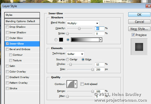
Another type of preset you can save to reuse is a layer style such as one that applies a vignette to an image. To configure this, convert the background layer of an image to a regular layer and choose Layer > Layer Style > Inner Glow. Configure an Inner Glow with settings such as Blend Mode: Multiply, Opacity: 50%, Noise: 0%, Color: Black or Dark Brown/Grey. Set the Technique to Softer, Source: Edge, Choke: 10%, Size: 250px (or to suit the image).

Click the New Style button and type a name for your style. Select both the Include Layer Effects and Include Layer Blending Options checkboxes and click Ok.

In future, you can apply this effect to an image by selecting Window > Styles to display the Styles Palette. Your new layer style will be the last one in the dialog and you can apply it to any image by clicking on it.


Saving the Presets themselves

Certain Brushes, Styles, Gradients, Shapes and Tool presets need to be saved to disk or your run the risk of losing them if, for example, you reinstall Photoshop, delete your preferences file or choose Replace instead of Append when adding presets to a panel.

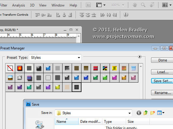
To save these presets to disk as files, choose Edit > Preset Manager and select the type of feature to save, such as Styles if you have created a custom style. Select the style or styles that you want to save, click Save Set and give the style set a name.

Once they’re saved as file on disk, you can load them into Photoshop at any time in future using the Preset Manager dialog or the feature’s own flyout menu.


Save a record of your work

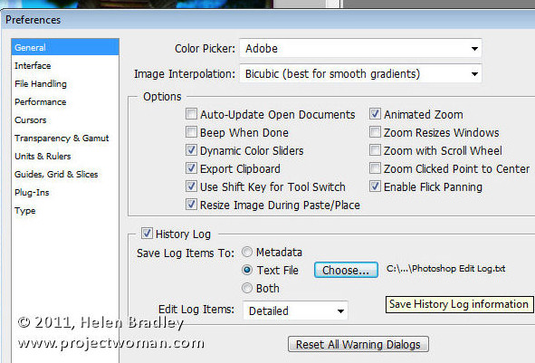
Sometimes what you want to save in Photoshop is not preferences or brushes but, instead, details of the work that you’ve been doing on your images. You can save details of the steps you have performed to individual files or to a log file by choosing Edit > Preferences > General and enable the History Log checkbox.

Select to save the Log Items to Metadata, Text File or Both. If you choose Text File, a dialog will open from which you can select the folder and text file name to save the information to. Select Sessions Only, Concise or Detailed – to learn more about these options check out this blog post: http://www.digital-photography-school.com/how-to-keep-a-log-of-your-work-in-photoshop. Click Ok and in future the work you do on all your files will be recorded and stored for you.


Save your Actions

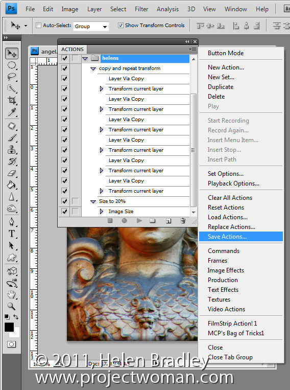
When you create Photoshop Actions to speed up the work that you do in Photoshop, like Brush and Presets, these will be lost if you lose your Photoshop settings. To make sure that these are backed up to external files so that you can recover them if they are lost, view the Actions palette, select the group of actions that you want to back up and click the flyout menu. Select Save Actions and, when the dialog appears, save your actions in a file so you can load then into Photoshop at any time.


Save your Workspace

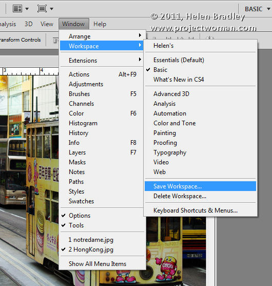
I like my Photoshop workspace to be a certain way so I use the workspace feature to store my preferred layout for the Photoshop window and Palettes. To see how to do this, arrange Photoshop the way you want it to look, including hiding any palettes you don’t want to see and showing those that you do. Choose Window > Workspace > Save Workspace (New Workspace in Photoshop 5) and give your workspace a name. Select whether to include Panel Locations, Keyboard Shortcuts and/or Menus.

In future, you can use your Photoshop workspace by choosing Window > Workspace and select your saved workspace. Unlike other preferences, workspaces are automatically saved as external files.


Helen Bradley

Friday, December 16th, 2011

Blow it Up with Alien Skin Blow Up 3

I’ve never used an upsizing or enlarging program before. Instead, when I need to enlarge an image, I perform the age old trick of increasing an image’s size by 110 percent multiple times in Photoshop to enlarge it. It seems to do a reasonable job of the enlarging process.

However, recently I was offered Alien Skin’s Blow Up 3 to test – since the folks at Alien Skin make some really cool applications I thought I’d give Blow Up 3 a try. I actually had an image that needed of blowing up for a magazine article. The image I had was a totally cool image but from a very old camera phone so it was a tiny 479 x 640 pixels in size. Not only was it very small but it had some very obvious jpg artifacts so when I enlarged it 300 percent it showed not only those artifacts at an enlarged size (the result was horrible) but the image also showed some distinct pixelization.

This was a perfect image to try out with Blow Up 3 – if I succeeded with the task the image would be acceptable quality for the magazine, if not, I needed to find something else.

Alien Skin Blow Up 3 with Lightroom

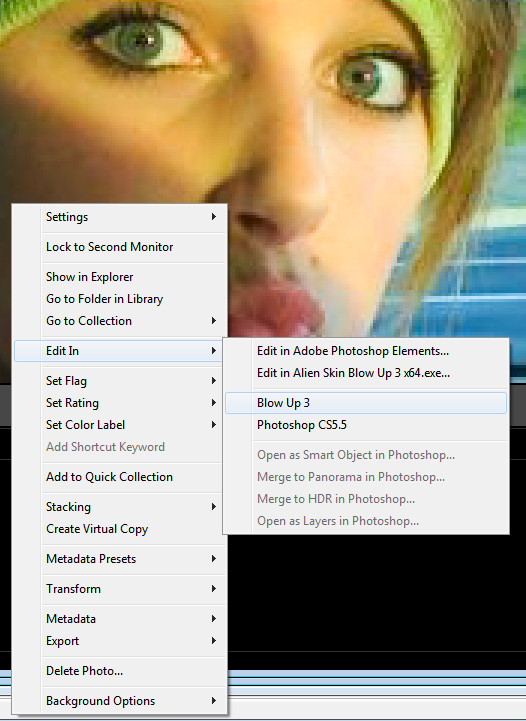
I had already installed Alien Skin Blow Up 3 for Lightroom, so running it is as simple as right clicking the image in Lightroom and choosing and choose Edit In > Blow Up 3. You get a choice of opening the image from Lightroom either as a copy with Lightroom adjustments, you can edit a copy or edit the original. You just select the option to use and click Edit and it opens automatically in Blow Up 3.

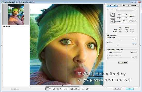
Blow Up 3 really couldn’t be easier to use. In fact I was a little confused at first because I kept looking for more options where there really weren’t any. I selected the Before/After option at the foot of the main screen so I could see the before version on the left and the after version on the right. I wanted to see as I worked just how effective the program would be. I then selected the Crop & Resize option and set it to Percent. I selected 300 percent for width and height and a resolution of 300 pixels per inch.

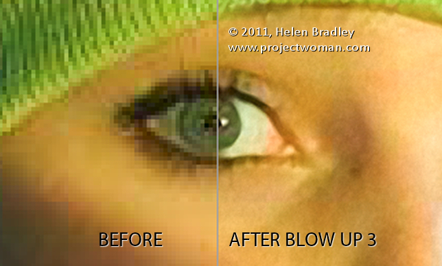
With the Before/After view on the screen, it was clear that the result would be a significant improvement for this image. The settings you can choose from include grain and sharpening. I checked out the grain slider. For this image, if I didn’t add grain, the jpg artifacts were still very apparent and they really detracted from the image because they were so visible. I opted to add a lot of grain to the image so I set the value to around 30 to soften and blend the artifacts.

I also checked out the Sharpen Edges setting to see how that would affect the image. For this image, I really didn’t want a lot of sharpening so I opted to set it to 40. This gave me some sharpening around the edges such as in her eyes but not really obvious haloing which the higher values produce.

Then, it is as simple as clicking Ok to blow up the image and be taken back to Lightroom where the blownup version appears in the same folder as the original so I found it alongside the original in the filmstrip.

From its original size the image is now nearly 1500 x 1900 pixels in size well suited to being used in a magazine and way more pleasing to look at than it was originally – sans artifacts. If you need to enlarge images significantly this application has the goods.

Helen Bradley