Tuesday, April 9th, 2013

Illustrator – Creating Halftones with Hearts

Learn how to make half tone effects with hearts (instead of dots), in Illustrator. Uses the Blend and the Transform tools for this effect. This is part 1 of a two part series on halftone hearts.

Transcript:
Hello, I’m Helen Bradley. Welcome to this video tutorial. In this tutorial I’m going to show you how you can make halftone hearts in Illustrator.

Before we get started creating our halftone heart effect let’s see what it is that we’re aiming for. And this is the effect that we’re going to create by the end of this video tutorial. And if you look at the link below for the next video tutorial in this series I’m going to show you have to create this effect and this one too.

Click Here to View Part 2

But for now let’s get started on this effect. I’m going to create a new file by choosing File and then New and click Ok. I’m going to view my rulers so that I can drag a guide in that I will use as a guide for drawing my shape. I’m going to grab the Pen tool. I’ll click and drag on the guide. I’m going to add a curve over here, another one here, and one finally back here down on the guide. And I’m just going to Ctrl click outside to disable that Pen tool. And here is my shape. And obviously I need to do something with it before we go any further.

I’m just going to adjust these points so that we get something looking a little bit more like a heart shape. I’m going to get rid of my guides so I’m just going to clear my guide. And let’s go back over, select this shape and let’s give it a stroke. So with the shape selected I’m going to give it a pink stroke, and I’m just going to make that a bit of a larger stroke so we can see it clearly. To flip this shape to make the rest of my heart I’m going to first select the shape and then I’m going to click the Reflect tool which shares a toolbar position with the Rotate tool.

The first thing to do with this tool is to click on the anchor point across which you want to flip it. So that’s going to be either this top point here or this one here. It doesn’t matter which. I’m going to Alt click on it. Now I’m getting that reflected shape sort of across the vertical access and all I want to do is to click Copy to make that a heart shape. And now I’m going to join it together by selecting it and choose Object Path Join. And here is now my heart shape.

Now I want to size this down a bit. Actually I’m going to scale it in proportion. And I’m going to make a duplicate of it so I’m going to hold it as I drag a duplicate away. And I just want to tuck this duplicate out of the way for the minute. I don’t want it around but I’m but I’m going to need it a bit later on. So let’s go and select this one and let’s size it down to be the starting point for our halftone heart. So I’m just going to fill this with pink. And I want another duplicate of this so I’m just going to Alt drag a duplicate away. And this is going to be the top one of my hearts. And I want these to line up, although right now is not the time to line them up. I’m going to size it down first of all. So this is going to be my little heart. This is going to be my big heart. And now I’m going to place it in position.

So I want these to align perfectly to their mid lines. They’re not doing that right now. There we are. This is the line that I want. I want to make sure that they’re perfectly aligned so that the point of this heart lines up with the point of this one. And I’m going to change the color so this one I’m going to make quite a sort of dark crimson color. Only I wanted that for its fill and not its stroke. So we’ve got a dark large heart and a very pale pink small one. What we’re going to do now is to blend these two shapes together so we’re going to blend the little and the big heart together. So we’re going to use the Blend tool here on the toolbar. So I’m going to select it and then I’m going to click on the first of the shapes and click on the second. And that blends these two shapes together.

Well it does such a good job that it looks nothing like what it is that we really want. So I’m going to double click the Blend tool to open the Blend options dialog. First of all I’m going to enable Preview and I don’t really want Smooth Color. I want Specified Steps. At the moment there are 127 steps to blend these two shapes and colors together. And I don’t want that. I want to actually see the shapes. So I’m thinking I’m going to start with something like 25 steps and see how that looks. That’s pretty good. Probably let’s just try down to 20 on this one. The other thing that you can do is you can also use Specify Distance as well as Smooth Color. So we don’t want Smooth Color. We definitely want to see these shapes. And we can either go with steps or distance. But I think that’s pretty good so I’m going to click Ok to accept that.

So now we’ve got the first of our lines of hearts and we just want the rest. And we get the rest with a Transform effect. So I’m going to click Effects and then choose Distort and Transform and we’re going to choose Transform. And here’s the Transform dialog. Again I always want to click on Preview so I can see what’s happening here. And let’s do 15 copies. And what I want to do is to make each copy a little bit to the side of this one. So I’m just going to choose Horizontal Move here. And I’m going to move these apart until they are looking like what I want them to look like. Now I quite like that but I think I don’t have enough copies. So I’m going for 25. What I want here is I want these hearts to run into each other. I made it so that the ones would run into each other in the vertical direction. And I want these in the horizontal direction also to run into each other so that I get this final effect. So I’m just going to click Ok.

And there is my effect that we came here looking for. This is a halftone set of hearts. And they vary from light at the top, very small too dark at the bottom. And if we want to create these so that we can work with them we’ll expand them. So with this line selected I’m going to choose Object and then just Expand Appearance. And these are now grouped but their appearance is expanded so we can work on them a little more time. Here is the Link on working

Click Here to View Part 2

Helen Bradley

Wednesday, March 20th, 2013

Photoshop Elements – Edit a layer style

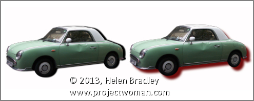
Adjust a shadow in Photoshop Elements

You have probably played around with the styles in Photoshop Elements and added things like a drop shadow to an image. But did you know that these can be  edited once they are created? Doing this gives you the ability to customize the shadow to suit your needs.

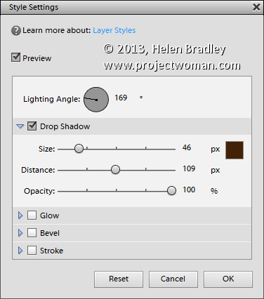
To adjust an effect such as a drop shadow, with the layer that you have applied the shadow to selected in the Layers palette, choose Layer > Layer Style > Style Settings. Alternately you can double click the fx icon in the  layer to open this dialog.


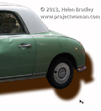
This dialog has the tools you need to adjust the shadow or other effect you have applied. Note that when you are working with shadows the Size is really a feather type effect and Distance is more what you might consider to be size and it positions the shadow at a distance from the original shape or object. 

Here too  you can change the shadow color and the direction it comes from by altering the Lighting Angle. You can also click and drag on the shadow on the image itself to move it into position. Click OK when you are done.

Helen Bradley

Thursday, March 14th, 2013

Photoshop Collage with Textures, Masks, and Fractal Trees

Learn how to make a collage or montage in Photoshop using fractal trees, a texture image and some masks.

The images used in this video are free to download and an earlier video shows you how to make fractal trees so you can make the collage yourself. The tutorial covers beginner level masking to help make the collage and two pieces are created from the same basic elements.

This is the link to the video that shows how to create fractal trees to use in Photoshop collages: http://www.youtube.com/watch?v=_hTWkhHI90s

Transript:

Hello, I’m Helen Bradley. Welcome to this video tutorial. In this tutorial we’re going to look at using masks, textures and some fractal trees to create composite images in Photoshop. In this video tutorial I’m going to show you how you can create a couple of interesting effects just using images that you can find online.

The background image here is from Flickr and details are in the end of the video. And the house image is actually from sxc.hu, and again I’ve got details at the end of the video. The tree is a fractal tree and you can see one of my other video tutorials for how to create fractal trees. And this is just done with my masking so that’s one of the images we’re going to create. We’re just going to reverse the mask here to create this image. So let’s see how we would do that and I’m going to start by showing you the two images we’re going to use. This is the one from sxc.hu which is free for download online and this is the background from Flickr.

The first thing I’m going to do is just to bring this image in so I’m just dragging on the background layer and just bringing the image into my sort of collage area. Now what I wanted to do was actually line up this background and it actually worked perfectly. These images haven’t as far as I’m aware actually been adjusted from their downloaded original. But the horizon line just works perfectly on the back of this texture image so I’m just going to do that and then we’re going to mask the house. Now the easiest way to mask this house is probably to grab the quick selection tool. And with the quick selection tool you can select over those areas of the image that you want to select. And if it’s not perfect you can just go back with the Alt key and just drag over the areas that you want to take out of the selection. But it does a reasonably good job. And because we’re doing masking anyway it’s a little bit forgiving. So having done that we can choose Select and then Refine Edge. And Refine Edge will allow us to refine the edge of this and we can do this with marching ants or on black or whatever.

Now I’m going to ask Photoshop to have another look at some of these edges here because it hasn’t done the world’s best job of getting them right and particularly these edges around the bottom here. And once we’re happy with that if we are happy with it we can just make this into a selection or a new layer with layer mask. So I’m going to choose New Layer with Layer Mask and just click Ok. And that has created the image here this house image as a new layer with its own layer mask. And I can determine how much of this inside that I want to bring in.

So I’d actually thought in the past that actually bringing these windows in would be attractive and perhaps a little bit more worked on the door. And now I want to fill these areas with black in the mask. So I’m going to select or target the mask layer, black is my foreground color so I’ll do Alt Backspace and that allows me to see through the building to what’s behind. And then I’ll just go and open one of my trees. And I have some trees here and I’ll just grab one of my fractal trees, drag it into the image here.

I’ll make sure I’ve got the tree layer selected and drag it into position here. And when we were looking at these fractal trees we determined that actually using the darker blend mode or darken blend mode blended the trees into their background a little bit better because that meant that any residual white in the tree that was left over from the process of bringing it into Photoshop would be eliminated that way. So there’s the first of our images.

So having completed our first image the second one is done in a very similar way. In fact we can borrow the first to make the second. So I’m just going to make a duplicate of the image layer here. And what I’m going to do is just invert the mask so I’m just going to press Ctrl I on the mask and effectively that was pretty much the beginnings of this image. I then brought in the tree so it would be a little bit over the edge and then we’re going to create a shadow for the tree. So the first thing I’m going to do with that is on the tree layer once it’s already set, I’m going to add a drop shadow. And I’m just going to go with whatever I get here because I’m actually not going to use it exactly as it is here so I’m just going to click Ok.

And now I want to take the drop shadow layer off onto its own layer so I’m just going to click Create Layer and click Ok. And that takes the drop shadow back onto its own layer which means I can do things with it such as sizing it down, putting it in position and then rotating it so it becomes more like the kind of drop shadow that it should be. And I want it to come over the background there so I’m just going to click Ok and actually position it a little closer and perhaps even kill down its opacity a bit, multiply blend mode is what I wanted there.

Now on this layer too I had a drop shadow so let’s just go and add a drop shadow to this. Yes, it was a drop shadow but it was a lot smaller than that. So I just gave it a little bit of a softening effect that I wanted, not quite as harsh as it had been. And we could change the color of that if we want to. But I’ll just click Ok.

So there are the two possible effects that we can create using this particular image. It’s just done through layer masks and you can create all sorts of fun collage effects using layer masks in Photoshop. And I’ve combined these with nice textures and these fractal trees. And the beauty of all of this is that these images can be grabbed online. So you can go and create these image effects if you want to yourself by grabbing the images and playing around with these effects.

I’m Helen Bradley. Thank you for joining me for this video tutorial. Look out for more tutorials on my YouTube channel and visit projectwoman.com for more tips, tricks and tutorials for Photoshop, Lightroom, Illustrator, Photoshop Elements and more. And if you liked this please click Like and comment on it and think about subscribing to my YouTube channel.

Helen Bradley

Thursday, November 1st, 2012

Lightroom – Edit in Photoshop

Learn how to take an image from Lightroom to Photoshop and back again. This will ensure that the image appears back in Lightroom, automatically added to the catalog, with the original version backed up. I also demonstrate the different possible settings so that you may customize this process.

Transcript:

Hello, I’m Helen Bradley. Welcome to this video tutorial. In this tutorial I’m going to show you how you can take an image from Lightroom to Photoshop and back successfully. I’m here in the Develop module in Lightroom and I’ve already done some work on this particular image. And I’m pretty happy with it. The problem is in this animal’s eye though you can see that there’s a little shape here that I want to get rid of.

Now I could get rid of this in Lightroom but it’s going to be a whole lot easier to take this image into Photoshop. So we’re going to do that now. To take an image from Lightroom into Photoshop I’m going to let Lightroom control the process. I’ll right click and choose Edit in. Because Photoshop has already been installed and Lightroom is aware of that I’m going to click Edit in Adobe Photoshop CS6. If I was using a different version of Photoshop I would select that from the list. I’ll click here. And now what’s happening is that Lightroom is asking me what I want to edit, either a copy of this image with the Lightroom adjustments, just a copy of the original or the original itself. In this particular case I want to edit this image with the Lightroom adjustments. So I’m going to edit a copy with Lightroom adjustments and click Edit.

If Photoshop is not already open Photoshop will be opened now. But here’s our image inside Photoshop and I’m just going to size it so that we can see the area in question. And now I’m going to bring in the tools. I have here the spot healing brush tool which is going to be the tool that’s going to help me fix this problem. I think I need to zoom in a little bit closer still so let’s get right into this problem area. And now with the spot healing brush tool I can size it down to suit the problem area and just start working over it. I could also use the clone tool if I wanted to. Any of these tools are going to help me fix this issue. And working with this tool in Photoshop is going to be a whole lot easier than working with the similar tools in Lightroom because I can just be a whole lot more accurate in Photoshop. If I want to undo it I just press Ctrl Alt Z to undo the change.

So when I’m happy with the resulting eye I’m just going to zoom out, make sure it all looks fine, which it does for this particular eye. I’ll probably fix this one while I’m here, but let’s call this good for now. And because I’m ready to go back to Lightroom now I’ve fixed the problem, I’m just going to close this image. So I’m just going to click the X button to close it. I’ll get a message which will say do you want to save changes to the document and I’ll say yes. The important thing at this point is not to choose File, Save as because you want to send the image back to Lightroom in the format that Lightroom sent it to Photoshop.

Now we’re back in Lightroom. The image that we’re looking at is the one that has been the fixed eye. And you can see here it’s called lionanimaleyes edit.tif. What Photoshop has done in conjunction with Lightroom is it’s taken the image, applied the edits to it and then sent it back as a TIF file with -edit after it. This is the original file. We haven’t lost the original. We’ve just got a copy back with the edits applied to it. Now the settings that Lightroom uses when exporting to Photoshop and receiving the image back are in the preferences setting.

I’ll choose Edit and then Preferences. And we’ll go to External Editing. You can see here that edit in Photoshop CS6 is set up as a TIF file. If we wanted to we could bring it back as a PSD file but TIF was selected here. It’s being sent out as proPhoto RGB with a 16 bit depth, a resolution of 240. And here’s the file naming. It’s coming back with the same file name with -edit on it. You can see that we’re using custom settings. Here’s the edit and here are our custom settings, the original file name with –edit applied, and then either PSD or TIF depending on what it is that we have set here for the file format. So all of this is customizable and this is where it’s being controlled as to what it goes out to Photoshop as and what it comes back into Lightroom as. And provided you use that process of just choosing File, Close or File, Save from Photoshop and not Save As so you don’t give it a name, you let Photoshop and Lightroom deal with it, then you’re going to be able to work seamlessly between Lightroom and Photoshop and back again.

I’m Helen Bradley. Thank you for joining me for this video tutorial. If you enjoyed this tutorial place click Like. You can subscribe to my channel and hear more about videos that are launched regularly every week in future.

Monday, October 29th, 2012

Lightroom – Faux Orton Effect

Learn how to create a Faux Orton Effect in Lightroom, which produces intriguing photos using glowy colors and contrasting details. I also demonstrate how to save the effect as a preset to reuse over and over again.


Transcript:

Hello, I’m Helen Bradley. Welcome to this video tutorial. In this tutorial I’m going to show you how to create the Orton effect or a faux Orton effect on an image in Lightroom.

I have an example of the Orton effect that we’re going to create here in Lightroom. This is the original image and this is the image with the Orton effect applied to it. What I’ve done is I’ve softened the image and then tried to boost the blacks a little bit. You can’t get a true Orton effect in Lightroom because you can’t apply layers in an image. So what I’m trying to do is to bring in some of the characteristics of an Orton effect, a slightly lighter more glowy sort of image with some sharp blacks in it and a sort of hazy look to it. So let’s see how we might do this.

With this image open in Lightroom, first of all I’m going to the Develop module and I’m going to upgrade this one because it’s been worked on in earlier version of Lightroom. So I’m just going to upgrade it to the new process version. And I’m happy with that so let’s just go back to the image that we’re working on. I’m going to make a virtual copy so we can see how far we’ve come. And we’re going to be working on this virtual copy.

Now the first thing I’m going to do is just adjust this image. I’m not so much worried about the histogram as I am about getting some things out of this image that I want to get out of it. But I’m going to turn off the highlight clipping because I’ve got that turned on here. You can see highlight clipping is showing here. So I want to hide this for now. Let’s turn off the histogram and let’s just adjust the image a little bit. I’m just going to set my black point. You can see I’ve got the Alt or Option key held and I’m just trying to darken this to get some blacks in the image. It needed quite a bit of darkness in the image. And let’s go up with the whites right now.

Okay, so once I’ve got the image adjusted reasonably well to get a little bit of contrast and I’m starting to see some blacks let’s start going for this Orton effect. And one of the things we’re going to do is to reduce clarity. So we’re going to bring the clarity right down on this image. I do want quite a bit of vibrance because I want a quite a bit of color. And now let’s go and add some more reduced clarity. I’m going to click the graduated filter. Now this allows me to apply a graduated filter to the image. And it needs to be anchored to a side of the image. So I want it anchored to the top so I’m just going to drag down here to create it. And because it has saturation set to minus one hundred what we’re seeing is that we’re seeing no saturation in this images at all. So that’s convincing us that this is the graduated filter. Of course I do want saturation in that image so I’m going to take it back to normal but I am going to reduce clarity. And that’s adding some more of that softening effect to this image. And I’ll click Done.

Now I can boost that even more by adding a second graduated filter to do exactly the same thing. So again, clicking on Graduated Filter, making sure I select New. This time I’m going to drag up. It doesn’t matter whether I go up or down but I just want two filters on this image. So I want to add the effect. So here’s the second filter. Again, the default on this one is for saturation to be minus one hundred. I just want to take that back to normal. And what I want to do is kill the clarity. And I can also kill the sharpness by taking that down a bit too. I might increase the exposure a little bit more in the way of highlights. And I can go to this one as well, click on this and again, bring down the sharpness on this layer, just tweak that a little bit and maybe add a little bit of exposure and highlights on that one, maybe even some shadows until I get the effect that I’m looking for. And I’ll click Done.

At this point I may want to come back and re-adjust my blacks on the whole of the image. You can see that the blacks have been affected by that adjustment and I don’t have nearly as much black as I had before. So let’s go in and adjust the blacks. Having done that I’ve brought way more black in I think than I want. So let’s just go and bring up the highlights a bit on the basic image underneath all those adjustments, and again, kick up the shadows a little bit.

So there’s the basic Orton effect applied to the image and having done that I could just go onto the next image. But I could also make this a preset that I can use in future. In the Develop module I can go up to presets here and I can click the plus symbol. So here we are New Orton because I think I have an old one, okay, and I’m going to select which options I want in there. I do want graduated filters. I didn’t use split toning. I did use color. I did use process version and calibration. I didn’t use any post-crop vignetting or grain. I didn’t use any lens correction or noise reduction here. I did use some color. I didn’t use any sharpening so I’m going to that out. I didn’t use any tone curve adjustment. But I did adjust clarity and I did adjust these settings. I didn’t adjust white balance. So now that I’ve made a selection of everything that I want added to this particular develop preset, I’m just going to click to create it.

Now this is a new Orton preset. And of course it’s been applied to this image by default. But let’s go and get another image shot in similar circumstances to this and let’s go and apply it to this image. And all I do is to click New Orton, and it is than applied to this image. The process version is applied and all of the settings that we included including the two graduated filters here and here. The reason why I used a graduated filter and not adjustment brush is that adjustment brush cannot be included in a develop preset whereas the graduated filter can. And now I’ve got a new Orton preset that I can use with any of my images. All I do is click on the image and then click on this new Orton preset and it’s automatically applied to the images.

Now if I don’t like it I can Ctrl Z to undo it. In the case of this image that I had already applied it to I kind of like it, but I think the saturation is too much. So I can use that as a starting point for working with this image. And I can then adjust the sliders because all you’re doing by creating a preset in Lightroom is actually recording what the sliders are set at. So you can use that as a starting point and then adjust the sliders as you like from there.

So there’s how to create a faux Orton preset in Lightroom to apply to your images. I’m Helen Bradley. Thank you for joining me for this video tutorial. If you liked the tutorial please like the video here on YouTube. Think about subscribing to my YouTube channel so that you get updates whenever we launch videos which at the moment is a couple of times a week.

Helen Bradley

Page 2 of 212