Thursday, December 16th, 2010

Using Lightroom Compare View

In an earlier post, I showed you how to use Lightroom’s Survey View to choose one image from a selection of images. In this post I’ll show you how to use another of Lightroom’s specialty views – Compare View which has a similar purpose but which operates very differently.

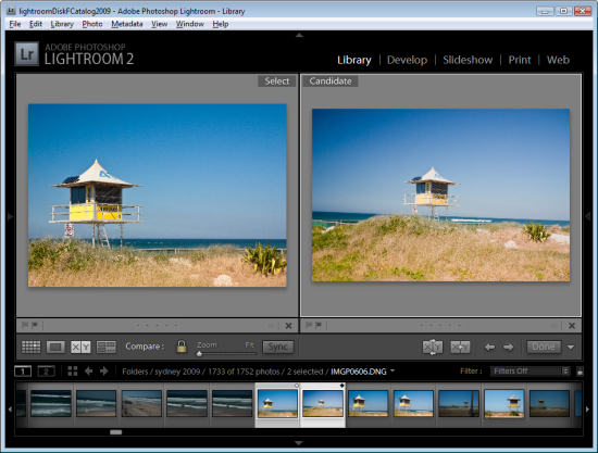
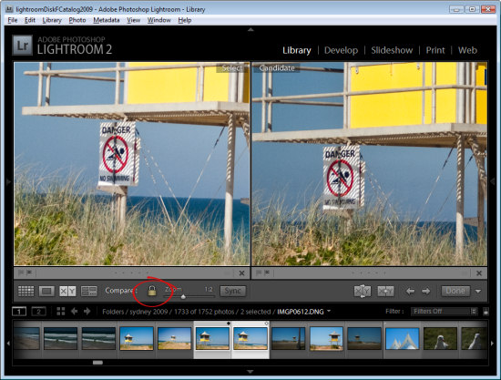
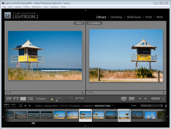
Start in the Library module, select an image and then click Compare View or press C. When you do, Lightroom shows two images, the one you had selected and the one you most recently selected before this one in this same folder.

If you didn’t previously select an image, for example if you selected Compare View immediately after you selected a folder, the first image in that folder will be the only one selected so Compare View will show the first image and the one immediately to its right in the Filmstrip.

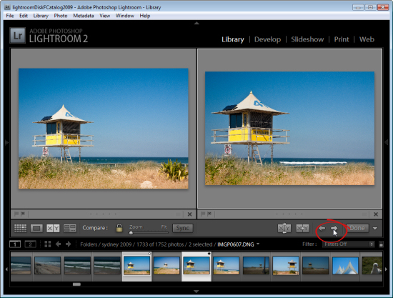
The two images you see are labeled Select and Candidate. The Select image is fixed and the Candidate image can be changed. To do this, click the left or right arrows underneath the Candidate image to move in the direction of the arrow through the folder. This replaces the Candidate image each time you click an arrow with the next image in the Filmstrip.

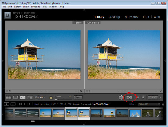
When you find an image that you want to use as your new select image, click the X<Y (Make Select) button and the Candidate image moves to become the Select image and the next image in the filmstrip in the direction that you had been moving will be the new Candidate.

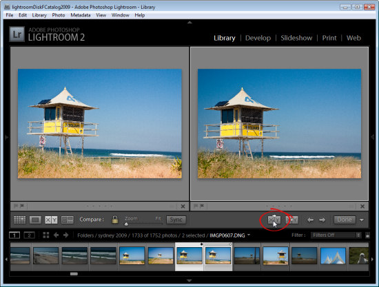
To simply swap the two images, click the Swap button to swap the two images. The current Select image becomes the new Candidate and vice versa.

Continue to work through the images on the filmstrip comparing them until you have the Select image that you want to use.

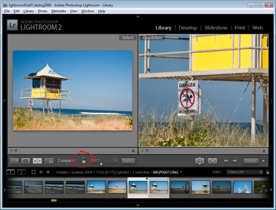
In Compare View, unlike Survey View, you can zoom the images. The lock icon on the toolbar, when locked, lets you scale both images at the one time using the Zoom slider.

If you unlock the padlock icon by clicking it, just the currently selected image (which can be either the Select or Candidate image) will zoom when you click the Zoom button.

You can also use Compare View with just one image by deselecting one of the images in the Compare View. Each image has a small X under its bottom right hand corner, which you can click to remove it. If you remove the Select image this way, you can work through images as Candidate images until you find a Candidate worthy of being a Select image and, when you do, click the Make Select button and the Candidate will become the Select image and the next image in the sequence will become the Candidate.

Click Done to exit Compare View with the Select image selected.

How Compare View and Survey View compare

While Survey View allows you to compare multiple images with each other and to remove images you do not want until you get the one that you do what, Compare View works a little differently in allowing you to view only two images. The Select image always remains in place, but you can scroll through multiple images very quickly to determine if any of them are a better candidate for your needs than the select image. If it is, you can replace them and continue your comparison.

While Compare View allows comparison between only two images, it is more complex to use and understand than Survey View. However it’s a useful way to make a choice from two images as to which is the better and then continue to compare your current ‘best’ pick with others in a sequence.

Helen Bradley

Sunday, December 12th, 2010

Choosing images using Survey view in Lightroom

Lightroom’s Survey view is a tool that makes choosing one image from a group of images a simpler process. In this post I’ll show you how to use Survey View and some tricks for working with it.

Step 1

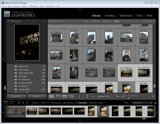
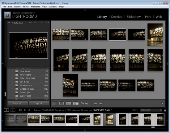
To see it at work, in the Library module, select a series of images on the filmstrip by clicking on one and Shift + Click on the last. Alternatively hold the Control key (Command on the Mac) as you click on each image that you want to make a choice from.

Step 2

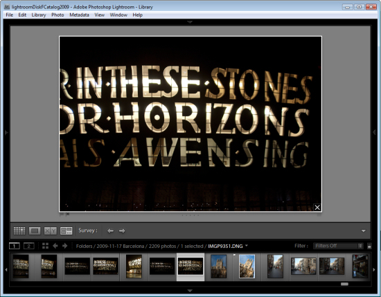
To enter Survey View, choose View > Survey, click the Survey button on the toolbar or press the letter N.

Once in Survey view, you will see only the images that you had selected. You can add more images by Control + Clicking (Command + Clicking) on them to select them in the Filmstrip.

Step 3

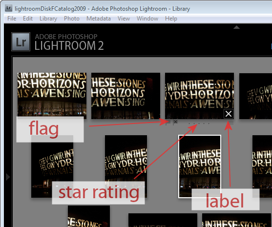
In Survey View, you can rate your images with a star rating, flag them and label them or simply use the view to narrow down your choices to a single image.

To rate an image, click the star value beneath the image – this appears when your mouse hovers the image.

You can pick an image by selecting it and press P to flag it, U to unpick or remove the  flag setting from it and X to reject it.

Click the label indicator under the far right of the image to select a label to apply to the image.

Step 4

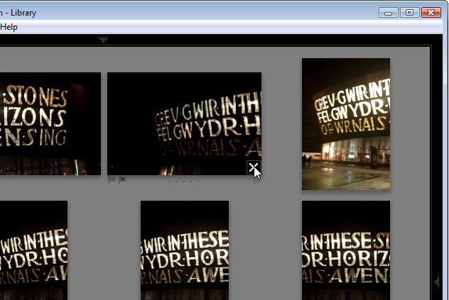
Press Shift + Tab to hide all the panels to maximize the viewing area. When an image is selected notice the X in its bottom right corner. Click that and the image will be removed from Survey View. Note that it is only removed from this view not from Lightroom and not from your disk – Survey View is simply a method you use to pick the best image from a sequence and has no other purpose.

Start removing those images you do not want by clicking their X buttons or Control + Click (Command + Click on the Mac) to remove them.

Step 5

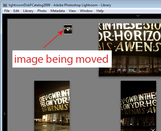
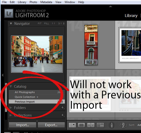
Provided you are working with a Folder of images or a Collection (but not a Smart Collection, All Photographs or Previous Import), you can reorder images in Survey View. To do this, drag and drop an image into the position you want it to appear in the group.

Files in a Smart Collection, All Photographs and Previous Imports can be selected and viewed in Survey View but you cannot reorder your images if they are selected from any of these collections..

Step 6

At any time you can exit Survey View by clicking G for Grid or E for Loupe.

The advantage of using Survey Mode is that you can quickly identify the image that you want from a series of images eliminating all the other images from the view as you do so.

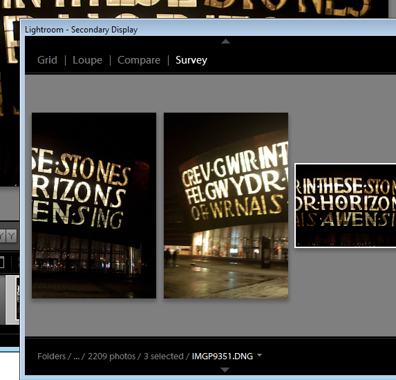
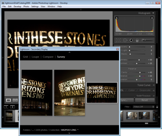
You can open Survey View in a separate window if desired. Press F11 to open the new window and select Survey as what should display in this window.

Using this secondary display window you can move Survey View to a second screen if you’re using two monitors or position Survey View in one area of your screen and work on one of the images in, for example, the Develop module at the same time.

Step 7

When you have only the image or images you want to use remaining selected, press E or G to exit Survey View. These images will remain selected so you can now do something with them such as adding them to a collection, export them or take them to Photoshop for editing.

Helen Bradley

Wednesday, October 20th, 2010

Create a Root Folder in Lightroom

If you store your photo collection on an external drive and switch between two or more computers, you can run into trouble when the Lightroom catalog does not recognize the current drive letter assigned to your portable drive. In this case, you may find that all of the folders in your Lightroom collection are “missing” requiring you to individually locate each folder in turn on the disk so that Lightroom can find the images.

If you have a large number of folders in Lightroom this can take a lot of time to fix and it’s a major nuisance. The solution is to create a folder in which all the other folders on your removable drive are located. Then add this folder to Lightroom so that it becomes your root folder. Then if the folders are ever reported as being missing you can quickly locate this root folder and Lightroom will automatically find all the other missing folders that are contained within this one.

To create a root folder, first make sure that you locate all the folders of images in your Lightroom catalog in a single folder on your external drive. Then make sure that there is, at the very least, one image in your root folder – if needed, simply copy an image there so you can continue.

Now return to Lightroom and import the root folder into Lightroom. You need at least one image in the root folder because Lightroom requires there to be at least one image in a folder before it will import it and its contents into Lightroom.

Once you’ve imported your root folder and its single image you can remove the image from Lightroom and from the disk if desired. Once the root folder appears in the Lightroom catalog it will stay there even if it doesn’t contain any images.

Now, in future, if you move your external drive to another computer and if it is not recognized by your Lightroom catalog, select the root folder in Lightroom and locate it on the disk. All the other folders below this in the hierarchy will then be automatically found.

Helen Bradley

Sunday, July 25th, 2010

Lightroom: Arrange files your way

Often when you’re working in Lightroom you will want the images to be sorted in the order that you want to see them, not in as order such as capture date which is one of the Lightroom sort options.

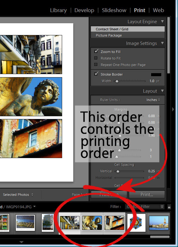
You may want to do this when assembling images for a slide show or for printing, for example as the order of the images in the filmstrip will affect how the images appear in a print template and in the slideshow.

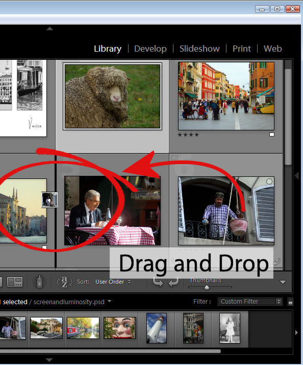
You can control the order of images in a Lightroom folder by dragging and dropping an image from one place to the other in the filmstrip view. To do this, grab the image in the middle and drag on it until you see a black bar appear between two images. If you let go the image it will drop into the indicated position.

This drag and drop process works in most instances but there are some exceptions to be aware of.

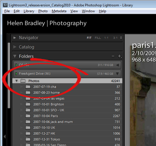
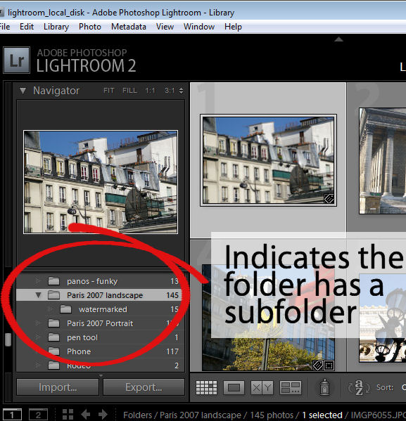
The first is that this will not work if you are in a  folder where there are images in a subfolder below it which are also visible. You can see if this is likely if you open the fly-out for the folder in the Folders panel in the library. If there is another folder the one you are working on, chances are that the images in the subfolder are included in the filmstrip and so you cannot arrange the images by dragging them into position if this is the case.

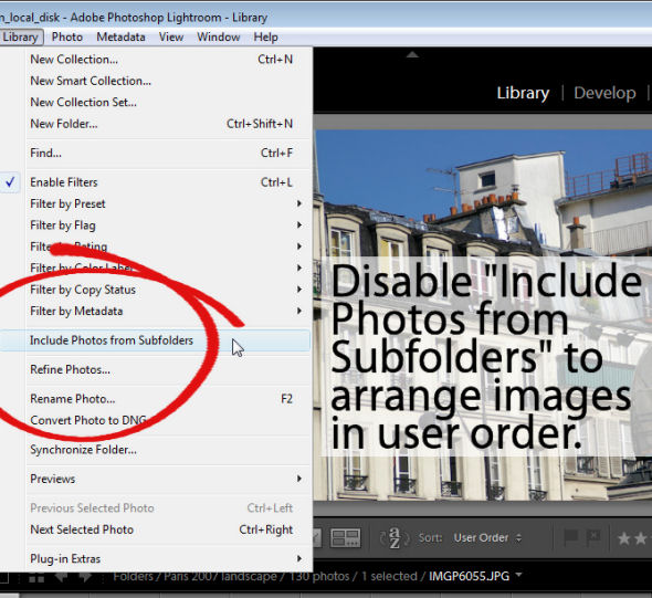
To workaround this limitation you can remove the photos in the subfolder from view – this just removes them from the grid and filmstrip and not from Lightroom or your disk. To do this, click Library in the menu and disable the Include Photos from Subfolders option.

With this disabled, you can now move images by dragging and dropping them into position.

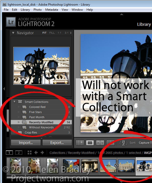
Another exception is when you are working with a Smart Collection. While images can be located in a regular collection and rearranged in order to suit, they cannot be rearranged if they are in a Smart Collection. If you have images in a Smart Collection that you want to be in a specific order, you will need to create a regular collection for them and add them to it to do so.

Another situation where you cannot reorder images to your own preference is when you are working on the images in the Catalog such as Previous Import. You must, instead, locate the folder or collection in which the images are stored and rearrange them there.

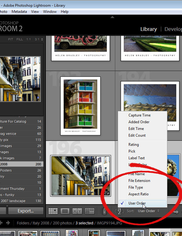
Once you have arranged the images as you want them to appear, Lightroom stores your ordering so it is as accessible as, for example, any other sort order options for that folder or collection. So, you can return to your preferred sort order at any time by selecting User Order from the Sort dropdown list.

Helen Bradley

Sunday, June 20th, 2010

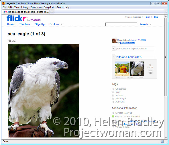
Lightroom to Flickr

If you’re a keen photographer, chances are that you publish some of your photos to Flickr for sharing with friends and family. One of the disadvantages of Lightroom 2 is that it does not come with a built in tool for publishing direct to Flickr although this has been addressed in Lightroom 3 which does offer this ability.

There are, however, tools like Jeffrey Friedl’s Lightroom plug-in that you can use to do the job. Here’s how it works:

Step 1

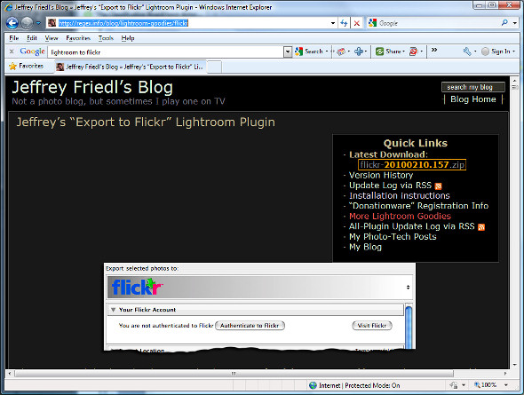
To download the tool, visit http://regex.info/blog/lightroom-goodies/flickr and locate the tool for your version of Lightroom. There are different downloads for Lightroom 1 and Lightroom 2 so get the right one.

Step 2

Download the zip file which, if you are using Lightroom 2 is via a link in the top right hand corner of the screen.

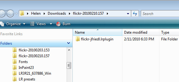
Unzip the downloaded file and, when you do, you will see a .LRPlugin folder inside the zip file.

You need the entire contents of this folder so drag and drop the entire folder from your Downloads folder into the place where you plan to keep it long term.

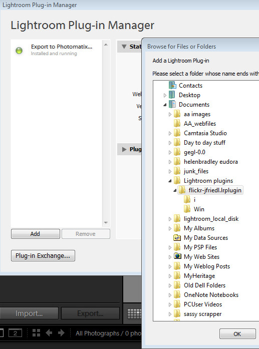
Lightroom isn’t fussy about where you place your plug-ins but it makes good sense to place them all in a central location where it is easy for you to find them. I suggest you place it nearby your Lightroom folder or in your Documents folder where it will be included in your regular system backup.

Step 3

Now return to Lightroom and choose File > Plug-in Manager. This opens the Plug-in Manager dialog where you install your Lightroom plug-ins. Click Add and navigate to the folder that you stored the .lrplugin folder. Click the folder to select it and click Ok.

Click Update if prompted to update your catalog to support the plug-in. A dialog will appear with more instructions in it. Read the information and click Ok when you are done.

Step 4

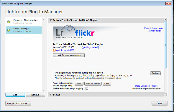
The Plug-in will be listed in the plug-in list so click Done to exit the dialog.

Step 5

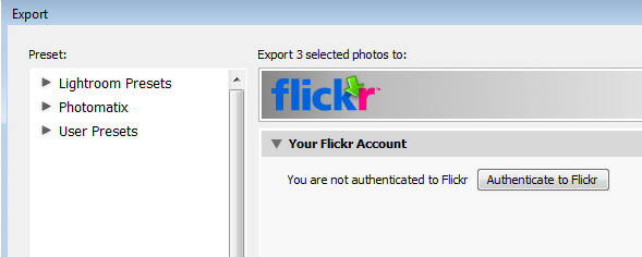
Now select a few images to upload to Flickr. Right click one of the selected images and choose Export > Export.

At the very top of the dialog you will see the Files on disk heading, click this panel and locate the Flickr (Jeffrey’s) option in the list.

Go ahead and (ignoring the Export Location settings) complete the other areas of the Export dialog as you would for any export task.

Pay particular attention to the file names, file format and quality because, when you click to Export the files they are sent direct to Flickr.

If you plan to resize the images select the Image Sizing options and choose the desired option.

Step 6

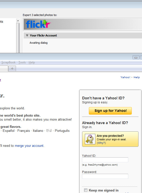
Click the Authenticate to Flickr button at the top of the dialog. You only need do this the first time you upload images. Your browser will open and you should sign in using your Flickr log-in and password.

Step 7

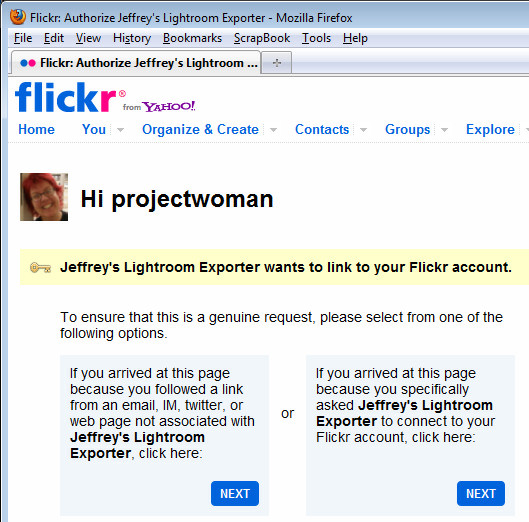
When prompted, click the second Next button to authenticate the connection then click Ok, I’ll authorize it if you are happy with the conditions displayed.

Once you have done this, close your browser, return to Lightroom and click the I’ve authenticated at Flickr.com button to confirm you have done so.

Step 8

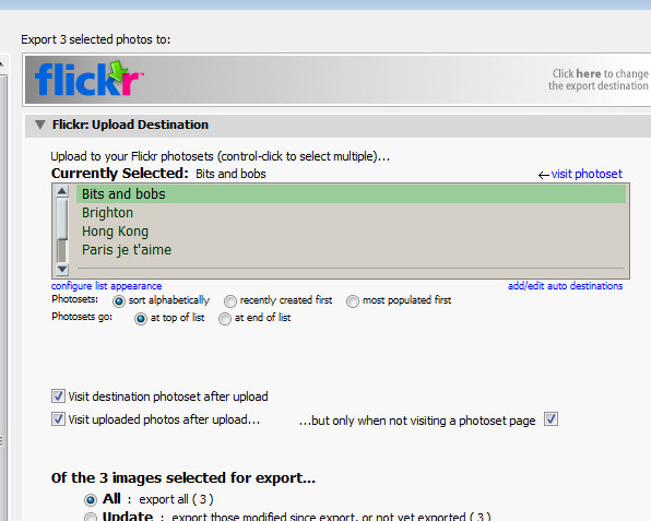
Once you are authenticated, additional options are available in the Export dialog. You can, for example, select the photosets for the images and ask to view the Flickr photoset when uploading is complete.

Step 9

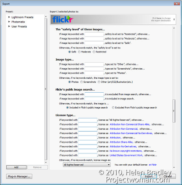
You can also set Licence types for the images, add keywords and configure a range of options for uploading.

Step 10

When you are done, click the Export button to export your images to Flickr.

This Lightroom plug-in is, what is called, donation ware. It is functional for six week and then you’re asked to register and make a donation one cent is the minimum PayPal fee. If you don’t register then functionality is reduced to uploading ten images at a time.

This plug-in works well and, until you upgrade to Lightroom 3 it is a smart addition to your Lightroom toolkit. For my money it makes the upload process seamless. And, because it saves me an entire step by rolling Export from Lightroom and upload to Flickr into a single step it represents the difference between things being left on my to do list and tasks getting a big black line drawn through them – and I like that!

Helen Bradley

Tuesday, April 20th, 2010

Lightening backgrounds in Lightroom

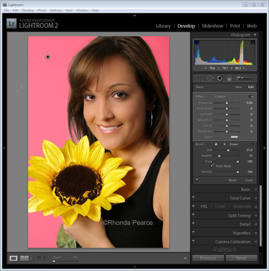
I was recently asked by photographer Rhonda Pierce to look at an image that she’d taken and to suggest how the background could be lightened to white in Lightroom.

This image raises an interesting question for anyone involved in postproduction and trying to understand when to use Lightroom and when to use Photoshop for editing.

Ultimately, if this image is to be printed at a large size then Lightroom really isn’t the tool for the job. There is too much wispy hair, particularly on the left side of the model’s face just opposite her mouth, which is cumbersome to work with in Lightroom. Selecting around the hair and doing a detailed job really isn’t possible or feasible in Lightroom. Ideally, Photoshop and a good extraction tool such as Vertus Fluid Mask would be the best combination to use.

However, if the image is not going to be printed at a large size and, for example, it’s destined for the web or if it is a preview image for a client where they’ll choose their favorite image from a series, then Lightroom is a good tool for the job. While Lightroom won’t do such a good job, it will do it very fast and, at the resolution we’ll be using the image we probably won’t see any real difference anyway. For this use, we can compromise on quality and harness the superior speed of Lightroom.

Later on, if this is the image the client chooses and if it will be printed at a large size, then we can wind back the Lightroom changes, export the image to Photoshop and do a proper job. We’ll only be spending time fixing those images that the client is actually paying for and that need a quality fix applied.

Lightening the background in Lightroom
So, assuming this image is destined for the web or for client preview purposes, let’s go back to the original question as to how the background can be lightened in Lightroom.

Any solution will require us to isolate the background. It’s not possible to lighten the background in Lightroom without affecting everything else in the image and that will destroy the rest of the image. The Adjustment Brush is the obvious solution.

Step 1
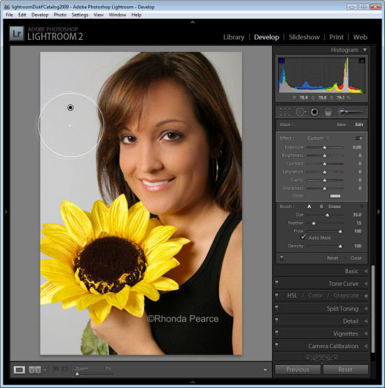
Click the Adjustment Brush in the Develop module and size Brush A so it is big enough to paint over the background. Add a small feather, and for this job, enable Auto mask so Lightroom will do most of the selection work for us. Set Density to 100.

Click and paint over the background with the brush. When you lift the brush you’ll see the Adjustment Pin. Make sure the cross hair in the middle of the brush stays on the background and then the Auto Mask feature will ensure that the brush doesn’t paint over anything but the background.


Step 2
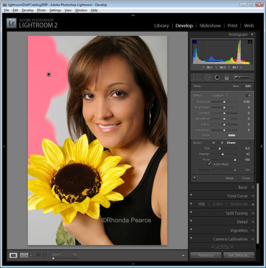
To see the painted area, press the O key and a red overlay will appear. This makes it easier to see where you are working.

Step 3
To get the background behind the very fine hairs you might be tempted to select a very small brush and try to isolate the areas manually. However, to do the job fast, it’s more efficient to size the brush very large so the center can be positioned over an area of the background and the rest of it extends over the wispy hair area. It might help to significantly decrease the density at this point to around 30 so that you only partially select the background in the wispy hair area.

Position the brush over an area of the background so the rest of it extends over the wispy hair area and click once.

Step 4
Return to 100% density and continue to work in the other background areas making sure to avoid the wispy hair.

When the area that you want to effect are selected, press O to hide the mask.

Step 5

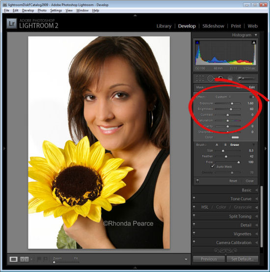
Now adjust the settings for the Adjustment Brush. Increase the exposure and brightness until the background is white.
Click Close to close the panel and deselect the Adjustment Brush.

Step 6
Check the wispy hair area and you’ll see that not all the grey has gone but, when viewed in context of the remainder of the image the results are acceptable.

Press the backslash key (\) to see the image before and after the fix.

Helen Bradley

Monday, January 4th, 2010

Video – Fixing animal eyes in Lightroom

Here is a video presentation of a recent blog post on fixing animal eyes in Lightroom.

How to use the Adjustment Brush in Lightroom to fix dull and dark animal eyes.

I am working on changing the size of the videos. A few of these were made for a special job and they are different sizes than I would actually want to use in future. I am aiming for some that are taller than this and narrower so they fit in the post layout more comfortably.

Helen Bradley

Monday, August 3rd, 2009

How do you Vignette?

Adding a vignette to an image involves adding a subtle (or not so subtle) edge effect to it. A popular vignette technique involves darkening the edges of your image – it gives the image a slight border which helps keep the viewer’s eye in the photo. This is an effect which has been popular for years and which was is a feature of some classic film cameras such as the Holga.

Nowadays many photographers and digital artists use vignettes as a way to finish their images. There are lots of ways to add a vignette to an image and here are some of them. I’ve included methods that work with Lightroom, Photoshop and Photoshop Elements. The latter process will work with most photo editing programs.

Lightroom 2

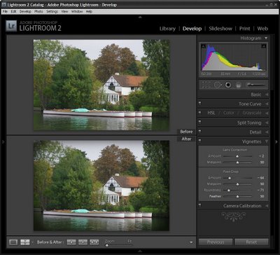
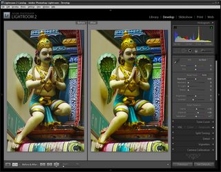
To add a vignette in Lightroom, move to the Develop module and choose the Vignette options. Set the Post Crop Amount value in a negative value to darken the edges. Set the Roundness to a low value such as -70 to get a rectangular vignette and set the Feather to around 50 so it is soft but not too soft.

Photoshop #1

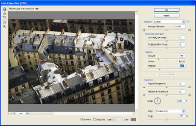
A simple way to add a vignette in Photoshop is to use the Lens Correction filter. Choose Filter > Distort > Lens Correction and adjust the Vignette amount to the Left to a negative value and the Midpoint to the left to bring the vignette into the image more.

Photoshop #2

Another way to add a vignette in Photoshop is to use a Layer style. This has some benefits and one is that the method works on just about any size image and it’s simple to do once you have the Style created.

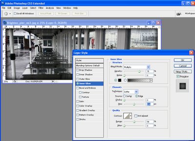
Make the background layer a regular layer by double clicking it and click Ok. Select the Add Layer Style icon at the foot of the Layer palette and choose Inner Glow. Set the Color to Black, set the blend mode to Darken or Multiply and adjust the Size so you can see the edge. You can save this as a style preset and you can then record the process of adding the style to the layer as an action so that you have a one click vignette solution.

Almost any photo-editing software

If your software supports layers and layer opacity then this method should work just fine in most photo editing programs. I’ve used Photoshop Elements and you should check your program’s help if you are unsure how to perform these tasks in your software.

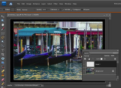
Add a new layer using Layer > New > Layer and use the Rectangular Marquee to select around the inside border of this layer leaving a small margin. Choose Select > Inverse to invert your selection so the border area is selected. Now use the Paint Bucket to fill the area with black or dark brown. Choose Select > Deselect.

Choose Filter > Blur >Gaussian Blur and use a high radius value to blur the edge and soften it. Adjust the Layer Opacity to blend this edge into the image underneath and, if desired, set the Blend Mode to Darken or Multiply.

Helen Bradley

Wednesday, May 20th, 2009

Lightroom – Understanding Clarity, Vibrance and Saturation.


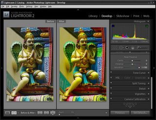
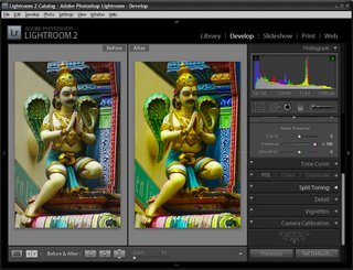
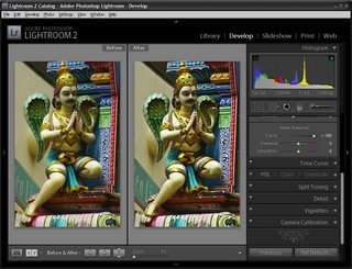
In Lightroom 2 the collection of Basic fixes available for your image includes three Presence sliders that sit together in the Develop module: Clarity, Vibrance and Saturation. This week I’ll explain the differences between these three adjustments and how they affect your photos. In each of the screenshots below I have set the slider value to 100 – way more than you would use to fix your image but a setting that will show clearly how the fixes work.


Step 1
Let’s tackle Saturation first. The Saturation slider works similarly to the Saturation slider in Photoshop or any other graphics software. It lets you adjust the saturation of the colors in the image – drag it to the right to brighten and deepen the colors in the photo. If you drag to the left, you remove some of the depth and brightness in the colors and, if you go all the way to -100 you end up with a desaturated or monochrome image.

One of the problems with using the Saturation slider is that it adjusts all the pixels in the image – those where the color is lacking in saturation and those that are already highly saturated. In trying to fix the pixels that need a color boost you can end up shooting some other pixels into right over the edge so the colors tend towards the ridiculous.


Step 2
The Vibrance slider solves some of the problems that you’ll encounter when trying to boost color saturation because it is more particular about what it adjusts. With vibrance only the least saturated colors in the image are adjusted and those pixels which are already relatively saturated are adjusted less. The result is that you’ll get a general improvement in the saturation in colors in the image but not to the extent where colors become unrealistically bright. Vibrance also offers some protection for skin tones which makes it a good choice for adding saturation to portraits as it is less likely to over saturate and destroy the subject’s skin tones. In many instances you can safely bypass the Saturation slider and adjust Vibrance instead.

Step 3
The Clarity slider affects the contrast in the midtones in the image. It works by increasing some of the edge detail in the midtones giving a general sharpening which adds punch to your photo. Typically you will want to adjust the Clarity of your image in a positive direction using a setting of around 10 to 15. If possible, view your image at 100 percent so that you can see the changes that you’re making to it as you adjust it.

Helen Bradley

Thursday, December 11th, 2008

Adding Keywords to multiple images in Lightroom


Let’s preface this blog entry by stating that what follows makes no sense at all.

I ran into some inconsistent Lightroom behaviour when trying to add keywords to images. The scenario was this: I needed to add the same keyword to a number of photos all at once. While you can do this as you import the images, sometimes you’ll be importing images which shouldn’t all have the same keywords so doing it in Lightroom later on makes more sense.

Problem is that you have to be in the right view to do it – choose the wrong one and you can waste a lot of time and have precious little to show for it. Please Adobe – make this simpler and more intuitive because right now it’s darn right frustrating and it really makes no sense at all.

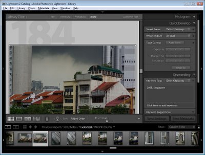
Until Adobe fixes the problem, here’s the low down on adding the same keywords to multiple images in Lightroom. First select the Library and then choose Grid View, if you don’t this things will fail, miserably. Choose View > Grid or click the Grid View button.

Now select the images to add the keywords to – click on one and Shift + Click on the last, for example. Type the keywords in the box which says “Click here to add keywords” and press Enter.

You can also copy keywords from one image and then paste them into others by copying the keywords then select the images to paste into (making sure you are in Grid view – it doesn’t work otherwise) and then paste the keywords into the “Click here to add keywords” box – use Control + V to do this.

If you try this and it fails you’re not in Grid view. Heaven help me – there’s no reason I can see why you should have to go into Grid View to do it but you do.. so now you know.

Helen Bradley

Page 11 of 11« First7891011