Friday, May 25th, 2012

Add a Photo Border in Lightroom

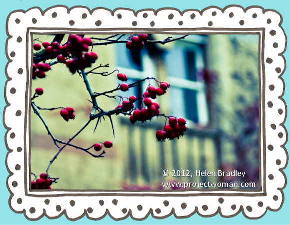
One hidden feature of the Lightroom print module is the ability to add a frame to an image. In this post I’ll show you how to add a frame to an image before exporting it as a JPEG image ready for uploading to the web or printing.

In Lightroom 3 you can create an image and export it as a JPG image from the Print module – however before you set this up, it’s a good idea to create a frame to use. I’m going to use a hand drawn border but you can use anything of your own design.

Step 1

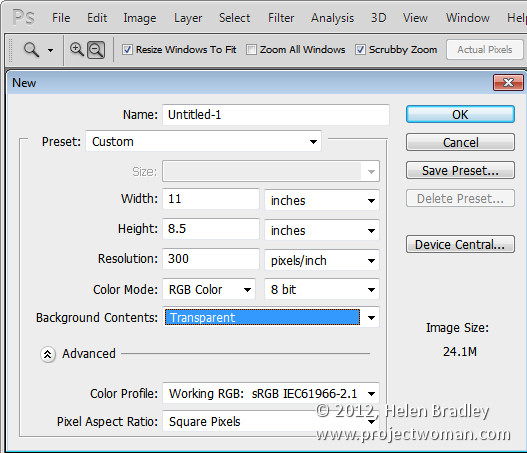
Start in a program like Photoshop and create a new image the size that you want to print from Lightroom. This is a critical step because the border image that you’re about to create cannot be resized any larger in any dimension than the Lightroom file dimensions that you plan printing to.

So, for example, if you want to print a landscape image on letter paper you need to create a frame image of the exact dimensions (or at least the exact ratio of dimensions) of an 11 x 8.5 inch sheet of paper. If you do this, the frame can be sized to the full size of the image in Lightroom.

Set the resolution of the new image as desired – I do this so it matches the resolution that I want to print from Lightroom at – so I use 300 dpi

Step 2

Design your frame making sure the inside of the frame is transparent if you plan for your frame to be placed over the image in Lightroom.

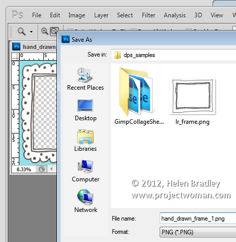
When you are done, choose File > Save As and save the image as a PNG format file so that the transparency information is retained – the JPEG image file format doesn’t support transparency.

Step 3

Close Photoshop, open Lightroom, select the image to print and click to open the Print module.

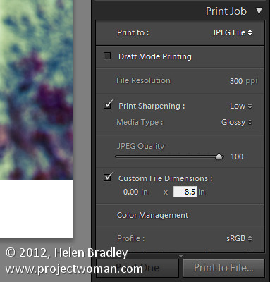
From the Layout Style panel select Custom Package. In the Print Job panel select Print To: JPEG File. Select Custom File Dimensions and set the size to the same 11 x 8.5 inches that you set the frame to be.

Set the File Resolution to the desired resolution – I’ve used 300 dpi.

Step 4

You will add the frame as a graphical Identity Plate. So open the Page panel and select the Identity Plate checkbox. Click on the identity plate box and, from the menu which appears, choose Edit then select the Use a Graphical Identity Plate option button. Click Locate File, select the frame png file you just saved and click Choose. You will most likely be warned that the file is very large – if so, click Use Anyway and click Ok.

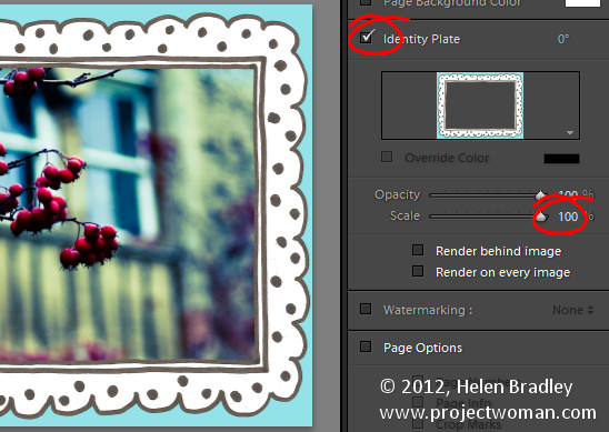
The frame will appear as an Identity Plate over the top of the image. Adjust the Scale slider to size it up to 100 percent which should ensure the frame fills the page size that you are working with.

Step 5

As the middle of the frame image was created as transparent, the image underneath it shows through it.

You can use the Render Behind Image option to place the frame under the image if that’s the way you have designed it to work.

Once you’ve added your identity plate select to print to file and the framed image will be printed to a new file.

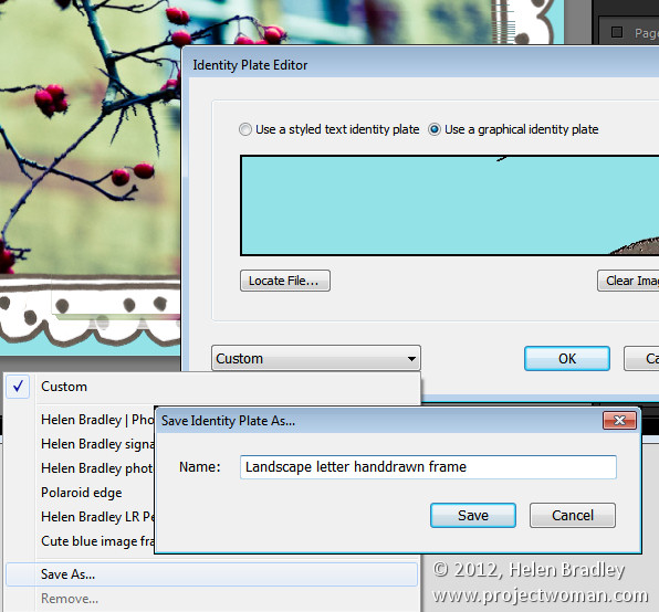
Before I am done, I click the Identity Plate box again and choose Edit and then from the Custom dropdown list I choose Save As to save the graphic frame as an Identity Plate I can use at any time in the future.

Armed with Photoshop you can create any sort of frame and import it as an identity plate to add a border to an image in Lightroom.


Helen Bradley

Tuesday, May 15th, 2012

A “Happy Snap” Lightroom workflow

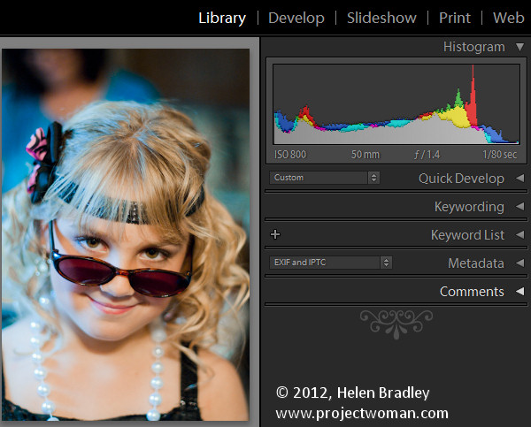
At Halloween last year I was asked to photograph some kids I’ve shot from time to time since they were born. Basically their mum likes to have some up to date photos of the kids and Halloween seemed like as good a time as any to get some shots.

When I’m shooting like this, my aim is to get some good shots but nothing formal and I prefer not to use a flash because I get a better response from the kids without one. I captured the images in raw and I chewed through three small size camera cards in about an hour and a half.

My deal with their mum is that I get to use the photos for my work and she gets a disk of pictures. To keep this fun – so it doesn’t feel like work for me – I need a fast and effective processing workflow.  I need to get the images off my camera, sorted, processed, burned to a DVD and delivered to mum in time for her to enjoy them.

Thanks to Lightroom the process was simple and, in all, I reckon I spent less than 2 hours getting the photos from the camera cards to a DVD. Here is what I call my Happy Snap Lightroom workflow – it’s what I do to quickly process casual snapshots:

Step 1: Determine a plan of attack

To begin with I have some criteria I work by. I never give away substandard photos so anything blurry, out of focus or over exposed gets permanently deleted. Then I sort out the best of the images intending to give mum around 50-60 photos of the kids – it’s a nice range of images for her to use to scrapbook and post to Facebook and it doesn’t over burden her with too many photos to choose from.

Step 2: Download the images

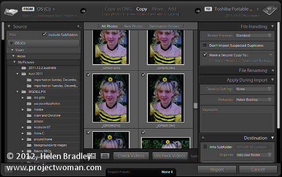
To begin, I download all the images from all three cards into a single folder on my hard drive (if there were only one card I would omit this step).

From there I import the images into Lightroom at the same time copying them to their permanent storage on my external photo drive and making a backup to a second drive. Copying rather than adding images to the Lightroom catalog lets me make backups and also add my metadata to the images so, when they popup on Facebook my copyright details are embedded in them.

Importing all the images in one step also means that when I’ve started the import process – which includes rendering standard previews – I can start working through the images and I don’t have to do it multiple times or switch out cards as I work – (the process works for me – your mileage may vary).

Step 3: Eliminating the duds

The first time I run through the images I am looking for images to delete as well as getting a general look at what I shot.

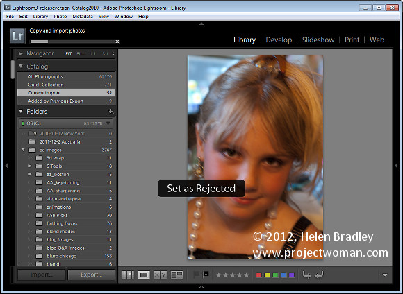
As I work through the images I’ll press X for images to delete and use the right arrow key to move past everything else. I’ll select to delete all out of focus images, anything where someone has their eyes closed or similar, and anything I don’t want to put my name to!

Once I’m done I choose Photo > Delete Rejected Photos to delete the images from my primary external photo drive. There are still copies on the backup drive and my hard disk but not on my main photo drive.

Step 4: Sorting the usable images

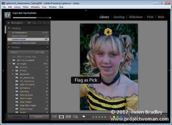
On the second run through the images I pick those I want to use. By now I have a rough idea as to what I have and what I might want to give mum. So this time I run through the images pressing P to pick an image and using the right arrow key to move past those she won’t be getting.

Step 5: Create a Collection

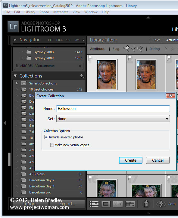
Once done, I isolate the picked images by clicking the first of the filter flag icons above the filmstrip. Then with only the picks visible I press Ctrl + A to select all of them and then click New Collection > Create Collection and type a name for it. Because the images are already selected, I leave the Include Selected Photos checkbox enabled and click Create.

Step 6: Apply initial processing to the images

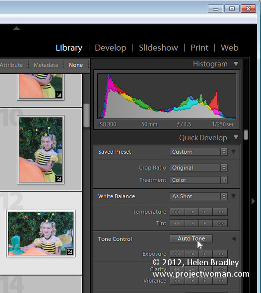
Now I have a collection of the picks and it’s time to process them. I start out by selecting all the images in Grid View in the Library and from the Quick Develop panel I select Auto Tone. This gives me a head start on fixing them but, because of the lighting, pretty much all of them needed a white balance adjustment.

Step 7: Process in the Develop module

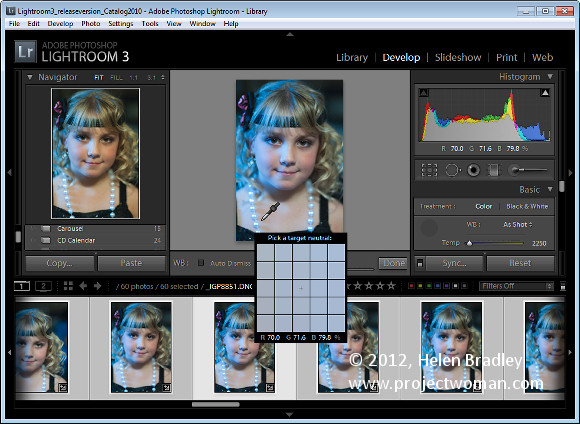
Switching to Develop module with the filmstrip visible I selected the White Balance Selector and then made sure that Auto Dismiss was disabled. This allows me to adjust the white balance on one image and then click on the next one in the filmstrip and continue to adjust the white balance from one image to the next without having to reselect anything. Basically all that most of these images needed was some white balance adjustment.

For those that needed cropping, I cropped as I finished with white balance adjustment and then moved on to the next image. This ensured that each image was dealt with only once as I progressed across the filmstrip.

Step 8: Make one off fixes

So, having fixed the worst of the problems I work backwards through the filmstrip to see if any of the images warrant special attention. If so, I make a call to fix them or simply remove them from the collection. To remove the image, right click it and choose Remove from Collection .

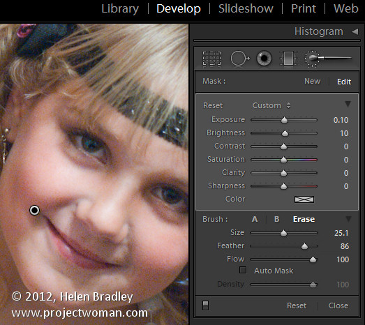
Here I had one issue with a couple of images where one child’s face was in shadow. For this, I used the Adjustment Brush tool at a small size with a large feather radius. I brushed over the areas where her face was in shadow and then adjusted the Brightness and Exposure to lighten to her face. In the same images other faces were overexposed so I added a second Adjustment Brush adjustment with the opposite settings to attempt to deal with this. The final result wouldn’t  stand up to close scrutiny but is just fine for the web and 6 x 4 printing.

Step 9: Export and burn

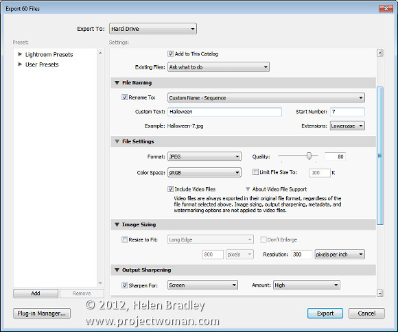
Once this was done it was time to export the images. Because they’re all in a collection, Ctrl + A selects all the images. I chose File > Export and then exported them as JPG images, 80 percent quality at the largest size and I added sharpening to them in the process. I made sure these images all went to a new folder so that they would be isolated from everything else and easy to find.

From there, it was a matter of launching Ashampoo Burning Studio, grabbing all the images and burning them to a DVD.

This workflow is one giant step better than simply burning the images direct to a DVD. It takes only a little more time with Lightroom to sort and apply some basic fixes to the images and it also means that only the best of the images get circulated and those that do have my copyright information embedded in them.

So now it’s over to you. What’s your “happy snap” workflow? Do you capture snapshots in raw? Do you process using Lightroom? And how do you get your images processed quickly so you’re not spending hours on images that are really just family snapshots?

Helen Bradley

Wednesday, May 9th, 2012

Lightroom – flagging in the Develop module

As you probably already know you can flag an image in the Library module in Lightroom using the Toolbar options.

But did you know you can also do it in the Develop module?

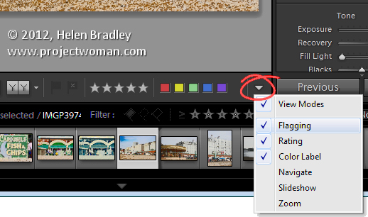
Check for the toolbar in the Develop module, if it is not visible press T to display it. Here you will find a series of options including some for flagging the image.

If the flags are not visible, click the down-pointing arrow at the far right of the toolbar and select Flagging from the menu. Click a flag to flag an image from here without having to go to the Library to do so.

The toolbars in the other modules: Slideshow, Print and Web while partially don’t have this same feature but it is a customizable option in the Library and Develop modules.

Helen Bradley

Wednesday, April 4th, 2012

Find the best photo and graphic editing software

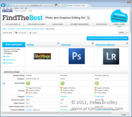
If you’re in the market for some new graphic software the first thing you’ll want to know is what’s the best for you. The folks at findthebest.com have done a lot of the work for you.

Visit the website and you can select to compare a range of applications. I’ve selected Photoshop, ArtRage and Lightroom – 3 very different applications, and then I ran a compare on them. You’ll get a heap of information including the Smart Ranking, what the purpose of the software is, the latest version and all sorts of details including ratings from the key sites such as PC World, PC Magazine, CNET and MacWorld. There’s plenty of information about supported file types, color spaces, help and online resources and whether or not the application runs on Windows or the Mac.

Findthebest.com is a great resource when you’re looking to compare different programs. Use the slideshow tab to view simplified information about each selected application and click the chart to see how the applications compare.

There’s plenty to like about this site when you need to get an overview of the kind of programs that you may want to use.

I think the interface looks a bit similar to those airline ticket site where you can sort by price, category and all sorts of things. Only here, you’ll get the best photo editing programs not a ticket to London!

Helen Bradley

Friday, March 30th, 2012

Print Contact Sheets in Lightroom

By Helen Bradley

Historically a contact sheet was a page of images each printed at the same size as the film negative – they were used as a reference for the images on the film roll. They were called contact sheets because the film was placed in close contact with the paper when printing them.

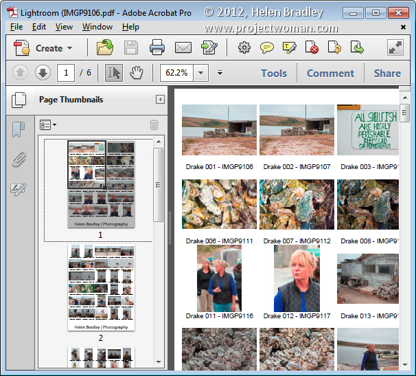
These days the term contact sheet loosely means an arrangement of multiple, small, same size images on a single page usually with some identifying information such as the image filename placed under the image. The purpose is to provide reference to a larger number of images. You may print them to keep or give to a client as a catalog of the images from a shoot, for example.

You can create a contact sheet inside Lightroom and here’s how to do it:

Select a template

Start by selecting the folder or the collection that contains the images that you want to add to the contact sheet.

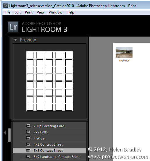
Launch the Print module and, from the Template Browser, select one of the contact sheet options. There are a few grid layouts including two with square image cells – a 4 x 8, and a 5 x 8. There are two with landscape orientation cells – one 5 x 9, and one 5 x 11.

I chose the 5 x  8 one.

Set up the print job

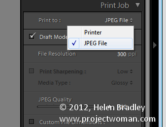
If you plan to ‘print’ the contact sheet to a jpg file, from the Print Job panel on the right of the screen, choose Print to JPG File. As contact sheets are just that – a contact sheet and not full scale images – select to use Draft Mode Printing to speed up their creation.

The page dimensions will be preset for 8.5 x 11in. You can set your own Custom File Dimensions but increasing the size of the page simply changes the page size not the size of the cells – you have to adjust them separately.

Adding images

If you have only one image selected in the Filmstrip then the contact sheet will only display one image.

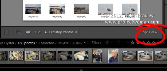
You’ll need to select all the images on the filmstrip to add them to the contact sheet. To do this, either click on the first image and Shift + Click on the last or select All Filmstrip Photos from the Use: list on the toolbar. If the Toolbar is not visible, press T to display it. You can also select Flagged photos, if desired.

The Toolbar shows you how many pages you will use and you can click the arrow keys on the toolbar to navigate the pages.

Add image captions

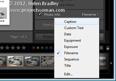
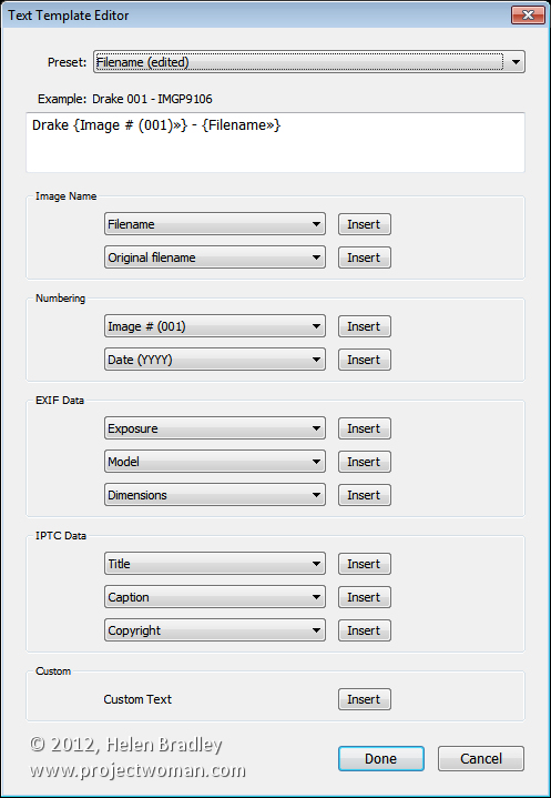
To add information below the images, from the Page panel on the right, select the Photo Info checkbox and choose the field to display. You can use one of the preset options such as Caption, Date, or Filename or click Edit to create your own field.

In the Text Template Editor, you can access to fields such as the filename, a sequential numbering or date as well as EXIF and IPTC data. You can also type your own custom text to create detailed photo info to add to the contact sheet. Here I typed some text, added a sequential number and the filename.

Customize the Contact Sheet

The template contact sheets are a starting point but you do not need to strictly adhere to their design if you don’t want to and they can be easily customized.

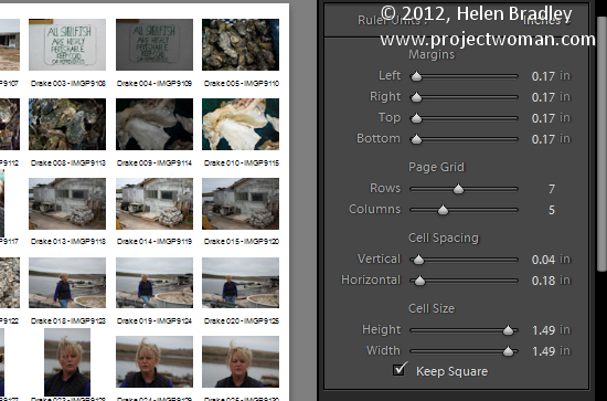
For example, from the layout panel if you click the Keep Square checkbox you will find that in some layouts your images may change orientation so the page will be a mix of portrait and landscape images.

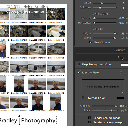
You can adjust the maximum cell size and width using the Cell Size Height and Width sliders in the Layout panel. As you adjust the cell size, notice that the Cell Spacing values will change.

You can decrease the number of rows and/or columns using the Page Grid options. By decreasing the number of rows or columns, you can increase the cell size.

Adjusting margins

If you increase the Bottom or Top margin you can give yourself room to, for example, place an Identity Plate on the page.

Here I’ve reduced the number of rows and increased the bottom margin and added an Identity Plate from the Page panel options. In the Page panel, select the Identity Plate checkbox and then select the Identity Plate to use.

The Identity Plate will appear, by default, in the middle of the page so drag it into position on the page. Adjust its scale by dragging on the Scale slider.

You can adjust its Opacity if desired and, if it is a text identity plate (rather than a graphic), you can also select Override Color to make it any color you like.

Print the result

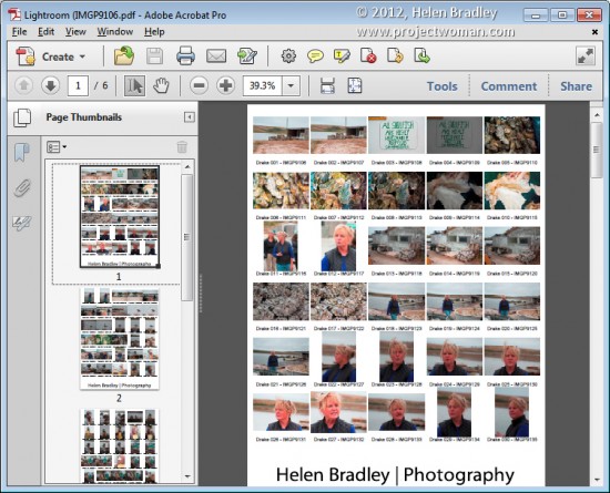
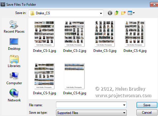
When you’re done, you’re ready to output the result. If you selected to print to a JPG file click Print to File and type a name for the file and select a location for them. The pages will be printed to a JPG file and if there are more than one they will be sequentially numbered.

Print to PDF

If you want to print to a PDF on a Windows machine you will need to have a PDF printer driver installed such as Adobe PDF or one you have downloaded from the web.

Select Page Setup, select the pdf printer driver and configure the page size so it matches the template size – such as letter paper portrait orientation. Then set the Print to: option in the Print Job panel to printer and click Print to print to a pdf.

Save the Template

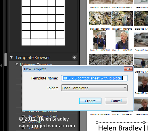
If you have customized a template and want to be able to use it again in future, save the design as a new template.

Click the plus symbol opposite the Template Browser panel header and type a name for your template. You can store it in User Templates or create a new folder for it. Click to create it.

In future you can save yourself the time setting up the template by starting with your customized version.

Helen Bradley

Sunday, March 25th, 2012

Use Lightroom Presets in Adobe Camera Raw

If you’re like me, you have some presets that you’ve created in Lightroom that you would like to use in Adobe Camera Raw. Unfortunately the format of the preset files in each program is different so you can’t just install a Lightroom preset in ACR. However you can make an ACR preset from a file that has had that same preset applied to in Lightroom. Here’s how:

Apply the Preset

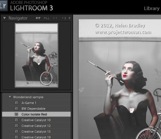
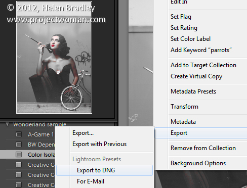
To begin, open an image in the Develop module in Lightroom. Without applying any other changes to the image, apply the Preset that you want to take to ACR. Here I have applied one of the free Wonderland presets from wonderlandpresets.com.
Export the Image

Now export the image as a DNG file so that the changes will be written to the file. To do this, right click the image and choose Export > Export to DNG and export the image to folder of your choice.

Open in ACR

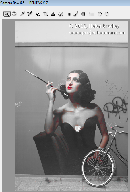
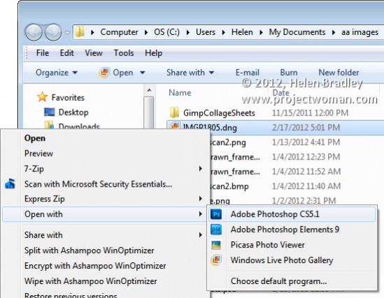
Launch Windows Explorer and locate the image on disk. Right click it and choose Open With > Photoshop CS5. Because it is a DNG file, it will open automatically in ACR.

Create the Preset

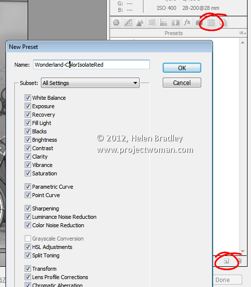
Click the Presets tab and click the Create New Preset option at the foot of the Presets panel. Type a name for your preset and then select the options that you want to include as part of the preset. Type a name for the preset and click Ok.

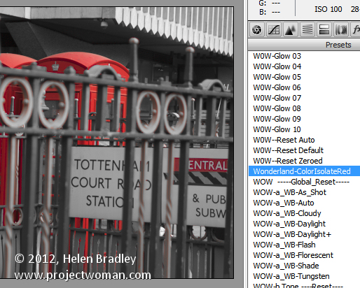
The preset will now be available from the Presets panel in ACR and will be able to be used to adjust any image.

Features not included

You should note that while most of the Lightroom adjustments that can be stored in a Lightroom Preset can also be saved as an ACR Preset, one exception is any Graduated Filter adjustment.

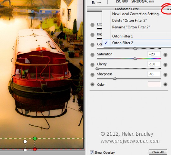
In Lightroom any adjustments you make using the Adjustment Brush cannot be saved in a Lightroom preset and in ACR those made using the Graduated Filter cannot be saved either. You will see the Graduated Filter adjustments that you made in Lightroom in ACR if there are any but you cannot save them in your preset as a Graduated Filter adjustment. What you can do however, is to save the settings for the Graduated Filter but not its placement as a separate setting. To do this, click the Graduated Filter icon in ACR to select the tool then click the Graduated Filter to save the settings for. Click the icon in the top right of the Graduated Filter panel and choose New Local Correction Setting and save it giving it a name.

You can apply this to an image in future using the Graduated Filter tool – just select the setting to use from this menu and drag to create the Graduated Filter for the image. The solution isn’t perfect but it can save you some work as shown here with the two Graduated Filters which are part of my Orton Preset for Lightroom. I can apply the preset then switch to the Graduated Filter and quickly apply the two Graduated Filter adjustments with their individual settings.

Advantages of taking Lightroom presets to ACR

One of the reasons you may want to take presets from Lightroom to ACR using this process is to take advantage of the free presets available for Lightroom. There are lots more of these than there are presets for ACR. If you use ACR as well as Lightroom then having your favorite presets available in both program will be useful.

Helen Bradley

Monday, March 12th, 2012

Deleting catalog backup files

I’ve been talking to a few people lately about deleting catalog backup files. If you backup and optimize your catalog every time you close Lightroom then, over time, you will end up with a lot of excess catalog backups.

Each of these backups will consume disk space so the question becomes – what is in these backups? What use are they? And can they be deleted safely?

Backup your catalog

When you set Lightroom to make a backup of the catalog what it does is to make a backup of just the catalog and not your images, or your previews, or the sidecar xmp files for your raw files, or your presets. While having a catalog backup is undoubtedly a useful thing, it is incomplete so you will need to have a system backup system in place to backup what Lightroom does not.

In fact, because Lightroom’s backup is only a catalog backup, some people don’t do a backup this way and instead rely on their regular system backup to take care of backing up everything – catalog included. I prefer to at least have Lightroom do a regular catalog backup but that’s my personal preference.

Which backups to keep?

Because the catalog backup files are all stored in different folders by date they will build up over time and keeping them all is not a necessity.

You can be selective about which ones you keep – you should, at least, keep the most recent backups because if your catalog is corrupt you will want to be able to recover using these. If the most recent backup has issues then you would progress backwards until you get one which isn’t corrupt.

So, if I use Lightroom every day, I would keep the backups from this week and then one from last week and one from last month and beyond that I could feel pretty safe about deleting the others.

Delete a catalog backup

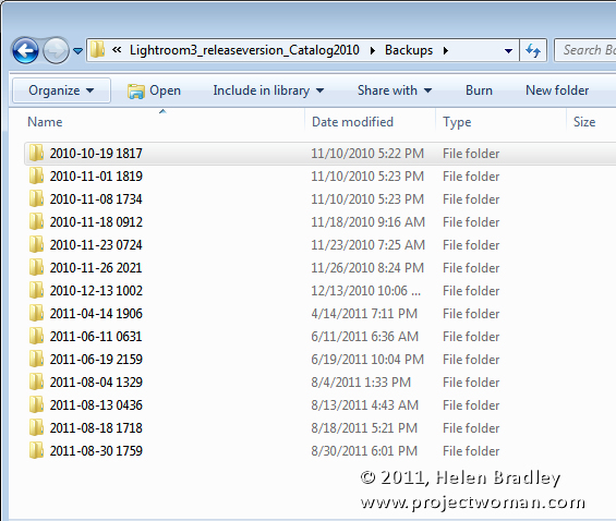
To delete a backup, locate the backup folder and identify the backup folders to delete and go ahead and delete them.

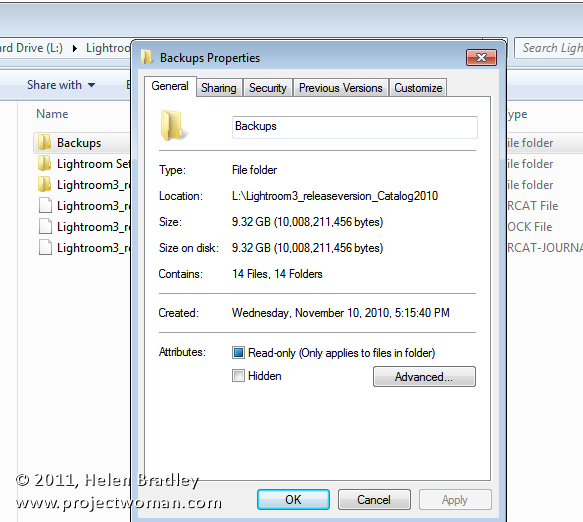
You will find your catalog backups, if you didn’t change the default location for them, in a folder called Backups inside your Lightroom catalog folder.

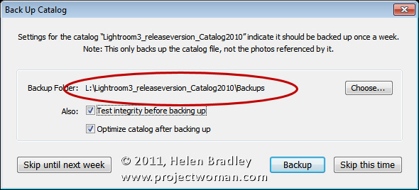
If you changed its location you can find the location you selected when you’re next prompted to backup Lightroom – the location is reported in the dialog prompting you to backup. Here too you can change that location if desired.

One issue with the Lightroom catalog backups is that the location, by default, is inside the folder that contains the Lightroom catalog. So, if the disk containing the catalog becomes corrupt you could lose your Catalog backups too. You may prefer to backup to a different disk to protect against this likelihood.

Every one of us will have different preferences for how we backup, where we backup to, the frequency of backup and what we backup. It’s over to you now – do you use the Lightroom Catalog backup tool? If you do, do you store your backups in the default location? Do you delete excess backups regularly?

Helen Bradley

Wednesday, February 8th, 2012

More Flexible Lightroom to Photoshop editing

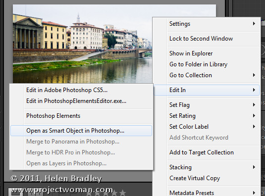
If you work in Lightroom, at some stage you’ll probably want to take an image to Photoshop for some additional processing. How you send it to Photoshop will have an impact on the options available to you. One option in Lightroom is to take an image to Photoshop as a Smart Object and that has some advantages. Here’s how to do it and why you might consider using this feature.

Open as a Smart Object

In Lightroom, when you’ve finished processing the image and you’re ready to head to Photoshop, right click the image and choose Edit in > Open as Smart Object in Photoshop (this is available if you’re using Photoshop CS5, CS4 or CS3 – Smart Objects weren’t available in earlier versions of Photoshop).

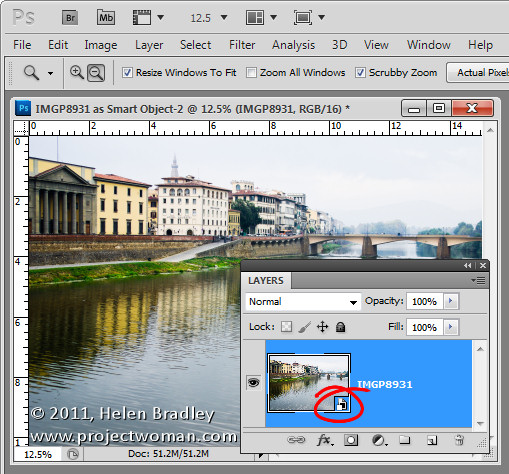
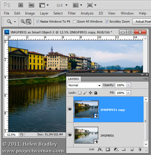
Photoshop will open with your image open on the screen. If you look at the Layers palette you’ll see the layer has an icon in the bottom right corner of its thumbnail. This tells you the image is a Smart Object.

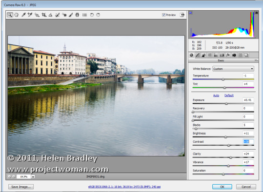
If you want to make further adjustments to the image you don’t have to start over. Instead, double click the image thumbnail in the Layers palette and the image will open in Adobe Camera RAW (ACR). The processing options in ACR are the same as you have in Lightroom so you can change how the image is processed.

When you are done making changes, click Ok. The changes to the image will appear in the Smart Object back in Photoshop.

Double processing

The obvious advantage of opening an image in Photoshop as a Smart Object is being able to make changes to the image even after it has been brought into Photoshop and even after you have made changes to it – such as adding an Adjustment Layer, for example.

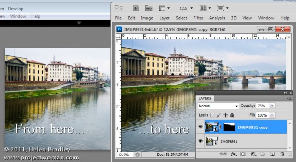
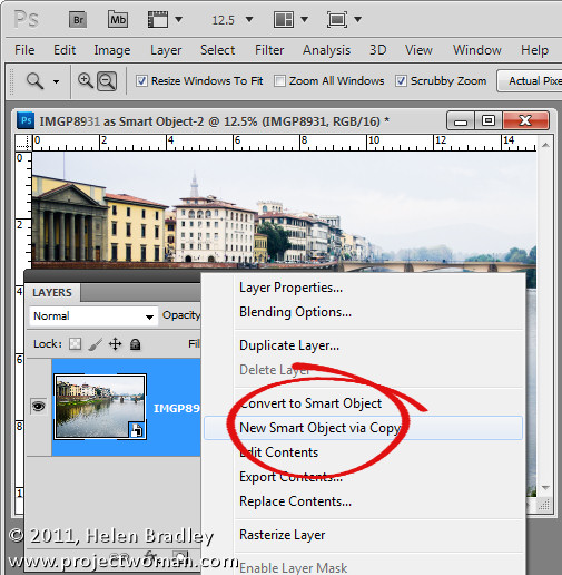
In addition you can use this feature to process an image in more than one way and to blend the two versions together. To do this, right click on the smart object layer and choose New Smart Object via Copy. This creates a copy of the smart object layer.

Double click on the thumbnail of this second Smart Object to open it in ACR and now process it a second time to bring out detail in another part of the image. In this case I adjusted to get a better sky. When you’re done click Ok to return to Photoshop.

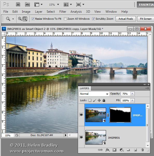
The changes have been applied to only the second copy of the image and not the first so there is a different version of the image in each layer.

To blend the two layers together add a Layer Mask to the topmost layer – to do this, select the layer and click the Add Layer Mask icon at the foot of the Layers palette. Target the mask by clicking its thumbnail in the Layers palette and paint on the image with black to bring back detail in the layer below.

If any of the layers still needs fine tuning, return it to ACR to fix it.

Because the two versions of the image are on separate layers you can blend those two layers together using a blend mode or adjust the Opacity of the top layer.

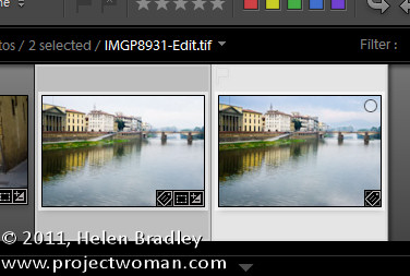
When you are done, click Save to save the file, close it and return to Lightroom. Your edited version of the image will be saved in the same location as the original image and will appear in Lightroom too.

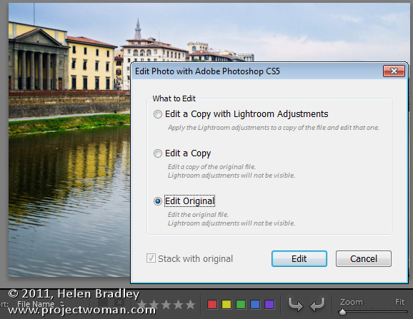
If  you want to edit this image again at a later date and have the Smart Objects still in place, when you right click the image and choose Edit In > Adobe Photoshop CS5 (or CS4 or CS3), choose Edit Original.

Taking your images to Photoshop as Smart Objects gives you additional tools for working with your images in Photoshop – it’s a handy technique to add to your Lightroom/Photoshop toolkit.

Helen Bradley

Tuesday, January 31st, 2012

5 Gotchas in the Lightroom Print Module

When you’re setting up single or multiple image printing in the Lightroom Print module here are some things to be aware of:

Nonexistent Drag and drop

You can drag and drop pictures onto a print template in Lightroom in some circumstances but not in others. This can be confusing but there is some logic behind it.

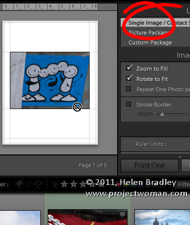
When you select a Lightroom template from the Template Browser, make sure to open the Layout Style panel on the right at the same time. Templates can be one of three layout styles and each operates differently. Knowing what style a template is will help you understand its behavior.

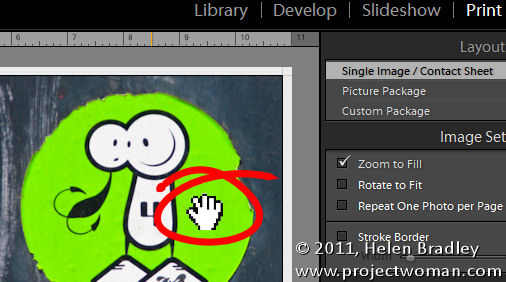
If it is a Single Image/Contact Sheet template then you must select images on the filmstrip to add them to the contact sheet and they appear in the layout in the order they appear in the filmstrip. You can’t drag and drop images from the filmstrip into a Single Image/Contact Sheet layout.

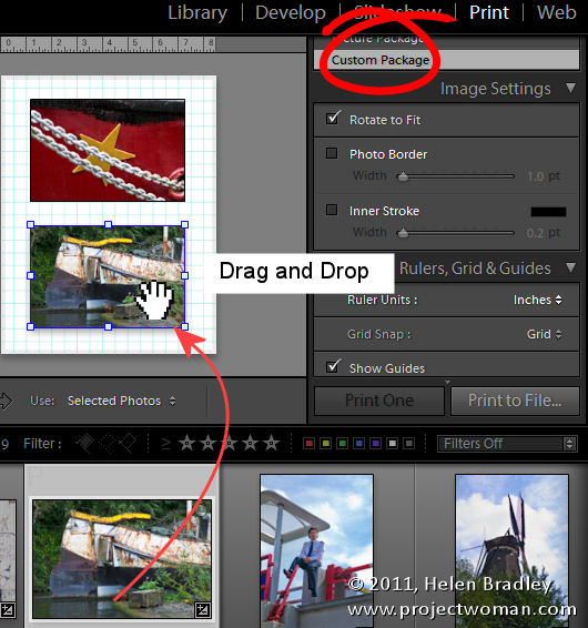
If the template is a Custom Package then you can drag and drop an image into any of the containers on the screen. You can also drag and drop an image into any position in the layout and it will sit on the screen even overlapping other images.

If a template is a Picture Package, then you can fill it by clicking an image in the filmstrip. A picture package prints multiple images on a single sheet of paper. If you select two images in the filmstrip, you’ll then have two pages in your picture package – one for each of the selected images. You can drag and drop an image into a Picture Package but when you do, you’ll create all sorts of issues. Not only will you add a new image to the layout page you are seeing on the screen but you’ll do the same for all the pages in the current layout. It’s generally best not to drag and drop images into an already tightly designed picture package layout.

Understand Border behavior

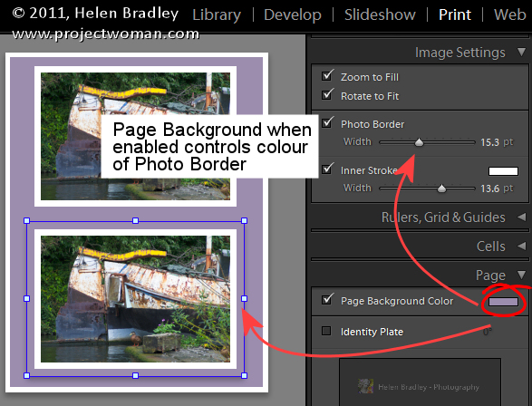
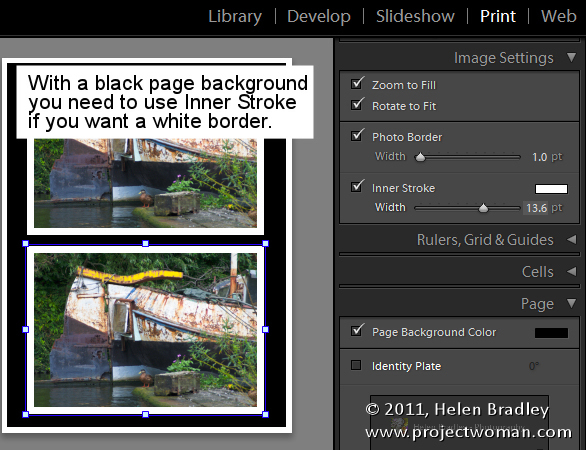
If you have a Photo Border enabled for a either a Custom Package or a Picture Package then the width of the border will make the image smaller. The color of the border is the color of the page background if you have a page background selected. If not, it will be white. If you set an Inner Stroke then it too will reduce the size of the image but it can be set to your choice of color.

So, for example, if you want a black page background but a white border around your images, set the page background color to black and use the Inner Stroke rather than the Photo Border to apply the white border to the image.

Identity Plate Behavior

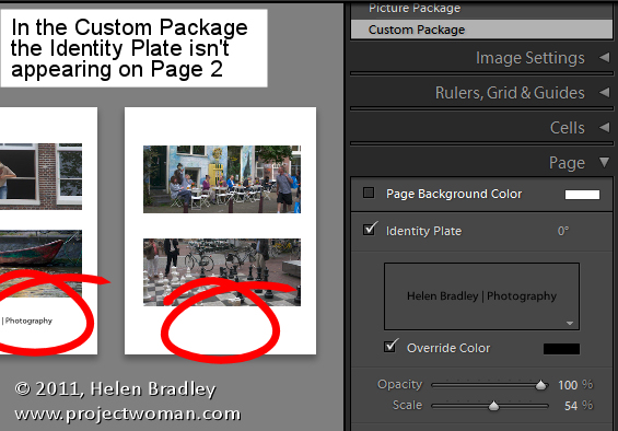
When you add an Identity Plate to a Custom Package it appears once on the page and you resize it to suit and place it where you want it to go. However, it only appears once in the layout so, if you add a second page to the print layout, the identity plate will appear only on the first page.

Alternatively you can add the identity plate to every image by selecting Render On Every Image. Now the identity plate will appear on each image rather than on each page but it will appear in the very middle of the image and  you can’t move it.

So, if what you want is your name on each printout as an Identity Plate, create a Custom Package design with an Identity Plate but not set to render on every image. Make sure the identity plate is in the correct position and fill the page with images and print or save it. Then fill it again with a new set of images and output the result and repeat as required.

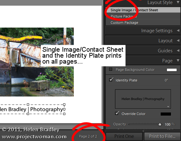
On the other hand, an Identity Plate added to a Single Image/Contact Sheet prints on every page of the document in the place you position it in.

Any size JPG output

You can print your layout to a JPG file that you can then upload to the web or send out for printing. To do this, from the Print Job panel, click the Print To: dropdown list and choose JPEG File.

Set the File Resolution and then the Custom File Dimensions for the page. Then, when you’re done assembling the images, click Print to File to print the layout to an image file rather than to a printer.

Crop your images

When you’re working with a Single Image/Contact Sheet, if the image is set to Zoom To Fill it will be made large enough to fill the container on the page. If the image height and width does not match the size of the container then part of the image will be removed. You can adjust the positioning of the image within the container by dragging on it with the mouse.

If you have a Picture Package or Custom Package selected you can move an image within its container also, but to do so you must hold the Ctrl key (Command) on the Mac.

The different behaviors of images within what appear to be similar layouts in Lightroom can be confusing but once you understand that different layout styles bring with them different key combinations and behaviors you’ll be on your way to creating great looking prints in Lightroom.
Helen Bradley

Tuesday, January 17th, 2012

5 Top Tips for Lightroom Develop Presets

Develop Presets are powerful Lightroom tools. You can use them to quick start your editing in Lightroom and to apply creative fixes to your images. You can create your own presets and you can download them from the web. Here are my top five tips for harnessing the power of Develop Presets.

1 Create Disconnected Presets

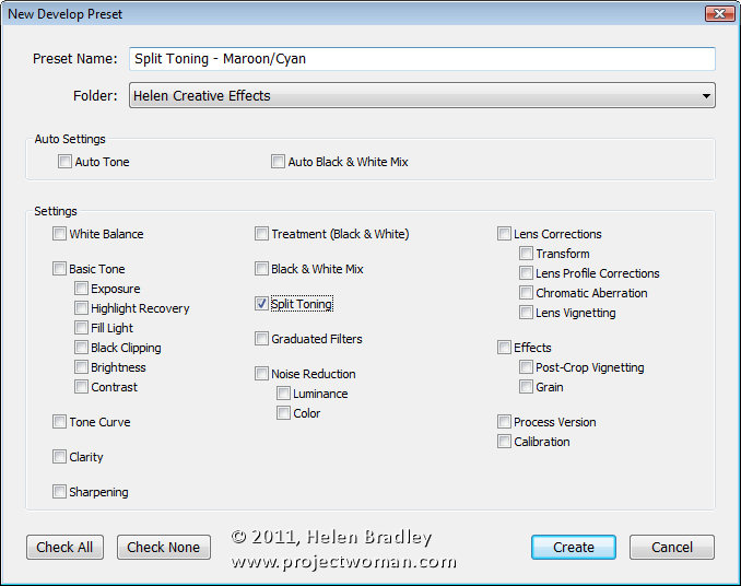
Instead of creating a preset which, for example, applies a split toning effect as well as a vignette to an image, split this into two separate presets. Then you can use the split toning effect as well as the vignette if you want to do so but you also have the ability to apply one and not the other. If both effects are applied with one preset, you’ll have some work ahead of you to undo one of the effects. In addition when they are separate presets the vignette, for example, could be used on images where you would not consider also using the split toning effect.

2 Create Undo Presets

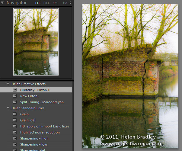
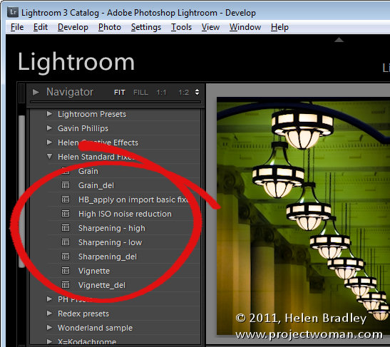
When you create a preset that adds, for example, grain or a vignette to your image, consider at the same time creating a preset that removes that effect. If you call the two presets the same name such as Grain_heavy and the delete preset Grain_heavy_del they will appear side by side in the list and it will be obvious that the second preset cancels out the effect of the first. Then, when you apply the preset and subsequently make other changes to the image you can easily remove the effect of the preset without having to wind back all the changes you’ve made.

3 Choose the Right Tools

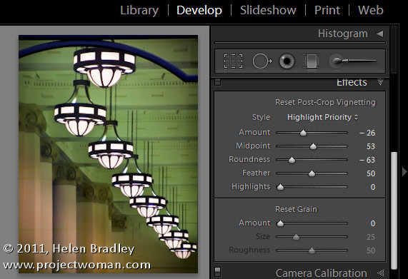
I recently downloaded a great preset which applied a cool effect as well as a vignette. Unfortunately the designer applied the vignette using the Lens Vignetting tool in the Lens Correction panel. This isn’t a post crop vignette so, while the preset worked fine on some images it failed spectacularly on images which had been cropped. When you want to add a vignette, do this using the Effects panel’s Post Crop Vignetting options so your preset will work on any image cropped or not. Testing your presets with a range of images will tell you if they have problems that using a different solution may avoid.

4 Organizing Presets

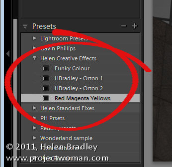
If you’re creating a lot of presets or downloading a lot of presets from the web, it will help to organize them neatly. For this purpose, I like to create separate folders for preset sets that I download from the web. This allows me to open or close a folder of presets to display all its contents or shrink the list to show just the folder title. Be aware that the folder  hierarchy for presets is very flat and you cannot create folders inside folders for example.

If you have a lot of your own presets consider grouping them in folders too – so you might have a folder of editing presets and then a second folder of more creative presets. You can drag and drop presets from one folder into another in the Develop module.

If you download or create presets and you know you will never use them, right click the preset and choose Delete to remove it from Lightroom and from your disk.

5 Apply them on Import

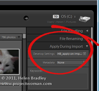
Here’s a good reason for ignoring Tip #1 (at least for now) and for creating a Develop Preset that applies all the changes you typically apply to your images. So, if you typically apply some extra Brightness, Clarity and Vibrance and some noise reduction to your images, make all these changes to an image and save them as a preset. Now, in the Import dialog’s Apply During Import panel you can choose this preset and have it applied automatically to all images as you import them.
Helen Bradley

Page 9 of 11« First7891011