Wednesday, December 10th, 2014

Photoshop Quick tip: Change from Dodge to Burn Tool

Switch between the Dodge and Burn tools with one key press

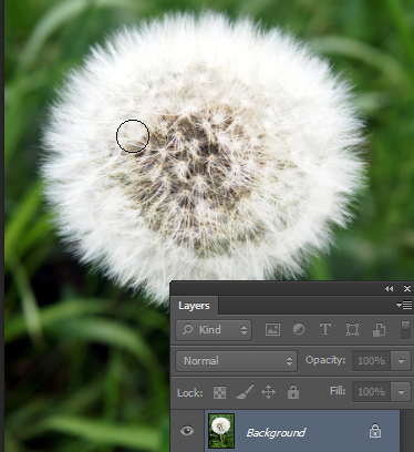
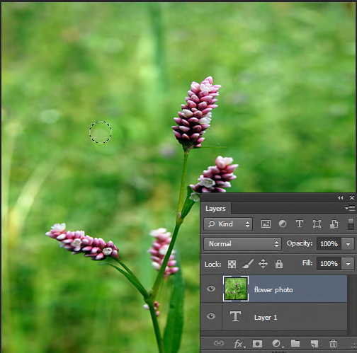
While you are making small photo edits one easy trick that could save you a lot of time is switching between pairs of editing tools like Dodge and Burn with one key press.

So to change from the Dodge to the Burn tool (or vice versa), hold down the Alt key (Option on the Mac).

While you have the Alt key (Option key) held you will be using the other tool. Let go the Alt (Option) key to return to the original tool you were using.

Now you can easily move back and forth between tools to speed up your edits.

Photo credit: © anitab0000 freeimages.com

Friday, November 21st, 2014

Photoshop – Quickly Change Your Brush Size

Quickly change the brush size (without using the slider)

When you’re using any tool in Photoshop that uses a brush such as the Brush itself, Eraser, Dodge, Burn and many others, you can change the size of the brush using a keyboard shortcut rather than having to use the size slider.  This fast and easy shortcut can save you a lot of messing around.

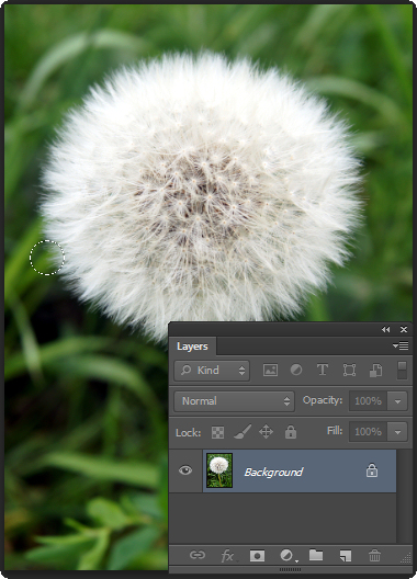
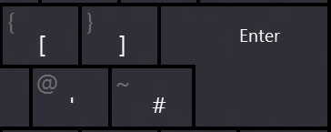
To change the size of the brush for any tool that uses it, press the opening square bracket key ([) to decrease the size of the brush and press the closing square bracket key (]) to increase the size of the brush.

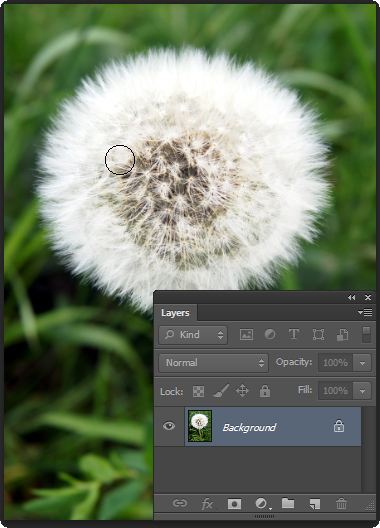
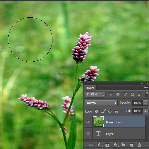
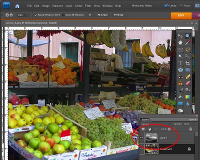
Notice from the top image to this one the brush has increased in size (I pressed the keyboard shortcut ] to do this) and I can easily make my adjustments without having to mess around with the brush size slider.

Photo credit: © anitab0000 freeimages.com

Wednesday, March 26th, 2014

Play and Burn DVDs in Windows 8

© ugaldew, sxc.hu

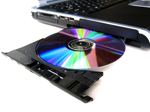
If you’re using Windows 8 or 8.1 you can play videos and movie files you have stored on your computer but you can’t view DVDs using Windows Media Player—this feature was removed from Windows 8 along with the Media Guide.  If you want to be able to play DVDs in Windows 8 you will need to download and install a DVD player. If you’re using Windows 8 Pro then you can download and install Microsoft’s Windows Media Center which costs $9.99 – this site will step through the process. If you’re not using the Pro version then you would need to upgrade to Pro to use the Media Center, which ends up being a $100 upgrade  just for the ability to play a DVD. Instead, I recommend you use the free VLC Media Player.

If you need to burn DVDs you will need a DVD burner to do so. Windows 8 doesn’t ship with a DVD burner but that doesn’t mean that the manufacturer of your computer hasn’t provided one. Check the Start screen and see if there’s a DVD burner already installed. If not, here is a round up of some of the DVD burning tools around which are Windows 8 compatible. The good news is that most have free trial versions so you can test them out and see how they perform:

Wondershare DVD Creator — $39.95

Ashampoo Burning Studio Free — upgrade to full version for $49.99

Aimersoft DVD Maker for Windows – $39.95

Nero Burning ROM 12 – $49.99


Helen Bradley

Helen Bradley

Wednesday, February 19th, 2014

Photoshop – Color Threshold Art Effect

Adjust Color and Contrast to make your Image Pop

by Helen Bradley

The threshold filter in Photoshop lets you turn an image into a black and white image where pixels are either black or white. It is a great tool when combined with some color for creating artistic effects with your photos.

The only issue with this filter is that you have no fine control over how the conversion takes place. This video solves the problem by showing you how to work with the image to give better results with the conversion.

Here you will learn how to use the threshold filter to adjust the image to make a black and white and how to pick out areas of the image to adjust them separately so you retain the details in it.

You will use masks and adjustment layers to lighten and darken those areas of the image that you wan to keep and highlight.

You will also learn how to create a reusable noise layer to give the final image a more grainy look.

You will also learn why using a fill layer makes better sense than filling a layer with color.

In all, this video is jammed full of handy Photoshop tips as well as showing you how to create a great color effect.

Helen Bradley

Helen Bradley

Saturday, April 27th, 2013

Photoshop – Monochrome Stamp Effect

Learn to create a monochrome stamp effect from a photo in Photoshop. Includes using filters such as Posterize, black and white, threshold and the Photocopy and Stamp filter to adjust the image to get the effect. Also see how Dodge and Burn can help you fine tune the effect.

Transcript:
Hello, I’m Helen Bradley. Welcome to this video tutorial. In this tutorial I’m going to show you how you can convert an image so that it looks like a stamped monochromatic image.

Before we get started on this tutorial this is the effect that we’re looking for. I have an original bird image here and what we’re going to do is to firstly get rid of the background around the bird. And then we’re going to convert it to black and white. We’ll posterize it and then we’ll apply a filter to it. And finally we’re going to apply the Threshold Adjustment. And we’re going to end up with this sort of stamped monochromatic effect from an original photograph. So let’s just hide that and let’s get started on the image that we’re working with. And I have a duplicate image sitting here.

Now I’ve already gone ahead and made the mask for this image so that we’re not wasting a lot of time cutting out the bird. But essentially what I would use is the Quick Select tool to just select over the bird. And then I made a duplicate of the background layer by just dragging it onto the New Layer icon and then just clicked this Layer Mask icon and that adds a layer mask to the image. So there’s the bit that we had selected. Then obviously I would make a much better selection and this would give me my isolated bird here.

So the next thing that we’re going to do is to convert this to black and white. So I’m going to click on the topmost layer and we’re going to do this using an adjustment layer. The reason for this is that it can then be redone later on if we don’t like the effect. So I’m going Layer, New Adjustment Layer, Black and White and click Ok, and here is the black and white adjustment.

Now what I’m looking for here is that we’re going to make this into a pure black and white only image later on so I want plenty of detail here. So I’m just going to walk these sliders in either direction to see where they go. And I want some edge detail because that’s going to define the birds so I probably want to bring the blue channels and the purple channels over towards the black. And let’s just see where the red gets us. I want to definitely see the bird’s eye so I want that to be different to the colors surrounding the bird. So I’m just looking for a reasonably good black and white conversion at this point, and I’ll just close that down.

Next we’re going to use Layer, New Adjustment Layer, Posterize. And what the posterize adjustment does is it flattens the image to a certain number of colors. They’re called levels but here we’ve got four levels of lightness and darkness. So if we had a color image we’d have four colors. And we can wind this up to a sort of surrealistic amount or we can take it back to a less realistic, more stylized amount. And that’s exactly what we want here.

But you’ll see that every time you change this it has different affects around the edge. So the difference between 5 and 7 and perhaps 6 and 5 is really quite significant. So I’m looking for a number of levels that gives me a good result. I’m worried about the eye disappearing here. Three is not enough. Four is a whole lot better. I really quite like that four so I’m just going to let that be what we’re using here. At this point if we were not getting the exact result that we like we could go back and dodge and burn on this layer. So we could grab the Dodge or Burn tools here to darken and lighten the image by clicking on these, taking the highlights, just make the brush a little bit smaller and perhaps brush around the edges here to darken it up which will ensure that later on we’re going to get some dark edges around the edge of our bird. So if that’s of concern to you selecting a tool such as Dodge or Burn will allow you to lighten and darken the areas around this bird that you want to have lighter or darker.

So for example if we really wanted to see this eye we could lighten the areas around the eye. So you can craft that to an extent using the Dodge and Burn tools here. So I’m just going to burn in a little bit around the top of the leg and the sides of the leg here, and perhaps just under the belly. So once we’ve done that I’m going to come up to the topmost layer and I’m going to make a flattened version of the image so far. And I do that by holding Ctrl and Alt and Shift and E, that’s Command, Option, Shift E on the Mac. And this gives us a flattened version of this that we can now apply a filter to.

I could use smart filters but the filter is just going to be fine for this. So I’m going to choose Filter and then Filter Gallery but before I do this I’m making sure I’ve got black and white as my foreground and background colors because the filter set that we’re using relies on black and white for the color. So if you don’t have black and white selected as the color it’s not going to be a black and white effect that you’re going to end up with. So I’m just going to drag this back in. And I used the Photocopy earlier, and I found that that was a really good result for me.

But you could also try the Stamp and see if in the light and dark balance you can get what you want with the Stamp. We’re going to get pretty much the Stamp effect by just using the Photocopy. But I’ve got a way of getting rid of these sort of almost blurry sort of gradient detail in the bird’s back. So I’m going to ignore that for now and just go for a good sort of stamped effect. I’m looking at the blacks and the whites in this image because that’s essentially what I’m going to get at the end of this. So I’m going to say that that’s good and click Ok.

And the final tool that we need to make these areas disappear is a Threshold Adjustment. And again, I’ll do this using an adjustment layer with Layer, New Adjustment layer and then Threshold. Now Threshold is an unusual sort of filter. What it does is it turns everything either pure black or pure white. There is no in between. And this selector here tells Photoshop at which point we want the colors to go to white or to black. So if we wind this back down a little bit we’re going to get rid of some of these areas in here and they’re become darker or lighter according to how we have this selected.

So I’m just going to go around about that midpoint because we do have this as an adjustment layer which means that if we make changes to this layer they will affect the adjustment layer. So I’m just going back to the Dodge tool here and just see if I can get rid of the very obvious sort of circling effect here, so I’ll just make that a little less obvious that that was something that got left behind with the Photocopy filter. Let’s just bring the exposure right up. And there’s our finished bird there. And we can do whatever we like with it.

You may want to save it out so that you could use it perhaps with a background color or something like that. But there’s this sort of stamped monochromatic effect created in Photoshop. And it’s done very easily by first just isolating the object and then converting it to black and white in a way that gives you the contrast that you want, posterize it to flatten it to some levels of color or levels of tonal range, create a brand new layer from that and apply a Photocopy or Stamp filter to it and then finally finish off with the Threshold Adjustment.

I’m Helen Bradley. Thank you for joining me for this video tutorial. If you liked the tutorial please Like it and comment on it and share it with your friends. Look out for more videos on my YouTube channel and visit projectwoman.com for more tutorials on Photoshop, Photoshop Elements, GIMP, Lightroom, Illustrator and a whole lot more.

Helen Bradley

Tuesday, May 15th, 2012

A “Happy Snap” Lightroom workflow

At Halloween last year I was asked to photograph some kids I’ve shot from time to time since they were born. Basically their mum likes to have some up to date photos of the kids and Halloween seemed like as good a time as any to get some shots.

When I’m shooting like this, my aim is to get some good shots but nothing formal and I prefer not to use a flash because I get a better response from the kids without one. I captured the images in raw and I chewed through three small size camera cards in about an hour and a half.

My deal with their mum is that I get to use the photos for my work and she gets a disk of pictures. To keep this fun – so it doesn’t feel like work for me – I need a fast and effective processing workflow.  I need to get the images off my camera, sorted, processed, burned to a DVD and delivered to mum in time for her to enjoy them.

Thanks to Lightroom the process was simple and, in all, I reckon I spent less than 2 hours getting the photos from the camera cards to a DVD. Here is what I call my Happy Snap Lightroom workflow – it’s what I do to quickly process casual snapshots:

Step 1: Determine a plan of attack

To begin with I have some criteria I work by. I never give away substandard photos so anything blurry, out of focus or over exposed gets permanently deleted. Then I sort out the best of the images intending to give mum around 50-60 photos of the kids – it’s a nice range of images for her to use to scrapbook and post to Facebook and it doesn’t over burden her with too many photos to choose from.

Step 2: Download the images
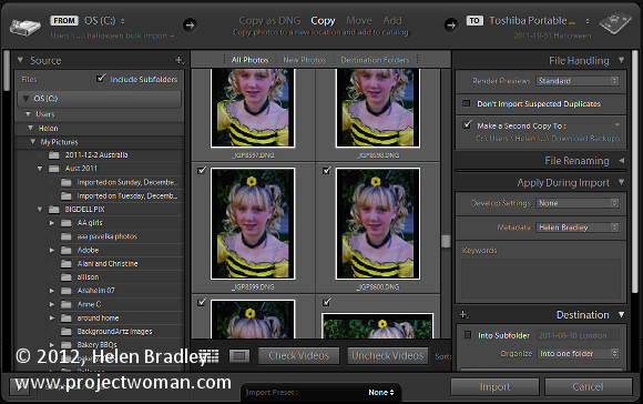
To begin, I download all the images from all three cards into a single folder on my hard drive (if there were only one card I would omit this step).

From there I import the images into Lightroom at the same time copying them to their permanent storage on my external photo drive and making a backup to a second drive. Copying rather than adding images to the Lightroom catalog lets me make backups and also add my metadata to the images so, when they popup on Facebook my copyright details are embedded in them.

Importing all the images in one step also means that when I’ve started the import process – which includes rendering standard previews – I can start working through the images and I don’t have to do it multiple times or switch out cards as I work – (the process works for me – your mileage may vary).

Step 3: Eliminating the duds
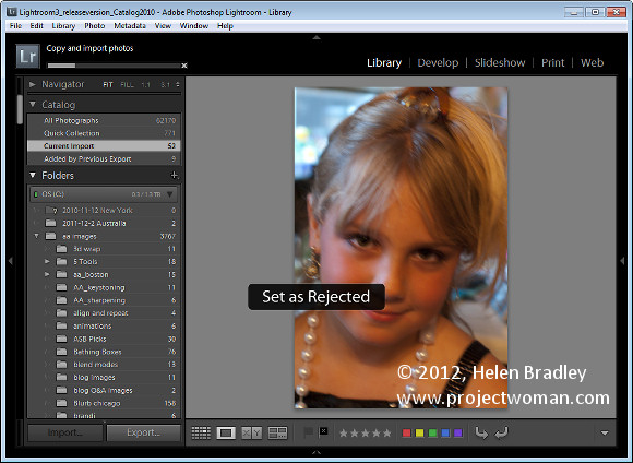
The first time I run through the images I am looking for images to delete as well as getting a general look at what I shot.

As I work through the images I’ll press X for images to delete and use the right arrow key to move past everything else. I’ll select to delete all out of focus images, anything where someone has their eyes closed or similar, and anything I don’t want to put my name to!

Once I’m done I choose Photo > Delete Rejected Photos to delete the images from my primary external photo drive. There are still copies on the backup drive and my hard disk but not on my main photo drive.

Step 4: Sorting the usable images
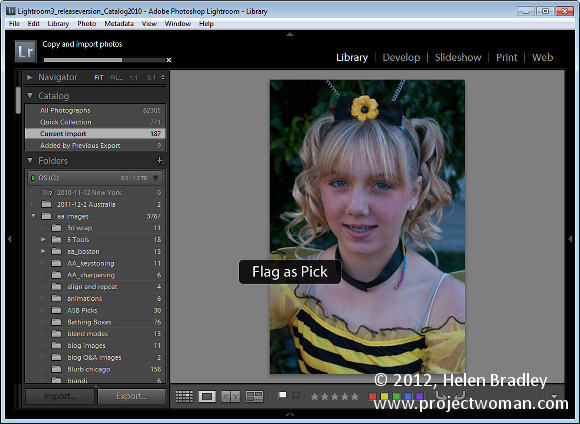
On the second run through the images I pick those I want to use. By now I have a rough idea as to what I have and what I might want to give mum. So this time I run through the images pressing P to pick an image and using the right arrow key to move past those she won’t be getting.

Step 5: Create a Collection
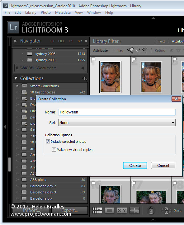
Once done, I isolate the picked images by clicking the first of the filter flag icons above the filmstrip. Then with only the picks visible I press Ctrl + A to select all of them and then click New Collection > Create Collection and type a name for it. Because the images are already selected, I leave the Include Selected Photos checkbox enabled and click Create.

Step 6: Apply initial processing to the images
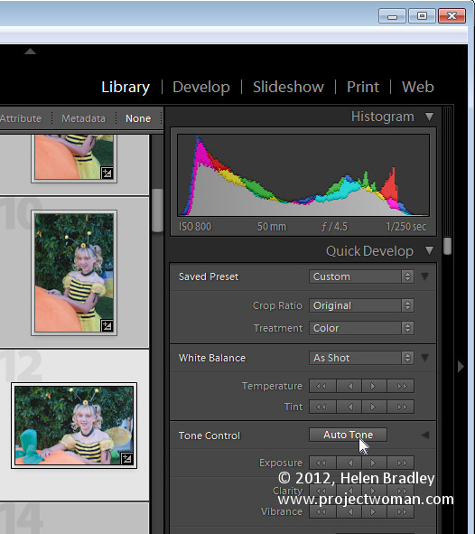
Now I have a collection of the picks and it’s time to process them. I start out by selecting all the images in Grid View in the Library and from the Quick Develop panel I select Auto Tone. This gives me a head start on fixing them but, because of the lighting, pretty much all of them needed a white balance adjustment.

Step 7: Process in the Develop module
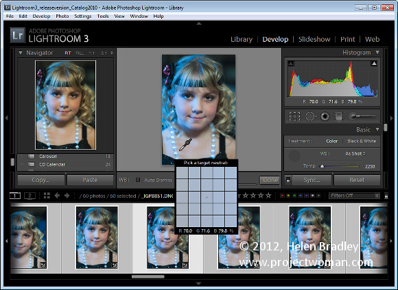
Switching to Develop module with the filmstrip visible I selected the White Balance Selector and then made sure that Auto Dismiss was disabled. This allows me to adjust the white balance on one image and then click on the next one in the filmstrip and continue to adjust the white balance from one image to the next without having to reselect anything. Basically all that most of these images needed was some white balance adjustment.

For those that needed cropping, I cropped as I finished with white balance adjustment and then moved on to the next image. This ensured that each image was dealt with only once as I progressed across the filmstrip.

Step 8: Make one off fixes
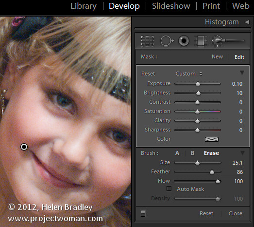
So, having fixed the worst of the problems I work backwards through the filmstrip to see if any of the images warrant special attention. If so, I make a call to fix them or simply remove them from the collection. To remove the image, right click it and choose Remove from Collection .

Here I had one issue with a couple of images where one child’s face was in shadow. For this, I used the Adjustment Brush tool at a small size with a large feather radius. I brushed over the areas where her face was in shadow and then adjusted the Brightness and Exposure to lighten to her face. In the same images other faces were overexposed so I added a second Adjustment Brush adjustment with the opposite settings to attempt to deal with this. The final result wouldn’t  stand up to close scrutiny but is just fine for the web and 6 x 4 printing.

Step 9: Export and burn
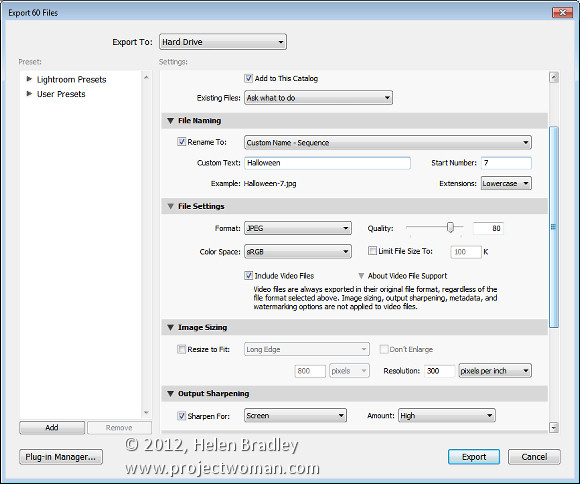
Once this was done it was time to export the images. Because they’re all in a collection, Ctrl + A selects all the images. I chose File > Export and then exported them as JPG images, 80 percent quality at the largest size and I added sharpening to them in the process. I made sure these images all went to a new folder so that they would be isolated from everything else and easy to find.

From there, it was a matter of launching Ashampoo Burning Studio, grabbing all the images and burning them to a DVD.

This workflow is one giant step better than simply burning the images direct to a DVD. It takes only a little more time with Lightroom to sort and apply some basic fixes to the images and it also means that only the best of the images get circulated and those that do have my copyright information embedded in them.

So now it’s over to you. What’s your “happy snap” workflow? Do you capture snapshots in raw? Do you process using Lightroom? And how do you get your images processed quickly so you’re not spending hours on images that are really just family snapshots?

Helen Bradley

Sunday, August 23rd, 2009

Smart Dodge and Burn in Photoshop Elements


In the traditional darkroom, you could adjust the relative lightness or darkness of parts of an image using processes called dodge and burn. If you were dodging or lightening the image you would expose parts of the image for a shorter length of time to lighten them. If you wanted to darken a portion of the image you would expose it for a longer period of time so that more light would be applied to the photo paper with the result that you would be darker.

The terms dodge and burn continue to be used in software today and Photoshop Elements has a Dodge tool and a Burn tool which are both accessible from a toolbar position which they share with the Sponge tool. The disadvantage of using the Dodge and Burn tools as they are shipped with Photoshop Elements and, indeed Photoshop, is that these fixes are designed to be made to the original image and the cannot be made on a separate layer and then, for example, be blended into the image.

The result is that if you apply a Dodge or Burn fix and later determine that you do not like the result or want to adjust it, it will be difficult to undo the changes that you have made.

In post production, dodging and burning are best applied to a separate layer in the image so that they can be undone, edited or blended at a later date.

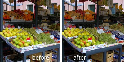
Here is a method dodge and burn an image in Photoshop Elements which works the same way in Photoshop. It involves creating a layer on which the dodge and burn process is performed. It also takes advantage of a special characteristic of the Soft Light blend mode. This is a different dodge and burn method to that which Food blogger Danny Jauregui used in his recent post.

Step 1
Open your image in Photoshop Elements (or Photoshop) and add a new layer by choosing Layer > New > Layer and click Ok.

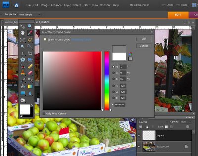
Click on the foreground color swatch and set the R, G, and B values each to 128 and click Ok.

Step 2
Click the Paint Bucket tool in the tool list and click on the image to fill the layer with the gray color. You can also press Alt + Backspace (Option + Delete on the Mac) to fill the layer with the foreground color.

Step 3
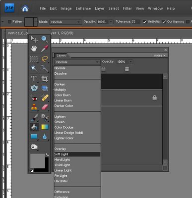
Set the layer’s blend mode to Soft Light. The result will be that you will see your image just as it was when you opened it.

The Soft Light blend mode can be used to lighten or darken an image. If the color on the top layer is darker than neutral grey the image on the layer below is darkened and if it is lighter than neutral grey the layer below is lightened. When you blend with neutral grey, nothing happens. Here we have filled the layer with neutral gray (each of the RGB values are 128) so you see no change to the image.

So, if we now paint on this top layer with white the image will be lightened and if we paint with black it will be darkened. This is the equivalent of dodging and burning on the image.

Step 4
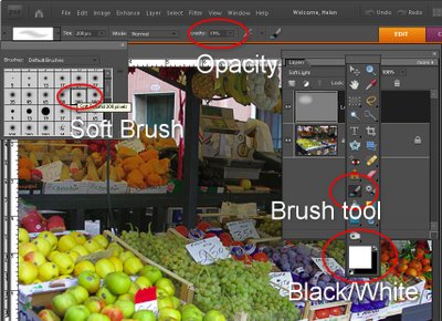
Select the Brush tool and select a circular soft edge brush adjusting its Opacity to around 25 percent. Adjust its size by pressing the [ or ] key on the keyboard. Set the foreground and background colors to white and black by pressing the D key and then the X key. Paint over the image on this top layer in white in those places that you want to lighten the image below.

For those parts of the image that you want to darken, paint over them with black.

If desired you can create one layer for burning and a second one for dodging. This will allow you to alter the opacity of each layer separately so you can subtly adjust the strength of the lightening or darkening applied.

To ensure that the fix remains changeable, save your image in a format that saves the image layers such as .psd.

Helen Bradley