Tuesday, June 19th, 2012

Photographing in Black and White Part 3 Portraits


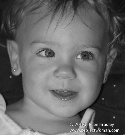
Black and white is particularly attractive for use in portraits photography. You can use it when your subject is dressed in or surrounded by colours that are not complimentary to them or which are distracting to the eye.

By shooting in black and white, you remove the impact of the clashing colours allowing the subject to become the focus of the image and not their clothes or, worse still, the background.

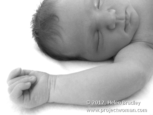
Bathed in soft light, babies captured in black and white look wonderful and the impact of jaundiced skin or blemishes is reduced.

For subjects that have facial details that can handle harsh light, try capturing your portraits with strong side lighting such as sunlight pouring in through a window. The dramatic contrast between light on one side of the face and shadow on the other can bring a portrait to life.

This type of setup is best used for a subject who has very strong facial features such as older subjects with lots of wrinkles or for subjects who live life hard as it reinforces their personalities and lifestyle.

Children’s and baby’s portraits captured in black and white do away with distracting colours and blemishes and allow you to focus on the child.

Helen Bradley

Friday, June 15th, 2012

Photographing in Black and White Part 2

What to capture?

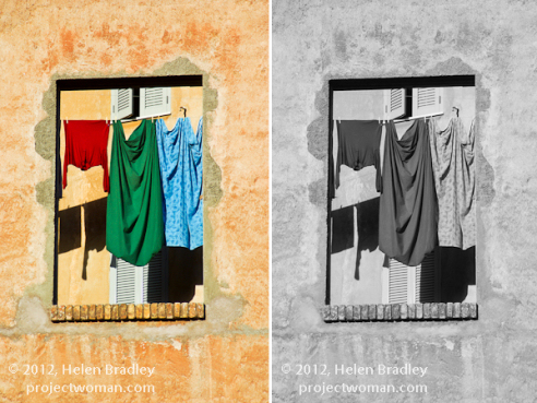
When you remove the colour from an image, you are left without one of the key elements that attracts the eye to an image – the differing colours in it.

However, colour is also distracting so removing colour removes a distractive element allowing the eye to focus on other elements in the image.

This image isn’t a good one to shoot in black and white as most of the interest in it is colour:

As photographer it’s your job to find other elements of interest to capture.

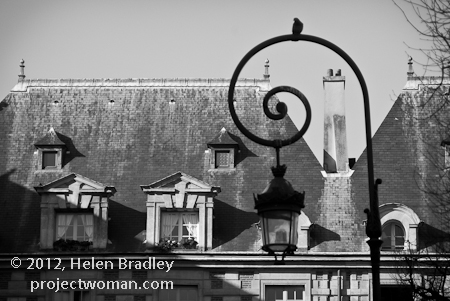
Look for different shapes, textures, tones and contrast in the scene that will be visually interesting and make these your subject matter.

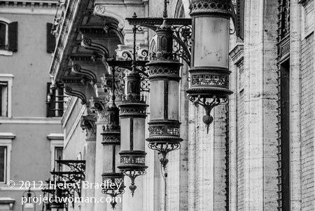
For example, one element that works particularly well in black and white is repetition.

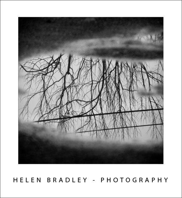
When you capture a series of repetitious elements such as trees, fence posts, light poles; then by removing the colour, you’ll be able to focus the viewer’s eyes on the repeated elements.


Helen Bradley

Tuesday, June 12th, 2012

Photographing in Black and White Part 1


Artistically black and white photos take a lot of beating. There is something about a good black and white image that invokes a level of appreciation that many colour images can never achieve.

In days of film, shooting in black and white meant that you had to commit to an entire roll of film for your black and white photos. Today you have a lot more choices and black and white is only a setting away in your camera.

However, shooting in black and white is a little different to shooting in colour so here is what you need to know:

Camera settings for black and white shooting

The first thing to do is to work out how your digital camera captures in black and white.

Most cameras have a setting that allows you to switch to monochrome or black and white capture.

You’ll need to be familiar with how to switch the camera into this mode, how to identify from its display that you are in this mode and how to return to full colour mode when you’re done.

When you capture in JPEG using a point and shoot camera or a digital SLR, your camera will discard all the colour information before saving the image. You can’t go from monochrome to colour later on.

However, if you shoot with a digital SLR and capture the image using Camera RAW you can generally configure your camera to capture monochrome images but, behind the scenes, the camera will still capture all the RAW data it would capture if you were shooting in colour and this will be available later when you process the RAW image.

Helen Bradley

Tuesday, January 10th, 2012

Pattern fills for your Excel 2007 charts

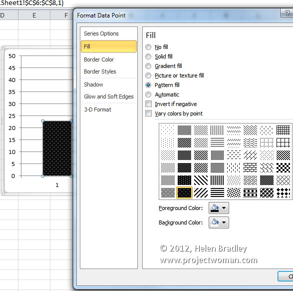
In Excel 2003 and now in Excel 2010 , there are pattern fills which you can use to fill chart bars so your charts print just great in black and white.

Unfortunately the same feature was removed from Excel 2007 – wtf? I have no clue why but it was but it has to be a very silly thing to have done.

If you are using Excel 2007 and you need to use pattern fills with a chart you are out of luck – well not really – you just need to read the rest of this tip because I can tell you how to put the fills back into Excel 2007.

To begin, download this handy add-in: http://officeblogs.net/excel/PatternUI.zip 

Update: This link is no longer live so patternui.zip is not longer available. You can find an add-in here (with instructions which achieves the same thing) courtesy of Andy Pope.

The zip file contains a single file patternUI.xlam which you need to extract and place somewhere you will find it easily and where it won’t get deleted by accident. You could make an Excel add-ins folder for it, for example.

Once you’ve done this, open Excel 2007 and choose the Office button > Excel Options > Add-ins and from the Manage dropdown list, select Excel Add-ins and click Go. This opens the old Add-ins dialog from earlier versions of Excel. Click Browse and locate the .xlam file that you just unzipped and placed somewhere safe. Select it and click Ok. Ensure that the PatternUI option appears in the Add-ins available list and that it is checked and click Ok.

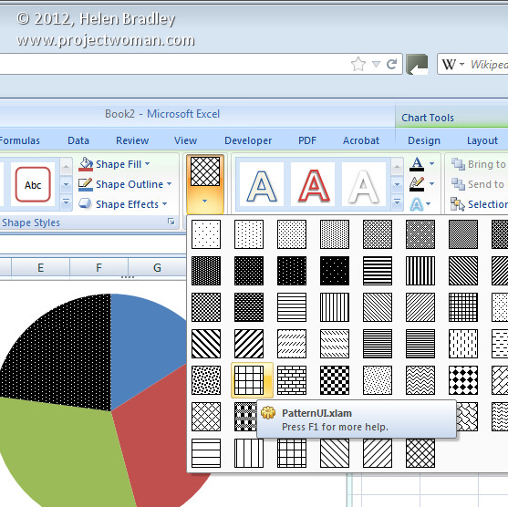
Now create an Excel chart. Once you have you chart, click on the data series to fill with a pattern – if you have a single series plotted then select just one of the columns at a time. Select the Chart Tools > Format tab and notice that you now have an option called Patterns available. Click the Patterns option and select a pattern to apply to the currently selected chart series or column. Click on each series or column in turn and apply a pattern to it. When you are done, you can print your chart as usual.

Installed add-ins are managed automatically by Excel so you will find that the add-in will still be there and accessible next time you use Excel.

If you are using Excel 2010 you don’t need this add-in as the pattern fills are back where they should have been all the time.

Helen Bradley

Wednesday, January 4th, 2012

Winter photography tip #1 – B&W

Most digital SLRs and point and shoot cameras can capture black and white images. Winter is a good time to experiment with this feature because of the general lack of color.

Find and enable this feature on your camera and then head out looking for suitable subjects.

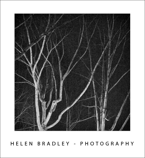
This early morning scene shows the mystery of the branches lit by a streetlight against the dark predawn sky.

Because you will not be capturing any color from your images, look for a scene that shows the contrast between light and dark elements. You may also find that foggy scenes where everything is not only by nature monochromatic but also biased towards mid tones is a great option for black and white photography.

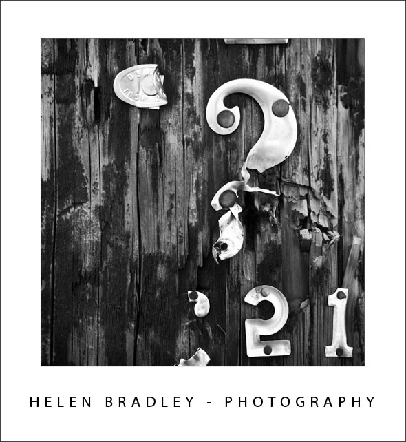
Another topic which can be rendered interestingly rendered in black and white is texture and repeating elements – the lack of color will enhance the texture and draw attention to the repeating elements.


In this image the texture and contrast between the rough wood and the metal letters is more apparent when captured in black and white.

Helen Bradley

Friday, November 25th, 2011

Craft great Black and white images in Lightroom

Most of us know we can convert and image to black and white in Lightroom by simply pressing the letter V. However, for the exact same image, your version of Lightroom might give a very different result to my version of Lightroom. The explanation is that there are two settings available for black and white conversions in Lightroom.

I’ll show you what these are, how to configure the one you want to use and how to quickly switch between them.
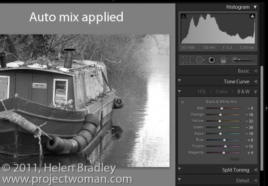
With a color image on the screen in Lightroom’s Develop module, press the letter V to convert it to black and white.

Open the B&W panel – it’s called Greyscale in Lightroom 2 – and check out the color sliders.
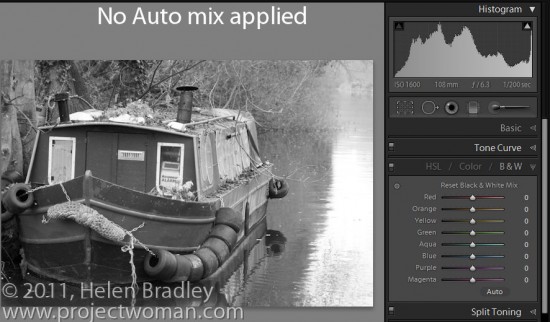
Depending on the preferences that you have set, the sliders might all be set to zero or they might show a black and white adjustment tailored to the image itself which Lightroom calls Auto mix.

The auto mix adjustment applies an auto exposure adjustment to the image as well as a conversion that maximizes the distribution of the grey tones in the image. This is customized for the image so every image will be given a custom adjustment much as you will get if you click the Auto Tone button in the Basic panel. Notice the subtle differences in the histograms in each of the adjustments here.
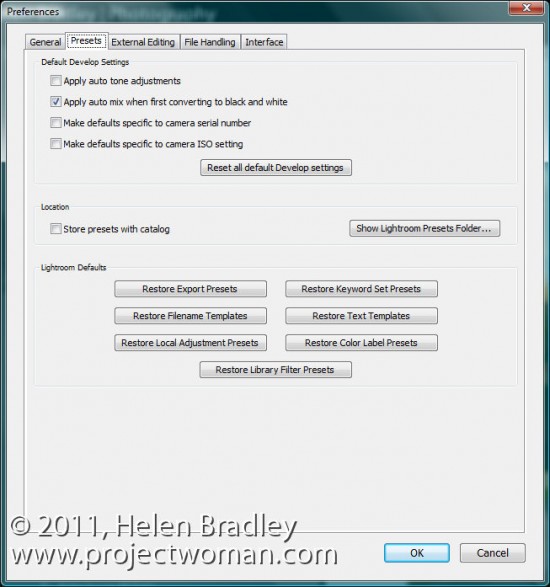
Whether or not you see this Auto mix applied to a black and white image is controlled by your Lightroom preferences. To see these, choose Edit > Preferences (or Lightroom > Preferences on the Mac), select the Presets tab and there’s an option there which reads “Apply auto tone mix when first converting to black and white”.

If this is checked you will get the auto tone mix applied to the image, if not, you will see a black and white adjustment where each color is given the same adjustment value of zero.
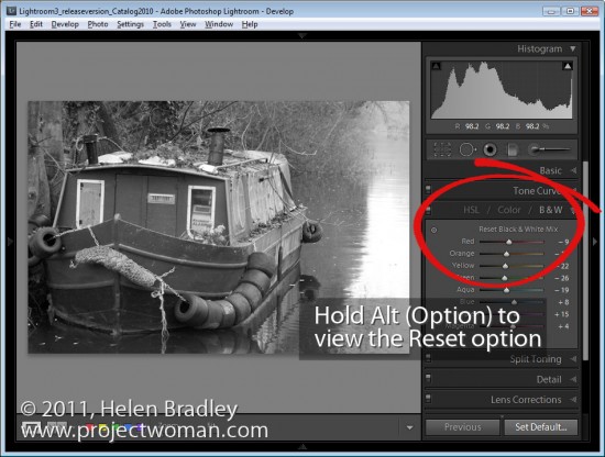
Regardless of which setting is in place you can switch between the two in the B&W panel.

If an Auto mix has been applied, hold the Alt key (Option on the Mac) and you will see an option Reset Black and White Mix. Click this and all the sliders will be set back to zero.
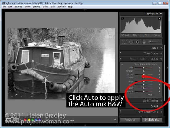
On the other hand, if your sliders are all set at zero, click Auto to apply the auto mix adjustment to the black and white image.

Step 5

You can further adjust the black and white regardless of whether you have an auto mix applied automatically to it or not by adjusting the sliders.
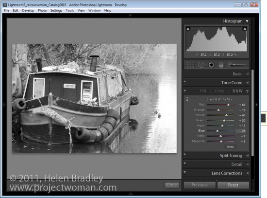
You can also select the Target Adjustment Tool and drag on an area of the image to adjust whether it is light or dark. Dragging downwards will darken it, dragging upwards will lighten it.


Helen Bradley
Monday, May 24th, 2010

Step 11 Photo-editing workflow – Getting to black and white

Some images look much better in black and white than they do in colour.

Increasingly photo editing programs are shipping with very good tools for converting to black and white. These allow you to select which portions of an image become black and which become white which is necessary when you want to differentiate between colours which have the same intensity such as green and red values which would, otherwise, be converted to the same shade of gray.

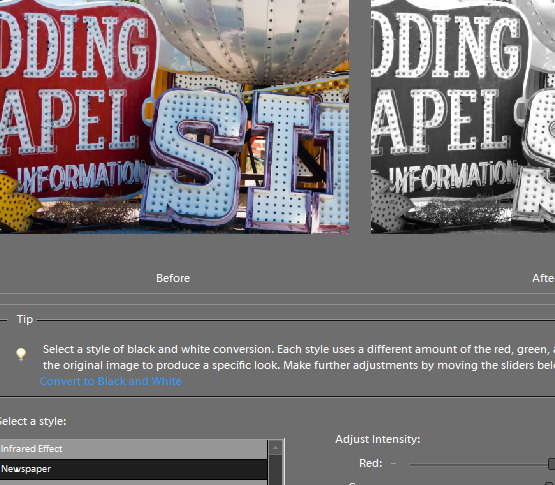
In Photoshop Elements, choose Enhance > Convert to Black and White and select a style from the list at the left of the dialog. These include Infrared, Newspaper, Urban Snapshots, Scenic Landscape, Vivid Landscape and Portraits. While the names suggest the type of image they are well suited to it is a matter of personal preference as to which you use.

Once you have chosen the image type you can select from options at the bottom of the image to adjust the various colours to darker or lighter shades of grey. You can also select the more or less contrast options to adjust the image contrast.

When you have a result that you like, click Ok.

Helen Bradley

Wednesday, March 17th, 2010

Photoshop: High Impact Sharpening

after image high radius low amount sharpening

There’s a lot been written about sharpening your images and traditionally when you sharpen you’ll choose a low radius value. In fact, Photoshop will let you choose really large radius values when sharpening even though, for correct sharpening what you need is a Radius of around 0.5 – 1 for a sharp image and just a little larger for an image that lacks sharpness.

before high radius low amount sharpening

So what is the value of being able to select really large radius values? The answer lies in a technique known as high radius low amount sharpening. It’s a way to add a huge visual impact to your images.

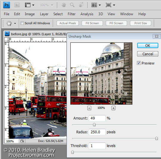
To see it at work, choose Filter > Sharpen > Unsharp Mask. Reduce the Amount to around 30 and push the Radius value up very high. You’ll need to keep the Threshold amount very low.

What Amount does is adjust the amount of sharpening so you don’t want a lot of this type of sharpening. By setting the Radius to a high value you’re pushing the sharpening halos away from the edges in the image into the image content areas so that everything is being given a significant contrast boost.

The Threshold setting is an amount representing the difference between pixels on the edges that you want to effect. It works the opposite to how you might think it would work – a small value gives you much more impact than a large value. So a value of 1 or 2 up to 10 is sufficient.

Once you have a high Radius and low Threshold value set, adjust the Amount to suit your taste.

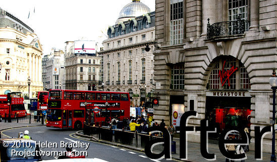
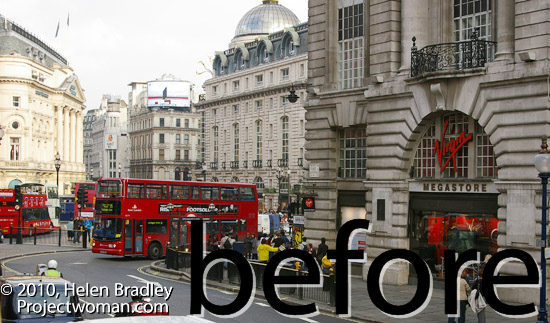
While this feature works really well on color images particularly busy color images, it also gives black and whites a really big shot in the arm.

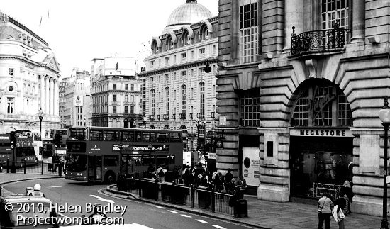
Apply high radius low amount to a black and white photo of london

And while you’re in Photoshop, know that this is the only place you can apply this fix. You cannot do this in Lightroom or in Camera RAW. The reason is that both Lightroom and Camera RAW allow a maximum radius setting of 3.0 and here, because we want to crank up the radius really high, Photoshop is our only option.

Helen Bradley

Friday, May 22nd, 2009

Excel – print charts in black and white


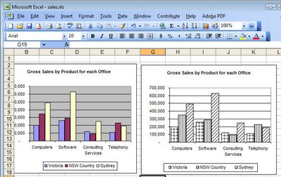
Although your Excel chart might look great in color on the screen, if you’re printing to black and white or printing in color and planning to reproduce the charts in black and white you might be disappointed with the final result. Light green, light blue and light orange all look very different on the screen but are indistinguishable in black and white.

So, when your chart is destined for reproduction in black and white, set it up so it is guaranteed to be readible. To do this, select each series or data point by clicking on it, right click and choose Format Data Series (or Format Data Point)> Patterns tab > Fill Effects > Pattern and use a grey or a black and white pattern. Repeat for all the series and save before printing. The chart is guaranteed to look good when printed.

Helen Bradley

Wednesday, November 21st, 2007

Metro – Paris

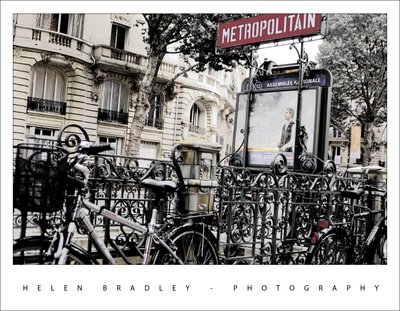
This was one of my favourite shots of the Paris metro stations. It was a throw away shot – I just took it walking past because I loved the bikes around it and there weren’t many people around.

I dumped most of the color in the photo as it just looked so good when you look at the blacks and whites in it.

I duplicated the background layer and turned the top layer into a black and white using the new Photoshop Black and White adjustment layer which lets you select which direction to take each colour into. It’s way more sophisticated than anything we’ve had in the past. Then I adjusted the opacity of the layer a little to show some of the colors from the layer underneath. The result is an almost ethereal photo. I’ve put it on a white tee shirt at CafePress in my store if you like it and want to wear it.

Helen Bradley
Page 2 of 3123