Friday, June 29th, 2012

Traditionally, when shooting with black and white film, photographers use filters to enhance the colours in the image.
Using red, yellow or orange filters when shooting landscapes or shots where the sky has interesting detail can help darken the blues in the sky giving them more punch than they would otherwise have.
You can purchase coloured filters that screw onto the lens of a digital SLR or which can be placed over the lens of a point-and-shoot camera using an adaptor ring.
The images captured with these filters will show different conversion of colours to black and white than you would see if you were to shoot in regular black and white without the filter.
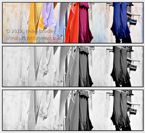
The image at the top shows two different renderings of a single image the first with a red filter and the second with a blue filter.
Helen Bradley
Labels: b & w, b and w, B&W, black and white, Camera Raw, camera settings, color, colour, digital SLR, dslr, film, filters, Helen Bradley, monochrome
Categories:photography
posted by Helen Bradley @ 8:09 amNo Comments links to this post
Friday, June 29th, 2012

When you add an object to another scene you will typically want to anchor it using a shadow.
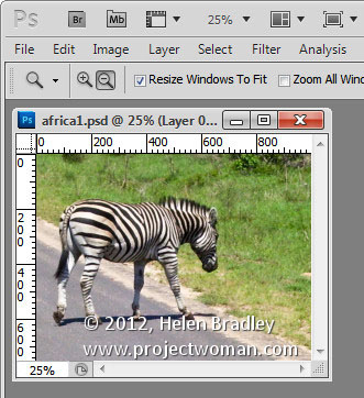
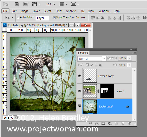
Here I have an image of a zebra that I want to incorporate in a larger image.

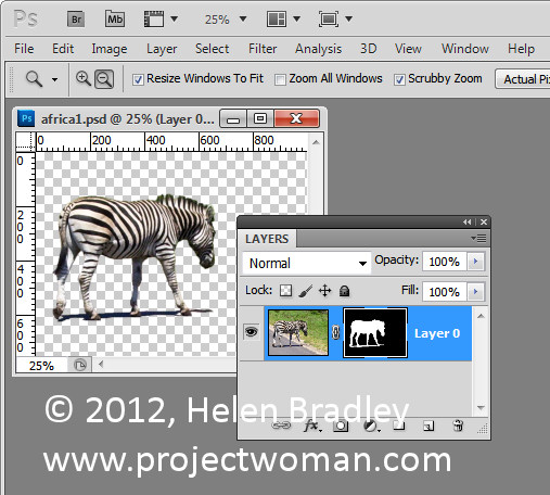
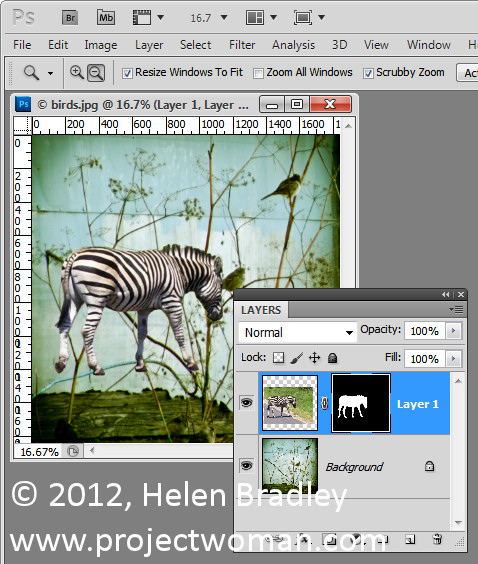
I masked out the zebra to add it to the image and included its own shadow with it.

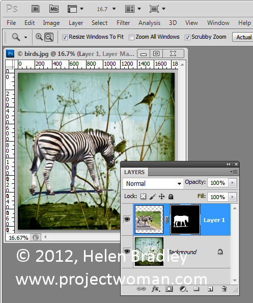
In place, the result is less than satisfactory.

I would prefer to create my own shadow so the first thing to do is to remove the shadow that I brought in with the zebra which can be done by simply masking it out. With a mask you’ll paint on with white to reveal the layer it is attached to and in black to conceal it. In this case I want to paint in black to remove the shadow.

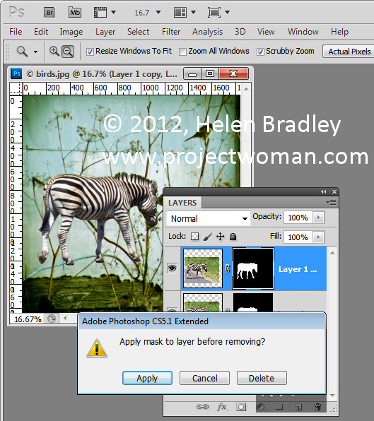
Once this is done I duplicated the zebra layer to create a second version of it and then dragged this layer’s mask into the trashcan. When you do this you’ll be asked if you want to apply the mask before removing it, and I clicked Apply to do this. This puts one version of the zebra by itself on a layer.

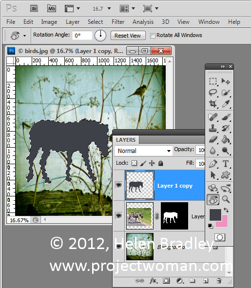
Now Ctrl + Click on the layer thumbnail for the zebra layer to select it. Press Delete to delete the zebra but to leave the selection intact. You’ll still see the zebra but you’re seeing the one from the layer below not the one you just isolated. Make sure that black or a dark gray is selected as the foreground color and press Alt + Backspace to fill the shape with the black color.

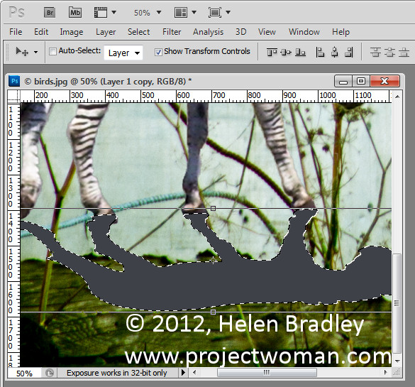
Target the Move tool and click on the shape. Choose Edit > Transform > Flip Vertical to turn the shadow upside down and then drag it into position. You will need it to line up correctly with the feet of the animal or with the base of the object that you’re trying to put into the image. In this case it didn’t line up exactly and needed to be rotated to the correct angle. Drag it into position and you can then shrink the shadow by dragging on the sizing handle to make it smaller.
You can also hold the Ctrl key as you drag on the corner handles to skew the shadow into shape. When you’re done, click to confirm the transformation. You can still continue to work on the shadow after this if necessary.

For example, you can also use Edit > Transform > Warp if you really need to bend the shadow into position. If the animal’s feet are on the ground the shadow should be attached to the bottom of the foot. Legs that are in the air like the rear leg of this zebra can be left floating.
Another tool that can be used is the Puppet Warp tool if you are using Photoshop CS5. You can also use the Liquify filter and use the Forward Warp tool to push the shadow around so that it matches the feet.
When you’re done blend the shadow into the underlying image using a blend mode. Modes such as Multiply and Overlay are good choices. Reduce the Opacity of the shadow layer until you get a blending of the shadow into the underlying image.
To move the shadow and the animal together make sure that you select both layers in the layer palette before moving them so that the two travel in unison.

For this image I finished off by cropping the image to remove the bottom part of it leaving just the zebra on the blue background.
Helen Bradley
Labels: changing shapes, color, Helen Bradley, how to, photo editing, Photoshop, shadow, shape, tip
Categories:photoshop
posted by Helen Bradley @ 8:00 am1 Comment links to this post
Thursday, June 28th, 2012

I’ve been taking a lot of screenshots lately and I have over 1,200 photos on my iPad – a lot more than I really want to store there.
When I went to delete the photos in bulk, I banged my head pretty quickly up against a problem with the iPad. It’s not immediately apparent how you delete a lot of images at one time and deleting them one at a time will get very cumbersome very quickly.
Here’s how to do it:
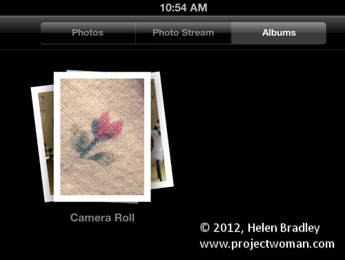
To begin, launch the Photos app, tap the Albums link and then make sure you’re viewing the Camera Roll or the place where your image are stored. I wanted to remove them from the Camera Roll so I tapped that.

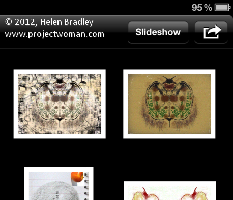
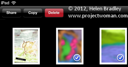
Now press the bent arrow icon in the top right corner of the screen and you’ll see options on the left for Share, Copy and Delete.

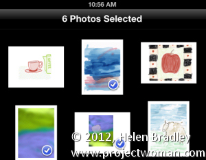
Tap an image to select it and then go ahead and select each of the images to delete – they’ll get checkmarks on them to show they are to be deleted. To undo the setting, tap the image again.

Then when I you have those you want to delete selected, tap the Delete button and choose Delete Selected Photos to remove them.

It is, as you might have expected this is ridiculously simple once you know how to do it but difficult until you do.
The good news is that the images aren’t removed from your iCloud download folder on your PC. So, for example, if you’ve previously had the images synched so they appear on your PC in a folder of iPad downloads, the images will still be on your PC at the end of the process – they’re just removed from your iPad.
Helen Bradley
Labels: delete, Helen Bradley, how to, images, ipad, photos, pictures, remove, share, tip
Categories:Uncategorized
posted by Helen Bradley @ 8:00 am2 Comments links to this post
Tuesday, June 26th, 2012

The same rules for composing an image in colour apply when you are shooting in black and white. Make sure the subject of the photo is placed in an interesting position in the shot, make sure the camera is square to the horizon and that the subject is in focus.
When you are photographing in black and white pay attention to how the colours are converted.
Some colour pairs like green and red which contrast so strongly in colour photos convert to the same shade of grey in a black and white image. Depending on what you are shooting this can be an advantage or a disadvantage.
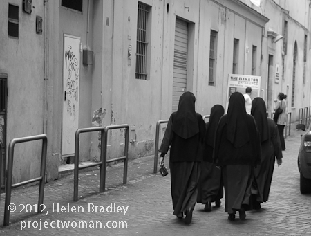
In the image above the solid black of the nuns’ habits ensures that the image will be a strong one and placing the subjects off center makes the image more dynamic.
If you are unsure how the image will convert, check the camera’s viewfinder or on a digital SLR take a reference shot and look at the result in the LCD screen to evaluate the composition and to check that what you are seeing in the scene will render well in black and white.
Helen Bradley
Labels: b & w, b and w, B&W, black and white, Camera Raw, camera settings, color, colour, composition, digital SLR, dslr, film, Helen Bradley, monochrome
Categories:photography
posted by Helen Bradley @ 8:06 amNo Comments links to this post
Monday, June 25th, 2012

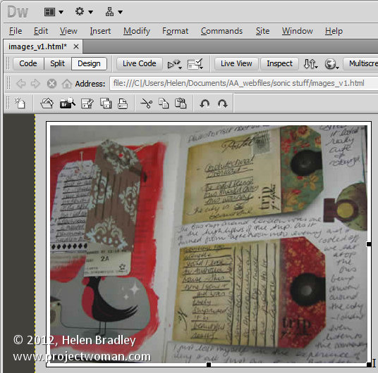
While Dreamweaver has some rudimentary tools for photo editing, if you want to do some real image editing, you’re better advised to take the image to a photo editor to do so.
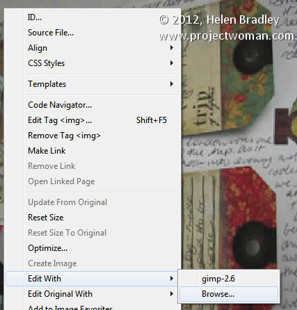
From Dreamweaver you can send an image to Photoshop by right clicking it and choosing Edit With > and choose the image editor to use from the list. If Photoshop is not in the list you can browse to find it, if desired.

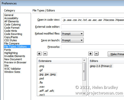
However, it’s better still to add Photoshop permanently to the list and to do this, choose Edit > Preferences > File Types/Editors and in the Extensions list, select the file extension to set the external editor for. In most cases you will be choosing .jpg .jpe .jpeg.

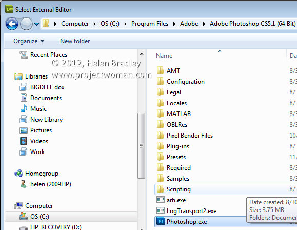
In the Editors box, click the plus (+) symbol above the box and browse to find the executable file for your version of Photoshop (or another program if desired). In most cases this will be in your C:\Program Files or C:\Program Files (x86) folder.

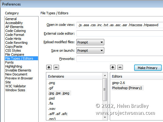
You can make an editor the primary one by selecting it in the list and choose Make Primary and then click Ok.

Next time you choose Edit With, you’ll be able to choose Photoshop and the image will be passed from Dreamweaver to Photoshop – if Photoshop isn’t open it will be opened automatically for you.
Helen Bradley
Labels: Dreamweaver, dreamweaver to photoshop, editing, Helen Bradley, how to, images, images of the web, photo editing, Photoshop, web optimized
Categories:photoshop
posted by Helen Bradley @ 8:00 amNo Comments links to this post
Friday, June 22nd, 2012

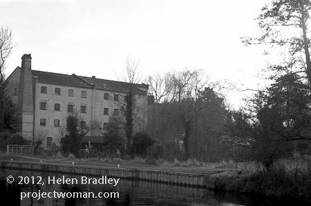
When the light is lacklustre because the weather is overcast it is often a bad time to shoot in colour because the colours are bleak and uninteresting.
These are times when black and white works particularly well because, by removing the colour problems, you can focus on the interesting things in the scene.
If the scene is monochromatic anyway and even flat but shooting it in black and white you can reinforce the desolation and age of the scene.
However, that’s not to say that a sunny day or sunrise and sunset is not also a good time to capture photos in black and white – when the sunlight is strong, the contrast between areas of light and shadow become very obvious and black and white is a wonderful way to capture this.

Helen Bradley
Labels: b & w, b and w, B&W, black and white, Camera Raw, camera settings, color, colour, digital SLR, dslr, film, full sun, Helen Bradley, light, monochrome, sunrise, sunset
Categories:photography
posted by Helen Bradley @ 8:03 amNo Comments links to this post
Thursday, June 21st, 2012

If you don’t pre-prepare your images before adding them to a page in Dreamweaver, you’ll need to resize them in the program.
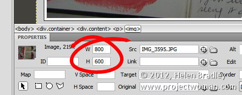
If you click an image and check the Properties panel, you’ll encounter your first problem. The selectors that let you adjust the Width and Height of the image do not do so proportionally so it’s perilously easy to skew your images out of alignment.

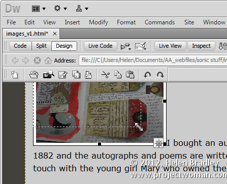
One alternative for resizing an image is to click the image and use the sizing handles to resize it. Hold the Shift key as you do this to scale the image in proportion.

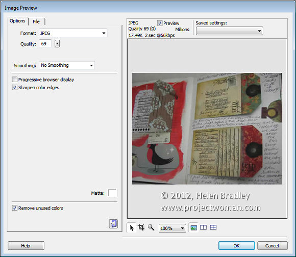
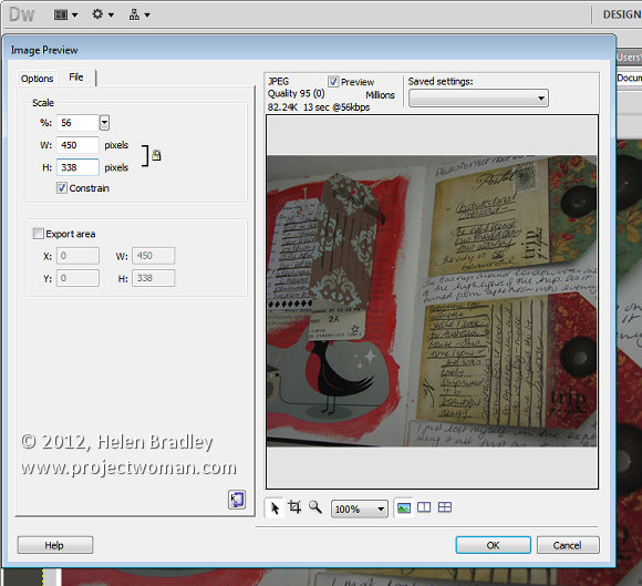
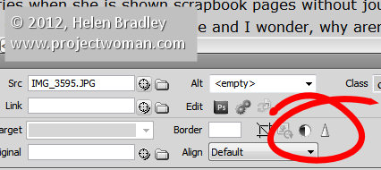
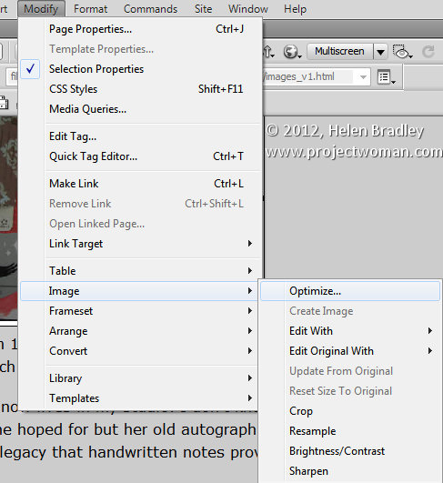
There is also another way and that is to click the image and choose Commands > Optimize Image. This is the same dialog as you get if you click the image and click the Edit Image settings button in the Properties tab (it’s just difficult to work out what button this is because it is so tiny). This opens the Image Preview window.

Click the File tab and you can scale the image to a fixed percentage or check the Constrain checkbox and adjust either the width or the height and both will be adjusted automatically in proportion.
Under the image are tools for moving around the image in the dialog, cropping it, zooming in and out of it and setting a magnification for viewing it in the dialog.
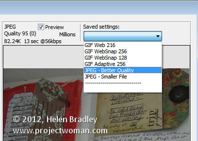
From the Saved Settings dropdown list you can select an optimization setting for your file, if you select JPEG – Smaller File the image will be saved as a low quality JPG. JPEG – Better Quality will result in a better quality but overall larger size file. For photos always select a JPG option and never GIF.

With the Preview enabled you can read off how long it will take to download the image at the currently selected quality at a 56kbps download rate.
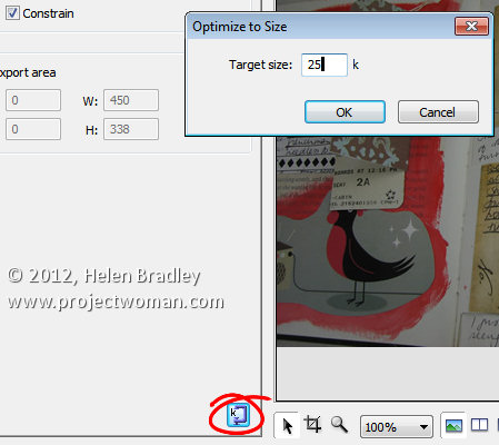
There is also a button in the bottom right of the left hand panel that allows you to optimize to a fixed size. Click it and you can set a target size for your image such as 20kb, click Ok and the image quality will be adjusted to give you file that is no larger than the size requested.

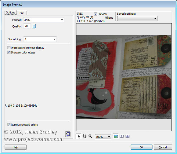
In the Options tab you can select to sharpen the color edges if desired. When you’re done, click Ok to configure the changes for your image.

Other image options include Brightness and Contrast and Sharpening both of which you can select by clicking the respective Brightness and Contrast, and Sharpen buttons in the Properties panel.

These options can also all be found by clicking Modify > Image. Here are options for optimizing the image, editing with an external editor, editing the original with an external editor, cropping, brightening, adjusting contrast, resampling and sharpening the image.

Helen Bradley
Labels: Dreamweaver, Helen Bradley, how to, images, photos, resize, web optimized, width height
Categories:photoshop
posted by Helen Bradley @ 8:00 amNo Comments links to this post
Wednesday, June 20th, 2012

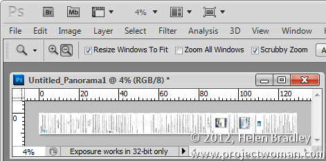
Well, who knew the humble Microsoft Paint could do what just about no other program can easily do? Well it can. I recently assembled a very large image from a series of screenshots of a help screen. The help screen was really long so I captured screenshots of each portion of it, assembled them into one really narrow and long file and then got stuck – how the heck could I print this? Hmm… enter Microsoft Paint… but first, here’s the entire process from Print screen to Photoshop to Paint!
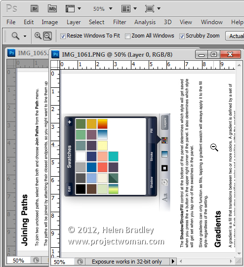
I brought all the screen capture images into Photoshop, cropped them using an action to do it very quickly, rotated them counterclockwise 90 degrees and then saved the images with sequential numbering. There was a bit of overlap in each image – you need this for the panorama merge to do its stuff and they need to be rotated or they won’t assemble properly.

Having done that I then used the photo merge tool in Photoshop (File > Automate > Photomerge) to create a merged image from the individual images.

Then, once the merge was complete, I rotated the image back this time 90 degrees clockwise to get a vertical image that was 770 pixels wide and over 9,000 pixels long.
The problem with an image this size is that when you try to print it from Photoshop – it has to be squeezed down to a very small size to print on a single page and no other option is available so you can’t print it on multiple sheets.
The question then becomes how to print a very large image in lots of smaller pieces. The solution is nearer than you think and, curiously, it comes in the form of Windows Paint.

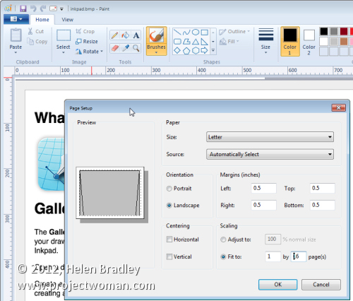
Launch Paint and open the image. Choose File > Print > Page Setup. Here you’ll find an option for sizing the printout to a fixed number of pages wide or long or you can shrink option to adjust the percentage scaling size. Wow! This is really very smart indeed.
When you do this, watch the boxes below as this will tell you how many pages tall and wide the image will be printed at. When you’re satisfied with the results, you can go ahead and click to print the document. If you have a PDF printer then you can print the document direct to a PDF file or if preferred, feed some paper into the printer and print the image. Then get out some sticky tape and stick it all together.
Helen Bradley
Labels: alternative to rasterbator, Helen Bradley, ms paint, mspaint, multi page printing, multi-page, multipage, Paint, PDF, print big images, printer, Rasterbator, scale
Categories:photoshop
posted by Helen Bradley @ 8:00 am1 Comment links to this post
Tuesday, June 19th, 2012

Black and white is particularly attractive for use in portraits photography. You can use it when your subject is dressed in or surrounded by colours that are not complimentary to them or which are distracting to the eye.
By shooting in black and white, you remove the impact of the clashing colours allowing the subject to become the focus of the image and not their clothes or, worse still, the background.
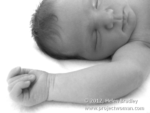
Bathed in soft light, babies captured in black and white look wonderful and the impact of jaundiced skin or blemishes is reduced.
For subjects that have facial details that can handle harsh light, try capturing your portraits with strong side lighting such as sunlight pouring in through a window. The dramatic contrast between light on one side of the face and shadow on the other can bring a portrait to life.
This type of setup is best used for a subject who has very strong facial features such as older subjects with lots of wrinkles or for subjects who live life hard as it reinforces their personalities and lifestyle.

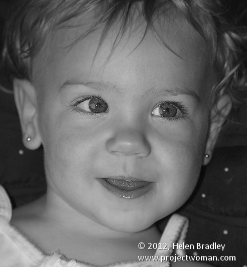
Children’s and baby’s portraits captured in black and white do away with distracting colours and blemishes and allow you to focus on the child.
Helen Bradley
Labels: b & w, b and w, B&W, baby, black and white, Camera Raw, camera settings, child, children, color, colour, digital SLR, dslr, film, Helen Bradley, kid, monochrome, skin tone
Categories:photography
posted by Helen Bradley @ 8:00 amNo Comments links to this post
Tuesday, June 19th, 2012

One of the most confusing things for Photoshop users will be the concept of a transparent layer in Gimp.
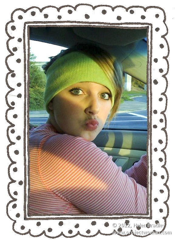
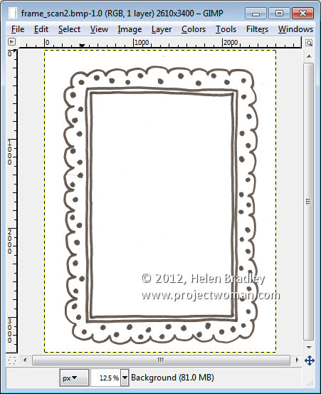
Consider the situation where you open an image such as this hand drawn frame here. The image is a BMP image and what I want to do is grab the middle out of the frame so that I can put something behind it.

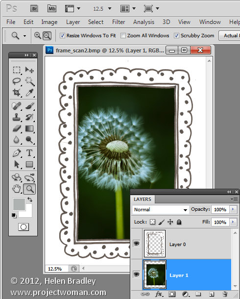
If this were Photoshop, I would convert the background layer to a regular layer by double clicking on it and press Ok. Then I would target the Magic Wand tool and click in the middle of the frame to select the middle area then press Delete to make it transparent so I can drop an image in behind it.

If you try this process in Gimp, all you get is an extreme level of frustration as nothing seems to work. Select and delete does absolutely nothing !
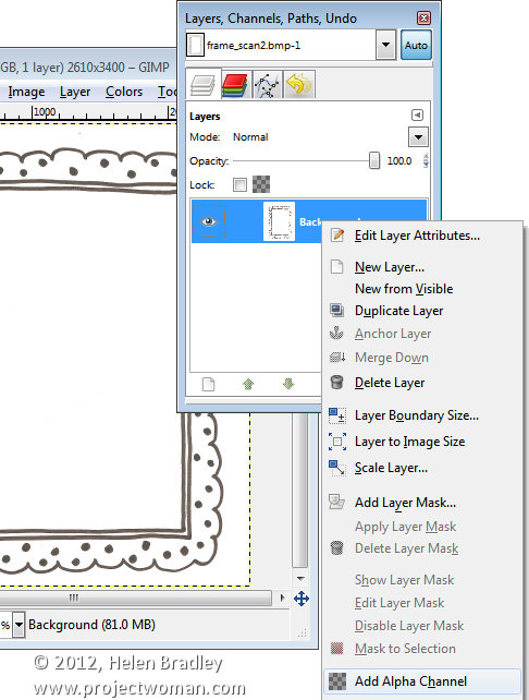
Here’s the solution. With the layer with the image on it selected, right click and choose Add alpha channel. This then allows you to select an area on the image using the Fuzzy Select tool, and press the Delete button. Then choose Select none and you will have a transparent middle to your image. It’s an easy process once you understand what’s happening but an extremely frustration one until you do.

Helen Bradley
Labels: gimp, Helen Bradley, how to, photo editing, photos for the web, Photoshop, tip, trick
Categories:Uncategorized
posted by Helen Bradley @ 8:00 amNo Comments links to this post
