Wednesday, November 28th, 2012

Trevor’s Quick Photoshop Tip – Resize an image

original Photo By: Gisela Royo

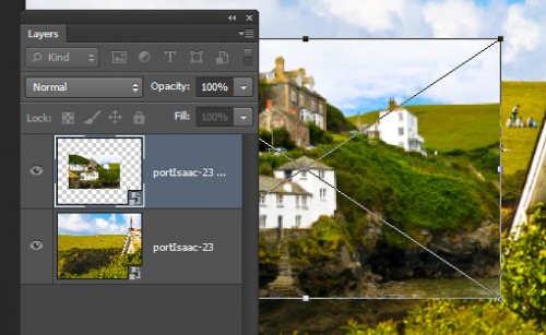
To resize the content on a layer or an object in Photoshop CS6 bring up the bounding box or transform controls by pressing Ctrl + T on a PC or Command + T on a Mac. When the controls appear you can drag on them to resize the object. To resize the background layer of an image you’ll first have to transform it to a regular layer by double clicking it in the layer palette and click Ok.

Helen Bradley

Monday, November 26th, 2012

Photoshop – Quick Portrait Makeover

Touch up your portraits with this quick video tutorial. I’ll show you how to remove blemishes and soften skin tones.


Transcript:

Hello, I’m Helen Bradley. Welcome to this video tutorial. In this tutorial I’m going to show you how you can do a quick and easy portrait makeover.

Let’s have a look and see before we begin exactly what we’re going to achieve. So this is the starter image that I started off with. And I did some spot fixing on it to make sure that I had removed the skin blemishes and then I brought out the detail from the shadows. And this is the starting point that I then had and this is the effect that we’re going to look at creating. We’re going to soften the skin and brighten the eyes in our model. So let’s have a look and see how we would start off with spot fixing this image.

I would go into this image and then I would start by selecting the spot healing brush tool here because this is a tool that you can simply just paint over problems on the skin and it will fix them. So I went over this image really, really carefully. I zoomed in and I got every single one of the blemishes on this model’s skin and it’s probably a five minute job to just neaten the image up and just to get a really good starting point for it. And then having done that I did a shadows and highlights adjustment to bring some detail out of the shadows. So I’ll choose Image, Adjustments, Shadows/Highlights. And the default setting is 35. Now I used that. It was probably a little bit high. So you could probably bring it down a little bit perhaps to around 23 or 24, but there’s a good starting point for your image. And from there you’re ready to go ahead with the softening effect.

So let’s go back to the image that I’ve spot fixed and now let’s get rid of the two layers that are the fixed layers. And we’re just going to work from the point at which we opened up some of the shadows and highlights. So the first thing that we’re going to do is to create a duplicate of this background layer, just duplicate it and then we’re going to blur it. So I’m going to choose Filter, Blur, and then Gaussian Blur. I’m going to set the blur value to sort of a lowish sort of value. What I want to do is blur the model’s skin and use that in a minute to paint over her skin. So I want something that’s sort of a little bit over what I want my final effect to be but not totally over. So I’m thinking here about 9 or 10 pixels will be a good amount for this image, so I’ll just click Ok.

And having blurred that layer a little bit I want to add a bit of noise into it and I’ll do Filter, Noise and then Add Noise. And we want to bring in monochromatic noise and we want it to be Gaussian. Gaussian noise applies more noise to the lighter areas of the image and less to the darker areas. And we want probably somewhere between 5 and 10 percent noise. And this slider is really hard to adjust at that level so I’m just going to type in 7.5 percent and that’s giving us a nice little bit of noise in her skin tones, so I’ll click Ok.

So we do not want the image to look exactly like this. We just want that to be a starting point. So let’s add a mask to this layer. I’m going to Alt or Option click on the Add Layer Mask icon. And what that does is removes the blur. it will remove the entire effect from the model. And we’re going to paint on this mask to bring back in the softening where we want it to be. So I’m going to select my brush tool and select a nice soft brush, this one’s a good brush to use, and I’m going to paint with white. I’m just going to size the brush up a little bit. Now you’ll be a bit more careful than I am being, but what I’m doing is selecting over all the areas, painting over all the areas that I want the skin to be softened. So that is basically everywhere but her nose and mouth and eyes. Although I want the skin on her nose to be softened, I don’t want to soften this detail around here. And I may want to soften this area, but I don’t want to soften her eyebrows themselves. So very carefully softening by painting on the image with white in the areas that you want it to be softened. And you can see on the mask here the areas that we’ve got and perhaps any areas that we might have missed out on at this stage. Again, I don’t want to soften that jaw line too much. that’s a nice strong line and I want to keep that there.

Now that I’ve done that I can adjust the opacity of this layer a little bit. I’m going to adjust it down to zero which is totally removing the sharpening effect. And now I’m just going to march it up using the scrubby slider until I get the amount of softening that I want. So I really want a subtle softening, not totally obvious but just subtle softening of the skin. And I think probably about 30 percent is a good value for this image.

Now I’m going to make another duplicate of this background layer and drag it to the top because what I want to do now is to fix her eyes. So all I’m going to do is focus on this top layer and I’m going to look for some stronger color and contrast in her eyes. So I’m going to choose Image, Adjustments, Curves. Curves is a good adjustment for this and again I’m going for slightly more than I need. So there is some more whites in her eye. Now I know that the blue color of her eye is in this area, so let’s add a bit more contrast through that area.

So let’s see. That’s the before and that’s the after on her eye. So I’m just going to click Ok to accept that, but of course that’s not the image effect that we what. We want more of this effect, but we’d like to borrow some of the eyes from this effect. So again I’m going to Alt or Option click on the Add Mask icon to add a layer mask. And again with my paintbrush which is already preset and my white paint I’m going to target the mask and paint over her eye. Now again this is probably going to be too much, but we can tone it down a little bit by again adjusting the opacity of the mask. So we’ll just take it up to what we want it to be. I am thinking it’s probably going to be a little too much, maybe about 50 percent.

So let’s have a look at the starting point for the image. This is post having been spot fixed and post having had shadows and highlights applied to it. Then we added the skin softening and finally we added a little bit brighter eyes in our portrait.

I’m Helen Bradley. Thank you for joining me for this video tutorial. If you liked the tutorial please click to like it on YouTube. Consider also subscribing to my YouTube channel. You’ll be advised when new videos are launched and right now that’s about twice a week. You can also visit my website projectwoman.com where you’ll find more tips, tricks and tutorials on Photoshop, Photoshop Elements. Lightroom, Illustrator and more.

Helen Bradley

Sunday, November 25th, 2012

Help! Lightroom Lost My Files

If there’s one thing that confuses new Lightroom users it is that quite often files that should be in Lightroom appear to have gone missing. Here are some things to look out for when this happens to you.

Is a Filter Hiding Things?

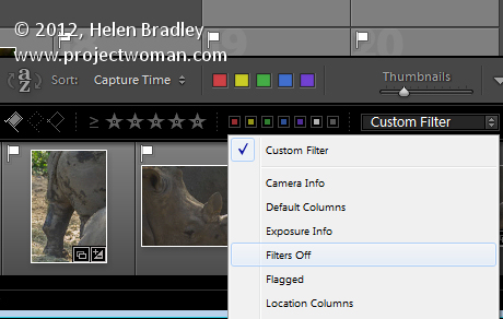
If you think a folder should be displaying more images than it does, check that there is not a Custom Filter in place. In the Library module, make sure the Filmstrip is visible and if there is a filter listed in the Filter box then that’s affecting what you’re seeing. To return to showing all your images in the currently selected folder, select Filters Off from the Filters list.
Are you looking in the right place?

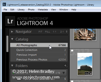
While Lightroom’s folders mimic the folder structure on your computer and external drives sometimes you really want to look through all the files in Lightroom. To do this, open the Catalog panel in the Library and select All Photographs. This selects all the photographs in the Lightroom catalog as the basis of your search.
Images in Subfolders

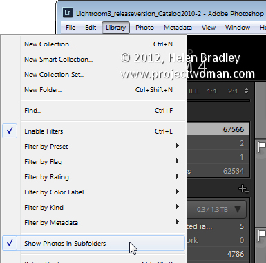
If you click on a folder that has subfolders but you see nothing or none of the images in the subfolder that is typically caused by a Lightroom setting. This setting lets you control whether or not you see photos in subfolders when you click that folder in the Library module. To view the current setting choose the Library menu > Show Photos in Subfolder. The setting can be enabled or disabled depending on your preferences but it’s often the cause of photos in subfolders not showing when you think they should be there.
Look in Folders and not Collections (or vice versa)

Lightroom has folders and collections and they can have the same name. You’ll find Collections in the Collections panel and folders in the Folders panel. A collection can include files from a number of folders but a folder can only contain images which are stored in that folder on your disk, so make sure you’re looking for the right folder or collection.

Contents of Smart collections Change

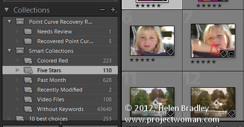
Regular collections are fixed so that the images, once placed in the collection, remain in that collection until you remove them. Smart Collections are dynamic so the images in them change depending on the criteria you have set for them. For example, the 5 Star Smart Collection shows all images that are 5 Star images. If you make an image a 5 star image it automatically gets added to that collection. If you change a 5 star image to a 4 star one then it no longer appears in that Smart Collection and that might be the cause of images going ‘missing’.
Search for Lost Images

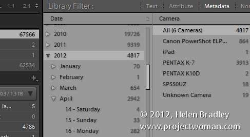
If you’ve lost photos and you know roughly when they were captured or which camera you captured them with it is possible to search your Lightroom collection for them. Start in the Library and click the Catalog panel and click All Photographs. Then choose View > Show Filter Bar. Click Metadata and you can then locate images by their metadata. For example if you know the approximate capture date was January 2012 then make sure that the first filter is set to Date and click 2012 and then January. This will show only those images that you shot during that time.

It’s also possible to filter by camera, lens and other metadata. You’ll just need to make sure that the primary field that you are filtering on is the one on the left of the Filter Bar. Images are filtered from left to right so, if the leftmost panel is Date and the one to its right is Camera type – you’ll see the camera types for only those photos shot on the specified date. If Camera type is the leftmost column and Date the rightmost one, then you’ll filter out all the images captured with a certain camera and see only those dates you actually captured images with it.
Lightroom Can’t Find the Image

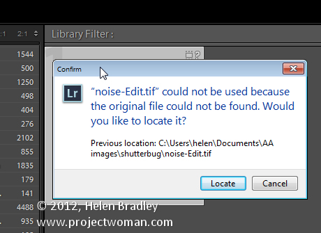
Sometimes Lightroom will display an image with a question mark in its corner indicating that the photo is missing. This means that the image was imported into Lightroom but Lightroom can’t find it any longer. To return it to Lightroom, click its question mark icon and you’ll be prompted to locate the image on disk. Click Locate, find the image on disk, select it and it will appear again and it will be editable inside Lightroom.
Lightroom Lost the Entire Folder

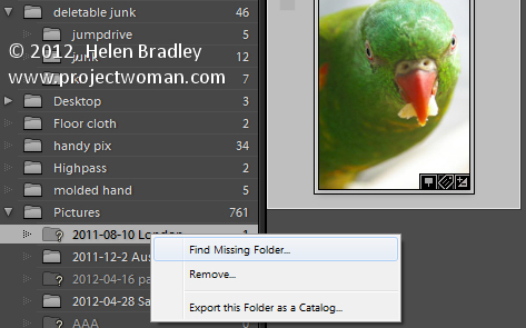
If you move or rename a folder on your disk outside Lightroom then Lightroom won’t know what you’ve done. If there are photos in the Lightroom catalog in that folder it will report the entire folder as missing when you launch it next. Missing folders will have a question mark beside their name. If you know where you moved the folder or that you renamed it, you need to tell Lightroom where it is. To do this, right click the folder in Lightroom and choose Find Missing Folder then locate the folder on disk and Lightroom will update accordingly.
A Folder is Missing Some Files

If you have a folder which you think should have more images in it than are currently showing in Lightroom this could well be the case. The Lightroom folder structure mimics the disk folder structure but only those images you import into Lightroom will actually be in Lightroom. It is also possible to remove images from Lightroom but in such a way as they remain on disk.

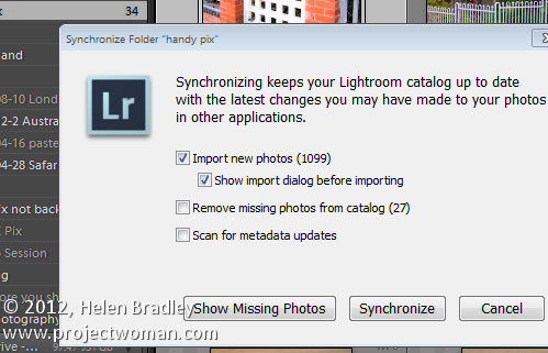
To check to see if there are additional images in a folder that aren’t showing in Lightroom, right click the folder in Lightroom and choose Synchronize Folder. Make sure that the Show Import Dialog before Importing option is enabled and select Synchronize. This shows the import dialog and those images that are in the folder but not in Lightroom so you can synchronize the contents of the folder with Lightroom.

Now it’s over to you. Have you ever experienced missing files in Lightroom and, if you did, what was the cause and how did you resolve the issue?

Helen Bradley

Friday, November 23rd, 2012

Trevor’s Quick Illustrator Tip – Edit in a Group

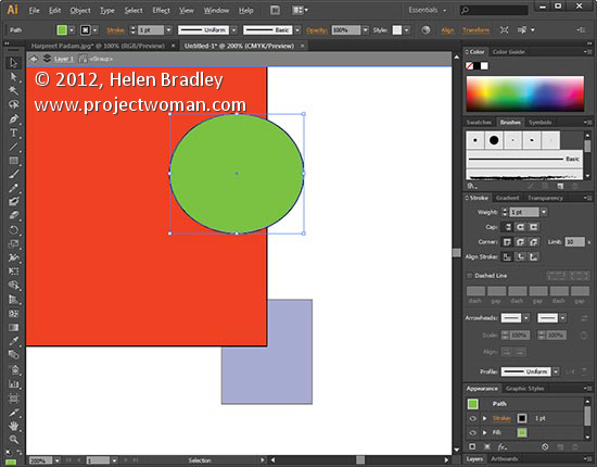
When you want to edit a specific part of a group of shapes without ungrouping everything to do so double click the grouped shape to enter isolation mode. Now select the object that you want to edit and make your changes. When you’re done double click outside the grouped shapes to exit isolation mode. This works for groups contained within groups as well.

Helen Bradley

Thursday, November 22nd, 2012

Photoshop Landscape Glow Effect

Quickly learn how to create a Landscape glow effect in Photoshop to give your photos a dreamlike quality.


Transcript:

Hello, I’m Helen Bradley. Welcome to this video tutorial. In this tutorial I’m going to show you how to apply a landscape glow effect.

Before we get started with creating this landscape glow effect let’s have a look and see what it is that we’re aiming for. This is the original image that I’m starting with. It’s from sxc.hu which is a stock image site and this is just a little house in the middle of a paddock. And this is the result of applying my landscape glow effect to it. The image has a bit more of a glow to it and a slightly more painterly look. I have another image that I’ve applied it to. Let’s just hide that one for now. Let’s have a look and see what this image looked like before. Again it’s a stock image and this is what it looks like after we’ve applied the effect.

So let’s get started creating this effect. I’m just going to remove these three layers from this image, and let’s see how we would do the effect ourselves. We’re going to start on the background layer of the image. And we’re going to choose Select and then Color Range because this allows us to pick out the darker areas of the image without having to make a selection which is really nice because they would be really hard to identify otherwise. So I’m just clicking to select shadows. And Photoshop has automatically selected all the shadow dark areas of my image so I’m just going to click Ok. And this is the selection it has made.

Now I’m going to put this on a new layer so I’m going to choose Layer, New, Layer via Copy. And that’s going to copy the blacks onto their own layer. So you can see this is what we’ve got. I’m actually going to hide that layer for now. Now I’m going to make two additional copies of the background layer. I’m going to right click it and choose Duplicate Layer and click Ok and then do that again. With the topmost of these duplicate layers I’m going to set its blend mode to Screen and that will lighten the image considerably. And then I’m going to merge this layer into the layer below by choosing Layer, Merge Down.

Now I have a lighter version of the image on top of the original. And I’m going to duplicate this so I have two light versions of the image on top of each other. And I’m going to set the blend mode for this particular top layer to Multiply and that will darken it all again. Now with this darkened layer I want to blur it so I’m going to choose Filter, Blur, and then Gaussian Blur. And I’m going to set my blur to a quite high value, something like sort of 9 or 10 but in that sort of higher value area so I’m going to get this sort of glow look to my image and click Ok.

So there’s my blurred darkened layer, my light layer underneath and my original layer below. And now that I’m ready to do so I’m going to make the top layer this dark tree visible again. And you can see that in actual fact the pixels in that layer are really quite light in comparison now to the rest of the image underneath. And I can even make it lighter by blending this particular tree back in in Screen mode and then just adjust the opacity down to suit. So that’s giving my landscape a very sort of glow look. It’s a lot richer color and a lot more of a glow look to it.

So I hope you’ve enjoyed this video tutorial. Thank you for joining me for it. If you liked the tutorial please like it on YouTube and subscribe to my YouTube channel to be advised when new videos are released which is a couple of times a week. You can also visit projectwoman.com for more tips, tricks and tutorials on Photoshop, Photoshop Elements, Lightroom, Illustrator and others.

Helen Bradley

Wednesday, November 21st, 2012

Free Hand Drawn Bird Brushes for Photoshop

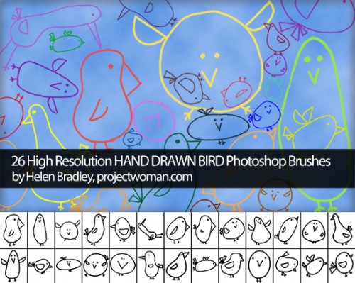
Some of you may already know that I’m a bit of a brush junkie, and hopefully you’ve checked out Project Woman’s brush collections before. If not, now is the perfect time! I’ve recently updated the page to include a new collection of adorable hand-drawn bird brushes. The set is entirely free and all pertinent licence information is included.

I update the collections regularly, so make sure to keep an eye out for any new brushes!

Download the bird brush set here!

Helen Bradley

Wednesday, November 21st, 2012

Trevor’s Quick Photoshop Tip – Change your Units of measure

original photo by: John De Boer
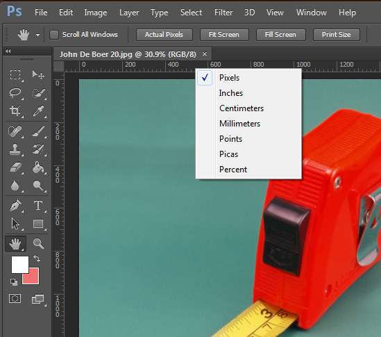
Need to change the units of measure on your rulers from pixels to inches or vice versa? To do this, right click on either of the rulers and select the measurement you’d like to use. Options include Pixels, Inches, Centimeters, Millimeters, Points, Picas and Percent. Bonus tip – this works in Illustrator too.


Helen Bradley

Tuesday, November 20th, 2012

Photoshop – Understanding Smart Objects

Smart Objects are a great tool for working with images in Photoshop but did you know there are two ways to make copies of them. One way you duplicate the Smart Object so every instance of it will always be the same image and the other way you copy the Smart Object but unlink it so you can change out one image without changing the other.

Also make sure to watch my video on Smart Objects here.

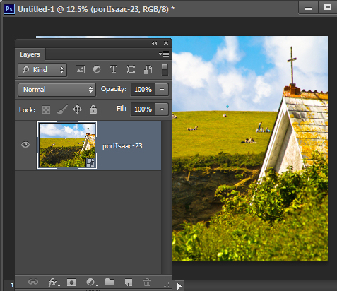
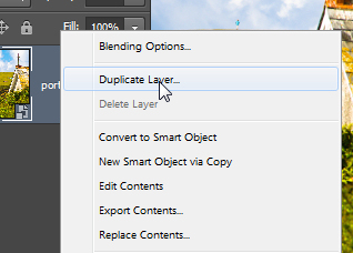
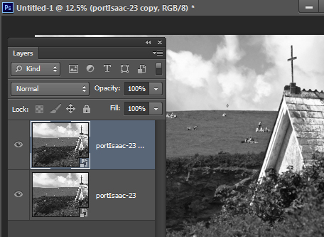
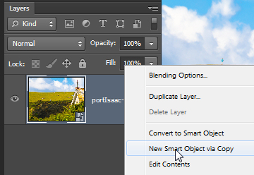
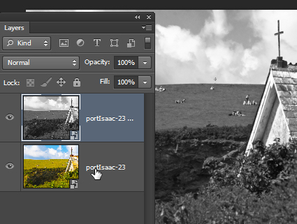
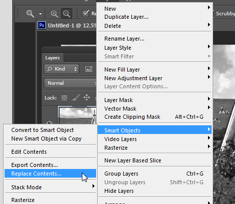
Here’s how it works: Start with a new Photoshop document and add an image as a Smart Object – my favorite way to do this is to choose File > Place and place the image inside the file.  This gives you one image as a Smart Object in the Layers palette. Now, the first way to duplicate a Smart Object is to right click and choose Duplicate Layer. This makes an exact copy of the layer so anything you do with the Smart Object on this layer will be done to both layers. Here I double clicked on one of the layer thumbnails and opened the actual image on that layer. I converted it to black and white then closed and saved it and this is what I have now in Photoshop. The two Smart Object layers are both changed. The alternative is to right click the Smart Object layer and choose New Smart Object via Copy. You get the same result as the earlier option with one exception – the two images are separate and they can be altered individually. Here I did the same alteration as before, only this time the image on the top layer is changed an not the one on the bottom layer. If desired you can change the image on the layer. To do this, click the layer to select it and choose Layer > Smart Objects > Replace Contents. Locate a different image to use, click it and click Place. Here I have resized the placed image so you can see they are different. If I had done this with the Duplicate layer then both images would be replaced. Which of these options you use really depends on what you want to do with the image. Sometimes  you want two of the same image, sometimes not.

Helen Bradley

Monday, November 19th, 2012

Photoshop Smart Objects

Learn how to link Smart Objects so, when one changes, they both change and how to un-sync them so they are separate. I’ll also show you how to replace the contents of a Smart Object with another image. Useful for wedding photographers and for creating albums in Photoshop.

Transcript:

Hello, I’m Helen Bradley. Welcome to this video tutorial. In this tutorial I’m going to show you how to work with smart objects in Photoshop. In this video I’m going to show you how you can use smart objects to assemble complex images, and you can do it in a way that harnesses the value of the smart objects. For example, I’m going to create a smart object for this background and then a smart object for this couple. This will allow me to go to this smart object and choose Replace Image. This will allow me to go to this smart object layer, right click and choose Replace Contents. And I can then replace the contents of that smart object with any of the images from that album. And so I can quickly and easily create images for an album with a background in place. But there is a catch and you’ll want to use the right tool for creating these smart objects so I’m going to show you that too.

Let’s just hide this away and let’s go and get our starter document. I’ve already got a vignette that I’m going to use, but we’re going to put in here the original background. So I’m going to choose File and then Place because that’s a way of getting an image in as a smart object. Here’s the portion of this image that I want to use as my background. I’ve already extracted it as a separate image so I’m going to click Place. And I know that this needs to be enlarged a little bit so I’m just going to enlarge it to 75 percent and then click the checkmark. So it’s now in place and it’s a smart object. It has a special little smart object icon. And I’m just going to show you that you have this vignette which is separate and it just goes over the top.

Now we want to create another smart object, but we want this smart object to be unhooked or unlinked to this one. So I’m going to right click and I’m going to choose New, Smart Object via Copy. And what that does is makes a copy of the existing smart object as a separate layer,  but it is not linked to the original layer. So now if I go into this and resize it, I’m just going to link these two together, this gives us a new smart object layer in the image which is not linked to the background layer although the two share the current image. I’m just going to add a drop shadow to it. So if we were creating a bridal album we could use this as the starting point for our album. I’m just going to get a slightly nicer drop shadow here and pull that vignette down so that it’s over the top of the background and not the image here. So having created this, this could be the first image in our album. And we can then go ahead using the same background image and just change the smart object out without having to recreate this document, right click, choose Replace Contents.

This time I’m going for an image of the bride and groom, and here they are in place. They’re a little large so I’m just going to choose the transform tool with Ctrl or Command T. I know they need to be taken down to about 10 percent so I’m going to scale them down to 10 percent and just move them into position. You can see that the drop shadow is still in place, the background is still in place, the vignette is still in place, and we’ve got another page of our album already created. If I right click and choose Replace Contents I can go and select yet another image to go in here. And again, the border and everything are already on that image. So it gives me a smart way of creating an album very quickly.

I’m just going to discard that for now and let’s have a look at what you might want to use and which would be a bad choice in this situation. And that would be to right click and choose Duplicate Layer. Now that would give us on the face of it exactly what we had before, a smart object with a second smart object layer over the top. Let’s just go ahead and select that and let’s add our drop shadow to it. Let’s position it where we want it to be above the vignette. And here’s what we had, an image over the background. And we’re ready to print that out.

But look what happens if we go to replace the contents of this image with our bride and groom. Not only do we replace the contents of the image with our bride and groom, and we can scale them back down to the 10 percent size that we were using before, but let’s just link that so that it’s going to be 10 percent in both directions. But look what’s happened to our background. These two smart objects instead of just being a duplicate of each other are in actual fact an exact copy of each other. And so anything that happens to this background smart object is also going to happen to this one and vice versa. If we change this one we’re going to change this one. So if we want the ability to create a smart object from another one but to unlink it so that they’re no longer the same image each time, we need to right click and choose New Smart Object via Copy.

But if we do want two smart objects that are linked and they’re always going to be the same image even if they’re different sizes of the same image then we would simply use Duplicate Layer. Smart objects are a really good tool to use when you’re assembling an album like this because it gives you the ability to create a background image and a smaller image on top and to easily replace that image and create an album very quickly.

I’m Helen Bradley. Thank you for joining me for this YouTube video tutorial. If you liked the tutorial please like it and feel free to add comments to the video tutorial. I encourage you to subscribe to my video YouTube channel. We release videos twice a week at the very least and you’ll be alerted to the new video releases. And don’t forget to visit my website at projectwoman.com. There you’ll find more tips, tricks and techniques for Photoshop, Lightroom, Illustrator and lots of other programs.

Helen Bradley

Sunday, November 18th, 2012

Understanding Lightroom Process Versions

If you’ve used any earlier version of Lightroom and if you now use Lightroom 4 you need to know a bit about Process versions.

In this post I’ll give you the basics of what you need to know which will explain why you see exclamation points by some of your images in the Develop module and why the new Lightroom 4 sliders sometimes disappear unexpectedly.

Process versions

In Lightroom 3 and again in Lightroom 4 the Lightroom Process version was updated. These process versions affect how your raw images are processed by Lightroom so it’s important to understand what they are and how they work.

Initially there was only one process version used in Lightroom 1 and Lightroom 2 so upgrading from one version of Lightroom to the next didn’t create any issues. The process version used in these versions was called Process 2003.

When Lightroom 3 was released it had a new process version called Process 2010. This process version had better rendering of the raw image and that meant better detail rendering, better noise reduction and better sharpening.

Because this new Process 2010 was so significantly improved, Adobe didn’t apply it by default to images in Lightroom 3 which had been processed using the older Process 2003. To have done so might have produced unwanted changes to images which had been already processed so it was left to each user’s discretion to apply the changes or not. Images newly imported into Lightroom 3 were processed using Process 2010.

Fast forward to Lightroom 4 and the situation is repeated. There is a new process version called Process 2012 in Lightroom 4. Images newly imported into Lightroom are processed with Process 2012, and those which were processed in an earlier version of Lightroom remain unchanged.

So What is the Exclamation Point

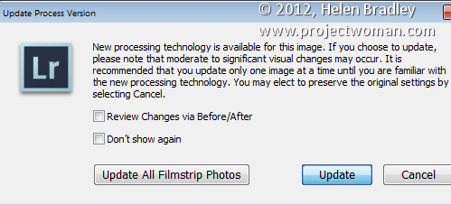
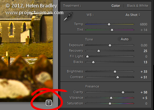
If you see an exclamation mark icon in the Develop module to the right of an image this indicates that it has applied to it a process version that isn’t the current version for the version of Lightroom you are using.

If you want to update an image, click the icon and select to update the image or select to update all the filmstrip photos. You can preview the changes before they are applied if desired.

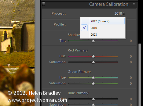
It’s also possible to update images from the Develop module’s Camera Calibration panel.  Here you simply select the desired process version from the Process list. The options are Process 2003, Process 2010 and Process 2012 (Current). In most cases, most users will choose to update the process version to the most current one.

Where did my Sliders go?

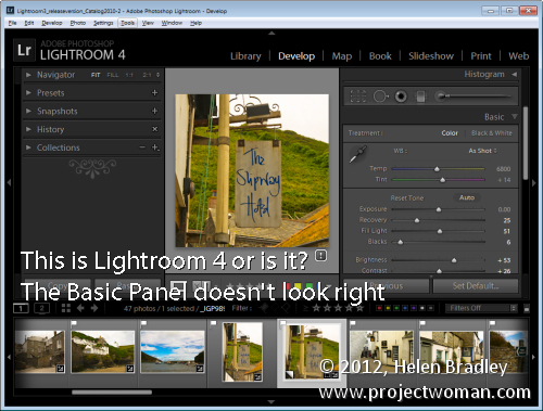
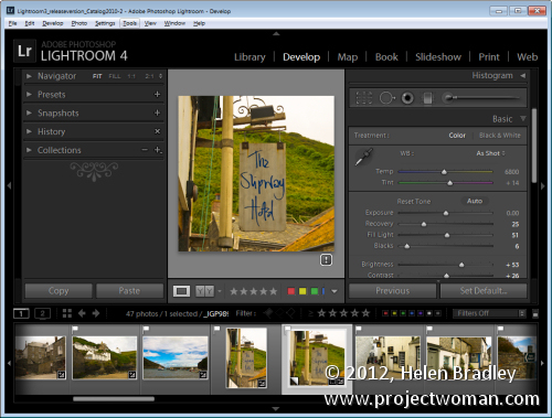
When Lightroom 4 was released the Develop module’s Basic panel was altered significantly. The sliders in that panel are now called by different names, they have different starting settings and they do different things to those in the earlier Lightroom versions. In short, the Basic panel adjustments in Lightroom 4 so significantly differ to those in Lightroom 3 that they aren’t interchangeable. Therein lies the explanation as to why your brand new sliders sometimes disappear and the older Lightroom 3 ones reappear – quite simply they do so when you are working on an image processed with an older process version.

So, if you have an image that has Process 2003 or Process 2010 applied to it, the Basic panel sliders will be those you are used to seeing in Lightroom 3 and earlier. If you’re working on a Process 2012 image the sliders are Lightroom 4 sliders. Updating the process version to the most current version will display the new sliders.

What this means to you

If you want the best processing for your images and if you want to see only one set of sliders in the Basic panel then go ahead and update all your images to Process 2012.

If you can see differences between the process versions and if you don’t want those changes applied to some or all of your images then you don’t have to update your images. It’s up to you to make the choice and you can do so for one or more of your images as and when you want to.

However, if you still have some Process 2003 or Process 2010 images in your Lightroom collection just be aware that Lightroom 4 sliders might disappear and be replaced by those from Lightroom 3 from time to time because of this.

Now it is over to you. Have you upgraded your older Process 2003 and Process 2010 images to Process 2012? If you didn’t what made you stay with the older version?

Helen Bradley