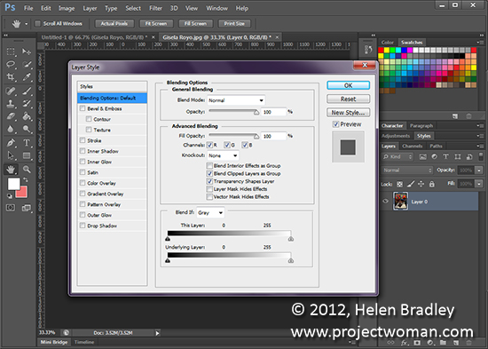
Double click a layer’s thumbnail in the Layer palette to open the Layer Style dialog. Here you can add a style such as a pattern overlay or drop shadow to your layer.
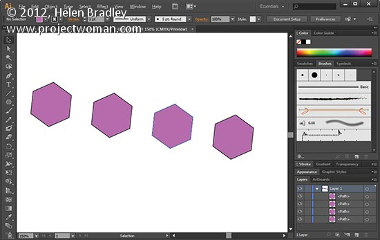
When you need to make a duplicate of an object without copying and pasting it you can do so. With the object selected hold down Alt as you click and drag to where you want the copied object to go. To do it again without having to click and drag, press Ctrl + D on a PC or Command + D on a Mac – it’s the command to repeat the previous action. Repeat as often as required.
Labels: Adobe, drag, duplicate, how to, Illustrator, object, repeat object, tip, trevor adobe, trevor payne
Categories:photoshop, trevor tip
Lightroom has a range of HTML Templates you can use to create a reasonable looking gallery in a very short time.
To make your web gallery in Lightroom start by placing your images in a Collection. This makes it easier for you to work with the images and you can save the gallery so you can edit it in future if needed.
Select your Collection and switch to the Web module. From the Layout Style options, you can select Lightroom HTML gallery or, easier still, from the Template Browser panel on the left of the screen, select a gallery that is HTML based. If you look in the preview area the HTML gallery templates all have the letters HTML in their bottom left corner. Select a template to use.
From the toolbar (press T if it isn’t visible), choose All Filmstrip Photos if you have a Collection selected and this will add all the images to your gallery. What you see on the screen in the editing area is a live version of your web gallery. You can click on any image to view it as it will look on the web.
Open the Site Info panel and type a Site Title, a Collection Title and a Collection Description. If you don’t want to use all of these simply delete the placeholder text for those items you don’t want to use and the space they take up in the template will be freed for use for your images.
For the Contact Info, type your contact name if desired and then complete the Web Or Mail Link and this will be linked automatically to the contact name in the web gallery.
You can add an identity plate to the gallery, if desired, it will sit above the Site Title. You can link it back to your site if desired by completing the Web or Mail Link box.
The Color Palette options let you change the colors for the various elements in the website template.
In the Appearance panel you can set the thumbnail image grid size – it defaults to 3 x 3 and cannot be any smaller but it can be considerably larger. If you want to show cell numbers over the images you can do so – this is useful when you need to give viewers an easy way to identify images they like. Images are numbered sequentially and if you have multiple pages the images on the second page continue sequentially from the numbering from the first page.
You can control the size of the full size image on the Image Page by adjusting the Size slider. You can also add Photo Borders to the images in the Image Pages. Note that the Appearance panel is divided into Common Settings, Grid Pages and Image Pages allowing you to make change that effect the entire gallery, only the grid pages or only the image pages.
In the Image Info panel you can select to add labels to your images. These appear on the Image Page only. You can select a Title which appears above the image and a Caption which appears below the image. For each you can source the text from the image metadata and there is no reason why you can’t set the Title to be the Caption metadata and the Caption to be your Equipment metadata, for example.
In Output Settings select the quality of the larger size JPG images – 0 is low quality and 100 is high quality. If you want to include Metadata with the image select what to include – your choices are Copyright Only or All.
Also add a Watermark if desired. If you select to add a watermark, you’ll see it on the image page and the index pages so you can check to see that it’s what you want.
Select whether or not to sharpen the images – this sharpening is only applied as the images are output so you won’t see it on the screen. If you’re unsure what to use, enable Sharpening and set it to Standard.
When you’re done, click Create Saved Web Gallery – this is a new option in Lightroom 4 and it appears to the top right of the main editing area. Type a name for your web gallery and click Create. Doing this ensures that the gallery is saved and once you have done this, Lightroom will track your changes from now on.
In future you can come back to the web gallery by clicking the special collection that Lightroom creates for you.
If you want to upload your gallery to the web later on, click Export to export it to disk. Otherwise you can upload it direct to your website by selecting the Upload Settings panel and configure your FTP server. For this, you’ll need your server details, user name and password. You’ll also need the server path although you can click Browse to browse your server to find it if desired. Type a subfolder in which to place the gallery – you’ll need to do this if you plan to have multiple galleries in the server folder you are using. Each gallery needs to be placed in a different subfolder or it will overwrite the previously uploaded gallery.
When you have everything configured click Upload to render the gallery images, create the necessary html code and upload it all automatically to your server.
The HTML galleries in Lightroom aren’t the best looking galleries in town but having a gallery accessible to almost any device is definitely and incentive to use them in place of Flash galleries.
Labels: .html, appearance, collection, flash, gallery, identity plate, Lightroom, size, template, Web, without
Categories:photoshop
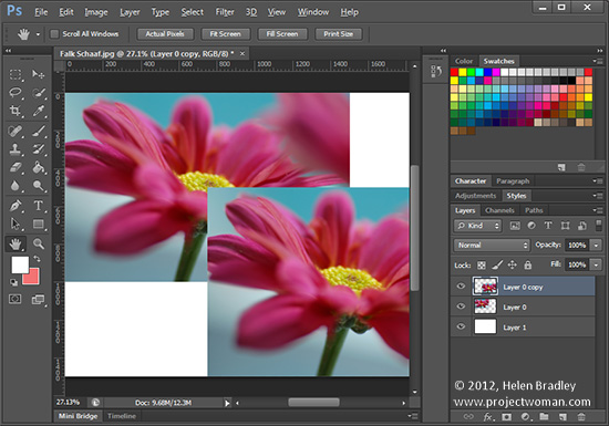 Original photo by: Falk Schaaf
Need an exact copy of a layer? Select the layer – click the layer in the Layer palette – not the thumbnail and press Ctrl + J on a PC and Command + J on a Mac. The new layer will appear above the original layer and will have “copy” added to the original layer name.
Labels: Adobe, duplicate layer, how to, layer, Photoshop, tip, trevor adobe, trevor payne
Categories:photoshop, trevor tip
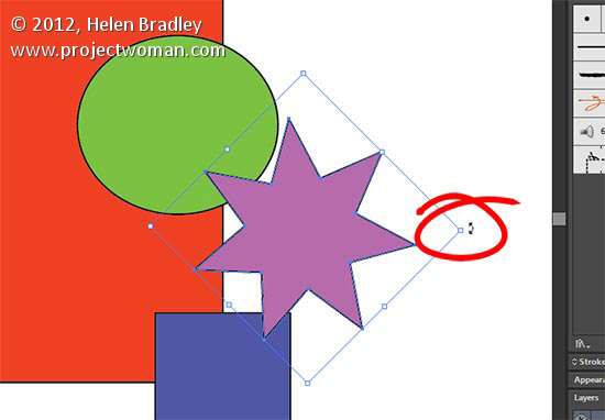
Angle of your object not right? You can rotate it by selecting the object, hover just outside one of the bounding boxes corners. Your cursor will change to a curved double headed arrow and when it does you can rotate the object by clicking and dragging it until you get the perfect rotation..
Labels: Adobe, how to, Illustrator, Rotate, tip, trevor adobe, trevor payne
Categories:photoshop, trevor tip
Photoshop Levels offers is a simple way to fix dull, lifeless images. Learn how to apply a Levels Adjustment layer to an image, how to read the histogram chart and how to use it to fix your image in seconds.
Transcript:
Hello, I’m Helen Bradley. Welcome to this video tutorial. Today I’m going to show you a quick fix for a dull or muddy looking image. This is an image that lacks tonal range. It lacks contrast and we’re going to give it a punch and we’re going to do it quickly and easily. In this video tutorial I’m going to show you how you’re going to fix an image that looks a bit like this. This image is what I would call muddy. It actually lacks tonal contrast. There no blacks in this image. We’ve got some light pixels around the sky area but there are no blacks. And the result is that the image looks a bit foggy, a little muddy, a little lacking in tonal range, lacking in contrast and the color is a little bit flat as well. And this is the fix that we can apply to the image extremely quickly and Photoshop will actually tell us how to make the fix. It will tell us what’s wrong with the image and how to fix it. So let’s have a look and see how we’ll do this.
To start off with, with the image open in Photoshop I’m going to choose Window and then Layers because I want to see this layer’s palette. Now we’re going to choose an adjustment layer. It’s exactly the same as making an adjustment except this time it is editable, and we would like to get you started using adjustment layers because it gives you a little bit more power in Photoshop. So we’re going to choose Layer, New Adjustment Layer. And the one that we’re going to use is called levels. So let’s just click on Levels and see what we get. We get offered to add a new layer so I’ll click Ok to say yes. And then we get this dialogue here. Now this might look a little bit confusing but it’s actually Photoshop telling us what’s wrong with the image and giving us a chance to fix it. This is the pixels in the image. It’s a histogram. And what Photoshop has gone and done is it’s had a look at every single pixel in the image, how light or dark it is, and it’s counted up how many really dark ones it has and how many middle tone ones and how many light ones. And it’s done that for all the 255 tonal ranges in this image. So we got from 0 to 255. And it’s telling us how many pixels are in each of those ranges of tone. And this is black and this is white. So you see that we’ve got a few pixels very, very white and then a lot of pixels in that sort of light white area which is of course all around in the sky.
But see here, this is the problem in this image. There are no blacks. There’s nothing in this black area of the histogram. And so levels is not only telling us that but it’s also giving us a chance to fix it. So what we can do is we can drag on this slider here, the one under the chart. I want you to ignore these ones all the way at the bottom. It’s these under the chart that you’re interested in. And when you see the chart doesn’t make it all the way to either end of this histogram you’re just going to drag in until it does. And look what happens to the image as we do that. We’re just going to drag in to give ourselves some black pixels in the image, and then we can adjust this mid tone point as well. We’ll go to the right to darken the image or to the left to lighten the image. And you just need to choose for your image where the best point for that is. And we could come in a little bit here on the whites, perhaps. And certainly if the chart didn’t reach the edge then we would drag in on those whites. So you just need to read your chart and then just drag these little sliders into position. And when you’re done you can just close that dialog.
And there’s our fix. This is the before and this is the after. Photoshop showed us what was wrong with the image and gave us the chance of fixing it. Let’s have a look at another image that also has a similar problem.
This was captured in London on the London I through a fair bit of Perspex glass I should imagine. And also given that London tends towards being a little bit cloudy and gray I think that’s probably not helped this image either. So again, with the layer’s palette visible we’re going to add an adjustment layer, Layer, New Adjustment Layer, Levels, click Ok. Here’s our levels dialog, not unsurprising that we have no black pixels in this image. And in this image we have practically no white ones either. This one is a little bit different. So if we want to perk up the whites we can just bring in this slider here to lighten the whites and stop them being gray and make them white, things like the clock face here and some of the areas around here, this white building probably here. And now let’s drag in on the black slider to get some blacks and then we could adjust the mid tone if we wanted to darken the image or to lighten it and again, it’s to your taste. When you’re done, click the Close button. This is how the image started out and this is how it looks now. And that fix will take you 30 seconds.
Now the benefit of using adjustment layers, if I double click on this you’ll see that it opens up again. And if I think that I haven’t darkened it enough I can darken it up now and close it. So I’m not bound into this fix. I can remove it if I want to or I can double click it to adjust it and just improved it a little bit if I think I haven’t got it perfectly right.
I’m Helen Bradley. Thank you for joining me for this video tutorial. If you liked the video please click the Like button. Consider subscribing to my YouTube channel to be advised when new videos are released. And visit my website at projectwoman.com for more tips, tricks and tutorials on Photoshop, Photoshop Elements, Lightroom and other applications.
Labels: adjustment layer, dark, dull, fix, image, level, levels tool, light, mid, muddy, photshop
Just in time for the holiday season, I’ve updated the Photoshop brushes page with a brand new set of Christmas tree brushes. Dress up your greetings cards and gifts with 32 hand drawn trees of all varieties. Best of all, it’s completely free! Happy holidays!
Labels: brush, christmas, download, free, holiday, Photoshop, tree
Categories:photoshop
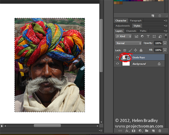 original photo by: Gisela Royo
To select the content on just one layer of your image to work on it or to make a mask from it, Ctrl + Click on the layer thumbnail on a PC (Command + Click on the Mac). Once the contents of that layer is selected you can work with it.
Labels: Adobe, how to, Photoshop, select a layer, selection, tip, trevor adobe, trevor payne
Categories:photoshop, trevor tip
Learn to turn 360 degree panoramas and other images into Amazing Circles, mini planets—whatever you want to call them.
Transcript:
Hello, I’m Helen Bradley. Welcome to this video tutorial. Today I’m going to show you how to make amazing circles in Photoshop. Before we look at how you can create an amazing circle let’s have a look and see exactly what we’re talking about. This is one of the Flicker set on amazing circles and this is a really, really nice amazing circle. And we’re going to create something like this but not with a white background. And there’s these here. They’re in black and white and they’re showing you There are two sorts of amazing circles we can create, either one that has all the detail on the outside or one that has all the detail on the inside.
So now you’ve seen what we’re aiming for let’s go and see how we would create this effect ourselves. I’m just going to open Photoshop and I have an image already prepared here. This is a panoramic image. It’s actually of the Seine in Paris. Now you could use any panorama to do it. Now the problem with my panorama is that of course it doesn’t wrap around but I have begun to create a duplicate of the tree on this end of the image so it will sort of partially wrap around. I’ll need to do a bit of cloning to fix it when I’ve actually done my amazing circle but this is a strip. If you’ve got a 360 degree panorama it will be even better. Add a little bit of image to the top and bottom of your panorama. What you want is an image that’s roughly four times as wide as it is high so I’ve added a bit of white on either side. And this will be either the outside or the inside of the amazing circle when we create it.
The first step is to resize the image. So I’m going to choose Image and then Image Size. I’m going to deselect Constrain Proportions because although this image is 8,000 x 2,000 I want it to be square but without losing any of the content. So I’m going to be deselect Constrain Proportions and type 8,000 in here because that’s the largest of these two values, so now I’m going to get a square image quite a bit larger than it was, and click Ok. And let’s just zoom out a bit so that you can see that this is the image just all squeezed up.
Now what we do next is to rotate the image and that gives us one of two possible amazing circles. So before we do that I’m just going to duplicate this image so that we have two images that we can make circles from. So you can see the two alternative shapes. Let’s start with this one and we’re going to just rotate it 180 degrees. So I’m going to choose Image, Image Rotation 180 degrees just to flip it upside down. And then all the work is done by what’s called a polar coordinates filter. It’s Filter, Distort, Polar Coordinates. And let’s just squeeze this up because rectangular to polar is the option that we want. The other option is polar to rectangular and that’s not the one we want. So now that we’ve got rectangular to polar I’m just going to click Ok. And that’s our amazing circle. That’s as easy as it is. You’ll see I’ll need to clone a little bit through the seam area because I didn’t do a very good job of making a circular panorama. But there is our amazing circle.
Now because we’ve flipped it upside down this one has the sky area on the outside and the river on the middle. This one’s going to be the opposite. Let’s just run the filter on this one without turning it upside down before we start. Just size the display, we can see what it’s going to look like and click Ok. And as you can see here the sky is on the inside and the river Seine would be on the outside. You can use whichever you like for your amazing circle.
I’m Helen Bradley. Thank you for joining me for this video tutorial. Please if you enjoyed the tutorial, like it on YouTube. Look out for more videos on my YouTube channel. Subscribe if you will. You can also visit projectwoman.com where you’ll find lots more tips, tricks and tutorials on Photoshop, Lightroom, Photoshop Elements, Illustrator and lots more.
Labels: amazing, circle, panorama, Photoshop, planets, polar coordinates filter