Thursday, June 12th, 2014

Thank You Font Creators!

Free fonts for commercial use – thank you!


I’m making this post in celebration of the wonderful typographers who have made their fonts available for use in my projects. Creating an elegant and legible font can be very difficult; giving it away for free must be even harder. I would like to present some of my favorite fonts to help give them the exposure they deserve and pay the authors back for all of their hard work (and so you can enjoy them too!). These fonts are all free and take seconds to install. They’re also really really great.


Chalk Hand Lettering Shaded Font

Scrappy Looking Font

Cutie Patootie


Saturday, May 17th, 2014

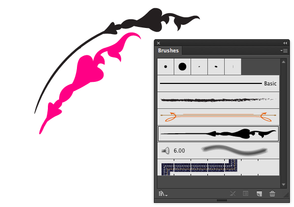
My Illustrator Brush Strokes won’t change Color

Learn  how to change brush colors in Illustrator

Ouch! I’ve been plagued with this issue for a few hours today and when I finally solved it I wanted to thump myself on the head! It was a real duh! moment.

The problem was that I made a line and wrinkled it and then shrunk it down and turned it into a brush – this one was an Art Brush. When I came to use it, it wouldn’t change color. I tried, well I thought I did, but nada.

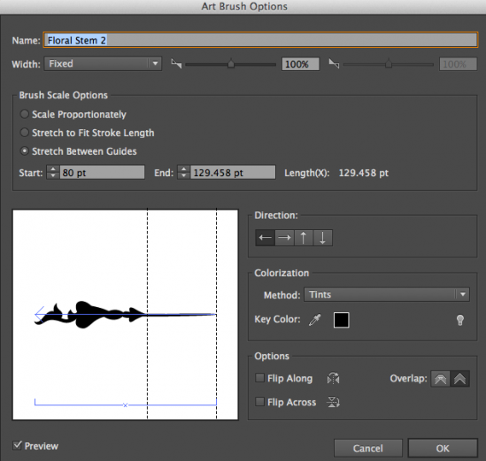
After musing on the problem, I came up with the solution and it involves the brush color setting.  You see, I created my brush using black – real black black, and then I set its colorization method to Tints and Shades. Then when I changed color it didn’t change – well it actually did but I couldn’t see the difference as any color rendered as a shade of solid black is pretty much black!

Turns out the problem is in Tints and Shades as a setting and changing it to Tints lets the color be applied as you expect it to. I consider the problem to be, in a big part, the colorization settings info in the dialog. They make absolutely no sense to me and it’s always a bit of guesswork to choose the colorization method. Basically the choice you (and I) should make is to set it to Tints and then it will recolor as you expect it to.

If you’ve already made the brush you can change the setting by double clicking on it in the Brushes palette, change the colorization method option and click Ok. You can choose to update the strokes you’ve already made in the document or not.

To change just one instance of the brush, select the line then click the Options of Selected Object button at the foot of the Brushes palette – you can now change the brush behavior for just this stroke.


Thursday, May 8th, 2014

Photoshop Basics: Learning About Layers

image credit © 2008 lockstockb, freeimages.com
Guest post

Understanding how layers work is crucial to being able to work effectively in Photoshop and in this post I will cover everything related to Layers including,

How to Create a New Layer

How to Duplicate a Layer

Add a Layer style

Using Adjustment Layers

How to Merge Layers

CREATE A NEW LAYER:

This is a very basic function in Photoshop which is elaborated further in this Photoshop tutorial. On the menus choose Layer > New > Layer to create a new empty layer right above your image. On that brand new layer, you can paint, create shapes, etc… all in a non-destructive way. This means that if you don’t like what you just did, hide or delete that layer on your image underneath will still look like it did at the start.

DUPLICATE A LAYER:

To duplicate a layer click on the layer you want to duplicate then go to Layer > Duplicate Layer and voila, you now have two identical layers!

ADD A LAYER STYLE:

Say you added a button or some text on your image and you’d like to add a shadow to it. To do this, choose Layer > Layer Style and choose Drop Shadow. Other popular options are Inner Shadow, Outer Glow, Inner Glow and Bevel & Emboss. I suggest you play with each of them to really understand how they can benefit you.

USING ADJUSTMENT LAYERS:

Adjustment layers are one of the most powerful tools in Photoshop. Use these to change the look of your image in a non-destructive way by, for example, adjusting the colors as well as the shadows, highlights and contrast. To add an adjustment layer to any image, go to Layer > New Adjustment Layer and choose the type of adjustment layer. Here is a list of the adjustment layers I use most frequently:

Brightness/Contrast: This lets you make simple adjustments to the tonal range of your image. In layman’s terms, when you move the Brightness slider to the right your image gets brighter, when you move it to the left the image gets darker. If you move the Contrast slider to the right, your image becomes more contrasty, you move it to the left, contrast is reduced and the image becomes more grayish.

Levels: A Levels adjustment allows you to adjust the intensity levels of shadows, midtones, and highlights in your image. Drag the slider on the left inwards to darken the shadows and drag the slider on the right inwards to brighten the highlights. If you drag the middle slider to the left you will brighten the midtones and drag it to the right to darken the midtones in your photo.

Curves: Use can use Curves to adjust the image tonality with more precision than by using Levels. By adding points on the curve, you’ll be able to adjust the brightness or darkness of the Highlights, Midtones and Shadows.

Hue/Saturation: This one is really helpful for adjusting colors. You can either adjust the saturation of all colors at the same time (this is the default and occurs when the Master channel is selected) or select individual colors from the dropdown menu to adjust the saturation of that color and also its Hue and Brightness.

In adjusting the hue you can, for example, with red selected, drag the slider to bring the red towards either pink or orange. The Brightness slider will either brighten or darken specific colors or the entire image – depending what you have selected in the dropdown menu.

Color Balance: Perfect for color correction, Color Balance changes the mixture of colors in a photo. You have the option here to adjust the colors in the Midtones, Shadows and Highlights. Let’s take the color blue for example, if you want to adjust the color of a blue sky, choose Highlights, a blue shirt, choose Midtones, a blushish shadow, choose Shadows. To color correct an image, I suggest you try each slider and move to the next slider once you like the look of the image.

Selective Color: This is another powerful tool for color correcting or color grading. Selective color will allow you in a very precise way to fine tune color. For every color (Reds, Yellows, Greens, Cyans, Blues, Magentas, Whites, Neutrals/Gray, Blacks) you’ll be able to fine tune them by adjusting the Cyan/Red, Magenta/Green, Yellow/Blue, Black/White found in each of those colors.

MERGING LAYERS:

Sometimes you want to duplicate a layer, other times you want to merge them together. To do this, from the Layer menu choose Merge Layers, Merge Visible, or Flatten Image:

Merge Layers: Use this option when you want to merge layers you have selected.

Merge Visible: Use this when you want to merge all the visible layers.

Flatten Image: Use this when you want to flatten the entire image/all the layers.

Helen Bradley

Sunday, April 20th, 2014

Luxuriating in chalkboard goodness


Find all the resources you need to create and print your own chalkboard designs.

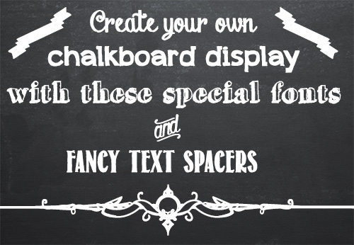
Grocery stores and cafes seem to be chock-full of hand drawn chalkboard menus these days. Of course, who can blame them when they look so great? While most of us are not skilled enough artists to reproduce the fancy flowing chalkboard fonts, our computers certainly are. Recently the chalkboard craze has come online, and font artists across the internet have given us dozens of wonderful chalk-like fonts to choose from. I’ve compiled a list of my favorites of these fonts, including some special symbol fonts for text dividers and flourishes. I’ll step you through the process of finding these fonts so that you can get to work on your own chalkboard designs.

Chalk Board Backgrounds

To create a chalkboard you’ll need a background. I have a couple of recommendations here. There are some nice backgrounds available from foolishfire.com – these are available in black, blue, and green: foolishfire chalkboards. If you wish, you can do a search and find your own. I like to use Compfight (www.compfight.com) – it’s an easy way to find images with commercial and creative commons licences and many of them are a good size. Just be sure to check the licence for any image you download. If you want a fast solution, lots of choices and you’re prepared to shell out a few bucks, then buy a chalkboard background from shutterstock.com.

Of course, if you’d like to make a chalk board design for commercial purposes you’ll have to ensure the image owner has given you the right to do so – in this situation cases using a Shutterstock stock image might be the prudent choice.

Chalk Board Fonts

Fortunately there are many great fonts available for free on the web. The following list contains only free fonts (although some charge for commercial use) that I think look great on a chalk board. If you don’t know how to add new fonts to your computer check out my font installation tutorial first. It’s really easy and once you do it a couple of times you’ll be an ace at doing it!

Chalk Hand Lettering Shaded

Appleberry

Grutch Shaded

Return to Sender

Drawing Guides

These two fonts are comprised of symbols that are perfect for breaking up text and adding some extra flair to your design.

Adhesive Nr. Seven

From this Moment


And that’s it! With these wonderful fonts and a chalkboard background the possibilities for your chalkboard designs are endless. If you find yourself wanting more, a quick Google search for chalkboard fonts should turn up lots of fun fonts to use.


Helen Bradley
Helen Bradley
Sunday, April 20th, 2014

Create a new Default Custom Swatch in Illustrator CC

Learn how to quick start a new document with your preferred swatches in place automatically

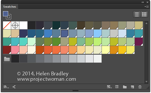
By default Illustrator starts all new documents with a preset set of swatches in the Swatches palette. If you prefer, you can create your own custom set of default swatches, save them and have them show up when you start a new document. Here’s how:

Create a new document – the size you create it as being will be the default for all documents created based on this profile as will the other settings in the New dialog.

Now choose Window > Swatches and select all the swatches you don’t want and drag them onto the Trashcan icon to delete them.

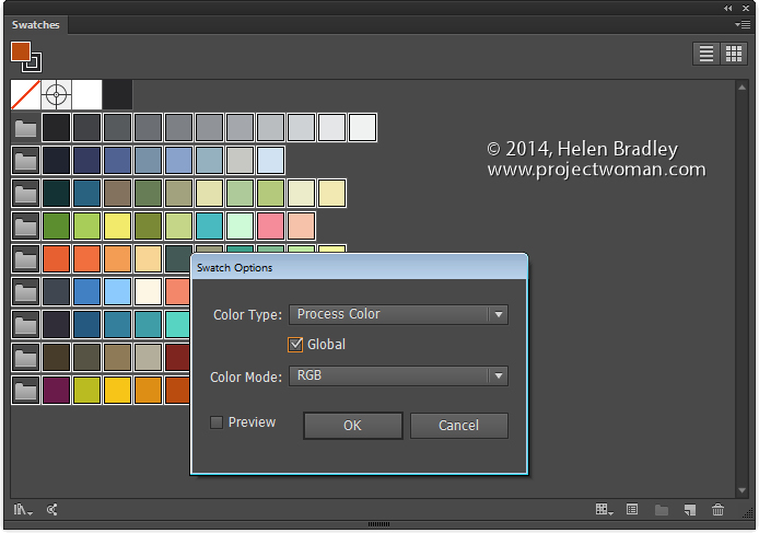
Add all the swatches you do want to have available to the Swatches palette. If you want some colors to be global colors, select them, click the Swatch Options button and click Global.

You can add any type of swatch at this point including pattern, gradients and solid colors.

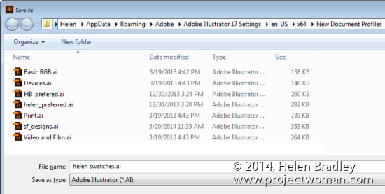
Then when you are done, choose File > Save As and save the file to one of these locations depending on your version of Illustrator and  your operating system:

On the Mac save the file to:


~/Library/Application Support/Adobe/Adobe Illustrator 17/en_US/New Document Profiles.

The tilde (~ ) indicates your hidden user library.
You can open it this way:
1 Launch Finder
2 Choose Go > Go to Folder
3 Type ~/Library and click Go
4 This opens the ~/Library folder and you can now navigate to the appropriate folder listed above.

In Windows 7:

First make sure you can see hidden folders and locate this folder (the exact folder structure may vary slightly but it should be pretty easy to find):

C:\Users\AppData\Roaming\Adobe\Illustrator 17 Settings\en_US\x64\New Document Profiles

To locate your c:\users\\AppData folder, launch Windows Explorer and type this in the address bar :
%USERPROFILE%\AppData
This automatically opens the AppData folder for you so you can now navigate to the desired folder as detailed above.

The name you give to your file is the name that the document profile will appear as in future so make it descriptive of the purpose of the document.

Once this is done, you can close the document.

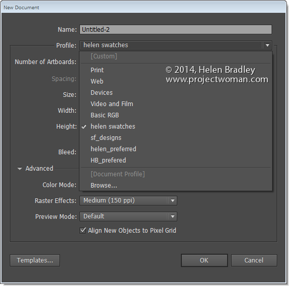
In future you can open a new document based on this profile by choosing File > New and choose the document profile from the Profiles list.

When you do so, your swatches will appear automatically. You can have multiple custom profiles so create them for the tasks you do most often.

Helen Bradley
Helen Bradley
Tuesday, April 8th, 2014

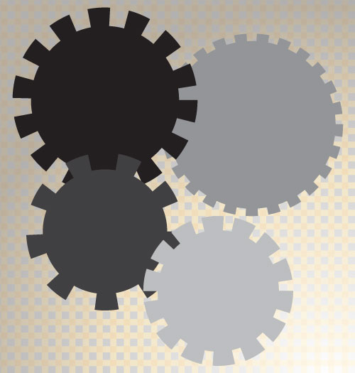
Create a stepped edge gear shape in Illustrator


Here’s how to easily create a shape with a stepped edge much like a steampunk gear, in Illustrator

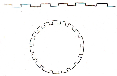
I love steampunk and I’ve even been known to create and give away a set of free steampunk brushes here on Projectwoman.com. Today, however I’m talking about  how to make your own steampunk shapes. A reader approached me and kindly drew out the shape he was interested in achieving and this is what he wanted:

Here’s how to do it easily using the Stroke options in Illustrator.

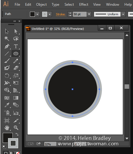
Draw a circle by clicking the Ellipse tool and holding Shift as you draw out a circle. I filled mine with black and added a thick grey stroke around the circle. You can make your stroke and fill the same, I’ve made them different so you can see what is happening.


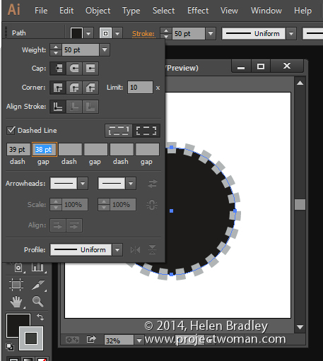
Click the underlined word Stroke on the Tool Options bar to open the Stroke panel. Set the Cap to Butt Cap, enable the Dashed line checkbox, set the Dash and Gap values to your preferred values.  A good place to start is to set the Dash and Gap to the same (or nearly the same) value as the point size of your stroke. Then alter the Dash value to change the length of the dashes and the Gap value to change the gap amount. Click away when  you are done.


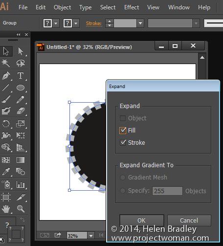
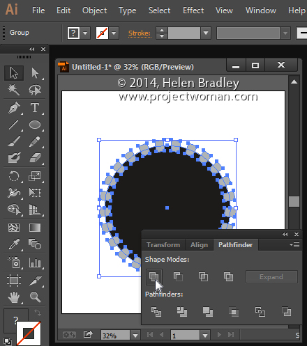
Now, with the shape still selected choose Object > Expand Appearance, then Object > Expand, leave Fill and Stroke checked and click Ok.


Now, with the shape still selected, in the Pathfinder palette (view it by choosing Window > Pathfinder), click the Unite icon (top row, far left). This creates a single shape with the edges you have described.


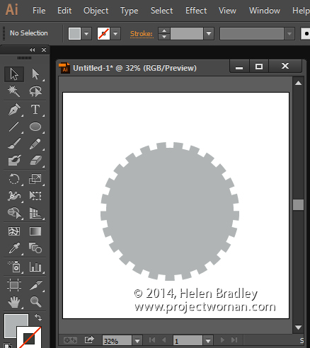
And that does it – there is your circle with a stepped edge and gear-like shape:


Helen Bradley
Monday, March 31st, 2014

Create Guides Accurately in Illustrator


image credit ©ezza116, istockphoto.com

Learn to place guides in Illustrator in the position you want them to appear

Sometimes the differences between Illustrator and Photoshop are really annoying. In Photoshop it is simple to place guides in exactly the position you want them to appear but in Illustrator it isn’t easy at all.

I want to create a square document with guides half way vertically and horizontally so, I’ll start with a new document of a fixed and known size such as 1000 x 1000.

Then choose View > Rulers > Show Rulers so you can see the rulers top and left. With the Selection tool selected, click and drag on the ruler and drag a guide into position. You probably won’t be able to get it exact but that’s ok for now. You can go ahead and drag a guide from the other ruler too.

Guides are, by default, locked so you need to unlock them to move them. Choose View > Guides > Lock Guides to disable the check mark. Now you can drag the guide into position. On the Tool options bar you will see values for X and Y. For the vertical guide, X should be half your document width – in my case 500 and for the horizontal guide the Y value should be 500.

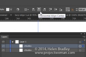
If you open the Layer palette you will see that guides are objects in the current layer. This means that you can click on a guide to select it in the Layer palette and use the tools at the top of the screen to align the guide. So, clicking on it and choosing Horizontal Align Center will center the vertical guide and Vertical Align Center will center a Horizontal guide.

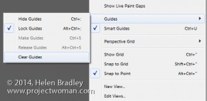
Once your guides are in position, choose View > Guides > Lock Guides to lock them so they won’t move. On this same submenu you can hide guides – this locks them when they are unhidden again or clear guides to remove them from the document entirely.


Other handy tricks include being able to create a vertical guide by dragging down from the top ruler  and hold Alt or Option to change if from horizontal to vertical.

You can make new guides (but not existing ones) snap to dividers on the rulers if you hold Shift as you draw them by dragging down from the ruler.
Helen Bradley
Helen Bradley
Thursday, March 20th, 2014

Photoshop – Recover an Unexposed Subject

Add an Artistic Effect to the Overall Image in Photoshop


Learn to recover an unexposed subject in your photos and how to add an artistic effect to the overall image in Photoshop.

Helen Bradley

Saturday, March 15th, 2014

Scroll though Blend Modes in Photoshop – Mac and PC

scroll through blend modes on the mac

by Helen Bradley
Learn the keystrokes that help you quickly scroll through blend modes in Photoshop on the PC and Mac

On the PC, being able to scroll through the blend modes in the Layers palette is a simple as selecting one blend mode in the list then use the Up Arrow and Down Arrow key to go from one to the next.

On the Mac, it isn’t as easy but it (thankfully), can be done.

On the Mac, click in the Blend Modes list and select a blend mode. Then use the Shift + + or Shift + – keys to scroll up and down the list. Unlike on the PC, the Mac keys roll you around the list so, when you reach the bottom and press Shift + + once more you go right back to the top. Neat huh?


Helen Bradley

Saturday, March 1st, 2014

Create a Graffiti Wall Effect in Photoshop

Learn to paint graffiti without a risk of being arrested

See how easy it is to create a graffiti effect on a wall in Photoshop. The video shows you how to use a graffiti font to create graffiti writing and how to use styles and colors to format the test to make it look like real graffiti. Then see how to use the Vanishing point filter to place the graffiti text onto a wall in a photo. Finish the effect by blending the text with brushes, blend modes and textures all created using layers and masks so that the effect can be edited in future.

Helen Bradley

Wednesday, February 19th, 2014

Photoshop – Color Threshold Art Effect

Adjust Color and Contrast to make your Image Pop

by Helen Bradley

The threshold filter in Photoshop lets you turn an image into a black and white image where pixels are either black or white. It is a great tool when combined with some color for creating artistic effects with your photos.

The only issue with this filter is that you have no fine control over how the conversion takes place. This video solves the problem by showing you how to work with the image to give better results with the conversion.

Here you will learn how to use the threshold filter to adjust the image to make a black and white and how to pick out areas of the image to adjust them separately so you retain the details in it.

You will use masks and adjustment layers to lighten and darken those areas of the image that you wan to keep and highlight.

You will also learn how to create a reusable noise layer to give the final image a more grainy look.

You will also learn why using a fill layer makes better sense than filling a layer with color.

In all, this video is jammed full of handy Photoshop tips as well as showing you how to create a great color effect.

Helen Bradley

Helen Bradley

Wednesday, January 29th, 2014

Vintage inspired shape in Illustrator

Learn to add multiple fills and strokes to a single shape in Illustrator

Illustrator can be a challenge to learn and once you get hold of the basics you may be so relieved that you have progressed this far that you forget to dig deeper for better and smarter ways to create designs.

One feature of Illustrator is the ability to add multiple strokes and fills to a single shape, to order them so they appear on top of each other correctly and even to blend them using Blend Modes.

This video shows how to turn a star into this vintage inspired free pattern filled shape in Illustrator. It’s simple to do when you know how – just a few minutes of video can open up a wealth of opportunities for being creative in Illustrator – Enjoy!

Helen Bradley

Saturday, January 25th, 2014

Illustrator – reverse the twirl tool

Click the Twirl tool and it twirls your path – but how to you twirl the other way?

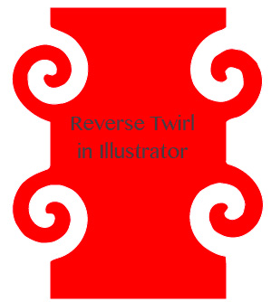
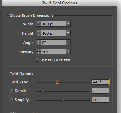
To reverse the twirl tool in Illustrator so you can twirl clockwise double click the Twirl tool in the tool panel and just set the Twirl Rate to a negative value – so if you love the twirl rate amount but want it to go the other way just add a minus in front of the current value – so go from 40 degrees to -40!

Click Ok and then twirl away to your heart’s content.

Easy when you  know how!

Helen Bradley

Tuesday, January 21st, 2014

Illustrator for Photoshop Users

Learning Illustrator is different and easier if you already know Photoshop

So, you’re pretty handy with Photoshop but Illustrator is different – isn’t it? It is not easy to understand when you first start and you might be scared off by an interface that looks both familiar and foreign at the same time. I certainly was when I started out. Illustrator was like a foreign language and it took a lot of time to learn it.

But learning Illustrator when you already use Photoshop can be simplified. You see you already know a lot about Illustrator so we can start out with that knowledge and build on it. You need to know what is the same and what is different between the two programs and you need to know what is important and what you can ignore for now.

So, to help you, I created this video. It’s for anyone who knows Photoshop and who wants to learn Illustrator. I will build on your knowledge so we don’t waste time on things you already know but so you learn quickly how Illustrator is different and how to get started with it.

No laborious “how to use the Pen tool” stuff here. Just quick and fun and interesting stuff guaranteed to get you on your way to loving the creative potential of Illustrator.


Helen Bradley

Sunday, January 19th, 2014

Create a Perfect (Archimedes) spiral in Illustrator

Create Archimedes spirals with evenly spaced lines in Illustrator

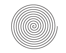
Illustrator’s Spiral tool creates quick and easy spirals but they aren’t Archimedes spirals – the latter have evenly spaced lines. Now it is possible to create an Archimedes spiral in one of a few ways. Here is what I have discovered.

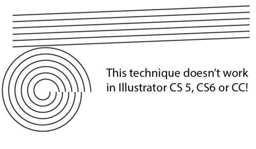
Multiple lines make a spiral (well they did once, they don’t any longer)

Ignore the multiple line solution. There are a few posts on the web that suggest you create a spiral by making a series of parallel lines, move them so they are on a slight angle and then save as an Art Brush. You then use them to stroke a circle and voila! a spiral. Well no. Sorry, it just doesn’t work. It used to work but it doesn’t seem to work in later versions of Illustrator. There is a video here on YouTube that shows some of the problem – for now just ignore what looks to be the simple (if inexplicable) solution.

Deke’s offering

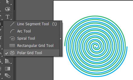
I like Deke McClelland’s stuff if you ignore that he calls some Illustrator tools by made up names like black arrow and white arrow tool (seriously?) but if you can put this technicality aside, see his approach by visiting this Lynda.com tutorial video. It’s a somewhat complex approach but you can use it to create two interlocking spirals or just a single one. Once you’ve done it a few times  it’s pretty easy to do. It also introduces the Polar Grid tool which is interesting and which you may have use for in other circumstances. I just don’t like the middle of this spiral so I prefer some other solution.

The best solution – a Spiral Script

Now let’s step into voodoo territory and talk scripting. While it might sound difficult it is so totally ridiculously easy that I can’t recommend it more highly. Better still, once you see how easy it is to run scripts you may be tempted to find and use more of them from time to time.

So, start by visiting this page where you will find the script to use. Copy the script from the box and paste it into a text editor – not Word, but WordPad or Notepad. Save it as a text file and give it a .jsx extension. You can save it anywhere, but if you want to be able to find it easily in 6 month’s time I suggest you save it in the Presets/Scripts folder for your Illustrator installation (ie in the Programs folder in Windows). Then restart Illustrator so it will find it easily.

Regardless of where your script is stored, start a new document and choose File > Script and select your script from the list (if you installed it in Presets/Scripts) or browse to find it. Click it and it runs and creates your spiral. Now I like this one a lot as the middle is awesomely cute and curly. It’s my favorite and once you’ve created the script file and saved it all you need to do to make one in future is to run the script. It is awesomely easy and look at how cute the middle is…

Now that you are a scripting guru – here’s more scripting fun

The script above makes great spirals but I’ve found another script set here that you can explore now that you’re a scripting guru! Well nearly one, anyway.

These scripts are zipped so all you need do is to download and unzip and place the scripts into your Presets/Scripts folder. Then run them. Some will need objects to act on but you will find information on how they work on the script page itself. I suggest you copy it to a document or print it out so you have it for reference.

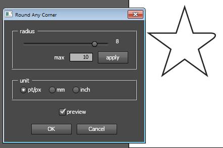
One of my favorites is the Meatball script which joins two circles into a sort of meatball shape. There is a spiral which makes a nice Archimedes spiral and one called Round Any Corner which lets you select one or more points or an entire shape and round the corners – this gives a different result to the Round Corners Effect so might be of interest to you.

Another script in the zip is one that creates trees automatically for you.

Finally – create a rectangle the size of the artboard

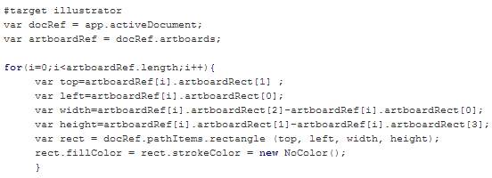
Over at the Adobe forums there is a short script from a user called moluapple which creates a rectangle the size of the artboard. It’s a winner! I use this all the time! I suggest you copy and paste the code from the forum into a text editor and make a script file from it so you have it handy to use anytime you need it. The code below is just a screenshot of the code, I captured it just in case the forum thread ever disappears because this is one awesomely useful script:

So, now it is over to you to enjoy your new ability to download, unzip, locate and run scripts in Illustrator.


Helen Bradley