Monday, July 8th, 2013

Photoshop Tip – Fixing Images with Contrast Masks

Use Contrast Masks to Fix Images Simply

Many of the fixes we commonly apply to images come from darkroom processes. Contrast masking is one of those fixes and it can be used to fix an image which is under or over exposed.

Contrast masking is a relatively simple process and it can work wonders with your images. I like it because it generally doesn’t require you to make selections and there is a lot to like about fixes that don’t involve selections.

Here’s how to use Contrast Masking to fix an under exposed image:

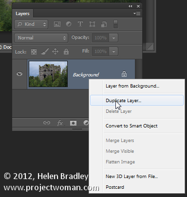
Open your image and duplicate the background layer. Target this duplicate layer in the Layers palette.


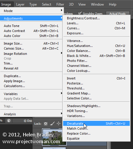
Desaturate this layer by choosing Image > Adjustments > Desaturate. Right now the default convert to black and white is just fine.


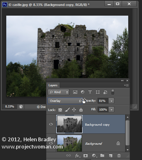
Alter the blend mode of this layer to Overlay.


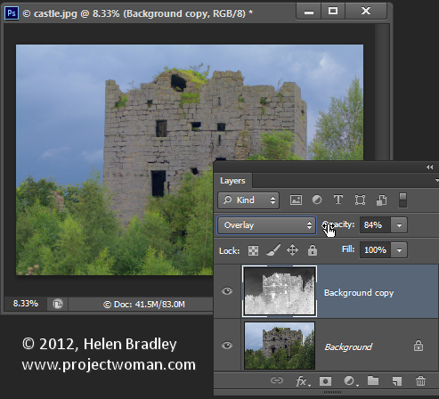
To invert this black and white layer choose Image > Adjustments > Invert – this gives a negative of the image.
Adjust the layer opacity to suit.


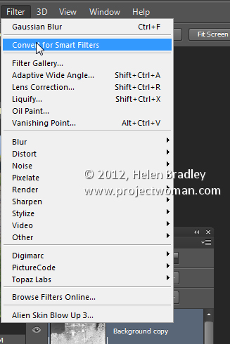
Convert the top layer to a Smart Object by choosing Filter > Convert for Smart Filters.

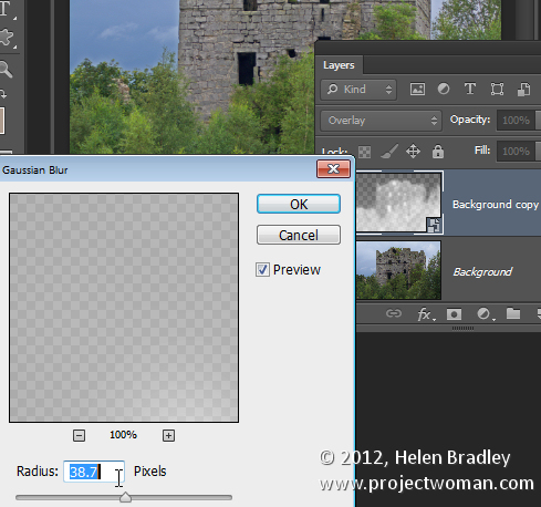
Now blur this layer by choosing Filter > Blur > Gaussian Blur. Adjust the Radius to adds some sharpening back to the image. Check the preview to get the best result for the image.

Helen Bradley

Sunday, July 7th, 2013

Lightroom Tip – Recovering Clipped Highlights


Recover Detail with the Recovery Slider for Clipped Highlights

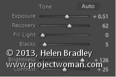
When you have clipped highlights you can recover detail from them in Lightroom 3 if you hold the Alt key (Option on the Mac) and drag on the Recovery slider.

As you do this you will see the clipped highlights in the image and they will disappear as you drag to the right. Do not adjust the Recovery slider any further than you need to to recover your clipped highlights.

In Lightroom 4 you can achieve the same effect if you hold Alt or Option as you drag on the Whites slider – the whites are the lightest portion of the image.

Helen Bradley

Thursday, July 4th, 2013

Lightroom Tip – Viewing Clipped Highlights


Learn how to check to see if you have any Clipped Highlights in your image

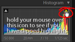
You can see the clipped highlights in the image by clicking on the white triangle in the top right corner of the histogram. Portions of the image that show red are clipped highlights.

Next time we’ll show you how to recover detail in these clipped highlights.

Helen Bradley

Sunday, June 30th, 2013

Lightroom Tip – Lighten an image with Exposure, Brightness, Whites and Highlights

Exposure vs. Brightness vs. Whites Vs. Highlights – Understanding the differences

When you increase Exposure, you’re increasing the exposure across the image and the entire histogram will move to the right. When processing it is best to adjust Exposure until the histogram moves to the right but stop short of clipping the highlights. So make sure the right hand side of the histogram doesn’t hit the right wall of the chart.

Brightness in Lightroom 3 is a midtone lightening tool, which protects the highlights more so than Exposure does. So, if you can’t get the image bright enough without blowing out highlights using Exposure, adjust the Exposure but without blowing out the highlights and then use Brightness to lighten the image further.

In Lightroom 4 you can adjust the Whites slider to lighten the whites or the Highlights to lighten the next brightest areas of the image.

Helen Bradley

Friday, June 28th, 2013

Photoshop – Adding Images to your Reusable Layout Template

Learn how to populate the layout template that we created in an earlier post with images of your own.

Click Here for Part 1


Transcript:
Hello, I’m Helen Bradley. Welcome to this video tutorial. In this tutorial I’m going to show you how you can actually make use of your reusable layout template that we made in an earlier video. In the previous video I showed you how to create this template.

It has a background color of white but that could be any color. It has space for two images. And then it has two copyright symbols here. One is black and one is white depending on which we want to use for any particular layout.

Now I’m going to show you how you can take this particular template and make it into this by adding images to it. I’m just going to hide this one away and we’ll focus on the one that we created.

I haven’t saved that yet but that doesn’t matter too much. Now I’m going to open some images that I want to use in it. So I’m going to go and select the images that I’d used previously. That’s winter7. And I want bird7 as well. So I’m just going to move these images into position. This is the main template and these are the individual images.

So to start off with I’m going to just drag and drop the background layers from each of these images into my main template. So this is this image first. I’m going to drag and drop it into position and I’m going to drag and drop this one in. Now you can see that the images that I’ve dragged and dropped in are way, way bigger than the template is. But that doesn’t matter because we know how to make them smaller. I’m going to click on the layer thumbnail, Ctrl T and then Ctrl Zero. You can see how much bigger these images are than the actual template itself. I’m going to size the image down quite small, click on this link here so I make sure that I don’t destroy its ratio of width and height, and I’m just going to move it roughly into position as to where it’s going to be in the final template. Now I’ll click the checkmark here and let’s go ahead and resize this one.

Click on the layer thumbnail, Ctrl T, Ctrl Zero. And now I’m going to scale it small, place it roughly in position, make sure that the width and height are scaled correctly in exactly the same proportion, finish off the positioning of it and then click the checkmark here. Now let’s zoom into the image. To make sure that this now works as we expect it to we need to bring back this line down here and we probably need to crop these images. Now the template has those crops already built into it.

The first thing I’m going to do is to drop this particular layer immediately above the layer that’s going to control its size. And then I’m going to drop this one immediately above the layer that’s going to control its size. And we’re going to use a simple feature called Clipping Path. With the topmost of this pair of layers selected, I’ll choose Layer and then Create Clipping Mask. And what that does is it clips this image to the exact size of the rectangle below. And now let’s do that with this one, click on the layer, Layer, Create Clipping Mask. And you can see that that’s clipped this particular image here to the exact size of the black box below.

The black has disappeared. It has nothing to do with it. These colors could be any color you like. But you can see that in doing so we’ve brought back the color from this layer here. And we can prove that that’s where the color is coming from. So I’m just going to select a blue color here and I’ll just fill this layer with blue. And you can see now that the space between those two images is the exact same blue as I just filled the background layer with. I’ll just undo that because I don’t really want blue.

To finish off I’m just going to decide which of these two copyright symbols is going to work better in this instance. Well I think the white one is. So I’m going to click its eyeball or its visibility icon and turn off the black one. So that’s how we would fill that template that we created in an earlier video.

Now your templates don’t have to be as simple as this one. They can be quite complex. And you may be aware that I have templates available on projectwoman.com. This is a free set of templates that you can download and use exactly as you’ve seen here. There are some triptychs and there are also some layouts with 9, 4 and 6 images in them.

I’m Helen Bradley. Thank you for joining me for this video tutorial. If you liked this tutorial place click the thumbs up to give it a like. Think about subscribing to my YouTube channel and visit my website at projectwoman.com for more tips, tricks and tutorials on Illustrator, Photoshop, Lightroom, Photoshop Elements, iPad and a whole lot more.

Helen Bradley

Tuesday, June 25th, 2013

Lightroom Tip – Controlling the White Balance Loupe


Learn to control and manage the White Balance tool and loupe in Lightroom

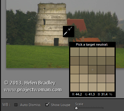
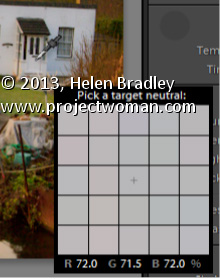
The White Balance Loupe shows you information about the color under the cursor. Across the bottom you will see the percent of Red, Green and Blue in the current selection. If the color is neutral then all values will be equal.

If you un-check the Auto Dismiss check-box at the foot of the preview, the Loupe will stay visible allowing you to click multiple times to find a good place to use to adjust the white balance. I think this setting should have been set to be not selected by default – it just makes white balance corrections so much easier because, let’s face it, none of us ever get it right first time every time!

Helen Bradley

Sunday, June 23rd, 2013

Lightroom Tip – A Quick and Easy White Balance Adjustment


Learn how to quickly and easily adjust an image’s White Balance


In the Lightroom Basic panel’s White Balance area is a White Balance Selector. You can get to it by pressing the letter W. Hold the White Balance Selector over an area of the image which should be a neutral color, such as gray, black or white – gray is the better choice.

You will see the Loupe appear (which is a grid of 25 cells showing the color under and around the cursor). Click once to set the white balance, using the center color as a reference. If the result isn’t what you want, click again to sample another area. Continue until you get a good fix for the image.

Helen Bradley

Saturday, June 22nd, 2013

Falling foul of the new Adobe cloud subscription service

I’ve been concerned a bit lately about Adobe’s cloud offerings mainly because they check the internet periodically to see if you are paid up. If you are teaching and don’t have internet available, I’m always just a little concerned that I may be locked out of my programs as a result.

Today I did get locked out – but not because I didn’t have an internet service. I subscribe to Adobe Captivate and it wouldn’t accept my id and instead wanted a serial number. Now even I know it shouldn’t ask for a serial number for a subscription service. So, I got onto Adobe Customer support – a monumental exercise in frustration. They made me change my Adobe password to see if that would work – seriously? Well of course it failed. They then gave up and put in a support ticket for me and basically told me to go home and they’d email – sometime.

Seriously?

Thank goodness for Twitter. I got online and began to vent! Adobe picked up right away and offered help and nonsense in about equal portions. They asked the obvious – yes I did try to sign out and in again, they offered up this gem – @HelenBradley Is Captivate the software you want to access? I’m afraid is not included as part of the Creative Cloud – Yeah! you know, I worked that out 7 months ago when I signed up and started paying $19 a month for the program! Not the problem clearly!

Eventually they too gave up and offered a help call – when would I be available? Now? Yes.

Next I get tech support. I give them control of my computer, they poke around for a long while, they give up and call in Captivate people. Oh! didn’t you know? this is a known bug – WTF! Why the Captivate group don’t bother telling support this is a problem I don’t know.

Support promises to escalate the issue. They give me a 30 day trial so I can do my work. They assure me all is hunky dory. It isn’t though is it? Because Captivate trials have time restrictions on content so any client work I do will expire and refuse to run about the time the client tries to go live with it!

At least we can now do some work but we have to await a fix before we can send it off.

This is my second call to Adobe support in a month – the other was a registration problem on an other program – in that case I had had a drive fail and needed to re-install Photoshop which you can’t do because you can’t unregister the old version because the drive failed. A delicious Catch 22 situation which took about an hour longer to sort out than it should have.

In summary, Adobe support is pretty pitiful most of the time and add the overhead of subscription software that has checks that if you can’t meet them can result in your software not running is just a bit scary.

Right now I’ll be days behind on a project. I paid an assistant to sit and listen to me try to sort out the software he was supposed to be working on and I lost an afternoon of my own work. Way to go Adobe!

Update #1 – Adobe breaks Master Collection

Ok, so a few days after my first experience with Captivate being unusable (because it is a trial version and any content you make is time limited) help came back to me. They tinkered with my machine for around a half hour and pronounced the problem fixed.  For my inconvenience they credited my $19 a month subscription with 4 days credit – wow. thank you Adobe – what, to you is around the cost of a Starbucks coffee is for me hours of lost time and wages paid to an assistant who can’t do what he is paid to do.

Now, the next time my assistant comes to work after this, Captivate is, thankfully working just fine. However, he preps his stuff in Photoshop and – he tells me with horror – his Photoshop Master Collection just switched to Trial Mode. Seems that the Support folk in turning Captivate into a trial managed to turn eveyr piece of Adobe software into a trial version – Photoshop, Illustrator, Dreamweaver – the list goes on.

Now luckily none of those programs are ‘cut down’ versions when they are trials so I spent 30 days ignoring the problem. The problem of course was that when support made my master suite a trial version they didn’t unregister the software so I couldn’t re-register it because I had already used my 2 installs! Whew.. it takes effort just to understand the mess much less try to explain it to someone. And overall, my feeling was that I needed a dose of Adobe support like I needed root canal!

In the end, however, the passage of time meant that the trials expired and I had no choice but to go back to support. First to explain how the problem happened (hum… your support people took away my registration and made it a trial and I can’t register it because I can’t deregister it and I’ve already used my two registrations) and then ask for what I want – hmmm – register my software? Then they tell me they can’t unregister it (curiously they could 3 months ago when my hard drive crashed and I had to get the program unregistered so I could reregister it). Could they add another registration to my account? Truly, like I care how you are going to solve this problem, I just want it solved. So, yes, thank you … another registration would be great.

Total time for the support call (including searching for the link to get help) was around a half to three quarters of an hour. Unusually, from my recent experience with Adobe the process went fairly smoothly and the problem got solved. It just shouldn’t have been a necessary call  for so many reasons! So, so far so good.

Update #2 – Adobe Cloud (Dis)connect

Hmmmm I think I spoke too soon. Fast forward 2 weeks. Assistant is at his desk about to do an urgent project for a client. He looks at me – what happened to Captivate he asks? I can’t get in. It is asking me for a serial number. WOW! a wave of deja vu washes over me. Yep, you got it, Captivate (the subscription program I pay $19 a month for) is asking for a serial number. You know – subscriptions don’t have serial numbers – so, long story short, we’re locked out of Captivate – the program won’t start. Nada.

Now, before I tell you how it all got sorted out and how I spent another 45 minutes+ on getting support to fix it, imagine for a minute (if you will kind reader) that I teach Captivate. I check my notes and presentation the night before – all is just fine. I turn up to the class – people have paid $199 a head for this 3 hour class. I turn on my computer and Captivate asks for a serial number. That’s the scenario that really scares me witless. Adobe hasn’t got this cloud/subscription model right. They keep telling us that we can still use the program after the subscription is expired – what they don’t tell you is that your software might not understand it is a subscription – and it might do that without warning – and it might do it over and over again – it has done just that to me.

This time Adobe support could fix the problem on the spot but it took time and they had to take over my computer and download and install software onto it to get it sorted. I lost time – again – my assistant couldn’t do his work – again. It is all starting to sound very much like a broken record. I wish I didn’t have to write this. I wish I could be writing great Photoshop posts and making YouTube videos but until Adobe sorts out its problems I think people having problems have an obligation to tell their stories in the hope that Adobe will listen. I did get a survey from Adobe about the support, I did complete it, I did say most of the things I’ve said here in the survey and I did offer to be contacted if they need more info.

I hope there are no more additions to this post.  I just worry that that won’t be the case.

Helen Bradley
Friday, June 21st, 2013

Photoshop – Make a Reusable Layout Template

Learn how to make a reusable layout template for your photos in Photoshop. This is part one of a two part series.

The second video/post shows how to use the template to populate it with images. This can be done with any version of Photoshop.

Click Here for Part 2

This technique shows a quick way to create even complex layouts using selections and layers in Photoshop. It is simple to achieve for any one with advanced beginner skills or better in Photoshop.

Transcript:
Hello, I’m Helen Bradley. Welcome to this video tutorial. In this tutorial I’m going to show you how you can use Photoshop to make a reusable layout template. In a later video I’ll show you how you can go ahead and reuse that template.

This is the type of template that I’m going to show you how to create in this video and in the next video I’m going to show you how to populate it. Basically the template is made up here of a background layer which can be any color you like and you can also change the color if you want to. And into the template we’re going to put two black boxes and these later on are going to be filled with images. Here’s one image and here’s another. And it’s going to be done in a way that’s going to be very easy for you to limit the size of these images to match these black boxes. And then you can add copyright symbol.

Now I’ve got two in this particular template because I’m not sure whether I’m going to need a black one or a white one. And that will pretty much depend on what the images are that I’m using. So into this template I’m going to put both of them so they’re both available. So in this particular video this is the point at which we’re going to have the template created. We’ll have a backing, the two boxes and then two alternate copyright symbols that we can use. So let’s get started.

The first thing to do is to choose File, New and then make a size for your template. I’m using one that could be used for a blog so it’s a mere 650 by 300 pixels in size, 72 pixels per inch because this is going to the web, RGB color mode, and because I want a white background I’m just going to select Background Contents White. But we could color that later on if we wanted to, and I’ll just click Ok. And here is my new document. It has just a background layer.

The next thing to do is to add a guide that I’m going to use to make it just a little bit easier to make those black boxes. I’m going to choose View and then New Guide and I want this one to be at 40 percent vertical. So that’s a little bit more than one-third of the way across this document. Now I’m going to add a new layer by clicking the Add New Layer icon here at the foot of the layer pallete. I’m going to target the Rectangular Marquee tool. And making sure that I’m pointed to this new layer I’m going to drag over to create a rectangle. Now I’m going to do that again so that you can see that I start my rectangle here outside the edge of the image to make sure that I get all the image up to this line. And because View is set to Snap I’m snapping to this guide so I’m making sure that I’m filling this exact area.

I have black selected here as my foreground color so I’m going to press Alt Backspace or Option Delete on the Mac to fill my rectangle with that black color. Now I’m going to add another new layer and this time I’m going to choose Select, Inverse because what that does is to select everything that I didn’t have selected before. Now I’m going to fill this with black again, Alt Backspace, Option Delete.

Now right now I’ve got two black boxes. And if I turn off these guides, I’m just going to clear the guides, you’ll see that these two boxes in fact butt onto each other so they’re creating an entire document. That’s not what I want. I want a marker between the two of them.

So I’m going to click on the topmost layer, click the Move tool and then just tap with the right arrow key and I’m just visually deciding how much space I want between these two boxes. And I think that’s a pretty good amount. So having done that I’m just going to select a different tool and that will turn this off. So here I’ve got my two layers and my background layer.

And all I need to do now is to add the copyrights so I’m just going to choose File, Open Recent because I recently opened my black and my white copyrights. So here they are. I’m going to just pull these images out of the way so that I can see my main image. And this is the white copyright here that is selected so this is its layer. So I’m just going to drag and drop it into my image. It’s way too big but we’ll worry about that in a minute. I’ll close it down. And now this is my black copyright image and I’m going to drag and drop its background layer into my image. And again, it’s way too big too. I’m now going to select the black copyright layer here and I’m going to press Ctrl and T and then Ctrl and zero. And what that does is it lets me see my sizing handles because this image this copyright image is really, really huge.

So I’m just going to size it down so it’s going to fit better in this area here. I’m going to make sure that I click this link here so that it’s sized in proportion. And now I’m going to just drag it back to approximately where I want it to be and click the checkmark. I can hide that now. And now let’s focus on the white layer exactly the same, click the layer thumbnail to select it, Ctrl and T and then Ctrl and zero. Now I’m going to drag in on the sizing handles to make my copyright small enough to position it in place on my image. I’m just going to click this link again just to make sure that this is scaled in proportion and click the checkmark.

So this is my template. It’s all done and now I can save it. So I can choose File and then Save as and I would give it a name such as 40, 60 something, like that to indicate to me that this is a template that I can now use to create other documents in future. In the next video I’ll show you exactly how to do that.

I’m Helen Bradley. Thank you for joining me for this video tutorial. If you liked the tutorial please click Like. Think about subscribing to my YouTube channel and look at my website at projectwoman.com for more tips, tricks and tutorials on Photoshop, Lightroom, Illustrator, iPad and a whole lot more.

Helen Bradley

Wednesday, June 19th, 2013

Lightroom Tip – Faux Orton Effect

Create the Orton Effect in Lightroom with the Clarity Slider

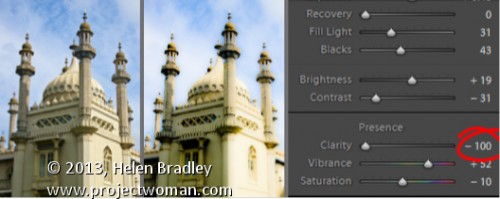
The Orton Effect is named after photographer Michael Orton. This process results in a somewhat surreal image which has a slightly out-of-focus look while retaining lots of edge detail.

You can quickly give an image a faux Orton look using the Clarity slider in Lightroom. All you need to do is drag the Clarity slider to the left close to -100 and then, increase the Blacks in the image to an higher than usual value.

Of course there is a lot more to the Orton effect than this but this gives you a good start and, for many images, may be all you really need.

Helen Bradley