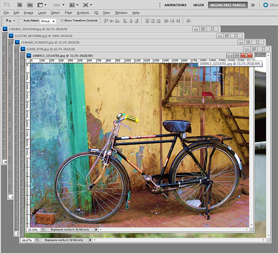
 (photo by: Asif Akbar)
Cycle through your open images by pressing the Ctr + Tab keys on the keyboard.
 (photo by: Asif Akbar)
Cycle through your open images by pressing the Ctr + Tab keys on the keyboard.
Labels: cycle, documents, how to, images, photohshop, tip, trevor adobe, trevor payne, work flow
Categories:photoshop, trevor tip
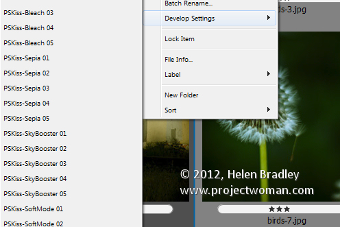
If you have a preset, for example a preset that applies an auto tone correction to an image in Adobe Camera Raw then you can apply this to an image in Bridge without needing to open Camera Raw.
Right click the image in Bridge, choose Develop Settings and then select the preset from the list.
Any preset can be applied automatically simply by selecting it. If you need to undo it, choose Develop Settings > Clear Settings. This will remove the settings from the image.
This strips out any ACR changes that you’ve made to the image.
A bonus of this feature is that the fix can be applied to jpg as well as raw images direct from Bridge.
Labels: ACR, adobe raw, bridge, develop settings, Helen Bradley, how to, images, jpg, tip
Categories:photoshop
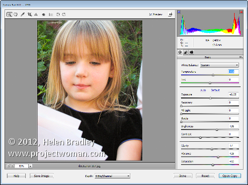
If you capture in jpg you may believe that you cannot take advantage of the Camera Raw processing features built into Photoshop Elements. This is because, by default, when you open a jpg image in Photoshop Elements it will open automatically in Elements bypassing the Camera Raw tool.
Only when you open a raw or dng file does will the Camera Raw tool appear allowing you to use its features to edit your image.
You can, however, get Photoshop Elements to open any image including a jpg image as a Camera Raw file. To do this, choose File > Open As and locate the jpg image to work with. From the Open As dropdown list, select Camera Raw as the option and click Open.
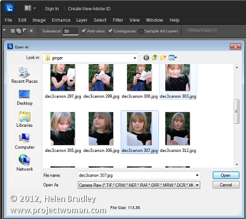
This treats the jpg image as a Camera Raw image so you have access to the superior processing tools available in Camera Raw for processing the image.
When you’ve finished with Camera Raw, click Open Image to move the image to Photoshop Elements with the Camera Raw adjustments in place. If you don’t want to go into Photoshop Elements then just click Done to save the fixed version of the image.
Labels: Camera Raw, dng, editing jpg, Helen Bradley, how to, images, jpg, jpg file, Photoshop Elements
Categories:photoshop
I’ve been taking a lot of screenshots lately and I have over 1,200 photos on my iPad – a lot more than I really want to store there.
When I went to delete the photos in bulk, I banged my head pretty quickly up against a problem with the iPad. It’s not immediately apparent how you delete a lot of images at one time and deleting them one at a time will get very cumbersome very quickly.
Here’s how to do it:
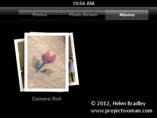
To begin, launch the Photos app, tap the Albums link and then make sure you’re viewing the Camera Roll or the place where your image are stored. I wanted to remove them from the Camera Roll so I tapped that.
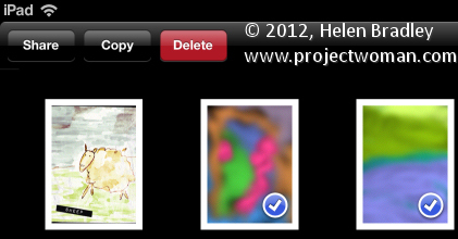
Now press the bent arrow icon in the top right corner of the screen and you’ll see options on the left for Share, Copy and Delete.

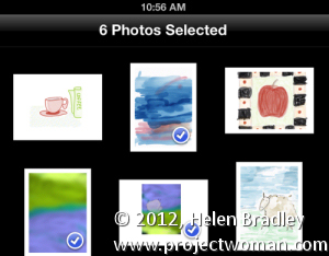
Tap an image to select it and then go ahead and select each of the images to delete – they’ll get checkmarks on them to show they are to be deleted. To undo the setting, tap the image again.
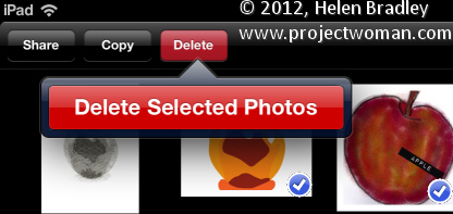
Then when I you have those you want to delete selected, tap the Delete button and choose Delete Selected Photos to remove them.
It is, as you might have expected this is ridiculously simple once you know how to do it but difficult until you do.
The good news is that the images aren’t removed from your iCloud download folder on your PC. So, for example, if you’ve previously had the images synched so they appear on your PC in a folder of iPad downloads, the images will still be on your PC at the end of the process – they’re just removed from your iPad.
Labels: delete, Helen Bradley, how to, images, ipad, photos, pictures, remove, share, tip
Categories:Uncategorized
While Dreamweaver has some rudimentary tools for photo editing, if you want to do some real image editing, you’re better advised to take the image to a photo editor to do so.
From Dreamweaver you can send an image to Photoshop by right clicking it and choosing Edit With > and choose the image editor to use from the list. If Photoshop is not in the list you can browse to find it, if desired.
However, it’s better still to add Photoshop permanently to the list and to do this, choose Edit > Preferences > File Types/Editors and in the Extensions list, select the file extension to set the external editor for. In most cases you will be choosing .jpg .jpe .jpeg.
In the Editors box, click the plus (+) symbol above the box and browse to find the executable file for your version of Photoshop (or another program if desired). In most cases this will be in your C:\Program Files or C:\Program Files (x86) folder.
You can make an editor the primary one by selecting it in the list and choose Make Primary and then click Ok.
Next time you choose Edit With, you’ll be able to choose Photoshop and the image will be passed from Dreamweaver to Photoshop – if Photoshop isn’t open it will be opened automatically for you.
Labels: Dreamweaver, dreamweaver to photoshop, editing, Helen Bradley, how to, images, images of the web, photo editing, Photoshop, web optimized
Categories:photoshop
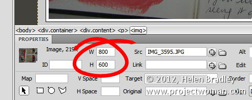
If you don’t pre-prepare your images before adding them to a page in Dreamweaver, you’ll need to resize them in the program.
If you click an image and check the Properties panel, you’ll encounter your first problem. The selectors that let you adjust the Width and Height of the image do not do so proportionally so it’s perilously easy to skew your images out of alignment.
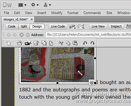
One alternative for resizing an image is to click the image and use the sizing handles to resize it. Hold the Shift key as you do this to scale the image in proportion.
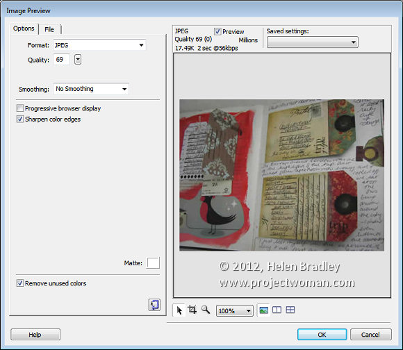
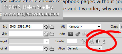
There is also another way and that is to click the image and choose Commands > Optimize Image. This is the same dialog as you get if you click the image and click the Edit Image settings button in the Properties tab (it’s just difficult to work out what button this is because it is so tiny). This opens the Image Preview window.
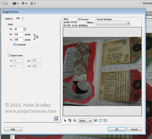
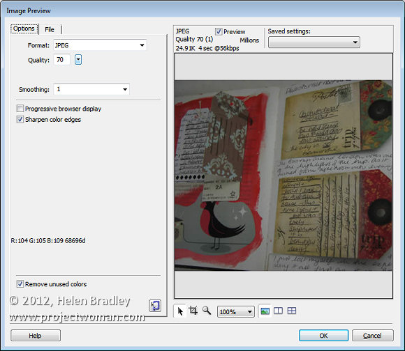
Click the File tab and you can scale the image to a fixed percentage or check the Constrain checkbox and adjust either the width or the height and both will be adjusted automatically in proportion.
Under the image are tools for moving around the image in the dialog, cropping it, zooming in and out of it and setting a magnification for viewing it in the dialog.
From the Saved Settings dropdown list you can select an optimization setting for your file, if you select JPEG – Smaller File the image will be saved as a low quality JPG. JPEG – Better Quality will result in a better quality but overall larger size file. For photos always select a JPG option and never GIF.
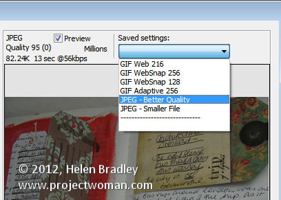
With the Preview enabled you can read off how long it will take to download the image at the currently selected quality at a 56kbps download rate.
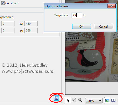
There is also a button in the bottom right of the left hand panel that allows you to optimize to a fixed size. Click it and you can set a target size for your image such as 20kb, click Ok and the image quality will be adjusted to give you file that is no larger than the size requested.
In the Options tab you can select to sharpen the color edges if desired. When you’re done, click Ok to configure the changes for your image.
Other image options include Brightness and Contrast and Sharpening both of which you can select by clicking the respective Brightness and Contrast, and Sharpen buttons in the Properties panel.
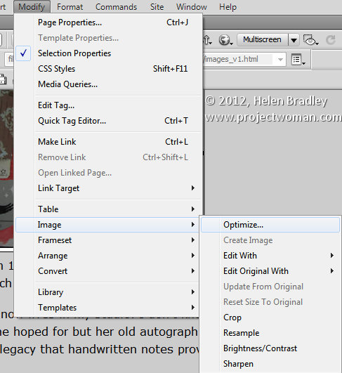
These options can also all be found by clicking Modify > Image. Here are options for optimizing the image, editing with an external editor, editing the original with an external editor, cropping, brightening, adjusting contrast, resampling and sharpening the image.
Labels: Dreamweaver, Helen Bradley, how to, images, photos, resize, web optimized, width height
Categories:photoshop
By Helen Bradley
On Monday, Adobe launched its Photoshop Touch application for the iPad. This long sought after app runs on the iPad 2, and not on the iPad 1, and it requires that you have iOS 5 installed. The app costs $9.99 which is at the high end of the price range for photo-editing apps in general but Photoshop Touch seems to have got the feature set about right so most people will probably consider it worth the money.
I use the iPad a lot for working with photos I’ve shot using a digital SLR camera in raw and which I’ve resized, converted to jpeg and downloaded to the iPad. Those images I have on the iPad are there because they are funky or because they lend themselves to some artistic play. So, I looked at Photoshop Touch in this light – I wanted to see if it would be part of my iPad image creative workflow. For heavy duty work, Photoshop and Lightroom will remain my tools of trade.
When you launch Photoshop Touch you get two options, viewing the tutorials or doing some work.
There are 10 tutorials that you can work through each of them is project based so you learn the program by learning a technique not by learning how individual tools work. These are text and image tutorials and not video ones, but they are interactive so you can learn as you go.
The second option is Begin a Project which is where I’ll start. You get the choice of adding an image from your iPad, the Adobe Creative Cloud, the Camera, Google or Facebook. I chose Local Photos then the Photo Library and an image from my iPad.
In the main editing area you’ll find the tools on the left, layers on the right and menus across the top. The program pays lip service only to Photoshop. Some icons are familiar but others are more iPad than Photoshop so Photoshop users may find it a bit confusing where iPad artists will find it more familiar.
You can add multiple images and multiple layers. I wanted to texture this image so I clicked the Add Layer button and selected Photo Layer.
Once you select a second photo you get to size it as you import it – you can also rotate, flip or skew it too. Click Done to proceed to the editing area.
Now, with the layer selected, you can apply adjustments to it.
I chose Curves as this was a texture and I wanted more contrast. There are no adjustment layers so the Curves adjustment is being applied just to the targeted (top) layer. As you can see, you can adjust the RGB composite channel or the individual red, green and blue channels.
With the texture layer still targeted you can apply a filter to it by clicking the FX button. There is a range of filters including Basic, Stylize, Artistic and Photo. Some add things like drop shadows, blurs and glows and others are more artistic.
I chose Stylize > Old Photo, configured the settings and tapped Apply. Unlike Photoshop where the foreground and background colors need to be selected before you run a filter, here you can select the colors to use in the filter settings – this really is a feature that Photoshop should have.
To blend the layers you click the Layer icon and you get a choice of blend modes and the chance to adjust the layer opacity.
There are no masks but you can use a gradient to fade the effect – when you do the gradient is applied to the layer and you can only undo it by tapping Undo – you can’t go back and edit it.
You can also add a new Empty Layer and fill it with a gradient.
And then blend it using a layer blend mode as I have done here.
I finished by cropping the image and then saving it.
You can then email it or send it to the Camera Roll or upload the project to the Adobe Creative Cloud so you can access them from there.
There are limits to Photoshop Touch and one is the 1600 x 1600 pixel image size limit. The text tools are rudimentary and, as a long time Photoshop user, I’d like to see editable masks and editable text. That said, for fixing photos and tinkering with creative projects this program is a welcome addition to the Adobe family.
This app will appeal to a range of users. There are plenty of basic tools that are easy to use but also some more advanced features for working with images. The Scribble Extract tool does a reasonable job of extracting a subject from a background and you can tinker with gradients and fades to get some interesting effects. You don’t need to know how to use Photoshop to use the app but your knowledge won’t go astray.
Labels: Adobe creative cloud, Adobe Photoshop, adobe photoshop touch, blend modes, camera, create, edit with adobe photoshop touch, effects, extract filter, facebook, filters, google, Helen Bradley, how to, images, ipad, iPad app, Layers, masks, photoshop for the ipad, project, tips
Categories:Uncategorized
At Halloween last year I was asked to photograph some kids I’ve shot from time to time since they were born. Basically their mum likes to have some up to date photos of the kids and Halloween seemed like as good a time as any to get some shots.
When I’m shooting like this, my aim is to get some good shots but nothing formal and I prefer not to use a flash because I get a better response from the kids without one. I captured the images in raw and I chewed through three small size camera cards in about an hour and a half.
My deal with their mum is that I get to use the photos for my work and she gets a disk of pictures. To keep this fun – so it doesn’t feel like work for me – I need a fast and effective processing workflow. I need to get the images off my camera, sorted, processed, burned to a DVD and delivered to mum in time for her to enjoy them.
Thanks to Lightroom the process was simple and, in all, I reckon I spent less than 2 hours getting the photos from the camera cards to a DVD. Here is what I call my Happy Snap Lightroom workflow – it’s what I do to quickly process casual snapshots:
To begin with I have some criteria I work by. I never give away substandard photos so anything blurry, out of focus or over exposed gets permanently deleted. Then I sort out the best of the images intending to give mum around 50-60 photos of the kids – it’s a nice range of images for her to use to scrapbook and post to Facebook and it doesn’t over burden her with too many photos to choose from.
To begin, I download all the images from all three cards into a single folder on my hard drive (if there were only one card I would omit this step).
From there I import the images into Lightroom at the same time copying them to their permanent storage on my external photo drive and making a backup to a second drive. Copying rather than adding images to the Lightroom catalog lets me make backups and also add my metadata to the images so, when they popup on Facebook my copyright details are embedded in them.
Importing all the images in one step also means that when I’ve started the import process – which includes rendering standard previews – I can start working through the images and I don’t have to do it multiple times or switch out cards as I work – (the process works for me – your mileage may vary).
The first time I run through the images I am looking for images to delete as well as getting a general look at what I shot.
As I work through the images I’ll press X for images to delete and use the right arrow key to move past everything else. I’ll select to delete all out of focus images, anything where someone has their eyes closed or similar, and anything I don’t want to put my name to!
Once I’m done I choose Photo > Delete Rejected Photos to delete the images from my primary external photo drive. There are still copies on the backup drive and my hard disk but not on my main photo drive.
On the second run through the images I pick those I want to use. By now I have a rough idea as to what I have and what I might want to give mum. So this time I run through the images pressing P to pick an image and using the right arrow key to move past those she won’t be getting.
Once done, I isolate the picked images by clicking the first of the filter flag icons above the filmstrip. Then with only the picks visible I press Ctrl + A to select all of them and then click New Collection > Create Collection and type a name for it. Because the images are already selected, I leave the Include Selected Photos checkbox enabled and click Create.
Now I have a collection of the picks and it’s time to process them. I start out by selecting all the images in Grid View in the Library and from the Quick Develop panel I select Auto Tone. This gives me a head start on fixing them but, because of the lighting, pretty much all of them needed a white balance adjustment.
Switching to Develop module with the filmstrip visible I selected the White Balance Selector and then made sure that Auto Dismiss was disabled. This allows me to adjust the white balance on one image and then click on the next one in the filmstrip and continue to adjust the white balance from one image to the next without having to reselect anything. Basically all that most of these images needed was some white balance adjustment.
For those that needed cropping, I cropped as I finished with white balance adjustment and then moved on to the next image. This ensured that each image was dealt with only once as I progressed across the filmstrip.
So, having fixed the worst of the problems I work backwards through the filmstrip to see if any of the images warrant special attention. If so, I make a call to fix them or simply remove them from the collection. To remove the image, right click it and choose Remove from Collection .
Here I had one issue with a couple of images where one child’s face was in shadow. For this, I used the Adjustment Brush tool at a small size with a large feather radius. I brushed over the areas where her face was in shadow and then adjusted the Brightness and Exposure to lighten to her face. In the same images other faces were overexposed so I added a second Adjustment Brush adjustment with the opposite settings to attempt to deal with this. The final result wouldn’t stand up to close scrutiny but is just fine for the web and 6 x 4 printing.
Once this was done it was time to export the images. Because they’re all in a collection, Ctrl + A selects all the images. I chose File > Export and then exported them as JPG images, 80 percent quality at the largest size and I added sharpening to them in the process. I made sure these images all went to a new folder so that they would be isolated from everything else and easy to find.
From there, it was a matter of launching Ashampoo Burning Studio, grabbing all the images and burning them to a DVD.
This workflow is one giant step better than simply burning the images direct to a DVD. It takes only a little more time with Lightroom to sort and apply some basic fixes to the images and it also means that only the best of the images get circulated and those that do have my copyright information embedded in them.
So now it’s over to you. What’s your “happy snap” workflow? Do you capture snapshots in raw? Do you process using Lightroom? And how do you get your images processed quickly so you’re not spending hours on images that are really just family snapshots?
Labels: burn, create collection, Develop Module, download, eliminating duds, export, fix, images, Lightroom, Photoshop, plan, processing image, sorting, workflow
Categories:Uncategorized
By Helen Bradley
Historically a contact sheet was a page of images each printed at the same size as the film negative – they were used as a reference for the images on the film roll. They were called contact sheets because the film was placed in close contact with the paper when printing them.
These days the term contact sheet loosely means an arrangement of multiple, small, same size images on a single page usually with some identifying information such as the image filename placed under the image. The purpose is to provide reference to a larger number of images. You may print them to keep or give to a client as a catalog of the images from a shoot, for example.
You can create a contact sheet inside Lightroom and here’s how to do it:
Start by selecting the folder or the collection that contains the images that you want to add to the contact sheet.
Launch the Print module and, from the Template Browser, select one of the contact sheet options. There are a few grid layouts including two with square image cells – a 4 x 8, and a 5 x 8. There are two with landscape orientation cells – one 5 x 9, and one 5 x 11.
I chose the 5 x 8 one.
If you plan to ‘print’ the contact sheet to a jpg file, from the Print Job panel on the right of the screen, choose Print to JPG File. As contact sheets are just that – a contact sheet and not full scale images – select to use Draft Mode Printing to speed up their creation.
The page dimensions will be preset for 8.5 x 11in. You can set your own Custom File Dimensions but increasing the size of the page simply changes the page size not the size of the cells – you have to adjust them separately.
If you have only one image selected in the Filmstrip then the contact sheet will only display one image.
You’ll need to select all the images on the filmstrip to add them to the contact sheet. To do this, either click on the first image and Shift + Click on the last or select All Filmstrip Photos from the Use: list on the toolbar. If the Toolbar is not visible, press T to display it. You can also select Flagged photos, if desired.
The Toolbar shows you how many pages you will use and you can click the arrow keys on the toolbar to navigate the pages.
To add information below the images, from the Page panel on the right, select the Photo Info checkbox and choose the field to display. You can use one of the preset options such as Caption, Date, or Filename or click Edit to create your own field.
In the Text Template Editor, you can access to fields such as the filename, a sequential numbering or date as well as EXIF and IPTC data. You can also type your own custom text to create detailed photo info to add to the contact sheet. Here I typed some text, added a sequential number and the filename.
The template contact sheets are a starting point but you do not need to strictly adhere to their design if you don’t want to and they can be easily customized.
For example, from the layout panel if you click the Keep Square checkbox you will find that in some layouts your images may change orientation so the page will be a mix of portrait and landscape images.
You can adjust the maximum cell size and width using the Cell Size Height and Width sliders in the Layout panel. As you adjust the cell size, notice that the Cell Spacing values will change.
You can decrease the number of rows and/or columns using the Page Grid options. By decreasing the number of rows or columns, you can increase the cell size.
If you increase the Bottom or Top margin you can give yourself room to, for example, place an Identity Plate on the page.
Here I’ve reduced the number of rows and increased the bottom margin and added an Identity Plate from the Page panel options. In the Page panel, select the Identity Plate checkbox and then select the Identity Plate to use.
The Identity Plate will appear, by default, in the middle of the page so drag it into position on the page. Adjust its scale by dragging on the Scale slider.
You can adjust its Opacity if desired and, if it is a text identity plate (rather than a graphic), you can also select Override Color to make it any color you like.
When you’re done, you’re ready to output the result. If you selected to print to a JPG file click Print to File and type a name for the file and select a location for them. The pages will be printed to a JPG file and if there are more than one they will be sequentially numbered.
If you want to print to a PDF on a Windows machine you will need to have a PDF printer driver installed such as Adobe PDF or one you have downloaded from the web.
Select Page Setup, select the pdf printer driver and configure the page size so it matches the template size – such as letter paper portrait orientation. Then set the Print to: option in the Print Job panel to printer and click Print to print to a pdf.
If you have customized a template and want to be able to use it again in future, save the design as a new template.
Click the plus symbol opposite the Template Browser panel header and type a name for your template. You can store it in User Templates or create a new folder for it. Click to create it.
In future you can save yourself the time setting up the template by starting with your customized version.
Labels: add image captions, adding images, adjusting margins, captions, contact sheet, customize, customize the contact sheet, Helen Bradley, how to, images, Lightroom, PDF, print, print contact sheets, print contact sheets in lightroom, print job, print to pdf, save, set up, template, tip
Categories:Uncategorized
There is a healthy range of free clip art available from Microsoft and it includes some photos including content from iStockPhoto.com. However, the process of getting them into your document any other way than by choosing Insert > Clip Art is not always obvious.
Here’s how to add a clip art image to a circle shape:
Choose Insert > Shape and select the Oval. Hold Shift as you draw to create a circle on the screen. If you choose Drawing Tools > Format > Shape Fill you get the option of applying a picture to the shape but not clip art.
Instead, right click the shape and choose Format Shape to get access to the new to Word 2010 – Format Shape dialog. Choose Fill > Picture or Texture Fill and click the Clip Art button.
Browse or search for an image. You could also have placed a Clip Art image into your document using Insert > Clip Art and then selected it and cut it to the Clipboard. Here in this dialog you can choose Clipboard to add the image from the clipboard – in short you have more options here for using image than you have using the Shape Fill list.
If the image is skewed out of shape – and it will be if it is a portrait or landscape image inside a circle which is pretty much a square with the corners cut off – you can adjust it.
Select Crop and, for a landscape orientation image inside a circle, increase the Picture Position Width value. For a portrait orientation image inside a circle, increase the Picture Position: Height value.
Then adjust the Offset X or Offset Y values, if desired, to control which portion of the image shows up inside the circle.
Labels: clip art, images, Microsoft Word 2010, photos, pictures in shapes, shapes, Word 2010
Categories:Uncategorized