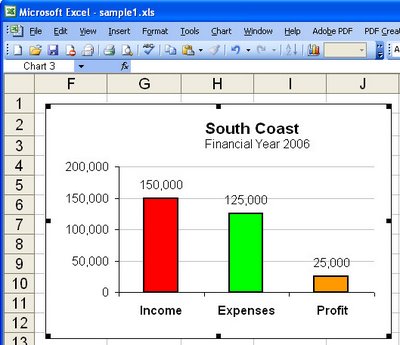
Data labels on your charts show your viewer the values they’re looking at and after all – isn’t that the purpose of the chart?
To add Data Labels to a chart, click the chart and choose Chart, Chart Options. Click the Data Labels tab and choose a style that will look good on your chart. Typically values is a good choice but, for pie charts, for example, a different type might work better.


Post a Comment
Please feel free to add your comment here. Thank you!